Every department wants something different from your landing page:
→ The product team wants more product shots.
→ The sales team wants a phone number, a form, and an email.
→ The legal team wants these terms on the form.
→ The creative team wants their video full-screen.
→ The marketing team just wants conversions.
But no CRO knows if a landing page will convert out the wazoo. At least not in the beginning.
So how do you figure it out?
It creates–hands down—the greatest lift in the conversion journey. High-converting landing pages are key to your digital marketing strategy. And it's easy to test every important component.
Copy, messaging, layout, design, offer, CTAs, forms…
Nothing’s off-limits.
Heck, landing pages are like a science lab for your marketing. Easily collect user behavior data, make educated guesses about how you can improve your marketing, and test those hypotheses to see if you (or product or sales or creative) were right.
The result?
Incremental improvements to your marketing campaign conversion rates. AKA more money in your pocket.
Think of landing page split testing like applying the scientific method to your marketing. Instead of relying on gut or intuition to make decisions, split testing provides you with empirical data.
Split testing takes the guesswork out of conversion optimization.
We’re going to explore everything you need to know about landing page split testing, along with 11 high-impact, low-effort split tests guaranteed to increase your conversion rate.sion rate.
- What is landing page split testing?
- What is Split Testing? (and why bother?)
- Split vs. multivariate landing page testing
- What are the benefits of split testing landing pages?
- Enhanced User Experience
- Common Mistakes to Avoid in Landing Page Testing
- How does a landing page A/B test work?
- 11 landing page split testing ideas to try for easy conversion rate wins
- How to split test your landing pages on your own
- 12-point landing page A/B testing checklist
- Best Practices for Landing Page Testing
- Closing thoughts
Get brand new landing page strategies straight to your inbox every week. 23,739 people already are!
What is landing page split testing?
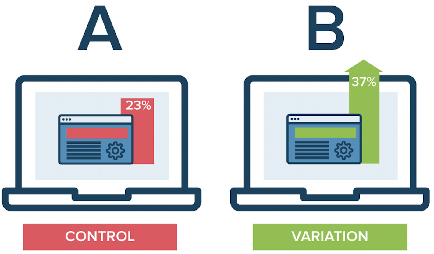
A landing page split test (also known as an A/B test) is a controlled experiment that distributes a randomized group of traffic equally (50/50) between two different versions of your landing page to discover which version converts best.
It’s one of the fundamental principles of conversion rate optimization.
The term “A/B” refers to the two different variants of the landing page. And the term “split” refers to the splitting of traffic equally between both variants.

What is Split Testing? (and why bother?)
Split testing (A/B testing), compares two or more versions of a landing page (each with a different variable) to pick a winner (the one that performs best). Using conversion rates to inform landing page performance is the right data-driven approach marketers should always take.
Chances are, a lot of your landing page headlines could be better. Find out! Create asecond version of the page with a new headline and run a test. Which headline resonates more with your audience? Take that insight and refine your landing page strategy to achieve better results.
(Then show your A/B test results to the higher ups on a report that shows similar landing page conversion success and ask for a raise).
Split vs. multivariate landing page testing
Mmhmm, now you're thinking deep.
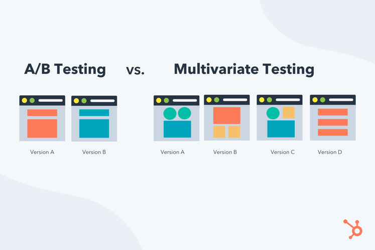
A split test only tests one landing page variable at a time. A multivariate experiment tests a combination of variables at the same time.
For example, an A/B split test might conduct a controlled experiment to see whether or not a new offer, headline, CTA, or form performed better than the original. But not at once. It would test, say, the headline first, then run a different experiment to test the CTA, and so on.
Multivariate tests, on the other hand, measure whether or not Headline #1 + CTA #1 + Form #1 at the same time converted better than Headline #2 + CTA #2 + Form #2 at the same time. These tests are particularly useful for high-traffic websites to drive better conversion rates by optimizing multiple components like headlines, CTA buttons, and visuals all at once.
What are the benefits of split testing landing pages?
A/B testing landing pages is a great way to evaluate small changes that can lead to big results.
- Data: With A/B testing, science rules the world. Instead of making decisions based on intuition, instinct, or seniority (which are often wrong), you can make decisions based on data and real user behavior.
- Conversions: The entire point of an A/B test is to put your user experience hypotheses to the test and improve landing page conversion rates. Consequently, it’s only a matter of time before you find a winning variant that drives more conversions. Then another. And another.
- User research: Split testing landing pages allow you to smoke test and validate messaging, positioning, and offers before pushing them live on your website or in your campaigns—invaluable user data.
- Global lift: A good A/B test will test elements that you can roll out sitewide (e.g. homepage or product pages), not just on landing pages. Wins on landing pages become wins across your entire website, which become exponential over time.
- Money (ROI): Last, a better understanding of your customers plus more conversion equals more revenue at a lower cost. Simple.
Enhanced User Experience
One of the key benefits of split testing is its ability to enhance the user experience. By identifying which elements of a landing page are most effective at engaging visitors and driving conversions, marketers can make informed decisions that improve the overall user experience. This could involve testing different headlines, images, call-to-action buttons, or even the layout of the page.
For example, you might find that a landing page with a clean, minimalist design performs better than one with a cluttered layout. Or, you might discover that a specific call-to-action button color leads to higher conversion rates. By continuously testing and optimizing these elements, you can create a more engaging and user-friendly landing page that resonates with your target audience.
Common Mistakes to Avoid in Landing Page Testing
You're company does better than common, so don't make these common mistakes when testing landing page testing:
- Testing too many variables at once: Don't make it difficult to determine which variable is causing the change in performance. Stick to testing one variable at a time for clear results.
- Not running the test for a long enough period: Short test durations lead to inaccurate results. Run your test long enough to gather sufficient data.
- Using a small sample size: You aim to achieve statistically significant results. Aim for a large enough sample to ensure accuracy.
- Ignoring statistical significance: Failing to test for statistical significance could create false positives or negatives. Always verify your results with a confidence level calculator.
- Skipping the control group: Without a control group, it’s hard to compare the results of your test. Always include a control version to benchmark against.
Your time is capped. Test things that will lift the needle, and don't make mistakes that might create unreliable data. Efficiency happens when you test properly and grab actionable insights from your landing page tests.
How does a landing page A/B test work?
Landing page split tests require four key components to work properly:
- Hypothesis: Every successful split test starts with an evidence-based hypothesis about why you think your target customers or users have performed a certain way. Your split test will validate or invalidate your hypothesis.
- Control variant (A): Your control variant is the landing page that stays the same; it’s the A in A/B test. To start, your control variant is your original landing page design. But after several A/B tests, it’s likely that your original design will lose to a challenger, in which case the challenger will become the control variant for future A/B tests.
- Challenger variant (B): The challenger variant is the new version of the landing page that you’ll use to test your hypotheses; it’s the B in A/B test. If it converts higher than variant A, you can call it the champion variant.
- Statistical significance (confidence level): Most importantly, for an A/B test to confidently predict that one version will convert higher than the other in perpetuity, it needs a statistically significant sample size. Without enough traffic, you won't achieve statistically significant results, and your data could be lying. How many people need to see each variant? Usually in the thousands. How will you know if you have statistical significance? We use CXL’s A/B test calculator (it does all the calculations for you). All A/B tests should shoot for a 90-95% confidence level.
When does split testing end? It doesn’t—at least, it shouldn’t.
Every good split testing program dons a new champion variant, then pits it against a new challenger. Rinse and repeat your way to higher conversions.
For example:
Experiment 1: Control page vs Variant A
→ Results show that Variant A (new CTA) outperforms the control version.
Experiment 2: Variant A vs Variant B
→ Results show that Variant A outperforms Variant B. Still the winner.
Experiment 3: Variant A vs Page C
→ Results show that Variant C outperforms variant A (new winner)
And so on…
11 landing page split testing ideas to try for easy conversion rate wins
What can you split test on your landing page?
Literally anything.
When it comes to an A/B testing strategy, start with landing page elements that will lead to the highest impact but require the lowest effort.
For example, it wouldn’t make sense to A/B test an ROI calculator before testing a better offer first.
A better offer will take minutes to change, but could potentially lead to massive conversion increases, whereas an ROI calculator might take weeks to engineer (and tons of money and resources) and lead to an unknown conversion boost, good or bad.
So what do high impact/low effort variables look like? We’ve got 11 landing page split testing ideas:
- Conversion goal
- Attention ratio
- Offer
- Forms
- Social proof
- Layout
- Headline
1. Conversion Goal Split Testing
Conversion goal split testing involves testing different versions of a landing page to determine which one is most effective at achieving a specific conversion goal, such as filling out a form or making a purchase. This type of testing is crucial for identifying which elements of a page are most effective at driving conversions and making data-driven decisions to improve the overall performance of the page.
For instance, if your primary goal is to increase newsletter sign-ups, you might test different form placements, button texts, or even the incentive offered for signing up. By analyzing the results of these tests, you can pinpoint the most effective combination of elements that drive conversions, ultimately leading to a more successful landing page.
By incorporating these new sections, we provide a comprehensive understanding of split testing and its importance in optimizing landing page performance and enhancing user experience. This approach ensures that the article remains informative, engaging, and aligned with the existing content.
2. Attention Ratio Split Testing
Attention ratio split testing involves testing the number of links on a landing page to see how it affects conversion rates. The attention ratio is the number of links on a page divided by the number of conversion goals. A lower attention ratio can lead to higher conversion rates, as it reduces the number of distractions on the page.
For instance, if your landing page has multiple links that lead visitors away from the primary conversion goal, it can dilute their focus and reduce conversions. By testing a version of the page with fewer links, you can see if a more streamlined experience leads to better results. This approach produces high converting landing pages by keeping visitors focused on the main action you want them to take.
3. Message Match Split Testing
Message match split testing verifies the message on a landing page matches the message on the ad or email that drove traffic to the page. A consistent message leads to higher conversion rates, as it reinforces the message and builds trust with the visitor.
For example, if your ad promises a 20% discount, your landing page should prominently feature this offer. If the messaging is inconsistent, visitors may feel misled and bounce off the page. By testing different versions of your landing page to ensure message match, you can create a seamless experience that boosts conversions.
1. Conversion goalsplit testing
When it comes to landing page goals, try to shoot for just one.
For example, if your primary conversion goal is to increase free trials, then you shouldn’t present visitors with any other options, like scheduling a demo, downloading a whitepaper, subscribing to a newsletter, or contacting sales.
I understand it’s not always that black and white. Sometimes it makes perfect sense to provide a secondary conversion goal.
But in general, the more conversion goals you include, the fewer conversions you’ll get.
In fact, adding more than one conversion goal can decrease landing page conversion rates by 266%
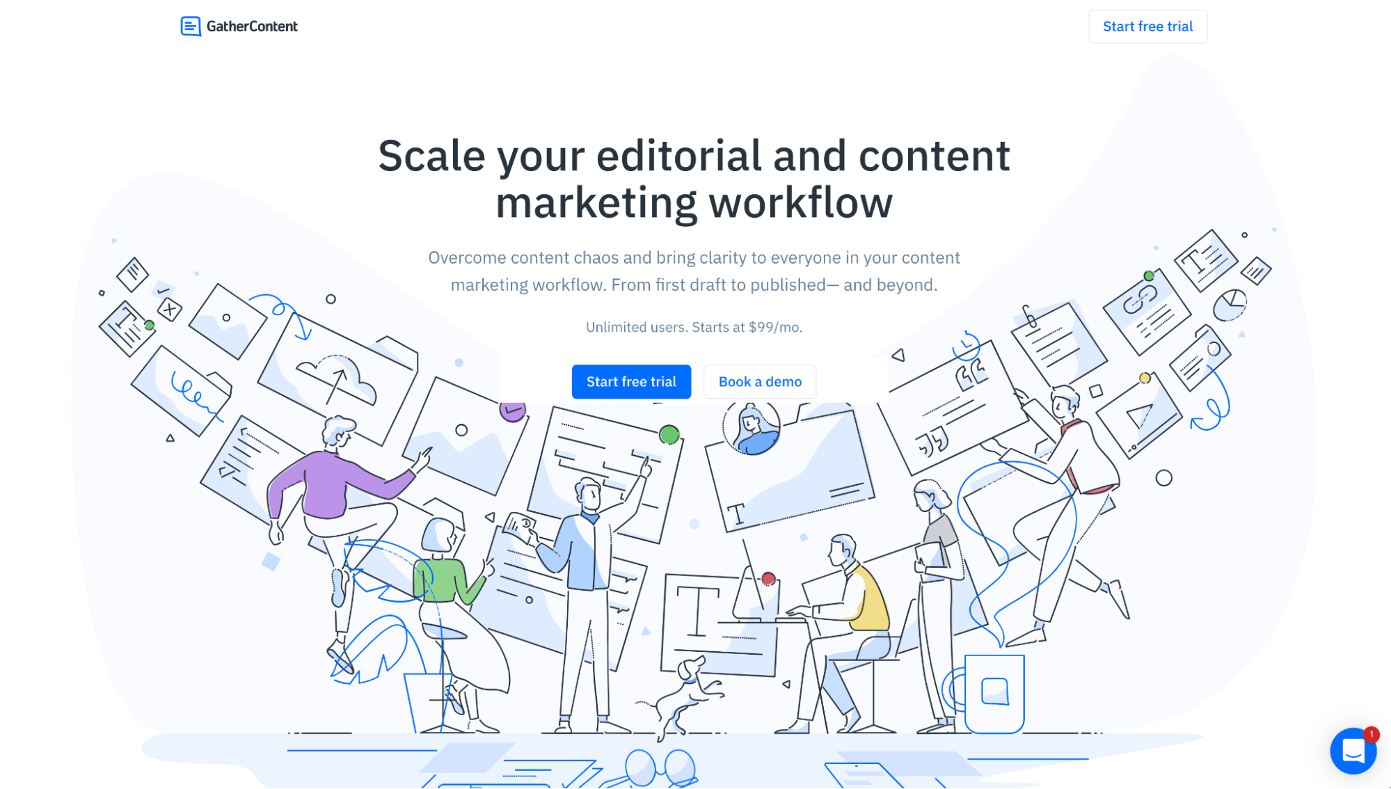
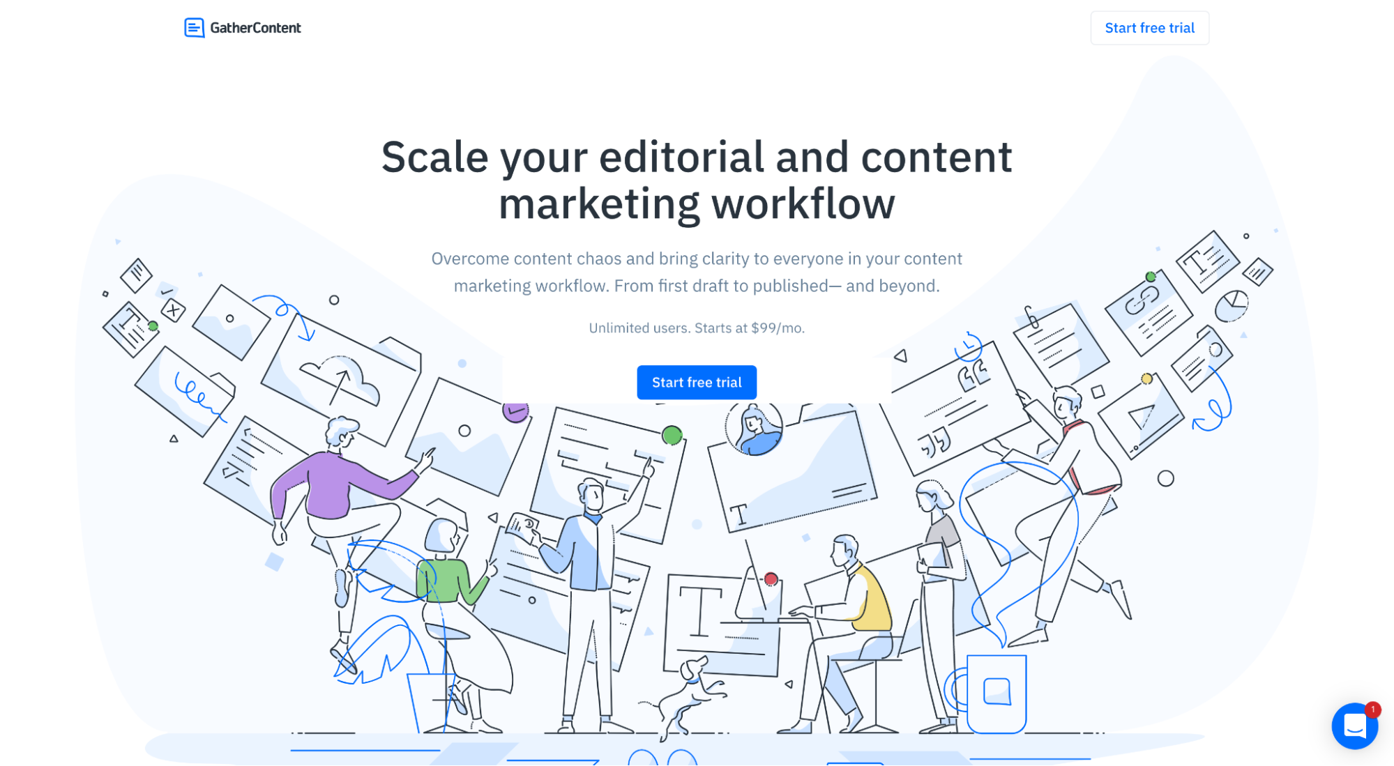
If your landing pages include multiple goals or offers, the first thing you can do is test landing pages by A/B testing a version of the landing page with only one offer.
Using GatherContent as an example, they could run an experiment that tests whether or not removing their second CTA (Book a demo) increases free trials:
2. Attention ratiosplit testing
Attention ratio refers to the number of links on the page compared to the number of conversion goals.
For landing pages, your attention ratio should sit at 1:1.
In other words, if you only have one conversion goal, you should only have one link on the landing page.
That means removing navigation menus, social media icons, internal links, and footer links (barring the legalese terms and service links, of course).
For example, when YuppieCheck ran landing page tests, specifically an A/B test, to see if removing their navigation would drive more sales, they discovered that it actually increased conversions by 100% (from 3% to 6%):
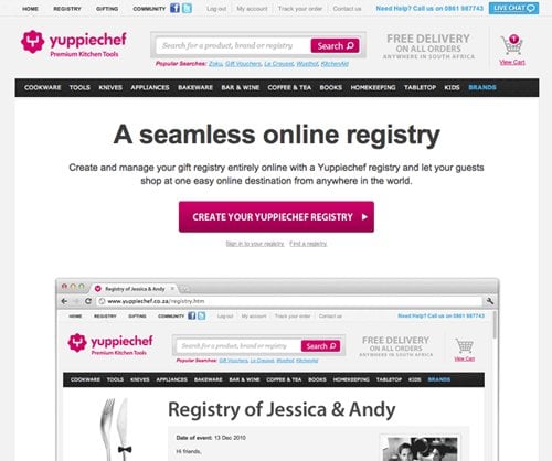
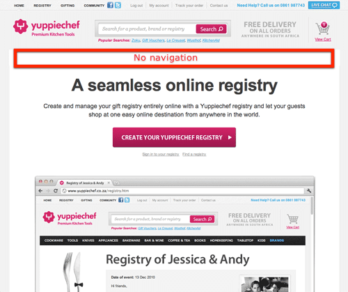
New page, no navigation (100% increase in conversions) -
If the messaging is inconsistent, visitors may feel misled and the bounce rate may increase, causing them to leave the page.
3. Message matchsplit testing
Message match refers to the practice of matching the copy and offer of your ads and campaigns to the copy and offer on your landing pages.
When an ad or campaign makes a promise, your landing page needs to deliver on that promise.
Too often landing pages and ads differ in style, tone, message, or wording, leading to a fractured experience for the prospect—which ultimately leads to more bounces and fewer conversions.
A strong message match, on the other hand, keeps the same promise from the ad to the thank you page.
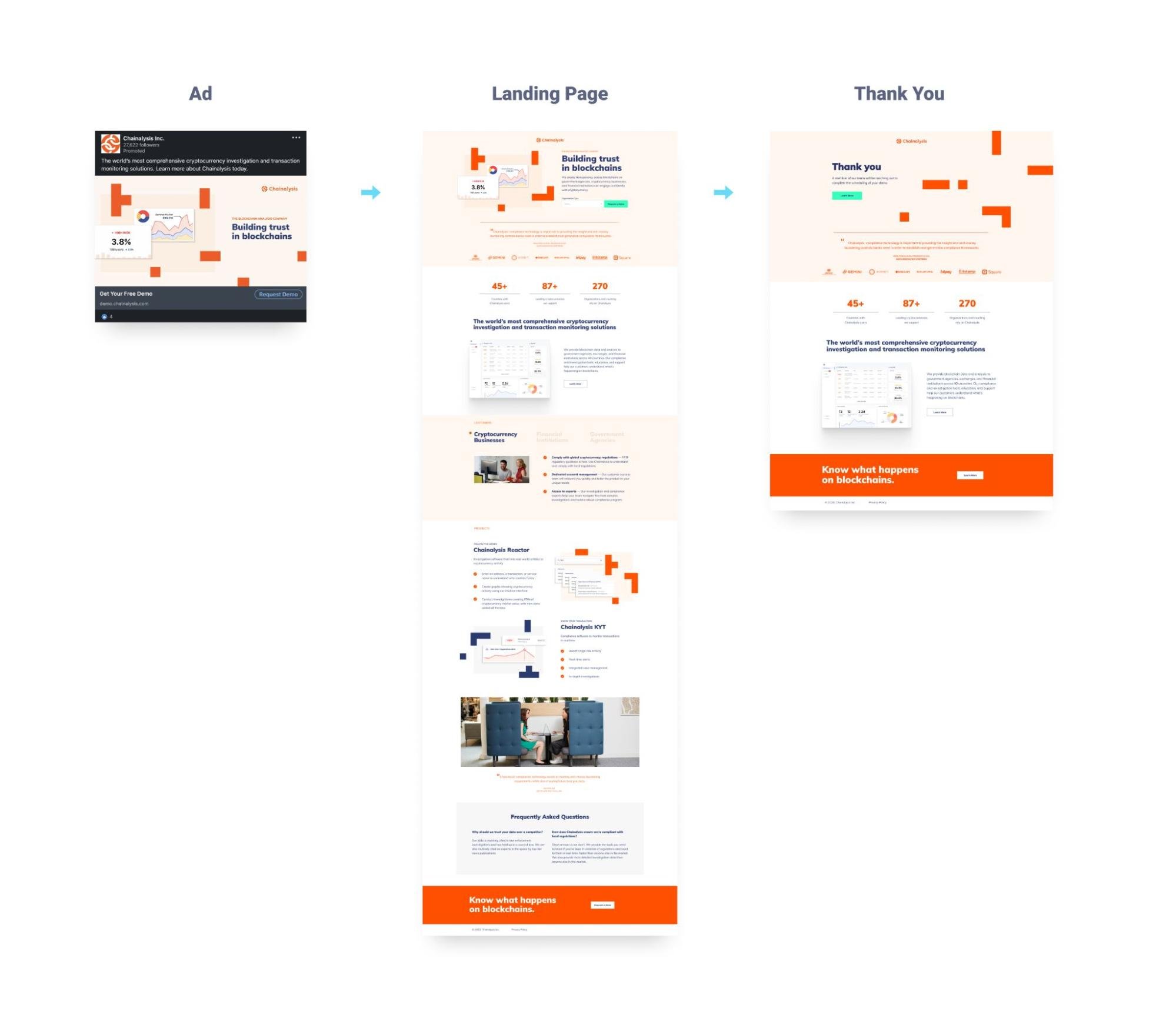
Everything looks and feels the same, from ad to landing page to thank you
If your ad headlines, benefits, offer, or style doesn’t match your landing page’s headline, benefits, offer, or style, run an A/B test with multiple elements that better matches your message (and watch your conversions jump).
Add urgency: Limited time, limited supply, presale bonus, buy now/pay later
4. Offer split testing
At the end of the day, everything hinges on an irresistible offer.
Even the best copy, design, layout, or headline can’t make up for an uncompelling offer. Employing A/B testing strategies is essential for developing successful landing pages that convert well.
Changing your offer provides the biggest upside with the lowest amount of effort.
How can you A/B test your landing page offer?
- Add urgency: Limited time, limited supply, presale bonus, buy now/pay later
- Add value: Discounts, free trials, bundles, BOGO, pricing tiers, free shipping
For example, Acuity A/B tested their offer by changing it from a “Free for life” plan with limited features to a “14-day free trial” PRO plan with every possible feature.
The results? A 268% increase in paid signups

When it comes to A/B testing landing page forms, you can test pretty much anything, including form fields:
- Form length: Short vs. long forms
- Field types: Dropdowns, checkboxes, radio buttons
- Field labels: Placeholder text vs. labels outside the fields
- Call-to-action buttons: Text, color, size
5. Forms split testing
Landing page forms are one of the most studied variables of any landing page element.
And for good reason, considering that more than 67% of landing page visitors will abandon your form forever if they encounter any complications.
Heck, we even wrote an entire article about landing page forms: 17 Key Elements For A High-Converting Landing Page Form [Proven]
When it comes to A/B testing landing page forms, you can test pretty much anything:
- Number of form fields
- Form labels
- Placeholders
- Microcopy
- Call-to-action button
- Single column vs. double column
- Horizontal or vertical
- Multi-step forms
- Popup vs. embed
For example, Arenaturist discovered that changing their form from a horizontal layout to a vertical layout increased conversions by 52%:
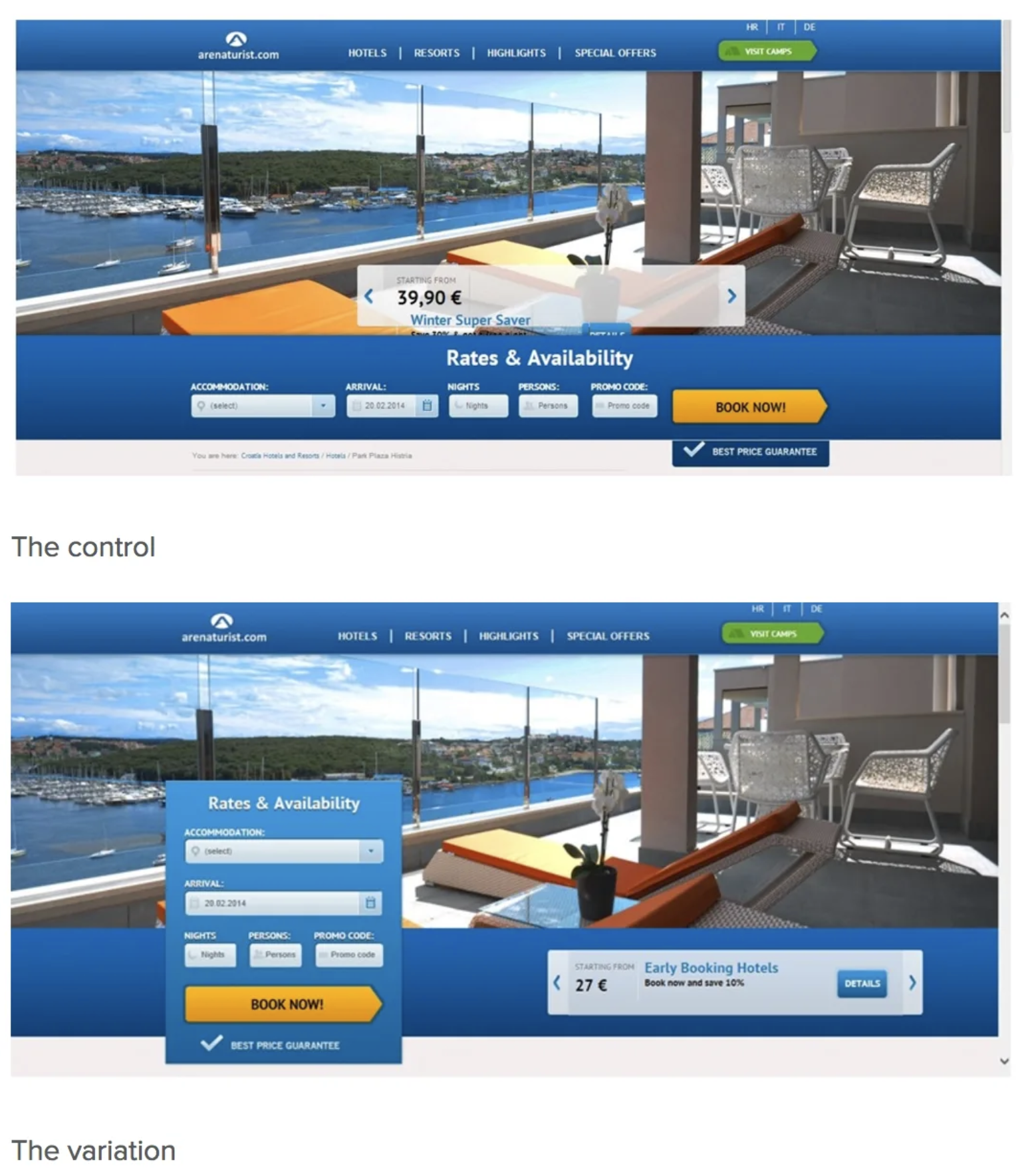
In a now-famous A/B test, Expedia discovered that removing the “Company name” field from their checkout form increased conversions to the tune of $12M/year.
6. Call-to-action (CTA) split testing
A good landing page CTA is clear, compelling, and action-oriented.
Instead of using vague, generic call-to-action copy like “submit” or “send,” a high-converting CTA communicates a clear benefit.
In fact, CTA buttons that contain a benefit have been shown to increase opt-ins by 15%
Copy isn't the only CTA element you can A/B test:
- Button contrast: Increasing conversions has less to do with button color and more to do with color contrast. Test different color contrasts to see which converts higher.
- Affordance: How much does your CTA look like a real button ? Flat and plain? Or 3D with a drop shadow?
- Click triggers: Click triggers refer to the microcopy under or around your CTA buttons designed to entice clicks, like “No CC required” or star ratings.
- Placement: Above the fold, below the fold, in the header, somewhere else?
- CTA style: Underlined text? Big button? Small button? With arrow icon? With email icon?
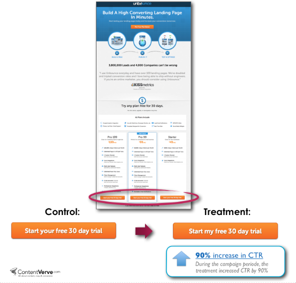
For example, in this oldie but goodie A/B test from Unbounce, they discovered that changing one word in their CTA button copy increased conversions by 90%:

7. Social proof split testing
66% of customers said the presence of social proof increased their likelihood to buy.
Reviews, testimonials, star ratings, client count, client logos, trust badges, user stats…
Social proof is like conversion gold: sprinkle a little of it on your landing pages and watch your conversions rise.
When it comes to A/B testing , consider the following:
- Placement: On your forms, above the fold, next to your benefits, as a click trigger, etc.
- Quantity: 10 testimonials? Try 100+ testimonials.
- Variety: Not just testimonials, but customer data, years in business, integration logos, client logos, trust badges, endorsements, etc.
- Credibility: Recognizable client logos, or small business client logos
- Quality: Try adding photos and names to testimonials or a “verified buyer” tag
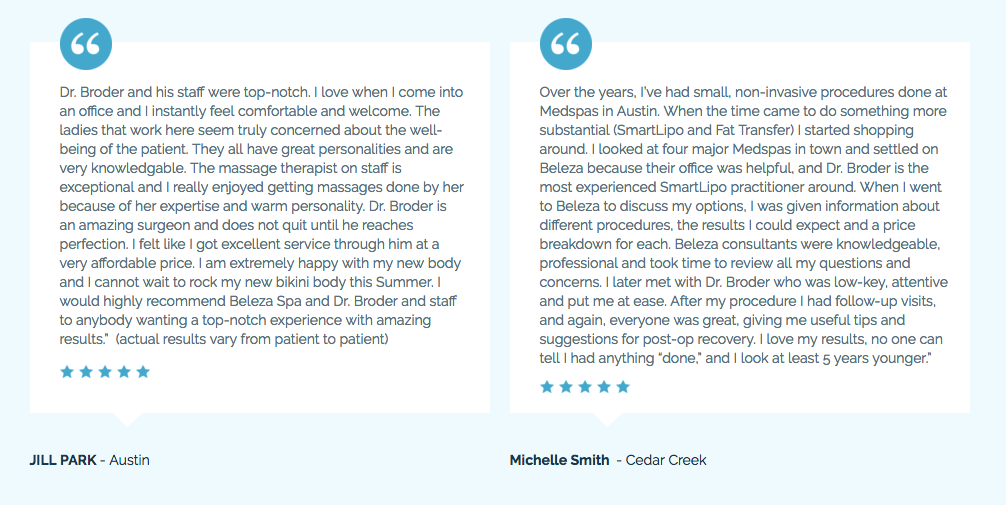
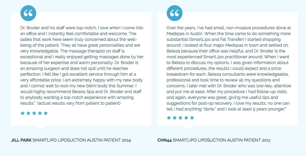
For example, for one of our medspa clients, we discovered that adding procedure names and dates to their landing page testimonials increase conversions by 18.7%.
8. Layout split testing
The structure of your landing page content plays a huge role in converting visitors.
For example, does your landing page use an F-shaped hierarchy? According to eye-tracking software, your visitors naturally read your landing pages from left to right and down (in the shape of an F).
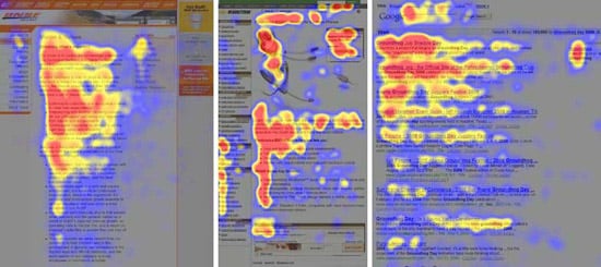
Or does your landing page use a Z-shaped hierarchy? Eye-tracking software has also shown that a Z-shaped pattern works well for landing pages with fewer words.
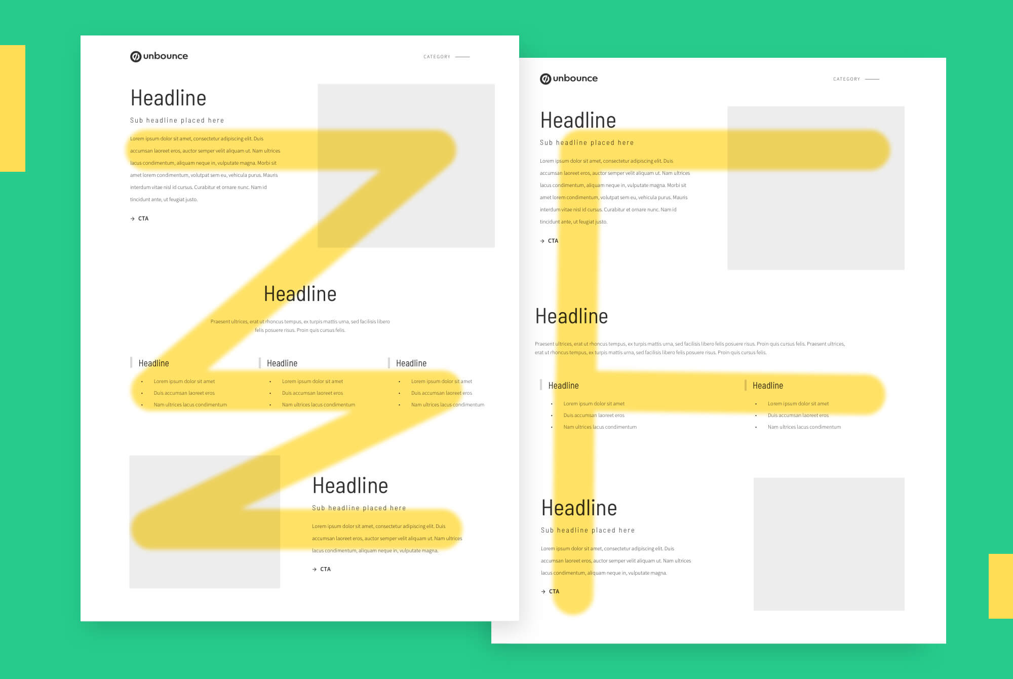
Other landing page layout elements you can A/B test include:
- Section order
- Image placement
- CTA placement
9. Headline split testing
A good landing page headline grabs attention and communicates a clear value proposition.
You can use intuition or gut feeling to choose the headline you think will convert best out of the 100 you wrote down, but only an A/B test will reveal which headline your customers like best.
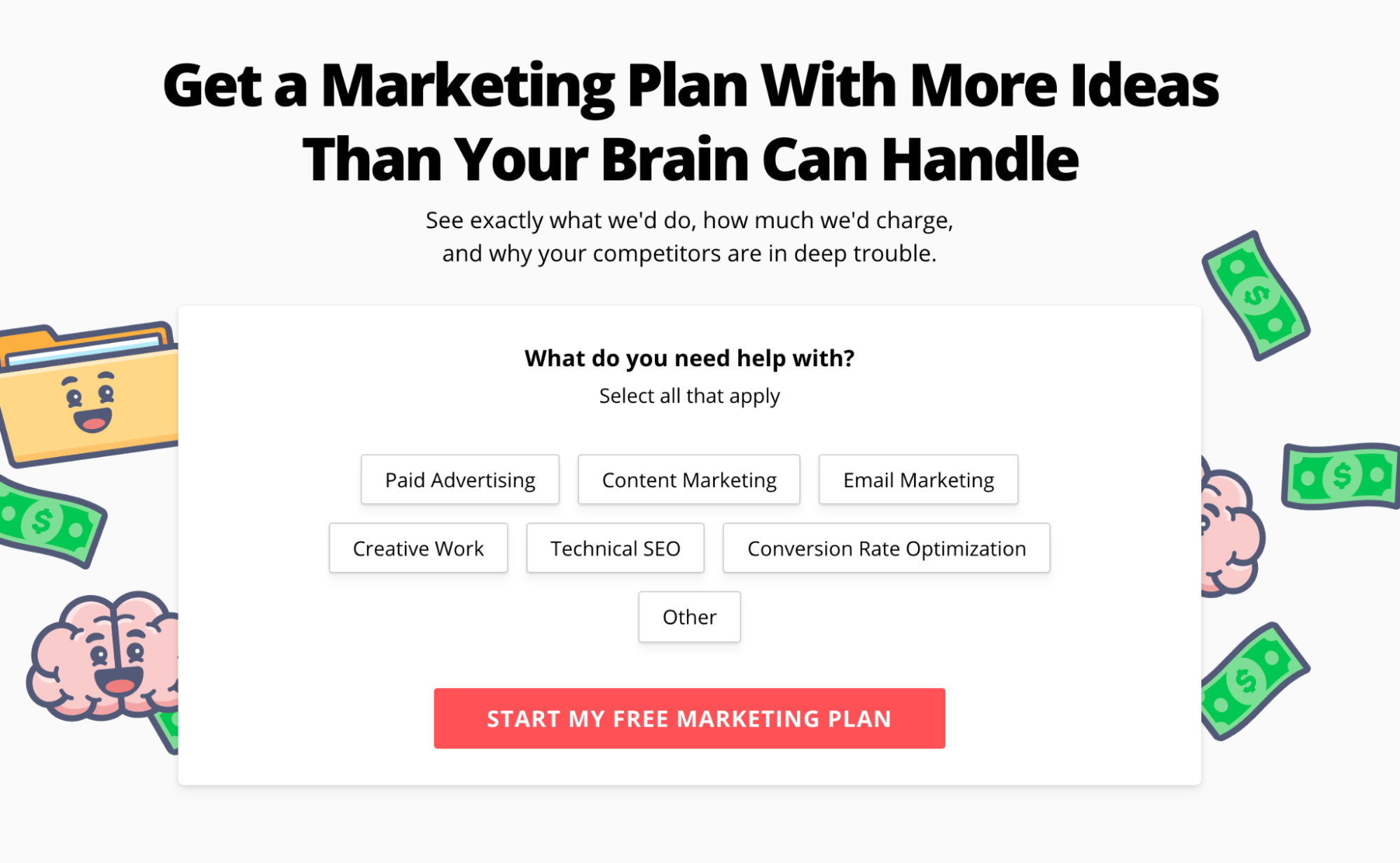
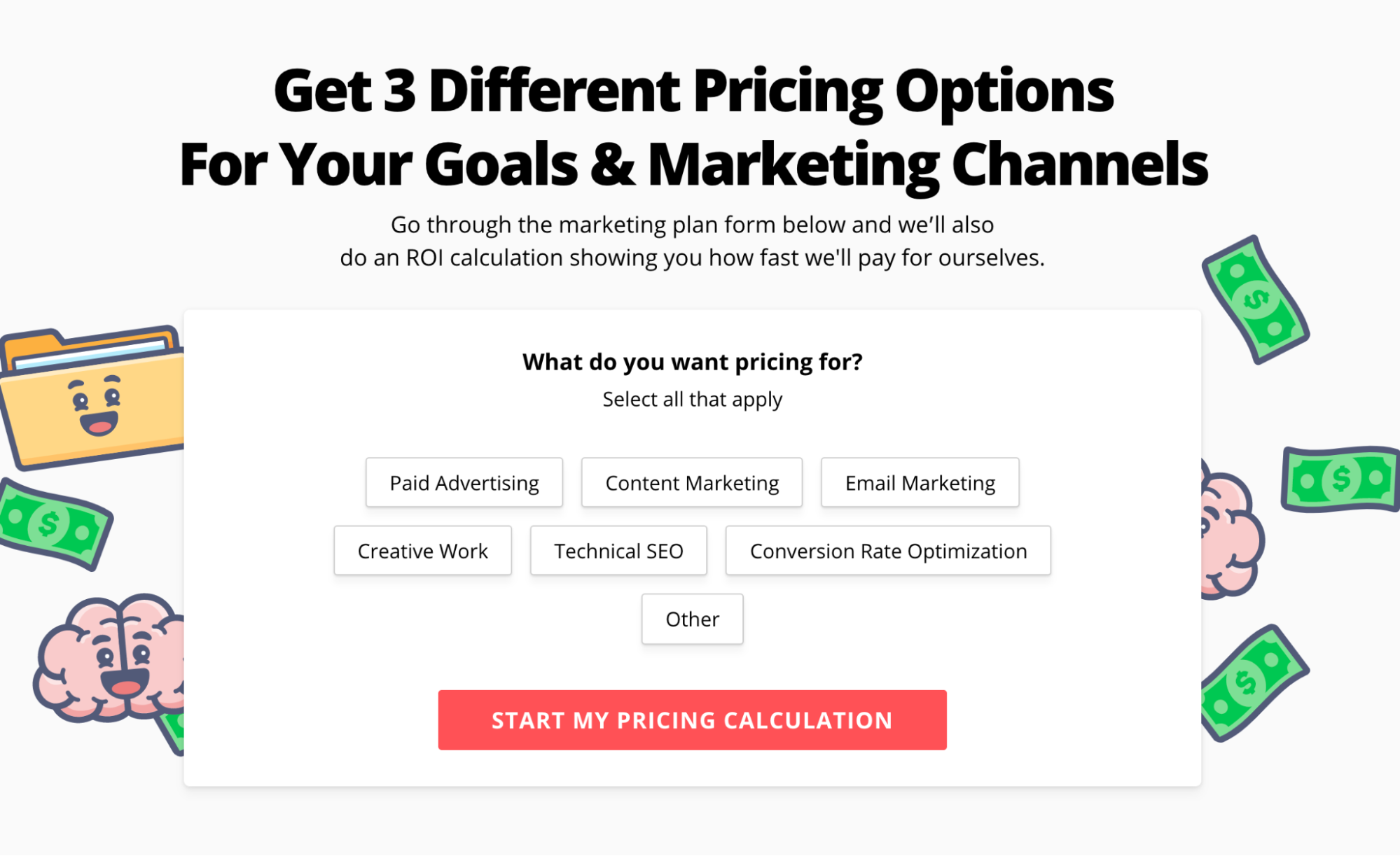
At KlientBoost, we love A/B testing landing page headlines
For example, we're currently testing the headline of our marketing plan page.
10. Design split testing
Remember, an A/B test is an experiment that isolates a single variable, not many variables.
But that doesn't mean you can't split test two totally different styles of design while keeping everything else the same or isolate individual design elements like:
- Color palette
- Iconography
- Hero shots
- Custom graphics
- Photography
- Style (e.g. bold fonts vs. thin fonts)
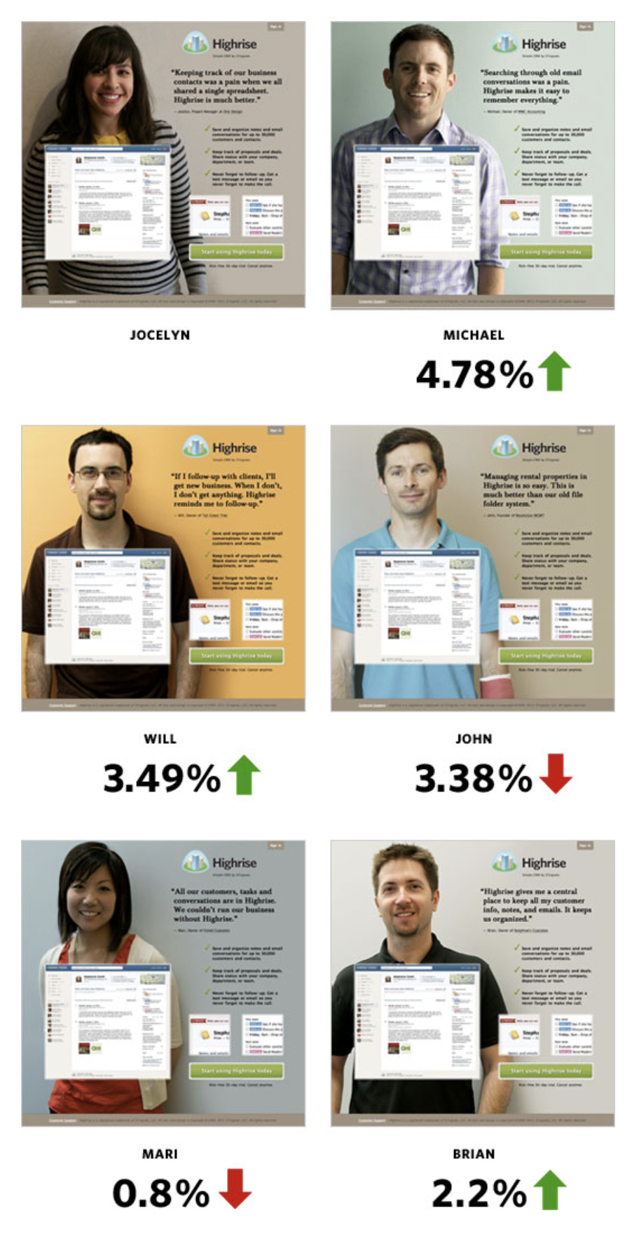
For example, Highrise discovered that A/B testing different images as their hero shot (between female vs. male customers) led to different conversion rates:
11. Copy split testing
Not only can you A/B test different value propositions, messages, benefits, or calls-to-action, but you can also A/B test tone, writing style, and formatting—all of which contribute differently to conversions.
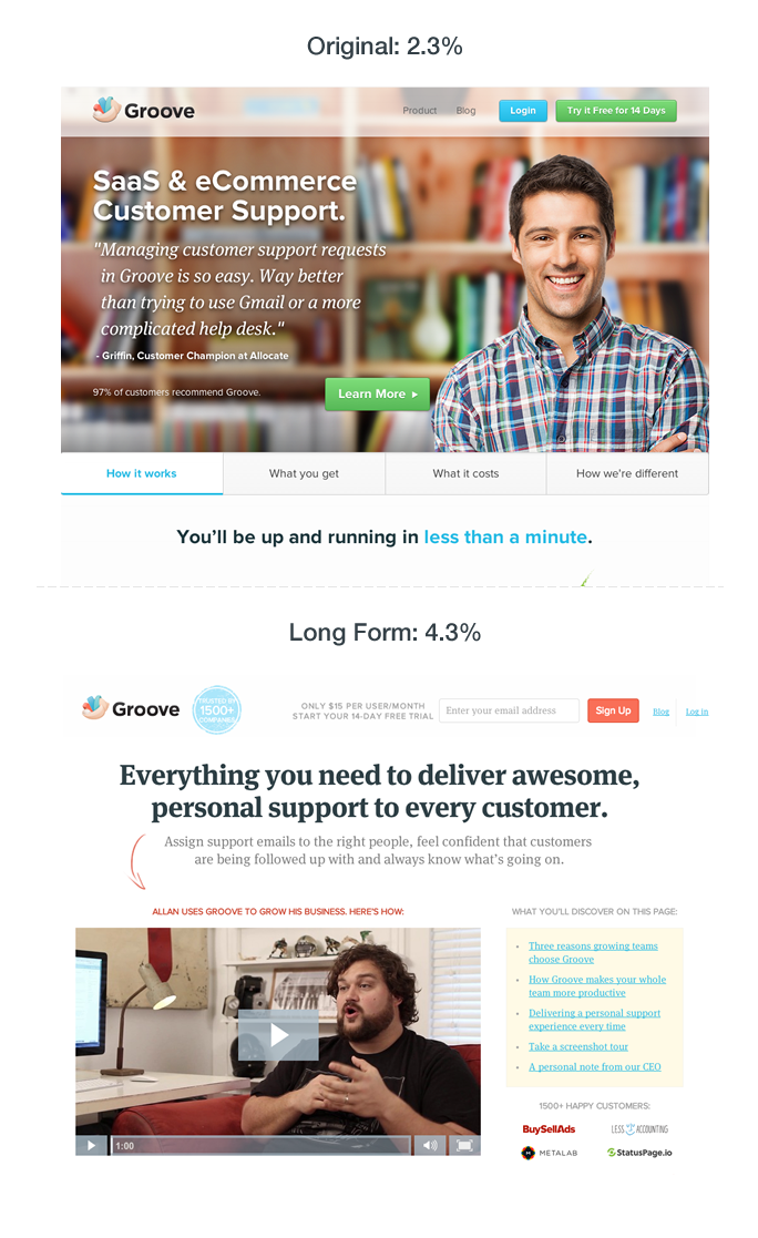
When Groove A/B tested their landing page copy (plus a redesign to fit the new copy), they increased conversions by 100%, from 2.3% to 4.7%.
How to split test your landing pages on your own
Before you can run an effective landing page split test, first you need a few requisites:
Traffic volume
As we mentioned earlier, you’re not going to get a statistically significant A/B test result if you can only send a few hundred visitors to each landing page. For smaller brands with shallow pockets or limited reach, A/B testing might not work.
User behavior data
All effective landing page A/B tests start with a hypothesis. But to formulate a hypothesis about what you think will increase conversions, first, you need to know why they’re suffering to begin with. Start with Google Analytics data, but also explore usability tools like VWO, HotJar, or CrazyEgg heatmaps. (P.S. We wrote an entire article on landing page tools.)
A/B testing tool
For most of you, your landing page builder will function as your A/B testing tool. For example, Unbounce, Leadpages, or Instapage. For enterprise brands with bigger pockets, you might want to consider a tool like Optimizely
Once you have those three boxes checked, it’s time to conduct your experiment.
Honestly, it’s not that difficult.
In fact, you can break down an effective A/B testing process into 13 simple steps (many of which we already reviewed).
12-point landing page A/B testing checklist
☑️ Use existing data and research to identify problem areas.
☑️ Prioritize high impact, low effort variables to test (e.g. test offer or form fields first, not an ROI calculator or tool) to create high converting landing pages.
☑️ Isolate one independent variable to test at a time.
☑️ Formulate a hypothesis that you will put to the test.
☑️ Design the “challenger” variant to compete against the original (“control”)
☑️ Repeat proofing steps, then publish challenger
☑️ Split traffic (50/50) between challenger variant and control variant (test both variants simultaneously).
☑️ Measure conversion rate increase or decrease
☑️ Verify statistical significance using a confidence level calculator (like this one: CXL’s A/B test calculator). Need 90-95% confidence level to designate a winner.
☑️ Designate a “champion” landing page variant.
☑️ Send 100% of traffic to the new champion variant.
☑️ Measure downstream metrics last. E.g. Changing an offer may increase leads, but the lead quality may go down (i.e. fewer closed sales).
☑️ Plan the next . Rinse and repeat.
Utilize a landing page builder: Tools like Unbounce or Instapage can help you create and test multiple versions of a page efficiently.
Note: I can’t emphasize step 12 from the above checklist enough (measure downstream metrics).
Think of downstream metrics like lagging indicators. Although one variable might increase immediate conversions (leading indicator), it could also reduce lead quality and, ultimately, lead to a long-term sales decline. Pay attention.
And from this checklist, follow best practices:
Best Practices for Landing Page Testing
Here are some best practices for landing page testing:
- Test one variable at a time: isolate the impact of each change for better results.
- Use a large enough sample size: Test a sufficient number of visitors so you hit significance.
- Run the test for a long enough period: Run your test long enough to gather meaningful data.
- Use a control group: Compare the results of your test against a control version to benchmark performance.
- Test for statistical significance: Use a confidence level calculator to verify your results.
- Use a landing page builder: Tools like Unbounce or Instapage efficiently create and test multiple page versions.
- Test multiple elements: Experiment with different headlines, images, and calls-to-action to see which performs better.
- Do multivariate testing: For high-traffic sites, test multiple variables at once to optimize various elements simultaneously.
- Use a testing tool: Automate the testing process with tools like Optimizely to ensure accurate results.
- Focus on conversion rates: Metrics like bounce rates and session duration are important, but prioritize conversion rates to measure success.
- Leverage test results: Use insights from your tests to inform future design and marketing decisions.
These landing page best practices give you the best impact for time put in: yield statistically significant results and drive higher conversion rates.
Closing thoughts
Landing page split testing helps your marketing department make data-driven decisions. And data-driven decisions beat intuition or gut feeling every time (at least when it comes to landing page conversions).
Just remember that effective split testing requires traffic, volume, and a strong hypothesis.
You can’t confidently designate a winning variant if only 100 people have seen it.
And the best A/B split tests don’t test arbitrary elements; they research current user behavior and make an educated guess about how they can influence it for the better. Then test that hypothesis.
Happy A/B testing, and cheers to higher landing page conversion rates.
