


At KlientBoost, we always like to give a little shout out to our team for all the hard work they put in for our clients, so get ready to view some of KlientBoost's most successful landing page improvements and tests of the year.
By following some standard best practices and creating a culture of ongoing testing, we’ve been able to see some substantial results from even slight adjustments made to client landing pages. With the right eye on the prize, sometimes that’s all it takes.
So, without further ado, here are six of our top performing landing pages that are sure to knock your socks off.
Get brand new landing page strategies straight to your inbox every week. 23,739 people already are!
Top Six Successful Landing Pages
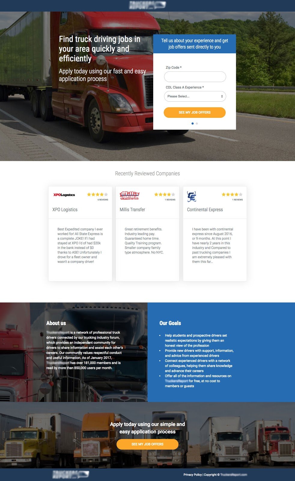
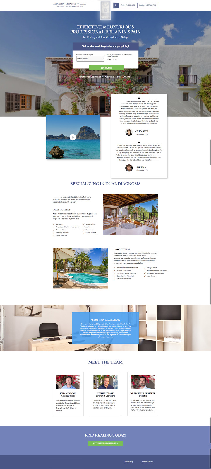
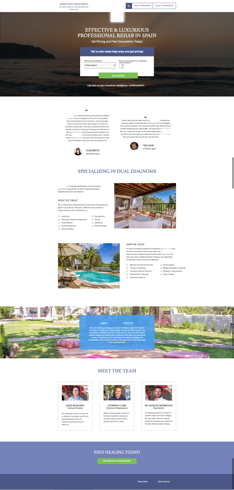
Featured Client #1
For one of our clients, the first version had 33.22% conversion rate. When social proof was added, it bumped up to 39.95%. Then, when both social proof and testimonials were included, it was boosted to 43.52%.
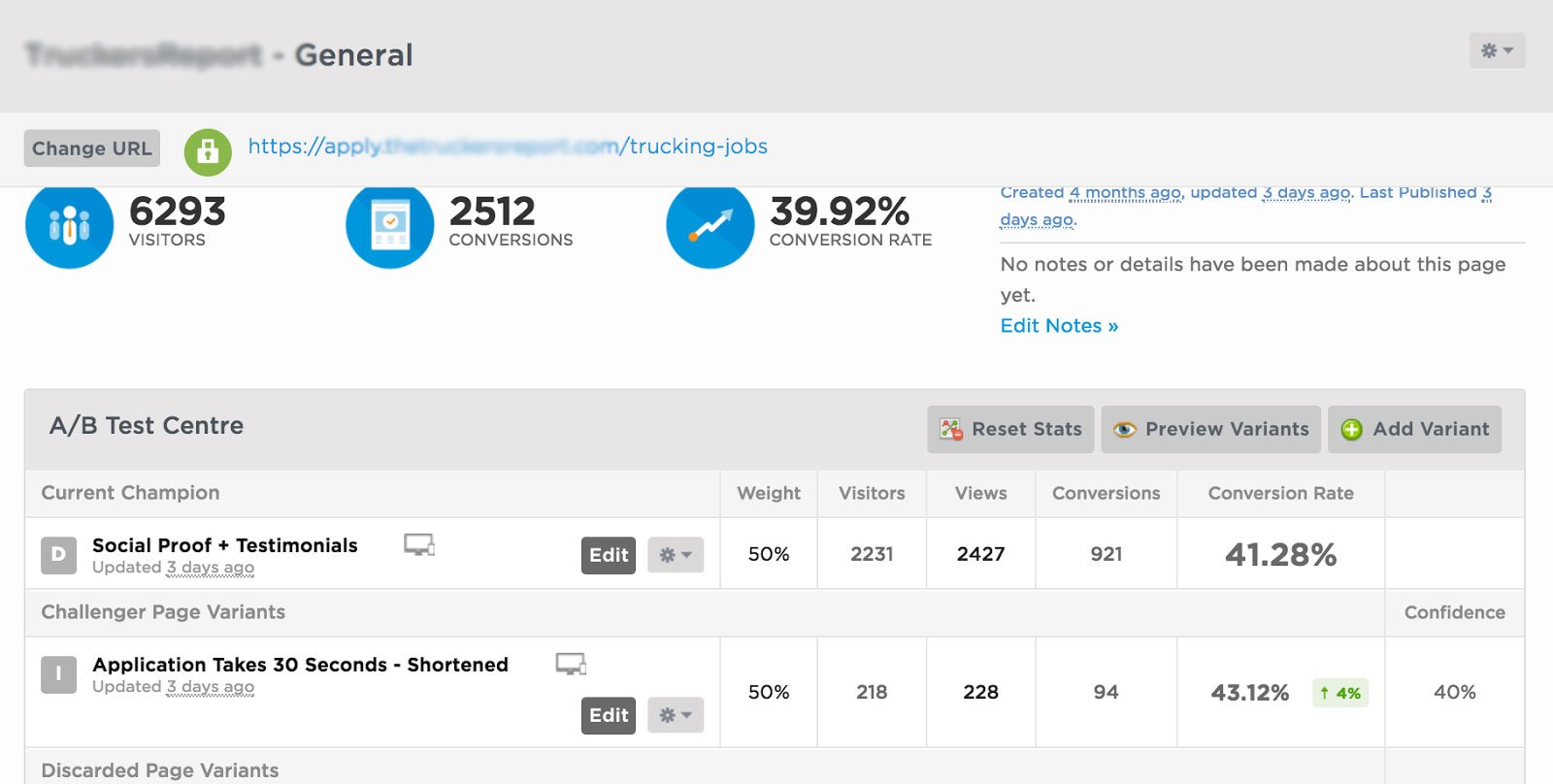
You can see below how the landing page was revised to get these results below:
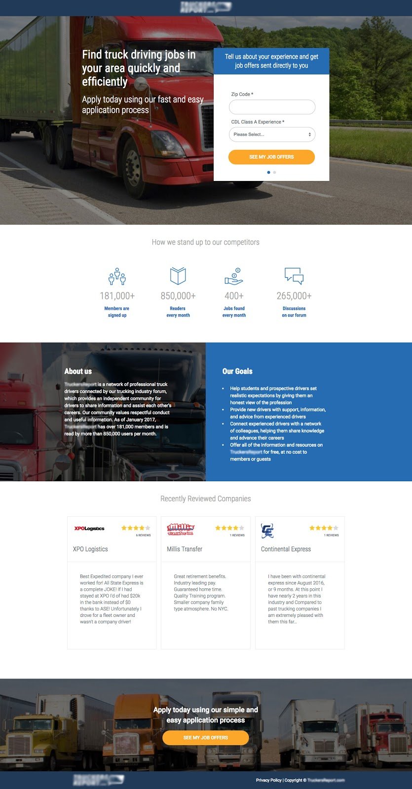

Featured Client #2
For one of our clients, they had a landing page with a 12.28% conversion rate. Then, after moving testimonials higher up in the new variation, they saw 23.62% conversion rate.
You can see below how the landing page was revised to get these results below:
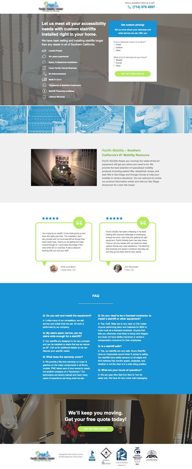
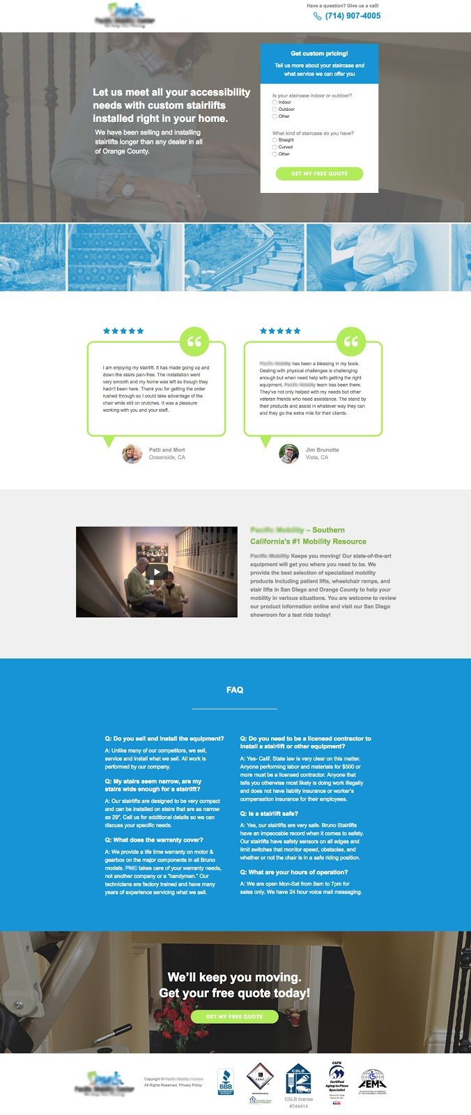
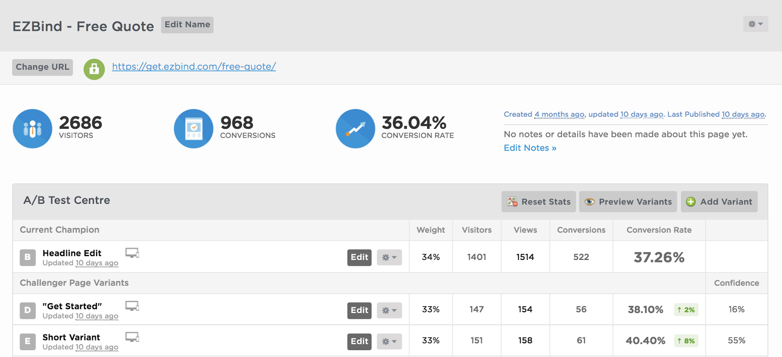
Featured Client #3
For another one of our clients, we found that by featuring more benefits and features above the fold, we see a steady rise in conversion rate. From this finding, we decided to eliminate any lengthy information that didn’t add significant value to the page. As you can see from the results below, a short variant of the page is seeing a healthy boost in conversion rate.
The Step 1 of their landing page is seeing a steady increase currently at 40.40% conversion rate compared with 37.26%.The reason for this is because too much information overload usually leads to more drop-offs.
Let's see how those changes looked below:
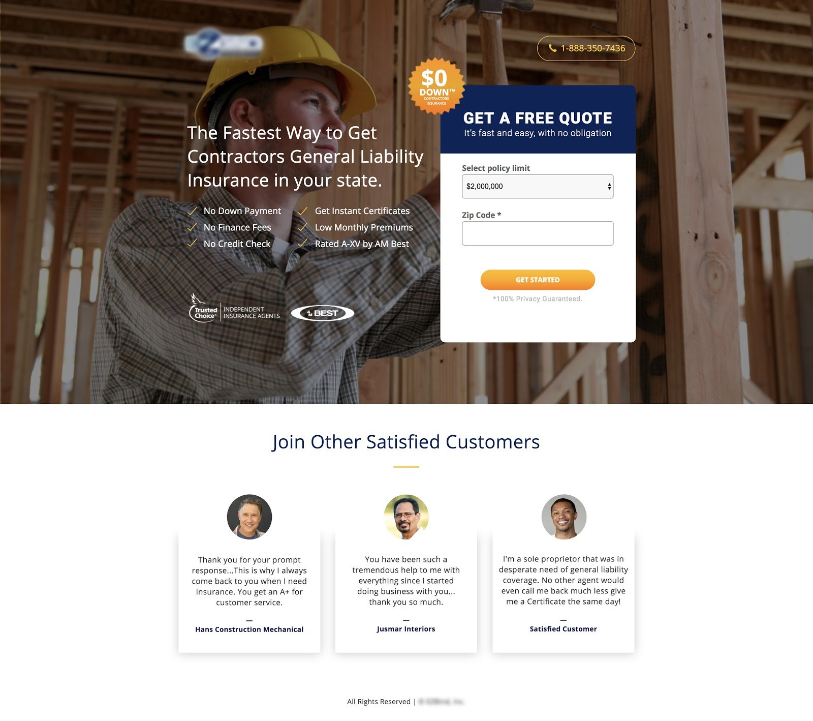
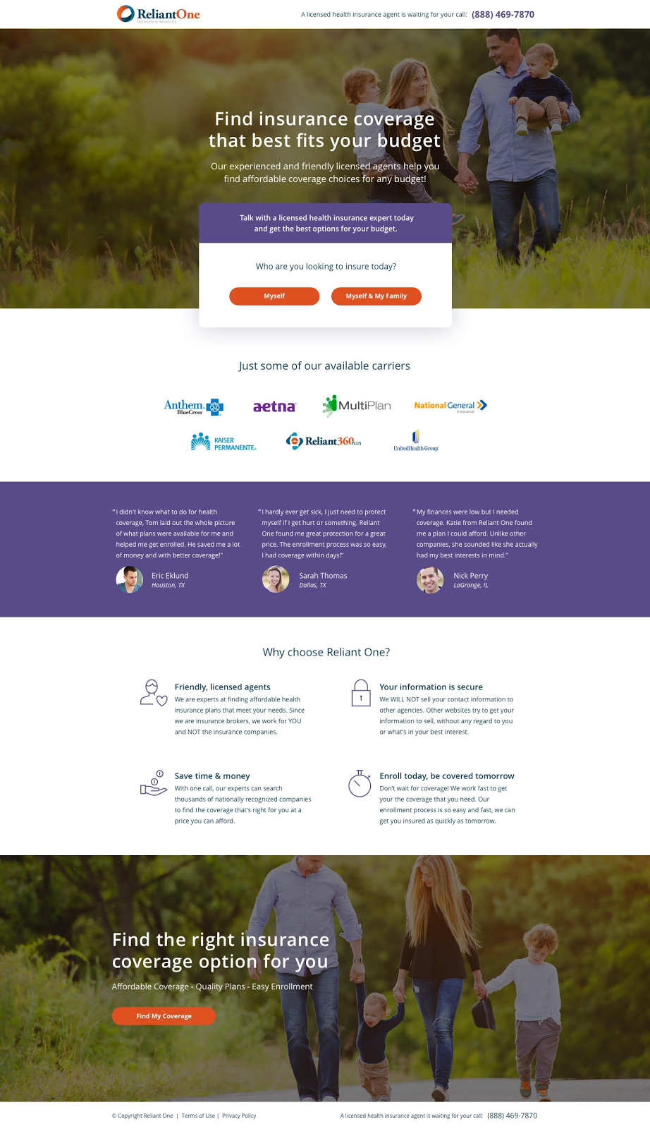
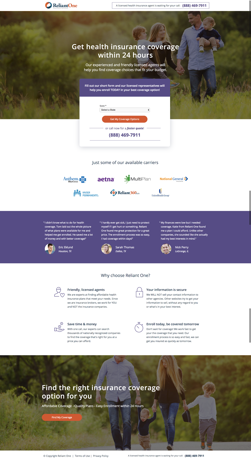
Featured Client #4
We found that a landing page that was performing well for our client Reliant One had an overall 28.88% conversion rate on Step 1. We attribute this to using dynamic keyword insertion on the landing page to automatically fill in the state name. We further improved this metric by informing visitors when they can expect coverage with “Get coverage within 24 hours” as the headline on that particular page/form.
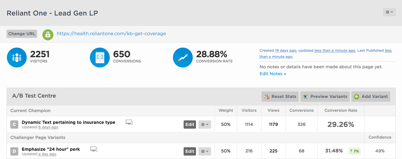
Now, again, let's check out the landing pages associated:
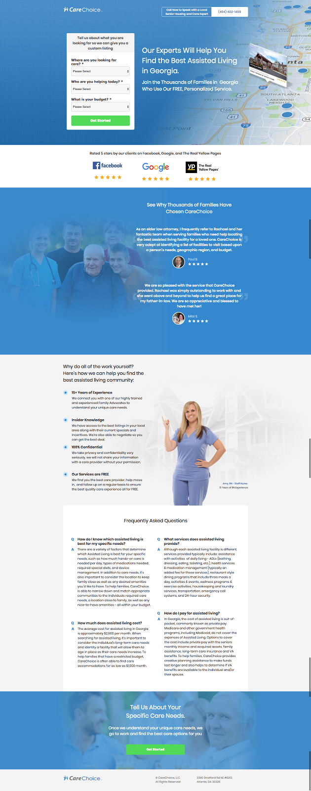
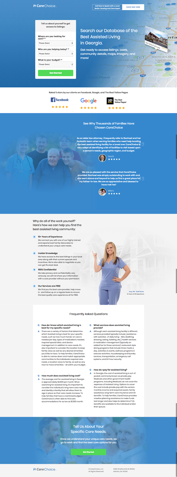
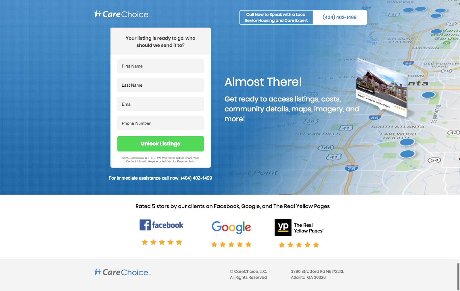
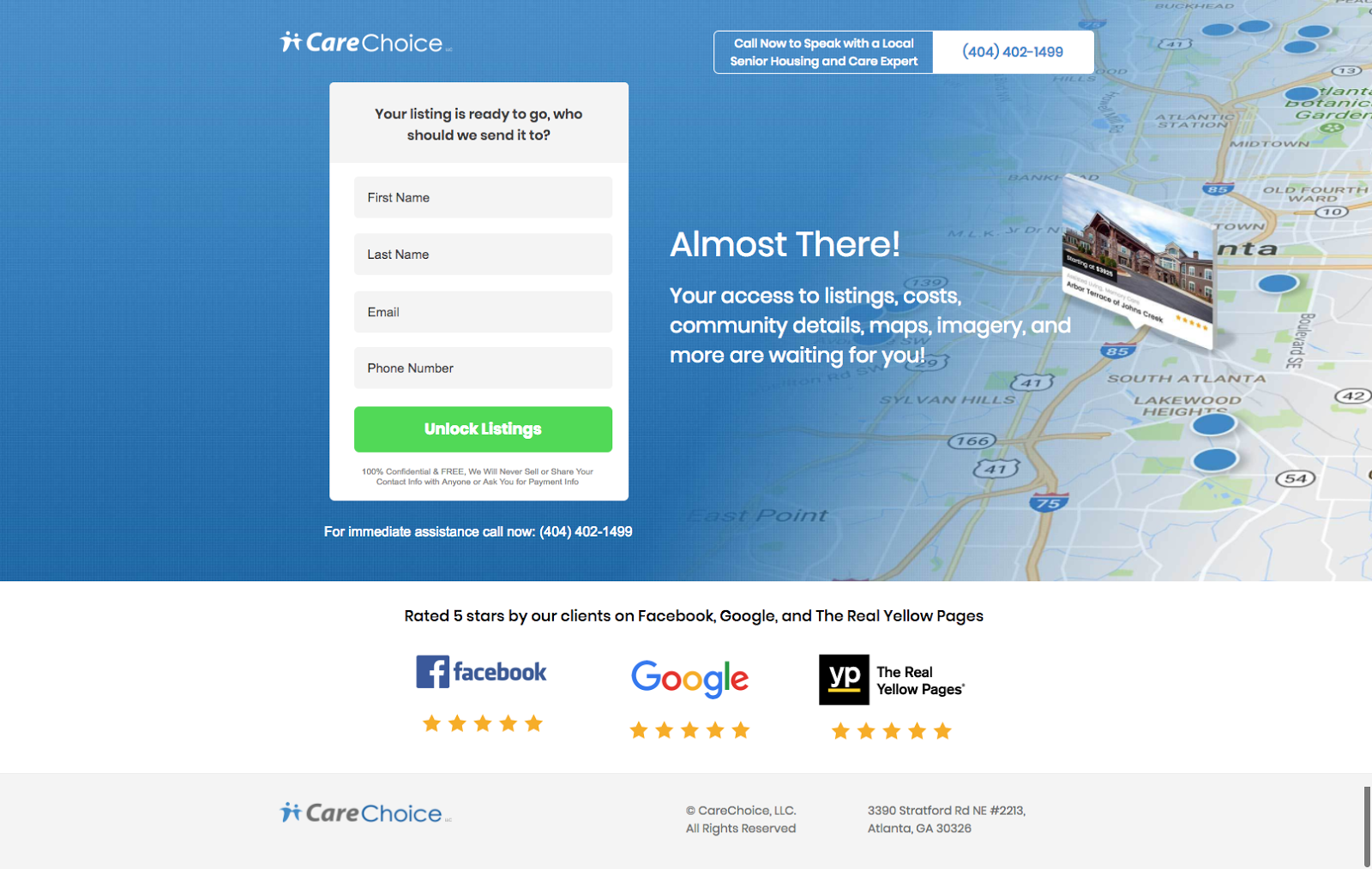
Featured Client #5
A landing page that we found doing well right off the bat was one for CareChoice, which got almost 34% conversion rate for the 1st step and 34.04% conversion rate for the 2nd step. We can attribute this in part to its use of dynamic keyword insertion.


You can see how these results were obtained in the revisions depicted below:
Featured Client #6
A landing page for another client of ours saw a 30.76% conversion rate compared to a previous landing page at 27.88% conversion rate in part to an A/B test we did with testing a video as the hero image.


So, let's get a visual of the landing page change below:
9 Lessons Learned from Our CRO/Design Team

Although this is just a snapshot of what we’ve accomplished, we didn’t want to leave without some insight into what was gleaned through our continuous commitment to improving results and processes.
“The importance of up-sell on the thank you page and the power of phone numbers, giving plenty of options to call instead of filling out the form cannot be ignored in helping increase conversions for the client."

“A good lesson for me was to look at pages from the client’s point of view, and try to keep landing page copy tailored, specifically, to their target demographic.”

“The biggest lesson I have learned this year is that researching your client at an in-depth level in the beginning stages will make you most successful in getting high conversions. The more you understand your client, their target audience, and the product they’re selling, the better you’ll be at solving problems quickly and meeting conversion goals.”

“The biggest lesson I learned was to be aware of what implications you’re making with your design choices. Be aware that styling copy in blue’s or adding a drop shadow to a box may imply that they are clickable, and that worsens your attention ratio.”

“The most important thing I’ve learned this year is that if you really want to make some impactful changes, you should mainly test all the information above the fold. This is the first bit of information users will see: headline, subhead, hero image, form. Changes here will make or break your entire landing page. If a page isn’t doing well, that’s where you check first before anything else on the page.”

“The biggest lesson learned for me this year is how to push back on clients’ design requests when necessary. We know our best practices and we have data to back up our results. We’re not simply making design decisions based off a feeling. If our job is to do right by the client, we need to voice when we believe something will or will not work.”

“Always optimize for mobile. This means going beyond simply making your page responsive. In addition, you should use elements that cater to your mobile audience (i.e. "Tap-to-call" buttons, large enough CTA buttons & forms, sticky headers, click-to-scroll buttons, etc.)”

“Have evidence (i.e. specific examples of positive results) to support the tests you are implementing. Make whatever is above the fold simple, visually interesting, and not tedious. If you aren’t excited about your landing page, your client/target audience won’t be either.”
Perhaps, the greatest lesson of all is no matter how much experience we have and how many tests we run, we can always learn more and do better. Sometimes we see significant results in the first test and sometimes it may be further down the line before we find the gem that really drives conversions. What works for one company/brand doesn’t always work for another, so KlientBoost builds a culture for learning with this in mind.
What’s Next in the Year Ahead
If you thought we were done, guess again -- we’re just beginning to show why KlientBoost is a top player when it comes to conversion rate optimization.

So, here are some quick tips from our team to keep in mind…
Tip 1: “Keep things straight and to the point. Don’t overload your viewers with a wall of text and useless information.” - Tyler Mabery
Tip 2: “Give people visual data that shows why they need what you’re selling. Show don’t tell. You can say all you want, but hard data creates the confidence someone needs to convert on your page.” - Krista Gregory
Tip 3: “Put yourself in the shoes of an everyday person poking around any old website. What are the non-verbal design queues that tell you how to navigate around a page? Being aware of these things will help remove confusion from your landing pages.” - Cody Chase
Tip 4: “Your copy has to explain what the user is getting out of giving away their info. It’s about them and what they, the customer, need.” - Olivia Taylor
Tip 5: “Never discount small testing. We’ve seen huge performance lift just by adding in three simple benefit points above the fold or rephrasing the CTA button to something simple like ‘Get Started’.” - Beavis Hari
Tip 6: “Great social proof is key for any landing page. If there’s no social proof (i.e. customer reviews, testimonials, case studies, etc.), it's much more difficult to convince visitors to buy a product or service.” - Aaron Packard
Tip 7: “Sometimes, best practices don’t always win when it comes to testing--and it can kind of be discouraging, honestly. But as long as you have more testing ideas under your belt, you’ll be solid. I’ve developed so many new ideas to test just by taking time to do some extra webinars, the CRO course, blog research. If you’re stuck, just always look for help from trusted outside sources, and you’ll always come out with new and better ideas.” - Tiffany Tran
Tip 8: “If there’s a page design you genuinely like, test it aggressively. A successful page is one where functionality and beauty work harmoniously to maximize conversion rate. It’s probably one of the most satisfying feelings as a CRO designer.” - Michael Musa
Armed with these tips, you should be ready to tackle any landing page CRO task that comes your way. But just in case you’re still a little unsure of yourself, let our team of CRO experts help you out.


