Landing pages are pared down on purpose. They do one thing really well: sell an action. That action is to click a button, and that click is called a conversion.
Despite the simplicity of the landing page, it’s often mucked up by adding things that shouldn’t be there.
What the heck should be on a landing page?
So glad you asked. This sort of stuff gets me talking excitedly fast, so have a sit down, curious person. In about 10 minutes you’ll know
- exactly what a landing page is
- what it has to have to work
- what it should never have
- what tools lift your landing page above the glut of gimmicky and garish landing pages that let down the internet
- why your landing page doesn’t convert—and how to fix it
These tips and tools will get you going right away and you’ll leave with a solid understanding of landing page mechanics and insight from digital marketers who do this every day.
Let’s start with what a landing page isn’t before we dive into what it should be and then plot out how to make it excellent.
Get brand new landing page strategies straight to your inbox every week. 23,739 people already are!
Your landing page: What it isn’t
A landing page is not your homepage or service page or blog page.
Can I get a show of hands if you’ve ever clicked a link or an ad to find out more about a specific thing but you jumped to a homepage instead?
🖐🖐🖐🖐🖐🖐🖐🖐 x too many times.
My kids’ school board does this and I have stopped clicking their links because I know doing so will send me on a wild goose chase that ends with an empty sack of nothing where valuable information should be—🤬. It took a few years, but they’ve lost me. I refuse to click their links now.
You don’t want that to happen to a customer. Not even once. It degrades your authority as a professional.
Make sure the external links in your search, display, and social media ads point to a dedicated page (your landing page) that speaks concisely about that one thing the ad or link promised it would.
Landing page optimization: What it is
Landing page optimization is the stuff you do to make your landing page better. First, let’s make sure you know what a landing page is. Then, let’s talk about what you optimize to make your landing page better in a way that counts (conversions).
What is a landing page?
A landing page is a linchpin in your digital marketing strategy. It’s a standalone web page that exists for one reason: to get a click (a conversion).
On other page types (like a homepage or blog page or service page), you add links to other pages, keep a navbar at the top as a clickable menu sitemap, show a footer at the bottom for more useful links, and present the visitor with several options as to where they can go from there.
Those pages are to educate, build industry authority, and improve your SEO (search engine optimization) by keeping visitors around for minutes on end, scrolling through your content.
On a landing page, you take all that choice away.
A landing page doesn’t have a menu bar or a footer section. It doesn’t link out to other pages either.
What it does have is a hero section (the top of the page) with a headline (your H1), a brief blurb that promises to fix the problem the visitor has, and a form that is the gateway to their answer.
Some landing pages have more information under the fold (below the hero section) that the visitor will see if they scroll. Adding in this extra information depends on where that visitor came from (more on that later).
You want visitors to get what they came for as soon as they land on a landing page. And you want them to love what you’re saying and offering so much, they can’t wait to click the only button you give them to click.
What is a conversion?
A conversion means that a visitor completed a desired goal. In the case of a landing page, a conversion changes the passive visitor who landed there into one of these two things:
- A lead
- A buyer
When a landing page is set up properly, it flows like this:
A visitor lands, they scan, they like, they click.
The click is the conversion.
Landing there in the first place probably had something to do with your advertising campaigns. But scanning your landing page elements and liking what they see is the optimization part.
What is optimization?
Optimizing your page is all about tweaking things to be better. It may be as simple as cutting your words down by half so your information gets read. Or it may be adding a non-threatening form (more on this later) right at the top of the page to make the thing you want them to do obvious and available right away.
When you optimize, you focus on the things that will get you more clicks (increase conversions).
That’s why the official term for “optimization” is “conversion rate optimization” (CRO).
CRO describes what you do to your landing page (how you optimize it) to increase your conversion rate.
What’s a good landing page conversion rate?
You are trying to increase your rate of conversion. So what should your conversion goal be?
Good question. It depends on your industry.
Though averages across industries hover between 2% and 6%, the best pages convert much higher, approaching 20%.
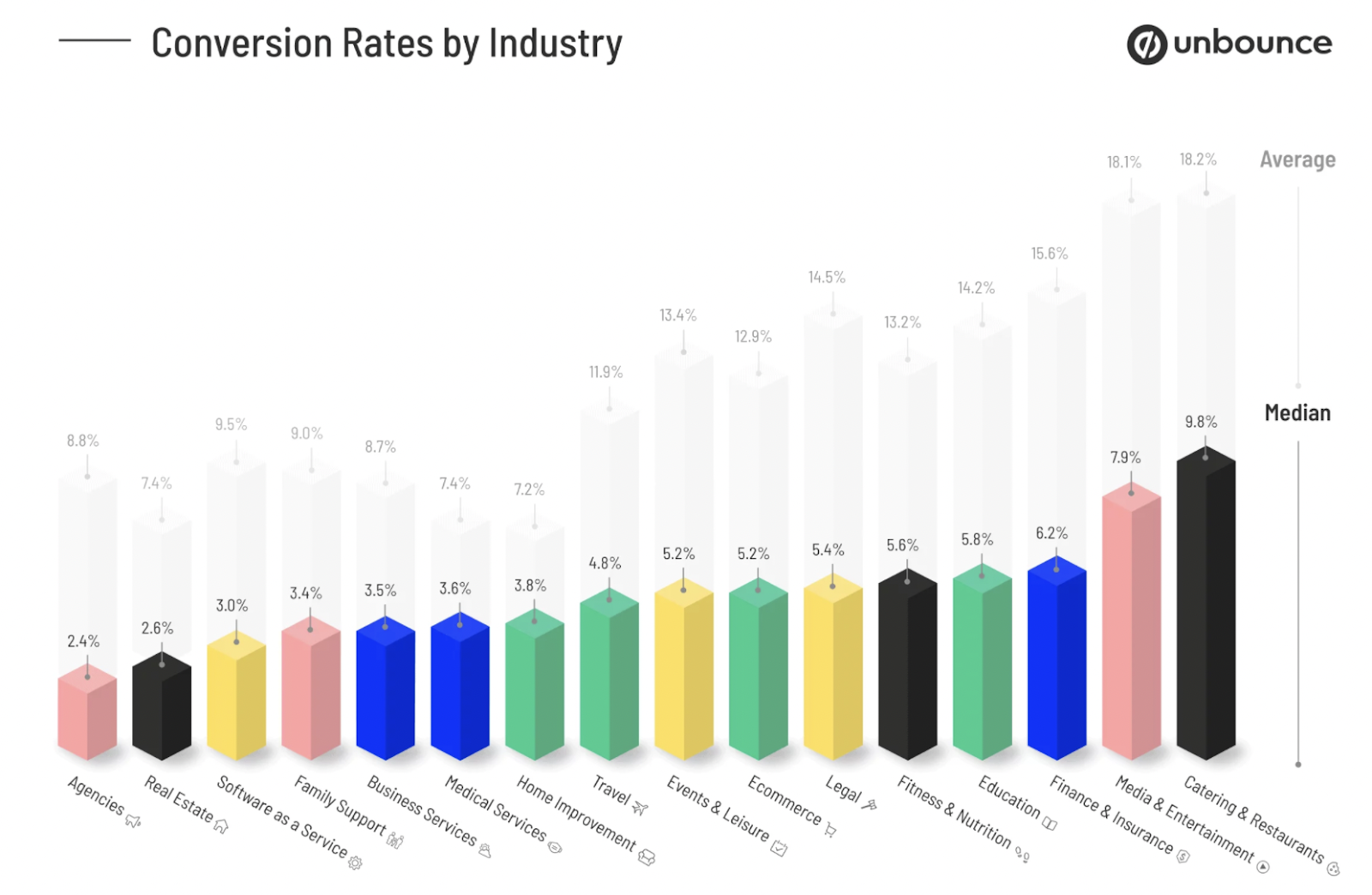
Go for gold, but pat yourself on the back if you’re hitting your industry average. The important takeaway is that you should always work toward a better conversion rate.
You do that through landing page optimization.
Landing page optimization is not a one-and-done thing. It’s an all-the-time thing.
How do I optimize a landing page?
You write it the right way, and design it the right way by
- following best practices and
- using the right tools to create the right ingredients that result in a conversion.
Landing page must-haves (best practices)
Here are five best practices that will tune up your landing page in short order:
Best practice #1: Design your landing page to convert
Some people create a short, precise, stripped-down landing page that puts almost all the information in the hero section (the top of the page above the fold that people see when the page loads).
Others build out their landing page to be a long form page that provides more information on scroll that supports the single call-to-action (CTA) button. What works for you depends on a few things—like where your traffic comes from.
Where does your traffic come from?
If your traffic comes from a search ad, a short and concise landing page is the way to go. Those visitors are closer to converting and know what they want. They are near the bottom of your marketing funnel. Give them the goods in that form at the top.
But if your traffic comes from a display ad, you’ll do better with a tad more information because those visitors are at the top of your funnel in the awareness stage of the buyer journey. They’re not ready to buy yet. But they’re looking for a reason to and they appreciate a few more details.
The only way to know for sure which landing page design (short or long) works better for your product or service is to build two landing pages and test them.
If you want more details about design and landing page layouts that convert, we’ve got it down to a science.
Design brass tacks:
1. Take the number of actions on the landing page down to one CTA
2. Remove the navbar, footer, and clutter
3. Use whitespace (less words + more space = more conversions)
4. Keep the conversion elements (the form and CTA) above the fold (the part that the visitor sees when the page loads).
5. Make your CTA button contrast against the background
6. Use one or two fonts max or your page will look like a circus bulletin.
Best practice #2: Write your landing page to convert
Every word you write should convince the reader to click your conversion button. Having said that, you should know that people don’t read web pages like they do books.
They skim them.
Typically, a landing page visitor will read your H1 (that’s the big headline at the top of the page that you should A/B Test), maybe a sub headline, your bolded text and bullet points, and what your button says (that you should also put through A/B Testing).
Start with your CTA button—the most important element on your landing page.
What do you want landers to do? What will they get if they click your button? Figure that out first and make your button crystal clear. Then write your headline and brief blurbs to push that button.
While you’re working on brevity, don’t forget to dumb down your words; it’s not a vocabulary contest—it’s a money-making contest. Use short sentences you would conversationally speak in one breath.
Avoid jargon (industry terms) and bloated adjectives like super amazing and totally awesome that make you sound like you’re trying too hard.
Also, get rid of conjunctions like and, but, yet, and or that create epic run-on sentences that lose people. Make your messaging clear, upbeat (if possible), and compelling. Use an emotional trigger if that works for your product.
If you’re not a writer, you probably struggle with this part.
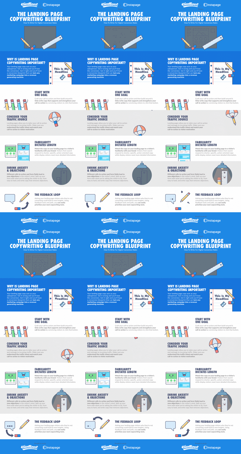
That’s why we created a landing page copywriting blueprint to make it easier.
Match your visitors’ landing page expectation to their last interaction (the ad they just clicked that brought them to your landing page). And match your landing page keyword to the keyword you bid on for your ad.
Grammar
If there is one piece of copywriting advice I can give you, it would be to write your landing page in active voice.
Active voice vs passive voice
What does active voice mean? It means don’t write in passive voice.
Not clear?
That’s okay. Not everyone loves grammar. But this tip can cut your writing down by half, so let’s take a peek.
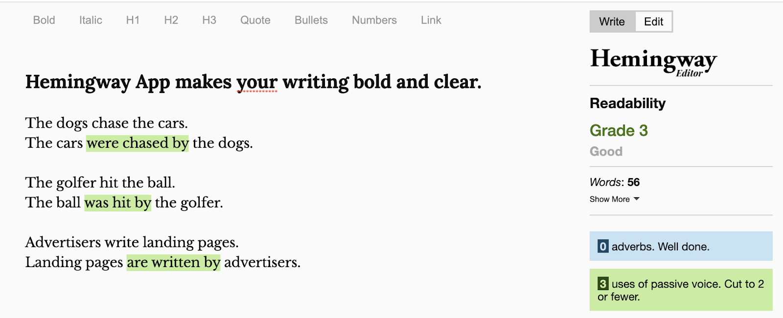
Active vs passive examples:
The dogs chase the cars. (active)
The cars were chased by the dogs. (passive)
The golfer hit the ball. (active)
The ball was hit by the golfer. (passive)
Advertisers write landing pages. (active)
Landing pages are written by advertisers. (passive)
Active sentences go like this:
Subject (dogs) + verb (chase) + object (cars).
Short and simple. The sentence gets right to the point. Active (verb-based) sentences are shorter and stronger than passive sentences.
A passive sentence flips things around and adds in a bunch of unnecessary junk, like the verb “to be” (is, are, was, were) and participles (words that end in ed, en, ing, ly, ion etc.) and prepositions (by, with, at, of etc.):
Passive sentences go like this:
Object (cars) + “to be” (were) + verb participle (chased) + preposition (by) + subject (dog).
Not simple. These sentences are backward and wordy.
Many people write in passive voice naturally because professors teach us to use fancy speech in our essays. So if you write passively, start making edits because the fancy part, whether you know it or not, means you start things off with an object and fluff out all the details like a poet.
Cold hard truth: poetry doesn’t make conversions and writing that way (passively) ruins the strength of your message.
You’re not trying to impress Shakespeare. You’re trying to impress Hemingway. Use the Hemingway app to keep your sentences short, blunt, and verby.
And now you know.
Watch how you lay down your words from now on and cut out the filler crap.
If you see a word with “ing” on the end or a sentence with “was” or “by” in it, that’s a heads up to flip that sentence from passive to active voice and chop out all the extra word poop you put in there.
Don’t use words that water down your message.
Best practices #3: Social proof
If you did your pay-per-click (PPC) stuff right, an ad brought a visitor to your landing page. If you designed and wrote your landing page right, your visitor either clicked your action button or they are hovering over it.
To move that hover to a click, show off your credibility.
Add customer and partner logos to the page next to a testimonial, review, or case study. Add a respected industry badge if you have one. You don’t need to overdo social proof, but you do need to legitimize yourself above some fly-by-night scammers.
Best practice #4: the Breadcrumb Technique
There’s something called compliance psychology that goes into form design. People generally don’t like forms and don’t want to fill them out. And that’s because spam and sales people come straight out of hell to hit your inbox and telephone, amiright?
Harsh.
But the truth is that the thought of being bothered stops your could-be-conversions from giving you their name or email or phone number.
So don’t ask them for that.
Ask them for something they don’t mind giving you. This is called the Breadcrumb Technique.
It’s a clever way to start the ball rolling so that you establish a degree of comfort and then convince them later to commit (by climbing the “yes ladder”). It’s a way to get a series of small wins that snowball into the ultimate get.
Start by asking them what they’re trying to do (goals) or what they have already tried. That’s a low commitment ask.
But… don’t stop there. Because once they commit a tiny bit of information, they are partially locked in (even though it doesn’t feel that way).
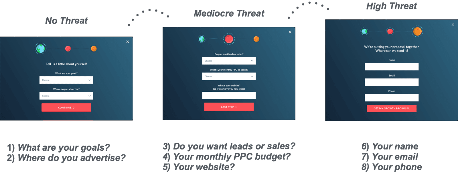
Probe for a bit more information.
What are they willing to spend? What is their website address? At this point, it feels like they’re having a conversation with you and they like that you are asking some pointed questions.
They’re invested now.
End that conversation by asking how to contact them with answers that solve their problems.
They’ve already worked their way through a form, clicking radio buttons or filling out form fields. They’re not likely to shut the form down without giving you their contact information (name and email) at this point.
That’s how you get a form right.
But here’s 31 ways your landing page bleeds money if you’re a doom scroller.
Best practice #5: Search Engine Optimization (SEO)
Paid PPC (pay-per-click) ads send traffic to your landing pages because you pay for that to happen. But search engines will also send traffic to your landing pages if you do your SEO right.
Optimize your landing pages for organic search (SEO) by writing a good snippet title and meta description. Make sure the focus keyword is in both the title and meta description and on your page a few times.
The keyword you bid on is the same one you use for your target audience (your potential customers) in SERP (Search Engine Results Pages).
Sprinkle that keyword into your headers (H1, H2, H3, etc.) and make sure you actually provide the value you propose (the value proposition) in that snippet so users get what they came for when they click through (CTR) and Google rewards you for that with a page rank boost.
Use landing page optimization tools
Tool #1: Decrease your page load time
Page load speed affects user experience. The faster your site loads, the lower the bounce rate.
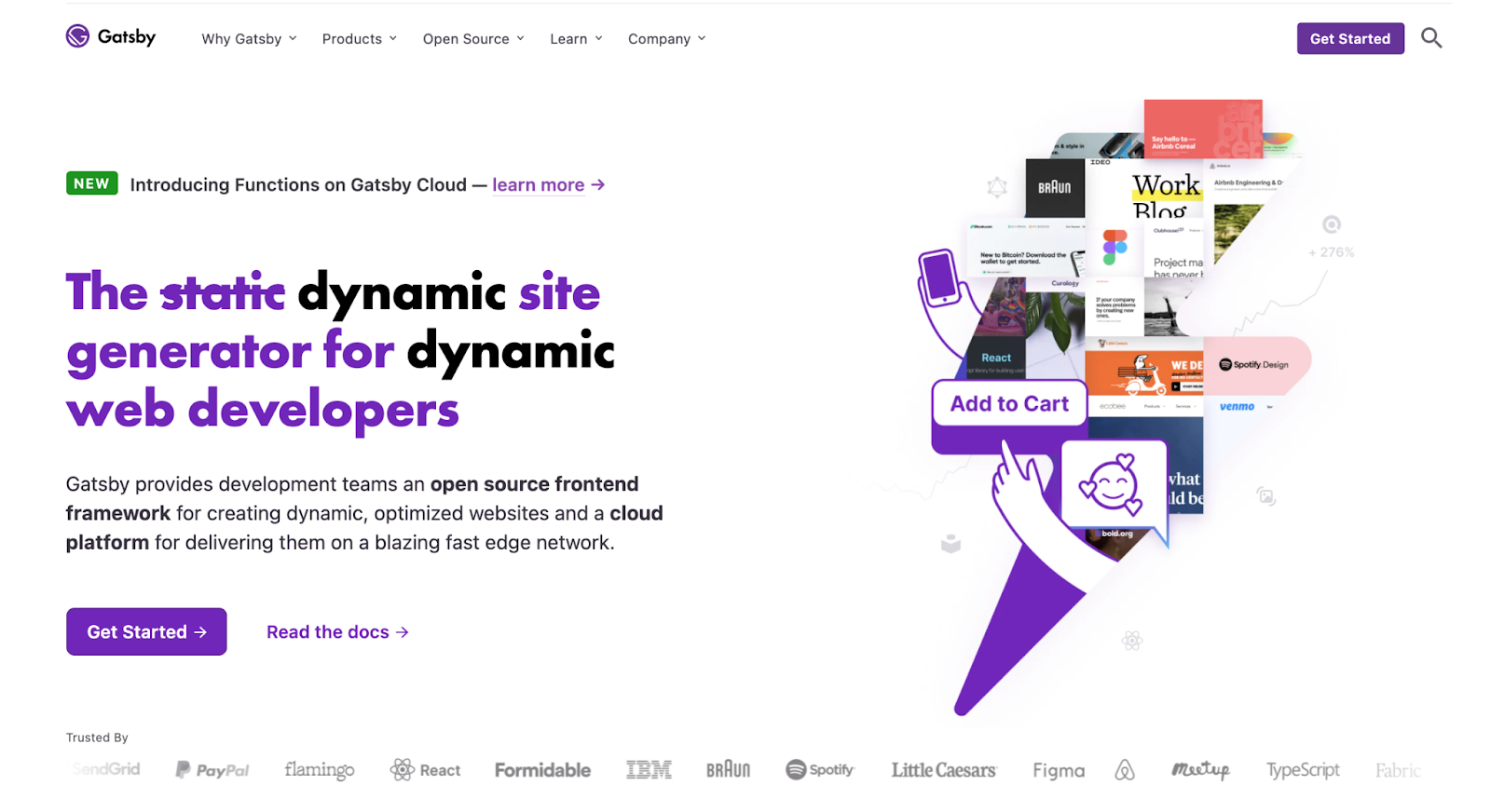
If your landing page takes longer than a second or two to appear, your authority takes a hit—you’ve lost trust already. So invest in a fast host, a CDN, or a performance platform like Gatsby.
Gatsby prefetches resources, code splits, optimizes images, and lazy loads them, rendering pages at blazing speeds.
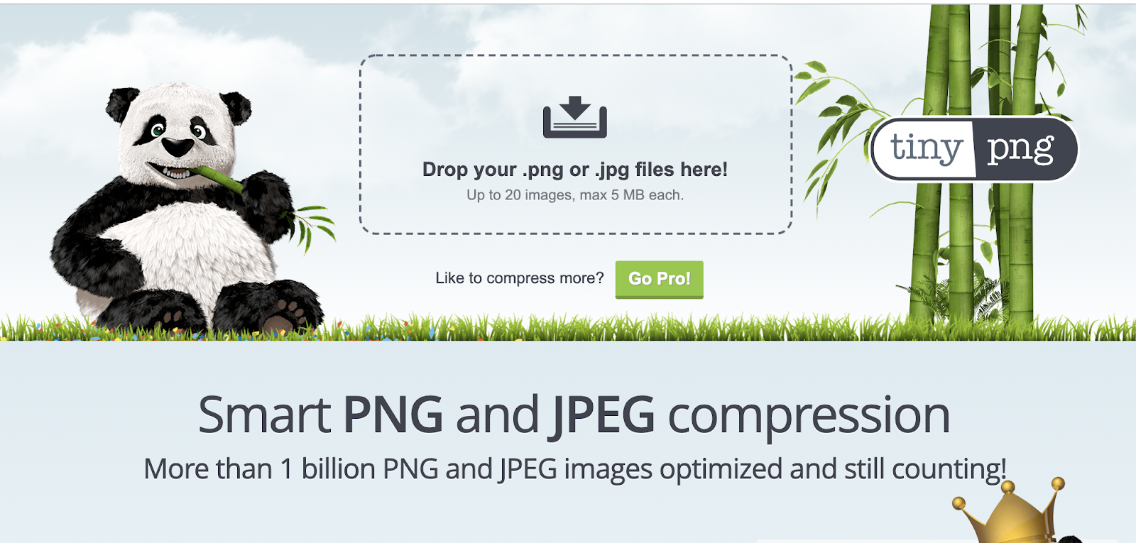
Not ready to make that big of an investment? At least optimize your images before you upload them into your CMS media library. Try a free online tool like TinyPNG.
Tool #2: Choose complementary colors
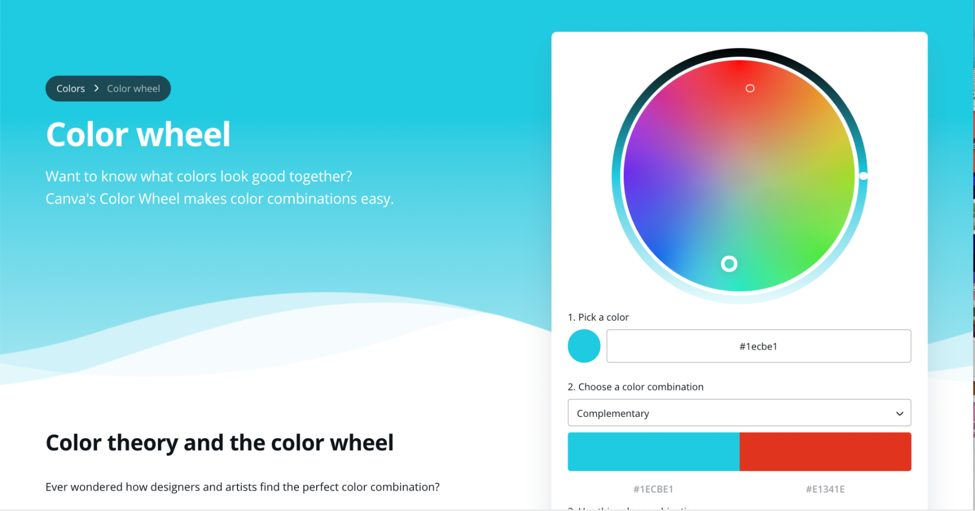
High contrast CTA buttons get more clicks. If you’re not a color theorist, use a tool that is.
Tool #3: A/B Testing
Also known as split testing, there are many tools out there that can test things like your headings, your forms, your page length, and your buttons. Some of the more popular WordPress themes (like Divi) build in A/B testing modules. But if your theme doesn’t come with an A/B tool, try one of these:
Shogun (ecommerce)
Tool #4: Landing page templates
You don’t have to build your landing page from scratch. Every web builder comes with templates. From WordPress to Squarespace to Wix to HubSpot, you’ll have a vault to choose from. But there are also CMS-independent templates out there (many of them from the same platforms that offer A/B testing) like Unbounce, Instapage, and Mailchimp.
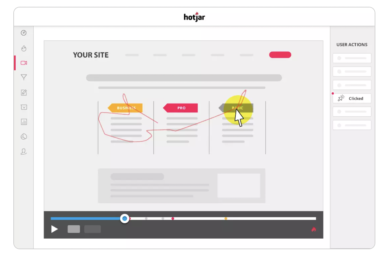
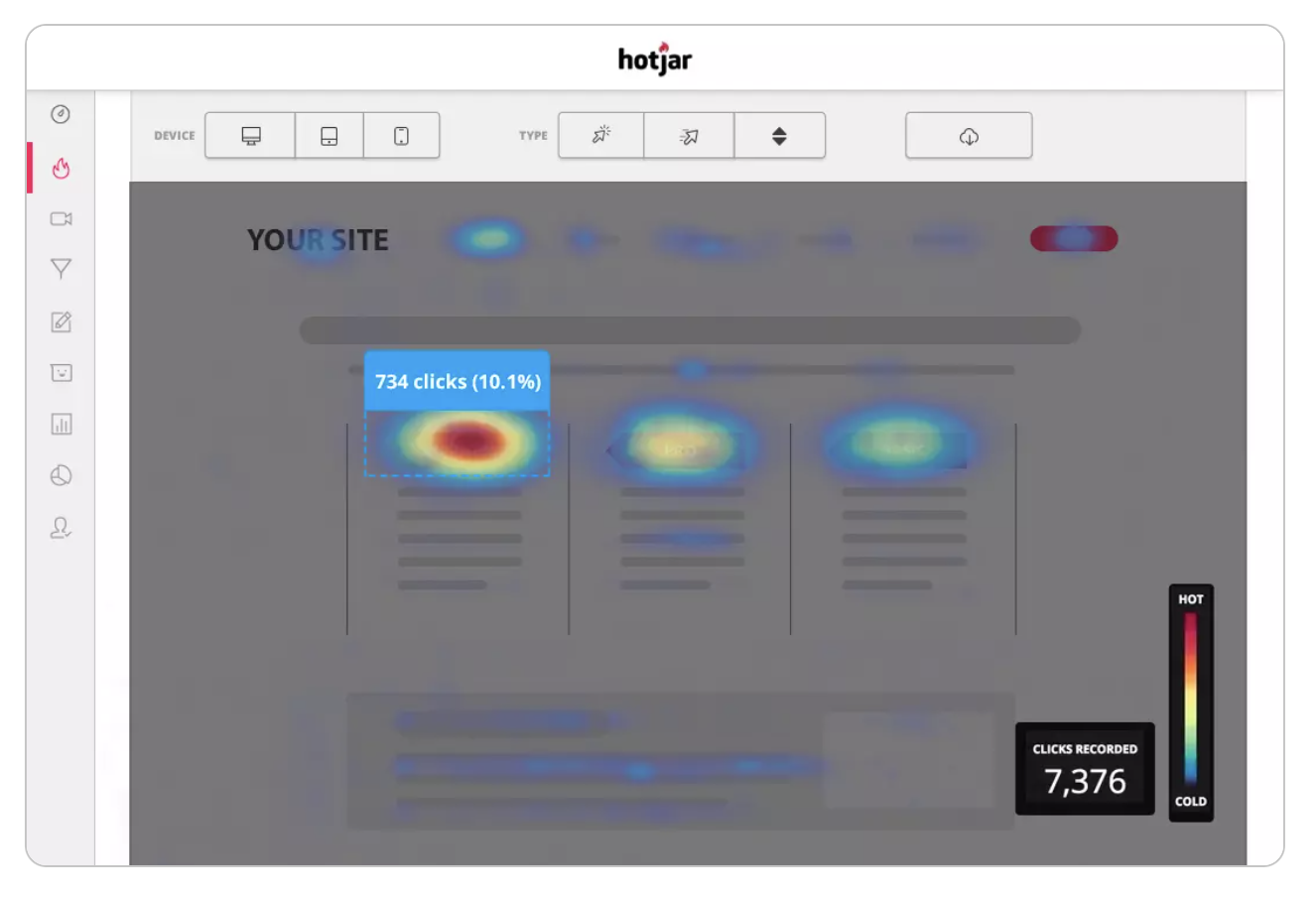
Tool #5: Heat maps
If you have followed best practices and used landing page optimization tools but your conversion stats are still low, you should find out what actions your prospects take on your landing page using heatmap software.
Why your landing page doesn’t convert
The prospect/seller disconnect
If your landing page isn’t converting, there is a gap between what the prospect wants to get from your page and what you give them.
You haven’t satisfied their expectations, or you haven’t addressed their objections.
This could be because of a problem on your landing page, a problem with your offer (your hook isn’t catching the right fish), or a problem with your product (it doesn’t come off as valuable enough to try).
How to fix
Ask yourself these questions:
- Is my design intuitive or does it lead prospects guessing what I want them to do?
- Does my headline and body copy directly relate to the ad that brought prospects to my page? Do both elements contain my focus keyword? Does my writing grab attention with wit or an emotional trigger?
- Is my CTA crystal clear?
- Do I have too much information that distracts prospects from my action button?
- Is there not enough information? Have I not created confidence in my prospect to drive a click decision?
If you aren’t sure, crank up your A/B testing for each of your landing page elements and see if a heat map clears things up. You could also try an incentivizing exit popup that offers a special discount or a different offer.
Your high-converting landing page
If I could sum up this post in one line, it would be this:
One goal, one message, one action.
Figure out the first, write the second, crush the third.
If you’re looking for even more landing page best practices, here you go. If you’ve got the mechanics down but could use some inspiration, then ta da.
An optimized landing page is a tool that boosts your conversion rate, lowers your customer acquisition costs, and maximizes what you get out of the money you spend on ads (Return on ad spend or ROAS).
Optimize to the moon, friends, and tell me what worked for you below.

