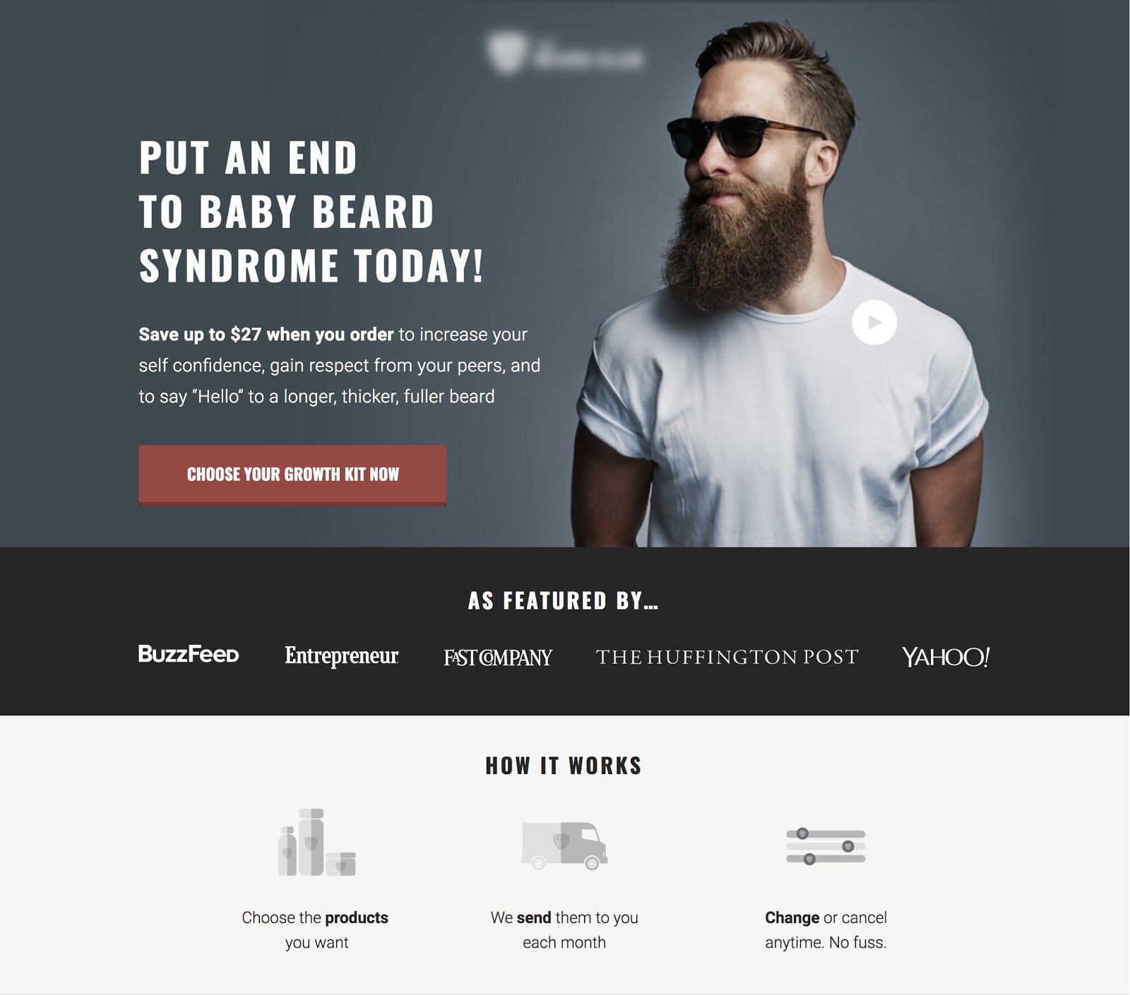
We can’t talk about landing pages without covering landing page video considerations, as its usage and viewing are becoming even more prominent.
Imagine this: Your prospect’s attention is being pulled in ten different directions at once, making it incredibly difficult to stand out from the crowd and secure their highly coveted attention.
The vastness of the Internet and its myriad opportunities have spoiled us. Any marketer knows that consumers aren’t looking for a product; they’re looking for a solution. Studies show that you’ve got just under seven seconds to capture the attention of your prospects by presenting the solution they desire.
And that’s only half the battle. Once you’ve captured attention, you need to retain it -- which is no small task when the average digital consumer’s attention span is constantly shrinking.
Now, some may say that “average” attention span is actually not worth considering, because attention span is all about how personally intrigued or invested one is with the content. But even if there isn’t an actual numerical bar you have to limbo under, keeping your videos shorter and more active at the beginning is still worth it.
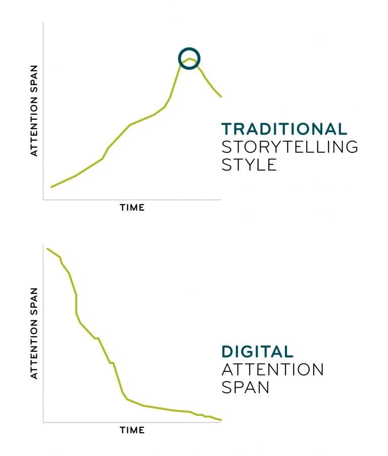
Why? Because with digital media, our attention spans are inverted from traditional storytelling — they begin at their peak and fade fast as opposed to building up gradually.
How you open your copy, whatever its purpose, matters greatly. You need to find the best way to hook and retain the interest and attention of your key prospects.
Get brand new landing page strategies straight to your inbox every week. 23,739 people already are!
Why Use Videos on Landing Pages?
Video is rapidly becoming the number one method for marketing online. HubSpot’s video marketing statistics for 2018, published by Adam Hayes, puts things into perspective.
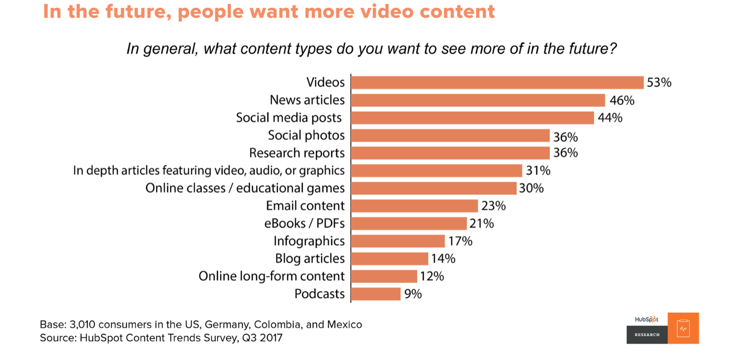
In addition to the above, HubSpot also describes how video is important:
- 62% of users consume video content more thoroughly than anything else.
- 52% of marketing professionals say video content has the best ROI of all content.
- 43% of consumers say video content is the most memorable type.
- 41% of consumers prefer to engage with brands via video to learn more.
We all know that just because video performs well in general, doesn’t mean it will perform well in certain use cases. But there are a few other points that show why video is a great way to go when considering landing page performance, specifically.
Best Way to Communicate A Lot of Info. Quickly
What’s the best way to communicate a lot of info. in a short amount of time?
The answer: Video.
And you’ve already asked your visitor to look at an ad or email and click on it to get to your landing page, so they’ve already invested time and energy. Don’t push them too much.
A landing page video is the only medium that gives the full package of showing and telling in one convenient package. It allows for greater depth of explanation than a few annotations on images and fulfills the need to know what the product looks like (from multiple angles rather than a static image of one viewpoint) and what it offers.
And the kicker?
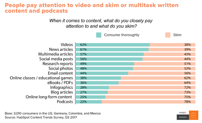
Consuming the content via video may be easier than reading an article, and they remember it better.
Increased Clarity
People learn in different ways. Some are better at processing words, others at processing images. By focusing on only one, you’re catering to a smaller segment of your demographic.
However, it’s not like a word processing prospect is going to find images completely useless, nor will an image processor find words completely useless. They work in tandem -- one clarifying the other and adding a deeper level of understanding for everyone. Video has the benefit of catering to both of these types of digital consumers, because you can include copy within captions along with the visuals in the video.
Simplification
Trying to explain technical actions through text isn’t easy. It’s even harder to understand. Ikea shoppers know what I’m talking about.

With attention spans so short, instructions need to be simple enough for a child to understand and text, well, it’s not exactly the most effective method for communicating complex technical actions or ideas to the uninitiated.
Video, however, excels at simplifying these things.
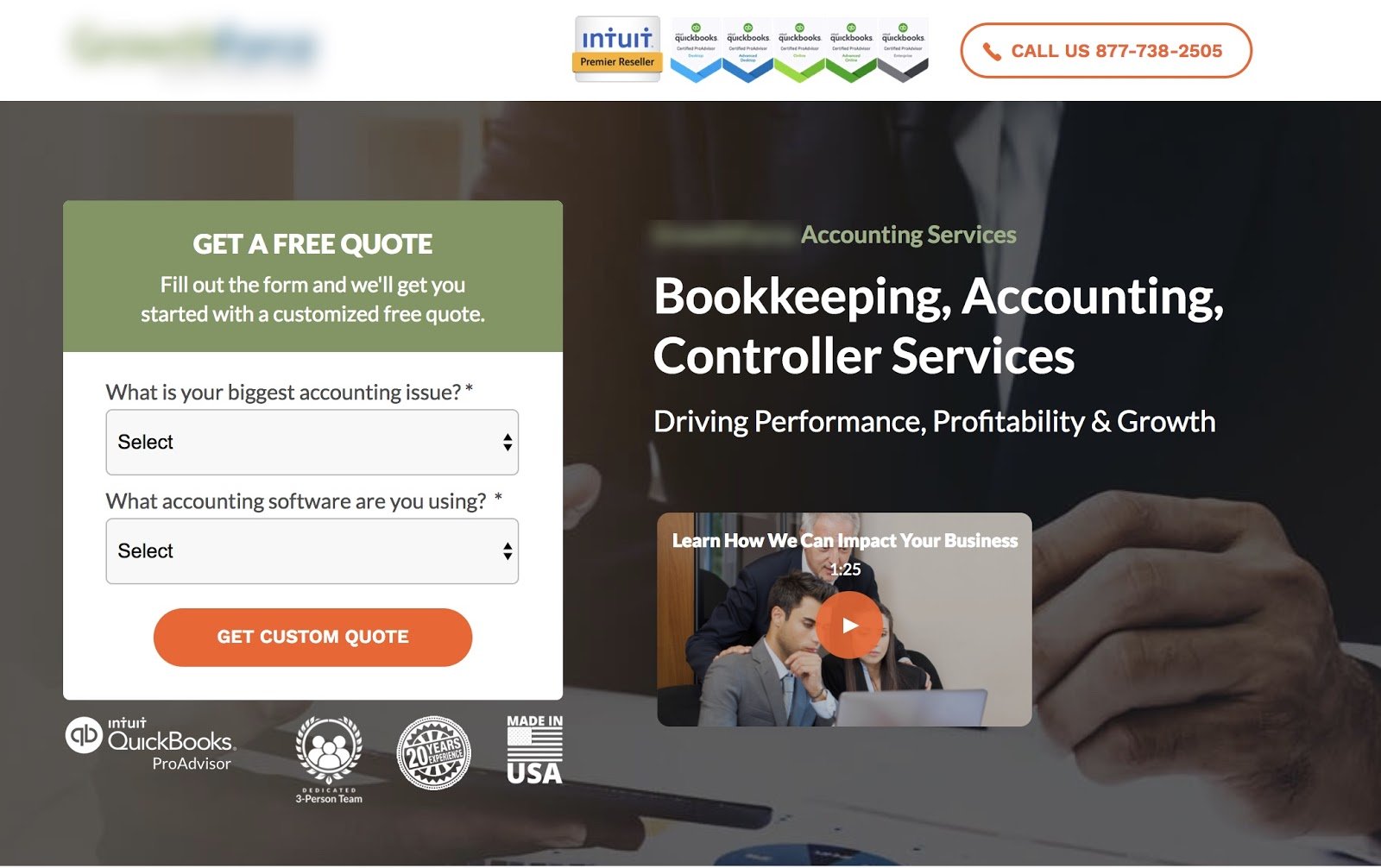
For a KlientBoost client landing page that involves Quickbooks services, we placed an explainer video in the hero instead of lengthy paragraphs of explanatory copy. This way, users could get a brief summary of what the service included without being lulled to sleep by too much reading.
The results? The landing page video was able to increase conversions by 60%. Which - I think we can all agree - is no small victory.
People don’t need to understand why as they can simply follow along with the actions they see. Video makes everything so much simpler.
Shareability
This just wouldn’t be a marketing article without a mention of shareability, would it?
Videos get shares. Simple as that. In fact, videos get shared 1200% more than links and text combined.
Providing a more shareable element for your video on the landing page (as well as social share buttons to make sharing easy) can help increase landing page video engagement. This is on top of video already being considered the strongest customer engagement content. And the more interested and invested in your video each user is, the better your odds of converting.
Presents a Positive Image
Branding matters. The way you present your business and the way customers interpret your presentation can have huge implications on your overall conversion rate of your landing page.
A good brand image that makes a positive first impression can bridge the gap between your business and its prospects. As Walter Chen says in this piece,
“It turns your prospects thoughts of me, into we.”
When your prospects view you as being on their side, they’re more receptive to any offers you make them.
But what’s all this got to do with video you ask?
Well, taking a deeper delve into the effects of video on eCommerce consumer relations yields some pretty interesting discoveries. According to research, not only do 85% currently have plans to increase their investment in video, but 81% of consumers were convinced to purchase by watching a video to learn about a product.
Video does so much more than quickly communicate the primary benefits of your product. It strengthens relationships, increases your brand’s reach and makes it simple for consumers to understand exactly what it is about your offer that’s so appealing.
And the more unique the product, the more people will want to watch a video. For example, Sticker Mule's video for poly mailers has a 5x higher play rate than their typical sticker product video.
This is all, of course, provided you’re using effective video marketing and proven strategies that work best with video.
And the benefits go on and on.
Creating video may seem overwhelming at first--but with the tips below, you’ll be increasing conversions in no time.
Let’s dissect how you can go about creating the best landing page video for your audience.
The 22 Landing Page Rules
There are some rules that continue to be good best practices for landing page video. But we also know our readers are interested in any new best practices that may have surfaced in the last year. We decided to cover both, so that you still know what’s relevant and can employ what’s new.
1) Script Your Video
I had the pleasure of listening to Kristen Craft (Director of Business Development at Wistia) present on video best practices back at Unbounce’s 2016 CTA Conference in Vancouver. She mentioned taking the time to start out by drafting a script for your landing page video.

This way, you can asses who your audience is, what message you want to bring across in your video, and what strong points you need to present to get conversions.
Rather than just winging your video, you need to strategically outline what information and vibe your video will present to your audience.
She has an awesome script format here that can help you get started.
2) Place Video Above the Fold
Another tip from Kristen was to make sure you place your video above the fold. Now, placing your video above the fold is not an ironclad landing page rule. But it is a widely considered best practice. Above the fold content is seen and read more by users, so you want your most important landing page assets immediately visible, of course.
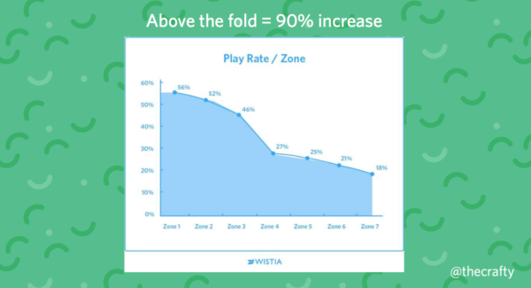
Pretty straight forward, but always test your results to figure out the best strategy for your audience.

3) Cut Out the Surrounding Text
One page, one purpose. That’s the golden rule for an effective landing page. Anything that doesn’t contribute to the action you’re trying to evoke is an unnecessary distraction.
Diana Urban of HubSpot tested how distractions affect the conversion rates of non-video landing pages. She measured the conversion rates of a landing page with and without the navigation bar (one of the largest distractions on a landing page).
Unsurprisingly, there was a lift on every page, which didn’t display a navigation bar.
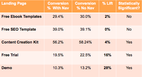
So what’s this got to do with landing page videos? Well, for a start, remove the bloody navigation bar.
After you’ve done that, I’d recommend removing any text that’s not headline or opt-in.
Below is an example of a landing page with a video that is being underutilized due all the distracting CTAs pulling users away from the play button.
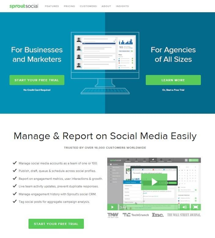
You’ve created a marketing video that you want people to watch, so don’t give them a reason to not watch it. Remove those distractions and keep their attention focused where you want it -- on your video.
4) Offer SomeContext
In a roundabout way, landing page videos are, or at least should be, a demonstration of the product in action.
A good landing page video should clearly show how the product looks, reacts, behaves and works.
The above Crazy Egg landing page video example is always a classic.
It’s a straightforward task for physical products. Think of those awful home shopping shows on TV. You could demonstrate the capacity of a bag with a week’s worth of holiday clothes or have a model select an outfit and walk the runway.
Consumers want a good visual representation of the product. They want to see how big it is, the detailed features and how you’re supposed to use it.
You could even show your product’s wider application, like creating a recipe video that depends on your new fangled kitchen appliance.
5) Optimize forSEO
We all want to rank on the first page of Google, right?
Well, good news.
Videos are like crack for the SERPs. Google just can’t get enough of them, especially if from YouTube (a Google product). Now, first, let’s be clear, if you’re using videos on your landing pages properly, they won’t be indexed by Google. The reason being is you don’t want to dilute your results by mixing organic with paid or other campaign traffic. But, that doesn’t mean you can’t host the originals of the videos on your actual website and benefit from the SEO perks that video brings with it.
Video is considered to be the most highly consumed digital media, so if your company isn’t using it, the fact is you’re falling behind. Video is incredibly important to search engines as it continues to grow as a highly engaging form of content. As as video views grow, so will their importance to the search engines, and thus SEO. All the more reason for you to reap the great SEO benefits from your landing page videos. Who says you can’t maximize what you get from your assets?
That is, of course, if you’ve followed the below basic steps for video optimization outlined by Evy Wilkins of SEW listed below:
1 – Create Video that Solves a Problem: This is, after all, how Google now ranks content -- on its usefulness.
2 – Easy Navigation: Only have one video per page--but link them all to a central video archive, which permits filtering by category and tags.
3 – Add Interactive Elements: Add interactive elements to combat the short attention span and prompt users to take the next action.
4 – Properly Optimized Metadata: Use rich metadata and smart content organization to squeeze every last drop of SEO juice from your video library.
5 – Add Full Transcriptions: Videos can’t really be indexed past headline keywords by Google. Use full transcriptions and add them to the HTML of your page to provide a better source of keywords.
6 – Host on Your Own Domain: A no brainer here. You’ve created the video, so don’t hand over your SEO potential to another site which hosts your embedded video.
7 – Sitemaps: I’m no SEO guru, and even I know the importance of a comprehensive sitemap. Try to find a service which automates the video sitemap and takes the hassle out of your hands.
8 – Use YouTube: Not to host the main video, but for shorter interest building pieces that have a CTA that links to your main video landing page. It adds to your SEO and gives you another source of referral traffic.
9 – Embeds: You want to host your own video, but that doesn’t mean you don’t want it appearing anywhere else. Give others the option to embed your video for easy inbound links and referral traffic.
10 – Test and Measure: Always keep an eye on how your videos are performing and examine how you might be able to improve them.
6) Make It Short
Landing page videos are meant to be succinct replacements for lengthy text explanations. So, it makes sense that you don’t want to bore your users with too long of a video. Studies show that all you need is 45-90 seconds to effectively and efficiently communicate the value of conversion.
After that, engagement starts dropping and you start to bore your users. The goal of your landing page video is still to generate immediate interest in converting -- and a 20 minute long explainer video isn’t going to generate any sense of urgency.
7) Custom Thumbnails
Another interesting point Kristen made at Unbounce’s CTA Conference, was to customize your thumbnail. Customizing your thumbnail strategically can radically increase your conversions.
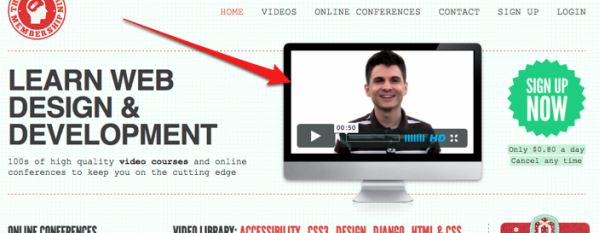
Using real people, particularly those who are smiling, look happy or are having a good time tend to intrigue people and therefore, get more plays.
8) Custom Player Color
Staying with the customization theme, you should customize your player color. YouTube reverts to red and Vimeo uses a grey overlay, but make sure your player color matches the theme/color(s) of your landing page or brand.
This gives your visitor a sense of trust and that your brand is established enough to match a simple player color. Paying attention to your button’s colors can make a big difference on your conversion rates, regardless of if the CTA is “download now” or “watch video.”
9) To Autoplay or Not?
As a general rule, it’s best to avoid autoplay. Why? Because using autoplay on your landing pages is the digital equivalent of shoving your message down your user’s throat -- and nobody enjoys that.
If you feel that your video is a must-view experience for your users, try silent full-screen video that plays as your background instead. It will be less of an invasive experience for your users and can still reap the benefits of autoplay.
Confusing?
A little, but just always be sure to test and go with what your audience responds with. That’s the basis of all great conversion rate optimization after all ;).
10) Sell Less, Teach More
No one wants to watch a salesy, boring advertisement. Focus on sharing something useful, and people will want to stick around and listen.
Genuine and non-salesy tactics always go far with people. Kristen suggests using real people with genuine reactions to your product.
Our Business Development Director, Richard Uruchurtu, puts it like this:
“We’re living in the age of social media where cell phone footage with real people can have a more viral impact than traditional advertising best practices. It’s better to drive value and to be authentic than to have professional lighting and slick graphics.”
11) Friendly and Personable
Your landing page video’s purpose is, of course, to sell. In that capacity, it’s filling a role often taken by a flesh and blood salesperson.
A cold, lifeless reading of a pre-written text isn’t going to convince anyone that your product’s worth their time. Just like a real life salesperson, the video needs to be friendly and personable. It’s got to bridge that gap between business and buyer, and form a relationship with your prospect.
That’s where video excels. You can exploit tone of voice and vocal inflection to ensure there’s no communication barrier or misunderstanding in your message. It’s much easier to build a relationship verbally than in writing.
As Joanna Wiebe says:
“A great tone can inspire desirable emotional responses in your visitors.”
Find the tone your users resonate with and implement it in your video copy.
12) Use Closed Captions
Have you scrolled through Facebook lately and discovered that almost all the videos you come across contain closed captioning?
More and more, people are watching videos without sound. In fact, Instapage has confirmed that 85% of video views are being watched with the sound off. As a result, providing subtitles has become an effective mean of engagement.
The same principle also applies to your landing page—providing text on your featured video can do wonders for engagement. Treat your video as if more than half of your audience are viewing without sound.
13) Make the First 3 Seconds Count
According to Puresive Films, 65% of people who watch the first three seconds of a video will watch for at least 10 seconds, and 45% will watch for 30 seconds.
Because it’s crucial to invest in the first 3 seconds of your landing page video, consider a strong opener that will hook the viewers in. A neat animated opening of your company’s logo might sound impressive, but might also be a waste of time.
When thinking of an engaging opener, ask the question: what’s in it for the buyer? If you’re able to answer this within the first 3 seconds of your video, there’s a good chance you’ll keep your viewer’s attention.
Here are a couple ideas to capture attention:
- Use an intriguing first line.
- Show the result or benefit of your product first and foremost.
- Dive straight into an engaging testimonial or review.
- Jump straight into the first step of a tutorial.
- Present the problem that your service is answering.
14) Find the Right Style For Your Target Market
Like designing a landing page, figuring out what style of video best suits your target market is an important part of the process. For instance, if you’re promoting a SaaS product, a GoPro style video might not be the best solution. Instead, an animated short will convey the subject better.
To better understand the right style for your target market, take the time to research. A great way to get started is by analyzing your competitors and studying what they have done stylistically.
To gain a broad perspective of what styles and mood work for your audience to translate into video, look into your niche in Dribbble. Going back to the SaaS product example, I would simply type “SaaS” in the search bar and see what look and design others in the space have come up with.
If most of what I’m seeing is illustrative design, that should give me a great indication that animation might be the best approach for my featured video.
Limelight Platform exemplifies this by featuring an animated video on their homepage to explain about their SaaS product.
15) Touch On Your Unique Value Propositions
What does your product or service offer that your competitors aren’t? Among the other points to cover on your video, highlight your unique value propositions, or what makes you different.
A video will allow you to expand on what sets you apart as a business to warm up a potential buyer. Videos aren’t just fluff for you to impress your landing page users with how many cool multimedia assets you have. They are about communicating genuine value to your user in easily digested and delightful experiences.
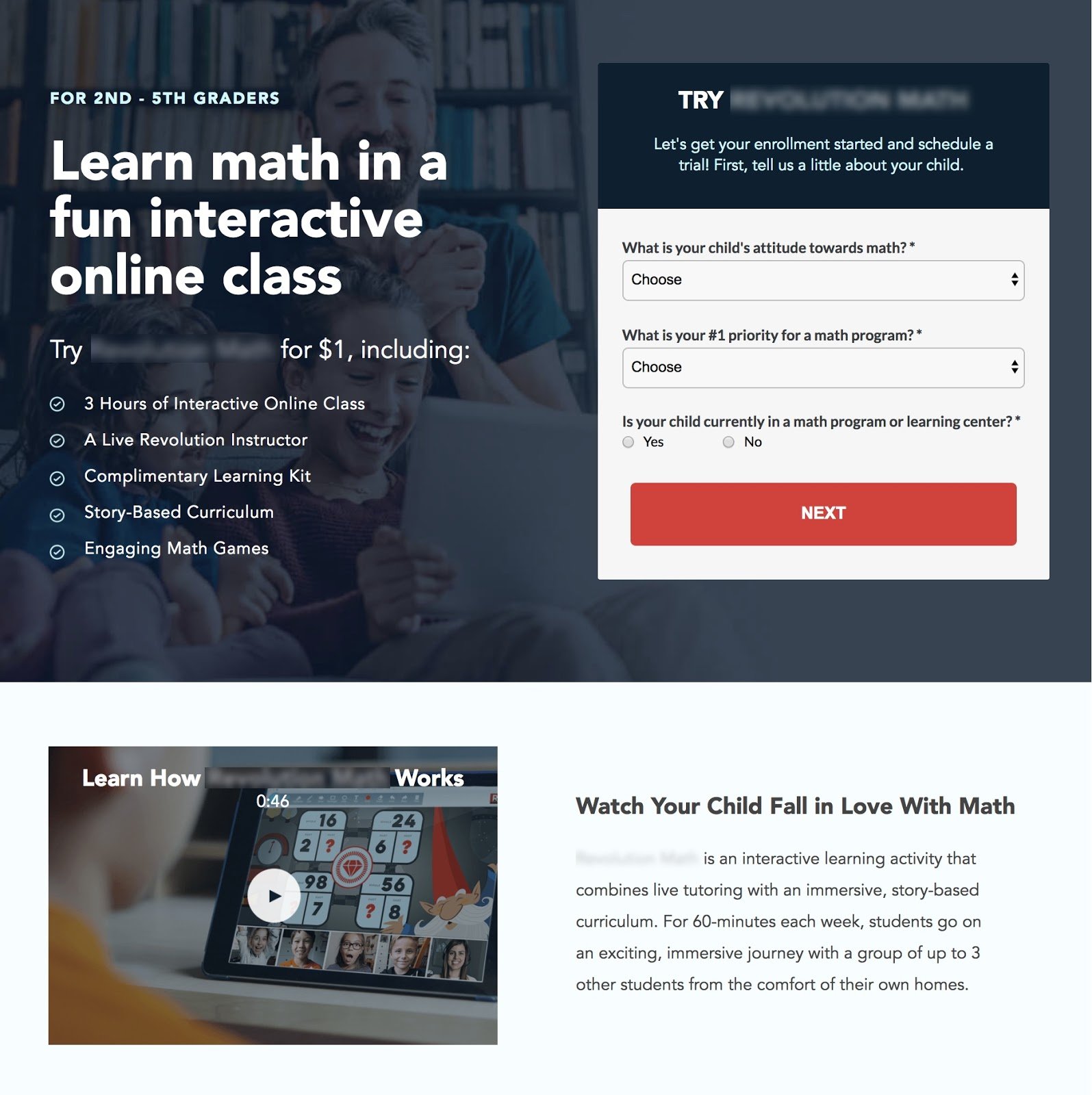
Among the many afterschool programs or activities, a KlientBoost client touches on all its unique value propositions in their landing page video, educating the viewers that there’s a new way to effectively teach children to fall in love with math.
The video focuses on what sets them apart from their competitors by capitalizing on the use of technology, play, and reward system.
16) Use Social Proof to Back UpClaims
Build trust by providing social proof. This is true in the world of landing page design as it is in video.
One of the most effective ways for your visitors to connect with your product is to see how others have been impacted by it.
When it comes to your landing page video, ask those who have really used your product to be the star of the feature. This will convey real expressions or emotions that viewers will be able to identify with.
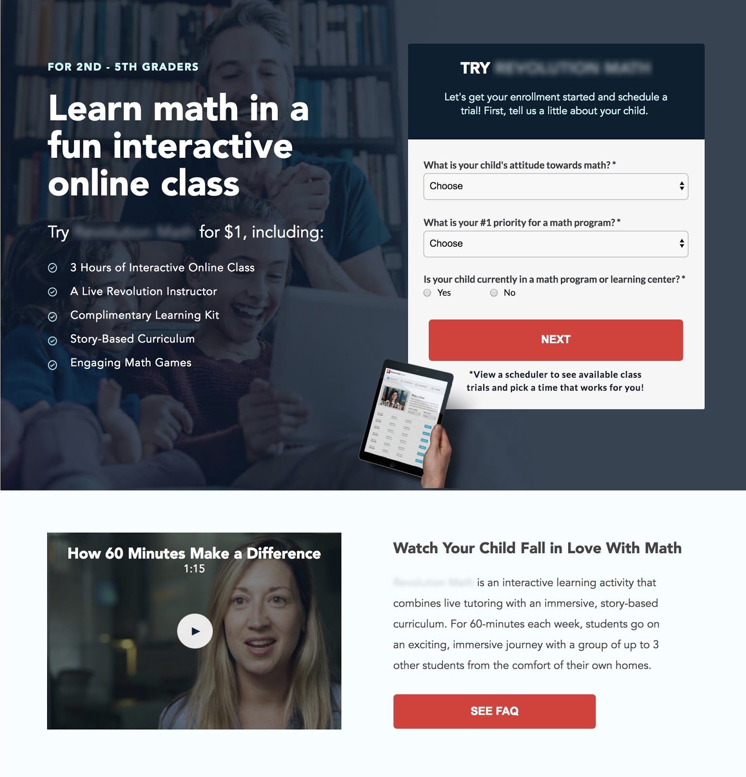
Using the previous landing page example, we saw positive results when we replaced the introductory video with a testimonial showing actual moms that have enrolled their child into the program.
When we tested this video against one that was an introduction to the program, the result spoke for itself.
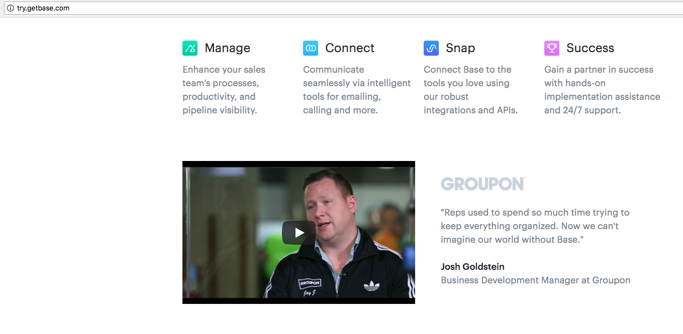
Base, a CRM software company, did the same by highlighting a success story of one of their biggest clients, Groupon.
As Josh Bean, Director of Marketing at Base CRM, puts it:
“We wanted prospects to hear directly from customers about the impact we’ve had on their business. By adding customer testimonials to landing pages, we’ve seen increases in time on page and conversions. We now require video to be on every landing page that we create.”
17) Display Video As Your Background Hero
Not all landing pages should display video as a background hero, but some could benefit from this. Products or services within the world of visual communication are among the few categories that could use the help of a video background hero.
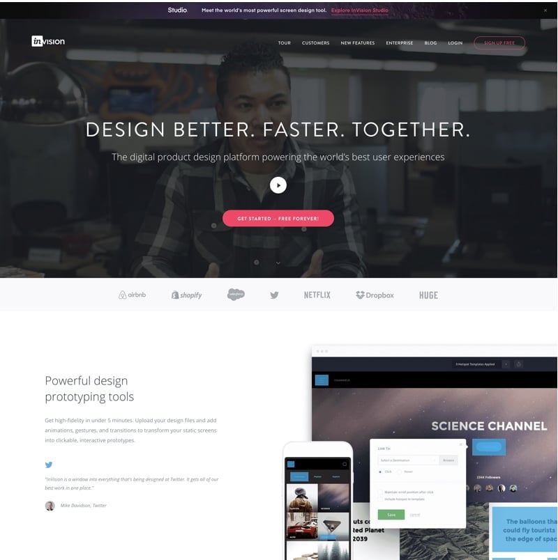
Invision App, a digital product design platform, displays a lifestyle video as their hero to back up their headline that states “Design Better. Faster. Together.”
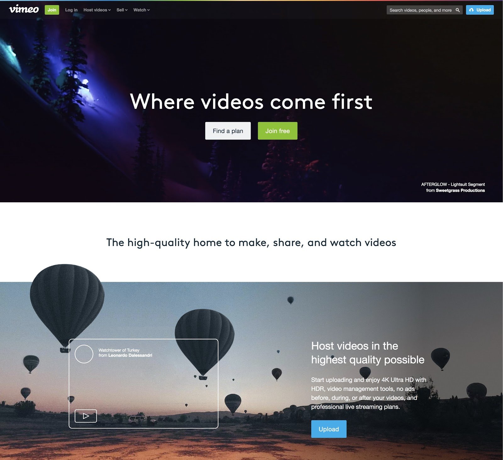
Vimeo, a video streaming platform, shows off some of the best visual works created by its users.
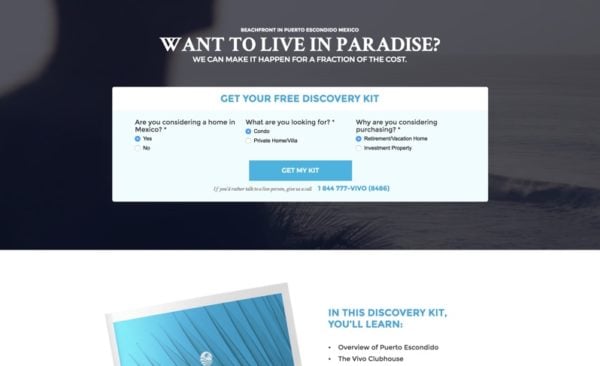
For a KlientBoost client that offer resort packages, we added a video background specific to the campaign that was running — a property in Escondido, Mexico.
The result was an astounding 20% increase.
Landing page builders like Unbounce offer a video background feature that allow users to easily create these types of dynamic video landing pages.
18) Explain How the User Derives Value From Your Product
In your landing page video, make it a point to show the benefits, not just the product. Like any great marketer, you know people are always asking, “what’s in it for me?”
Show the convenience, the efficiency, the time-saving benefits, the lifestyle upgrades, and how awesome your viewers could be — if only they owned your product.
InVision Studio introduced a new design tool to the masses by marketing the benefits. They could have shown a step-by-step tutorial on how to technically use their product (after all, they are a tech company right?). But instead, they show the list of benefits and features, and simply how awesome their product is.
We implemented the same on a recent KlientBoost client landing page, and already we’re seeing a positive trend.
19) Your Video Content and CTA Should Match
As you start rolling out landing pages across multiple campaigns, it becomes more imperative that you cater your video content towards your CTA.
If your landing page calls for visitors to sign up for a free trial, your video can back that up by stating the same call-to-action.
At the end of this video, viewers are prompted to “fill out the form” provided on the landing page.

20) Limit the Amount of Videos Within a Landing Page
As a general rule-of-thumb, never overwhelm your visitors with too much of anything.
Too much text on your landing page, and a heatmap analysis, will let you know that no one’s even scrolling down to read more of what you have to offer.
The same best practice applies to video. Just because you have multiple videos to use at your disposal does not mean you should populate your landing page with them.
The golden number here is one. Although it may not always be the case, one video per landing page will do the trick. Any more and you may risk visitors skipping out on your videos entirely. Again, less is more.
21) Focus On One Main Point
Instead of trying to cover all your bases in one video, consider making multiple ones that get featured in separate campaigns.
One landing page could cover the how-to’s of your product with a tutorial style video, while another could highlight a success story. Within each landing page video, consider the phrase “less is more”. Make it your goal to focus on one main point.
An example can be taken from a KlientBoost client that specializes in insurance adjusting. Instead of displaying a video that provides a general overview of the company, we tested a video that was more specific to insurance for fire-damaged homes.
The result was a whopping 133% lift in conversion rate.
22) Take the Risk, Enjoy the Reward
In business and in life, we know that in order to gain the reward, we need to first take the risk.
The same can apply to your video. By taking risks and thinking outside of the box, your video can significantly improve engagement.
Michael Dubin, Founder of Dollar Shave Club, states that “When you’re launching a new business and sharing a new idea, if you can get people to remember it, there’s obviously a better chance at success.”
In his promotional videos, Dubin pushes the envelope by capitalizing on humor and creativity to make for a memorable product. Keep in mind that what’s being sold here is simply a razor.
An Entrepreneur article reveals that in the first 48 hours after the low-budget video (approximately $4,500) debuted on YouTube, over 12,000 people signed up for the service. Talk about ROI. Sure this was a while ago that this article was written and the video released, but it still backs up the point with some solid results.
In the article, Dubin’s friend who helped with the creativity behind the video, Lucia Aniello suggests, “People understand brand messaging, and when you subvert that, they recognize the risk you took… Learn to trust the funny. If you take a risk, you may get a reward.”
I get it, going viral isn’t necessarily always the goal here. What I’m suggesting is to take the time to think creatively before getting your feet wet. If the goal is ROI, we want your video to bring you money. And to do that, Dubin suggests to be unexpected. “Don’t give them a video they could have written themselves.”
And of course, we ran with the advice with a current landing page we’re currently running right now.
In the name of best practices, we’re currently running a test without the video to see if Dubin’s notion is sound. Check back soon as we give you an inside look at real live results. :)
The Good, The Bad, and The Ugly
It’s time to dive into some examples of awesome (and, well, not so awesome) landing page video usage.
CrazyEgg
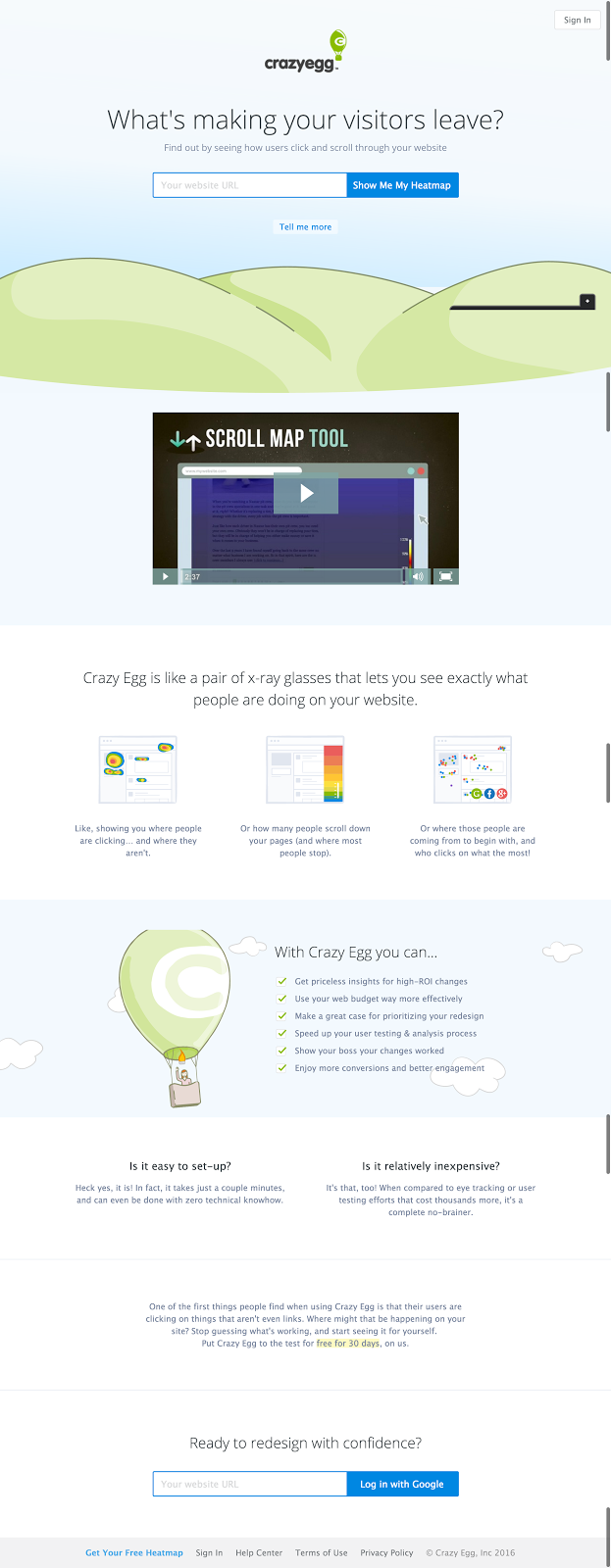
The Crazy Egg landing page is an interesting design. The video is not above the fold, but occupies a screens worth of space upon scrolling down.
The Good
- There’s a strong cue on the landing page that gets you to the video. Once at the video’s section, it takes up an entire screens worth of space. There’s no distracting text or any other elements that take attention away from the message that’s being communicated.
- The video comes in at just over 2:30. It’s not in the golden 30 second band, but it definitely does a great job of communicating exactly what a heat map is and what it can do for your business in a very short period of time.
- Does an amazing job of showing the product in use. It takes the idea of a heat map and puts it into relatable, understandable context.
The Bad
- 8-10 seconds to get going.
- It’s not the clearest or most compelling CTA. Perhaps, they rely on the larger landing page to handle this for them.
The Ugly
- Very little is ugly with this. In fact, it would make for a great starting point for you to model your own video on. Crazy Egg is rigorous with their testing and this video helped increase revenue by $21,000 a month.
Urban Sitter

Good
- Real people are used in the video. It sounds like a small detail, but using stock images or overly fake videos are a surefire way to ruin trust. By using real people, they’ve added the always valuable element of social proof.
- It’s short. Again, it’s not under the golden bar of 30 seconds, but it comes in just under the next major drop off of four minutes.
- It gets straight into the video, starting with a question many looking for a babysitter would want to ask.
Bad
- The video focuses solely on the sitters. There’s nothing within the video from those who hire the sitters. It lets you see who you might be hiring, but offers little social proof from other paying clients.
- The area where the video is placed is extremely busy. There’s extraneous text nearby and other elements, which would take attention away from the video.
- It’s literally the last thing on the page prospects will see. If they’ve scrolled down this far they’re likely already sold on the concept. It needs to be higher up to help convince those who aren’t yet sure.
Ugly
- There is zero CTA in the video, it kind of just ends. Sure, there’s a button nearby, but it doesn’t really tie into the video at all. It’s just there, nearby yet separate.
Dollar Shave Club
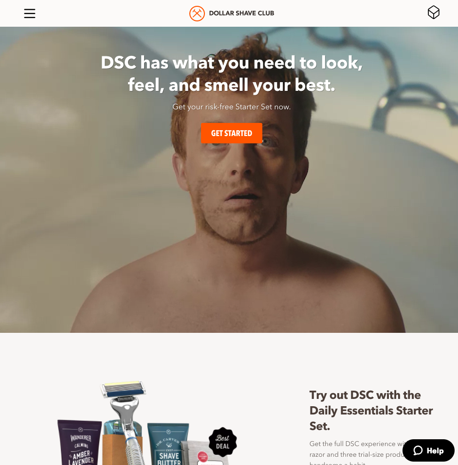
You can’t have an article talking about videos without including the Dollar Shave Club.
Good
- The video has great use of humor, which keeps you entertained and engaged throughout.
- It’s a very short looping video that autoplays on repeat so it doesn’t take too long to view and doesn’t distract the user.
- Very simple design. Some text to the left, but it’s quickly read and then ignored, so you can focus on the video itself.
Bad
- There is zero social proof in the video or on the page at all. It’s a hilarious video, but I really want to know if the blades or the shaving cream are as great as the owner claims.
- While the video is entertaining there isn’t much feature driven content explaining the quality of their razors or shaving cream in actually clear value statements. This might scare away users who aren’t familiar with the quality of the brand before landing on the page.
Ugly
- The landing page video focuses far more on brand development (product development if you want to be specific to the shaving cream) instead of driving a specific action like purchasing. This is a well designed landing page and delightful video -- just not specifically optimize towards driving purchases.
A Landing Page Video Is Awesome…When Done Well
Videos are the best way at hooking interest and compelling users not only to stay on your site, but to take the action you want them to.
But they’re not at all easy to implement effectively. There’s a lot going on in a video, which presents more opportunity for things to go horribly wrong.
For the best possible marketing videos, you need to remember:
- Script your video
- Place video above fold
- Cut out distractions
- Show the product in use
- Optimise for SEO
- Keep it short
- Use custom thumbnails
- Use custom player color
- Don’t use autoplay (but constantly test)
- Sell less, teach more
- Keep it friendly and personable
- Use closed captioning
- Make the first 3 seconds count
- Find the right style for your target market
- Minimize risk by producing video for cheap
- Use social proof to back up claims
- Display video as your background hero
- Explain how the user derives value from your product
- Touch on your unique value propositions
- Your video content and CTA should match
- Limit the amount of videos within a landing page
- Focus on one main point
- Take the risk, enjoy the reward
So there you have it, a complete guide to what you need to know about your landing page video. For more tips you can check out our post on the Landing Page Video Commandments.
What’s your take? Do you have any tips or tricks that aren’t listed? Let me know in the comments below.

