Changing one word in your call-to-action copy can lead to a 90% increase in click-through rate. True or false?
…
True.
One. Word.
In a now-famous A/B test, Unbounce discovered that changing the call-to-action (CTA) copy on their landing page from “Start your free 30 day trial” to “Start my free 30 day trial” led to a 90% increase in click-through rates.
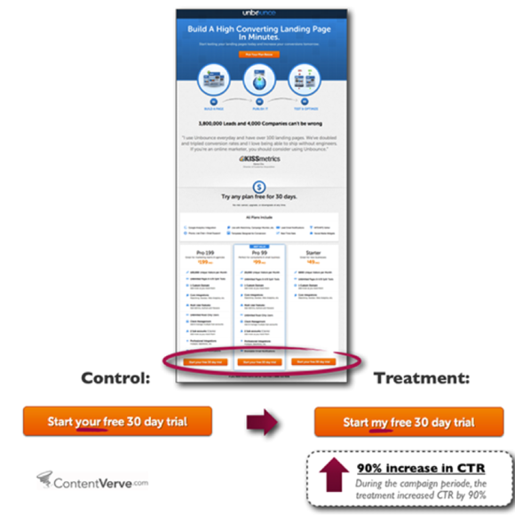
That’s how important CTA copy is to the success of your marketing campaigns.
But how can one word lead to such an increase in CTR? Why do some CTAs increase conversions but others don’t? And how can you systematically write calls-to-action that convert better?
That’s exactly what we’re going to explore in this article in EIGHT simple steps (call-to-action examples included).
Get brand new landing page strategies straight to your inbox every week. 23,739 people already are!
What is CTA copy?
A call-to-action (CTA) is a prompt in the form of a link or clickable button that tells people what to do next. But not just anything to do; a CTA motivates progress toward a specific and desired action defined by you.
If a headline delivers a promise, a CTA fulfills that promise.
Call-to-action copy, then, refers to the words you use in your CTA to motivate action.
As Michael Aagaard explains:
"The copy you use in your buttons has a major impact on your prospects’ decisions. Button color and design are important visual cues that tell the prospect where to click. But in the last critical moment, the copy itself is what impacts the prospect’s final decision. In other words, your CTA copy answers the question, 'Why should I click this button?'"
Get your copy wrong, and it can cost you hundreds, thousands, even millions of dollars in lost conversions. Period.
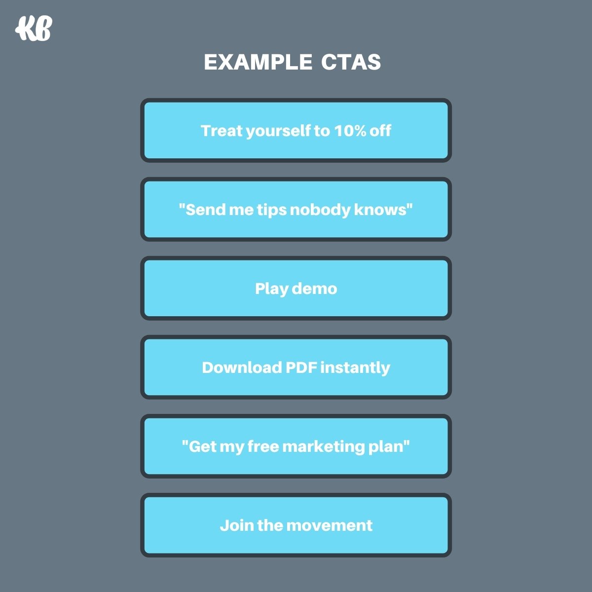
How to write call-to-action copy that converts
You don’t need to be the next David Ogilvy to write effective CTA copy for your landing pages, homepage, webpages, ads, or anything else. Not even close.
You just need to follow eight simple steps, no matter the type of CTA:
Step 1: Identify conversion intent
Step 2: Define your conversion goal
Step 3: Start with a strong verb
Step 7: Keep it short, seriously
Step 8: Say it again, but different
Let’s explore each, along with examples.
Step 1: Identify conversion intent
Before you can craft a compelling CTA, first you need to know your target audience's conversion intent: how likely are they to convert, and on what offer?
For example, someone who has never heard of you before and who isn’t in-market will convert differently (and later) than someone who is actively seeking products or services you offer right now. Consequently, both will require different offers and CTAs.
Also, different sources of traffic have different conversion intent too.
For example, the conversion intent of someone searching for your products or services on Google will vary from the conversion intent of someone passively consuming content on social media.
Though both potential customers might want to buy eventually, the one who discovered you via a purchase-intent keyword on Google is more likely to convert now than the one passively hearting posts on Instagram. Again, both will require different offers and CTAs.
So step one to writing an effective call-to-action is to align your copy with your target audiences’ conversion intent.
To do that, you need to know two pieces of information:
- Stage of funnel: What stage of the metaphorical buyer’s journey will you target with your ad or campaign? Top (awareness), middle (consideration), or bottom (purchase).
- Traffic source (channel): On what channel will your target audience discover your ad or campaign?
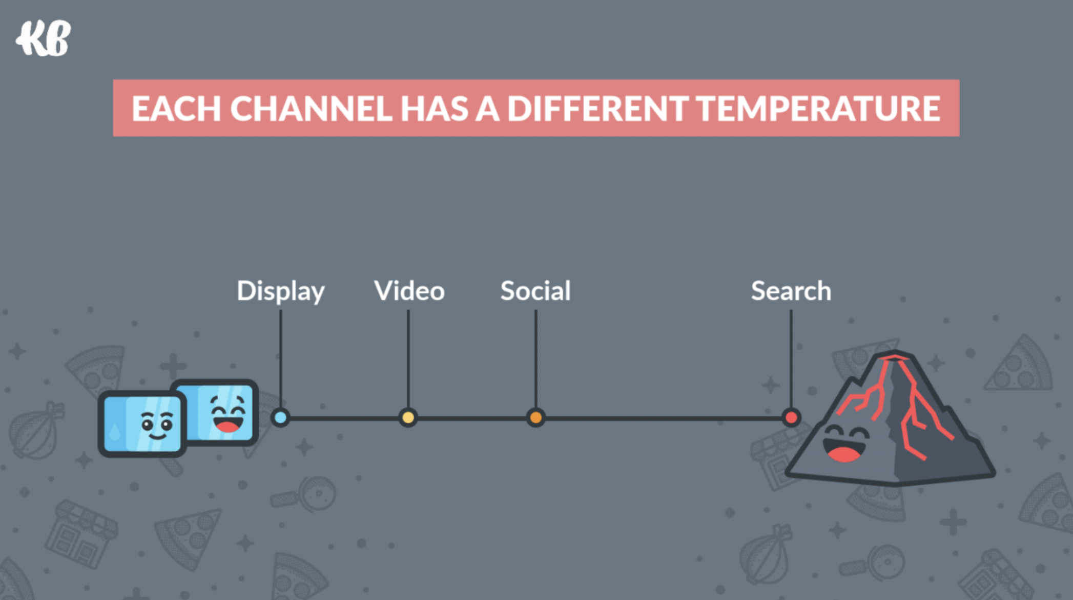
When it comes to channels, different channels have different conversion temperatures. It’s just harder to get someone to schedule a consultation or book a demo on social media than it is via a Google ad (different intent).
And when it comes to the stage of the funnel, different stages have different conversion temperatures too (hopefully that’s obvious).
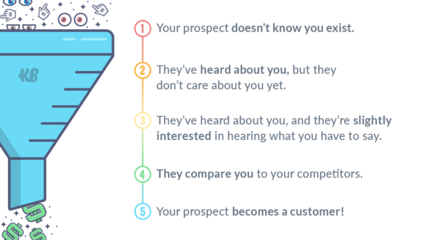
The trick is to align channels with funnel stages.
For example, save your bottom of funnel offers and CTAs for Google PPC ads; save your middle of funnel offers and CTAs for social media ads; and so on.
Once you know at which stage of the funnel your target audience will engage with your ad or campaign, and on what channel, now it's time to define your conversion goal.
Step 2: Define your conversion goal
Every conversion goal needs a CTA.
What’s a conversion goal? Your conversion goal is the offer you want your website visitors to convert on.
Good news: A high-converting landing page only has one conversion goal. That’s it.
The more conversion goals you include (e.g. subscribe + download + schedule = 3 goals), the more diluted your conversions, the fewer total conversions you’ll get.
At this stage, you should already know the channel and funnel stage of your target audience. Now all you need to do is match both with the right offer.
When looking at funnel stage, consider the following:
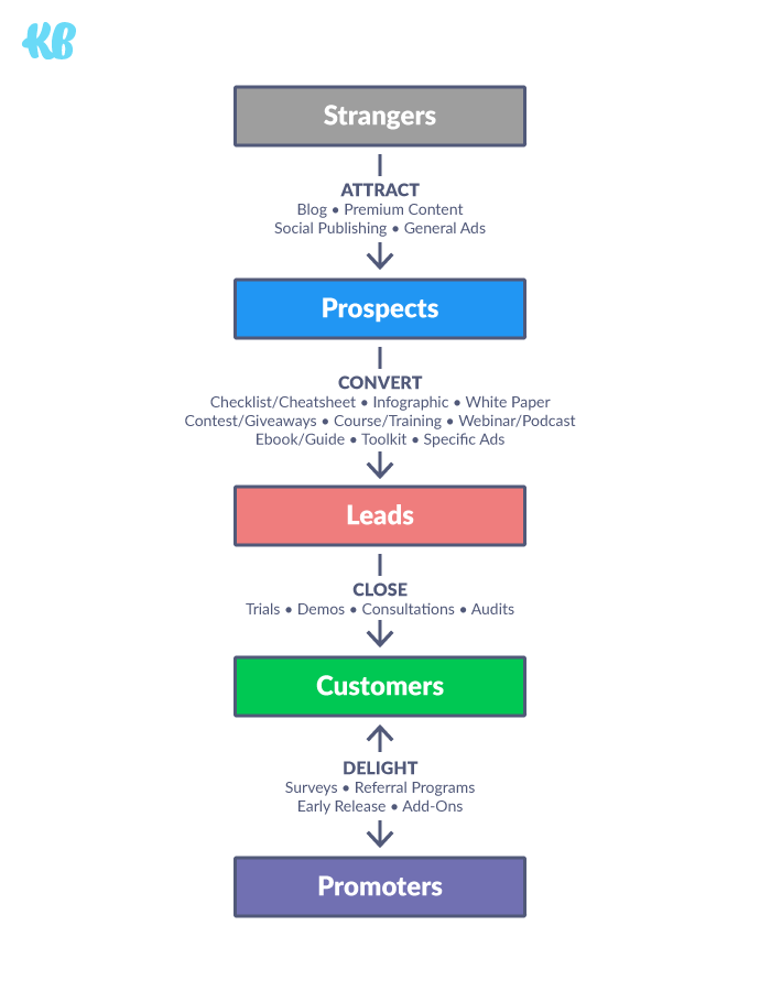
And when looking at channel, consider the following:
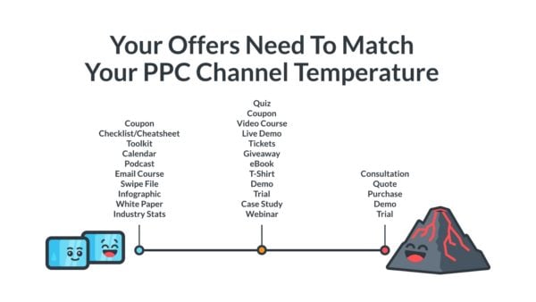
Remember, the best offers (and subsequently best calls-to-action) match funnel stage with channel source (cold to cold, hot to hot).
For example, set a demo or purchase as your conversion goal for all Google PPC traffic (hot channel + hot offer), or set a demand generation guide as your conversion goal for social media (lukewarm channel + lukewarm offer).
Ok, with your conversion intent mapped and your conversion goal decided, now the fun begins: writing your CTAs.
Step 3: Start with a strong verb
A verb is a word used to describe an action, state, or occurrence—and it’s the first word in your CTA phrase (at least it should be).
What does a strong verb look like?
A strong verb is a specific verb, not a generic verb; it gets to the point immediately and motivates action.
Most importantly, a strong verb communicates value, not effort; receiving, not giving.
Why? Because not all actions are created equal.
For example, words like submit, start, activate, learn, pay, earn or go are all action-oriented words. But unlike words like receive, get, view, enjoy, discover, see, or play, those words represent calls to effort, not calls to reward.
For example, in the graphic below, notice the verbs in the left-hand column vs. the verbs in the right-hand column. The verbs to the left emphasize giving (and heighten anxiety); whereas the verbs to the right emphasize receiving (and reduce anxiety).
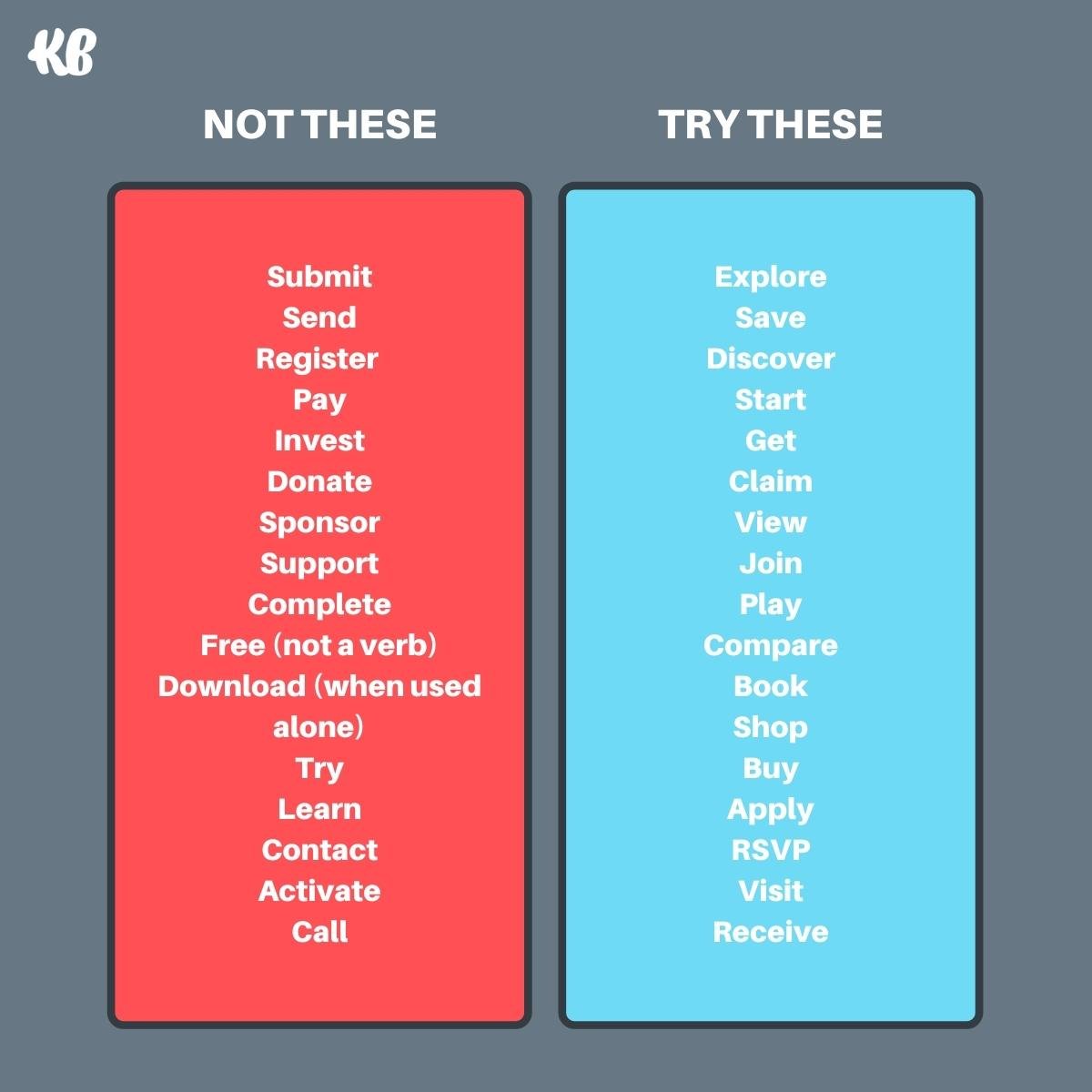
When it comes to CTA verbs, opt for the verbs on the right, not the left.
And whatever you do, don’t forget to use a verb.
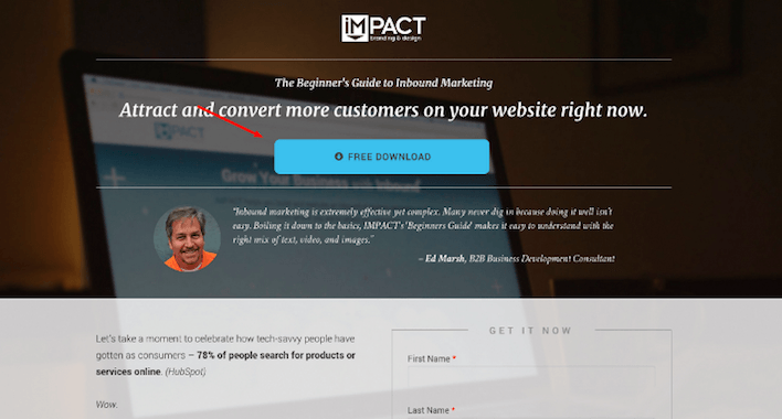
For example, “Free” is not a verb.
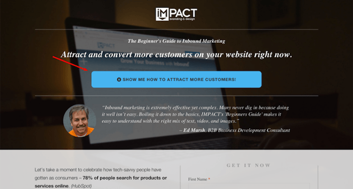
When iMPACT changed their CTA from “Free download” (no verb) to “Show me how to attract more customers!” their conversions increased by 78%.
Step 4: Emphasize value
For what seems like forever, marketers have implored the masses to use “action-oriented” CTAs.
After all, it’s called a “call to action” for a reason.
But we think there’s a better way to think about CTAs: as calls to value.
Why?
Because action without value is like tactics without strategy: ineffective. When it comes to CTA copy, value phrases typically convert higher than purely action phrases.
Let’s look at some examples:
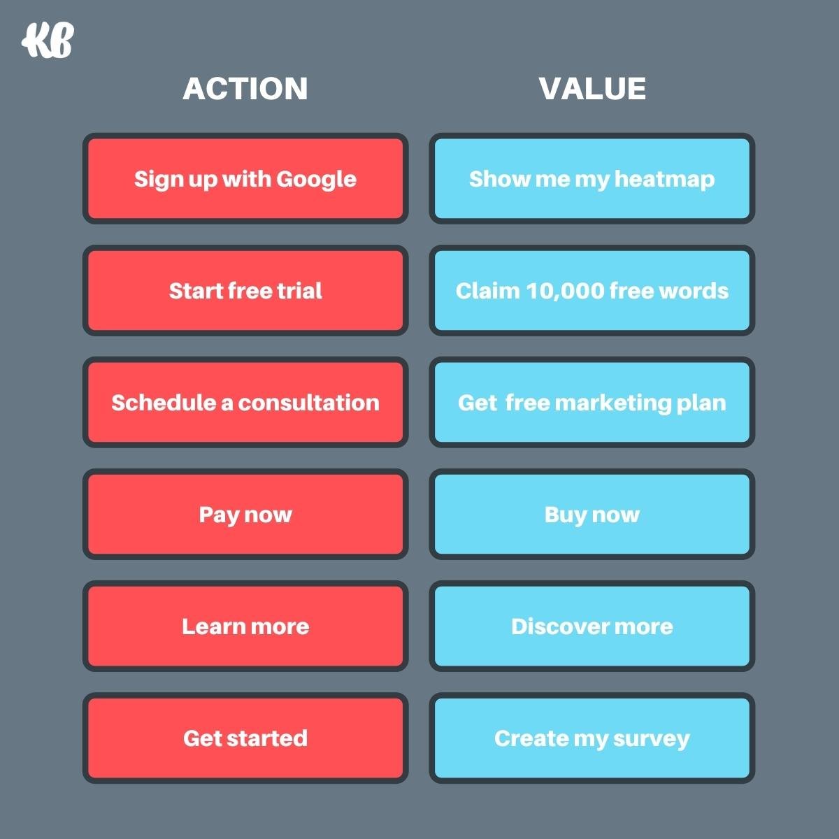
Notice how much more compelling and enticing the CTAs on the right read compared to the CTAs on the left?
How do you write calls-to-value?
Fulfill your promise in your CTA copy.
What’s the main benefit your headline promises to achieve? Now how do you plan on fulfilling that promise? That’s your call-to-value.
A good call-to-action button copy uses an action verb followed by a value word.
Start with an actionable word such as “get,” “learn,” “discover” or “enjoy.” Then once you’ve set yourself up to speak to the value of the offer, follow up your action-packed verbs with “the value the clicker shall receive.”
For example, button copy like “click here” or “download now” doesn’t communicate what you stand to gain by clicking. “Enjoy a free week — on us!” on the other hand, does.
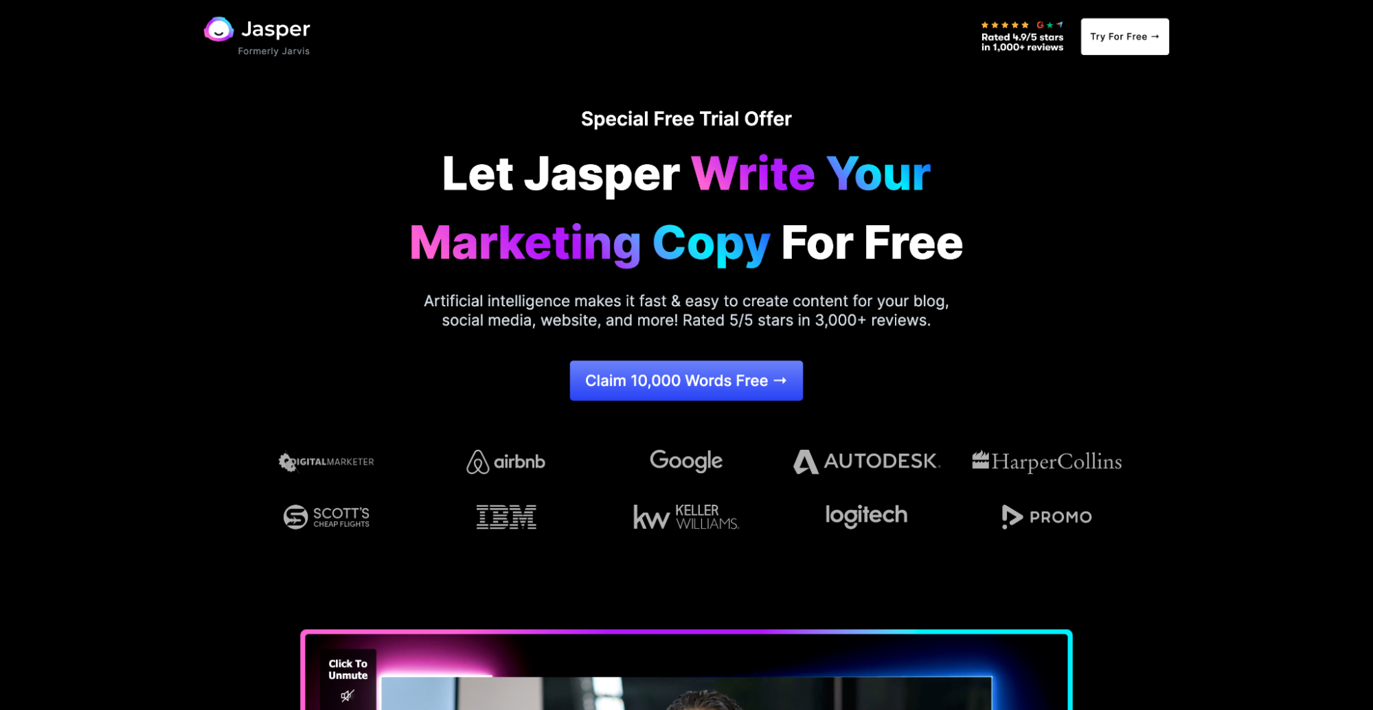
Let’s look at a real-world example: Jasper’s (formerly Jarvis) free trial landing page:
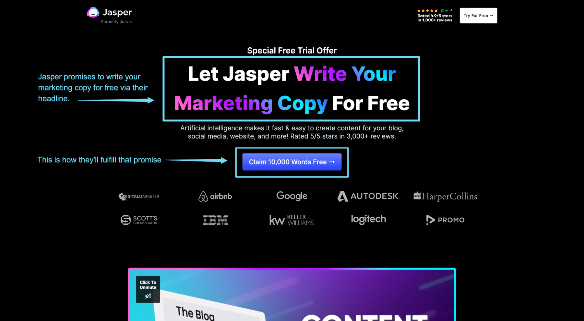
In their headline, they promise to write your marketing copy for free. Great benefit, right?
In their CTA, they tell you how they plan on fulfilling that promise: by giving you 10,000 words for free.
Jasper not only fulfills their promise with their CTA copy, but they do it by communicating a clear and compelling benefit, not a generic call-to-action.
Now juxtapose that with one of Jasper’s competitors, Copy.ai:
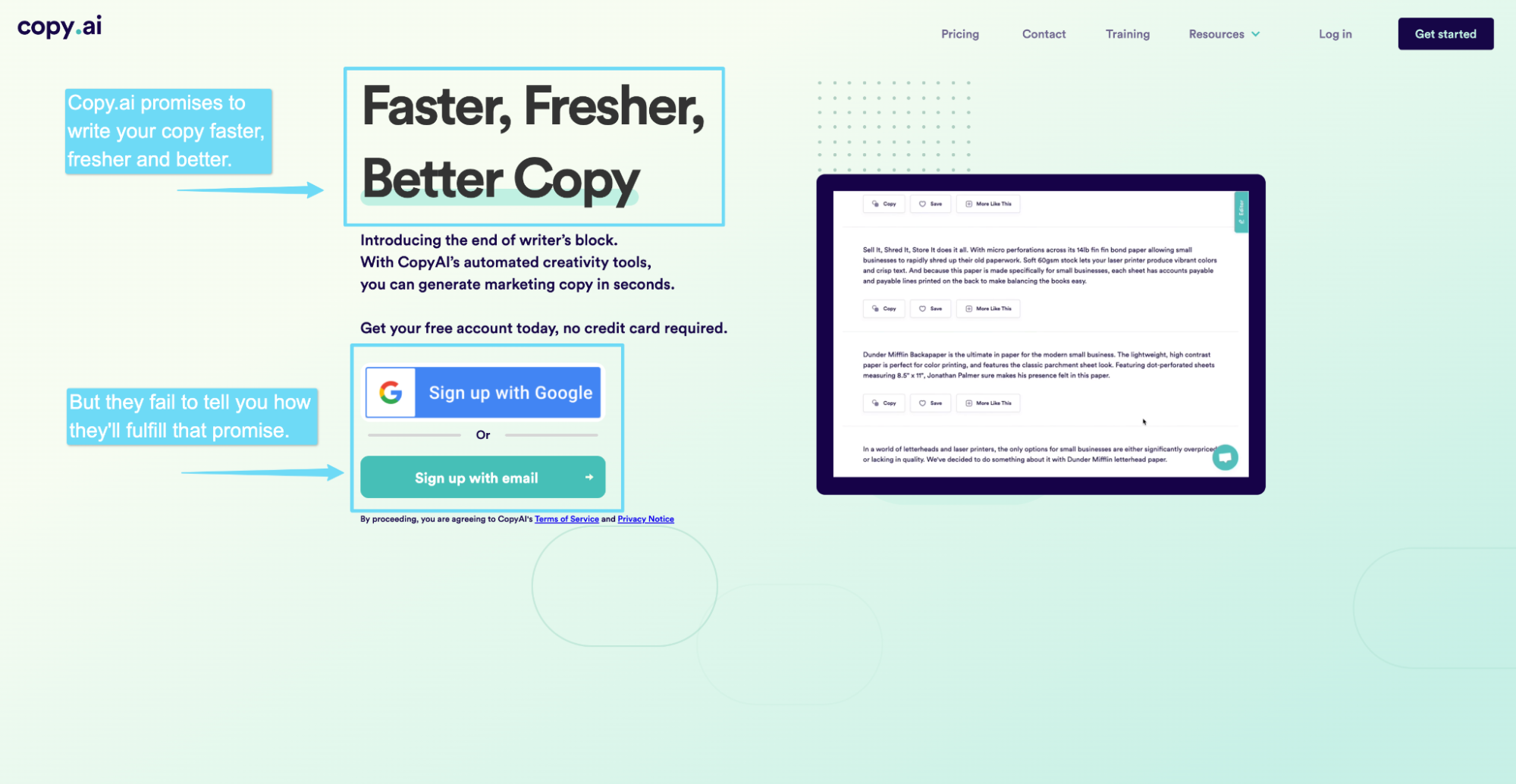
“Fast, fresher, better copy.” Ok, check.
And how are you going to fulfill that promise? With Google? Meh.
Step 5: Handle objections
Your prospects have tons of objections about your products, services or offer.
Hopefully, you’ve anticipated and handled those objections directly within your landing page copy.
But since your CTA button is the final step before committing, and unresolved objections are likely racing across your prospects’ minds, think about ways you can temper anxiety by handling any last-minute objections within or around your CTA copy.
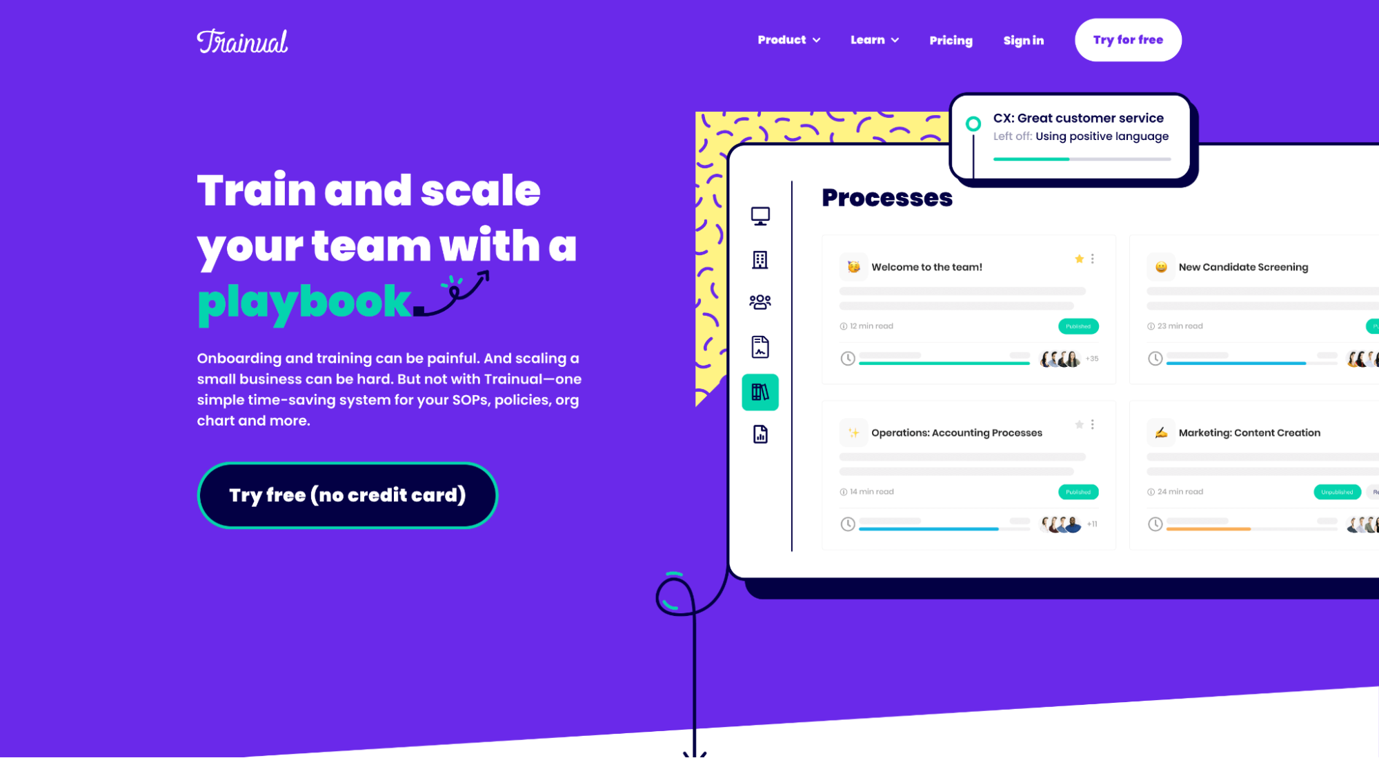
For example, notice how Trainual handles the popular objection “will the trial cost me any money?” by adding “no credit card” within their CTA copy:
Or, since it’s not always easy to address a legit objection within the CTA copy (since space is limited), you can do it with a click trigger: a piece of microcopy in close proximity to your CTA that handles objections.
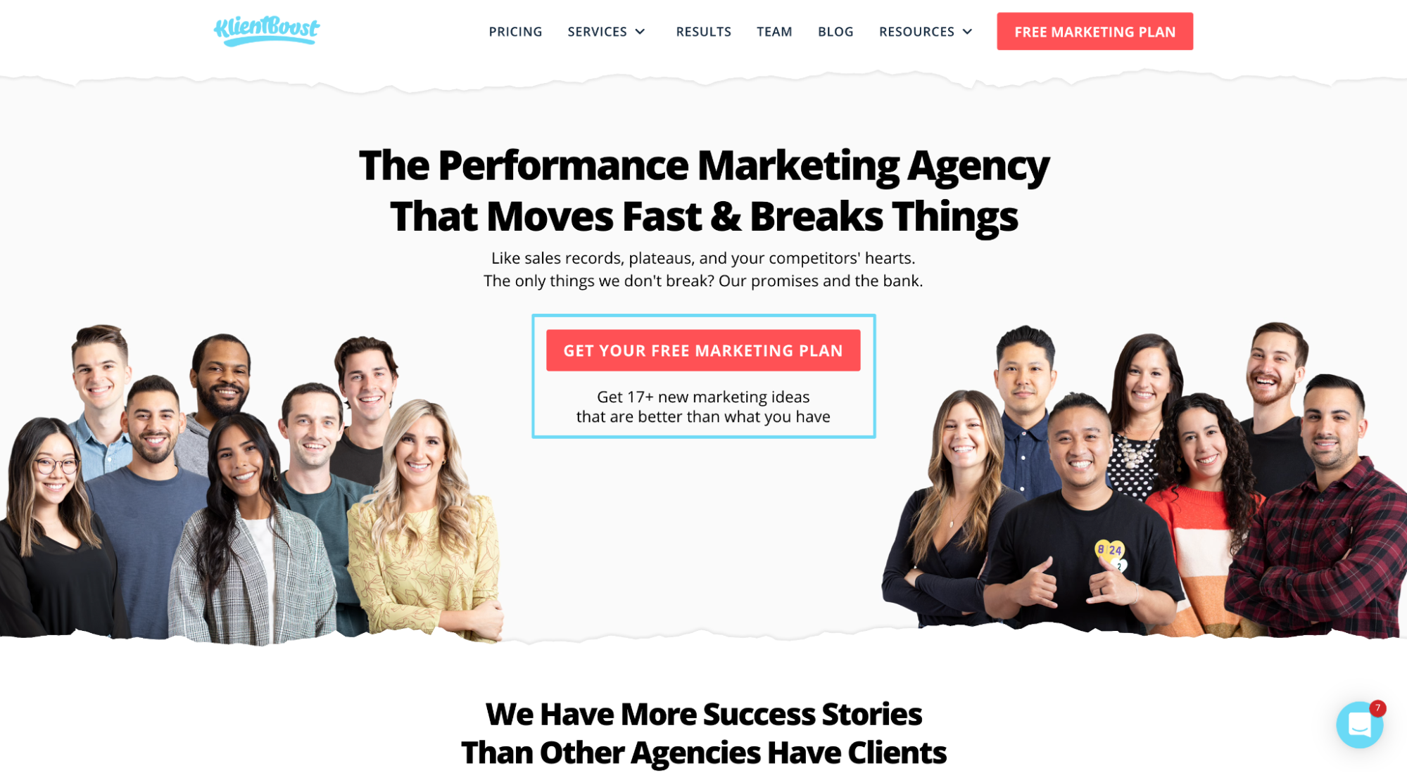
For example, notice how we (KlientBoost) added a click trigger below our digital marketing plan CTA that says, “Get 17+ new marketing ideas that are better than what you have” to handle any objections about the value of our proposal:
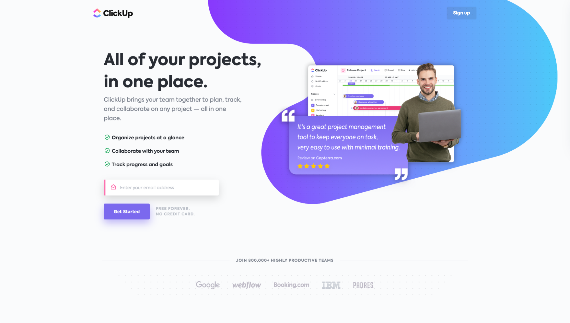
Or notice how ClickUp uses a click trigger to add “Free forever. No credit card” next to their CTA as a way to handle any objections about the price or duration of their trial.
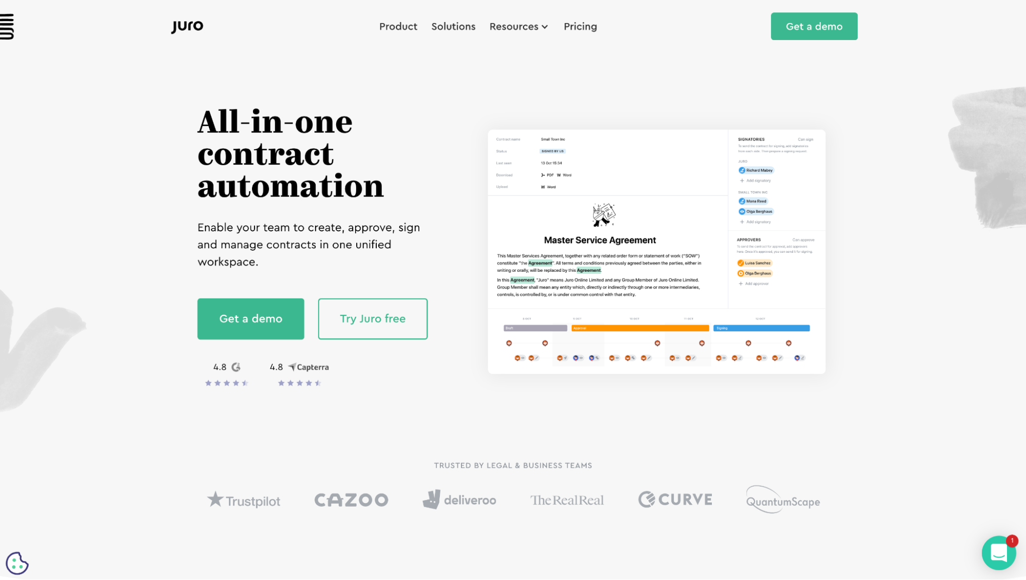
Last, notice how Juro uses social proof in the form of star ratings to handle any objections about credibility:
Note: We’re not talking about handling your product’s or service’s biggest objections; we’re talking about handling objections to your call-to-action, whether that’s to buy now, start a free trial, download a guide, or something else.
Let’s look at a few more examples:
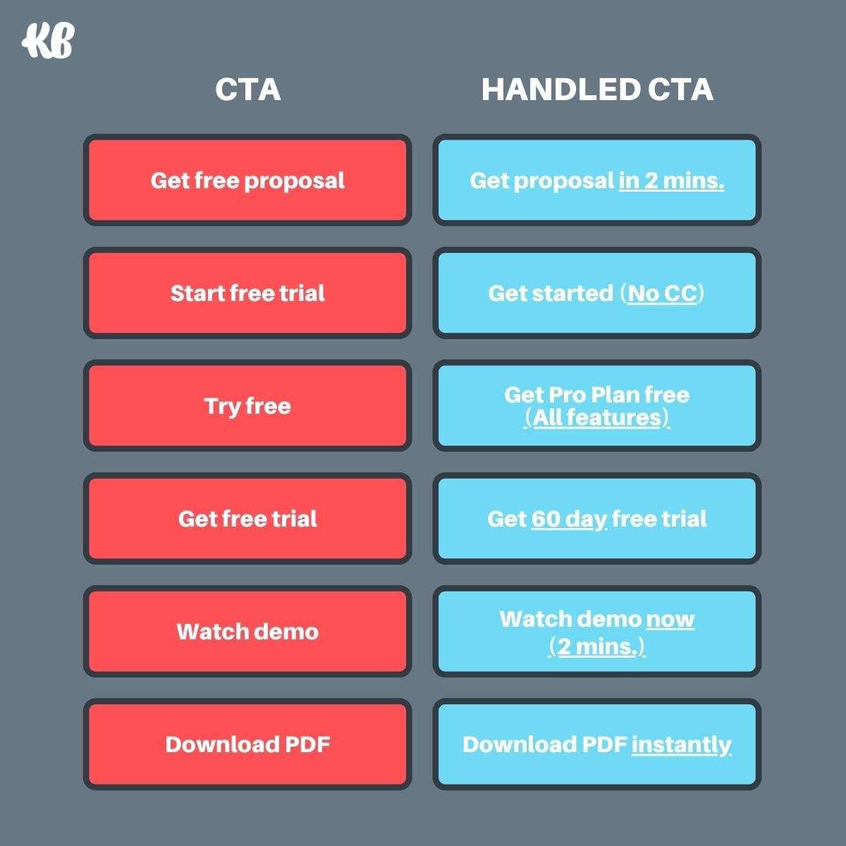
CTA: Get a free proposal.
Objection: But how long is this going to take?
Handled CTA: Get proposal in 2 minutes.
CTA: Download PDF.
Objection: Ugh, I don’t feel like checking my email for this. I want it now.
Handled CTA: Download it instantly.
CTA: Try free
Objection: But free what? I really need X, Y, and Z.
Handled CTA: Get Pro Plan free (All features)
Handled CTAs just work better.
Step 6: Test your pronouns
A pronoun is a word like I, she, her, him, it, you, they, or we that gets used in place of a noun.
For example, in the CTA “Get my free proposal,” the word “me” is the pronoun (it replaces the person’s name).
When it comes to pronouns and CTAs, you can opt for first person, second person, or third person pronouns:
- First person: Get my proposal
- Second person: Get your free proposal
- Third person: Get a free proposal
Though we always recommend testing variants, according to numerous A/B tests, first-person CTAs typically fare best:
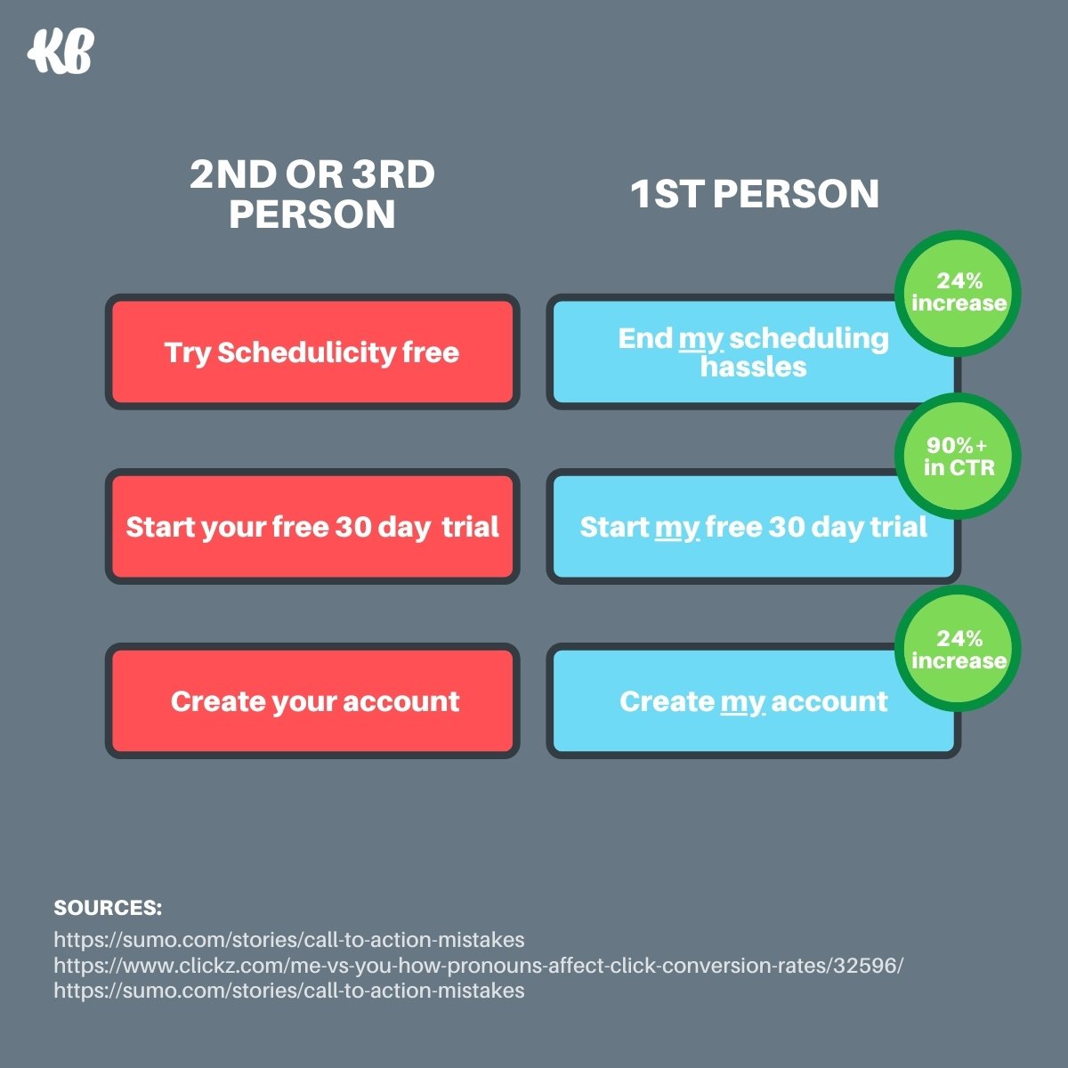
According to Michael Aagaard, who ran the test on example two above (which saw a 90% increase in CTR):
The only thing we did was to tweak one word in the copy – we changed the possessive determiner “You” to “My”. After running the test for three weeks, the treatment button copy, “Start my free 30 day trial” had increased the click through rate to the payment page by 90%.
Our hypothesis as to why first-person typically performs better?
First-person pronouns make visitors feel like the experience is personalized to them, which makes them feel in control and helps them visualize the next step.
Step 7: Keep it short
According to a recent study, the average landing page CTA is about 3.4 words long.
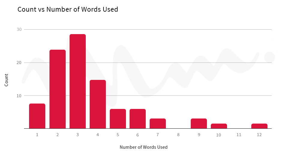
There’s no hard and fast rule about how many words to include in your CTA phrase.
CrazyEgg says that “anything that goes over ten or fifteen words is probably too long.” And HubSpot says that “no more than five [words] is ideal.”
In most cases, you won't have the pixels to write long CTAs even if you wanted to. Not without creating text that’s too small or buttons that are too big.
So best to err on the side of caution. Limit your CTAs to as few words as possible while still communicating your value, all without sacrificing legibility or design.
Your CTA should deliver a motivating nudge forward, not a novel, which typically falls between 3-6 words.
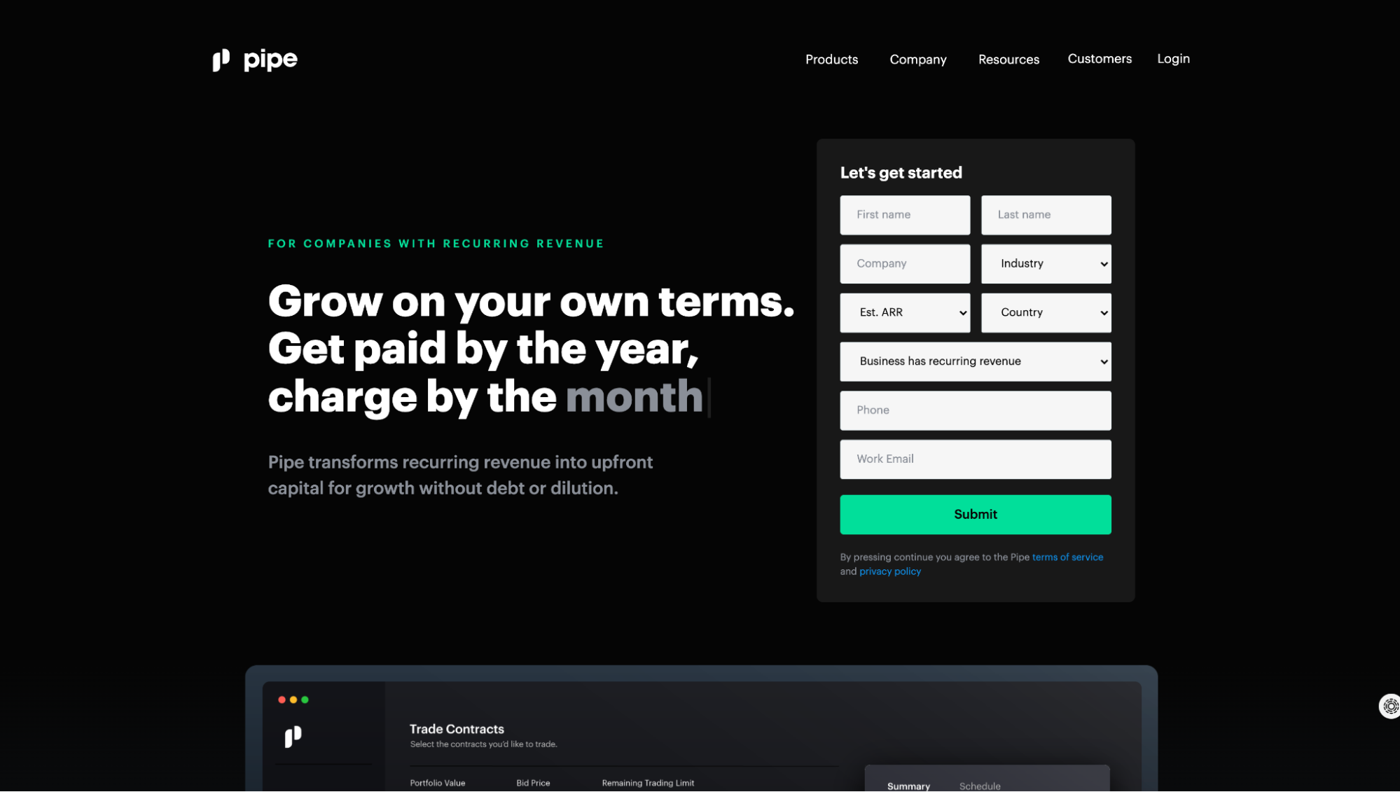
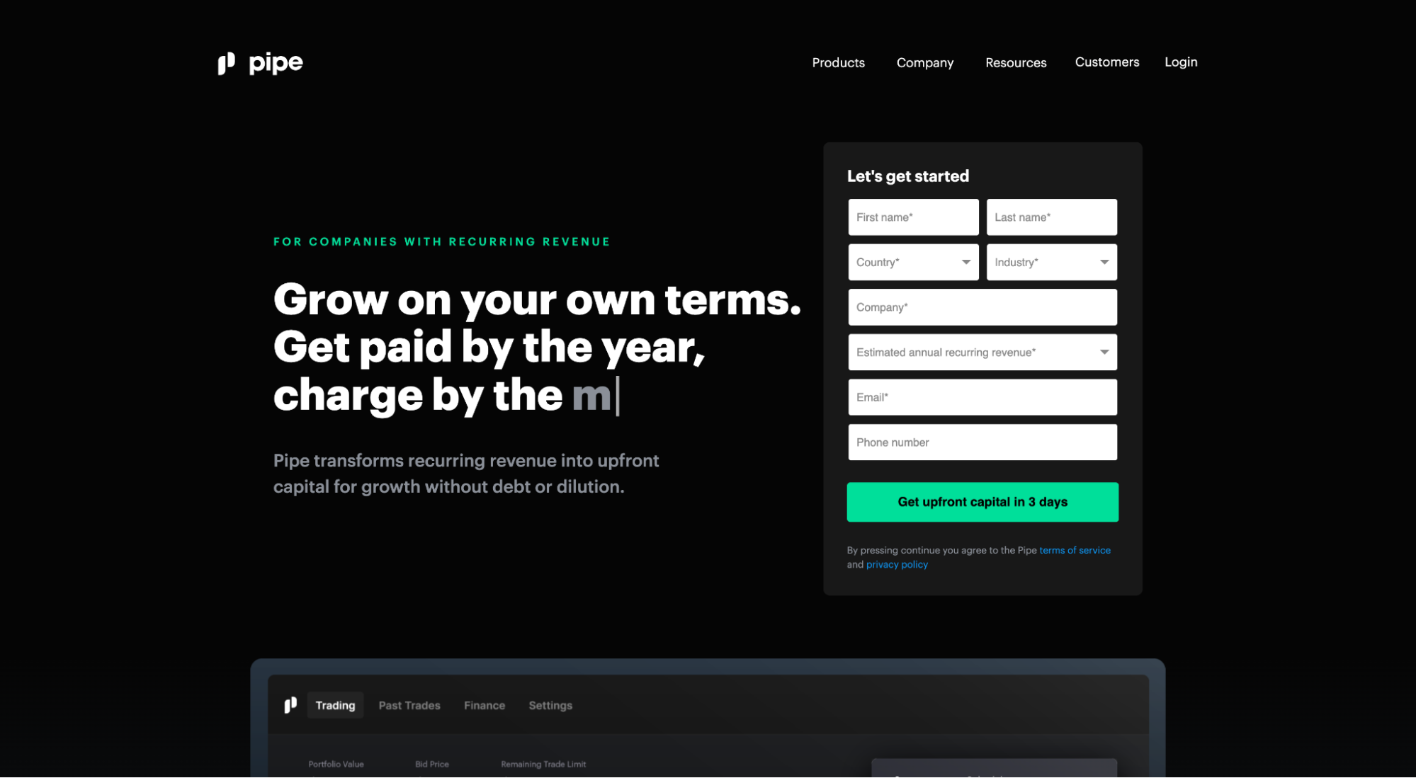
For example, Pipe’s current CTA (“submit”) is uncompelling, unmotivating, and vague. So let’s add some words to it: “Get upfront capital in 3 days.” Six words is all we need to emphasize value and motive action.
Step 8: Say it again, but different
Remember how we mentioned the best landing pages have only one conversion goal?
It’s true.
But that doesn’t mean you can’t write different versions of your CTA button copy for different sections of your landing page.
In fact, that’s exactly what you should do, especially at the bottom of your landing page.
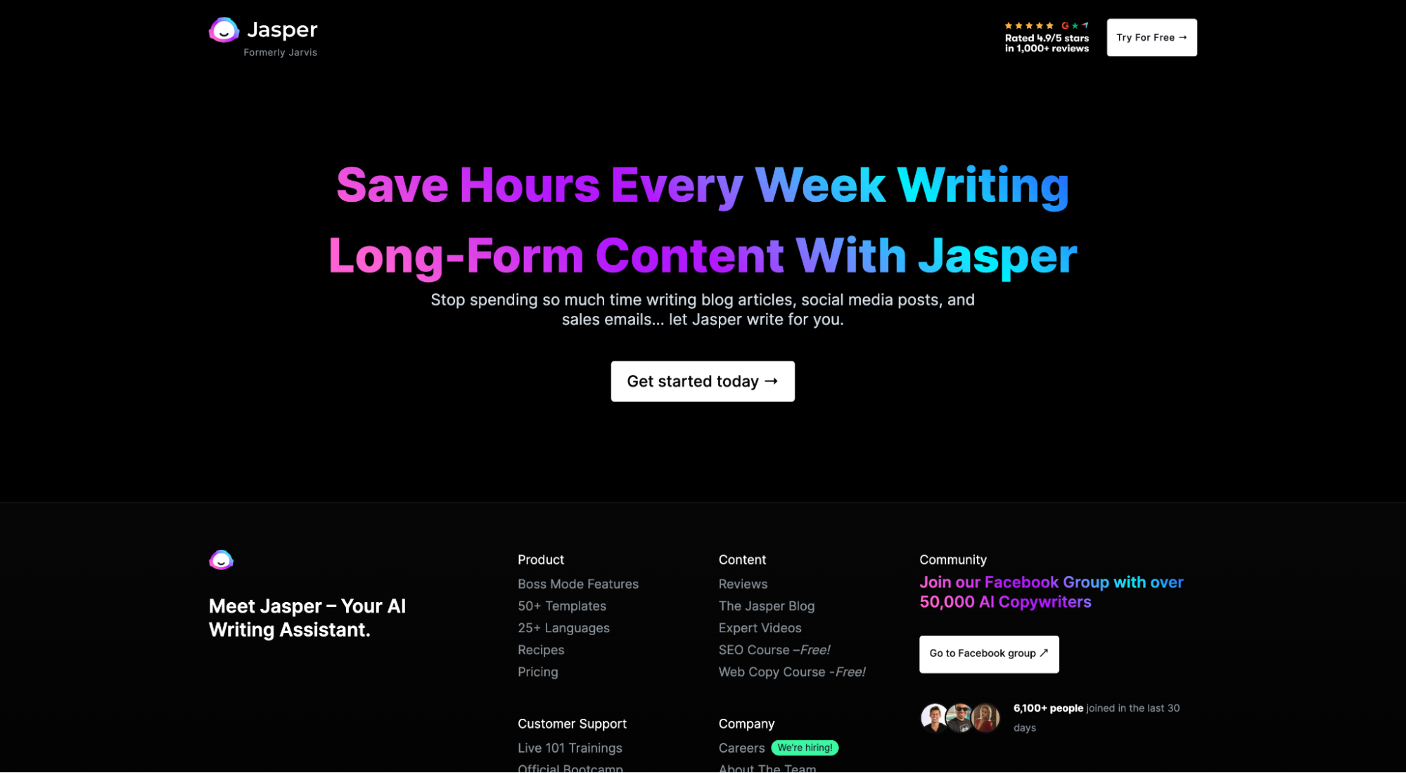
For example, remember the Jasper example from above? Compare their first CTA within the hero section (above the fold) with their final CTA near the footer of their landing page.
Above the fold: Free copy offer
Final CTA: Save time benefit
In their first CTA, Jasper emphasizes their 10,000 free words offer.
In their final CTA, they emphasize saving time with their software.
But both CTAs lead to the same offer: a free trial.
When you get a second chance, explore different but related benefits, reiterate the value of your offer, and remind potential customers why they should click.
When to leave CTA copy alone
After having said all of that, is there a time when you shouldn’t optimize CTA copy?
Yes.
Remember Jakob’s Law: People spend most of their time on other sites, which means they expect and prefer your site to function the same way.
When it comes to generic but widely adopted CTAs, don’t overthink them. Just stick with the status quo.
For example, think about transactional eCommerce CTAs like:
- Add to cart
- Checkout
- Buy now
- Save for later
- Add to wishlist
- Shop now
People look for and expect these CTAs. Any slight change could send your potential customers' cognitive load into overdrive, leading to abandoned carts or bounces.
That’s not to say you can’t get creative with CTA copy for eCommerce offers, promotions, or sales. But when it comes to rudimentary calls-to-action, stick with what your customers expect.
Closing thoughts
One thing will never change about marketing: the need to motivate specific action.
The better the CTA, the stronger the motivation, the higher the conversion rate.
When crafting compelling call-to-action copy, remember the following:
- Identify conversion intent: Align CTAs with conversion intent
- Define your conversion goal: What single promise do you want to fulfill?
- Start with a strong verb: Use specific, descriptive action-verbs that communicate receiving, not giving
- Emphasize value: Good CTAs emphasize action; great calls-to-action emphasize value
- Handle objections: Address objections to your CTA, temper last-minute anxiety
- Test your pronouns: First-person pronouns for the win
- Keep it short, seriously: Get in, get out (3-6 words)
- Say it again, but different: Reiterate the value of your offer, remind people why they should click
And now you’re ready for a little more inspiration. Get 61 genius call-to-action examples you can’t help but click.
Happy conversion optimization.
