Conversions are pretty important when it comes to digital marketing because customers are the fuel that powers the marketing machine. If prospects come in but don’t convert, you’re paying for fuel without reaching your goal markers.
In other words, your ROI cries a little bit.
Maybe you’re reaching those goals, but not as fast as you thought you would (or need to be).
So you naturally ask yourself if your conversion process is as smooth as it could be? Are potential customers coming in? At what rate do they do the thing you want them to (convert)? Is that a good rate? If you optimized the conversion process a little more, would that translate into a few more percentage points in gains?
A CRO audit figures that out.
Maybe you already know this, but you have no idea how to do it. Or maybe you’re not even clear about what CRO is.
Let’s get some clarity.
This post will teach you how to run your website and landing pages through a CRO audit to find the squeaks and add oil to 12 different gears.
Got your coveralls on?
- 12-step CRO audit overview
- 1. Recognize your need for CRO
- 2. Establish your conversion goals
- 3. Align your business goals with your marketing goals
- 4. Choose the right metrics
- 5. Hit the Design
- 6. Identify your Ideal Customer Profile (ICP)
- 7. Sort out lead gen, eCommerce, or SaaS
- 8. Message match your headers (say no to clickbait)
- 9. Optimize conversions with the Breadcrumb Technique
- 10. Improve conversions by minimizing objections
- 11. Scrutinize your offer (bounce rate and temperature)
- 12. Thank you page CRO opportunities
- CRO Audit low-hanging fruit wins
Get brand new conversion strategies straight to your inbox every week. 23,739 people already are!
12-step CRO audit overview
An audit doesn’t sound small, now does it? That’s often why the individual parts work away doin’ their own thing, but the overall machine misses its checkup.
Here’s how we analyze the machine:
- Recognize your need for CRO
- Establish specific goals
- Align business and marketing goals
- Choose the right metrics (not vanity metrics)
- Hit your page design/layout
- Identify your ideal customer
- Sort out lead gen, eComm, and SaaS
- Message match and traffic temperature
- Optimize user experience with color & design
- Improve conversions by minimizing objections
- Scrutinize the offer itself (bounce rates)
- Thank you page CRO Opportunity

1. Recognize your need for CRO
They say that “the first step to solving a problem is recognizing it exists.” Digital marketing isn’t immune to this cliché. If you’re trying to get anyone to do anything online, you could probably use some CRO.
What is a CRO audit?
Conversion Rate Optimization takes the traffic generated by your PPC and SEO efforts and increases the percentage of that traffic that converts.
A CRO audit puts a magnifying glass on a web page’s ability to do things like
- generate leads for your sales team
- increase the number of products sold on a product page
- increase the number of scheduled software demos for a SaaS company
Each CRO audit will be unique to your industry, company, goals, and pain points.
Why is a CRO audit important
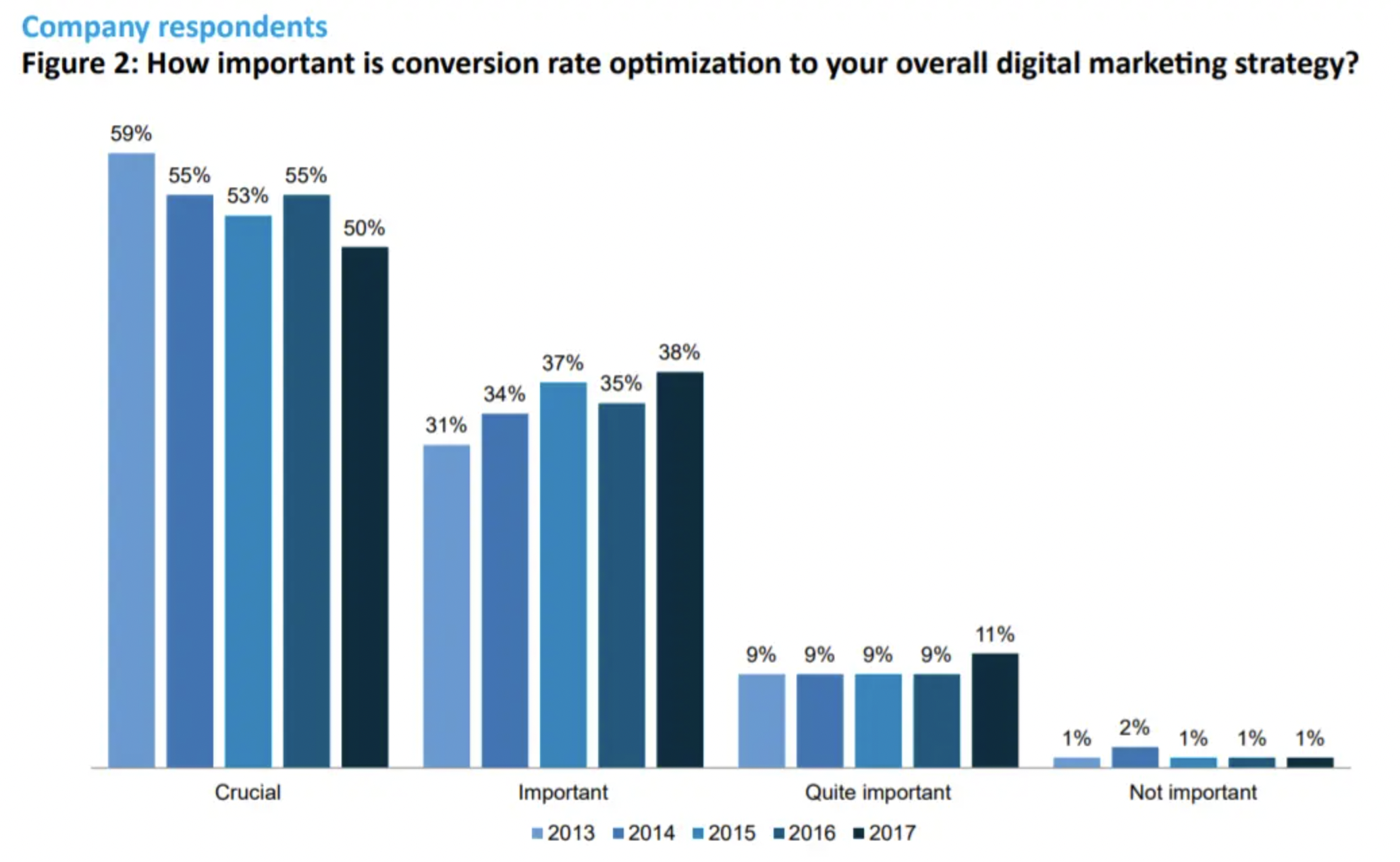
According to Search Engine Land, the average landing page conversion rate is 2.35%. If you convert two website visitors out of every 100 who land on your site, that could translate into a huge revenue boost. And that’s why CRO is crucial to over 50% of all companies.

An audit optimizes your conversion plan (and how you a/b test its accuracy) to win that 2%, which is important considering only about 22% of businesses are satisfied with their conversion rates.
That might have something to do with the fact that many different factors impact conversions and beginners might struggle with what to fix first.
Knowing what to fix points straight back to your goals.
If you don’t know what you’re optimizing toward, you’ll end up optimizing your campaigns and pages for clicks instead of conversions, and your ad spend will shoot through the roof without improving your conversion rate 😭
2. Establish your conversion goals
Imagine you’re the captain of a pirate ship, plundering the seas for treasure and fame. That goal has direction. You wouldn’t aimlessly sail the seven seas hoping to find some gold 🤞. You’d need a map.
The same goes in business. What’s your map?
Set clear, specific business goals to guide your CRO journey and make future optimization/budget priorities and decisions easier down the line.
Do you want to grow brand awareness or generate more sales? Those metrics are different, and the KPIs (key performance indicators) you track will be different.
Blog subscribers might be one of your brand awareness KPIs, even though that metric doesn’t grow revenue directly. If you’re looking to increase ROAS (return on ad spend) and ROI, you might be better off tracking sales-qualified leads (SQLs).
The distinction matters. Identifying your business goals early keeps you focused on conversion goals later.
3. Align your business goals with your marketing goals
Too often, clients join a new agency and find that they’ve been tracking metrics and prioritizing goals that have nothing to do with their business growth. 🤯
They weren’t wasting their time and money altogether, but chasing leads up blind alleys and down dead ends does tend to burn up a budget.
I used the pirate ship metaphor in the last section, so let’s keep that going:
Imagine if, on your pirate ship, you were trying to navigate with a torn map. The few words on the map were in a language you didn’t recognize.
Even if you figure things out eventually, you’d have some trouble staying on course. And you’d waste time and resources trying to course-correct.
The same goes for your business and marketing goals—they should feed into each other as directly as possible. The more accurately you correlate your marketing actions to quantifiable value, the more confident you’ll be implementing each conversion optimization you decide to test.
4. Choose the right metrics
Steer clear of vanity metrics.
Vanity metrics distract PPC marketers because they are easy to inflate or improve. But they don’t grow the value of any specific page or campaign. Chasing these metrics can cost you money instead of making you money.
The classic example of a PPC vanity metric is traffic volume. Beginner-level PPC marketers may think that an easy way to increase their lead volume is to increase their traffic volume. After all, more target audience traffic means more conversions—right?
Nope.
Well, not entirely wrong. But it’s not that simple; there’s an entire CRO universe that comes into play after traffic lands on a page before a conversion is won.
The only for-sure thing you know about getting more traffic is that you’re spending money to get those clicks.
If your conversion rate isn’t the same as, or higher than, your click-through rate (CTR), you’ll burn through your budget before you see any legitimate increase in value.
Just like you’ve aligned your business and marketing goals, choosing to prioritize and track the right metrics can make or break your campaign’s success.
And, if you’re a conversion designer or account manager, you’ll also need to prioritize which of these metrics to improve first.
Talk with your client: certain optimization opportunities will have to go on the back burner while other urgent matters get attention.
5. Hit the Design
Your landing page design is more than colors and fonts. There’s psychology behind it. And math. And technical stuff.
Depending on the aggressiveness of your offer (according to PPC temperature and threat level), the design is a tool to set the right tone/mood for your page with imagery, whitespace, and color theory.
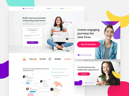
A strong landing page layout guides users through the content quickly and clearly. They’ll know right away the value of converting because they can skim it above the fold (the top of your landing page).
Too much information scares site visitors away, so resist the urge to stuff the space you have with every possible detail a user might want.
Highlight the value in the H1 (header), qualify the value in the H2 (subheadline), and make the conversion CTA (call-to-action) specific.
Anything more than that asks too much of the user. They should consume a singular piece of information on a page—easily. Ask them for more than that, and they’ll bounce.
How you present the message is just as important as the message itself.
Also take a look at some technical issues under that design:
- page load speed time
- image quality
- dysfunctional animations
- broken links
- broken forms
These technical issues may seem tedious, but they can be seriously detrimental to your landing page’s performance, especially in the modern digital marketing world where you only have seconds to grab and hold the user’s attention.
6. Identify your Ideal Customer Profile (ICP)
Let’s be clear on this; when I say Ideal Customer Profile, I mean customer—singular.
The more specific your ICP, the better you can customize your content, offers, and landing page copy to create a unique and memorable experience for that specific user.
Much like your business and marketing goals, your ICP will be a guiding light for your optimization process and CRO decisions. Some changes engage or incentivize your ICP, while others broaden the range of your ICP (or target an entirely new demographic).
As you make changes and run tests, always ask this: “What will my end users think of this?”
7. Sort out lead gen, eCommerce, or SaaS
Before you start on your CRO audit, clarify which type of landing page you want to optimize.
Landing pages usually fall into one of three categories:
- lead generation
- eCommerce sites
- SaaS
Each comes with its own idiosyncrasies.
For example, eCommerce sites target a different conversion funnel stage and involve a checkout process and things like abandoned shopping cart email marketing. Lead generation pages don’t have all of that.
The differences between these three types of landing pages justify mentioning it here as a starting point 🙂 .
8. Message match your headers (say no to clickbait)
As you comb through your page, the first thing to check in your CRO audit is that your ad message matches your landing page message.
Here’s why: you create ads with irresistible, must-click headlines, but all those clicks don’t increase user time on page—or determine conversions. As we mentioned above, your ad spend might increase without a corresponding increase in revenue.
And that hurts.
In contrast, when a (qualified) user clicks on your ad, they expect a few things:
For starters, they expect a good user experience that continues what started with your ad. Whether this is finding a free downloadable asset, watching a video, purchasing a product, or scheduling a call with your sales reps, that message from your ad must match the message on your landing page.
This is what we call “user intent.”
Make the ad-to-page message match right up front in the ad’s headline and the associated landing page.

The ideal user experience should be streamlined from the initial ad through the landing page conversion.
9. Optimize conversions with the Breadcrumb Technique
When it comes to landing page CRO, our Breadcrumb Technique is one of the best ingredients of KlientBoost branded strategies.
A surprising amount of bounce rate and landing page conversion problems stem from the conversion form itself.
This is because the landing page form creates too much friction for users to opt-in. There has to be an equal ratio of landing page friction to landing page benefits for the user to feel comfortable converting.
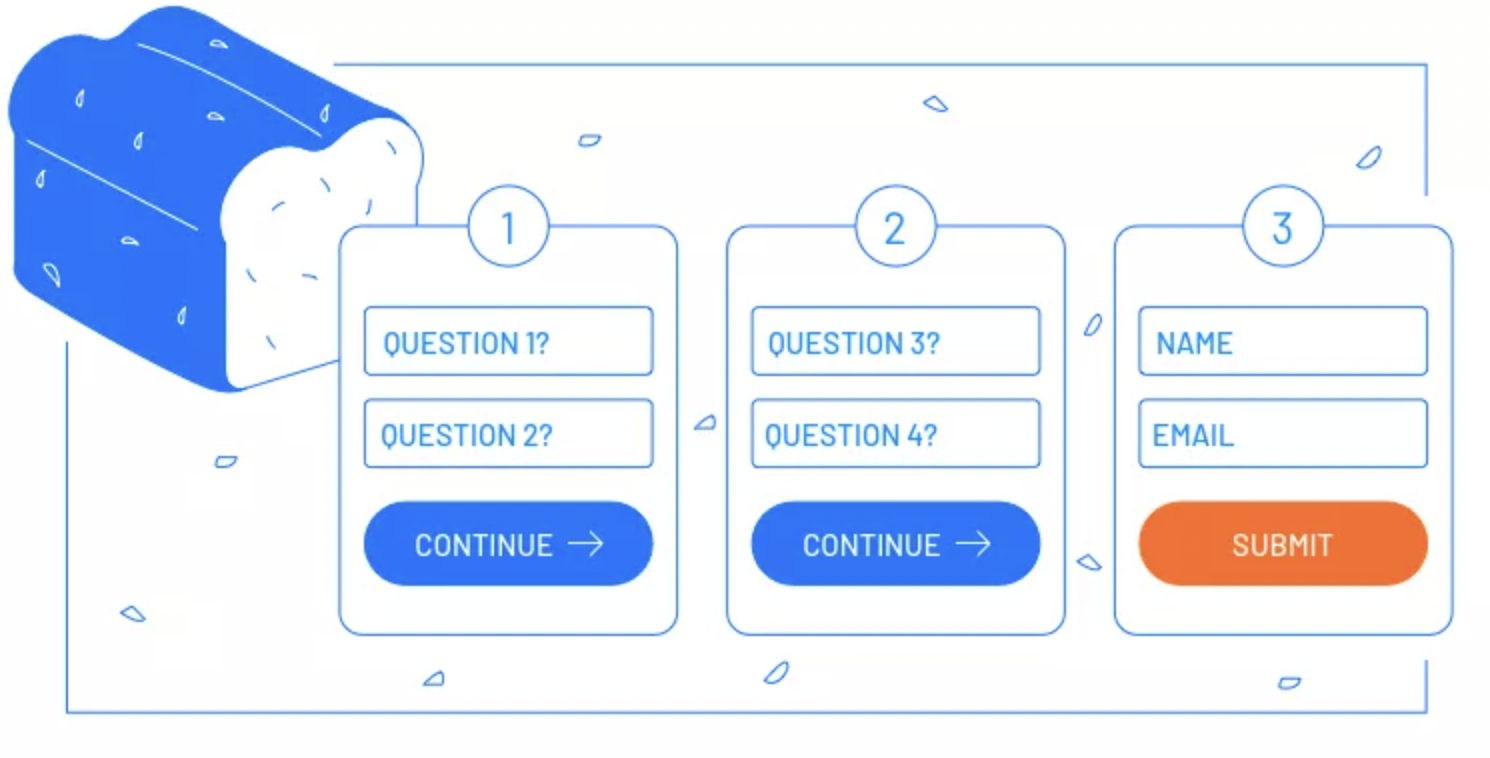
This is where form brilliance comes into play: the Breadcrumb Technique. It’s based on a psychological persuasion tenet called the “yes ladder.”
By mastering some basic user behavior psychology, we figured out that users are more likely to convert on multi-step forms when the first step of that form includes no significant threat (like asking for contact information).
By moving the conversion action to the second or third step of the form, the users are more likely to finish the process they already started.

Use the Breadcrumb Technique in your own forms to see if the conversion rate improves. If so, providing more value upfront to get your foot in the door should make the final conversion easier in the long run.
10. Improve conversions by minimizing objections
If you want someone to understand the value of your product or service, it’s on you to educate that user (and that’s exactly the purpose of a great landing page 😉).
It’s also on you to communicate how that value has helped others just like them—testimonials and referrals put their minds at ease.
You only get one chance to make a great first impression.
This is where overcoming common user objections becomes essential, which is why answers to frequently asked questions, social proof like reviews and ratings, and pricing/delivery options are vital on your landing page.
Here’s the best place to put that social proof on your landing page.
11. Scrutinize your offer (bounce rate and temperature)
If you haven’t seen a bump in conversions after running your site through an aggressive CRO audit, it might be time to consider a more troubling scenario:
It could be that the users who click your ad simply aren’t interested in your landing page offer at all.
This type of misalignment is rare, but it does happen. It’s flagged by abnormally high bounce rates, as users will click through your ad, land on your page, and immediately click away.
If this is the case, lower the intensity of your offer to match the temperature of your incoming traffic.
Consider this: Someone who clicks on a retargeting display ad has already engaged with your ads and expressed interest in buying your product. This click can be considered high conversion intent, or hot traffic.
But someone who clicks a preliminary-level ad about the potential benefits of hiring a PPC agency (colder traffic) isn’t going to want to sign up for a six-month contract right off the bat. If you offer that on your landing page, you’ll likely scare those users away.
Align your traffic and landing page offer according to temperature, and you should see an increase in conversion rates.
12. Thank you page CRO opportunities
Hooray. You’ve run your landing page through the wringer. That’s what an audit is all about.
But you’re not done with your CRO audit because when your user converts, the customer journey isn’t over.
Your thank you page is a golden opportunity to up-sell new products and remarket other offers that have failed to convert in the past.
Complacency has no place in the realm of CRO. The best CRO auditors will always look around the corner for their next big money-making opportunity.
CRO Audit low-hanging fruit wins
There you have it 👆, a concise 12-point guide to performing a conversion rate optimization audit to increase conversions.
Make sure you stay true to the goals that you set at the start of your audit. Remember that, when it comes to CRO, you’re working to impress real live humans on the other end of your landing page (not a bot like it is with search engine optimization).
Follow these guidelines to prioritize what changes will generate the biggest conversion rate bumps with the least effort over the CRO process. Those low-hanging fruits will grow your online marketing ROI the fastest.
The sooner you start to see returns, the sooner you can double down on your wins and move on to bigger CRO opportunities and refinements… like CRO copywriting genius that nails your value proposition.
👆 That’s next.
