


Updated March 2025
In 1911, the Syracuse Advertising Men’s Club held a banquet to discuss journalism and publicity. One of its members (Arthur Brisbane) was quoted in the paper saying, “Use a picture. It’s worth a thousand words.”
Fast forward 100+ years and Arthur’s proverbial words still ring true—especially when it comes to landing pages.
Enter: the landing page hero shot.
If your headline and subheading communicate your value proposition, your landing page hero shot brings it to life in a way only an image can.
Get it wrong, and watch your conversion rates plummet.
In the name of getting it right, we’re going to make Arthur proud by exploring the different types of hero images, the steps required to create your own, and examples of good, bad, and bogus ones.
Let’s go.
Get brand new landing page strategies straight to your inbox every week. 23,739 people already are!
What is a landing page hero shot?
The landing page hero shot is the image or video that communicates the value of your offer at the top of the page. It’s the first image your visitors see when they land there.
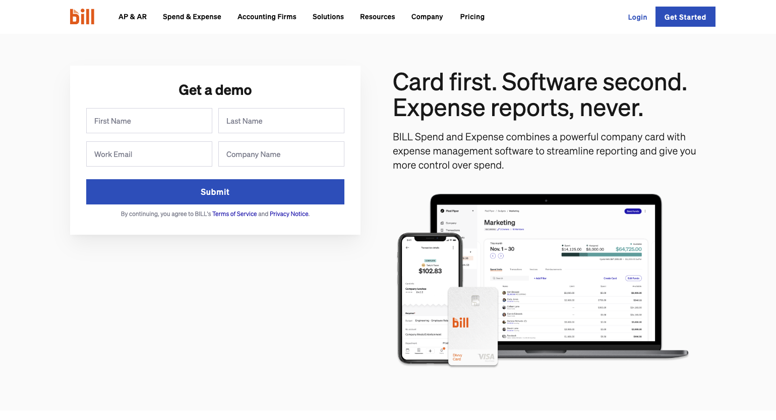
Bill's hero image is an example of its sleek dashboard and a simple transaction UI, both of which add context to their headline:
Card first. Software second. Expense reports, never.
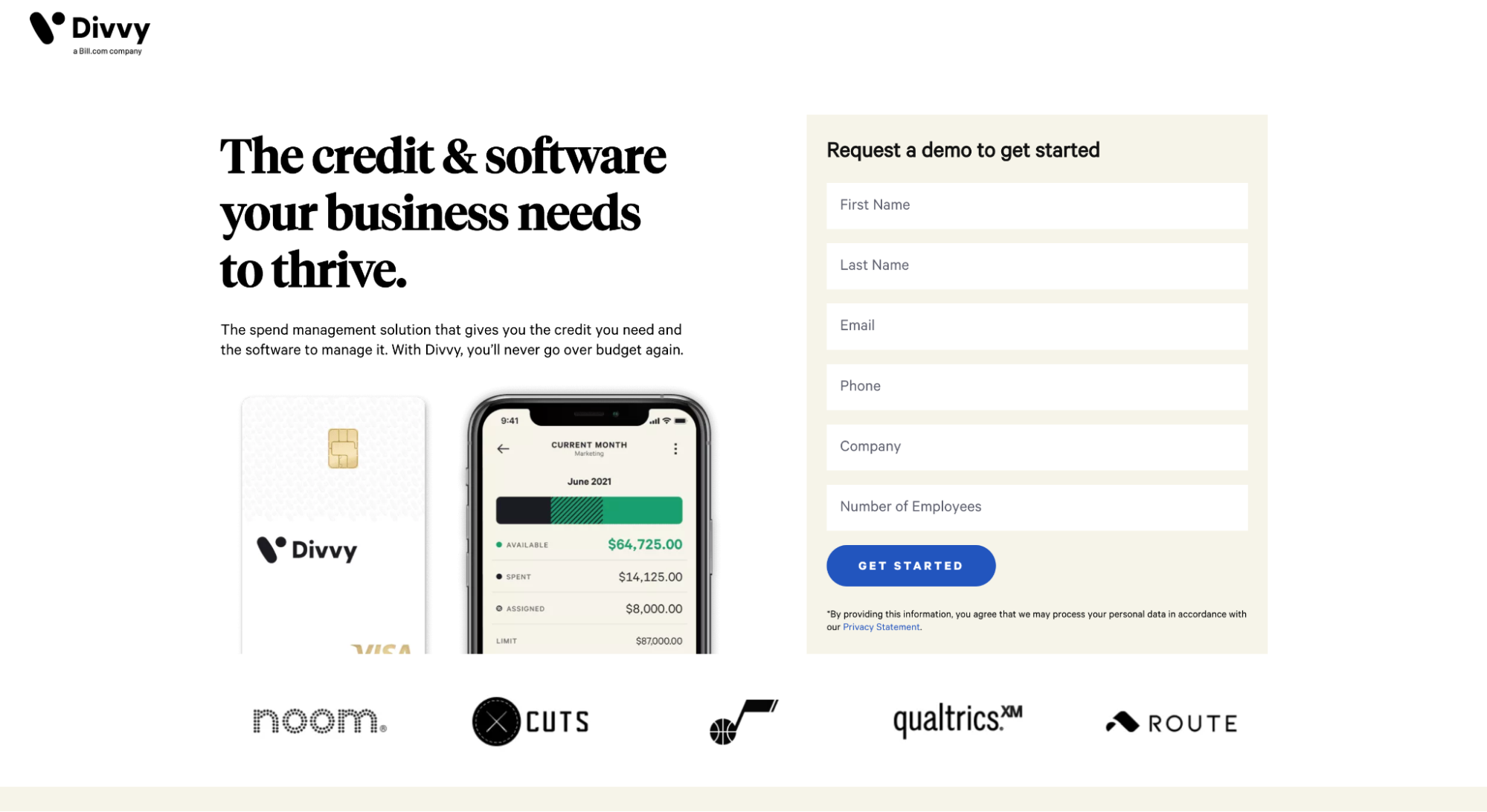
In this example, notice how Divvy’s hero image features a credit card and a mobile app, both of which add context to their headline that states: “The credit & software your business needs to thrive.”
Does a hero image create a sale?
Not by itself.
But when it’s put together with your headline, subheading, offer, and call-to-action (CTA), your hero shot provides the context, emotion, and clarity that pushes visitors across the finish line by visually showing the customer the transformation.
Up close and personal.
Talk about a first impression.
Hero shot vs. hero section
The hero shot is one part of the hero section. Usually, half of it.
The hero section of your landing page is above the fold—the part of your web page that loads on the visible screen and makes a first impression before the scroll.
Your hero section includes your
- CTA (at a minimum)
- Hero shot
- Headline
- Subheading
Types of landing page hero images
Illustration, animated, custom photography, a video, or some other style, landing page hero shots fit into five main categories:
- Product-focused
- Metaphor
- Promised land
- Process-focused
- Abstract
1. Product-focused hero shots
Product-focused landing pages spotlight the product in action through a compelling product image. Surprise, surprise.
For a new or complicated product, a product-focused hero shot makes your offer clear by turning abstract into concrete.
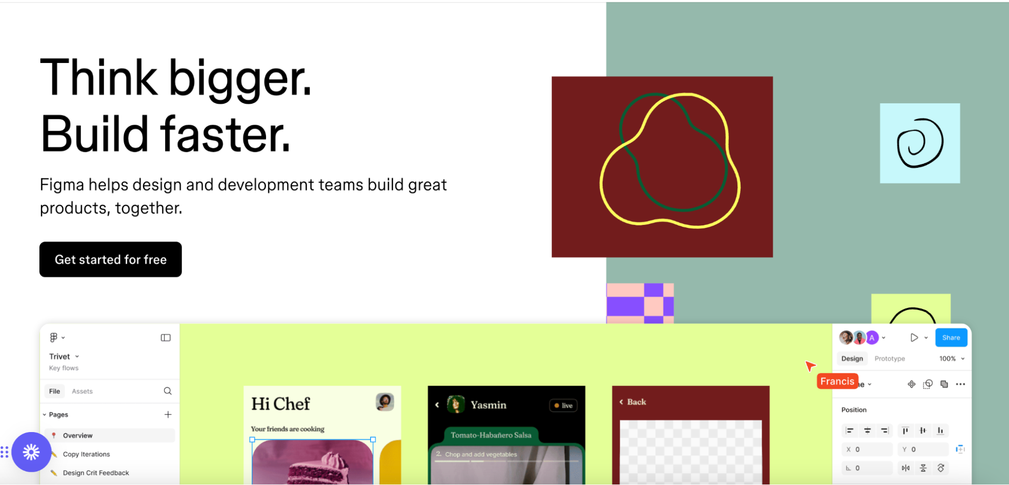
For example, Figma’s hero shot features their visual editor interface using animations, a true-to-life mouse cursor like you’d see in-app—albeit they’re cheekily hiding it halfway down the fold.
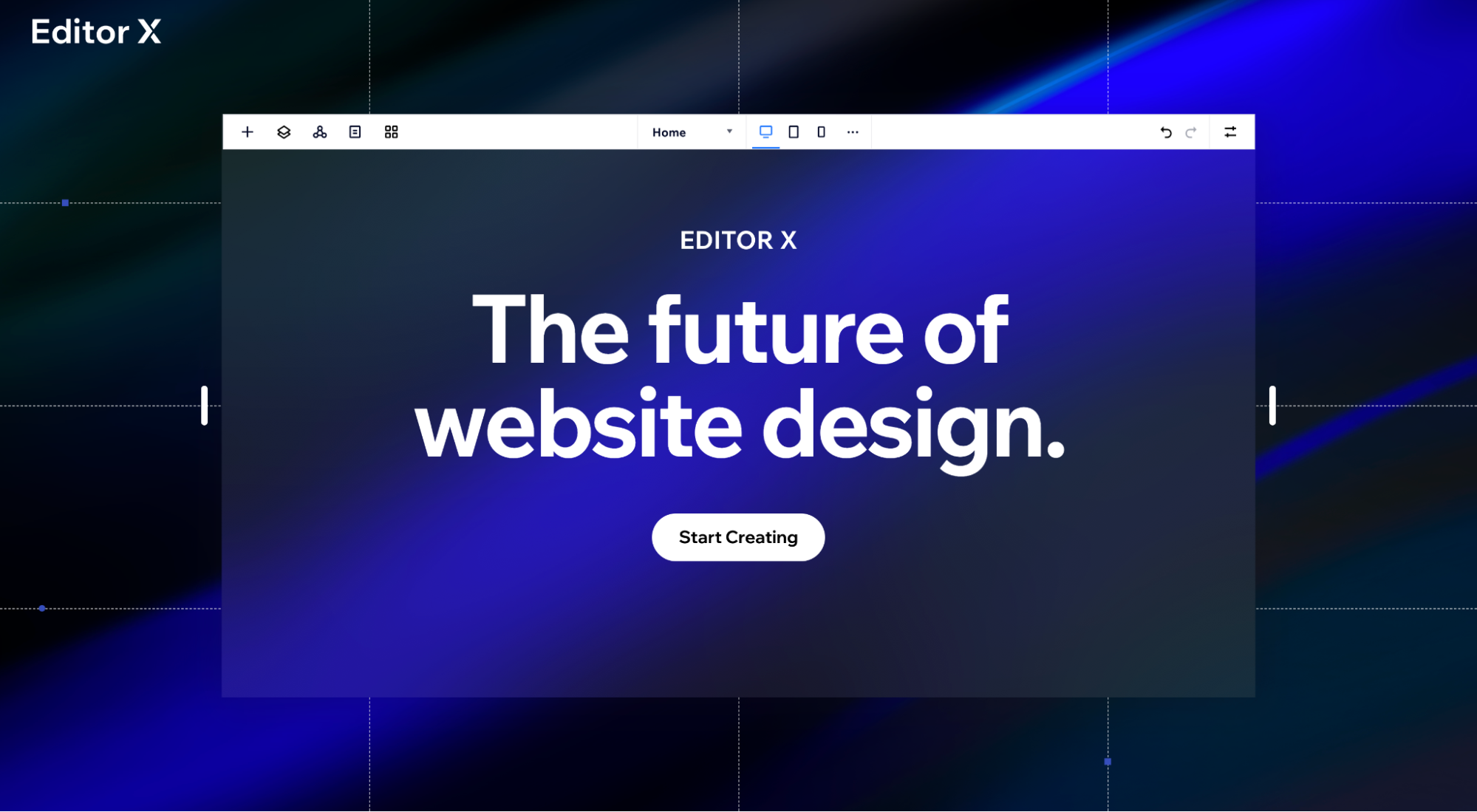
Editor X shows off their visual editor interface in the hero shot, too:
2. Metaphoric landing page hero shots
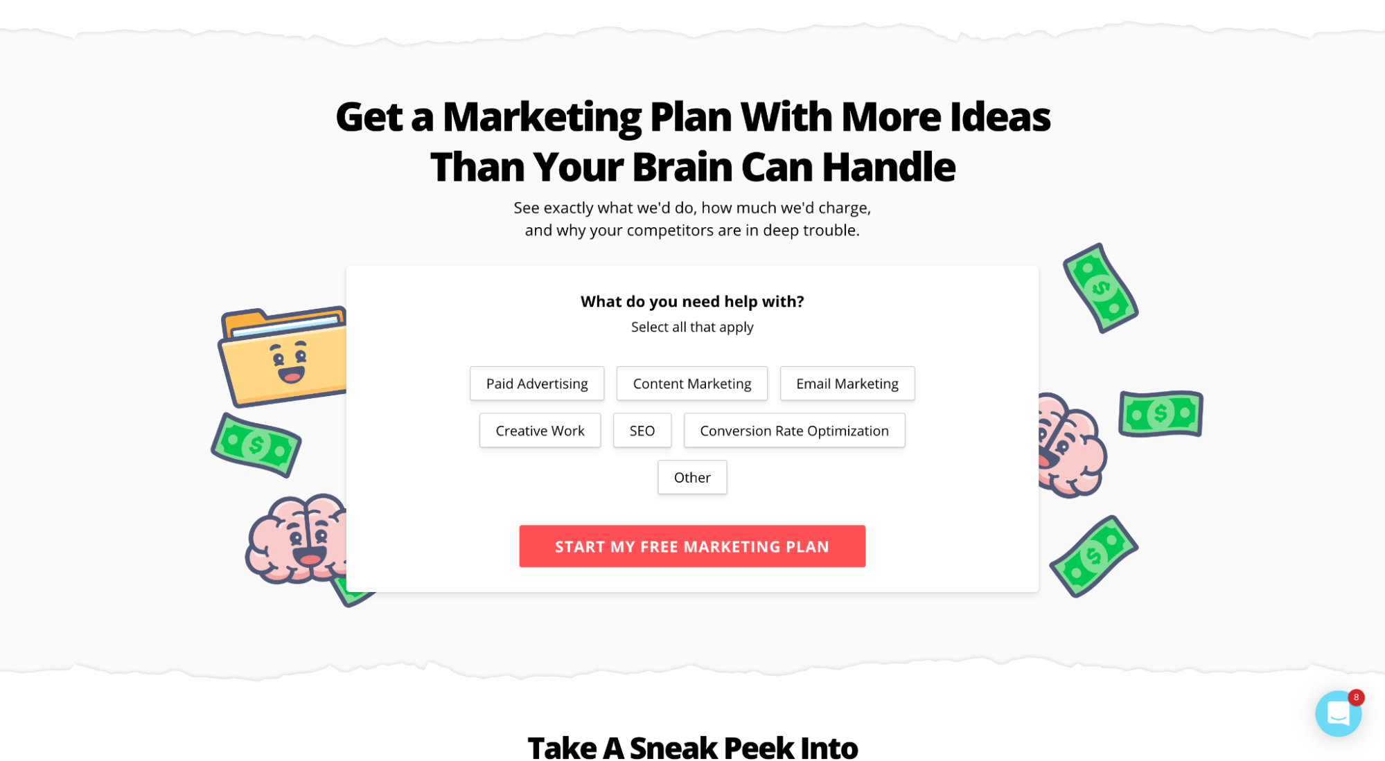
Metaphoric hero shots use images that represent or symbolize the value of the offer, just not in a literal sense. For example, the hero shot on our free marketing plan landing page features our brand emojis in the form of dollar bills and smiling brains:
3. “Promised land” landing page hero shot
Promised land hero shots show the desired outcome of using your product or service, either by spotlighting a successful customer or a desirable future state.
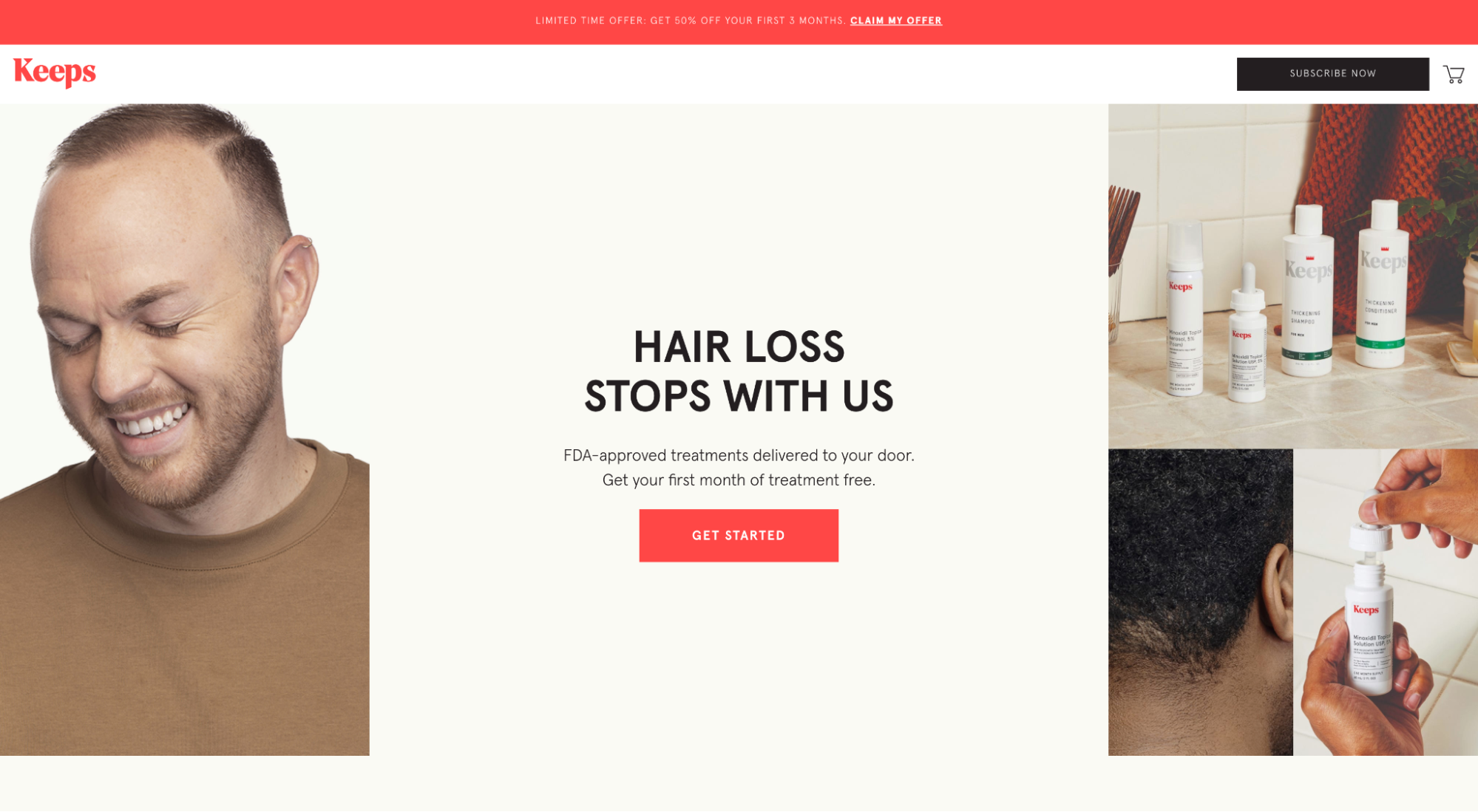
For example, Keeps subscription hair loss medicine showcases a satisfied and smiling customer, presumably after using their hair loss medicine:
4. Process-focused landing page hero shot
If not a product in the hero, a company likely has their service or software there. The hero shot helps you visualize the valuable process. This is a strong hero shot if you tie it to the brand story elements in your landing page design.
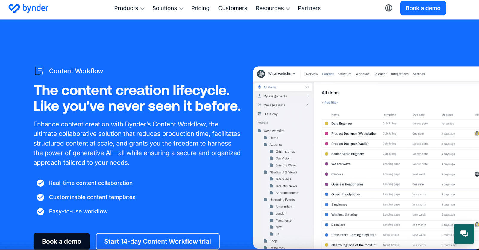
For example, Bynder uses a custom graphic to illustrate the content management process in Bynder’s UI. It shows the organizational steps you’d take as a user to get the most beautiful transformation ever: A fully built-out and optimized content calendar.
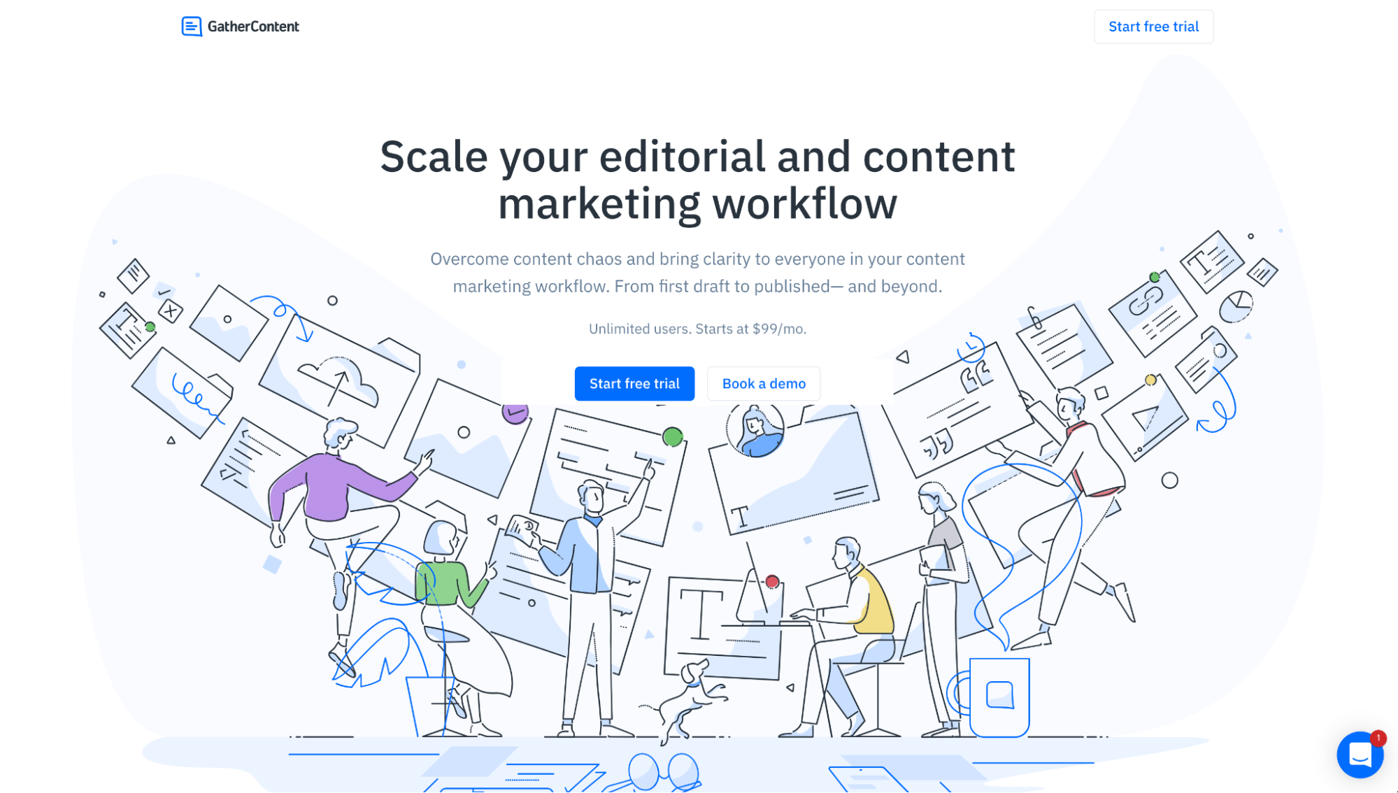
GatherContent uses a custom graphic to illustrate its software’s content management process:
5. Abstract landing page hero shot
Ah yes, our least favorite hero shot: abstract hero images (or hero images composed of visual elements like shapes or patterns).
Why are they our least favorite?
Because they just fill space. Not much else. Your target audience might love graphic art—or not—but colorful abstractions are in the same room as stock photos. They’re meh. That space is CRAZY important.
Don’t put twirly whirls in your money shot.
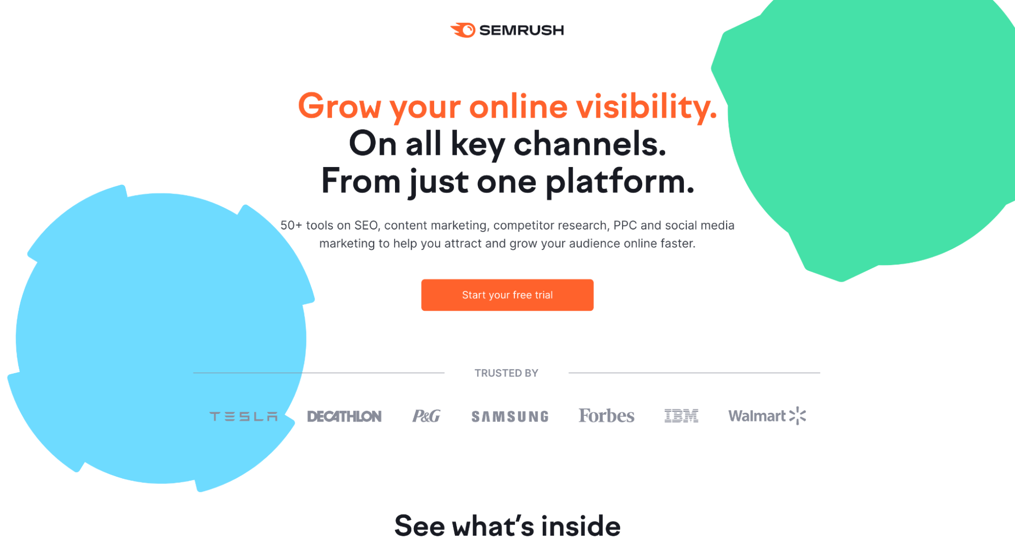
For example, Semrush sports two abstract shapes as the hero shot—a missed opportunity. They shove their gold under the fold, putting the illustrative dashboard (what Semrush feels like) under the dualling artsy cogwheels that tell us diddly squat.
How to create a landing page hero shot and increase conversions
A high-quality hero shot doesn’t fill space; it adds context, communicates relevance, evokes emotion, and enriches the user experience—all of which translates to higher conversion rates for you.
Put great body copy with your killer hero shot to support the visual. Visuals + copy guide your customers to a place of brand awareness and conversion in the funnel, using a combination of intangible brand factors like
- concreteness
- relevance
- context
- emotion
- customization
- alignment
Let’s explore each.
1. Prioritize clarity and concreteness
Abstract hero shots do two things well:
- Absolutely nothing
- Increase the viewer’s cognitive load (the time visitors take to “get” your offer).
That's it. And it’s even worse if it’s animated. Don’t ask us why (ask Willy Wonka).
High-quality landing page hero shots should show your product, service, desired outcome, or value proposition in action, in the real world, or as close to reality as possible—a la photography. Simple. Sleek. Universally appealing.
Don't make your visitors think too hard.
Avoid art for the sake of art. And keep your visuals concrete.
For example, Zenni uses their hero image to illustrate the products included in their latest collection for the year.

Simple and effective. Background colors on-brand. You seriously can’t go wrong with this type of approach.
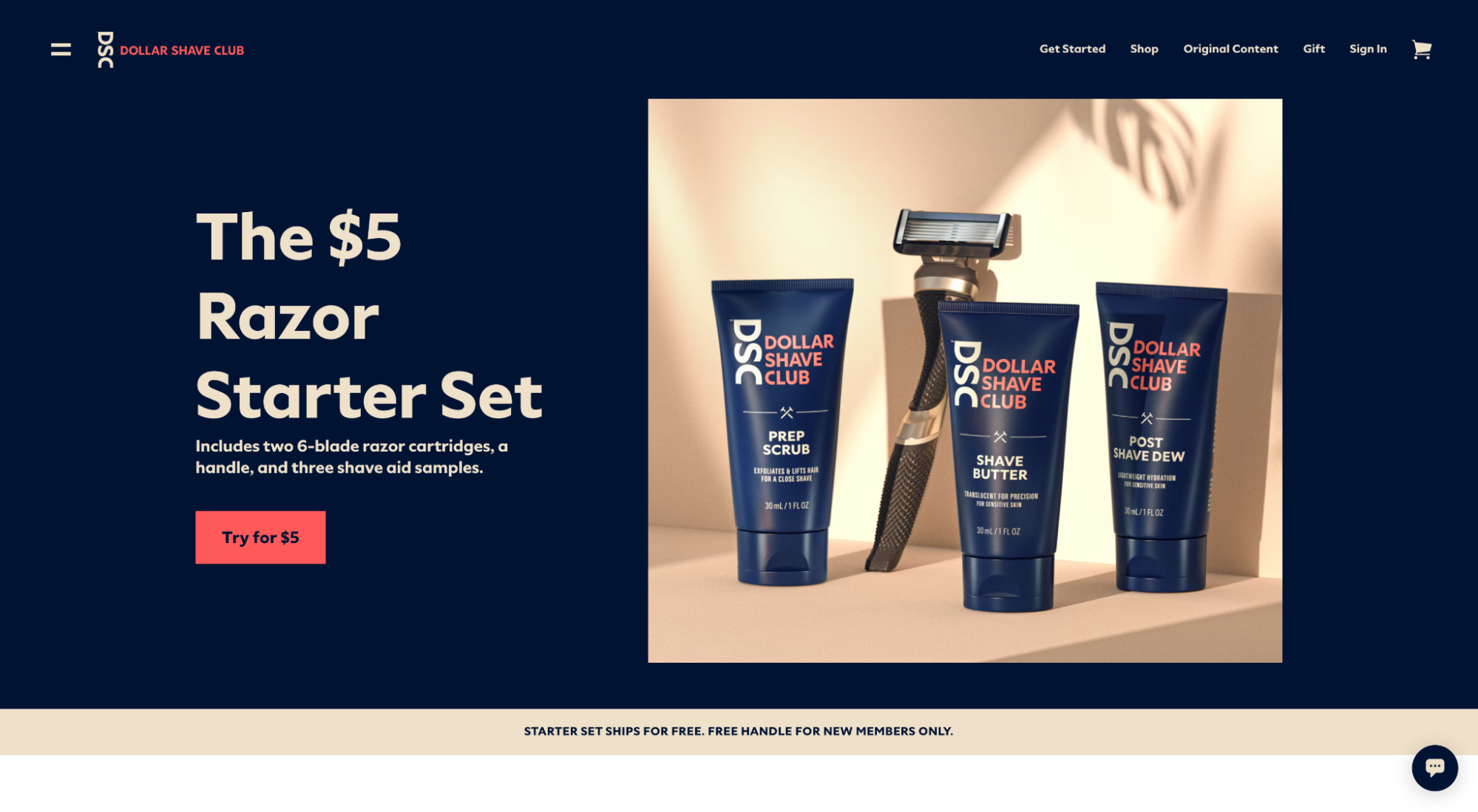
Dollar Shave Club uses their hero image to illustrate the products included in their $5 Razor Starter Set. Super clear.
2. Make it relevant for some, irrelevant for others
A high-quality landing page hero shot should resonate immediately with your target audience while simultaneously signaling “This is not for me” to anyone else.
You heard us right. User exclusivity is good here. We want to capture high-intent users that’ll convert, and those are your ideal audience members.
Your visitors make split-second decisions mainly influenced by their unconscious minds. If your hero shot doesn't immediately bring clarity to who it's for and who it's not for, try again.
That also means matching your landing page hero shot with the messaging and creative that sent people there (i.e., message match).
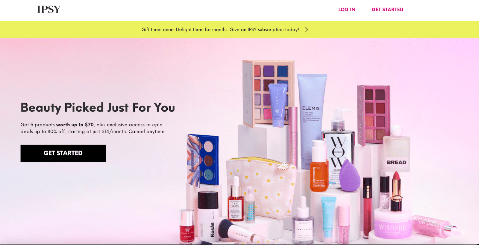
For example, when you look at IPSY’s Beauty Box hero shot, is there any question that it's for people specifically interested in beauty?
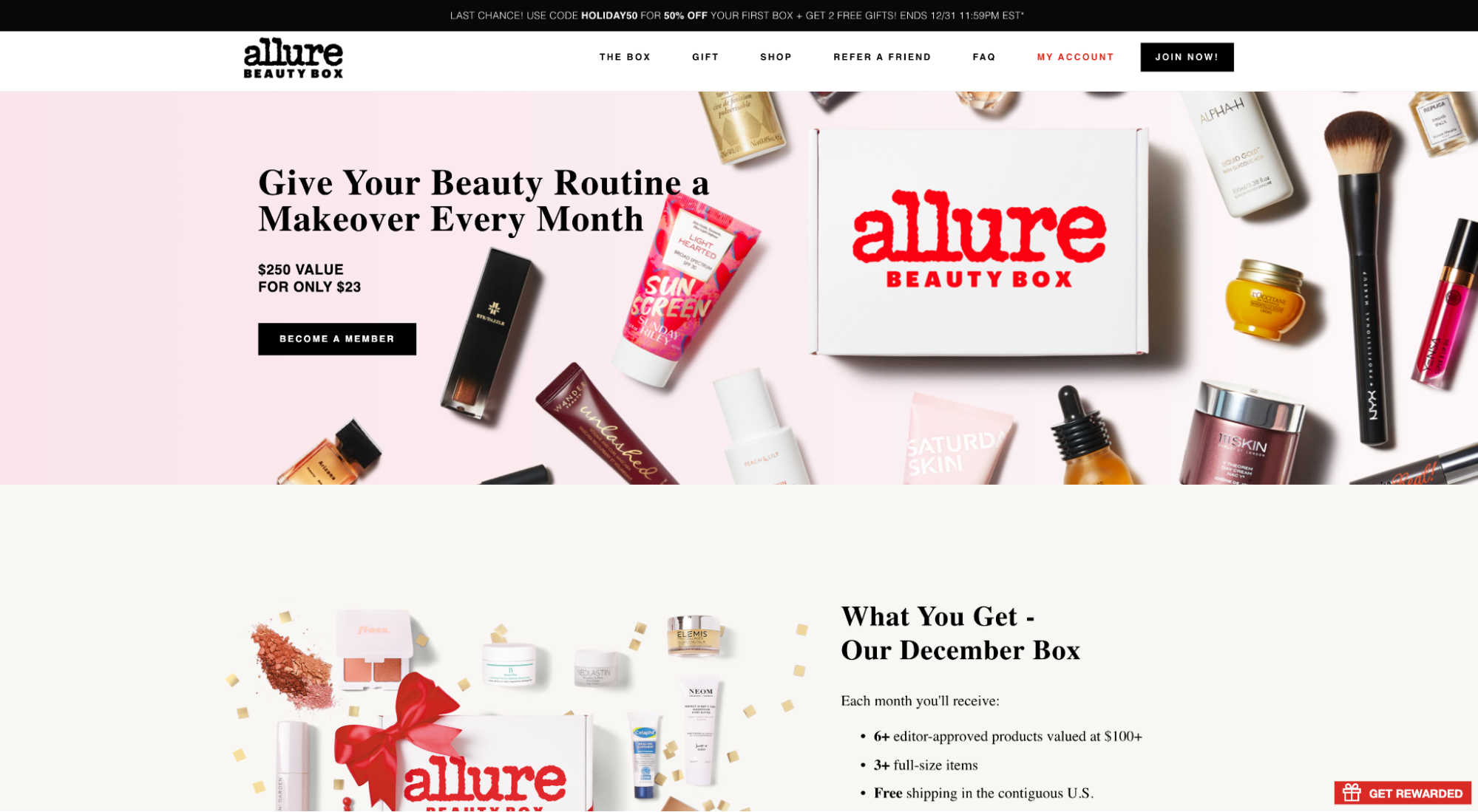
When you look at Allure’s Beauty Box hero shot, is there any question that it’s for people specifically interested in beauty?
3. Use it to add context
Your landing page hero shot lives to support your headline and subheading. Period.
Better yet, think of it as the visual representation of your value proposition.
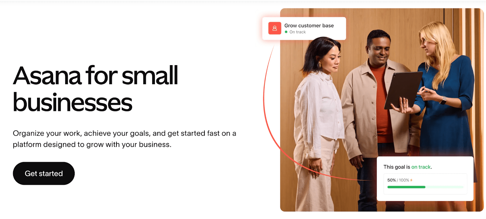
That means your hero shot needs to bring to life the promise you make in your headline, not some promise you make elsewhere on the page. For example, Asana subtly nods to the ideal user transformation in its body copy while using imagery to show physical proof of on-track goals and business growth.
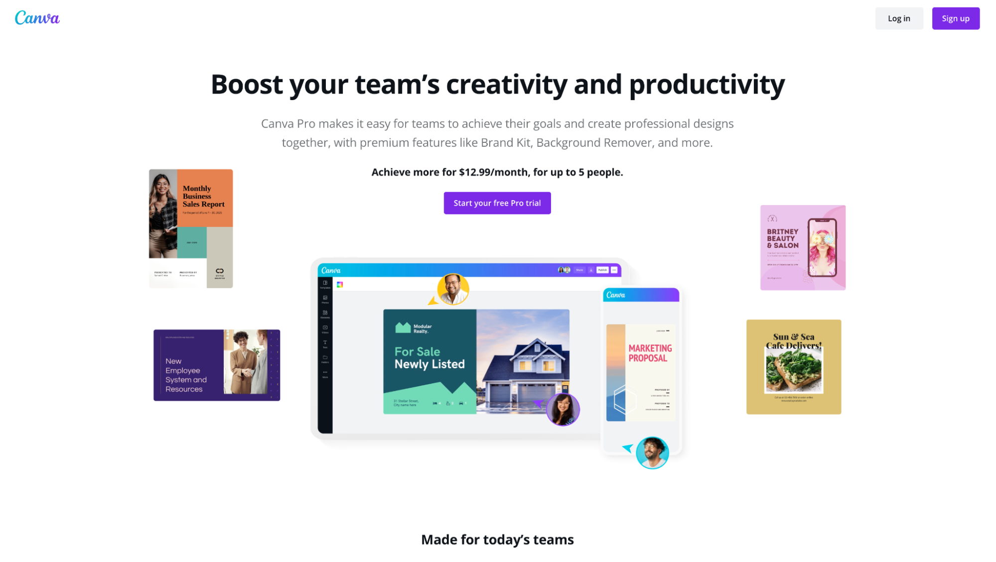
Canva adds context to their “creativity and productivity” headline with a product-focused hero shot that illustrates collaboration, templates, and design on the go (mobile app):
4. Add emotion
When we say emotion, we don’t mean moving someone to tears; we mean creating a positive feeling about your brand and offer.
A lot of it boils down to the quality of your graphic design—quality web design builds trust and establishes credibility.
But you can evoke positive feelings like trust, safety, happiness, and confidence directly from your hero shot by using choice imagery. Understand body language and communicate the intended emotions effectively through imagery.
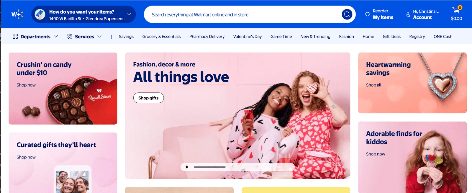
For example, Walmart features a variety of happy-go-lucky buyers and feel-good imagery—almost as if to say, “This is what your customers will feel like after you start using our cute holiday-themed products.”By mirroring positive emotions associated with their value proposition’s “promised land,” Walmart drums up positive emotions (and a wee bit of FOMO) from its potential customers.
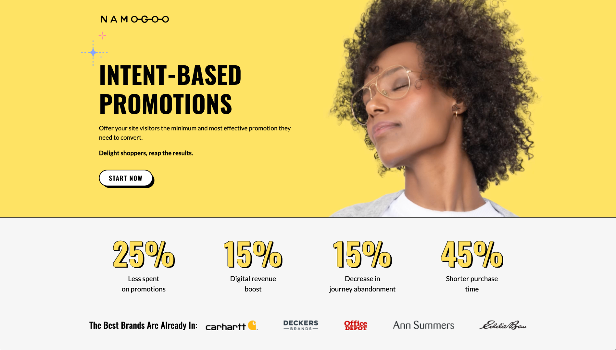
Namogoo features a variety of happy-go-lucky “buyers,” as if to say, “This is what your customers will feel like after you start using Namogoo.”
By mirroring positive emotions associated with their value proposition’s “promised land,” Namogoo elicits positive emotions from its potential customers.
Or you can feature social proof, like customer testimonials, star ratings, or awards, directly within your hero shot to evoke feelings of trust and confidence.
5. Customize it to your brand
SAY IT WITH US:
No.
Stock.
Photography.
Not even in the background, 2018.
If you think that your customer won’t notice stock photos in place of a product image…
… They will.
Keep your landing page hero shots custom to your brand.
If your resources are limited, at the very least, work stock photography into a custom graphic so that it fits the style and feel of your brand.
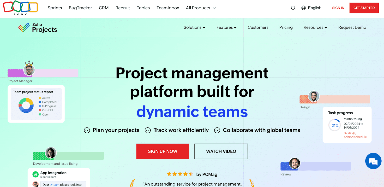
For example, Zoho uses stock photographs of people, but they edit them into their landing page hero shot in an original and unique way.
If you're going to use stock photos, use them as accents, not focal points
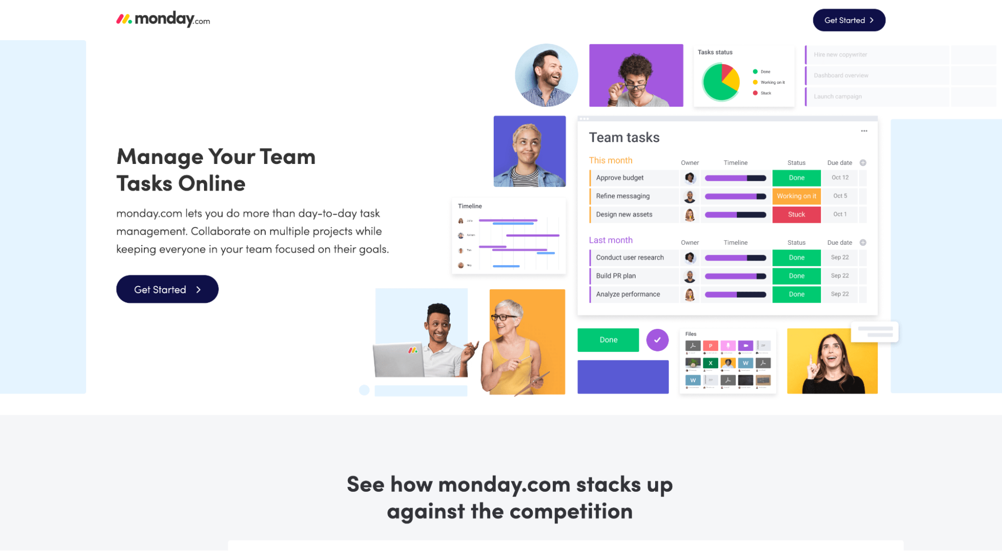
Monday.com uses various stock photographs of people, but they edit them into their landing page hero shot in a way that feels original and unique.
6. Don’t let it get in the way of your copy
Lastly, the best landing page hero images don't distract from the copy; they tastefully align themselves around headlines and CTAs in a way that draws attention to (not away from) your message.
For example, notice how Real Hire has the portraits of the speakers slightly aligned to the left, with some even tilting their heads that direction?
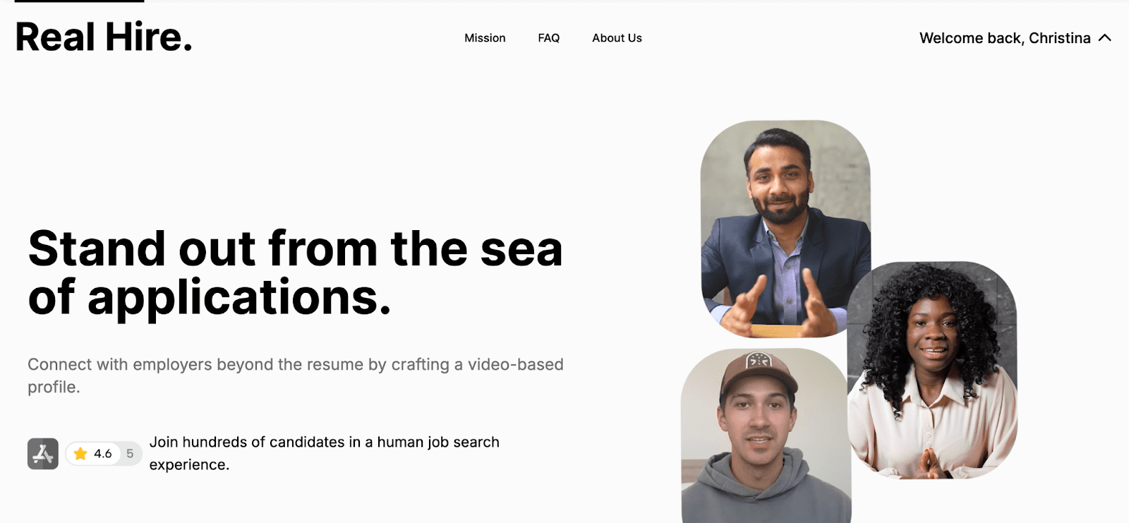
This tilt creates a subtle visual cue that draws the visitor's attention in the same direction—right toward the headline and CTA.
Notice how Apostrophe features a dermatologist looking toward the headline and CTA?

Directing her body and gaze to the right creates a subtle visual cue that draws the attention of the visitor in the same direction—right toward the headline and CTA.
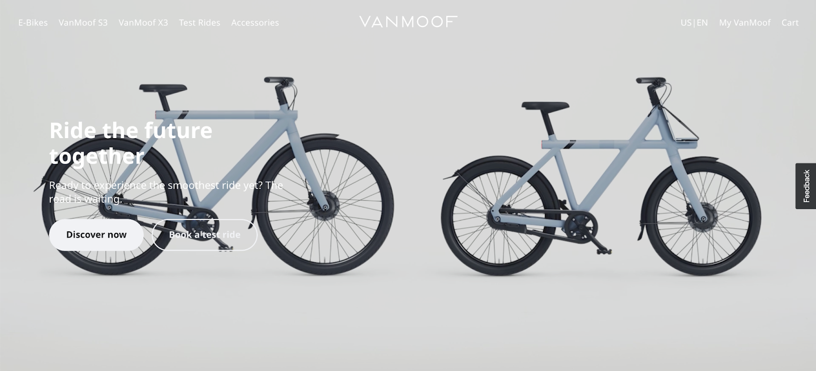
Now juxtapose that with VanMoof’s landing page hero shot. It doesn’t make the headline and CTA standout; it buries them.
That is the end of the basic tutorial. You already have 23 examples to kickstart your conversions.
Now here are 23 more that include our favorite examples, a few examples that fail, and a handful of garbage.
Landing page hero shot examples
We broke up this section into three categories:
- The Good (12 examples)
- The Bad (5 examples)
- The Bogus (6 examples)
Why?
Because not all hero shots are superheroes, and learning what not to do is just as important as learning what to do.
The Good
Bookmark them. Add them to your swipe file. Tell all your friends.
- Canva Pro
- Doo
- Todoist
- Gusto
- Public
- Adobe Creative Cloud
- KlientBoost
- Squarespace
- Spline
- SnapCall
- Typeform
- Armadillo
Canva Pro
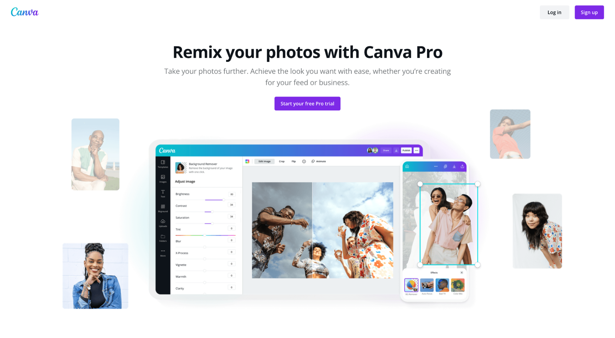
What we love: Product-focused hero shot that adds context to the headline, doesn’t distract from the CTA, and evokes positive emotions.
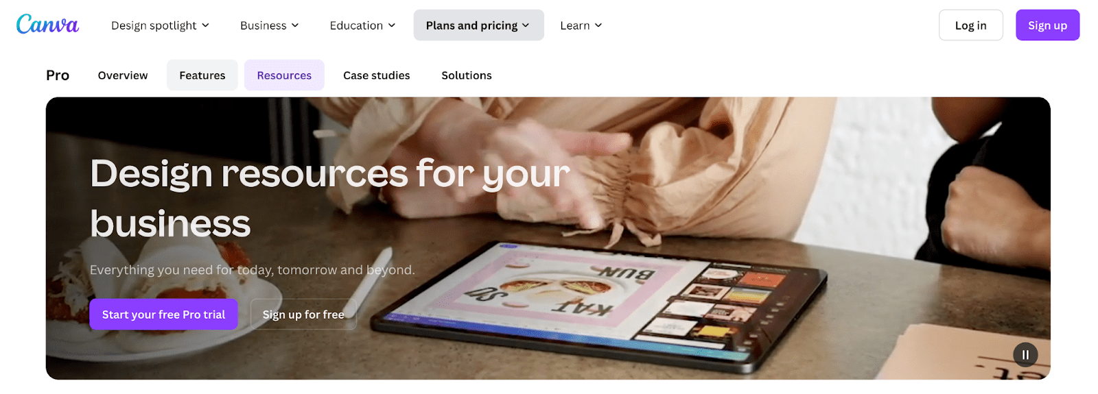
What we love: Product-focused, doesn't distract from the CTA, and is animated for further engagement. This shows a range of capabilities within Canva Pro.
Doo
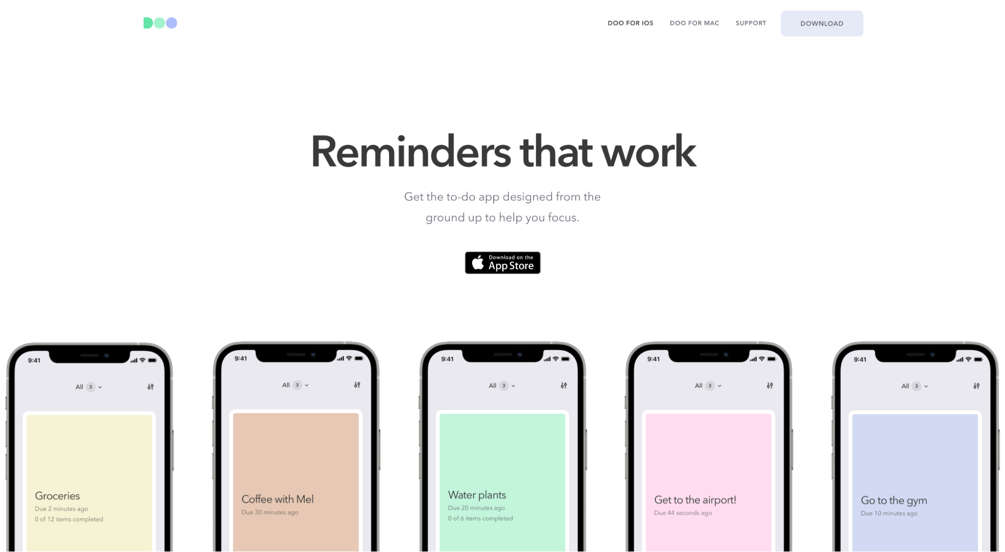
What we love: Doo shows real screenshots from their reminder app. Simple, concrete, contextual, custom, effective.
Todoist
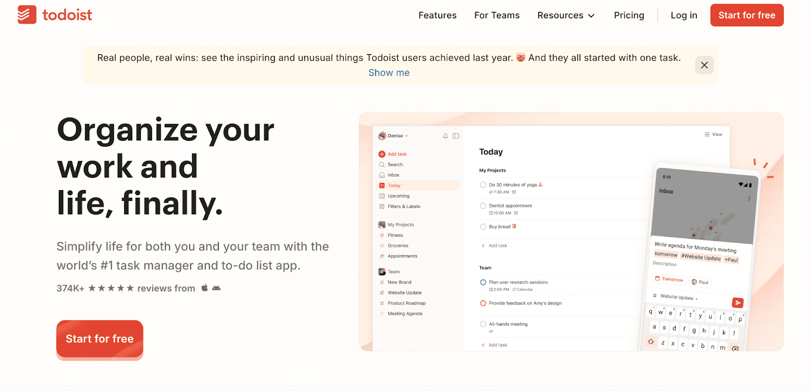
What we love: Todoist shows real screenshots from their reminder app alongside complimentary copy. Simple, concrete, contextual, custom, effective.
Gusto
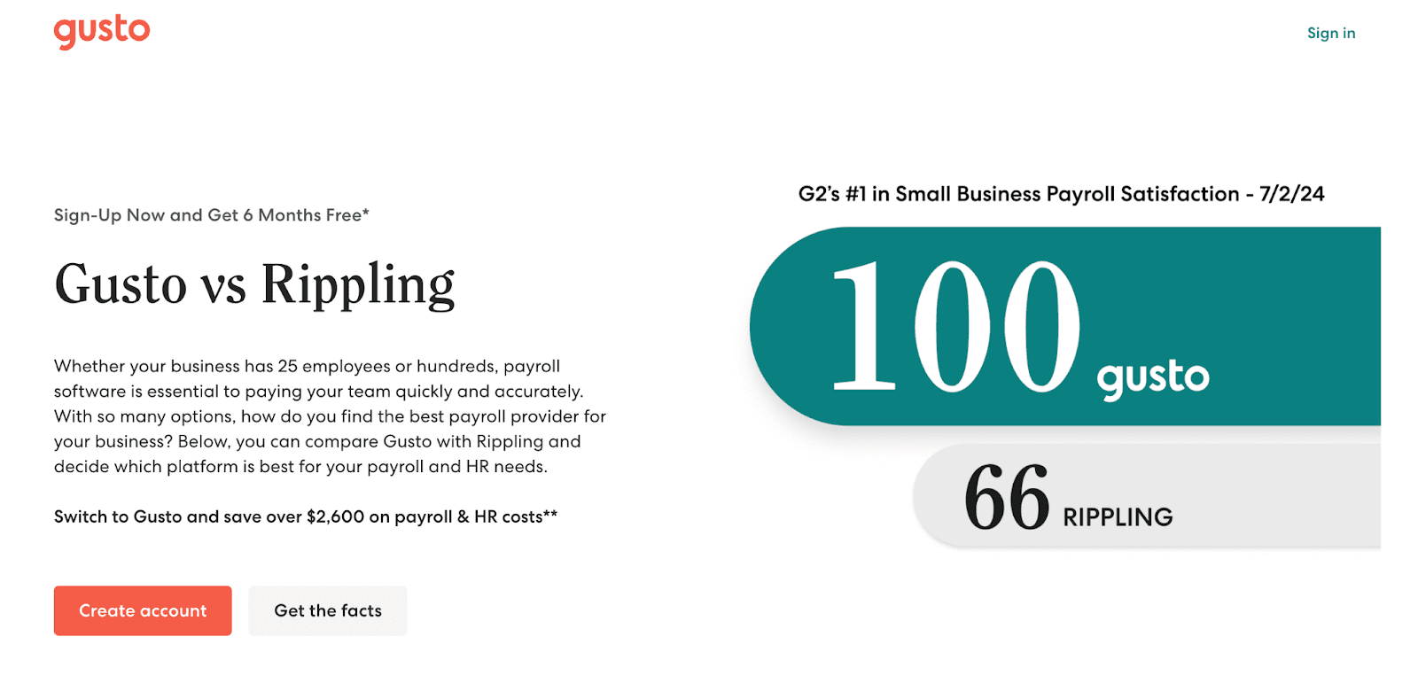
What we love: Subtle nod to social proof in a tastefully colorized way, and complimentary copy that’s quantified with actual results. We love to see it.
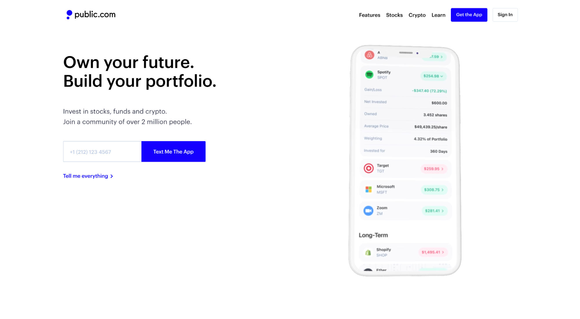
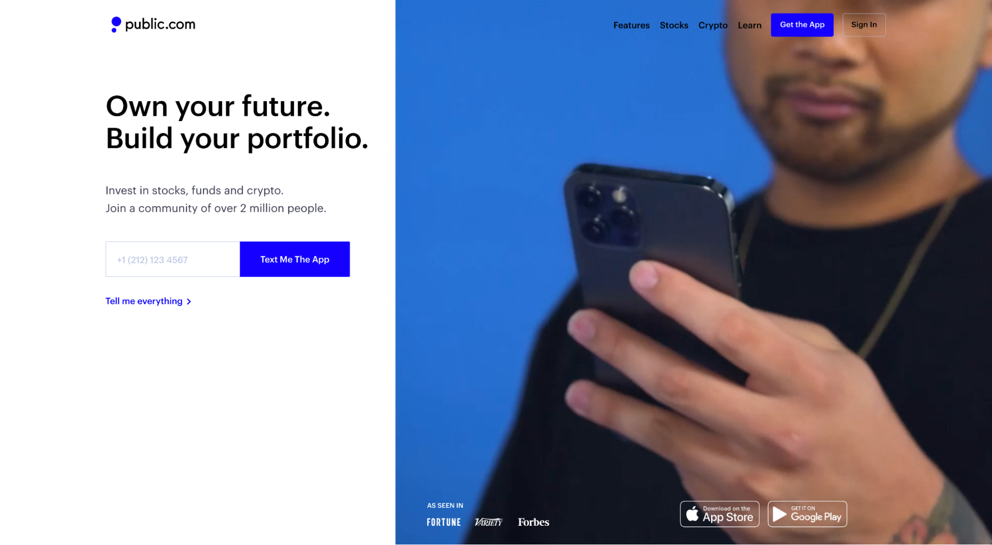
Public
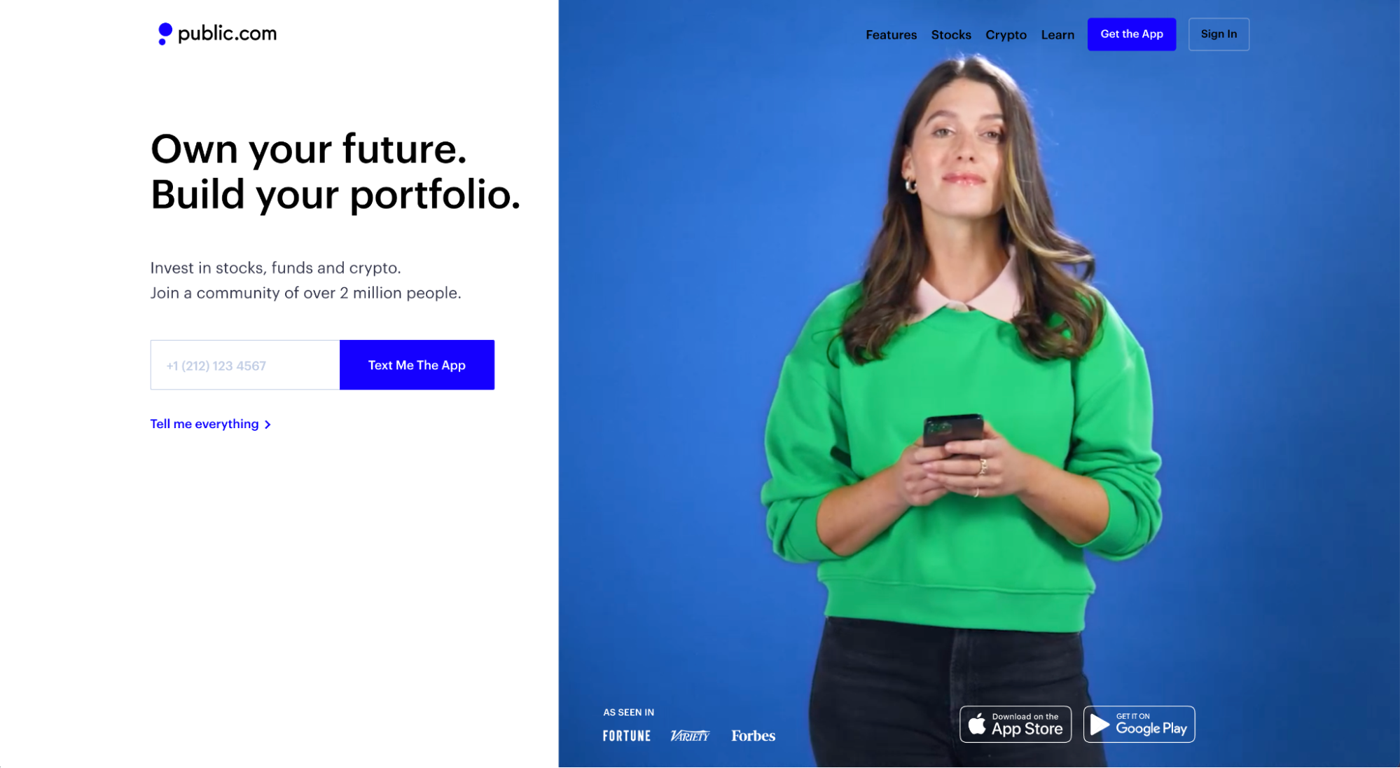
What we love: Public features a looping video that showcases screenshots from their app along with real, authentic users. This video marries product-focused with promised land to artfully capture its ease-of-use, target market, and mobile-friendliness.
Adobe Creative Cloud
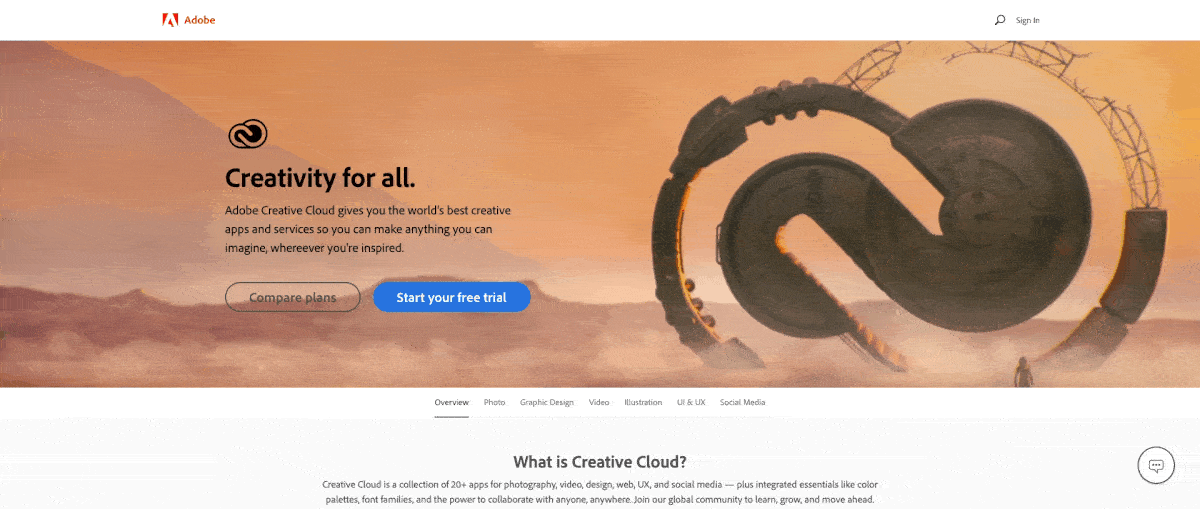
What we love: No better way to demonstrate the power of your design software than by showcasing the actual designs it facilitated. Well, maybe one way: by making your logo the subject of the design. Bravo, Adobe.
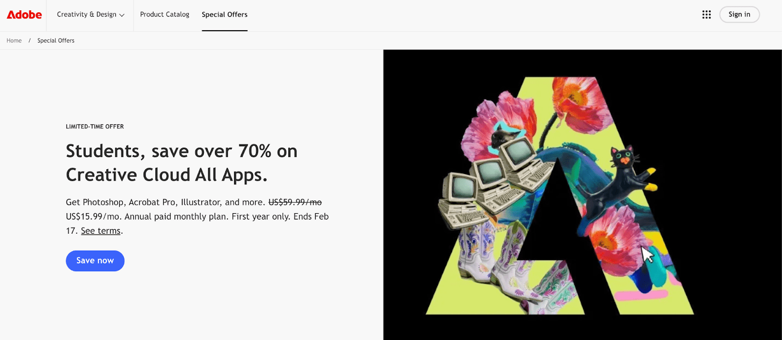
Another featured design with the logo as the subject of the design.
KlientBoost
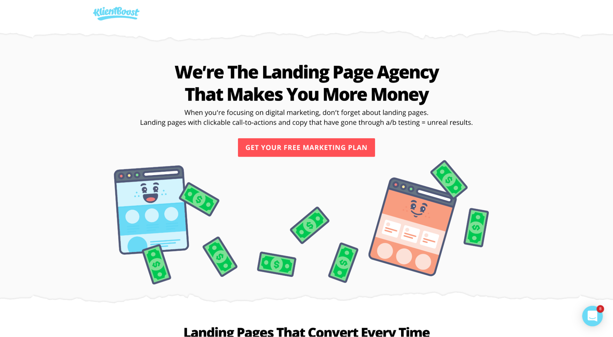
What we love: We LOVE metaphoric landing page hero shots at KlientBoost. Mainly because we've grown an entire family of brand mascots that need their 15 minutes of fame. But also because they illustrate our value propositions in a distinct and fun way. Who doesn't love smiling landing pages, raining money, and fresh green dollar bills?
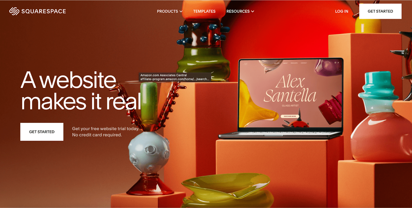
Squarespace
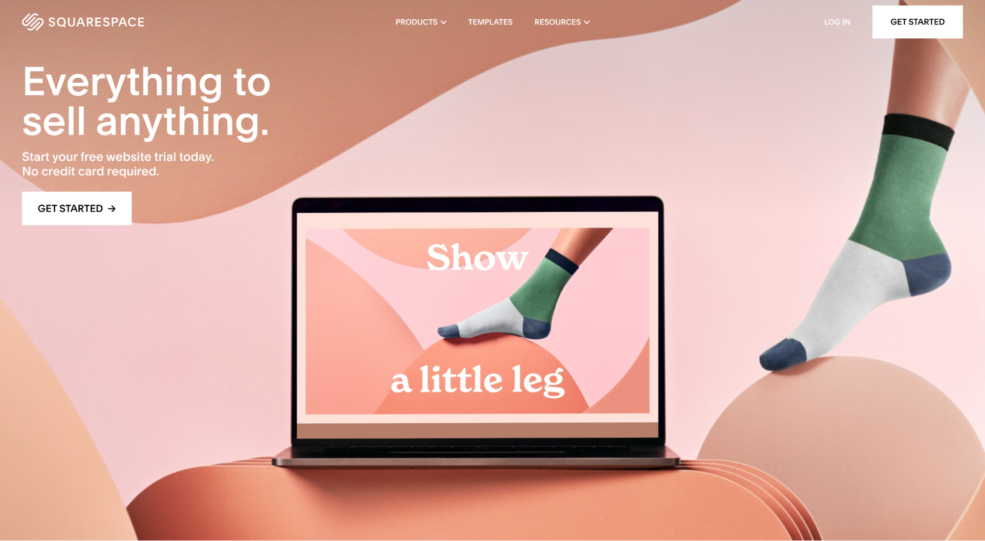
What we love: Squarespace prioritizes design, always. So no surprise that their landing page hero images look more like modern art than most modern art. But like we mentioned earlier, art for the sake of art doesn’t cut it when it comes to landing page hero shots. Not unless you’ve captured your product in real life within that art. And that’s exactly what Squarespace does here.
Spline
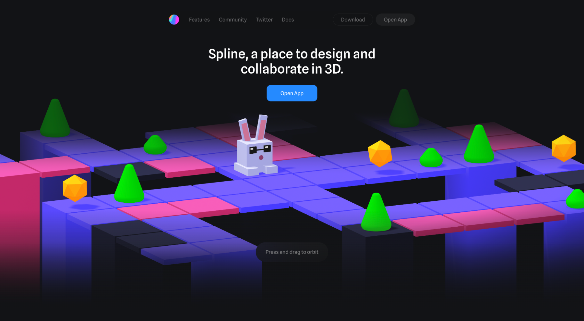
What we love: It's a bit hard to tell from this image (I suggest you visit their webpage), but Spline's 3D hero shot moves when you click and drag your mouse over it. Pretty neat, considering that they sell collaborative 3D design tools.
SnapCall
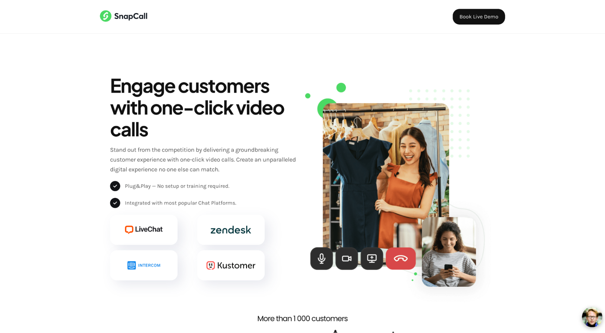
What we love: SnapCall uses their hero shot to illustrate a common use case (or pain point) their target market might find valuable (like interacting with your customers remotely). Makes sense, considering their subheading promises to “deliver a groundbreaking customer experience with one-click video calls.”
Here, SnapCall uses their hero video element to illustrate the range of use cases for their target market. We just don’t love all the whitespace…and think it could be zhujhed up a little bit.
Typeform
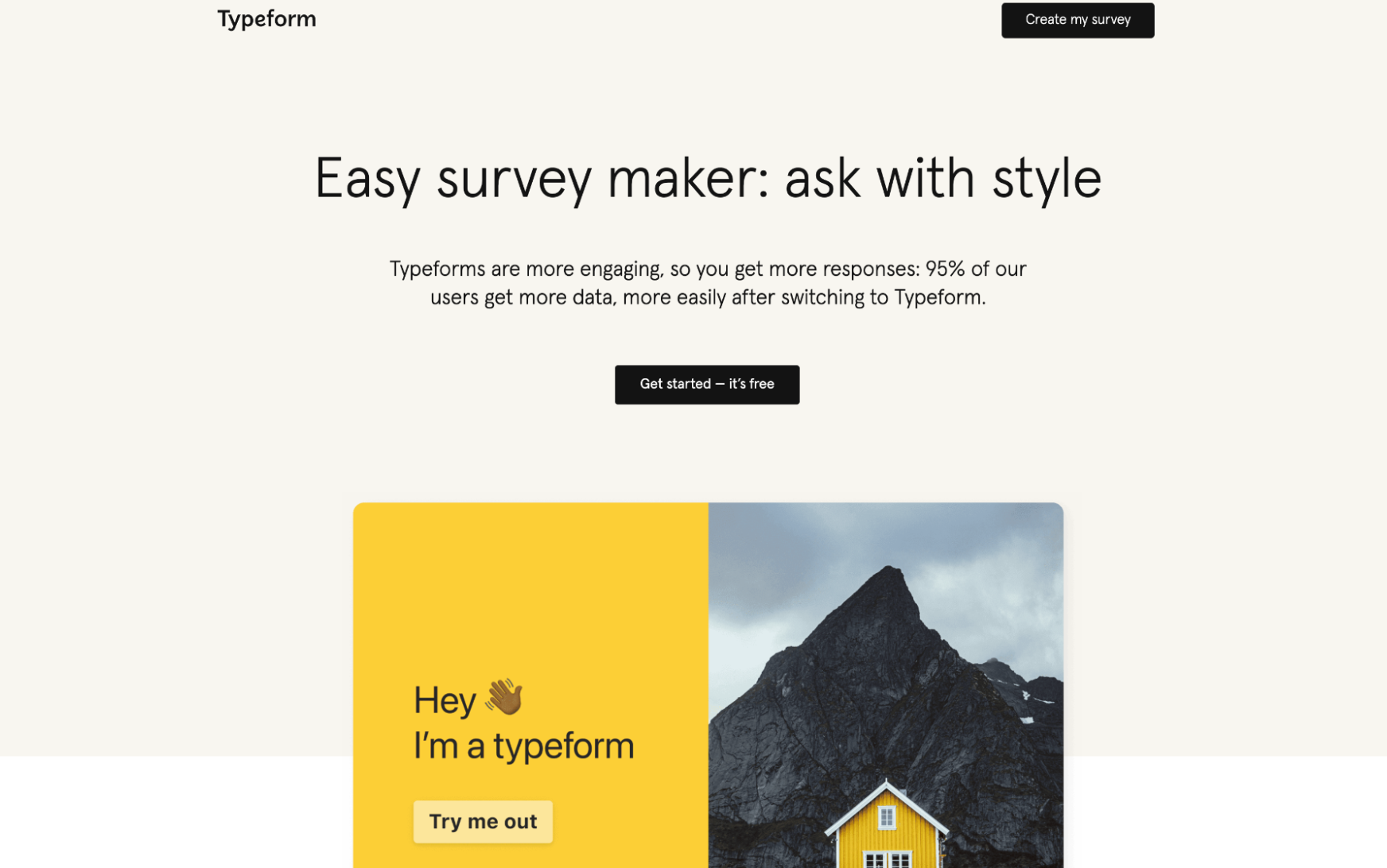
What we love: Talk about product-focused. Typeform uses a real-life embedded Typeform form as their hero image. Visitors can actually click on the “Try me out” button and experience the form for themselves. Brilliant.
Armadillo
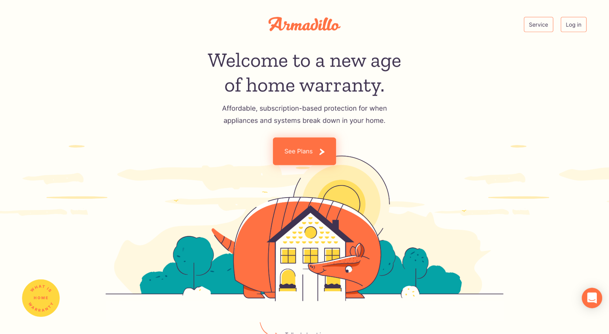
What we love: Metaphor alert. An armadillo wrapping its body around a house as if it were protecting it like it was its own baby. Is it even possible to communicate their brand promise and value proposition in a better way? No chance.
Now the bad landing page hero shots.
The Bad
We’ve seen worse, but these landing page hero shots still don’t make the cut.
- Semrush
- Miro
- MURAL
- PocketGuard
- Atlassian/Jira
Semrush
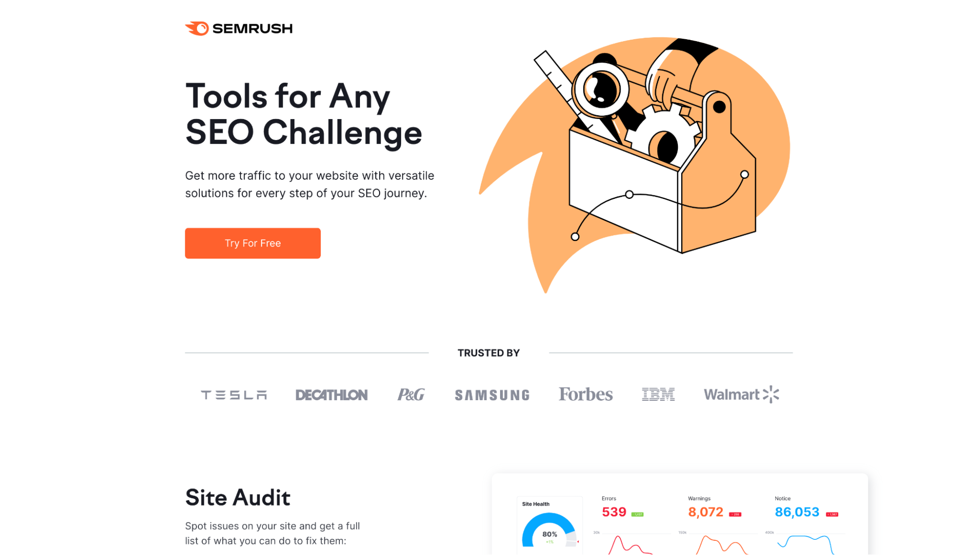
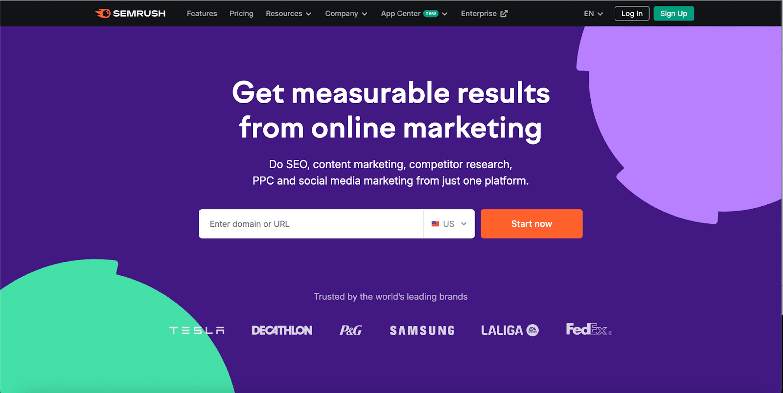
What we don’t like: Here’s what happens when metaphors fail. Semrush uses a toolbox, presumably to highlight their “Tools for any SEO challenge” value proposition. Only the toolbox is filled with a ruler, magnifying glass, and cog. Are you selling plumbing tools? Or SEO tools?
Another example: Abstract gearwheels threatening to artistically crush the copy. Or fly off into outer space? Are they even gears?
Miro
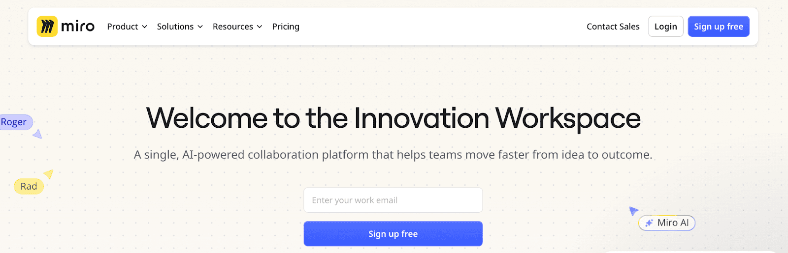
What we don't like: This is what happens when an abstract fails. This hero shot kind of shows what Miro’s UI is about…but not really. This looks like graph paper. Where’s the freewheeling collaboration? People want to see the software in real life, especially when it's a unique type of software.
MURAL
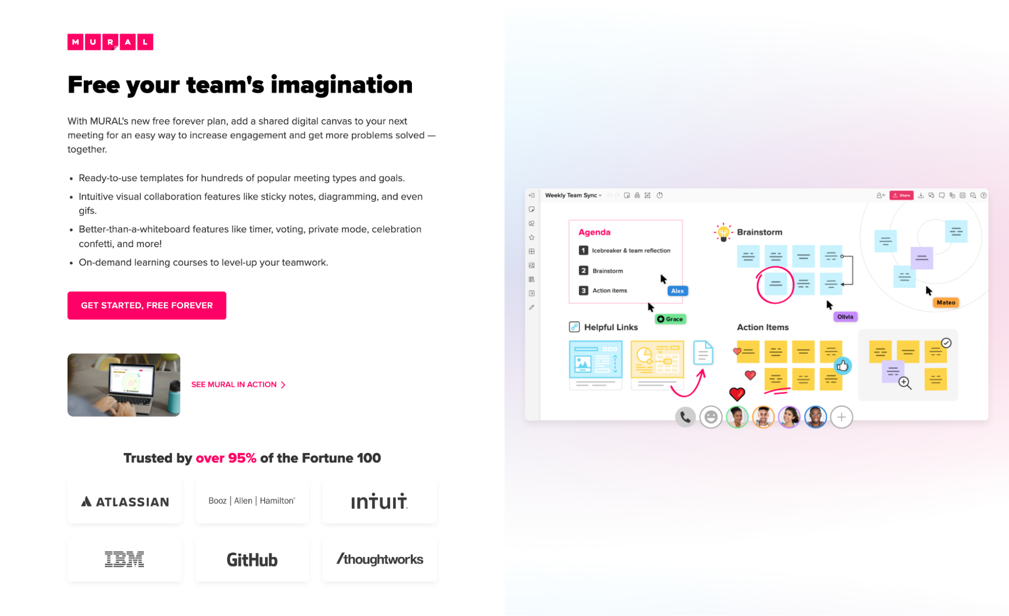
What we don’t like: It’s overloaded. What do we even focus on? MURAL attempts to use a product-focused hero shot, but they’ve squeezed too much in it, making it hard to discern what each feature does. I can see it now: too many people want too many features represented, so the designer said, “Eff it, we’ll throw them all in there.”
Years later, Mural rebranded and let the pendulum swing LARGE. It's not overwhelmingly busy now but... where’s the design? Did you forget that you’re a design tool? Instead of engaging product images that give us a sneak peek of the tool, we’re left with…an H1 heading and a slide bar CTA.
Eghck. We are rooting for you to find the clear middle ground.
PocketGuard
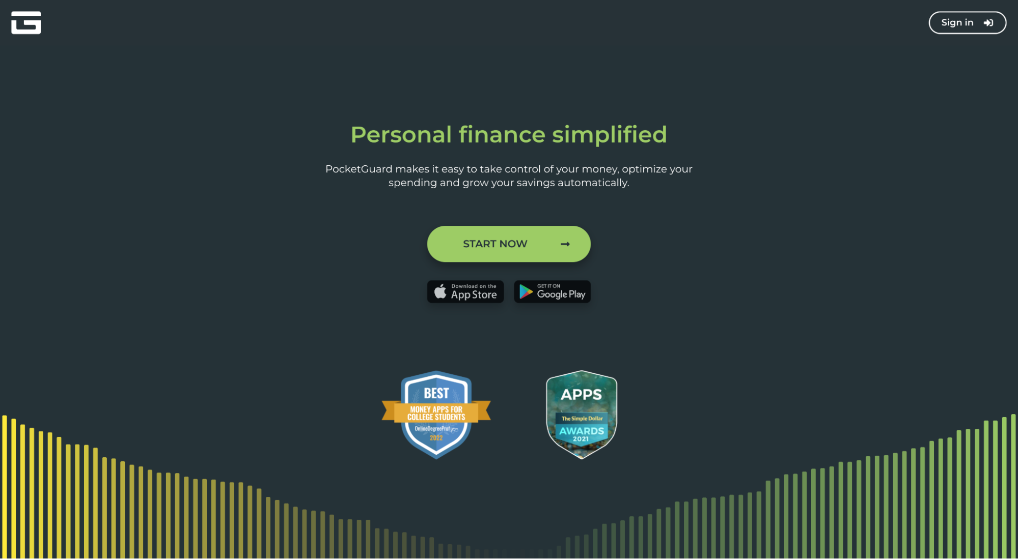
What we don’t like: What’s most disturbing about this abstract design is that it looks like a sound wave of sorts. But PocketGuard is a personal finance app. The lesson? Ensure your hero shot doesn’t look like a different service at first glance, even if by accident.
Atlassian/Jira
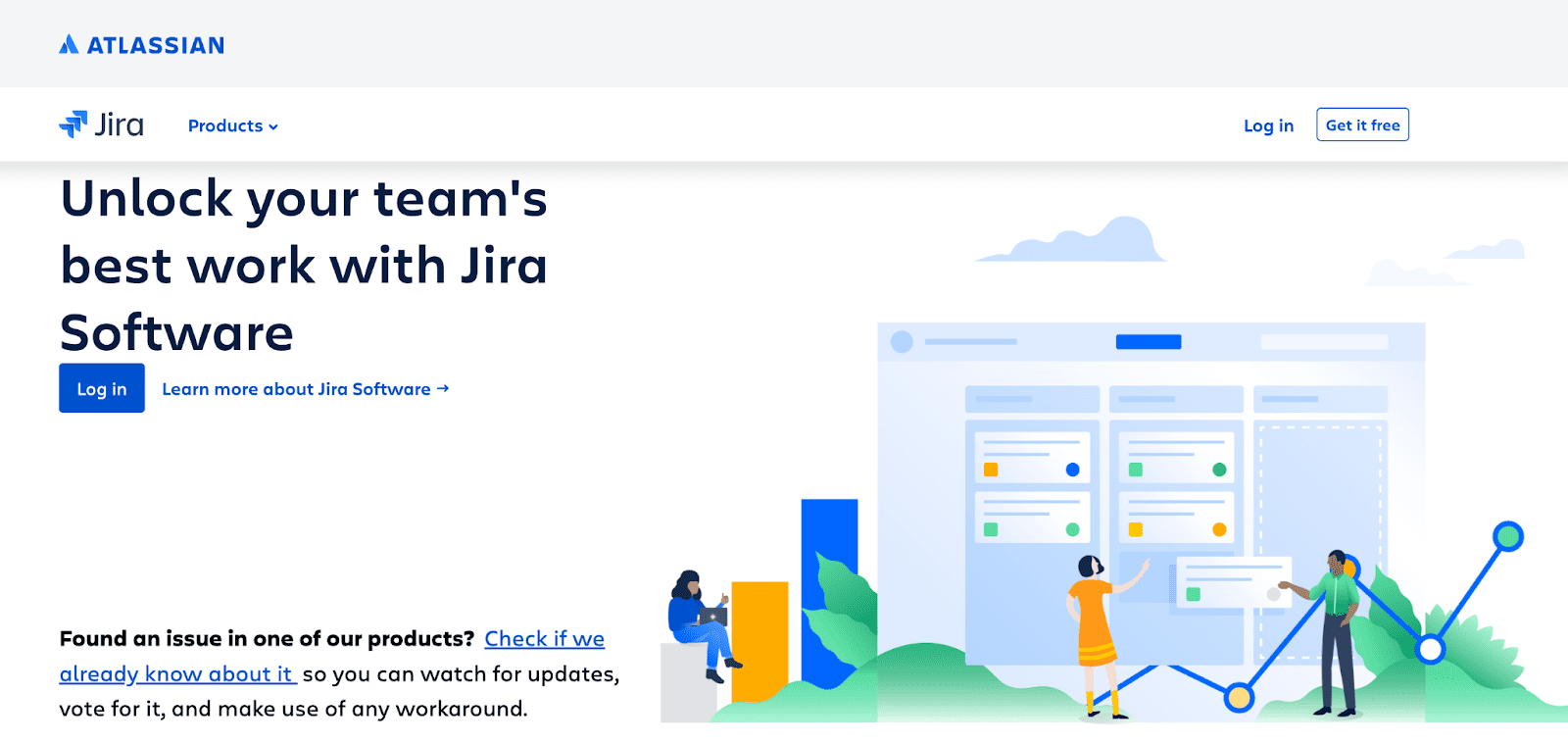
What we don't like: It’s so abstract it’s completely generic. Alongside some less-than-compelling copy, we’ve got nondescript animated people pointing to a nondescript animated task board. Eek.
The Bogus
Yep, we can’t forget about the bogus. These hero shots straight up waste the most valuable piece of landing page real estate.
- Talentcap
- Nordstrom
- Act On
- Intercom
- SurveyMonkey
- ZoomInfo
Talentcap
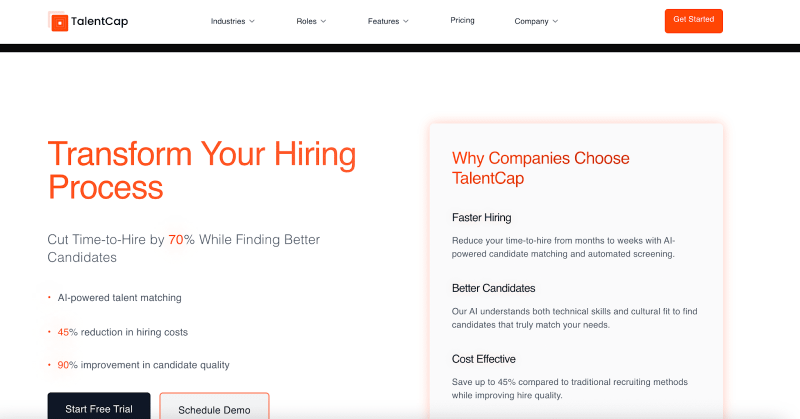
What's bogus: There’s no visuals here at all. None. Sure, stats are compelling…but we, the site visitors, demand more. Specifically graphically.
Nordstrom
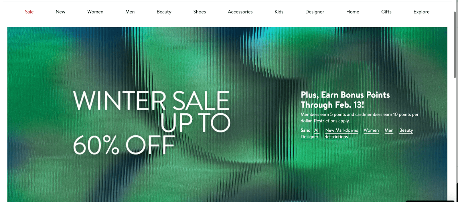
What's bogus: Nordstrom, are you selling green abstract wavy glass? Is that what really sells a winter sale? Were you out of time and energy here? You're mega ecomm. You have the budget. Do better.
Act-On
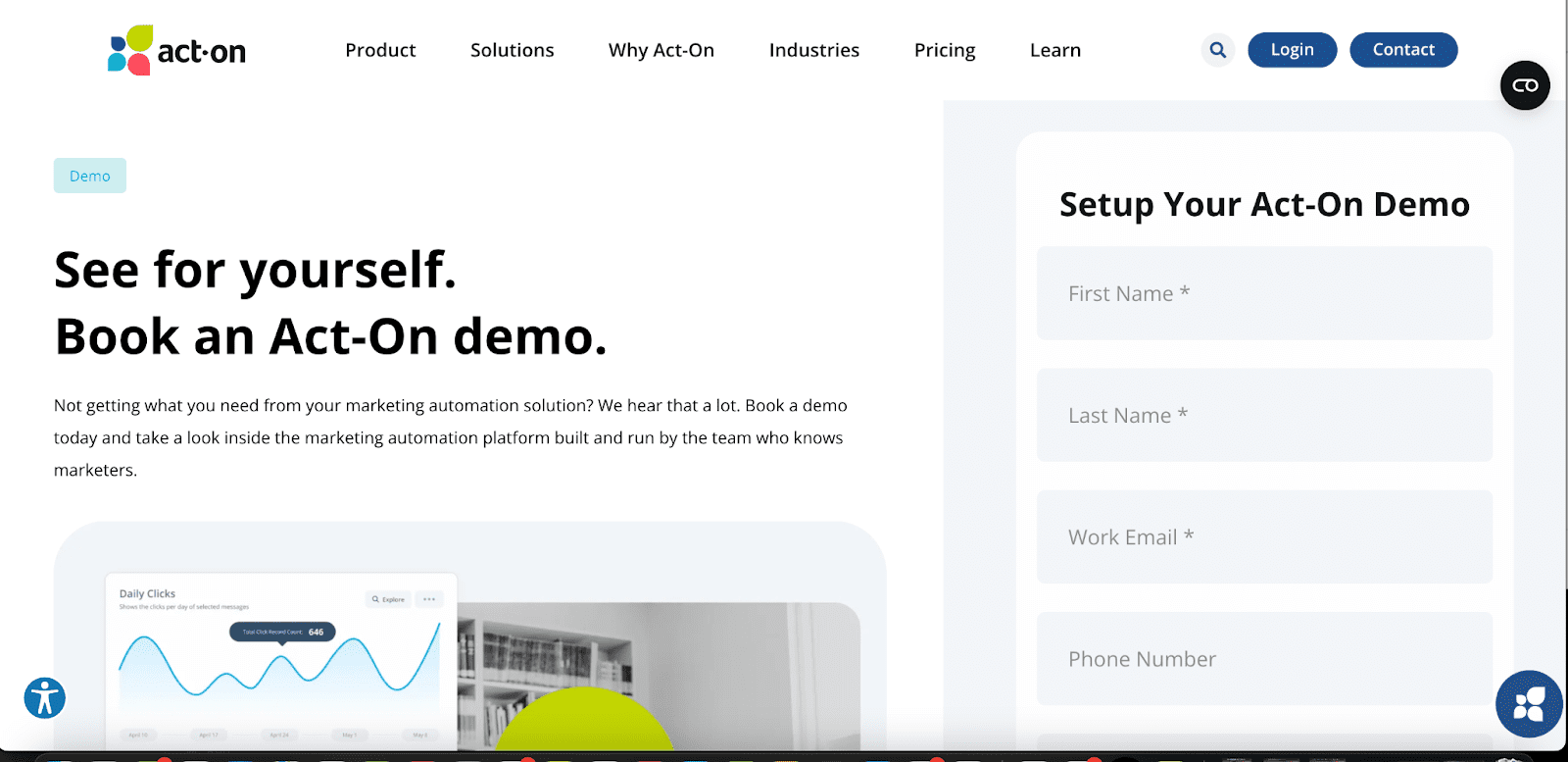
Act-On landing page hero shot
What's bogus: Formatting. And a CTA that comes off the tongue awkwardly. Unbalanced flow. It’s a no from us. Oh, and that graphic way down there? It’s a stock photo people pointing at a generic wavy line chart. We aren’t even sure what the tool’s UI IS at this point. landing page.
Intercom
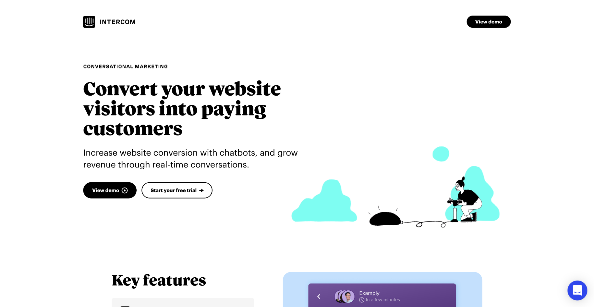
What's bogus: A woman blowing up a balloon? That’s how you illustrate your “Convert more website visitors into paying customers” value proposition? Swing and a miss.
SurveyMonkey
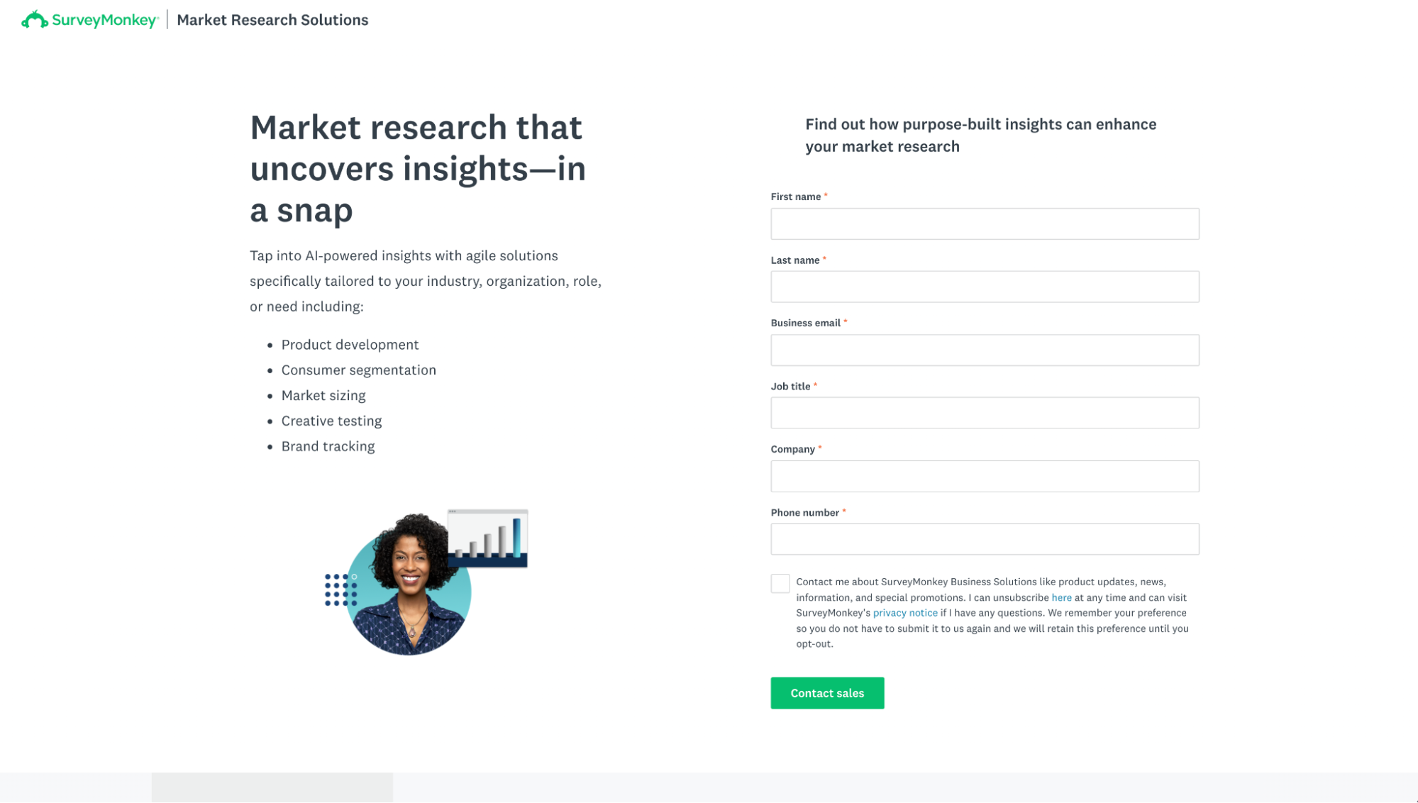
What we hate: Landing pages don’t always need hero shots to convert. So don’t squeeze them in just because you “need something visual.” Say no to space fillers (ahem, SurveyMonkey).
ZoomInfo
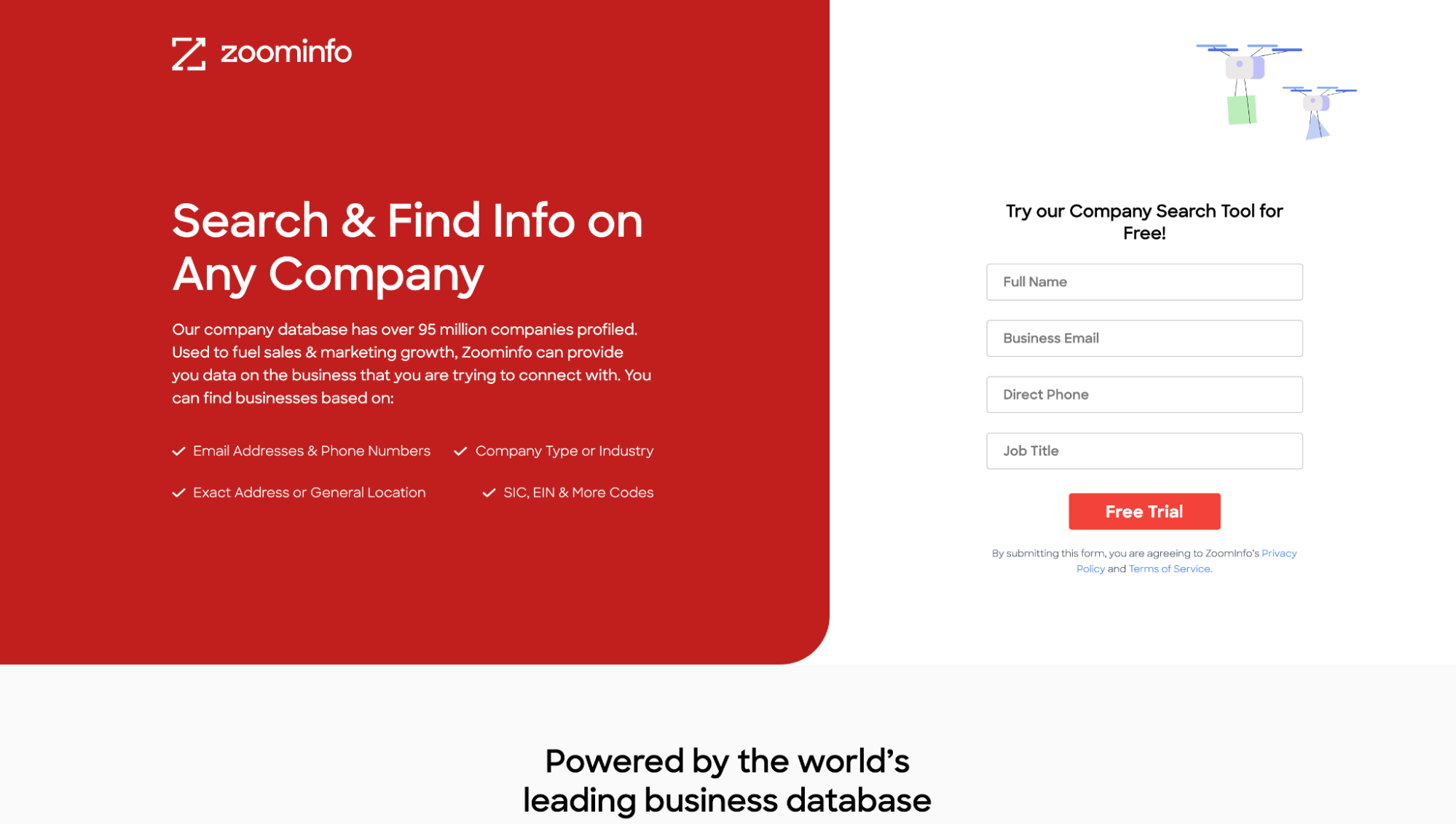
What's bogus: Is that an Amazon drone delivering my new extension cord? Yikes. Not to mention the placement (top right) pulls your attention away from the CTA at the bottom, not toward it.
Closing thoughts: the landing page hero shot test
Bottom line?
Humans are visual creatures, and effective use of imagery can significantly enhance engagement and retention.
Whether you’re a small business or a global organization, prioritize these elements to nail your landing page hero shot.
Want to know if your hero shot hits the mark?
Try the hero shot test.
Find a friend or colleague (preferably someone who has never encountered the product your landing page promotes), load the landing page, and give them five to ten seconds to review the hero shot.
If they can’t accurately describe your value proposition and the accompanying hero shot in two sentences, it’s time to start A/B testing different variations.
Now go forth and make Arthur (and us) proud.
And don’t forget to master your landing page headlines while you’re at it. Read all about how to do that here.
FAQs
The Five Core Types of Hero Images That Drive Conversions
Landing page hero shots typically fall into product-focused, metaphoric, "promised land," process-focused, or abstract categories. Each serves a different purpose and works best for specific types of offers and industries. Feel free to experiment and determine what works best for you!
Why Abstract Hero Shots Often Reduce Conversion Rates
While abstract designs might seem artistically appealing, they increase cognitive load and often fail to communicate value effectively. The most successful hero shots prioritize clarity and concrete representation of your offer's benefits.
Essential Elements That Make Hero Shots Convert
High-performing hero shots combine six critical elements: concreteness, relevance, context, emotion, customization, and alignment with copy. When these elements work together, they create a powerful visual first impression that drives conversions.


