Anyone can make a simple landing page modification and increase conversions.
Big deal.
But can you replicate those conversions over and over again? And can you scale wins across different clients, different industries, and different use cases?
We can.
But that’s only because we couldn’t for a long, long time.
After nearly a decade of landing page design experience and literally thousands of client campaigns, A/B tests, and failed experiments, we’ve determined that every winning landing page incorporates a set of clear, replicable, and often scientific best practices.
And since we’d hate to watch you blow through as many failed experiments (and money) as we did to arrive at this list, we’re going to give it to you for free, right now.
Like any type of best practice, the following landing page best practices should serve as a starting point, not an ending point.
Use these best practices to inspire your landing page design and execution. Just remember that mastery isn’t summarized in 31 points, no matter how much data supports each respective best practice.
Capeesh?
Without further ado…
- Landing Page Best Practice #1: Design with high affordance
- Landing Page Best Practice #2: Keep a 1:1 attention ratio
- Landing Page Best Practice #3: Use the Breadcrumb Technique (multi-step form)
- Landing Page Best Practice #4: Don’t ignore below the fold
- Landing Page Best Practice #5: Use contrast (not psychology) to make CTA buttons pop
- Landing Page Best Practice #6: Segment your audience
- Landing Page Best Practice #7: Test local and toll-free call-tracking numbers
- Landing Page Best Practice #8: Move faster with a landing page builder
- Landing Page Best Practice #9: Add live chat
- Landing Page Best Practice #10: Sell the next step, not the last step
- Landing Page Best Practice #11: Use explicit directional cues
- Landing Page Best Practice #12: Increase motivation with click triggers
- Landing Page Best Practice #13: Optimize for mobile
- Landing Page Best Practice #14: Match offer with conversion intent
- Landing Page Best Practice #15: Design your information hierarchy (F-shape or Z-shape)
- Landing Page Best Practice #16: Optimize your thank you page
- Landing Page Best Practice #17: Write value buttons, not effort buttons
- Landing Page Best Practice #18: Steal from other landing pages
- Landing Page Best Practice #19: Make the invisible visible (live demos)
- Landing Page Best Practice #20: Use distinct brand assets
- Landing Page Best Practice #21: Grab attention with your headline
- Landing Page Best Practice #22: Message match ads with landing page
- Landing Page Best Practice #23: Build credibility with social proof
- Landing Page Best Practice #24: Increase page speed (load time)
- Landing Page Best Practice #25: Remove navigation and footer exit links
- Landing Page Best Practice #26: Format for readability (and skimming)
- Landing Page Best Practice #27: Embrace white space
- Landing Page Best Practice #28: Add images with purpose
- Landing Page Best Practice #29: Handle objections with benefits
- Landing Page Best Practice #30: Incentivize your offer
- Landing Page Best Practice #31: Test everything
- Wrapping up
Get brand new landing page strategies straight to your inbox every week. 23,739 people already are!
Landing Page Best Practice #1: Design with high affordance
What’s affordance?
It’s a design principle that refers to an object whose characteristics alone tell users exactly what to do.
For example, when you look at a button on your landing page, can you tell that it’s a clickable button just by looking at it?

High affordance makes your landing page more usable and less taxing for visitors.
To improve your landing page user experience, increase its affordance in four key categories:
- Physical: Can visitors tell what action they should perform just by looking at an object on your landing page? For example, if you removed the words on a button, would visitors still know that it’s clickable?
- Language: Do you use language to tell visitors exactly what action to take? For example, in search bars, around form fields, or on button copy?
- Metaphors: Do you use symbolic iconography to indicate meaning? For example, a house to indicate the home page, an envelope to indicate a send button, or a FB logo to indicate Facebook.
- Pattern: Pattern affordance refers to affordance that is ubiquitous; everyone uses them. For example, links that are highlighted and underlined, navigation menu or bar, or arrows to indicate direction. Stick with universally adopted design features. 100% originality isn’t good for the user.
Landing Page Best Practice #2: Keep a 1:1 attention ratio
Oli Gardner of Unbounce defines a 1:1 attention ratio as:
“The ratio of links on a landing page to the number of campaign conversion goals. In an optimized campaign, your attention ratio should be 1:1. Because every campaign has one goal, every corresponding landing page should have only one call-to-action – one place to click.”
Landing pages shouldn’t include four different goals. They should include one. Which means one call-to-action (CTA). (You can test multiple visions of your call-to-action button copy, as long as they all lead toward the same goal.)
That’s right—adding more than one goal can decrease conversion rates by 266%.
Not to mention a singular goal makes measurement easier. In the words of Michael Steele of MemberUp, a 1:1 attention ratio:
“...makes your testing much simpler, and eliminates other variables that could complicate your results. Straightforward data, more confident results in less time. Hallelujah.”
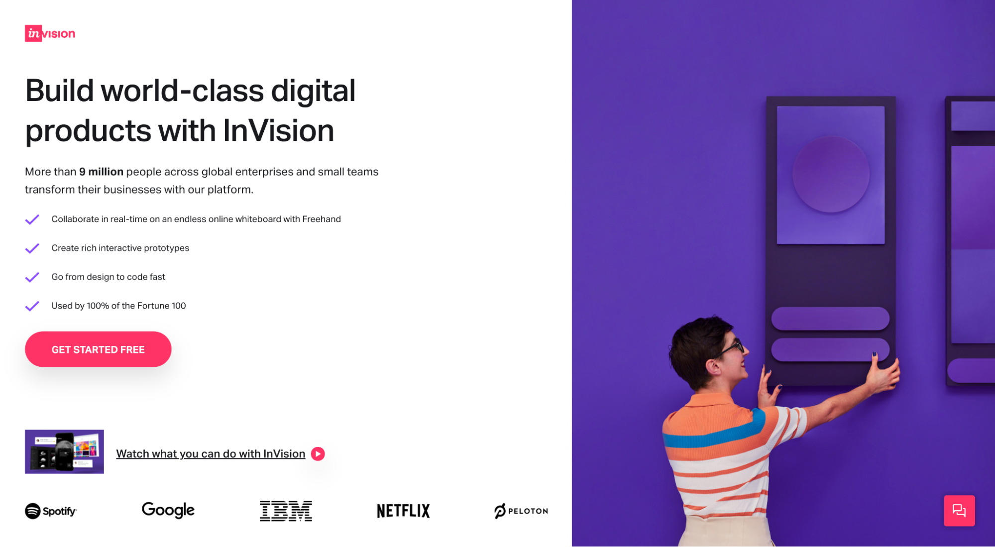
What does this look like in real life?
Not this:
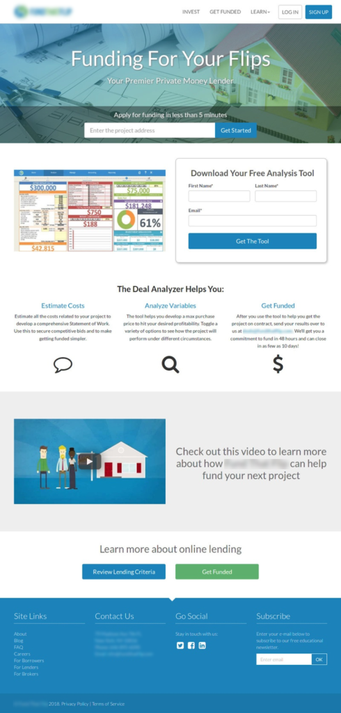
Instead, it looks like this:
Landing Page Best Practice #3: Use the Breadcrumb Technique (multi-step form)
The Breadcrumb Technique (coined by us) uses behavioral psychology to make forms less intimidating and higher converting by getting visitors to say “yes” to a smaller request before asking for their email or phone number.
The idea was inspired by the “Yes Ladder,” which was inspired by Robert Cialdini’s “commitment and consistency” principle of persuasion.
Cialdini’s principle states that people are more likely to make larger commitments if they make smaller commitments leading up to it.
How do we do that with forms?
By breaking them up into multiple stages (not one long form), then asking the most intimidating questions (like contact information) last.
Let’s look at an example from one of our financial clients.
Originally, their customized quote form asked for all information, including name, phone number, and email address on the same form.
So we split their form into two stages then asked for a phone number and email address on the second stage.
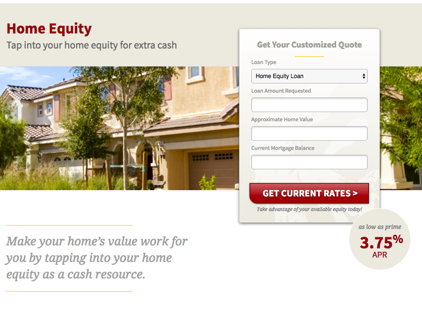
The results? We increased conversions from 1% to nearly 20% and dropped CPA from $800 to $35.

The Breadcrumb Technique works best for high-stakes requests, like a consultation, sales meeting, or quote, not so much for small requests like an ebook download.
Landing Page Best Practice #4: Don’t ignore below the fold
“Above the fold” (i.e. the section of the page visitors first see when they land on it, before scrolling) gets all the hype deservedly so. If you can’t pull together a compelling offer at first glance, your prospects aren’t going to keep scrolling.
But below the fold matters too. In some cases more than others.
In his article about non-profit marketing, Paul Cheney explains how sometimes you need to front-load people with information first, so they can understand what you’re asking for before converting. And that takes a lot of words.
For example, this NPO increased its copy by thousands of words before including a CTA, which resulted in more high-quality conversions, a 74% increase in donor conversions, and a 274% increase in revenue.

Here’s a secret: the more sophisticated the product or services, and the more unsophisticated the buyer, the more words you’ll need before expecting a conversion.
For example, if you’re selling toilet paper, just show me the price, but if you’re selling ABM software, I’m going to need to know more (especially because I’ve never done account-based marketing).
Landing Page Best Practice #5: Use contrast (not psychology) to make CTA buttons pop
In the early days of conversion rate optimization, button color reigned supreme.
Literally, everyone ran A/B split tests on button color to see which colors converted higher. Heck, an entire sub-industry of marketing popped up professing the psychology of button colors.
What we discovered though is that color doesn’t matter as much as contrast.
In other words, it’s not so much the implicit or subconscious signals that a certain button color triggers that lead to conversion; it’s whether or not the damn button pops off the page.
Using our homepage as an example, if we used a transparent button background against our white background, along with white text, the button wouldn’t pop off the page and conversions would suffer:
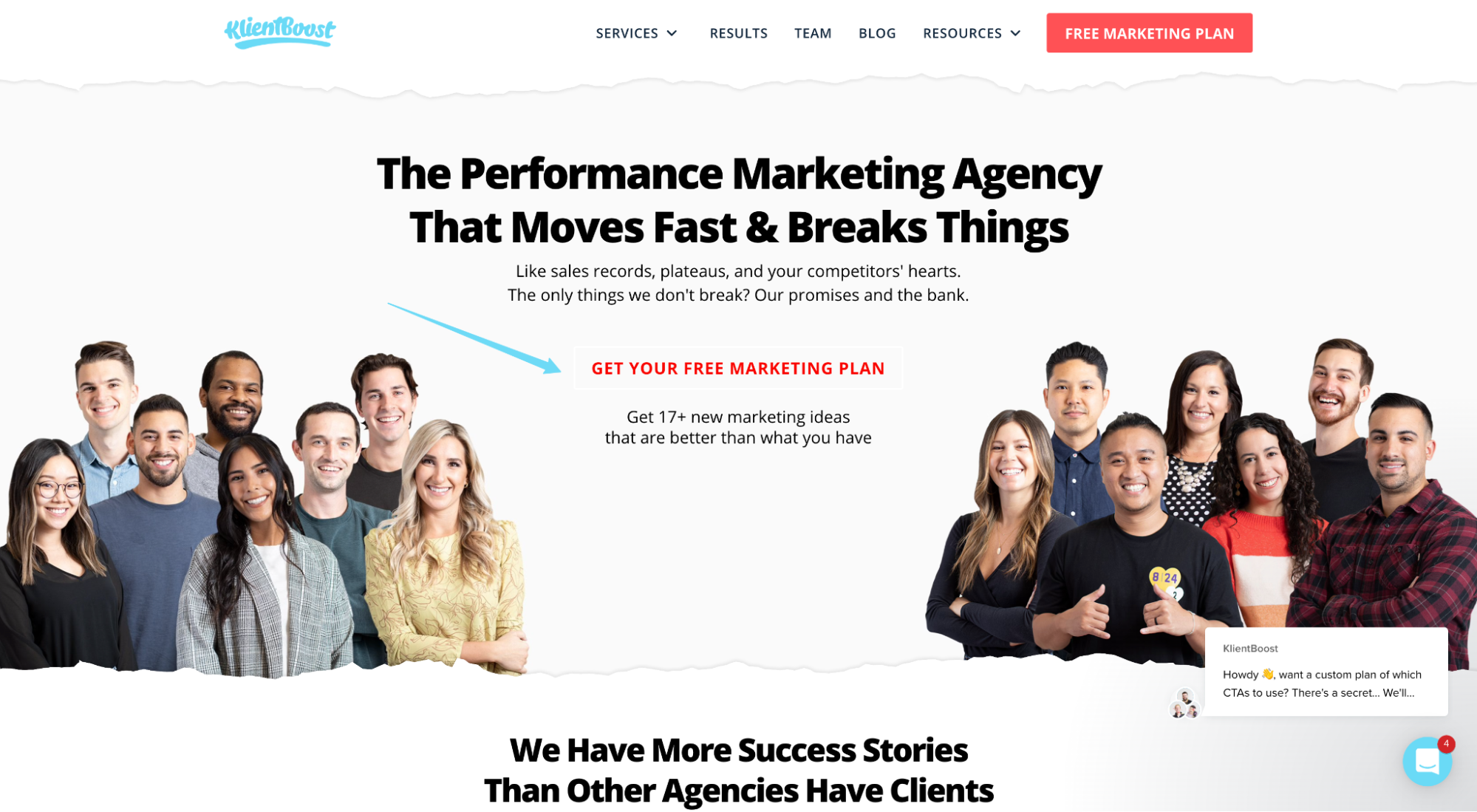
But since we do use a contrasting button background (red) on a white background with no competing colors near it, our CTA pops off the page:
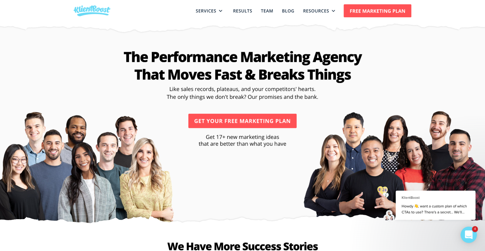
When designing buttons, forget color psychology. Focus on contrast instead.
Landing Page Best Practice #6: Segment your audience
Great audience segmentation starts long before you ever run an ad or drive traffic to a landing page. It starts during the diagnostic phase, even before you develop your marketing strategy.
At least it should.
We wrote an entire article on market segmentation for your pleasure: 5 Market Segmentation Strategies + 7 Ways to Collect Data.
But when it comes to landing pages, not only should you segment your ad campaigns so specific sources of traffic go to specific landing pages, but you should also ensure your landing page copy speaks to different segments accordingly.
When segmenting your audience, for both ad campaigns and landing page destinations, each of the following segments deserves a different message:
- Purchase intent: Awareness, consideration, or purchase?
- Traffic source: Social media, email promotion, PPC ad, direct mailer, billboard, etc.
- Behavioral: Subscribers, customers, past purchases, etc.
- Geography: Local? National? Global?
- Psychographic: Interest, values, personality traits, lifestyle, social status
It’s not always economical to create a distinct campaign with a distinct landing page for each distinct segment. Not unless you have deep pockets and resources (and even then it doesn't make sense sometimes). But that doesn’t mean you can’t address multiple segments from a single landing page.
For example, ADP offers payroll services for both small businesses and enterprise businesses. To ensure their landing page copy speaks to both differently, they use a splash page to ask visitors for their company size before entering:
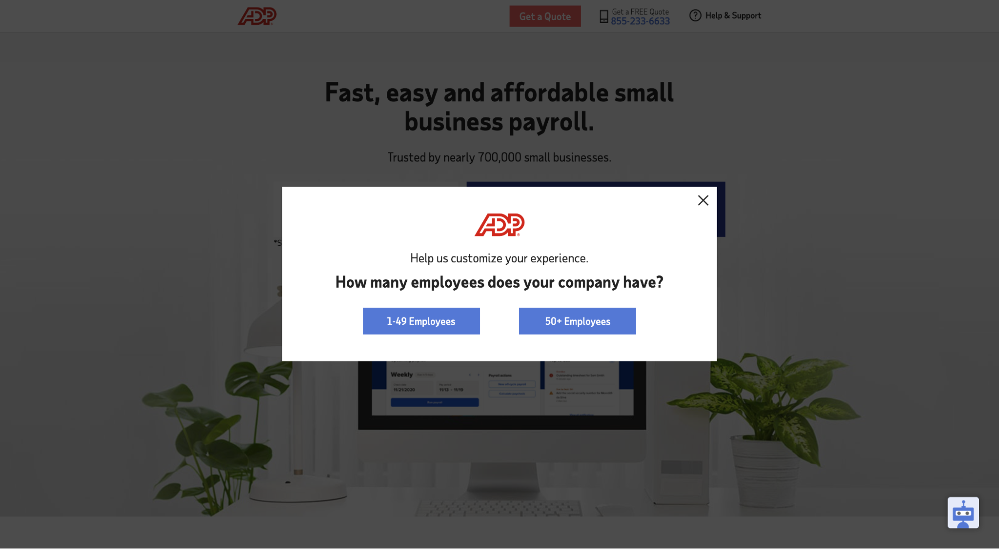
Depending on which button a visitor clicks (1-49 employees or 50+ employees), ADP tailors the landing page accordingly.
Landing Page Best Practice #7: Test local and toll-free call-tracking numbers
Should you use local call tracking numbers (i.e. with local area codes) or toll-free call tracking numbers (i.e. 800 numbers)?
It depends.
If you’re local, then it makes sense to use local area codes. Duh. But even if you’re not local, it might make sense to use local area codes for different regions that you target.
Why?
Because 86% of consumers are willing to pay more for the benefit of doing business locally. Local area codes create commonality and build trust. So much so that appearing local can increase call volume.
For example, in an A/B split test, one agency discovered that local area codes increase call volume substantially when compared to toll-free numbers:
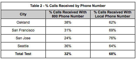
However, research has shown that ads that use toll-free numbers see a 30% increase in response rate. That same study showed that consumers associate toll-free numbers with a quality business.
Bottom line: Test both, no matter your business type.
Landing Page Best Practice #8: Move faster with a landing page builder
Speed is underrated in marketing.
The quicker you can roll out landing page variants and start testing, the quicker you can get feedback and make improvements. Speed = money.
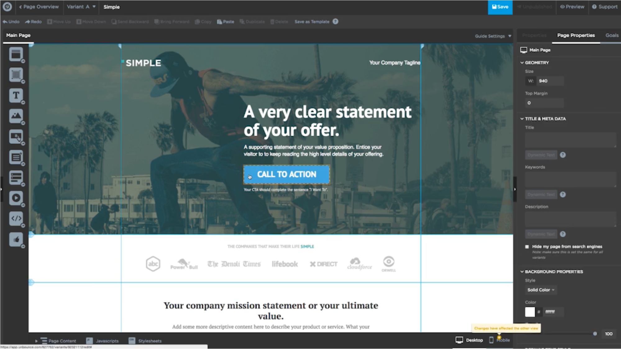
You can design and hard code your own landing pages, then manually test different versions (i.e. the slow way). Or you can use a landing page builder that lets you import templates, duplicate landers with one click, design with a drag-and-drop editor, A/B split test automatically, and measure conversions in minutes (i.e. the easy way).
Make marketing easier (and more scalable). Let a landing page builder do the heavy lifting so you can spend more time crafting offers and getting them in front of buyers.
Landing Page Best Practice #9: Add live chat
Live chat took the long road to prominence, but it finally arrived. By 2022, 85% of companies are expected to adopt live chat support.
Makes sense, considering 69% of shoppers demand live chat, and 73% of customers find live chat the most satisfactory form of communication with a company.
But does it increase conversions?
It can.
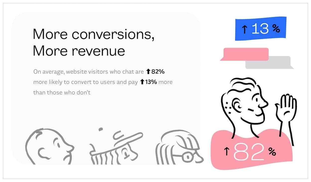
PureVPN reported that live chat led to a 20% increase in conversions. OptInMonster reported that visitors who live chat are 16x more likely to convert. And Intercom found that website visitors who live chat are 82% more likely to convert and pay 13% more than those who don’t.
However, other companies have reported that live chat didn’t increase conversions at all.
Bottom line: When used right, live chat can help provide real-time answers, nudge visitors, and target messages, all of which can increase conversions. Not to mention a growing percent of your prospects expect it. But like anything, always test it.
Landing Page Best Practice #10: Sell the next step, not the last step
It’s tempting to use landing page copy and offers to go straight for the jugular: the sale.
In some cases, that might be exactly what you need to do (e.g. eCommerce).
But in many cases, there’s a conversion step before the sale, like a demo, consultation, or sales meeting.
We’re not suggesting you don’t sell the features and benefits of your product or service from the landing page. But if your conversion path includes a step in between the lead form and a sale, don’t forget to sell that next step too.
If it’s a demo, then what value will I get from the demo? Will it be worth my time? What will you show me that I don’t already know? Tell me on the lander.
For example, at KlientBoost, when we wanted to increase conversions for our free marketing plan, we discovered that creating a dedicated landing page that sells the marketing plan (not our PPC, SEO, CRO, or landing page services), increases conversions more than anything.
When visitors click on our “free marketing plan” button, they’ll arrive on a page that shares a video preview of an actual marketing plan, an outline of what’s included in the marketing plan, and testimonials about the marketing plan.
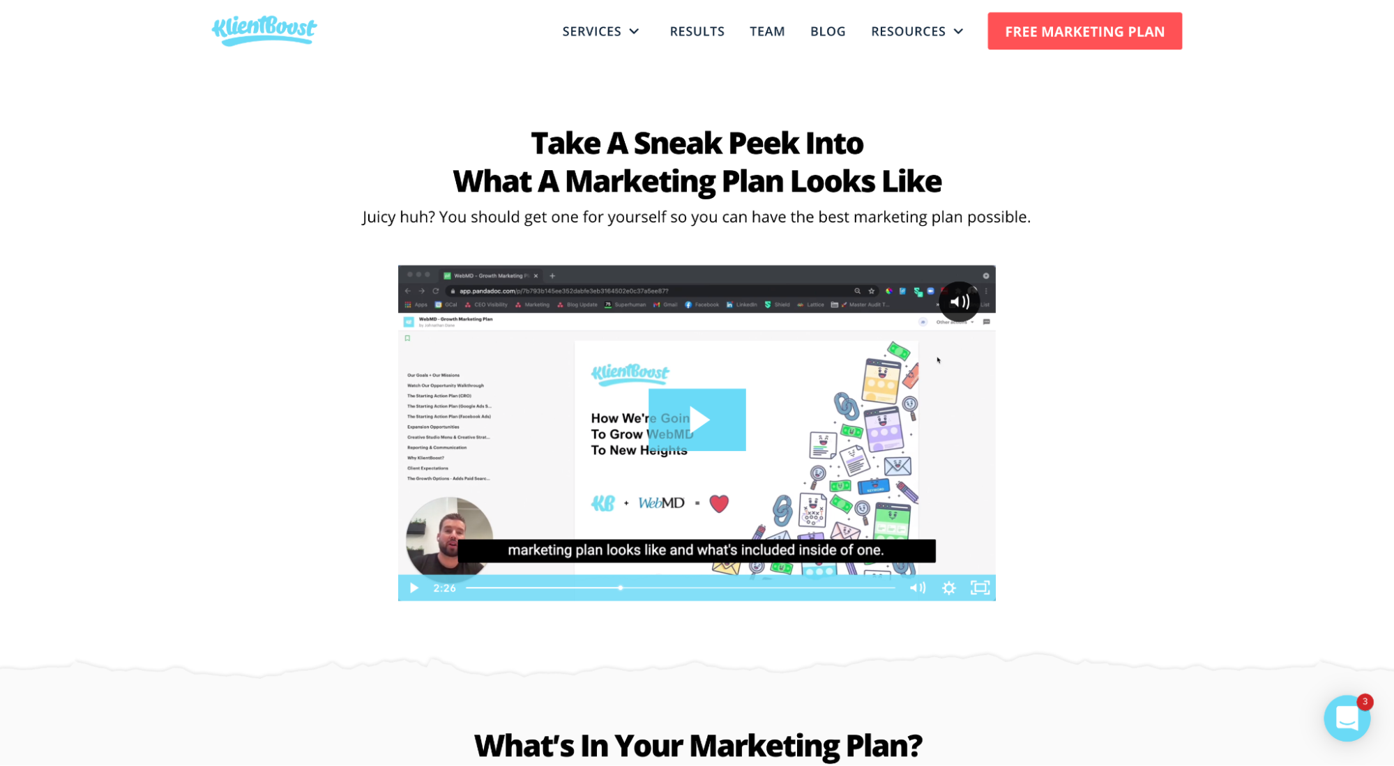
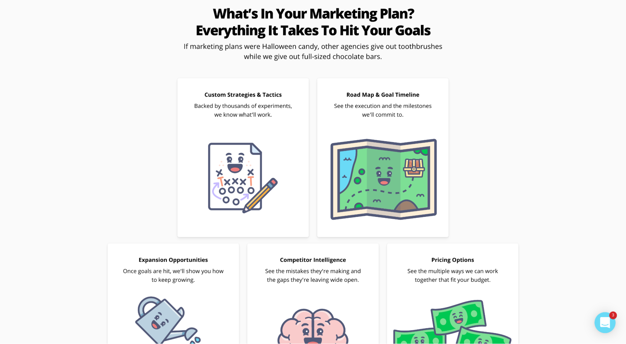
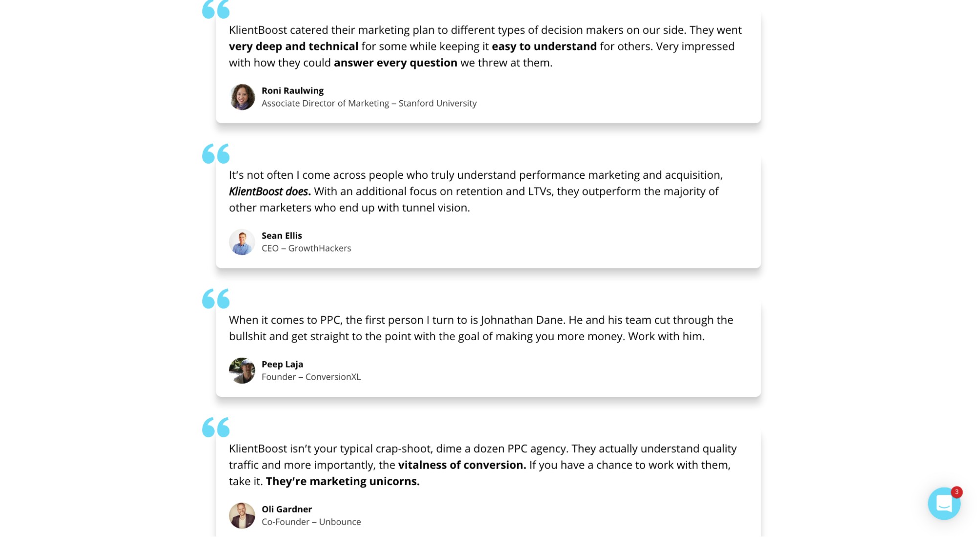
Our next step is a marketing plan + call. So we sell it. Whatever your next step is, don’t forget to sell it too.
Landing Page Best Practice #11: Use explicit directional cues
An explicit directional cue is an icon or graphic (like an arrow) that signals to visitors where to direct their attention.
Surprisingly, they don’t show up very often on landing pages. But when they do, they rip off the page and draw attention. That’s because directional cues send subconscious signals to our brain indicating importance.
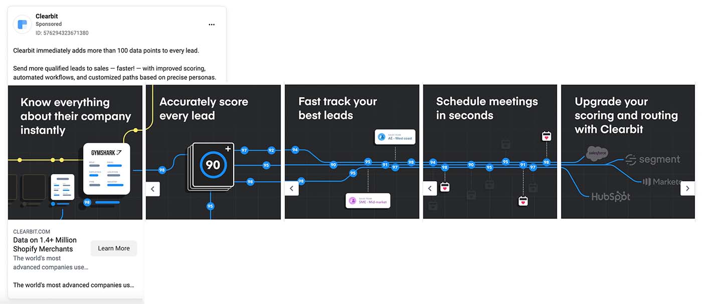
For example, Clearbit uses an abstract directional cue within their Facebook carousel ad design to draw attention from one image to the next and keep users tapping through.
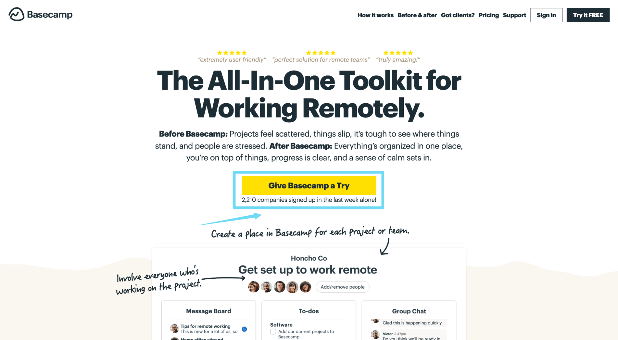
Just like Basecamp uses a directional arrow to spotlight their landing page CTA:
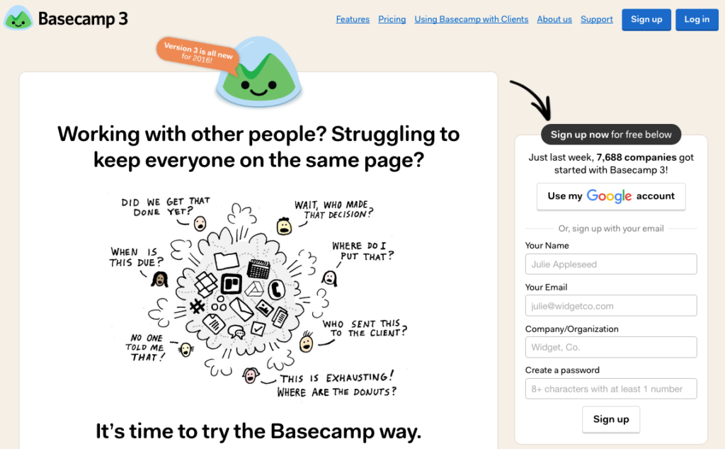
Though subtle in design, directional cues are anything but subtle when it comes to grabbing attention.
Use them wisely.
Landing Page Best Practice #12: Increase motivation with click triggers
A click trigger is a nudge that sits in close proximity to your CTA button and helps motivate clicks.
For example, Basecamp includes the click trigger “2,210 companies signed up last week alone” below their CTA to keep prospects moving forward:
Or SproutSocial uses their click trigger to highlight a benefit: “No card required. No software to install.”
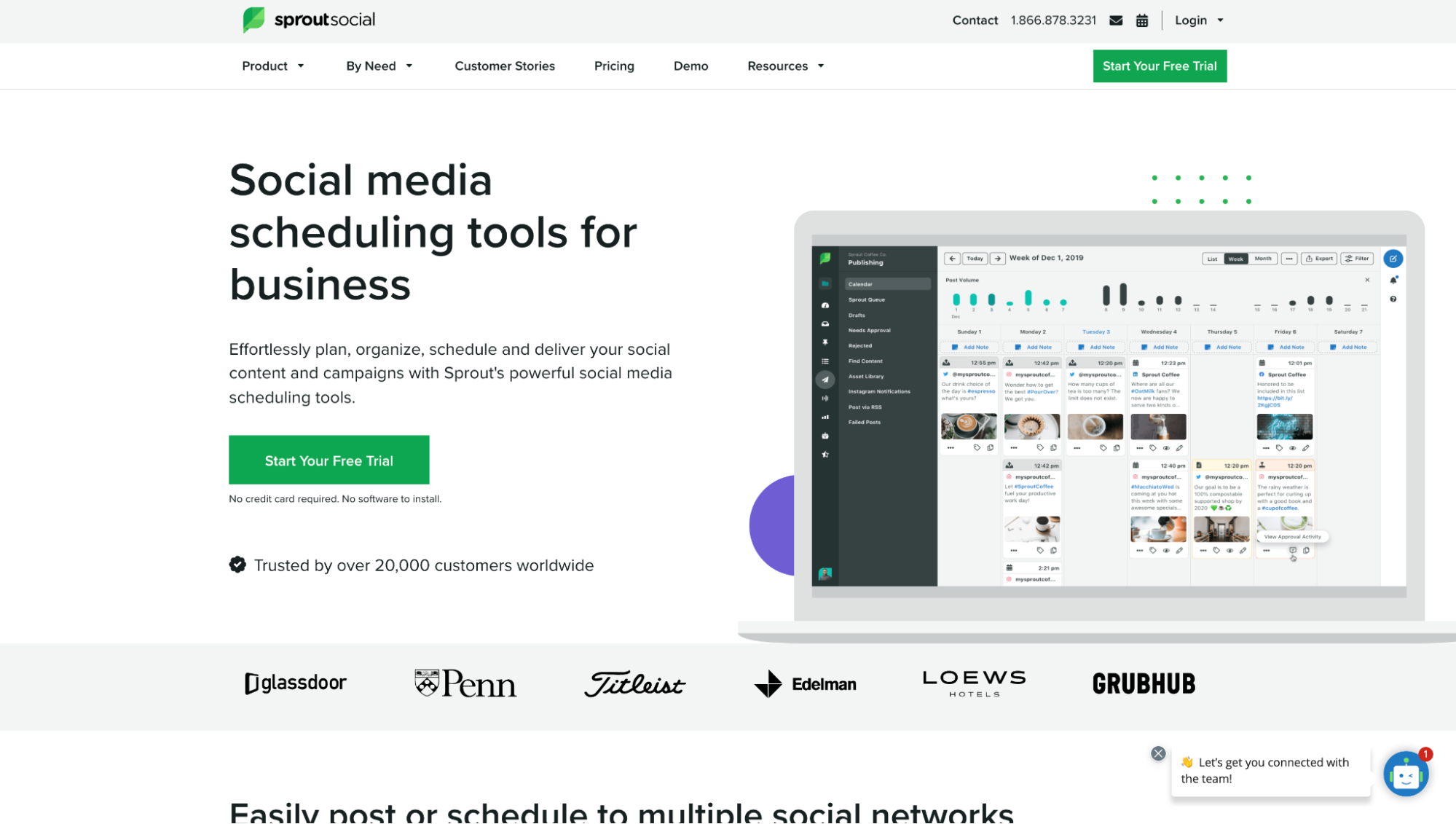
Use click triggers to increase motivation by neutralizing anxiety, highlighting value, or displaying social proof. And whatever you do, don’t encourage negative thoughts, like “we will not spam you” (even though negativity isn’t your intention).
Not sure what click triggers to use? They come in all shapes and sizes:
- Social proof (testimonial, review, tweet)
- Use stats (“Over 2,210 signed up this week”)
- Star ratings (“4.9/5 stars across 11 platforms”)
- Guarantees (“30-day money-back”)
- Free incentives (“free shipping”)
- Payment-option and/or icons (“We accept Visa, MasterCard, or Amex”)
- Security badges or icons (“Certified checkout by TrustAdvisor”)
- Benefit (“No credit card required. No software to install.”)
Landing Page Best Practice #13: Optimize for mobile
Back in 2019, 56% of all internet traffic came from a mobile device, and over 162 million mobile shoppers existed in the U.S. alone. This means those numbers have only grown in the last two years.
Mobile is here to stay, and your landing pages need to reflect the needs of mobile users (which differ from the needs of desktop users).
And that entails more than building a “responsive” web page.
We wrote an entire article on optimizing mobile landing pages beyond responsive design: 31 Mobile Landing Page Ideas to Help You Fly Above Your Competition, so we won’t go deep here. But let’s review some data-backed takeaways nonetheless (for more details on each, read the article):
- Enable “shop later” (for eCommerce buyers on the go)
- Design for a comfortable thumb reach
- Adjust keyboard for each form field (e.g. phone number vs. message)
- Segment mobile traffic to different landers
- Use short action-oriented headlines
- Remove ancillary chunks of content (stick with core benefits)
- Make phone numbers clickable
- Consider a phone number as a CTA
- Geotarget based on GPS
Landing Page Best Practice #14: Match offer with conversion intent
To increase landing page conversions, your landing page offer should match the intent of the visitor.
For example, you wouldn’t want to hit out-of-market buyers with a CTA to buy now; they’re not ready to buy now. Just like you wouldn’t want to hit in-market buyers with a CTA to download a guide instead of scheduling a demo.
But depending on the source of traffic, visitor intent will vary.
For example, social media traffic tends to skew colder (i.e. less likely to convert now), whereas PPC traffic tends to skew hotter (i.e. more likely to convert now). That’s because PPC ads let you target purchase-intent keywords (bottom of the funnel) whereas social ads don’t (and social media users aren’t actively shopping).
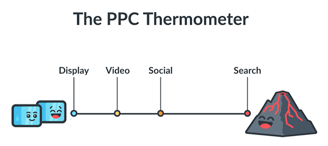
Either way, when building your landing pages and setting up your ad campaigns, always make sure your offer matches the visitor’s intent.
To help, we created a simple cheat sheet that pairs offers with channel temperature:
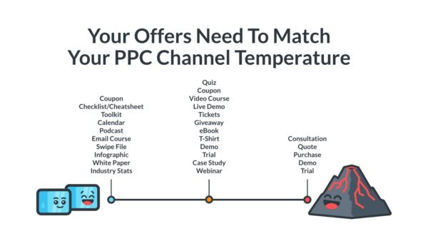
Let’s explore some real-world examples.
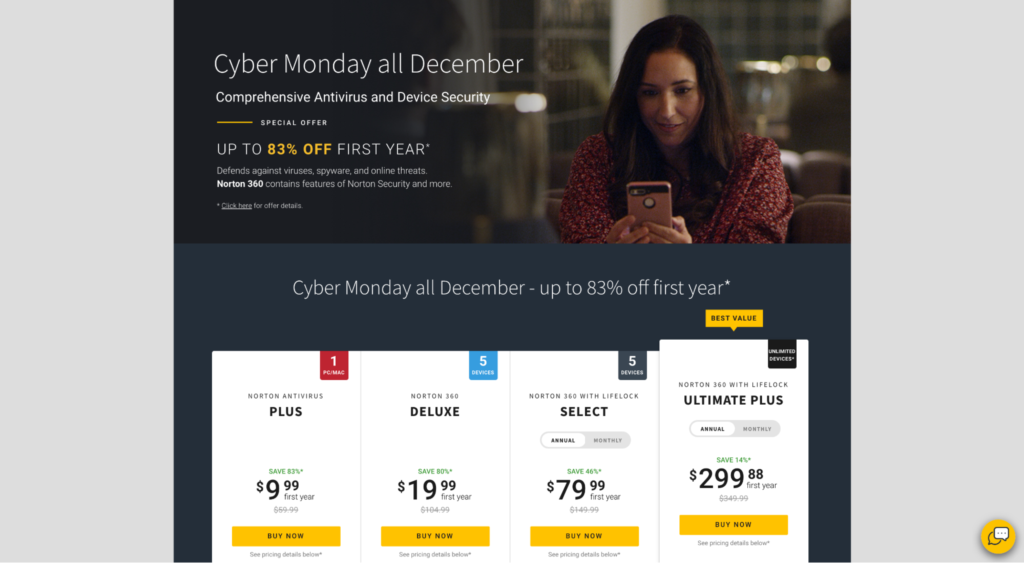
When I type the keyword “buy virus security software” into Google, Norton pops up as the top ad. Because Norton knows that I want to buy now based on my keyword, they target their CTA and offer accordingly (“Buy now”):
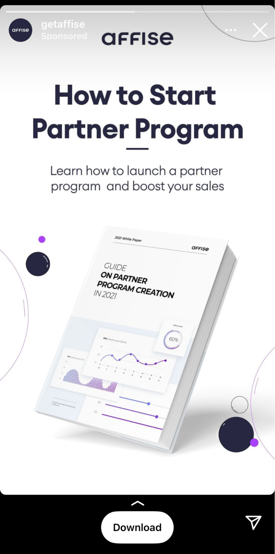
Affise, on the other hand, knows that I’m not looking to buy now because (1) I’m on social media, and (2) I’ve never visited their website. So instead of hitting me with an offer to buy now (which I’ll likely gloss over), they hit me with a top of funnel resource guide:
Landing Page Best Practice #15: Design your information hierarchy (F-shape or Z-shape)
Landing pages need structure.
This is why you should start your landing page design process by structuring information hierarchically, from most important to least important, top to bottom.
If you’re relying on a landing page template to provide that structure for you, stop.
Don't make the landing page mistake of trying to squeeze information into a pre-defined, templatized hierarchy; create the hierarchy first, then choose a template that matches it.
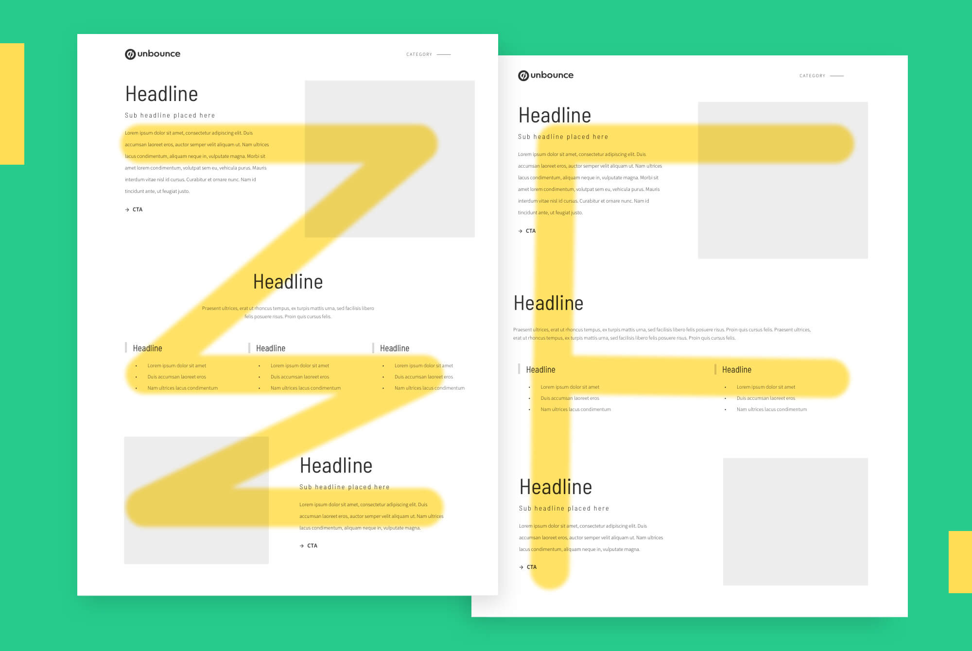
When outlining your information hierarchy, remember that visitors navigate your landing pages in two dominant ways: F-shaped or Z-shaped. Pick one.
Hint: For pages with a lot of copy, opt for an F-shaped structure and keep important information along the F lines below. For pages with little copy, a Z-shaped structure might work best.
Landing Page Best Practice #16: Optimize your thank you page
Don’t forget about the thank you page.
Not only do thank you pages make measuring conversions easier (by using visits to trigger goal completions in analytics), but they also offer prime real estate that you can use to nudge prospects toward specific actions, like:
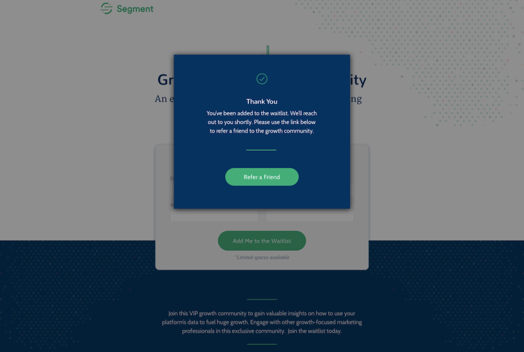
Asking for a referral:
Subscribing to a newsletter:
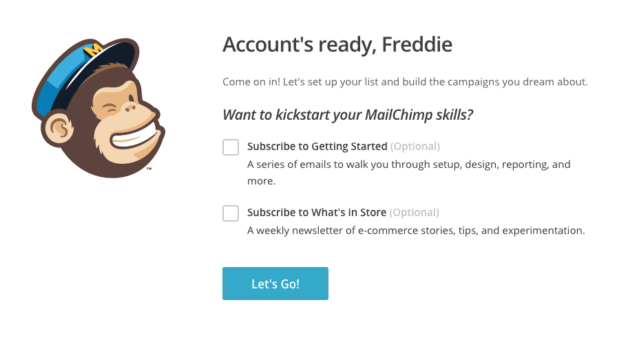
Emailing to a friend:

Taking next steps:
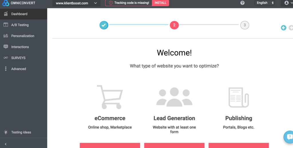
The list goes on…
To discover more creative ideas for your landing page thank you pages, check out our article: 17 Thank You Page Ideas to Nurture Visitors Through The Sales Cycle.
Landing Page Best Practice #17: Write value buttons, not effort buttons
Is your CTA button copy value-focused? Or is it effort-focused?
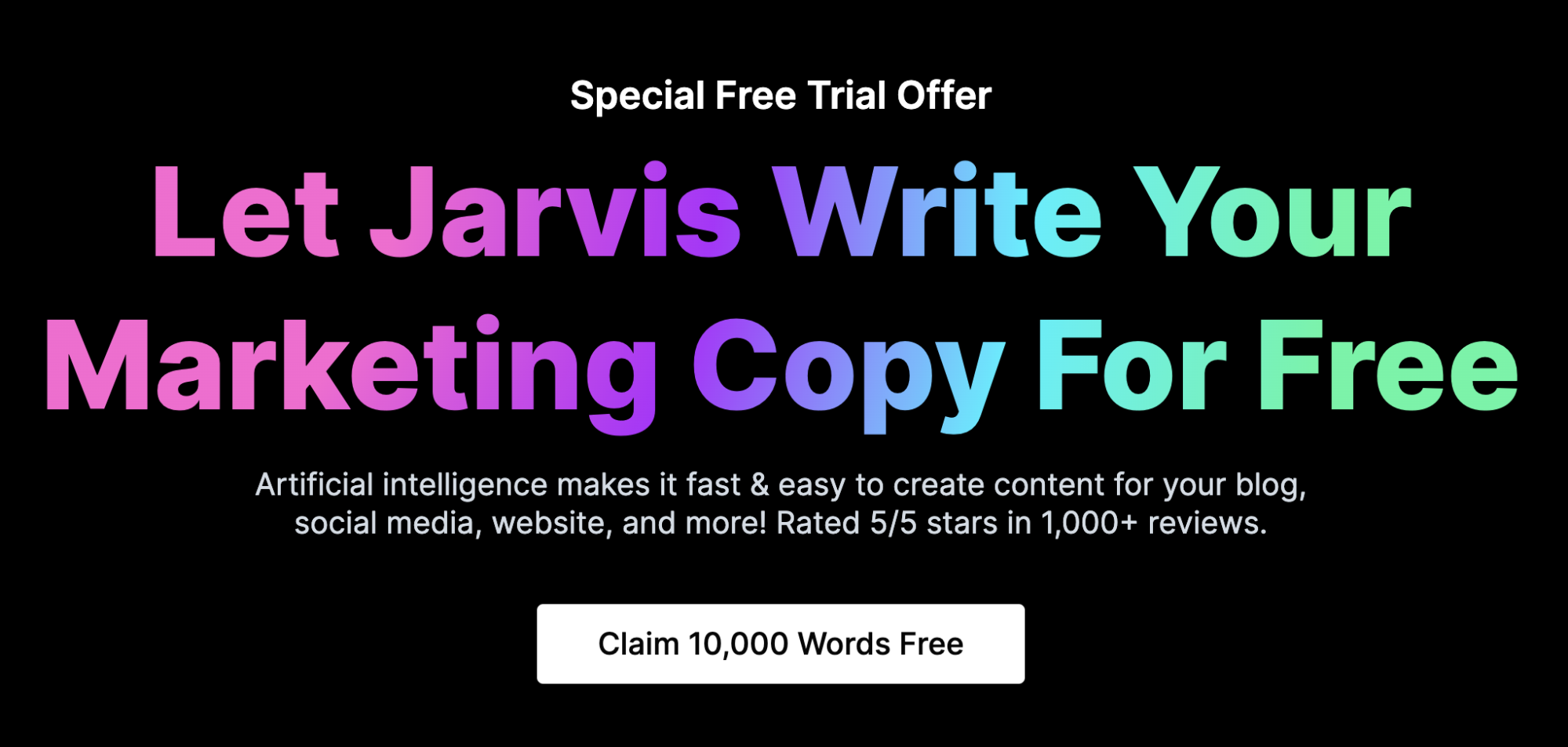
Value-focused CTAs use words that appeal to the lazy: receive, get, view, enjoy, discover, see, or play.
Effort-focused CTAs use action words that subliminally make you think you have to work: submit, start, activate, learn, pay, earn or go.
Who should you appeal to? Yes, the lazy.
Make your CTA button copy sound as effortless and rewarding as possible.
Like this:
Landing Page Best Practice #18: Steal from other landing pages
Yes, seriously.
Great design gets inspired by other great designs.
When designing landing pages for ourselves and our clients, we like to draw inspiration from a few valuable resources.
- Landingfolio: A library of landing page designs, organized by types, sections, goals, and more
- RareBlocks.xyz: A library of wireframe kits and components
- Chapter 3 of our landing page guide: This chapter explores 10 types of landing pages with examples.
- Dribbble: If you know, you know
- Template galleries: As in free templates offered by landing page builders (e.g. Unbounce templates, Instapage templates, LeadPages templates)
- Google ads: Yup, good ol’ fashioned Google searches (sorry for the click, friends).
Landing page design is hard when staring at a blank page. Kickstart your creative juices with a little inspiration. We’re giving you permission.
That’s all.
Landing Page Best Practice #19: Make the invisible visible (live demos)
Sometimes you just have to see it, right? Right.
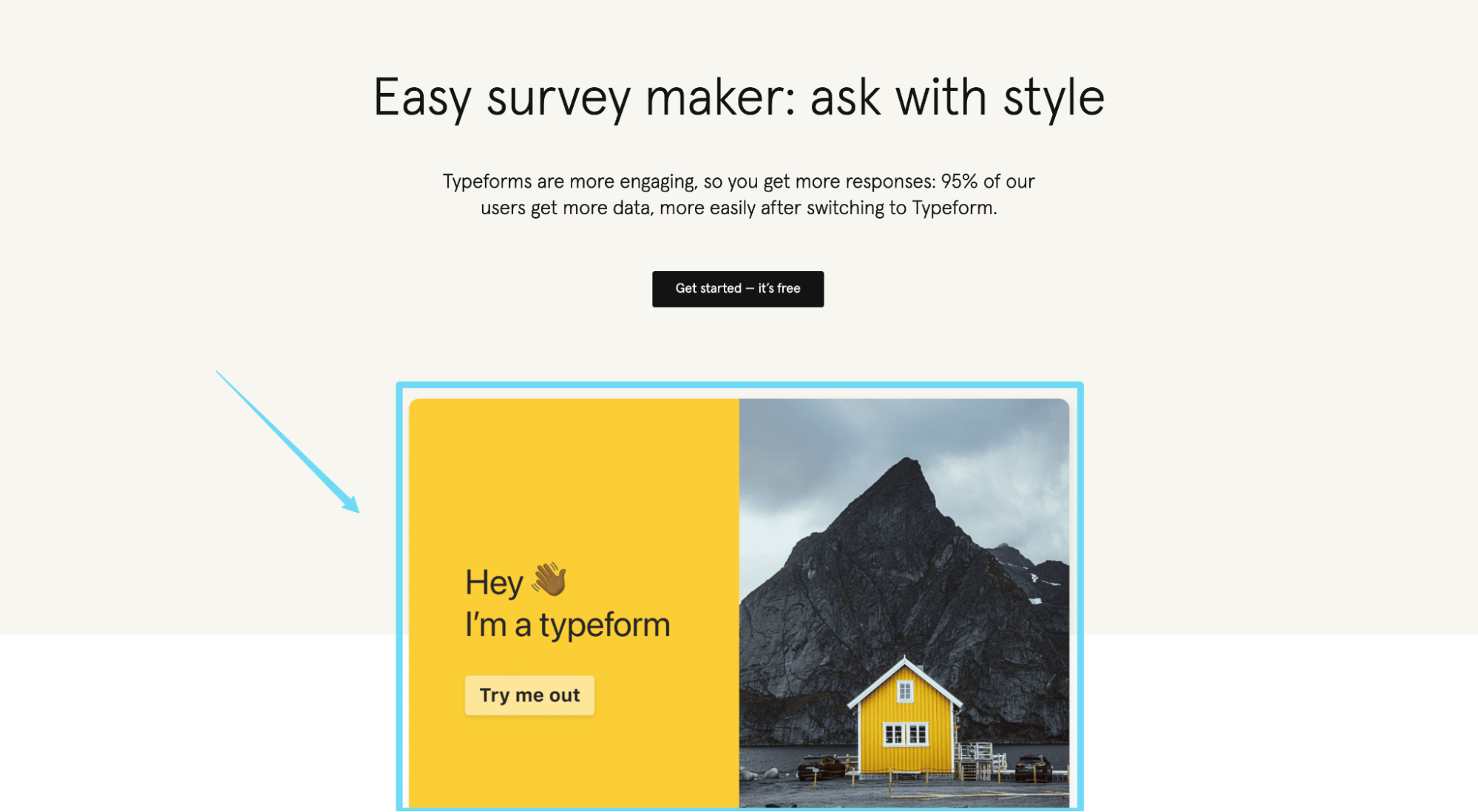
This means not hiding a product video or short demo behind an email gate, but embedding it on your landing page instead. Or instead of a video demo, embed your tool within the actual landing page (if applicable).
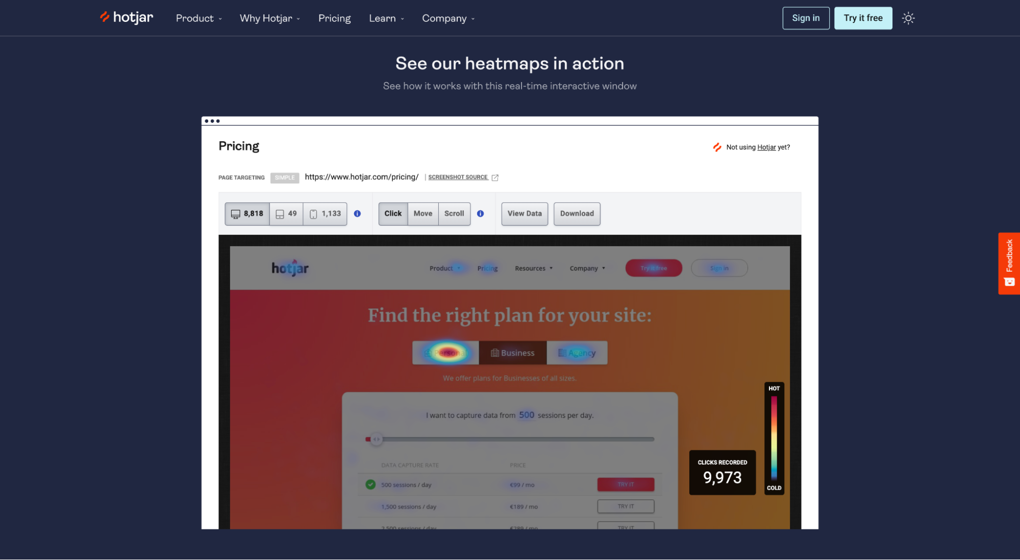
For example, both TypeForm and HotJar embed live demos into their landing pages for visitors to explore. No better way to put your product in the prospect's hands than by embedding it directly within the landing page.
Landing Page Best Practice #20: Use distinct brand assets
A recent study by Kantar Millward Brown discovered that brands with the strongest and most distinct assets are on average 52% more ‘salient’ than their rivals. This means consumers are much more likely to remember those brands when they’re shopping within the category.
Why is that so important? In a sea of sameness and feature parity, familiarity is usually all you need to win a sale.
Which begs the question: When people arrive on your landing page, what distinct brand assets have you incorporated that will remind visitors that they already know and trust you?
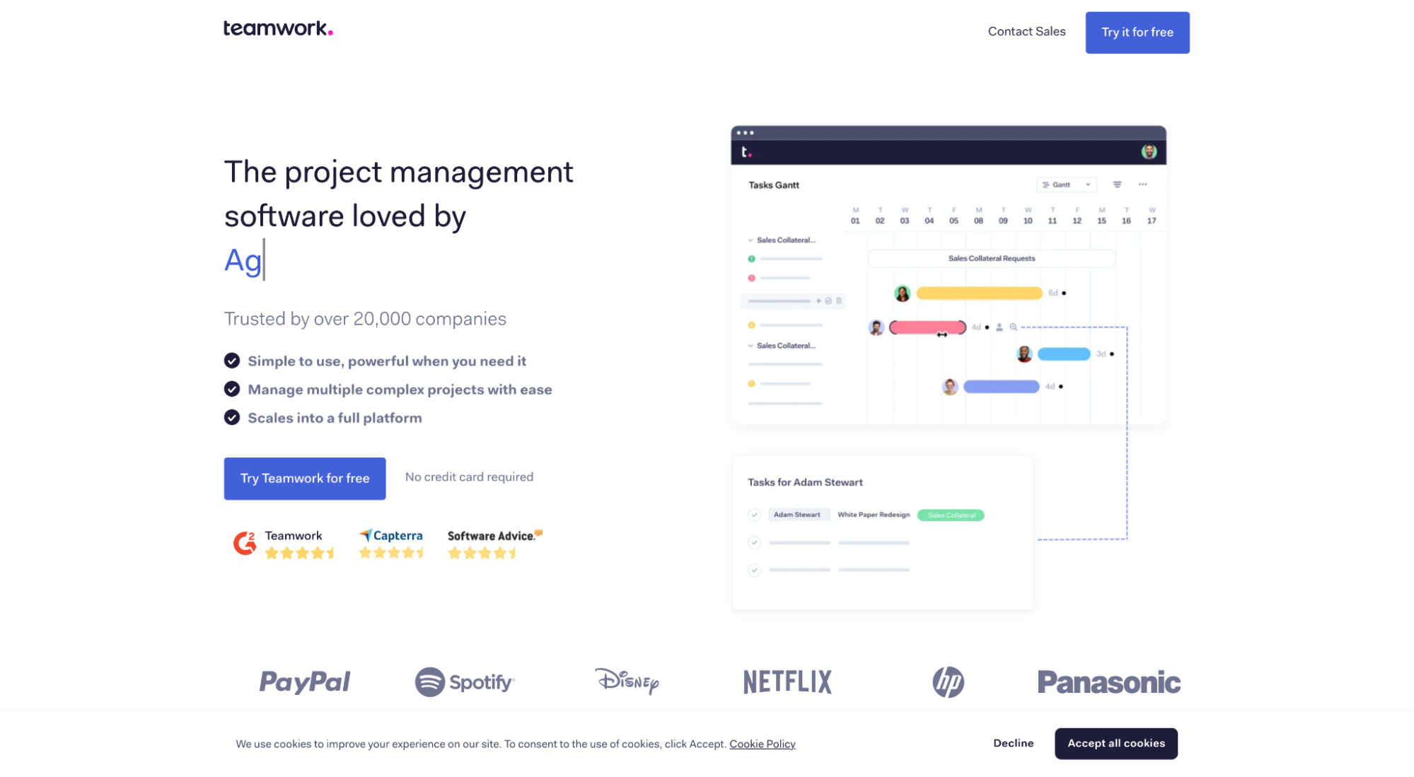
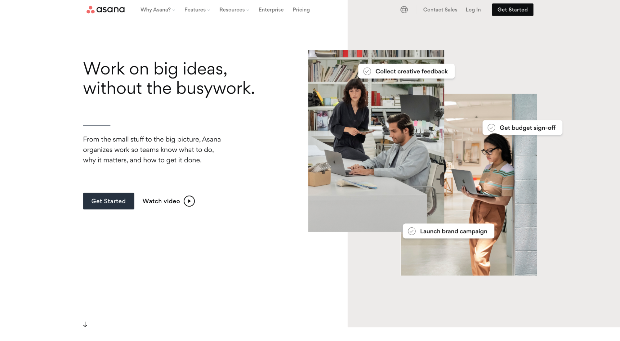
For example, say I was searching for project management software but couldn’t recall any names off the top of my head. If I landed on any one of the below three landers from a Google PPC ad, would something about the design trigger a memory?
Option 1: Teamwork
Option 2: Asana
Option 3: Monday
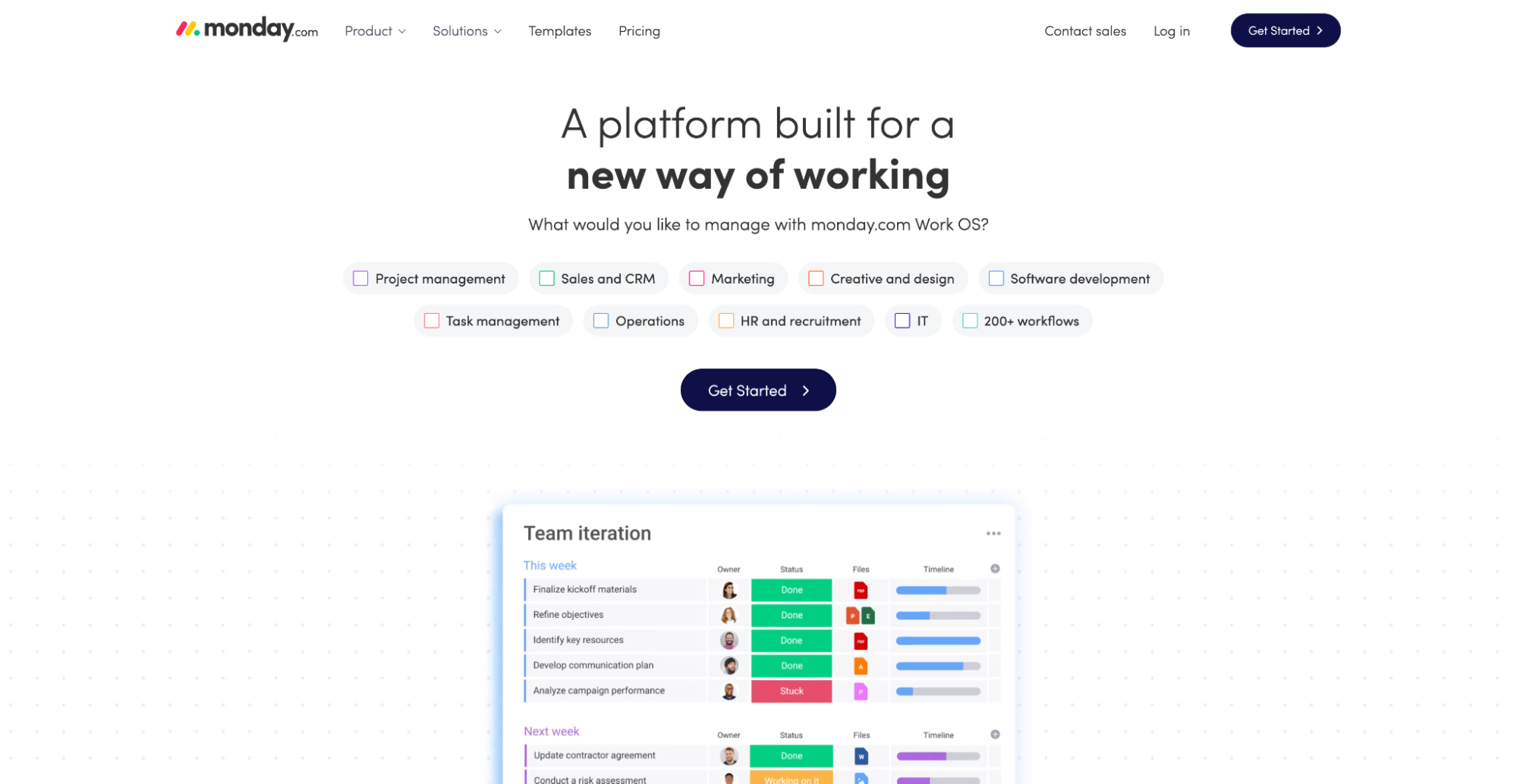
The answer: No.
Each lander uses the same colors, graphic style, typography, messaging, and tone. If I pulled the logo off of each, you wouldn’t know which was which.
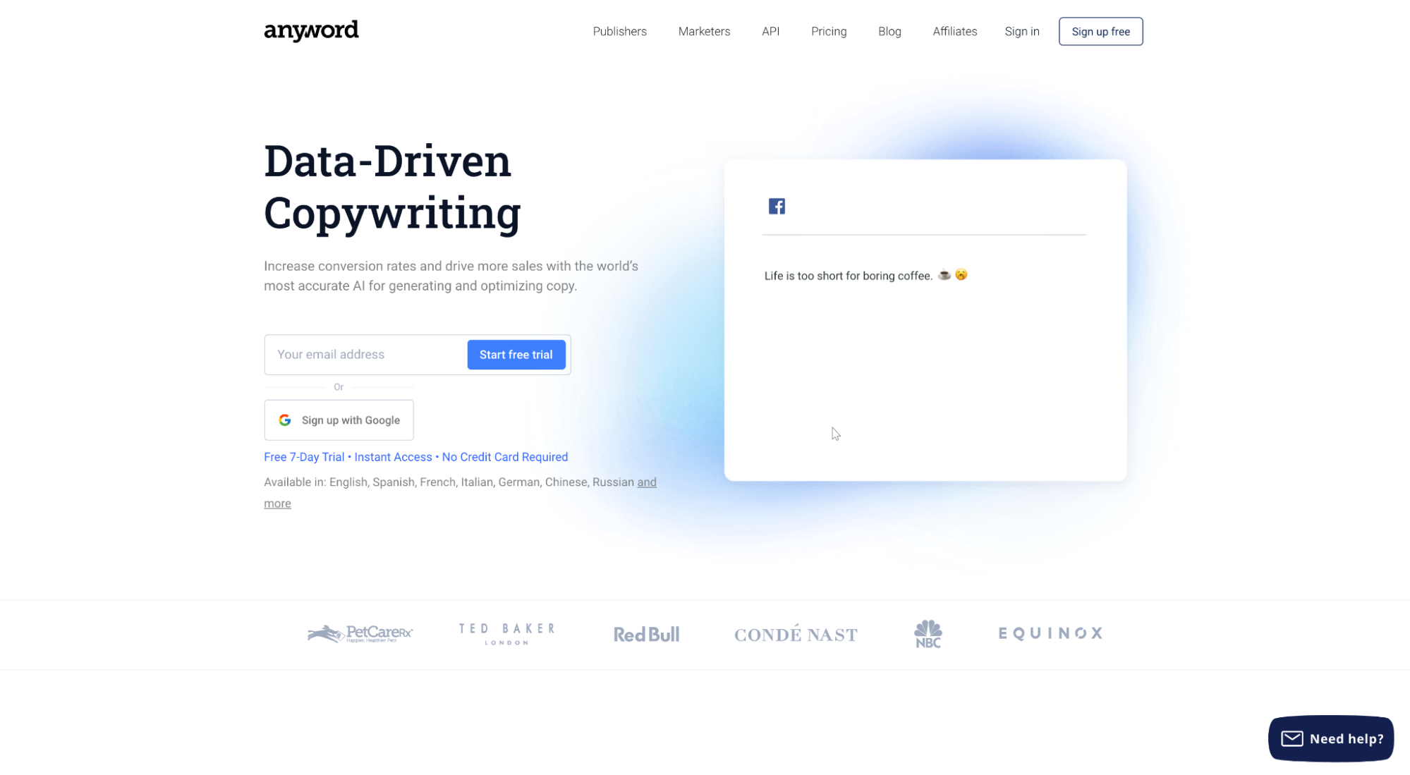
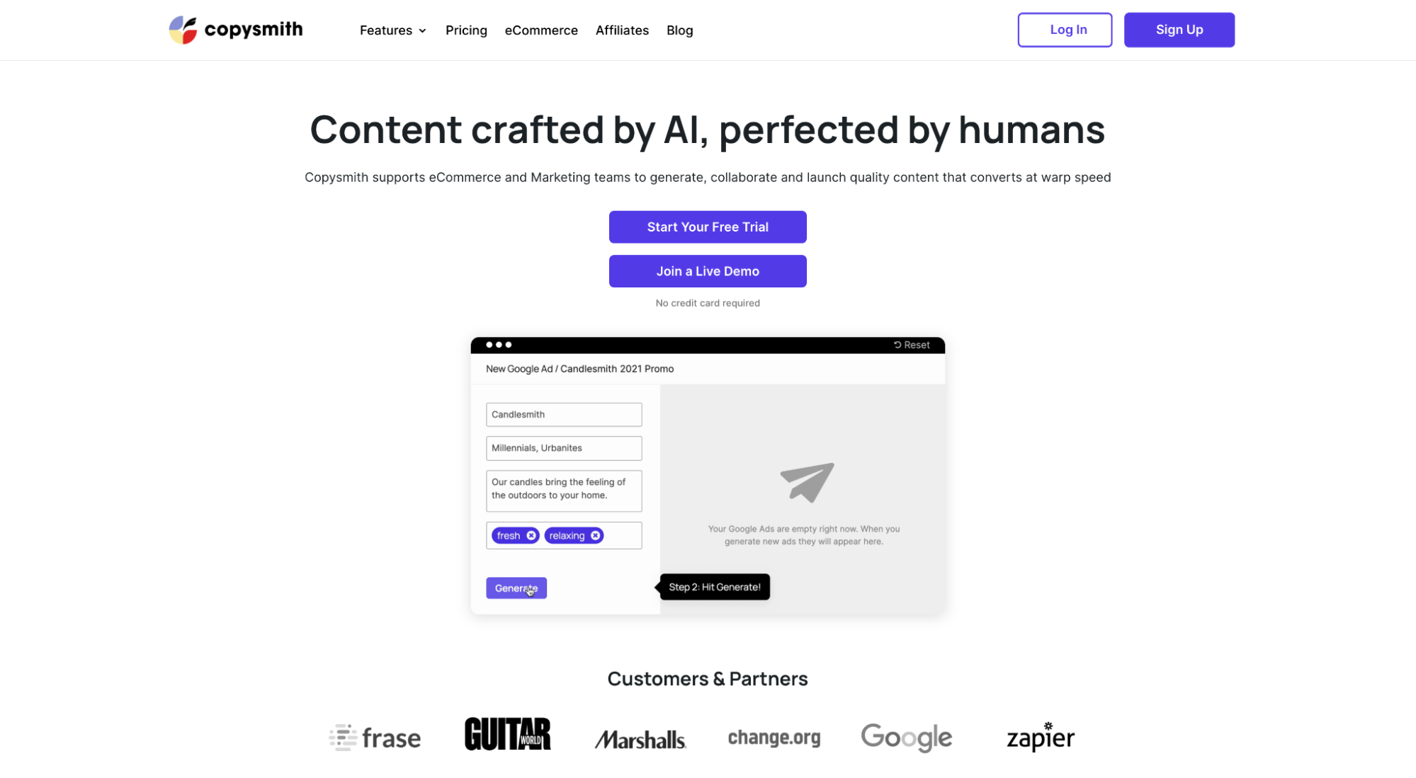
Now let’s look at another example, this time for AI-powered copywriting software.
Is there anything distinctive about one of the following examples that might trigger a memory?
Option 1: Anyword
Option 2: Copysmith
Option 3: Jarvis
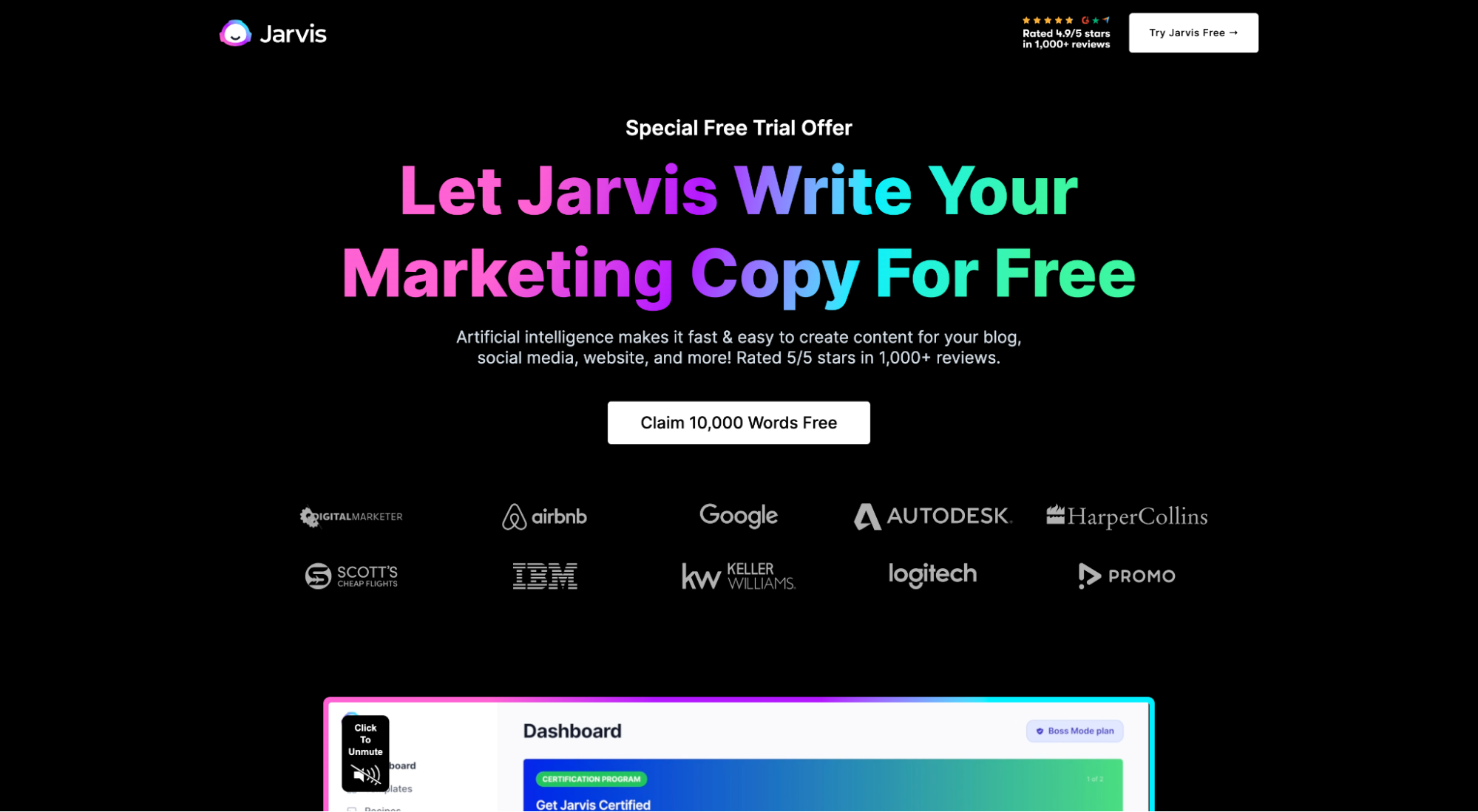
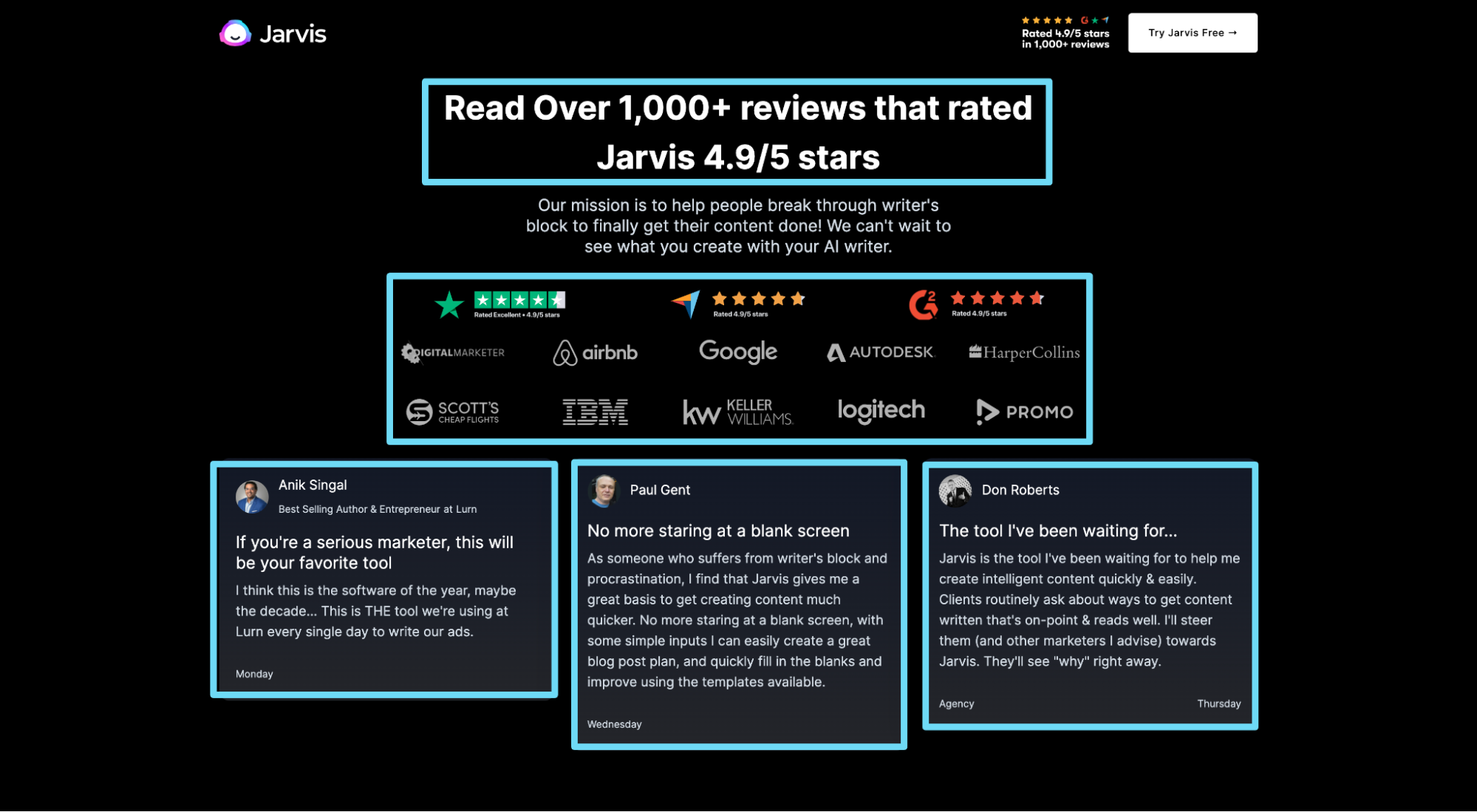
Bingo! Jarvis understands the power of distinct brand assets: dark backgrounds, rainbow gradients, and their robot mascot (named Jarvis).
When available, bake your distinct brand assets into every landing page design. Be memorable so when people arrive, they have a sense of familiarity.
Landing Page Best Practice #21: Grab attention with your headline
Your landing page headline should grab attention, deliver a concrete benefit or value proposition, and let visitors know whether or not you’re the right fit for them.
That’s a big ask for a few words. But it’s mandatory.
Ambiguous headlines tank conversions.
For example, if you never knew what service Buffer provided, would this headline and subheadline help explain it or its benefits? Nope.
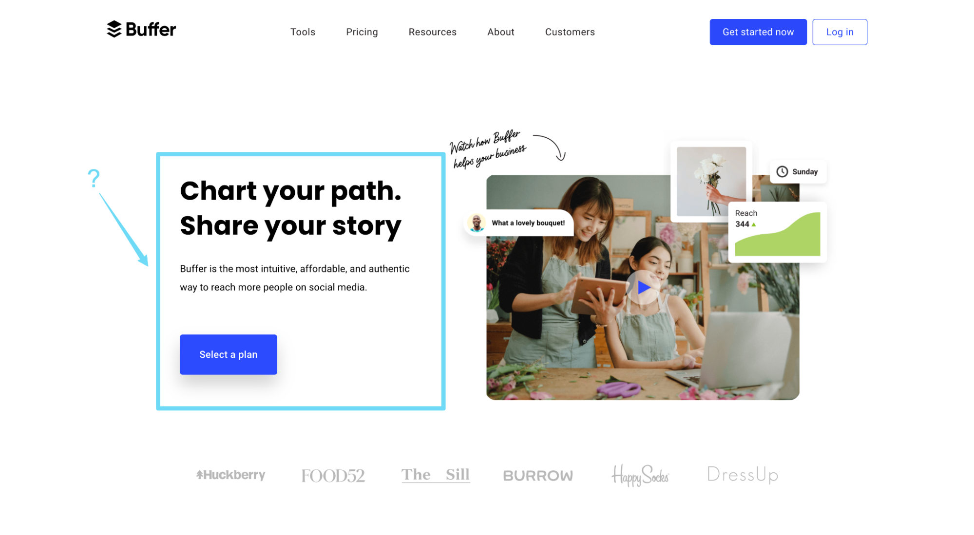
Now juxtapose Buffer’s headline with Jarvis’ headline and subheadline:

Boom.
It’s clear. It’s compelling. It communicates a benefit. And it provides supporting details (w/ social proof).
When writing your own headlines and subheadlines, consider one of the following headline templates:
- Plain and simple: Red Satin Heels, 20% Off
- Big benefit: Put long-term growth on autopilot, for less than $9/day.
- Loss-aversion: Stop bleeding profit. Start Increasing Pricing Power.
- Question: Content Marketing Taking Too Long? Not anymore.
- New: Introducing the future of copywriting: Jarvis AI
- Command: Work With A Facebook Ad Agency That Talks Less And Delivers More
- Testimonial/social proof: Over 365,000 Small Businesses Do Payroll with ADP
Further reading: Landing Page Headlines That Convert Up To 67% Better (how’s that for a headline?)
Landing Page Best Practice #22: Message match ads with landing page
If someone reaches your landing page, it’s because they clicked on an ad, promotion, or campaign first. After all, that’s the entire point of a landing page: to provide a targeted destination with a targeted message for a target audience.
Consequently, visitors expect that the promise made in your ad or promotion will match the promise made on the landing page. And if it doesn’t, your bounce rates will skyrocket (or visitors will think they clicked on the wrong ad).
This means everything on your landing page, from your headline and benefits to your tone and keywords, should match the ad copy that someone clicked on before the lander.
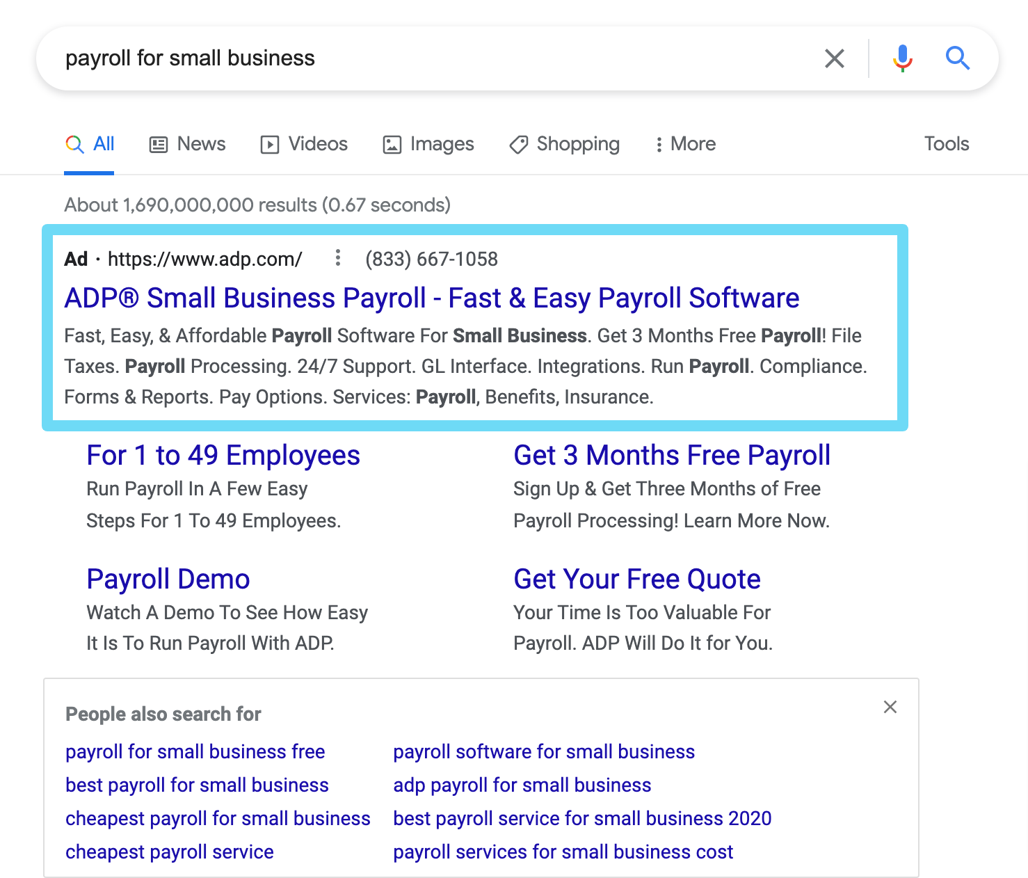
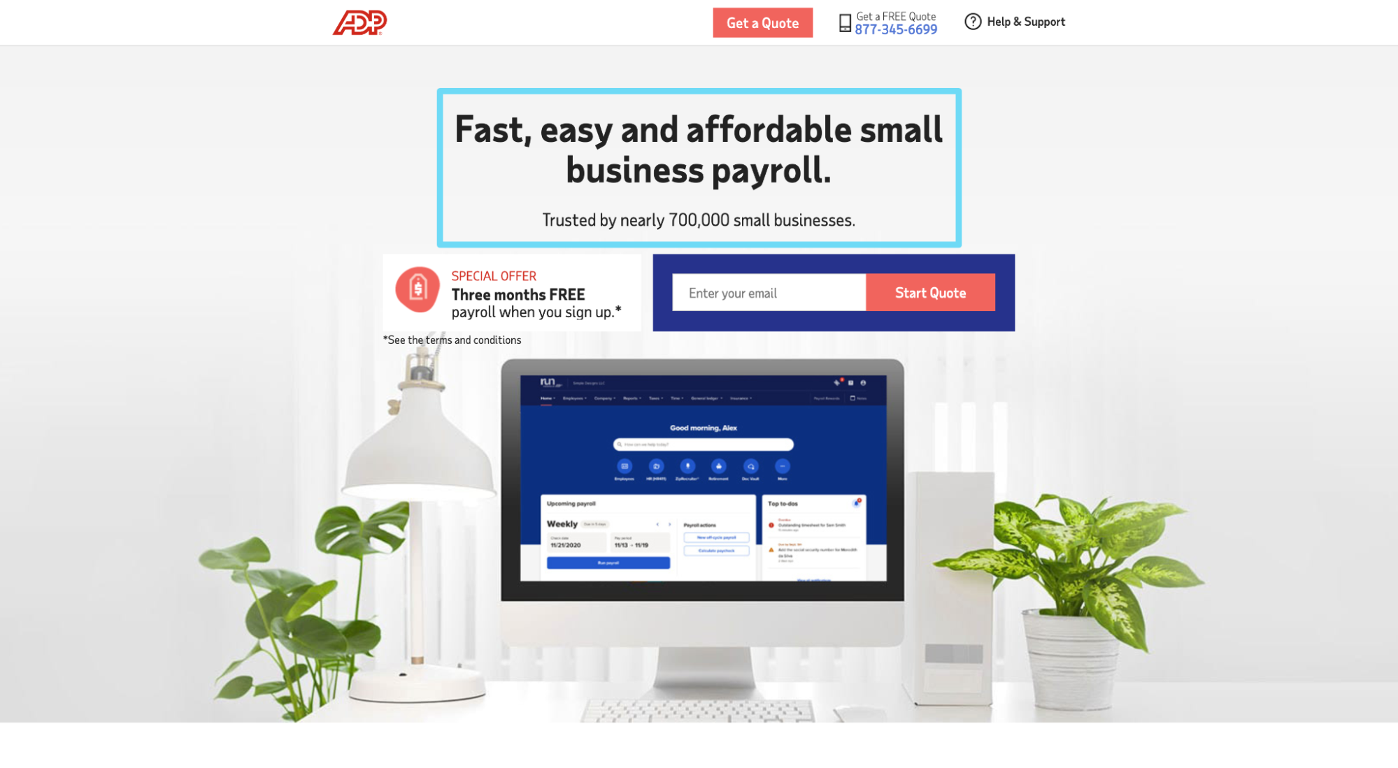
For example, when I search for “payroll for small business” on Google, ADP serves a PPC ad that matches my query: “ADP Small Business Payroll - Fast & Easy Payroll Software.” Bingo.
When I click on the ad, it takes me to a landing page that matches the message precisely: “Fast, easy and affordable small business payroll.”
Landing Page Best Practice #23: Build credibility with social proof
Social proof (another principle from Cialdini) refers to the phenomenon wherein people copy other people’s behavior. In other words, in situations when we don't know what choice to make, we look to see what choices other people have made in the same situation, then copy their choice.
When it comes to landing pages, social proof comes in the form of reviews, testimonials, star ratings, case studies, awards, and user stats. And its conversion goal:
- 83% of people trust reviews over advertising
- More than half of consumers won’t use a business if it has less than a 4-star rating
- 97% of consumers look at reviews before purchasing
- Testimonials can increase conversion rates on sales pages by 34%
- A single good review can increase conversions by a whopping 10%
- Having at least 5 reviews causes purchase likelihood to increase by a factor of nearly 4X
To increase landing page conversions, use social proof generously.
Who uses social proof better than anyone? Jarvis.
They use client logos, star ratings (“4.9/5 stars from over 1,000+ reviews”), testimonials (100 total), and customer stats (“Over 55,000 customers”) to remind visitors that people in their same situation chose Jarvis (and didn’t regret it).
Further reading: Where To Put Social Proof: The 7 Best places
Landing Page Best Practice #24: Increase page speed (load time)
Slow loading landing pages are conversion killers.
In fact, Walmart discovered that for every 1 second improvement in page speed, conversions increased by 2%.

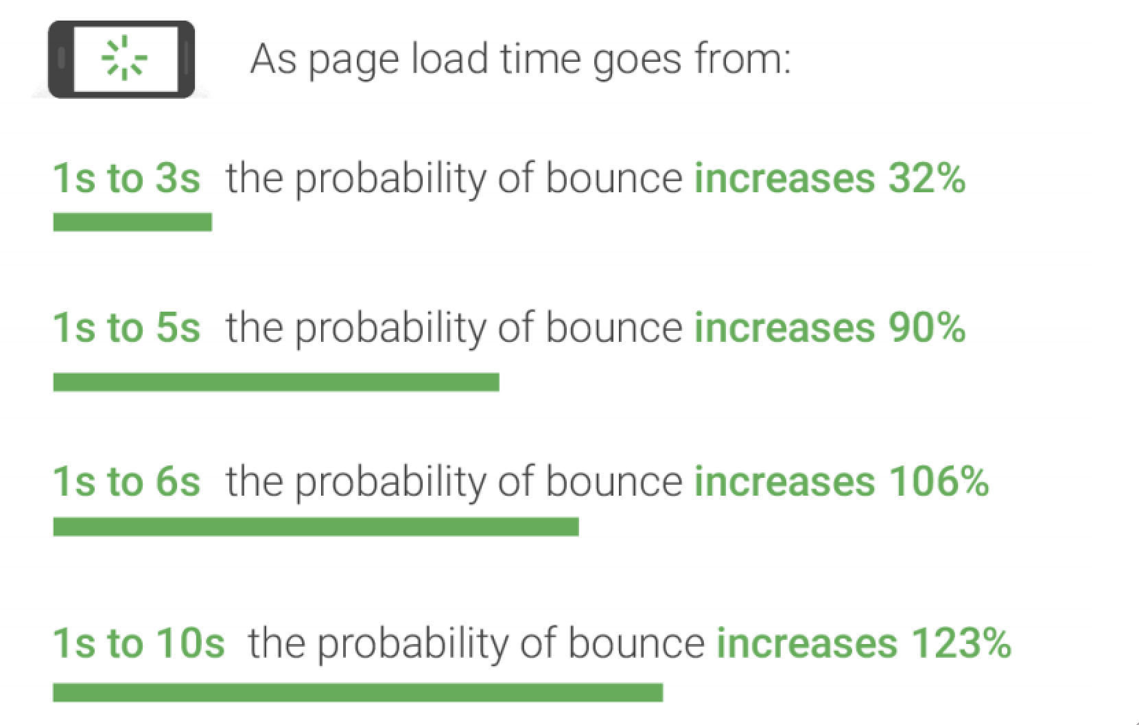
And Google discovered that as page load time goes from 1s to 3s, the probability of a bounce increases 32%. Yikes.
How do you increase landing page speed?
Unbounce’s Brad Smith gives us 11 Ways to Accelerate Page Load Time. Here’s the short and skinny:
- Clean up your code
- Minify HTML & CSS
- Use GZIP compression
- Use less redirects
- Relocate scripts
- Don’t use as many WordPress plugins
- Upgrade your hosting
- Resize images
- Compress images
- Use Content Delivery Network for images
- Use external hosting when possible
Bonus: We wrote an entire article on technical SEO that covers page load speed. Check it out here.
Landing Page Best Practice #25: Remove navigation and footer exit links
The tyranny of choice is real.
Which is why removing navigation and footer links (i.e. removing choices) is the easiest way to increase conversions.
Don’t believe us? Hubspot ran an A/B test where they removed links (social links, navigation links, footer links) from their five most visited landing pages, and conversions rose significantly for all but one page:
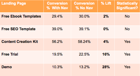
Hubspot also discovered that the further down the metaphorical marketing funnel visitors travelled, the more impact removing links had on conversions (e.g. demo conversions increased by 28% whereas free ebook conversions increased by 2%).
Eliminate distractions. Nix the unnecessary nav and footer links. Watch conversions go up.
Landing Page Best Practice #26: Format for readability (and skimming)
81% of people skim website content, and the average website visitor reads, at most, 20-28% of the words on the page during a single visit.
To ensure your landing page communicates your key benefits and CTA, format accordingly.
- Short, choppy sentences: No one has time for long, blocky chunks of content
- Bullet point lists: Break big ideas up into smaller, easy to read lists
- Bold headlines: Make sure your benefits pop off the page—no guessing
- Legible fonts: Don’t get cute, keep it simple
- Images: People are visual learners so speak their language
- White space: This one matters so much we’re going to cover it in its own section next
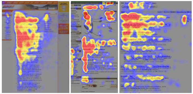
Bonus: People read web pages in an F-shaped pattern. Keep this in mind when designing your landing page layout.
Landing Page Best Practice #27: Embrace white space
White space refers to the area between design graphics (or the area between elements within a single graphic). As in the literal space between one line of copy and the next, or one image and the next.
Why is white space important? It creates balance and directs attention.
Think of white space like a river that your visitors float down, from the top of the page to the bottom.
Whereas icons or arrows function as explicit directional cues, white space functions as an implicit directional cue.
For your landing pages, use white space to accomplish the following:
Improve readability
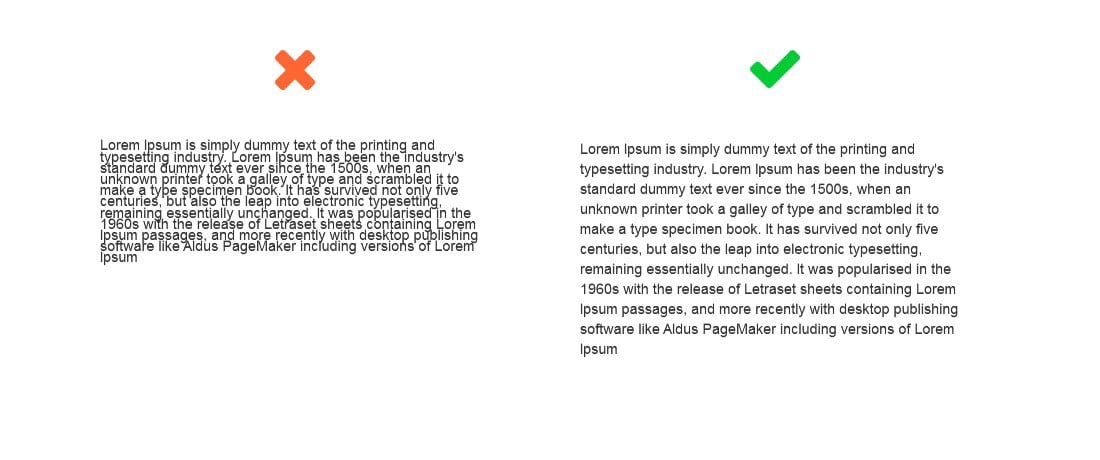
Draw attention
Guide the visitor down the page
Make content digestible

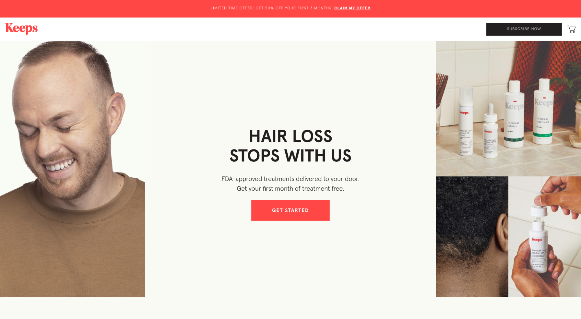
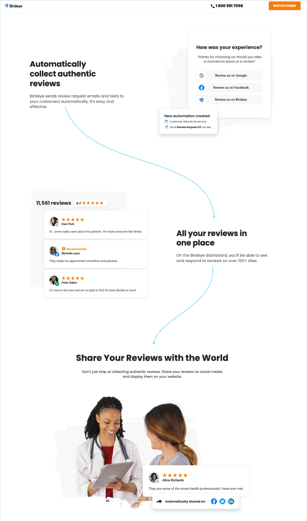
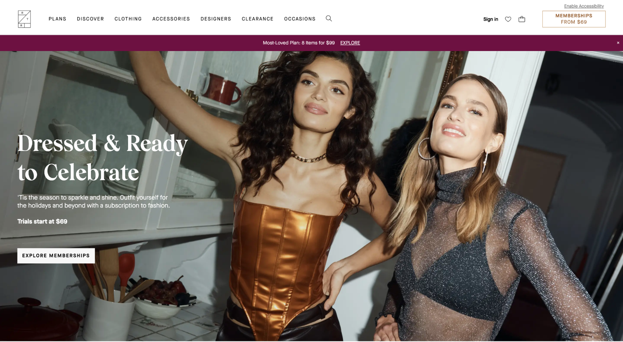
Landing Page Best Practice #28: Add images with purpose
“A picture is worth a thousand words.”
That’s because 90% of information transmitted to our brain is visual, and images are much more memorable than words.
When it comes to landing pages, images are the first thing your visitors will see. So make them count.
Draw attention
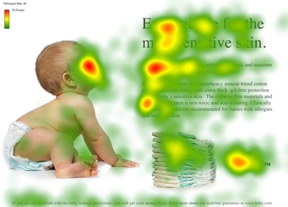
Provide context
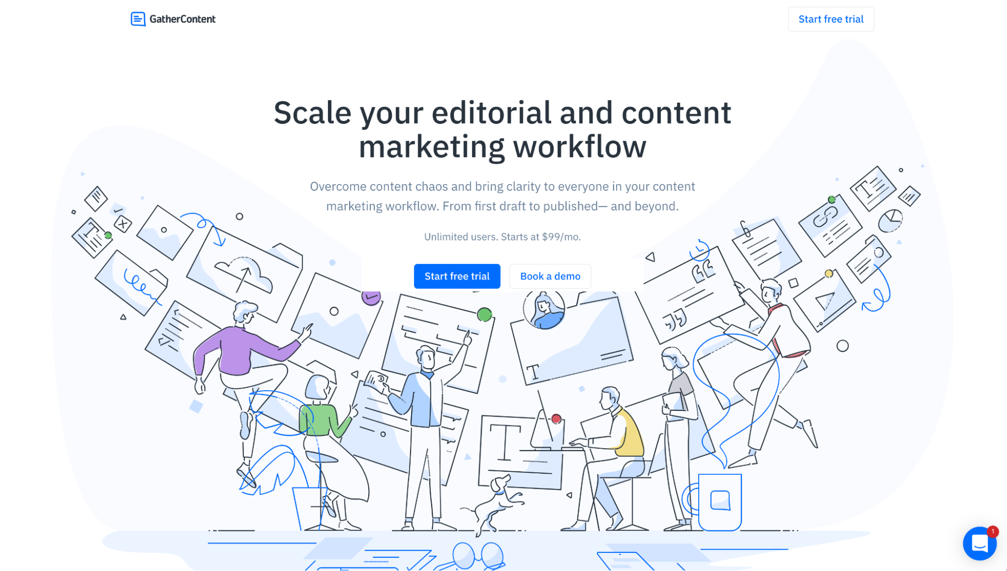
Convey emotion
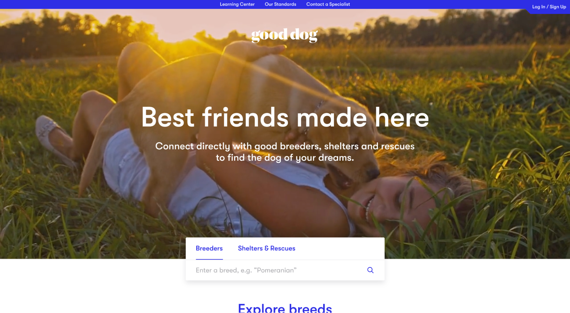
Show the product in action
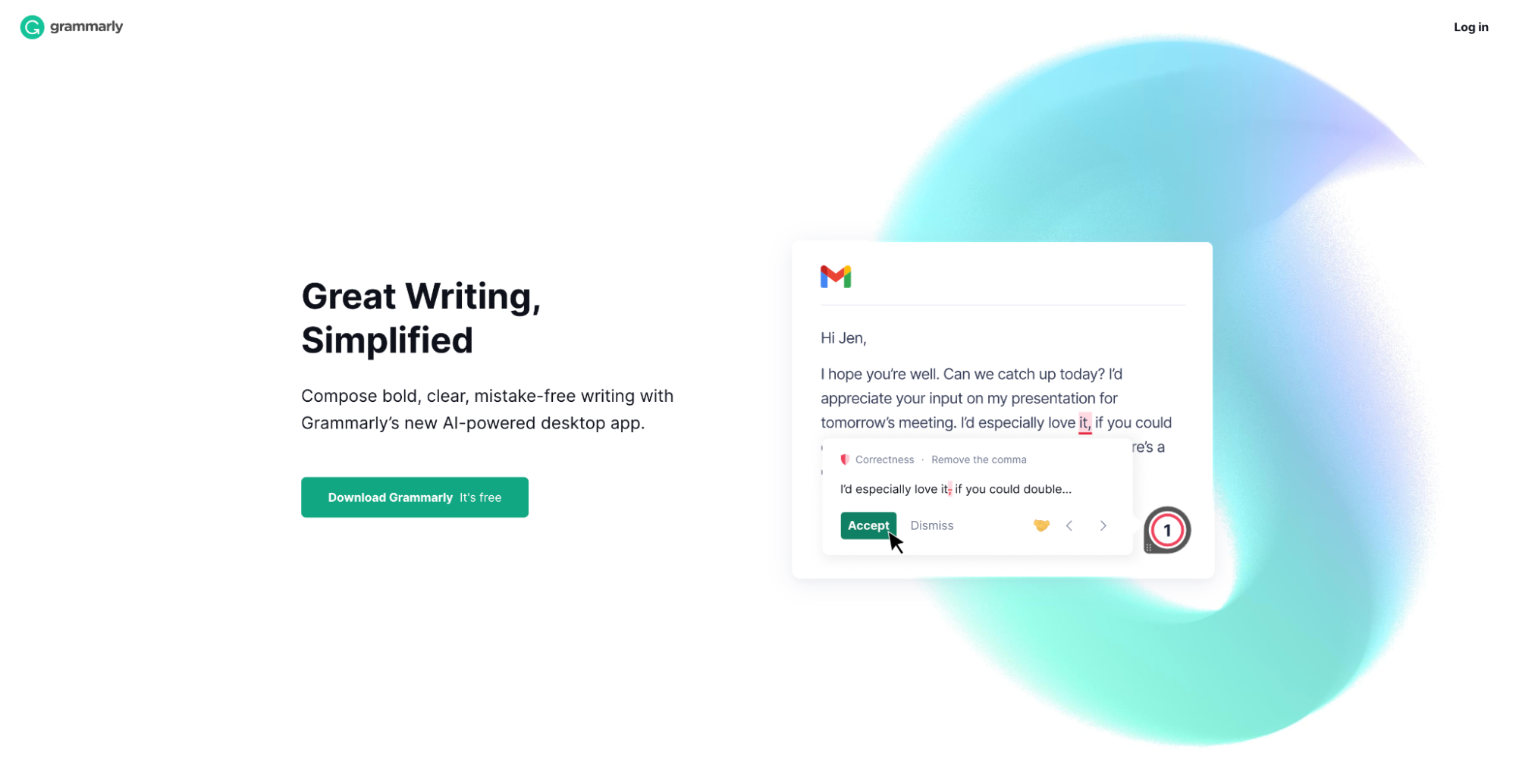
Agitate pain
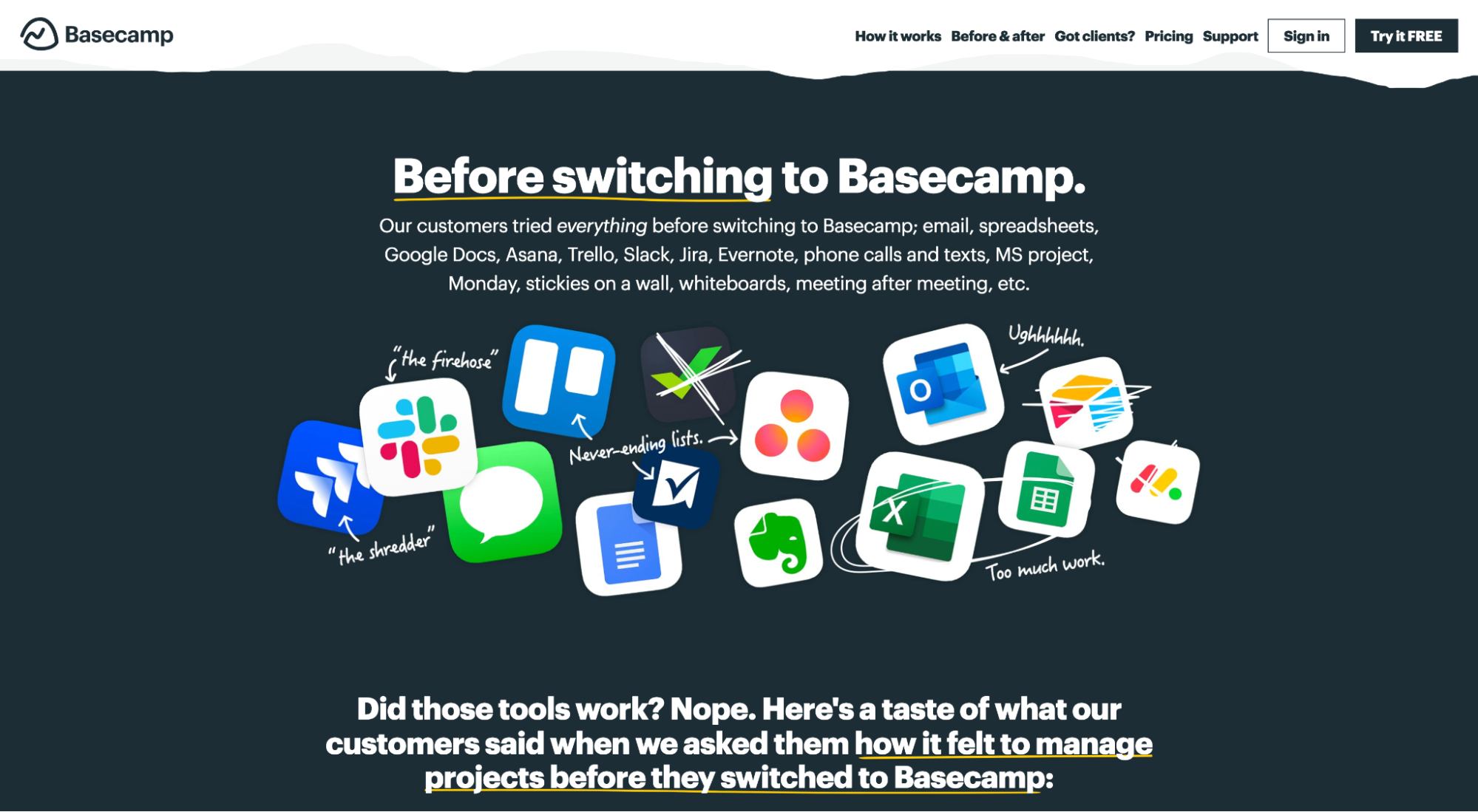
Communicate a desirable future
Landing Page Best Practice #29: Handle objections with benefits
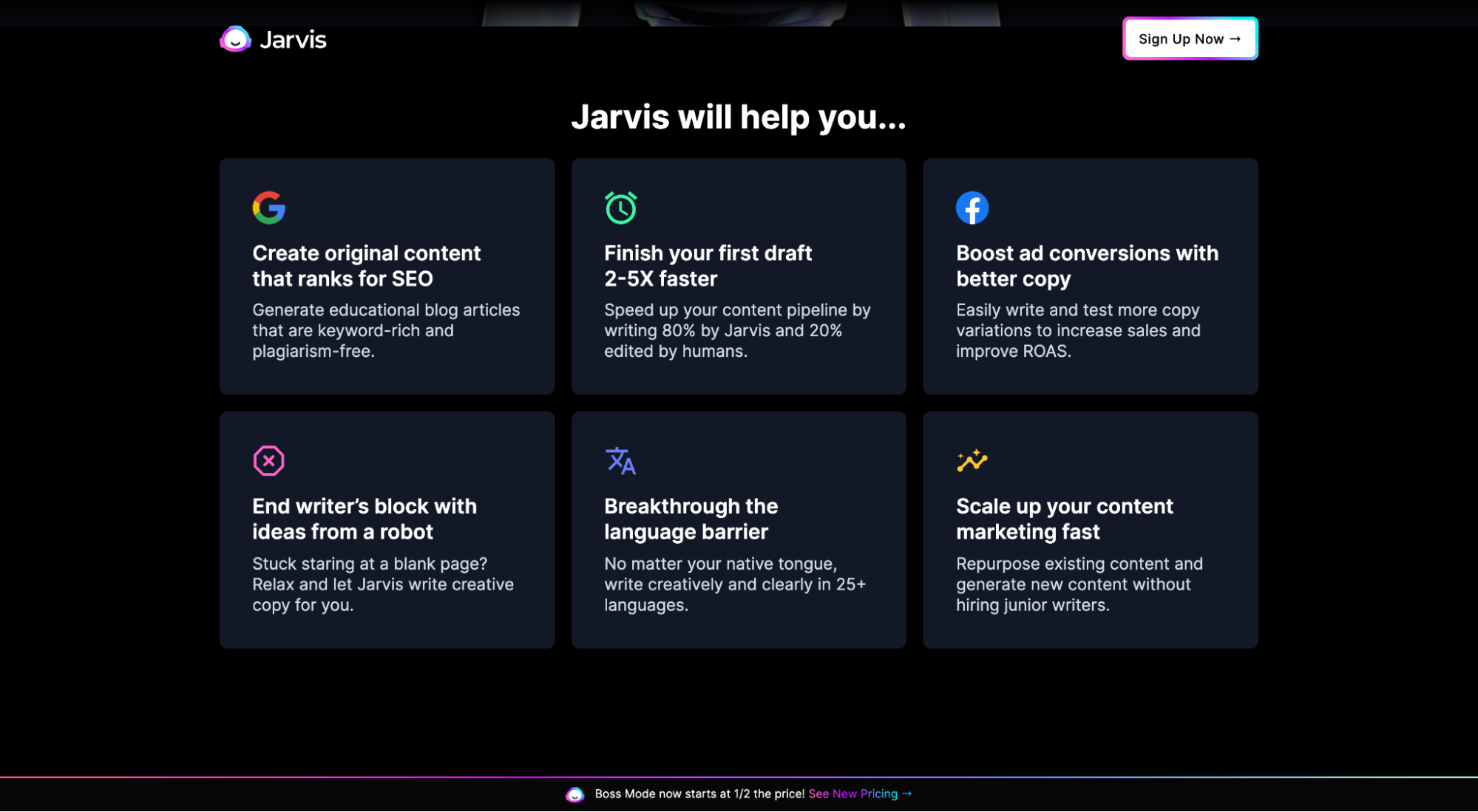
The best landing pages preempt their prospects' objections and handle them within the landing page copy. And they do it by communicating strong benefits, not features.
For example, on Jarvis’ click-through landing page, they don’t stress features like artificial intelligence or their library of templates and recipes; they sell the outcomes achieved by using those features (i.e. benefits), like boosting campaign ROAS, writing faster, increasing conversions, ranking in search engines, and scaling your marketing.
When building your landing pages, go heavy on benefits, light on features.
How do you identify your visitors' biggest pain points? Talk to them. Talk to your sales reps. And talk to your customer service colleagues.
Henneke Duistermaat suggests you should start with your end goal first, and work backward from there. In short:
- Figure out your visitors’ primary goal and write the CTA button text based on it.
- Think about the buyer and tailor promises they’ll find relevant.
- Make a list of the potential objections a customer may have.
- Address and overcome those objections by communicating the benefits of your offer.
Landing Page Best Practice #30: Incentivize your offer
Think of incentives like mouth-watering sprinkles you can add to your offer that sweetens the deal and motivate action. Bonus: they’re scientifically proven to affect human decision-making.
For example, one of the most common incentives is free shipping: 73% of people are more likely to buy an item if it includes free shipping.

When it comes to landing pages, use incentives to increase conversions in three ways.
- Price-based incentives: Buy one get one (BOGO), free shipping, bundle discounts, freebies, free trials
- Scarcity incentives: Limited supply, inventory counters, out of stock labels, exclusivity
- Urgency incentives: Offer deadlines, discount hours, countdown timer
Landing Page Best Practice #31: Test everything
Most of you reading this won’t ever have the traffic volume needed to perform a statistically significant A/B split test, but that’s ok.
My point is that you should take every piece of conversion advice with a grain of salt, including the best practices we outlined in this article (even when the “data” shows up).
Blind faith is not the path to better landing pages; a good marketer is a skeptical marketer.
Wrapping up
I just wrote 5,700 words. Do you really want me to say more?
How about a compromise…
I’ll leave you with the same message I started this article with:
Incorporate all of these landing page best practices into your landing page optimization checklist.
Heck, make them second nature.
Just don’t stop here.
Best practices, by definition, are tactics that everyone can access. They’re a starting point, not an ending point.
Mastery lives beyond this list.

