


The average landing page conversion rate hovers right around 10%.
Not bad, considering the average website conversion rate hovers around 3%.
Still… 10%?
We can do better.
And it all starts with better landing page layouts.
The truth? While designing a high-converting landing page layout might require a bit of science, it’s definitely not rocket science. And in this article, we’re going to prove it.
How?
By demystifying landing page design once and for all and by distilling landing page layouts down to 11 simple steps.
We’re also going to share 15 of our favorite full-length landing page layouts for your inspiration (and swipe file).
Let’s get started.
- How to create a landing page layout and design
- 1. Start with a landing page design creative brief
- 2. Gather copybefore design
- 3. Define your design's information architecture (landing page layout)
- 4. Establish a visual hierarchy for optimal landing page design
- 5. Keep attention ratio as close to 1:1 as possible
- 6. Make an indelible first impression (above-the-fold)
- 7. Bake distinct assets into your landing page design
- 8. Add context to layout with visual aids
- 9. Support benefits with features
- 10. Validate claims with social proof
- 11. Say it again, but differently (the bottom of the page)
- 15 best landing page design examples (by type)
- Effective landing page design isn’t rocket science
Get brand new landing page strategies straight to your inbox every week. 23,739 people already are!
How to create a landing page layout and design
After years of practice, over 10,000 conversion rate optimization experiments, and countless wins and losses, we’ve discovered that every high-converting landing page layout incorporates the following 11 steps at a minimum:
- Start with a creative brief
- Gather the copy
- Define your information architecture (structure)
- Establish a visual hierarchy
- Keep attention ratio as close to 1:1 as possible
- Make an indelible first impression (above-the-fold)
- Bake distinct assets into your design
- Add context with visual aids
- Support benefits with features
- Validate claims with social proof
- Say it again, but differently (the bottom of the page)
Depending on the landing page type, layouts will vary (more on this in the next section). But consider these 11 landing page design best practices requisites for creating a high-quality landing page user experience, no matter the type.
1. Start with a landing page design creative brief
As with anything with design elements, your landing page design needs a box to be creative within, too.
Enter: the creative brief.
Most agencies and businesses botch the creative brief or exclude it altogether.
Big mistake.
Think of a creative brief like a blueprint. It resurrects guardrails, illuminates a path forward, defines goals, and functions as a single source of truth for designers, copywriters, and project managers.
What should your creative brief include?
Get/Who/To/By (compliments of Julian Cole):
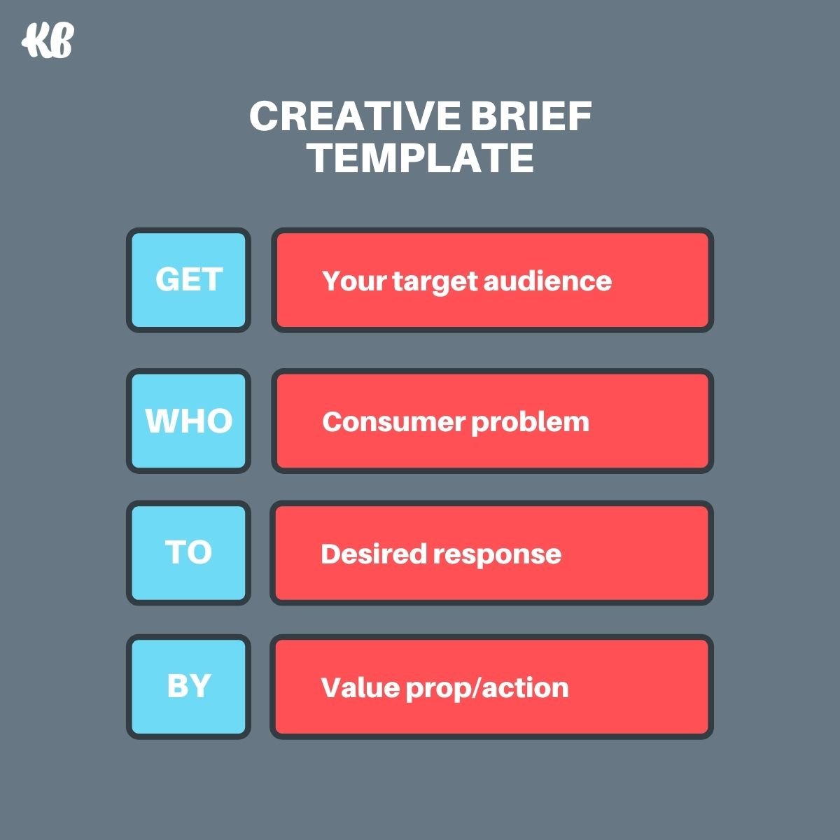
Most use the Get/Who/To/By creative brief template for ad creative. But it works perfectly well for web page or landing page creative, too.
- Get: describe the target audience who will encounter your landing page
- Who: describe the core problem your target audience faces (not speculation or gut feeling, but real consumer problems uncovered during research)
- To: describe how you want your target audience to respond when they encounter your landing page (i.e., what will it make them feel? And what is your conversion goal? Free trials? Lead generation? Immediate sales? More downloads?)
- By: describe the message you want to communicate and the value proposition that will motivate action
That’s it.
For example, we want to…
- get small-to-medium-sized SaaS businesses with annual marketing budgets of $300K or less…
- who have failed to scale their performance marketing due to budget restraints and talent access…
- to sign up for a free consultation…
- by showing them that our agency can increase conversions by 25%, decrease cost-per-acquisition (CPA) by 25%, and reduce staffing by 18%
Boom.
Only after you’ve clearly articulated the audience, problem, goal, and value proposition can everyone involved work collaboratively toward a meaningful landing page design.
Now it’s time to start designing. Well, almost…
2. Gather copybefore design
I won’t belabor this point since this article is about designing a high-converting landing page layout, not a high-converting headline or body paragraph. (You can read how to do that in our blog on landing page headlines or landing page copy instead.)
But I put this step second to remind you that words should almost always come before design (sorry, graphic designers).
Why?
Well, remember how we talked about creating a box to be creative within?
If your creative brief (target audience, problem statement, goal, message) functions as the frame of the box, then your copy functions as the nails and screws holding it together.
Copy dictates size, structure, space, and art direction.
It’s much easier (and sensible) for a designer to manipulate the size or placement of text than it is for a copywriter to manipulate your message to fit the design. This is why free landing page templates from landing page builders like Unbounce or LeadPages are more susceptible to underperforming.
3. Define your design's information architecture (landing page layout)
With words in tow, now it’s time to select the overall structure of your layout, AKA your information architecture.
When it comes to organizing the information on your page, you have two primary options:
- F-shaped
- Z-shaped
F-shaped pattern
An F-shaped pattern is the most popular information hierarchy online.
And for good reason.
According to a study that used eye-tracking software, most people naturally read a page, from top to bottom, in the shape of an F.
Use an F-shaped hierarchy for text-rich landing pages.
Z-shaped pattern
A Z-shaped pattern weighs in at second place for its easy-to-follow zig-zag pattern from top to bottom. For a Z-shaped pattern to work, it uses white space as a yellow-brick road that guides visitors' eyes down the page.
Use a Z-shaped hierarchy for visually-rich landing pages.
4. Establish a visual hierarchy for optimal landing page design
Your visual hierarchy supports your information architecture by helping visitors navigate your landing page with ease and adding emphasis to certain parts over others.
How?
- Contrast: using contrasting colors or shades and hues create subtle reminders that certain objects are more important than others
- Scale: big, bold headlines vs. medium, semi-bold subheadings vs. light paragraph text
- Balance: a balanced section signals equality between parts; an unbalanced section signals one part (the one that takes up more space) is more important than the other
- Repetition: keeping it consistent (whatever you choose, make your landing page layout learnable by repeating your visual hierarchy throughout the page)
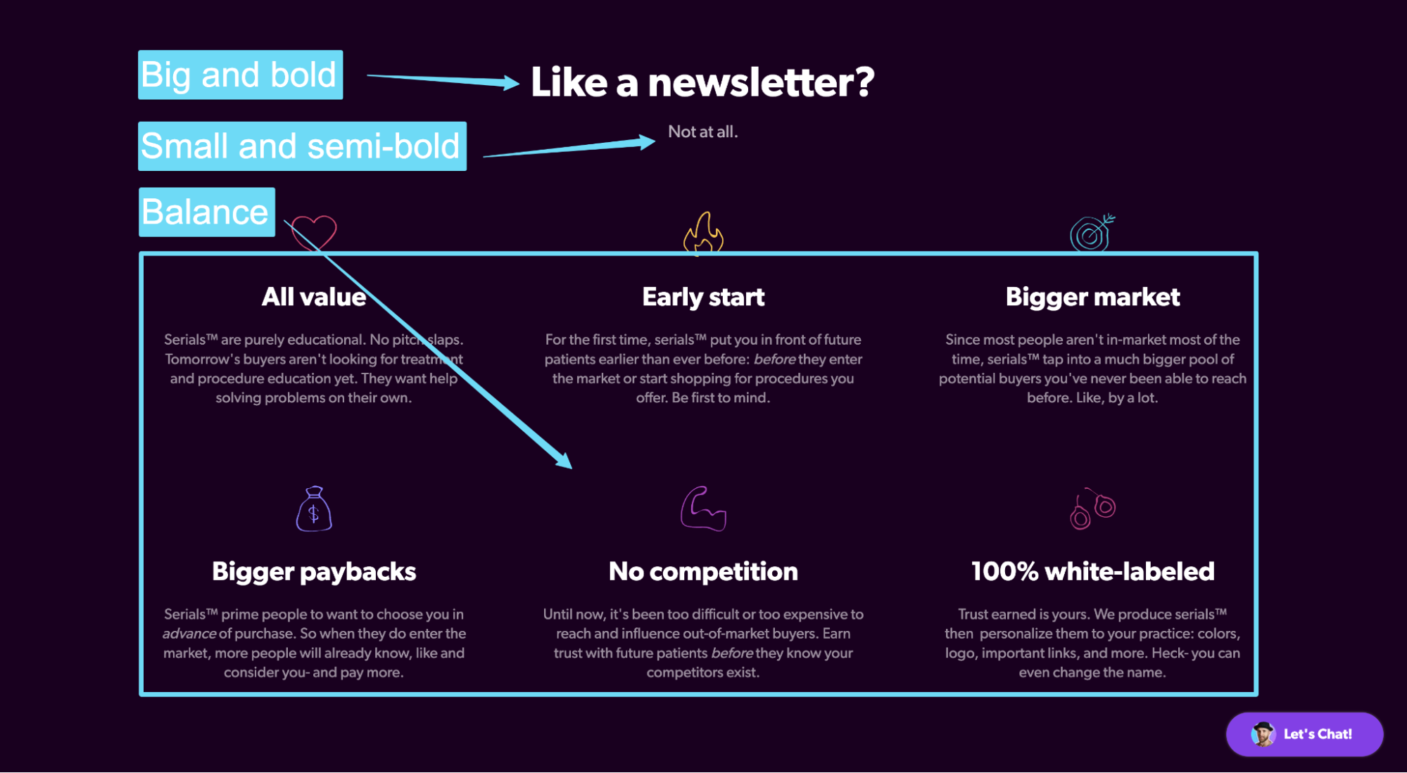
No landing page design worth its salt is complete without a clearly-defined visual hierarchy.
The best way to develop a visual hierarchy for your landing page layout is to adopt the same visual hierarchy your website or brand already uses.
5. Keep attention ratio as close to 1:1 as possible
Attention ratio refers to the number of links on the page compared to the number of conversion goals.
For example, if your landing page only has one conversion goal (e.g., a free trial) and one link (the CTA button), that’s a 1:1 attention ratio.
Why is 1:1 optimal?
No distractions.
Every campaign that sends traffic to your landing page should have a single goal, just like your landing page should have a single goal. That’s it.
Adding unnecessary navigation links, footer links, or social media icons has the power to create a leaky pipe.
When designing your landing page, keep your headers and footers clean; don’t include navigation links or footer links (with the exception of terms and privacy policy).
Keep your visitors' attention focused on one goal.
For example, notice how this Spotify lander only has one primary link: the link to convert on their CTA. That’s it.
6. Make an indelible first impression (above-the-fold)
A quality landing page design sticks the introduction: above-the-fold.
Above-the-fold refers to the part of the landing page your visitors see when they first land on your page before they scroll down.
For example, check out the above-the-fold section of our homepage:
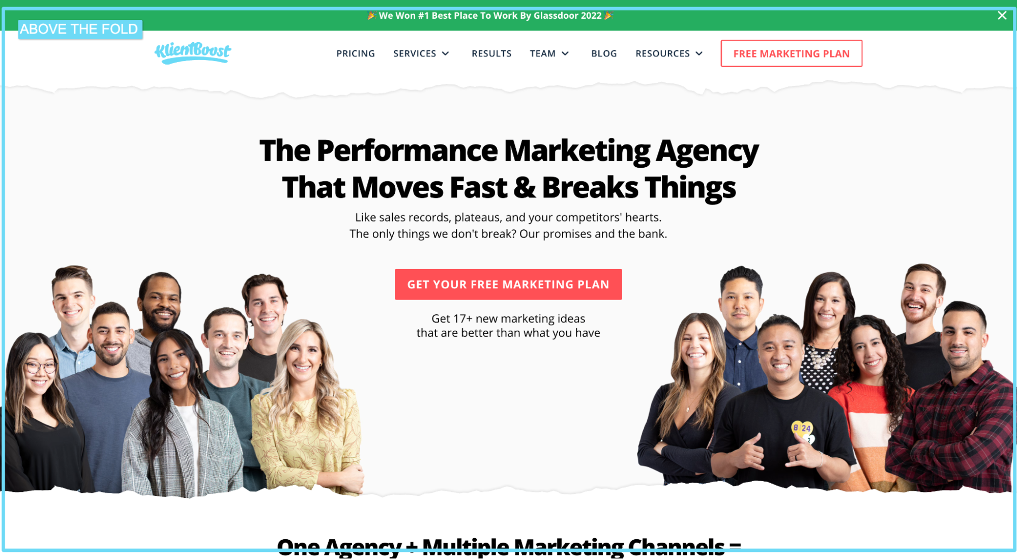
Though many visitors won’t convert on the above the fold section alone (they’ll need to scroll down to gather more information), design it as if they could by including all essential elements:
- Headline: Your landing page headline should explain your offer, define your niche, and hook your visitors.
- Subheadline: Your landing page subheadline should add context and details to your headline. If your headline describes what value you intend on creating, your subheadline should explain how you intend on creating it.
- Hero shot: Your landing page hero shot (the primary visual) should add context to your offer. Don’t use abstract shapes or design to fill space; instead, show visitors your product or service in real life (our service is our people, which is why we show Mitchell’s ugly mug above the fold)
- CTA: Your landing page CTA copy should entice clicks by teasing the promised land and handling any last-minute objections.
- Form (if applicable): Your landing page form needs to do a lot with a little (so click the hyperlink and read the full article). Just know that every solid lead capture page needs to put the form front and center, above the fold, where everyone can easily fill it out.
7. Bake distinct assets into your landing page design
Distinct assets refer to your brand's unique codes: logo, colors, mascots, style, sounds, fonts, and more.
Why are they so important?
Let’s play a game…
Which brand is this below?
Now, which brand is this below?
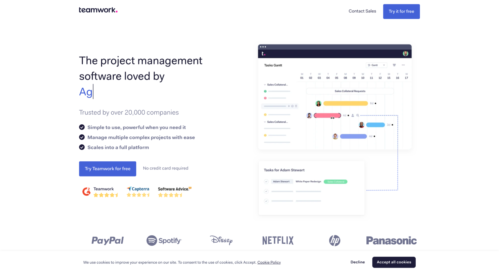
Brand 1: Mailchimp.
Brand 2: Teamwork.
Even without a logo, most of you will have recognized Mailchimp because of their distinct yellow background, visual style, and font duo.
The same might not be able to be said about the second. In fact, most of you will have probably scratched your head at Teamwork because they look, sound, and feel like every other project management software out there.
In a word, distinct assets matter because they create familiarity.
There’s a good chance that someone who lands on your design might not recall your brand name but will recall your distinct assets once they see them. So bake them into your landing page design layout.
That obviously means you need to have distinct assets to begin with, which many of you may not. In that case, consult your brand manager and start codifying your brand.
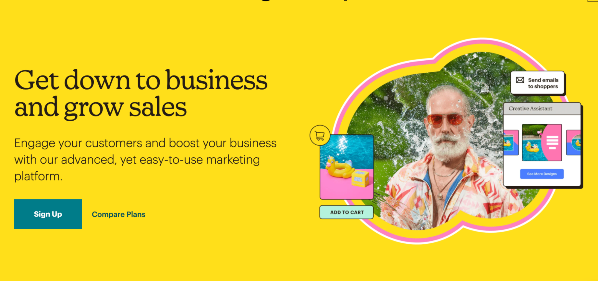
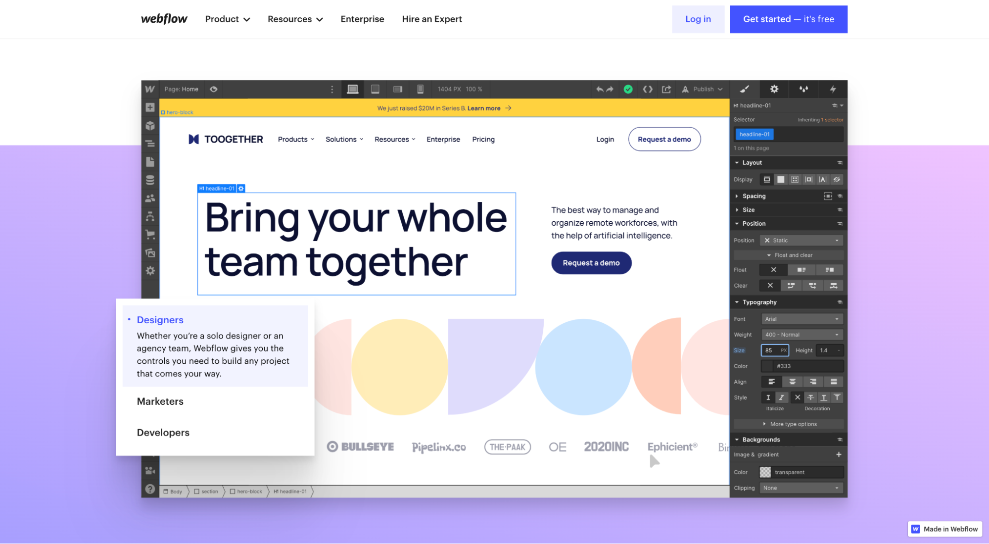
8. Add context to layout with visual aids
Too many landing page layouts use visuals as space fillers.
Whether original graphics, screengrabs, or illustrations, don’t spend time and resources crafting visuals just to fill white space. Instead, use them to add context and meaning to your words.
Better yet, use visuals to show visitors your product or service in real life. Make the invisible visible.
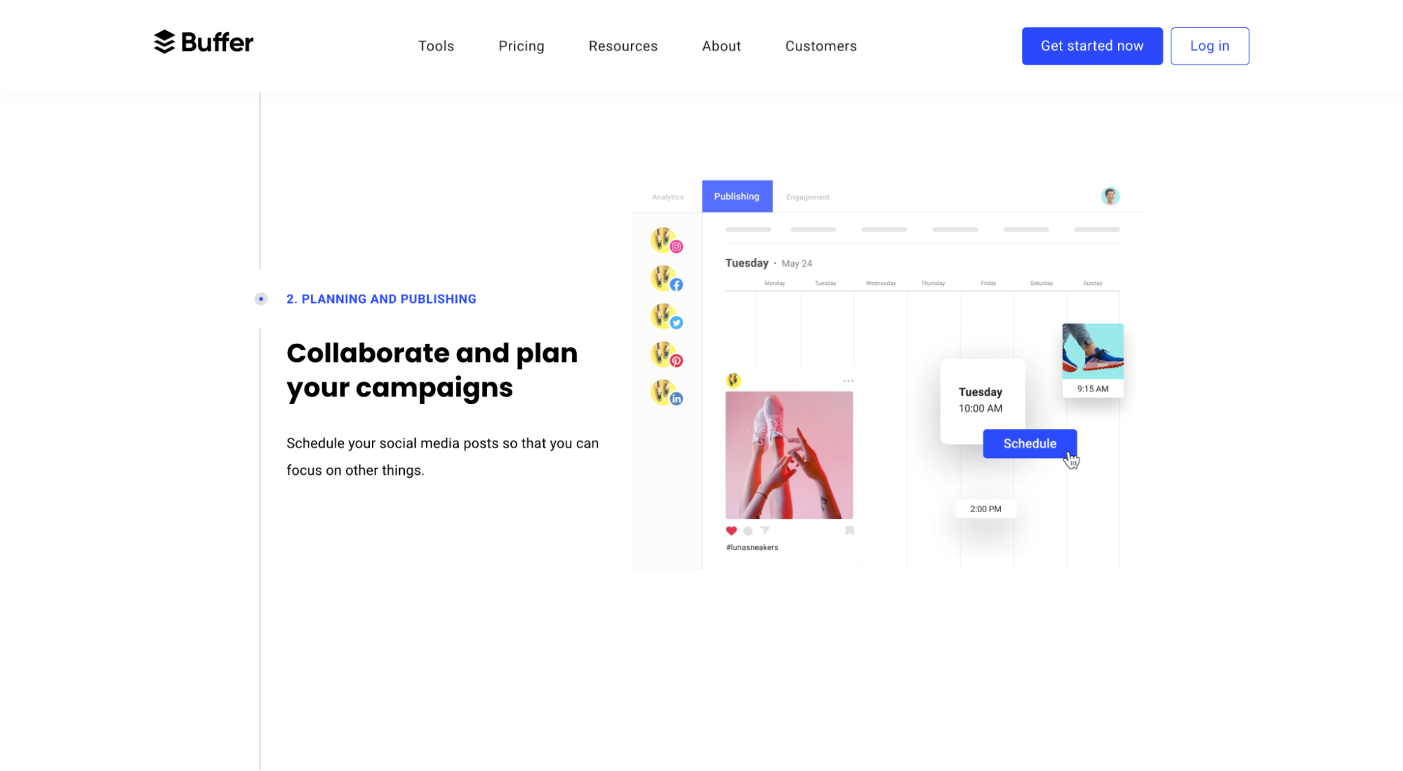
For example, notice how Webflow uses an animated GIF to illustrate the point they make in their copy?
Or notice how Buffer does the same but with semi-animated screengrabs:
9. Support benefits with features
You read that right: support benefits with features. Not the other way around.
Every landing page layout needs a section dedicated to the concrete benefits your customers can expect to achieve by using your service or product. And those benefits should be associated with core features.
You don’t need a feature section that explains what your product or service does without explaining the benefits those features deliver.
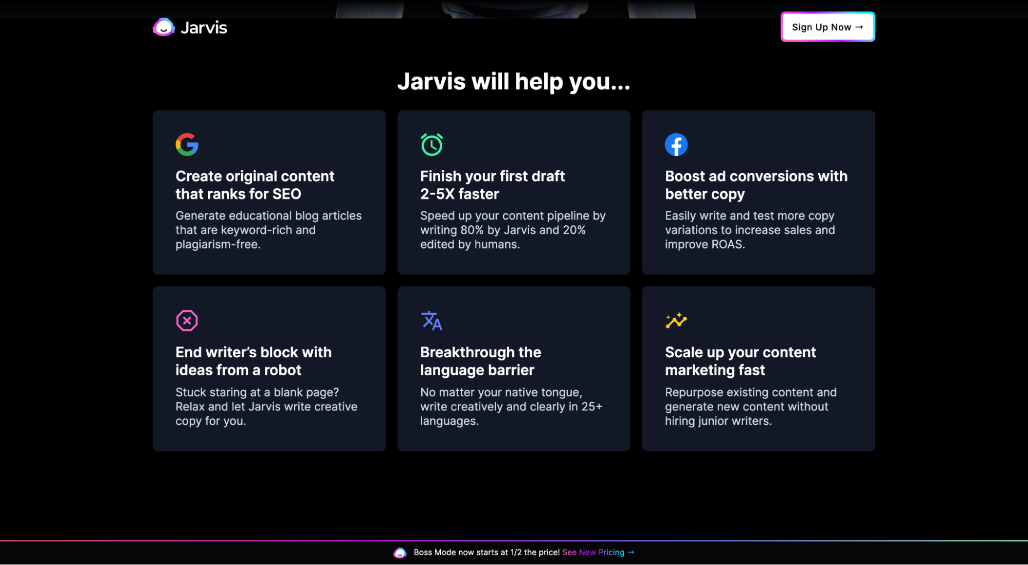
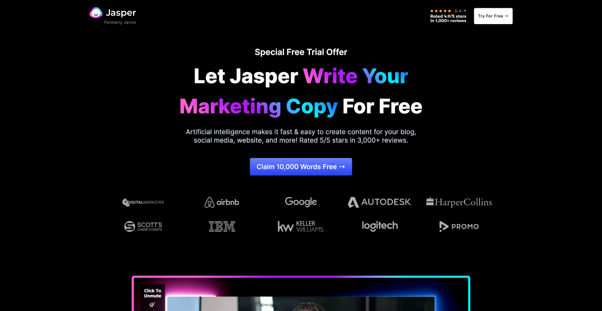
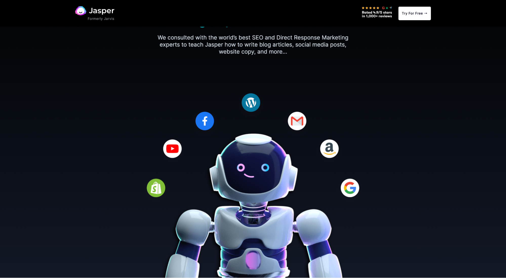
For example, notice how Jasper (formerly Jarvis) never mentions features like AI or machine-learning, even though they’re the core features powering each of their benefits:
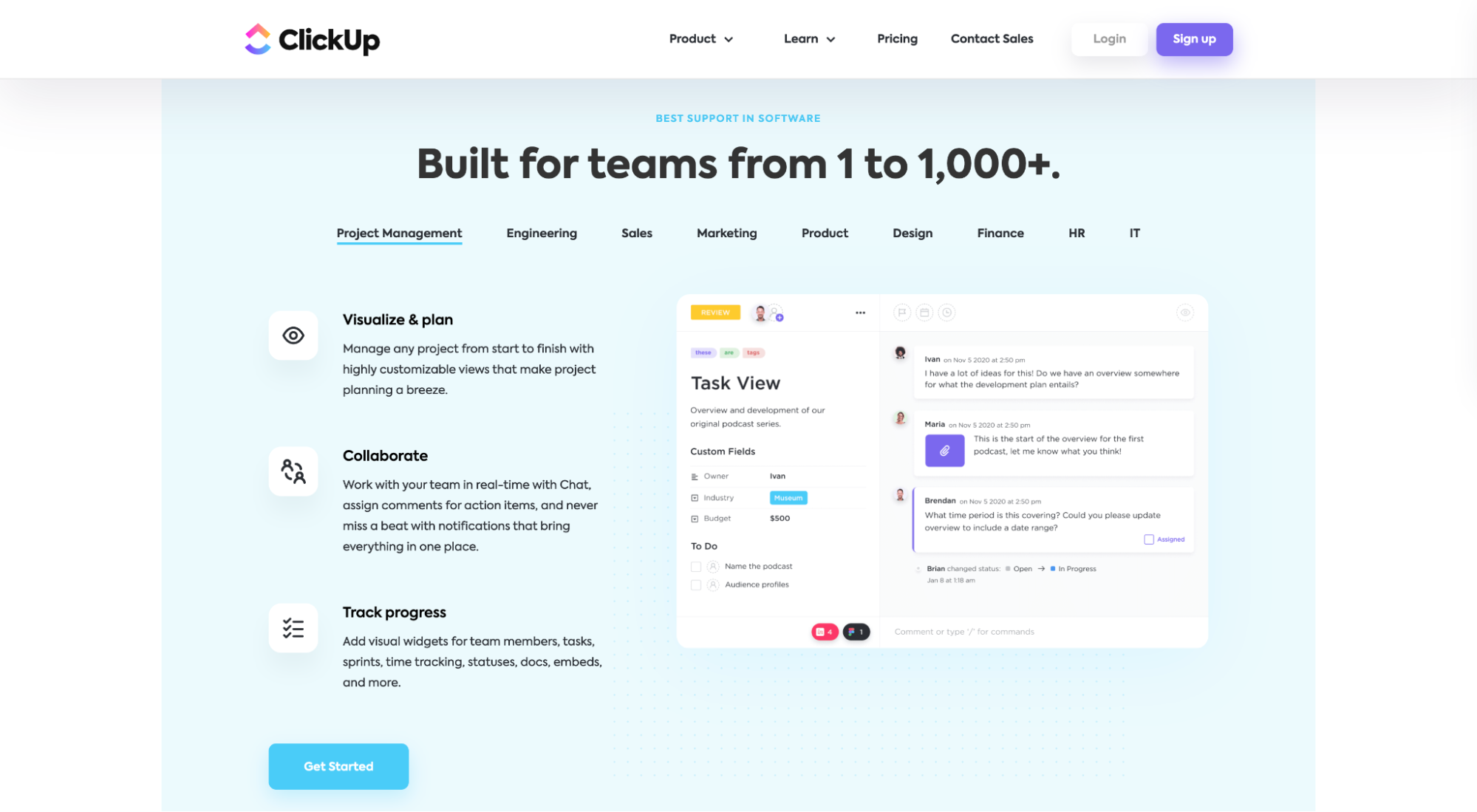
Or ClickUp, who masterfully explores their benefits by using tabs titled with their features:
10. Validate claims with social proof
You should sprinkle social proof, or third-party validation of your product or service, everywhere on your landing page layout.
What’s considered social proof?
- testimonials
- reviews
- star ratings
- client logos
- trust badges
- awards
- customer data or user stats
- client count
- years in business
- user-generated content
- endorsements (celebrity or influencer)
And so much more.
Where should you place social proof?
Heck, place it above the fold, near your CTA buttons, next to your benefits copy, and on your sign-up forms. Literally, everywhere.
But no matter where you place it, always try to build a dedicated social proof section into your design. Many website visitors will be looking for it.
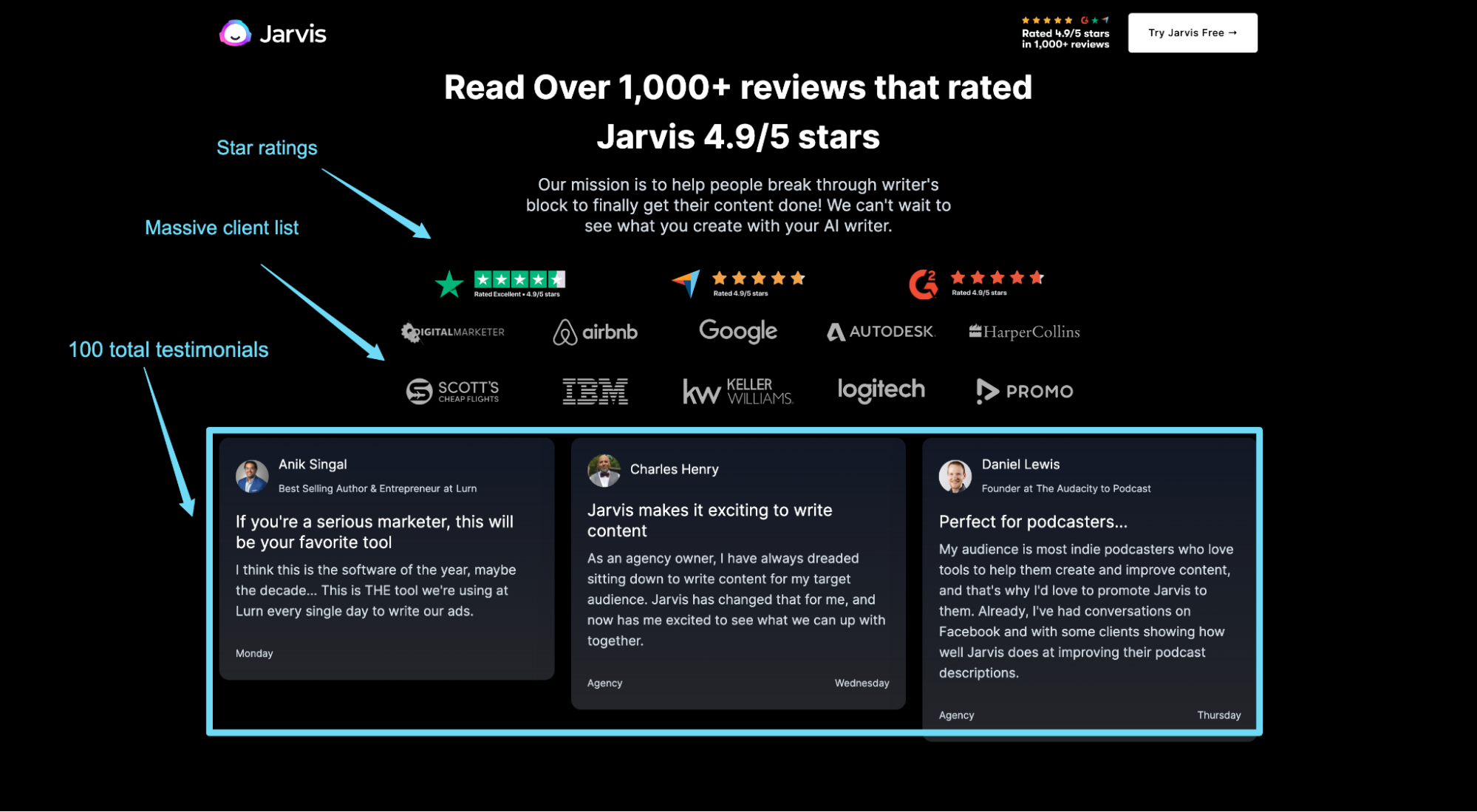
For example, Jasper peppers landing page social proof from top to bottom, but they also designed its own section into their layout:
11. Say it again, but differently (the bottom of the page)
A well-designed landing page layout will include multiple instances of a CTA throughout the page.
But just as your above-the-fold section should leave an indelible first impression, your final CTA section should leave a memorable last impression.
This time, restate the value you intend on providing and how you intend on providing it, only in different words.
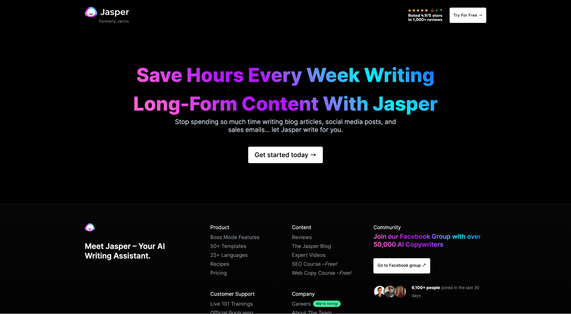
For example, using the same Jasper example from above, notice how their above-the-fold CTA and below-the-fold CTA both communicate the same call-to-action, but in different ways:
And that’s it—11 simple steps to crafting a high-converting landing page layout.
Now let’s explore real-world examples and designs that do it right.
15 best landing page design examples (by type)
Now the fun part: examples.
As we already mentioned, your landing page layout will vary depending on the type of landing page you use.
For example, a lead capture page includes a form, but a click-through page doesn’t.
So in this section, we’re going to attempt to capture the nuance between landing page layouts by showcasing some of the best landing pages from the following landing page categories:
- lead capture
- click-through
- SaaS
- B2C (eCommerce/DTC)
- mobile apps
The good news is that we wrote deep-dive articles on each of the aforementioned landing page types. So we’re not going to dive too deep here.
But we will feature our top three favorite examples (with links to full landers), along with what makes each so special.
Let’s explore.
Lead capture landing page layouts
- Pipe
- KlientBoost
- Oscar
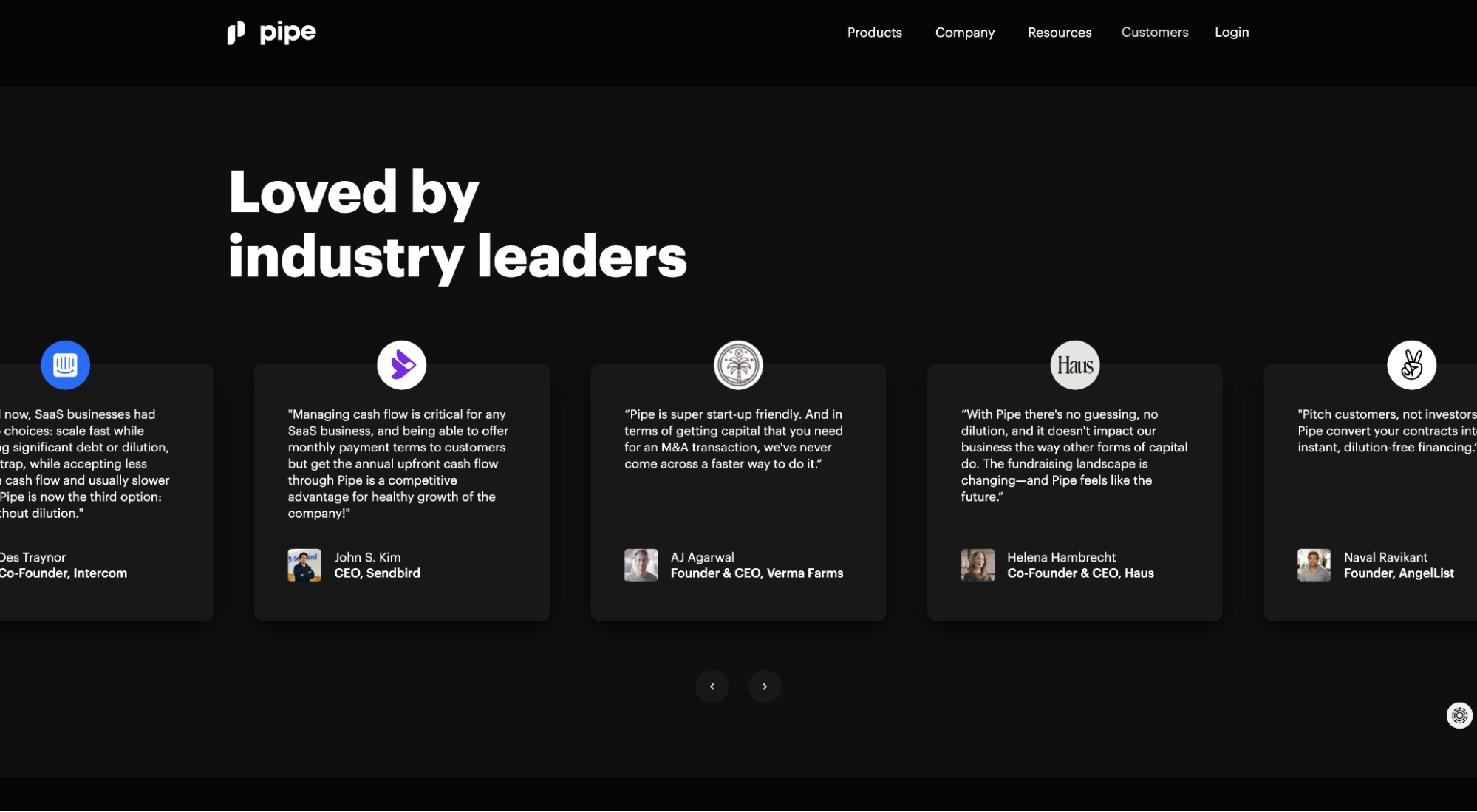
Pipe
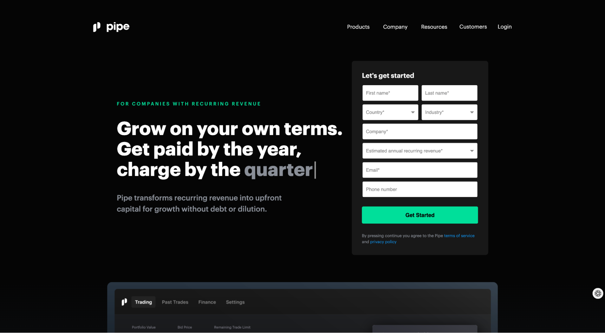
What we love: social proof section
Like we mentioned earlier, every quality landing page layout needs a social proof section. Pipe not only includes a clean slider chock-full of testimonials, but those testimonials come from some of the biggest names in the startup world. Win-win.
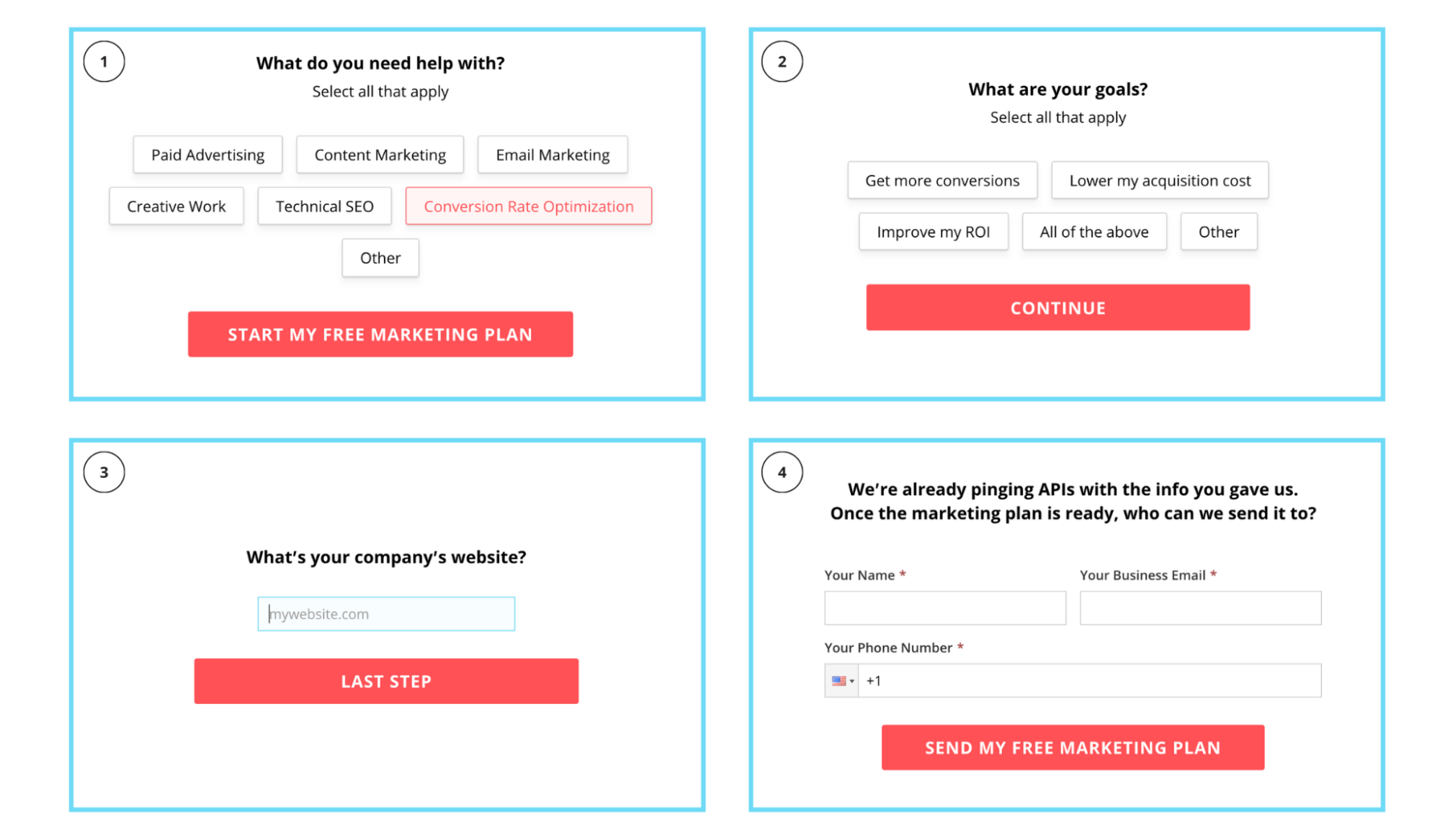
KlientBoost
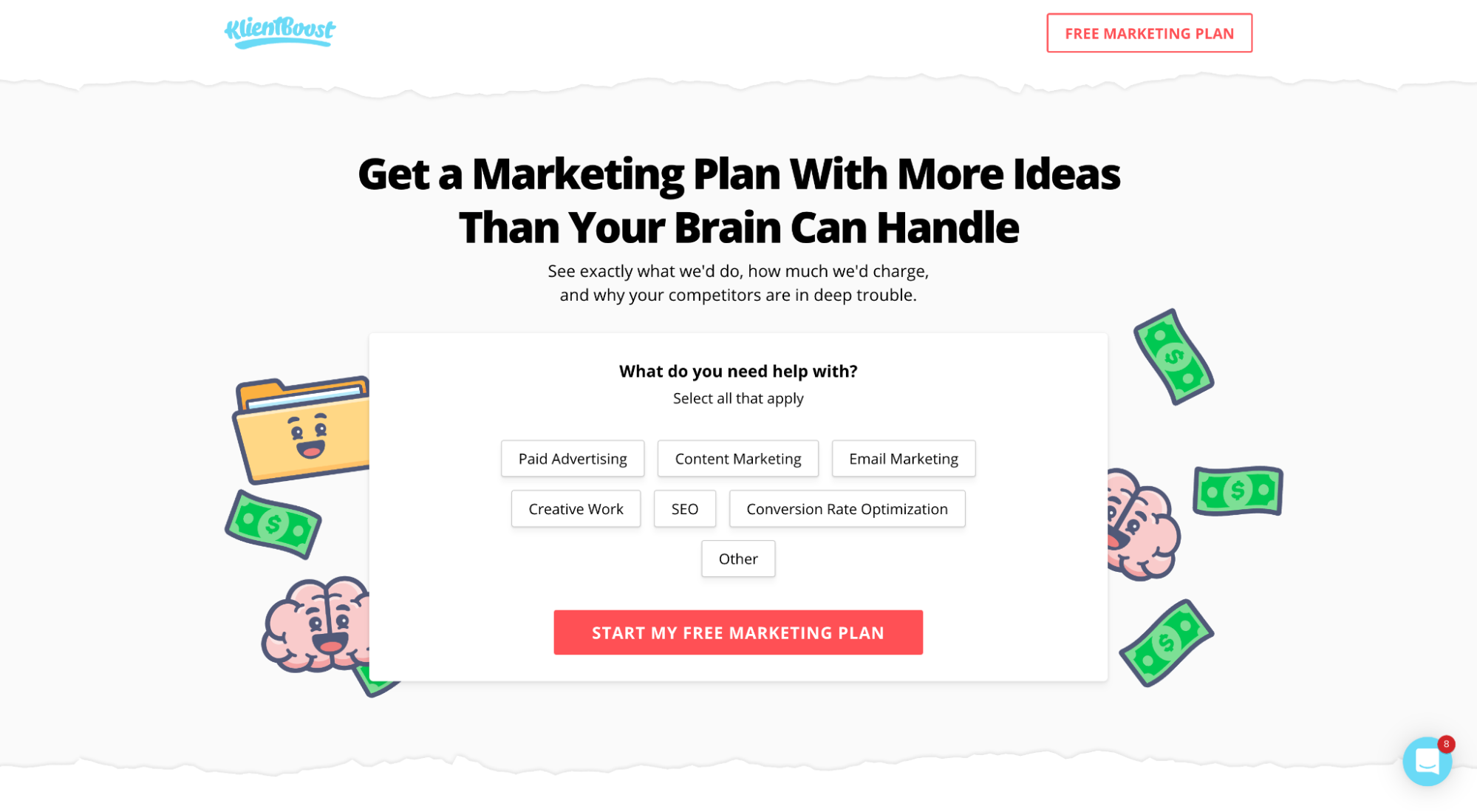
What we love: Breadcrumb Technique (multi-step form)
When it comes to lead capture forms, there’s no better way to increase conversions than by using a multi-step form.
We call this the Breadcrumb Technique, or splitting up longer forms into multiple steps and asking your least threatening questions first, most threatening questions last (email, phone number, name).
Why a multi-step layout?
The Breadcrumb Technique leverages behavioral psychology (yes laddering) to get prospects to commit to a small request (the softball question you ask first). And once they commit, they’re more likely to complete.
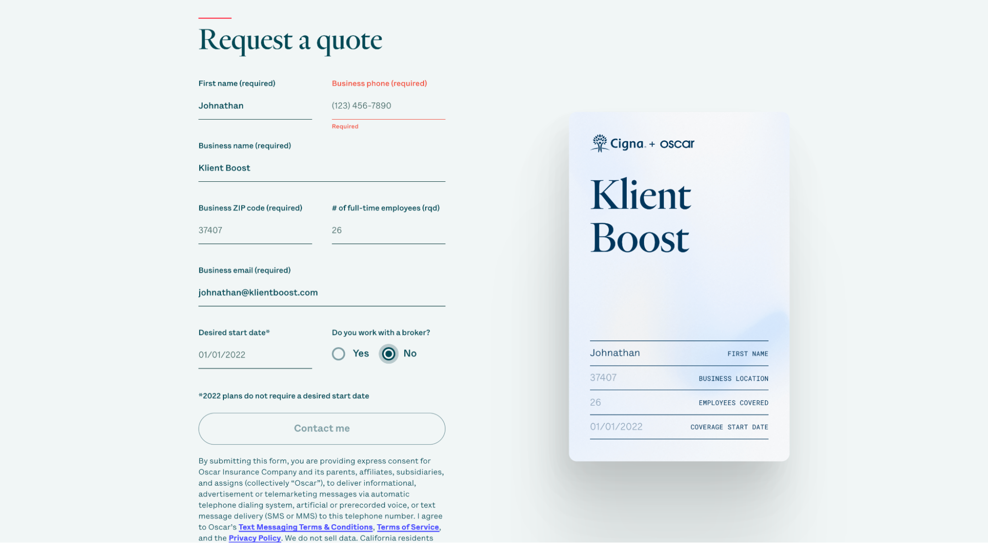
Oscar
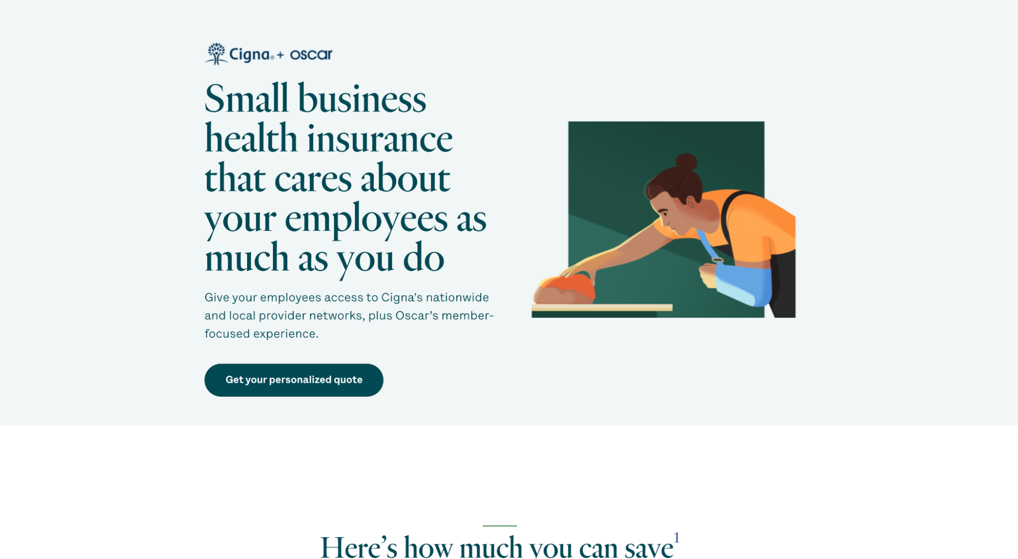
What we love: visual aid + form
Oscar’s lead capture form auto-populates a graphic of a health benefits card. Brillant.
Why? It reminds leads in a visual and concrete way what they’re signing up for—not just benefits, but the peace of mind knowing you have that little card in your wallet when you need it.
Dive deeper: Best Lead Capture Page Examples To Copy
Click-through landing page layouts
- Jasper (formerly Jarvis)
- Semrush
- Editor X
Jasper
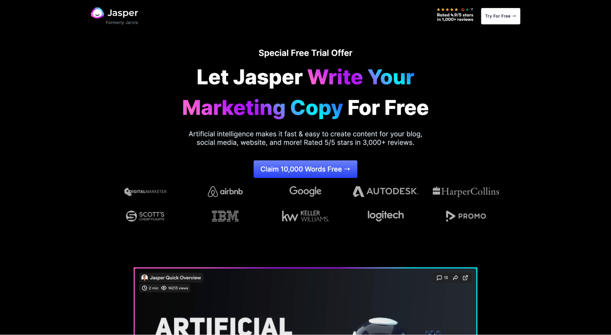
What we love: distinct brand codes
We already mentioned Jasper’s social proof section earlier in this article, but this time, let’s focus on their distinctive brand assets:
- Dark background
- Distinct brand colors (Blue/purple/pink)
- Jasper the robot (mascot)
There’s no question about it. When someone lands on this page who has encountered Jasper’s creative before, they’ll remember it.
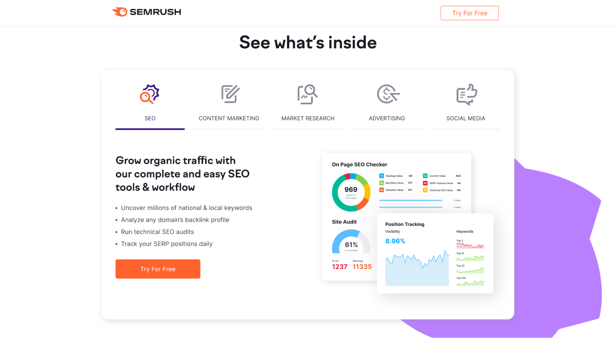
Semrush
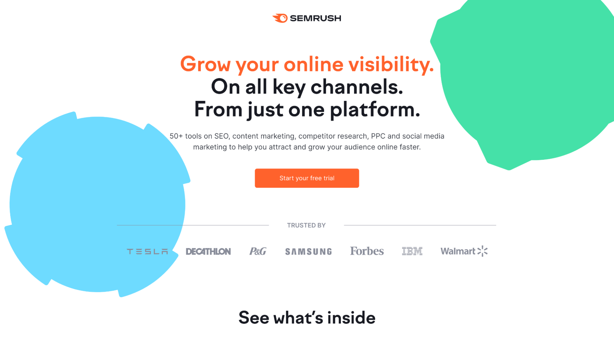
What we love: benefits supported by features
Like the ClickUp example earlier, Semrush also places their product features and benefits within a tabbed section. And again, like ClickUp, they go heavy on benefits (what visitors actually care about) and light on features.
Editor X
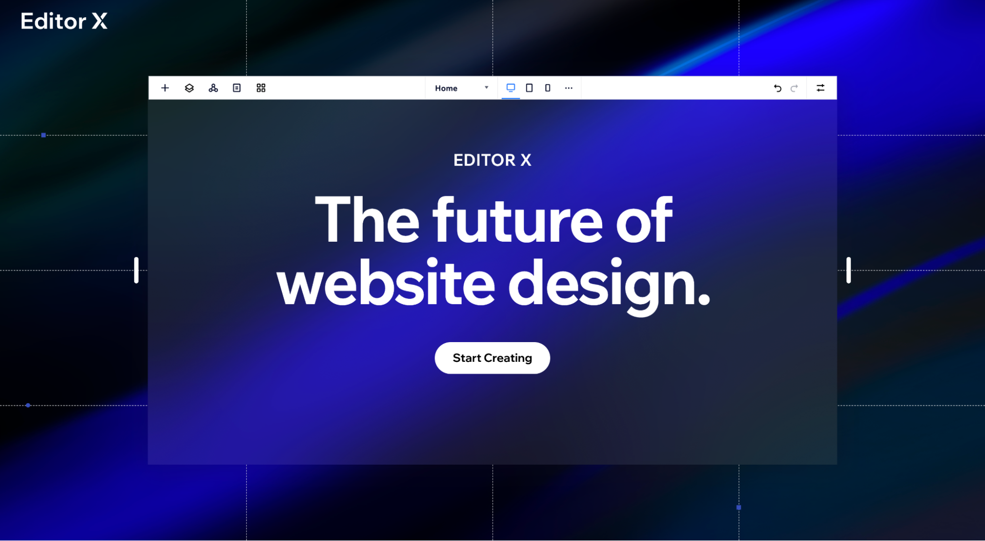
What we love: minimalism
Your landing page layout doesn’t need a lot to create a big impact. And Editor X proves it.
Simple. Sophisticated. Concise. Effective.
How minimal? There are just three sections:
- hero section (above-the-fold)
- benefits section
- second CTA
*Though we’d suggest adding a social proof section, too. 😉
See more layouts: Click-Through Pages: Definition, Examples, Best Practices
Mobile app landing page layouts
- Pzizz
- CashApp
- Nara Baby
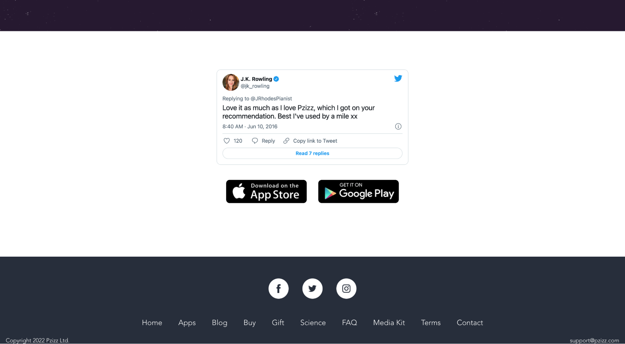
Pzizz
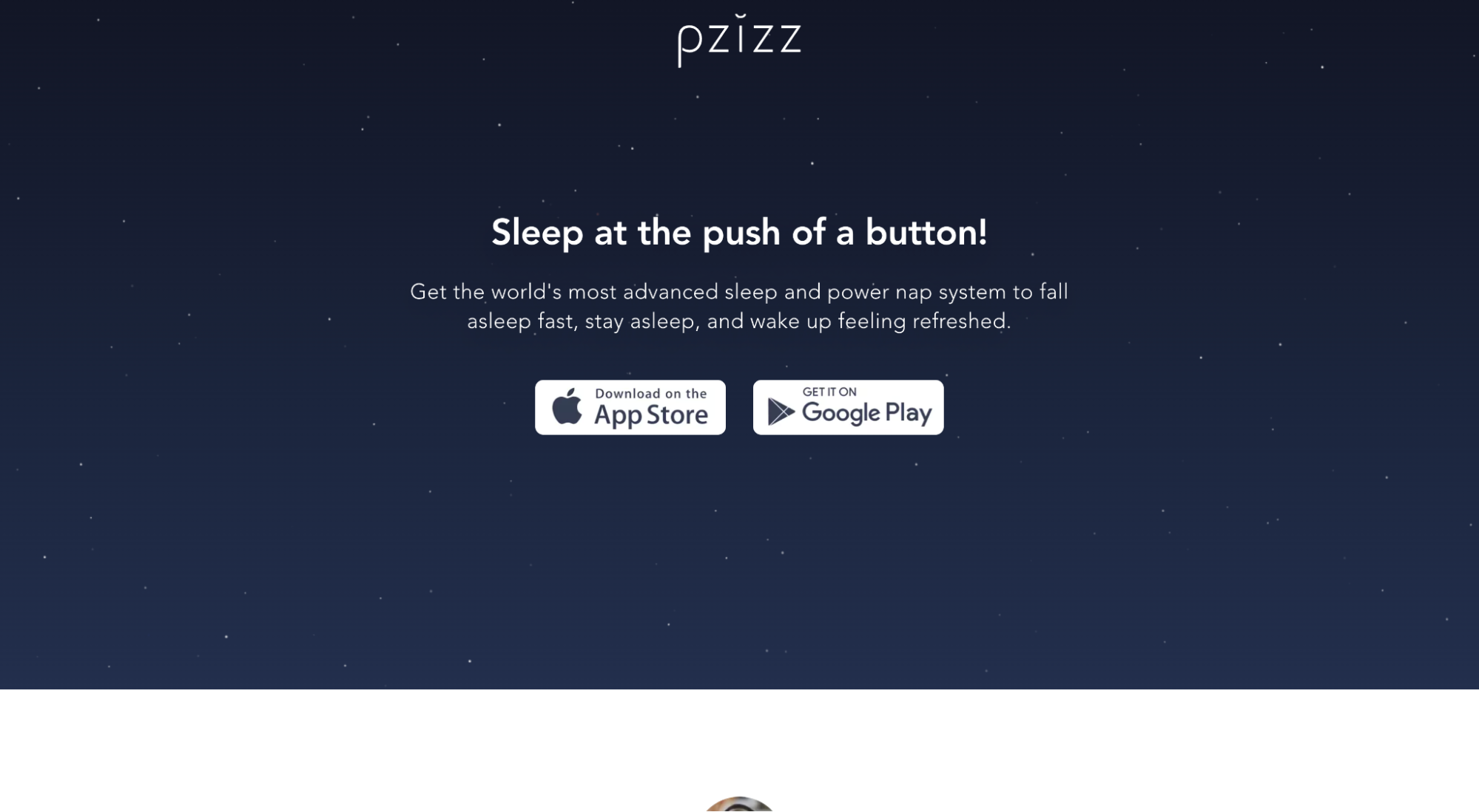
What we love: final CTA section
Honestly, what better way to close your landing page design than with a final CTA that includes a testimonial from J.K. Rowling and your CTA button? Beautiful.
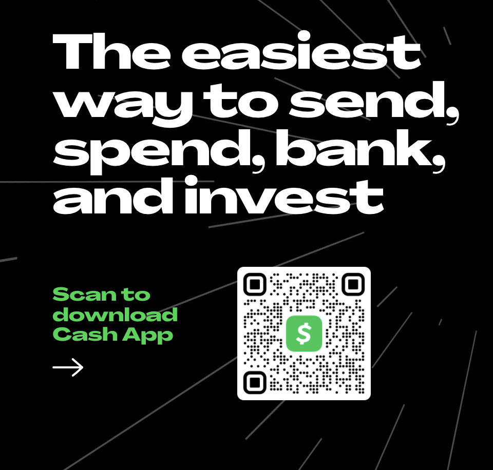
CashApp
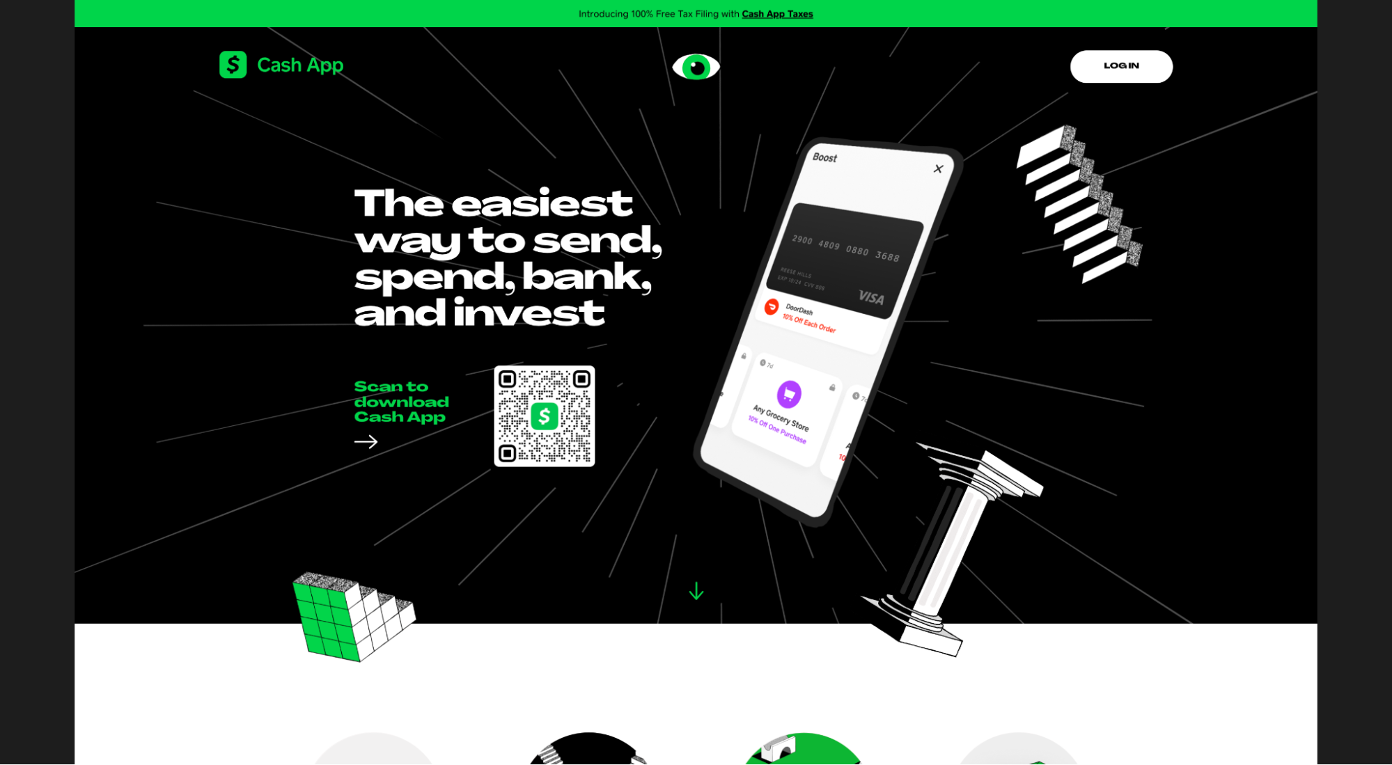
What we love: CTA section
Most app landing pages feature a CTA button that opens the app store to download the app.
That’s great for mobile device users, but for desktop users, it creates an unnecessary step. First, you need to click the link, then you need to copy the URL from the app store, then you need to message it to yourself on your phone so you can download it.
CashApp eliminates all those steps by using a QR code instead. All you need to do is just pull out your phone, snap a pic, and the app store opens on your mobile (right where you need it to).
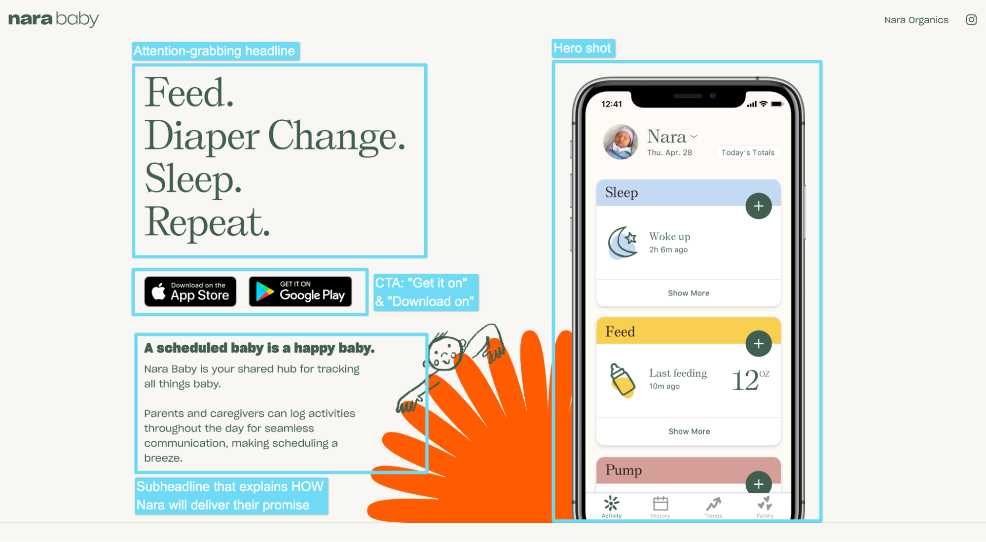
Nara Baby
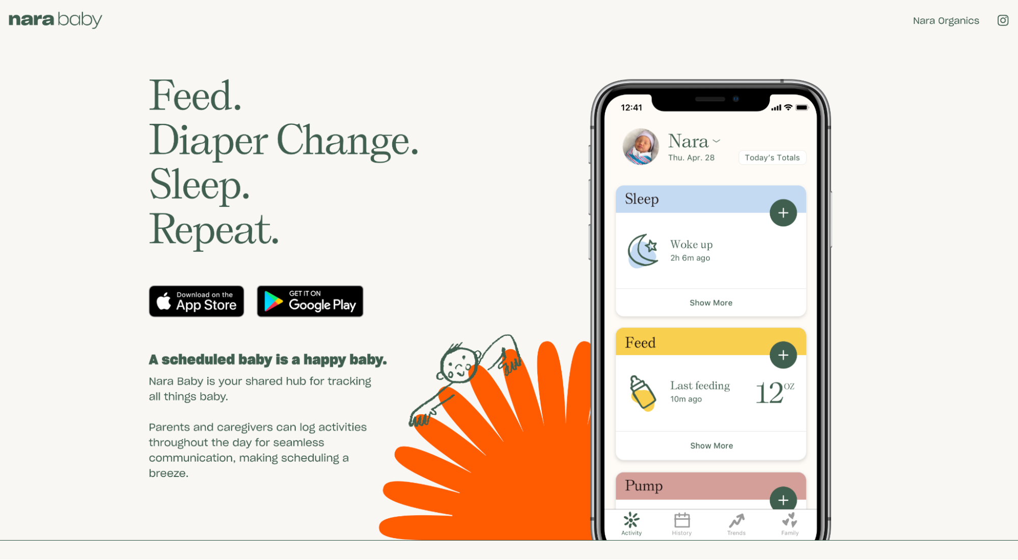
What we love: an indelible first impression (above-the-fold)
Nara Baby’s above the fold section checks all the boxes:
- headline
- subheadline
- hero shot
- CTA
Dive deeper: Best App Landing Page Examples
eCommerce/DTC landing page layouts
- Keeps
- Dollar Shave Club
- Hers
Keeps
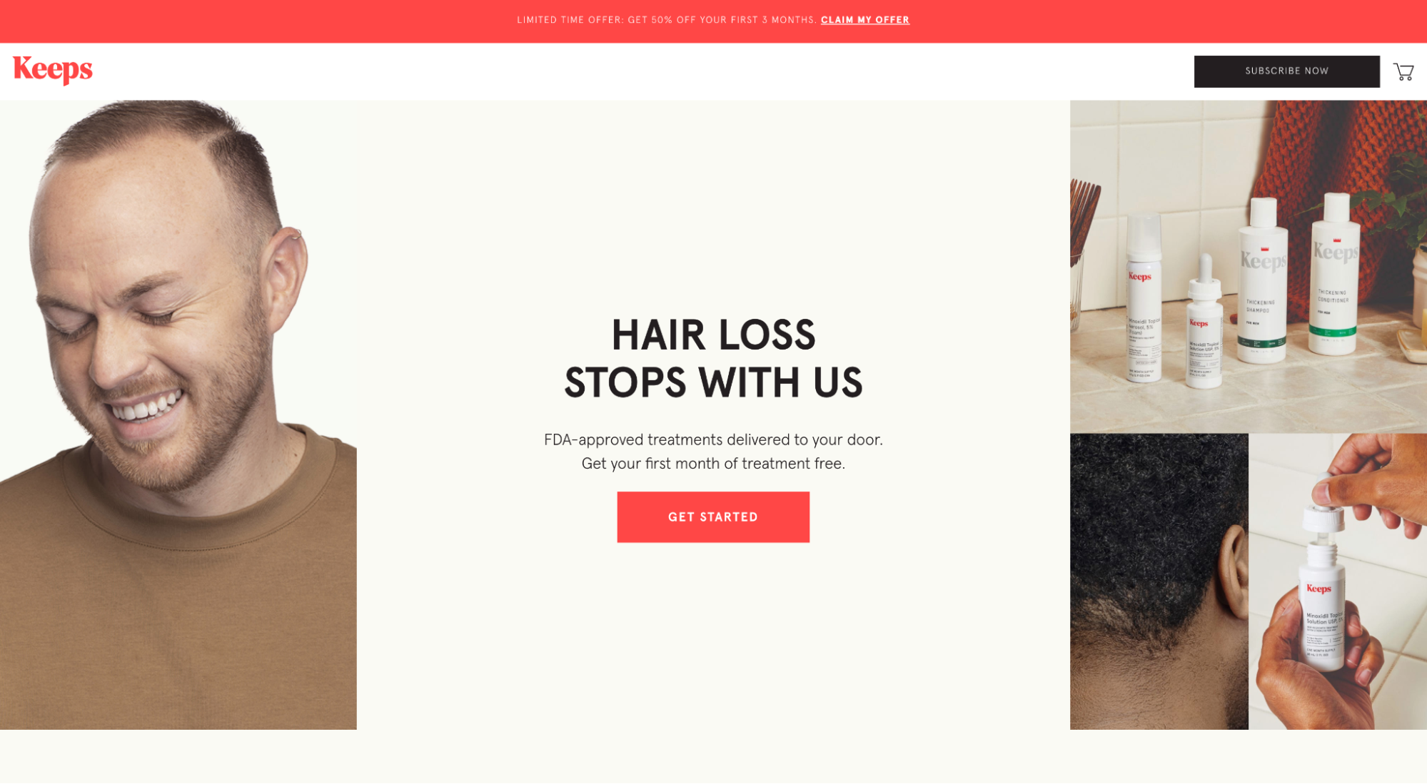
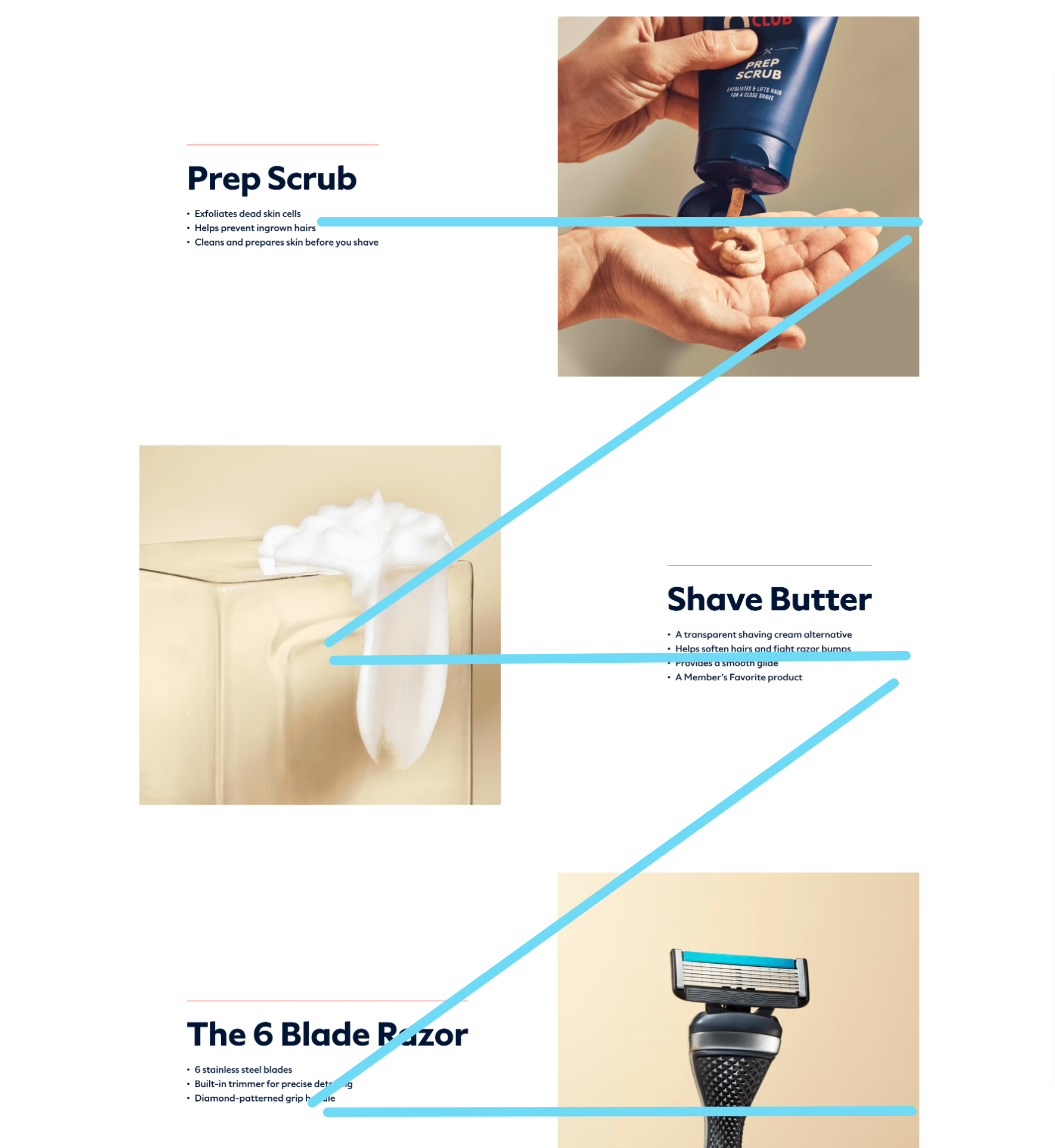
What we love: visual aids
This one’s easy. Keeps showcases real people using their products in real life. Make the invisible visible, remember?

Dollar Shave Club
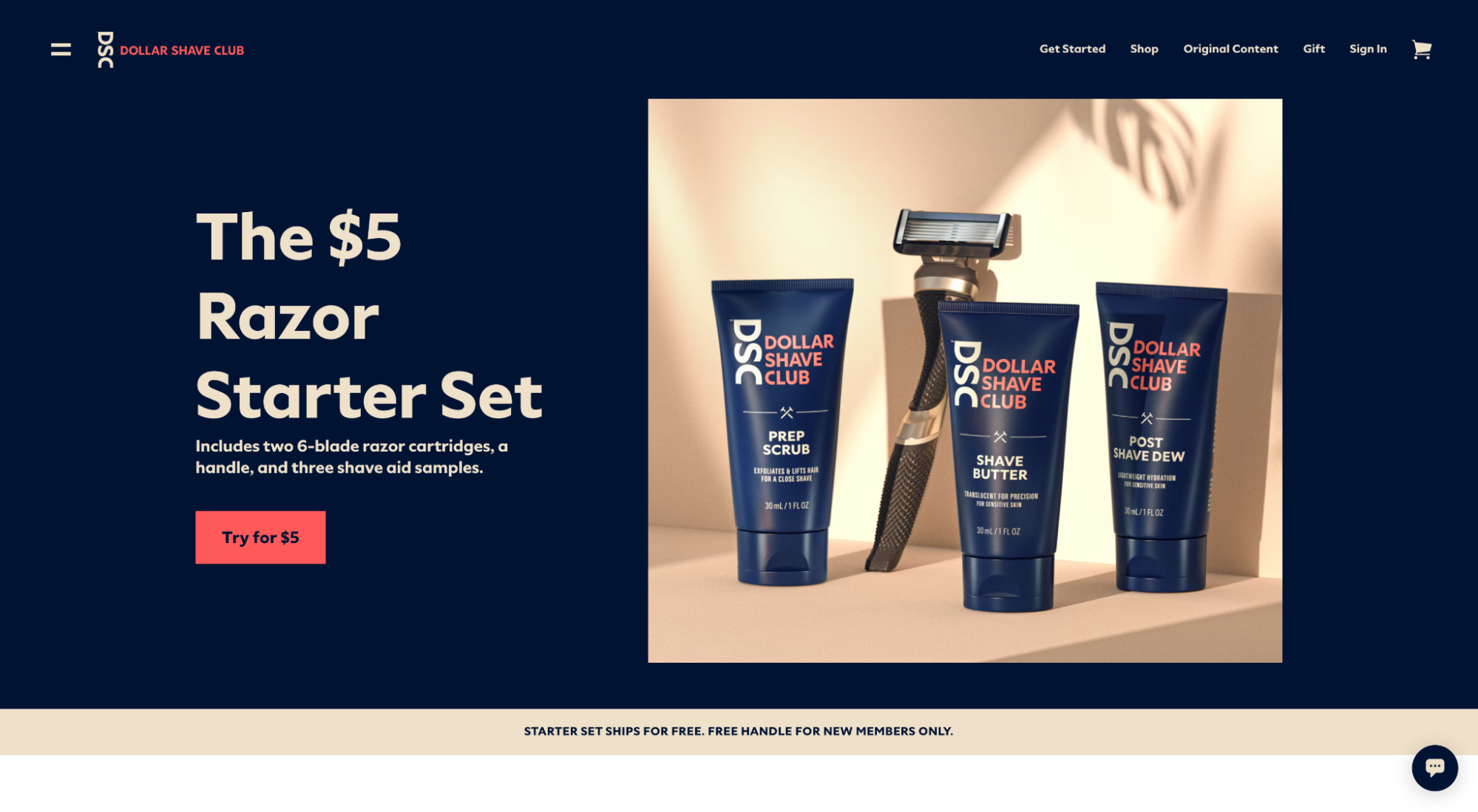
What we love: Z-shaped information hierarchy
Dollar Shave Club goes light on text, which makes the Z-shaped information layout optimal.
Hers
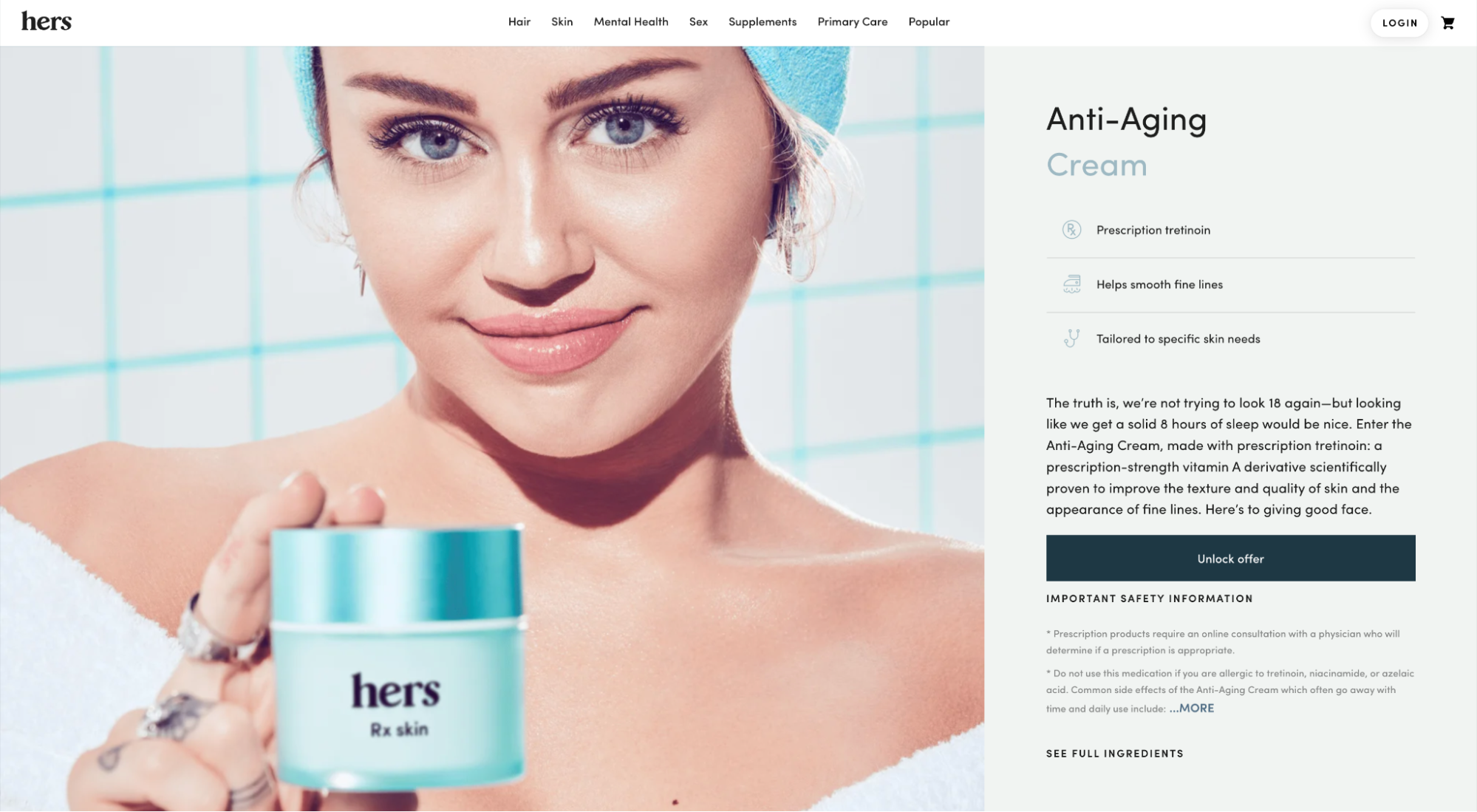
What we love: visual hierarchy
Hers makes their landing page layout easy to learn by leveraging color contrast, scale between headlines and body paragraphs, icons for bullet points, balance, and repetition.
At a glance, you know which parts of the below section matter most and how they relate to each other.
Explore more layouts: Ecommerce Landing Page Ideas to Increase Sales
SaaS landing page layouts
- ClickUp
- Hotjar
- Canva
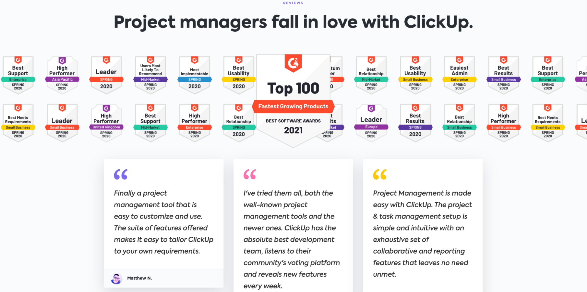
ClickUp
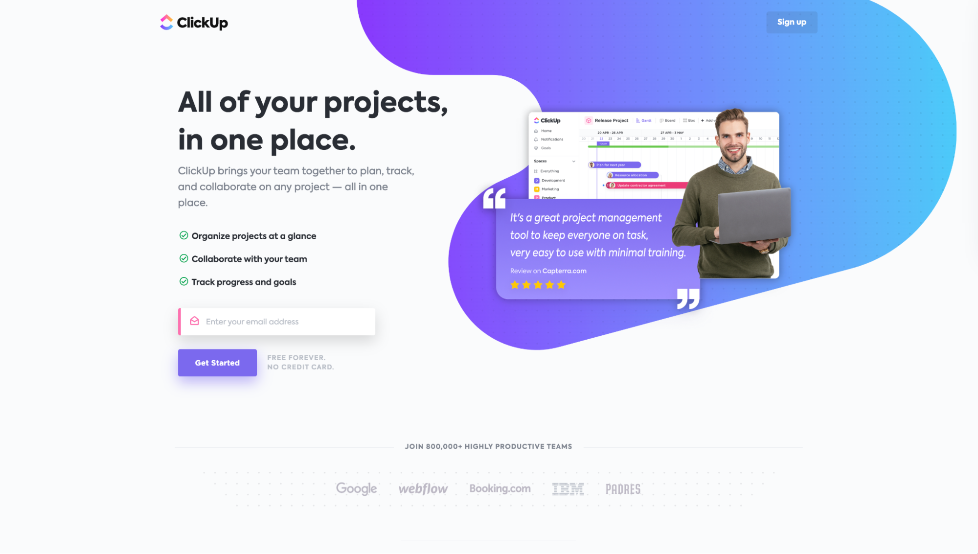
What we love: social proof section
Like many SaaS layouts, it’s common to find third-party review badges as social proof. ClickUp is no different.
But what we love about how ClickUp presents their awards is that they take their 20+ badges and stream them continuously so it actually looks like more. Subtle, but effective.
Hotjar
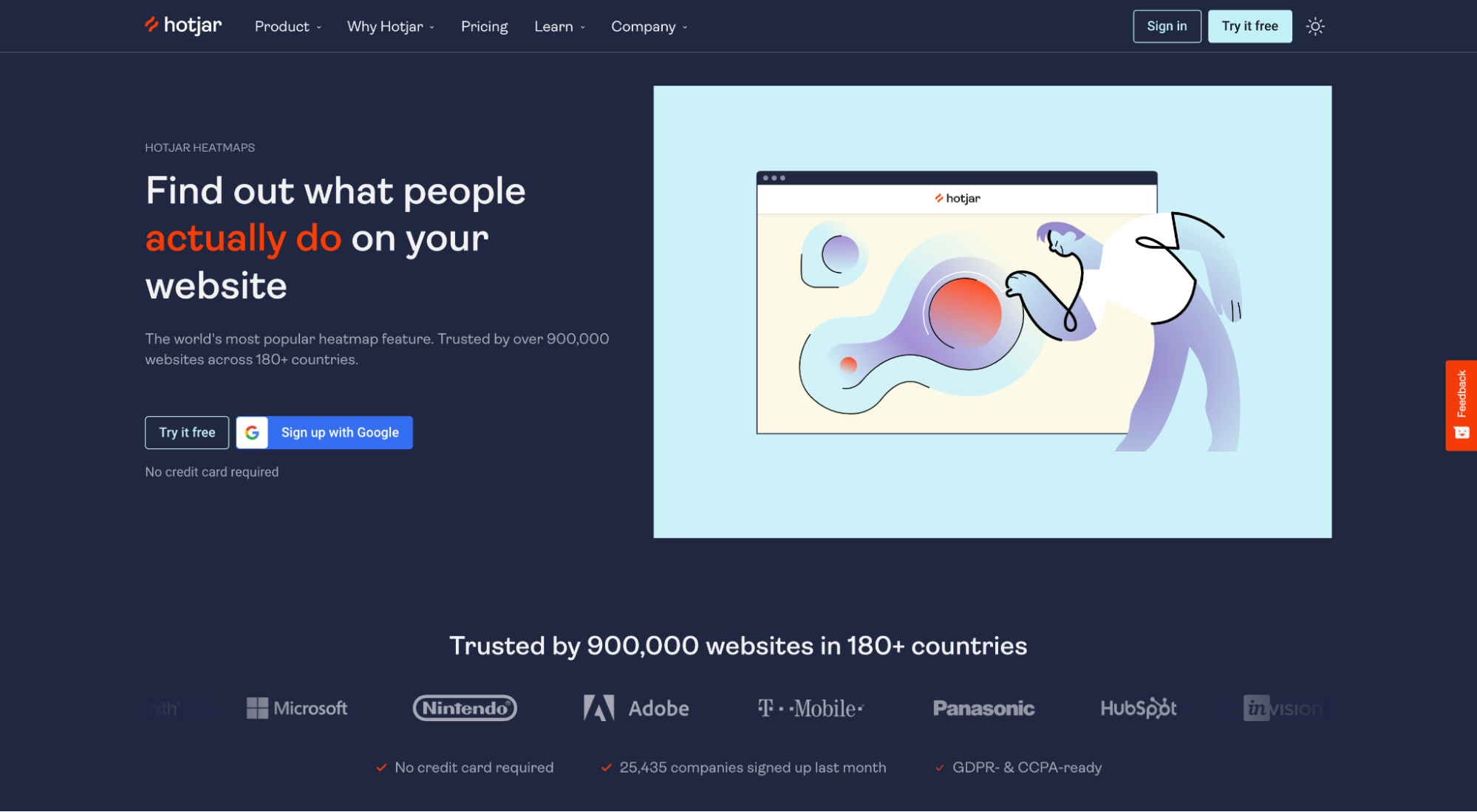
What we love: visual aid
Who said a visual aid had to be a graphic or photo?
Hotjar embeds an actual heatmap (with data) into their landing page. You can give it a spin, toggle between views, and download sample data.
Talk about making the invisible visible. Great work.
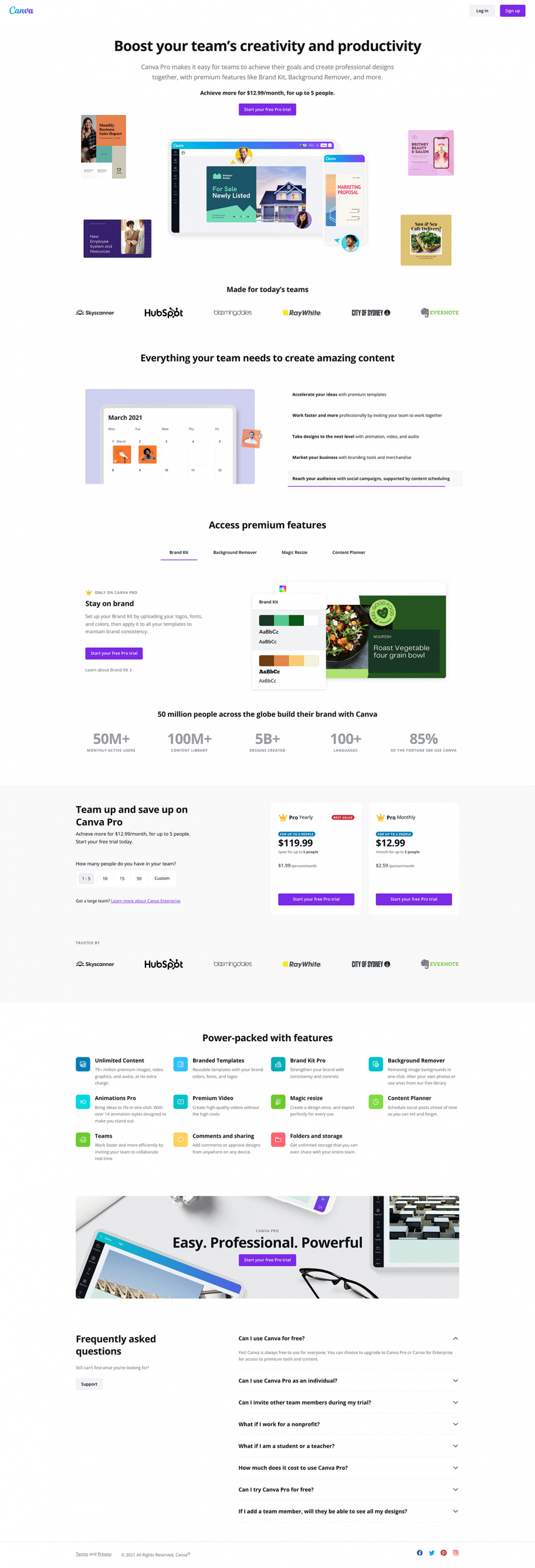
Canva
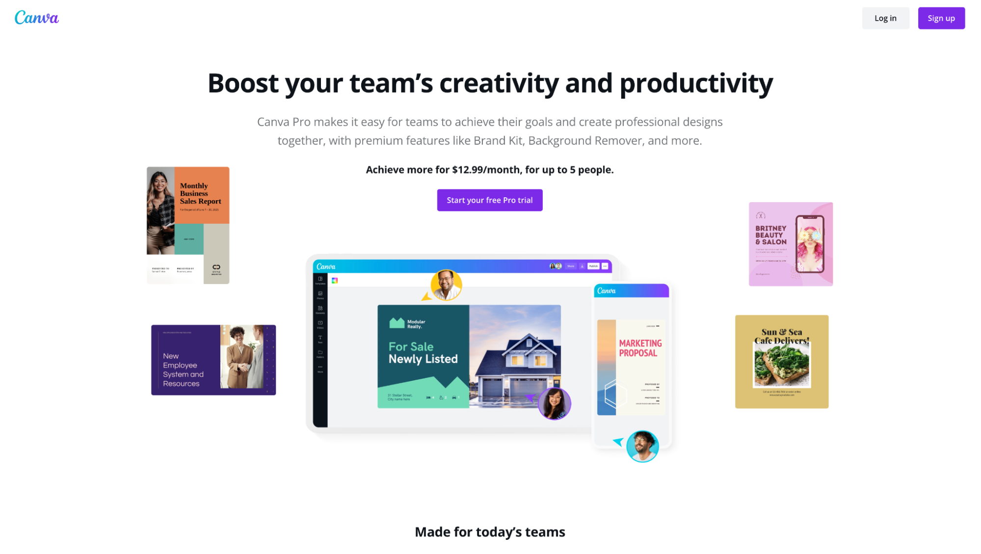
What we love: attention ratio
Canva knows how to keep their potential customers focused on a single conversion goal.
No navigation bar.
No footer links.
No other CTA than “Sign up.”
Explore more layouts: High-Converting SaaS Landing Page Examples
Effective landing page design isn’t rocket science
It’s easy to overthink landing page design and A/B testing different layouts.
But the truth remains—an eye-catching landing page design that converts doesn’t take much. Stick to what’s most important:
- creative brief
- information hierarchy
- visual hierarchy
- attention ratio
- benefits over features
- headline, subheading, hero image, CTA
- distinct assets
- visual aids
- social proof
Creating great landing page layouts might be a science. But it’s not rocket science.
Now that you know all the elements of a good landing page layout, remember to build it upon great copy first. You can learn how to do just that in our next article all about writing landing page copy.
Happy converting!


