


There's a reason Kris Kringle had a checklist:
It freed his mind from having to remember every kid on the planet.
Without a checklist, the cognitive load on his brain would have roadblocked getting anything done, and children around the world would have lost hope in Christmas magic 🎅 ❄️✨
Planning that kind of joy while simultaneously remembering 2.2 billion names and addresses?
Impossible.
Freeing your mind of repetitive tasks helps you improve:
- Productivity: Not just activity, but achievement (fewer mistakes, more efficiency)
- Delegation: Break up checklists into smaller tasks; delegate with confidence
- Creativity: Use a checklist for repetitive tasks to free up brain power for creativity
- Motivation: Who doesn't love checking off every box of a list? Dopamine for the win!
- Peace of mind: “Did I forget something?”—check the list
Designing effective landing pages with all of those things gets you to that finish line.
So we created the ultimate landing page checklist with all the best practices we use (with results that get up to a 413% increase in conversion rates 🤯)—and we're sharing it with you.
We use this landing page checklist to capture loads of conversions from PPC ads.
We made a list. Now you check it twice 😉
TL;DR
- Copy
- Design
- Call-to-action (CTA)
- Form
- User experience
- Social proof
- Tracking & integrations
- Landing page checklist: Copy
- Landing page checklist: Design
- Landing page checklist: Calls-to-action (CTAs)
- Landing page checklist: Forms
- Landing page checklist: User experience
- Landing page checklist: Social proof
- Landing page checklist: Tracking and integrations checklist
- All the landing page checklist boxes are checked
Get brand new landing page strategies straight to your inbox every week. 23,739 people already are!
Landing page checklist: Copy
Landing page copy is the easiest thing on the landing page checklist to change, but the hardest to get right.
It needs to grab attention, communicate your value proposition, and motivate action quickly.
When building your landing page, check the following:
- Headline
- Subheadline
- Message match
- Readability
- Urgency
- Conversational tone
- Formatting and legibility
- No negative speak
1. Headline
Does your headline grab attention and communicate your value propositions? Does it answer the question, “What's the cost of doing nothing?”
According to Unbounce, effective landing page headlines have three essential ingredients:
- Focus: Your headline should focus on one topic, one goal.
- Relevance: Your headline should directly relate to your offer and CTA.
- Benefits: Describe a clear benefit; communicate your unique selling proposition ASAP.
We couldn't agree more.
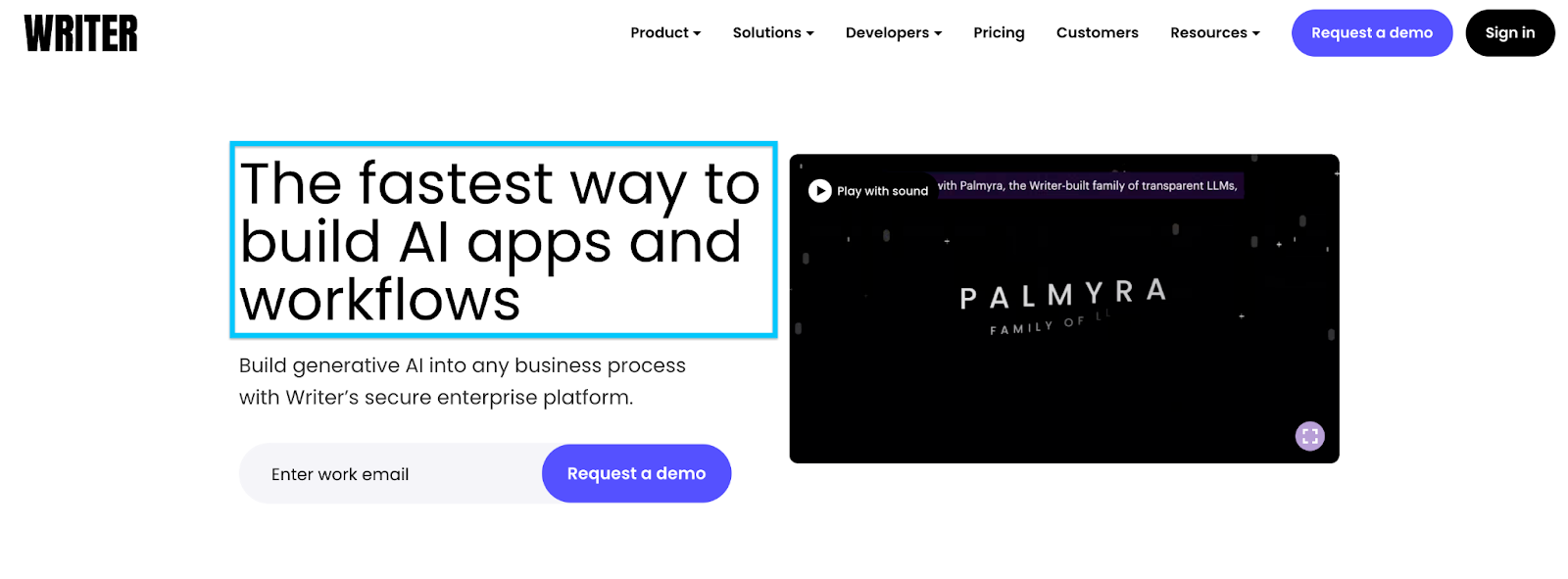
For example, Writer hits a homerun with their unique value proposition (UVP) by outlining the immediate benefit of using their product:
2. Subheadline
Does the text immediately following your headline support your value proposition and provide context to your offer? Does it expand upon your headline or continue the thought, not start a new idea?
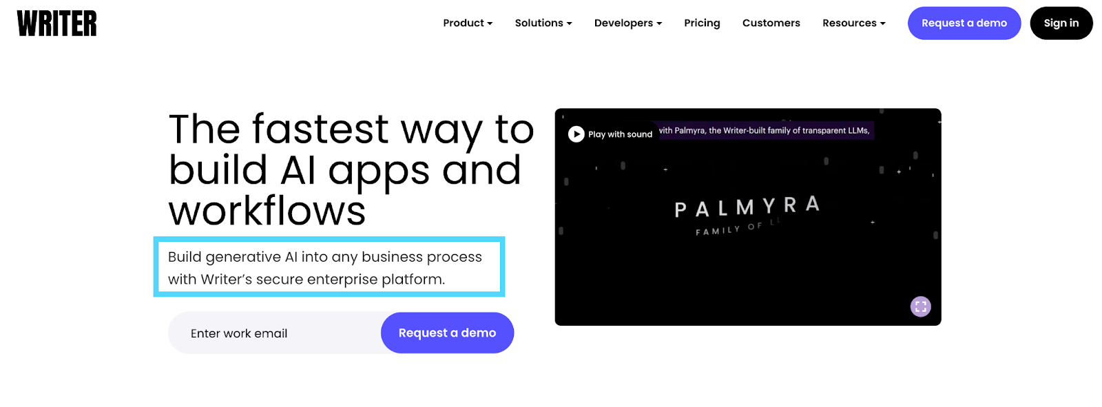
Sticking with the Writer example, their subheadline provides much-needed context and clarity to their headline: “Build generative AI into any business process with Writer’s secure enterprise platform.”
This is helpful because when we think about marketing AI products, security and privacy are common concerns buyers have. Their subheading tackles that objection right away.
3. Message match
Does your landing page copy and offer use the same phrasing and language from the original ad(AKA message match)?
If your ad makes a promise, your landing page needs to deliver it.
As Oli Gardner of Unbounce would say: “Match your ad copy with your landing page or you fail.”
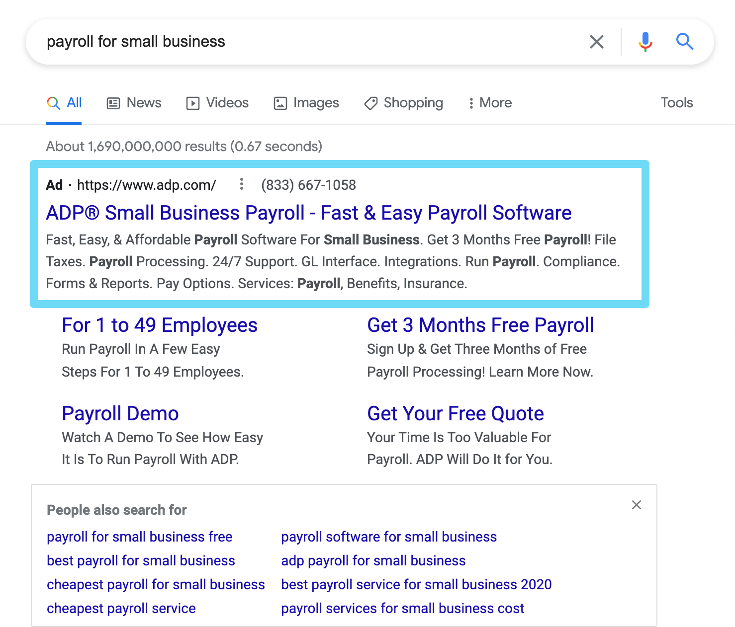
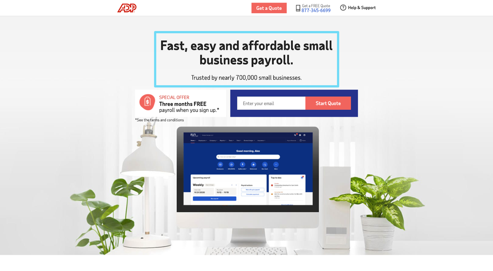
For example, ADP perfectly matches their PPC ad copy and offer with their landing page headline and offer:
Matching ad copy with landing page keywords also benefits your Google PPC Quality Scores: the more aligned, the more relevant Google will find your ads.
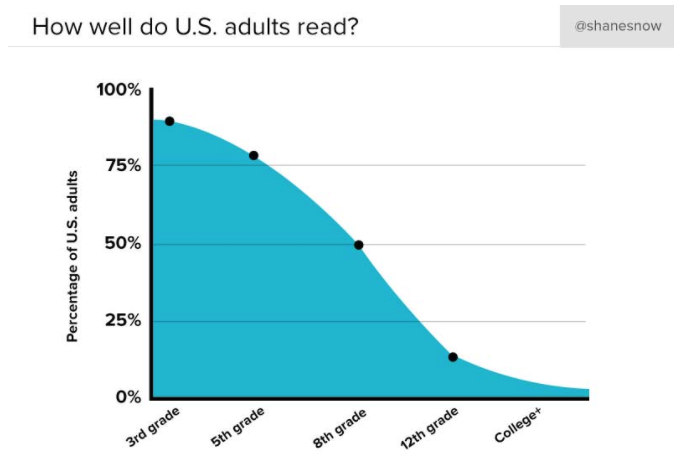
4. Readability
What's the average reading level of your landing page visitors? Lower than you think.
The average American reads at a 7th-8th grade level. This means your landing page copy should do the same.
How do you measure reading level? A few of our favorite tools:
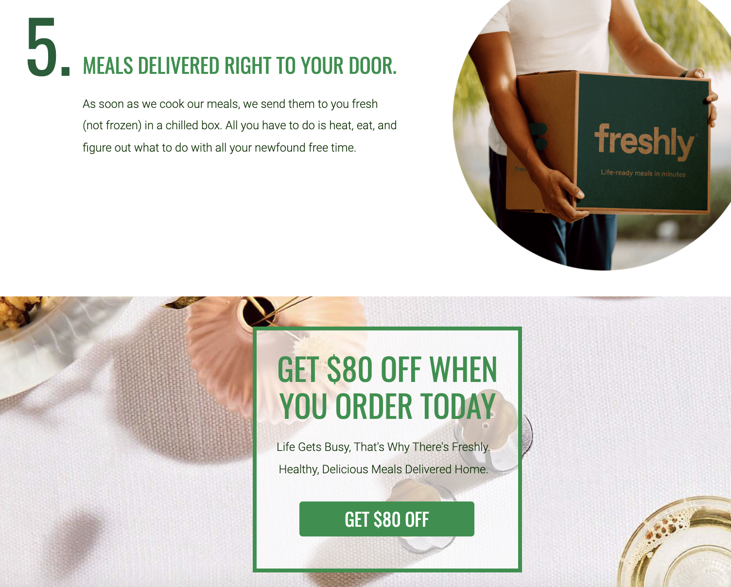
5. Urgency
Does your landing page motivate visitors to act now? Are you tapping into your visitor's psychological sense of loss aversion and FOMO (fear of missing out)?
Great landing pages increase urgency in a number of ways:
- Countdown timers
- Bonus incentives
- Limited inventory
- Limited time offers
- Low inventory warnings
- Exclusivity
- Social proof
For example, Freshly creates a sense of urgency by encouraging customers to "order today" to get access to an $80 discount. They put together a limited-time opportunity that visitors won’t want to miss.
6. Conversational tone
Do you sound like a human?
Here's how:
- No industry jargon. Limit acronyms.
- No fluff
- Second-person voice
- Short sentences
- Contractions (e.g. it's, not it is)
- Active (not passive) voice
- Informal transition words (e.g. “Plus” instead of “Moreover”)
- Shorter words (fewer syllables)
- Ask questions
Can tone really make a difference in conversion rates?
Absolutely.
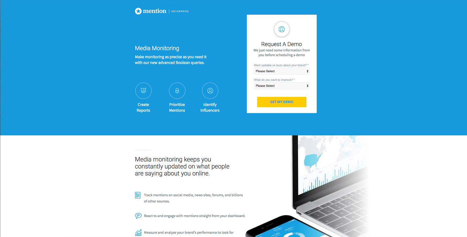
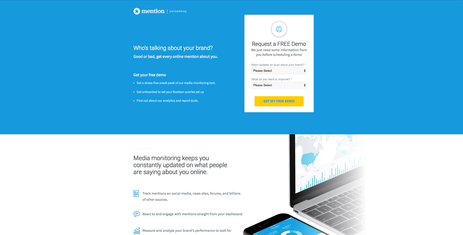
For example, for our client Mention, we swapped out stuffy language for a more conversational tone and increased conversions by 31%.
Instead of “Media Monitoring”, we changed the language to “Who’s talking about your brand?”
Feels more conversational, right?
Have a look at the full copy changes we made:
7. Formatting and legibility
Is your copy legible and skimmable?
- Typography (no more than three fonts)
- Visual hierarchy (big headings, smaller subheadings, even smaller paragraphs)
- Bullet points
- Numbered lists
- Strong contrast (text vs. background)
- Short copy (no long chunks)
- White space
- Consistent style
For example, the New School of Architecture in San Diego is an example of an illegible landing page:
- Competing headlines
- No white space
- Big chunks of texts
- Too many colors
- Inconsistent style

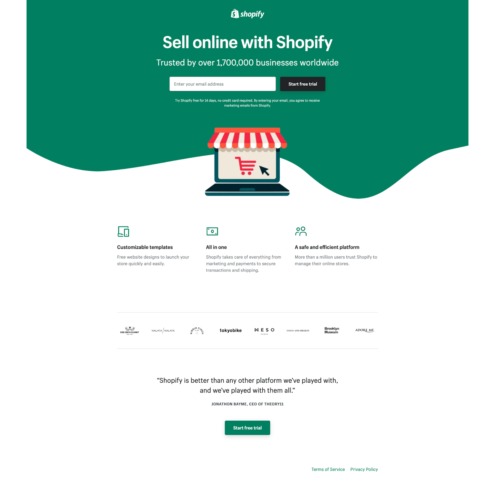
Shopify, on the other hand, created a legible and skimmable landing page:
- White space
- Visual hierarchy
- Short sentences
- Iconography
- Clear CTAs
8. No negative speak
Is your copy giving off bad vibes through negative language?
Even though we mean well when we add phrases like "won't spam" or "won't sell emails," the mere presence of negative reminders can deter clicks. You’re feeding objections into your visitor’s mind before they have them.
Reframe that content to be positive. Try this:
Won't spam ❌ → Only valuable content ✅
Won't sell your email ❌ → Your information is safe with us (and only us) ✅
Stop wasting money on XYZ ❌ → Get money back in your wallet with XYZ ✅
See what I mean? Keep things positive.
Landing page checklist: Design
Design brings words to life. Period.
Good conversion design
- Reduces cognitive load
- Draws attention to important elements
- Drips with distinct brand codes (colors, style, typography, etc.)
When it comes to your landing page's design, check the following:
- Information hierarchy
- Hero shot
- Directional cues
- Images
- Branding
- Consistency
- 1:1 attention ratio
- Mobile responsiveness
- Logo
9. Information hierarchy
Does your page flow from top to bottom using either an F-shaped layout or a Z-shaped layout? Do you use different column layouts (i.e. two columns vs. one column) to establish new sections?
Bottom line: Use a heatmap to test how visitors read your page, and every time they'll follow one of these two patterns:
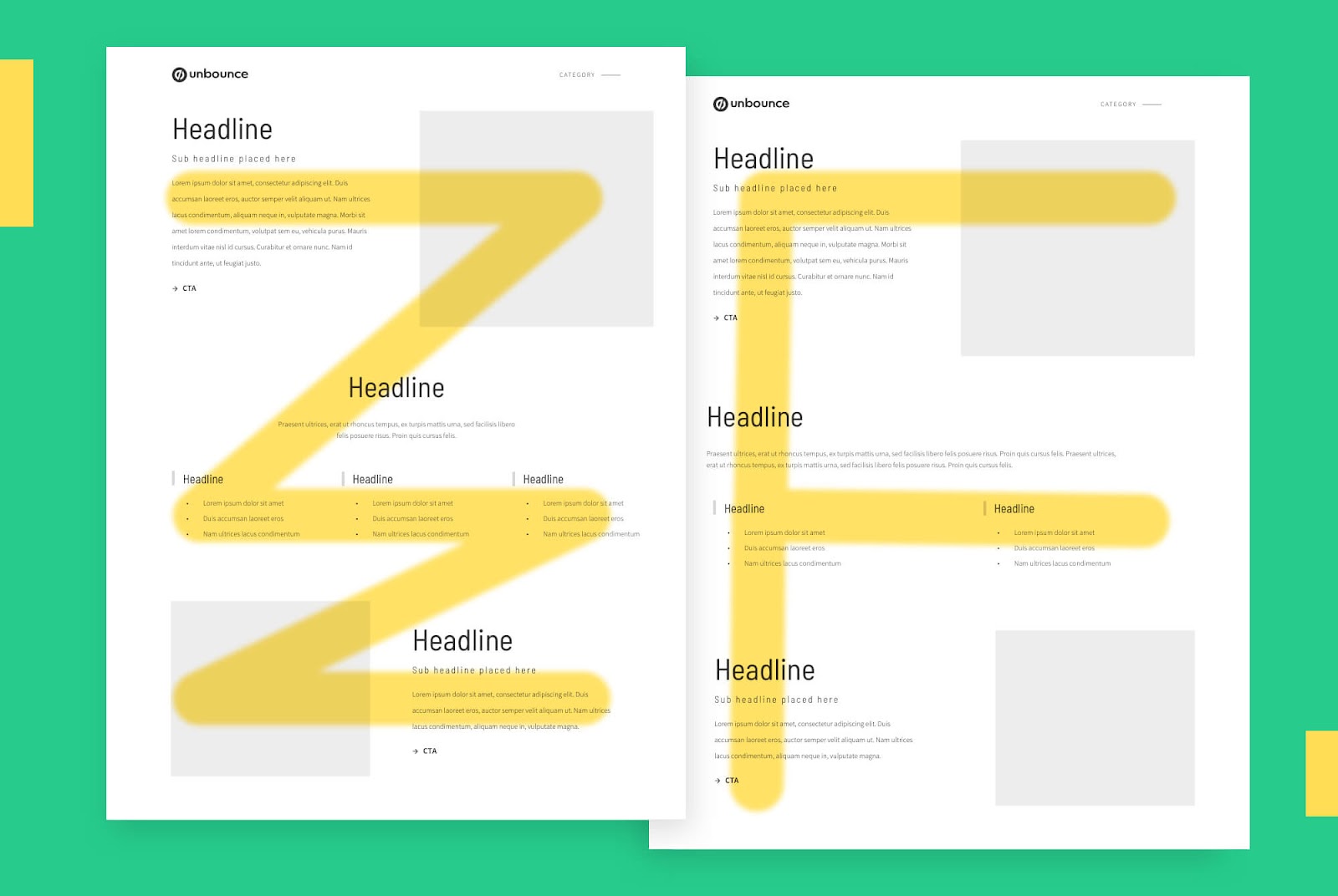
F-shaped vs. V-shaped information hierarchy
The general rule of thumb is to use an
- F-shaped hierarchy for information-rich landing pages (lots of words)
- Z-shaped hierarchy for minimal landing pages (image-rich)
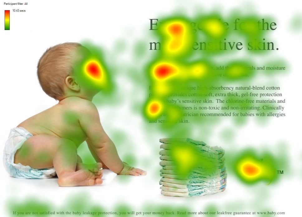
10. Hero shot
A hero shot refers to the primary visual element (background image, graphic, video) that every landing page visitor sees first, above the fold.
- Does your hero shot add context to your value proposition?
- Does it draw attention to your CTA?
- Does it support your copy or overwhelm it?
For example, the landing page below uses a diapered baby to add context to their value proposition (quality diapers). The direction the baby’s looking also draws attention to their headline:
11. Directional cues
Does your landing page include explicit directional cues like arrows or icons to draw attention to important elements of the page, like your CTA? Does it use implicit directional cues like white space to guide visitors down your page?
How's this for a direction cue (or four)?
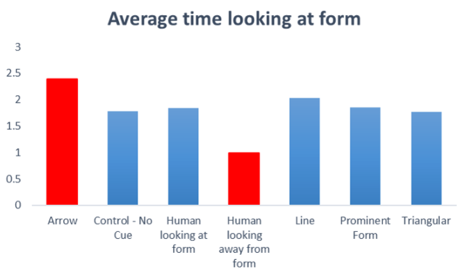
Note: Not all visual cues are created equal. In fact, ConversionXL tested out various directional cues near forms and discovered a wide variety of reactions:
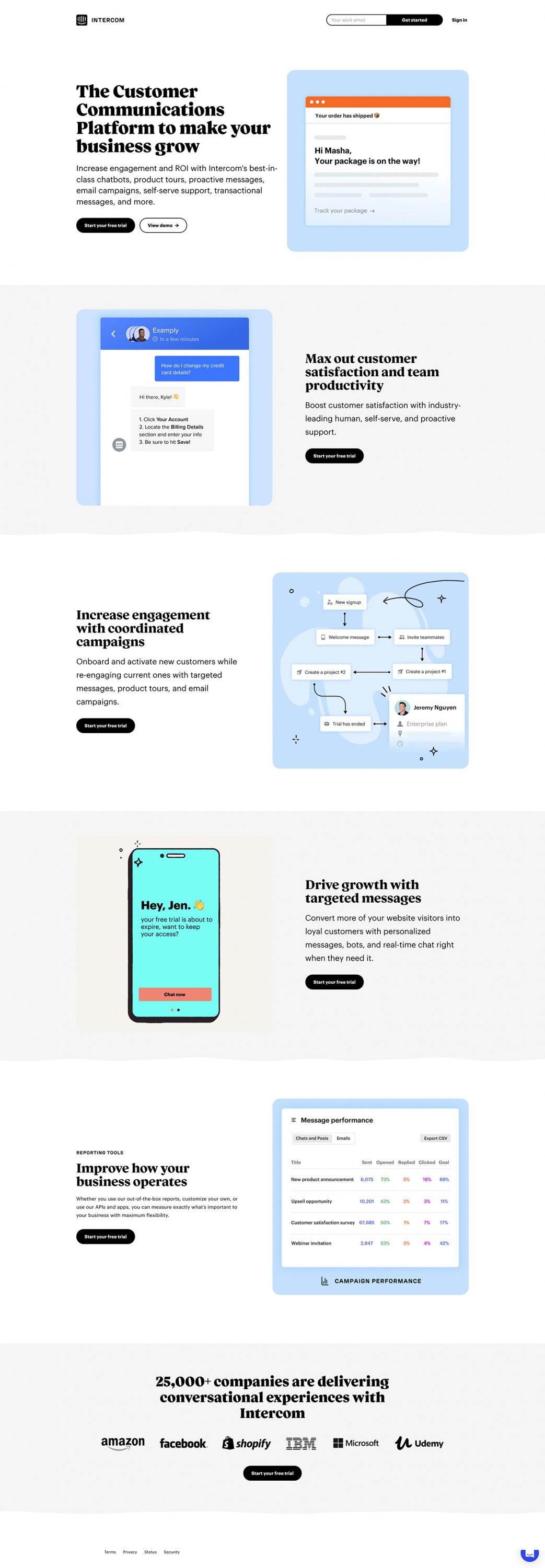
Don't forget white space. White space gives your design breathing room, but it also works covertly to corral your visitors' gaze.
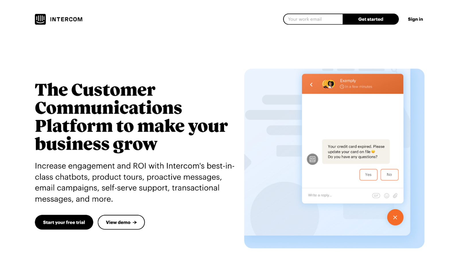
For example, notice how the white space on this Intercom lander keeps your eyes zig-zagging from left to right down the page:
12. Images
Does your landing page use images to add value, not fill space?
Good landing page images check the following boxes:
- Relevant: Images that add context to the copy in a way that makes the words more understandable
- Distinct: Images that look and feel like your brand, no one else's
- Real: Custom photos and illustrations, not stock photography
- Emotional: Images that elicit an emotional response, and in doing so, help sell your value proposition
- Optimized: Don't forget image alt text (search engines use them to understand your images and better rank pages; screen readers use them for the visually impaired)
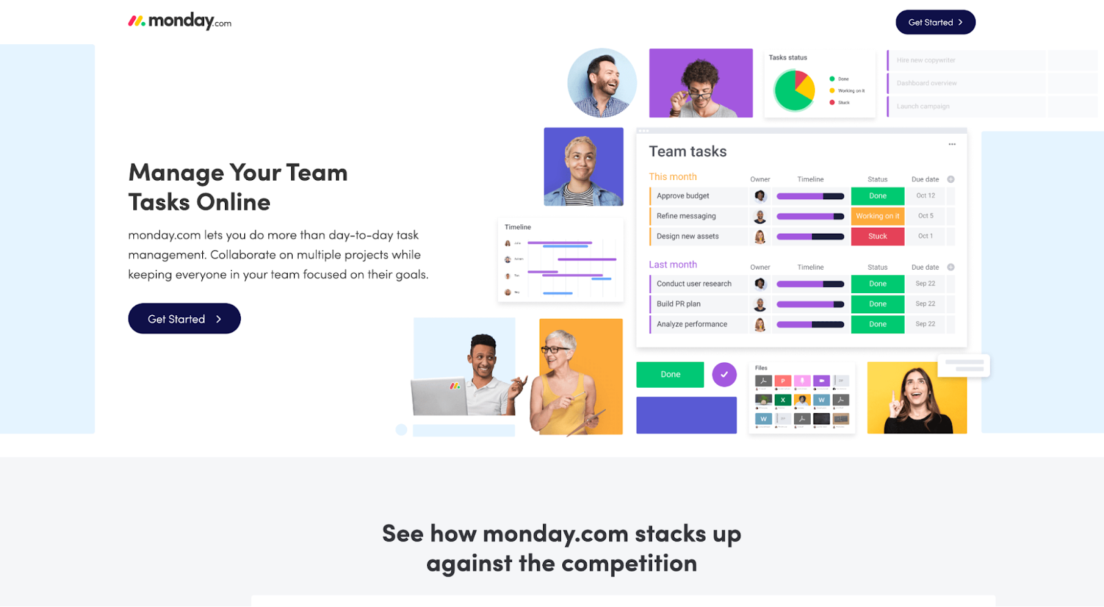
For example, Monday.com uses custom illustrations to communicate what a successful implementation of their product could look like for users:
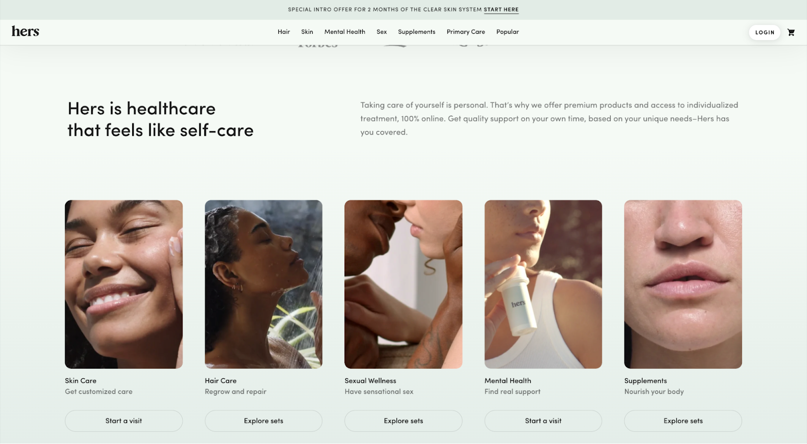
And Hers uses custom photography so they can fully control their brand while providing context, emotion, and authenticity to their products.
13. Branding
Does your landing page look and feel like your brand across
- Brand colors
- Typography
- Visual elements
In many cases, familiarity is all you need to win a sale. But if your landing page lacks any identifiable brand codes, you may get mistaken for someone else—and lose the sale.
For example, no one does distinct brand assets better than Jasper. When compared to their competitors, who stands out, and who blends in?
Option 1: Anyword
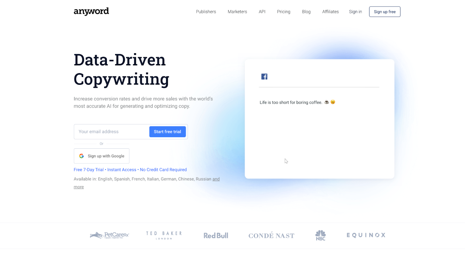
Option 2: Copysmith
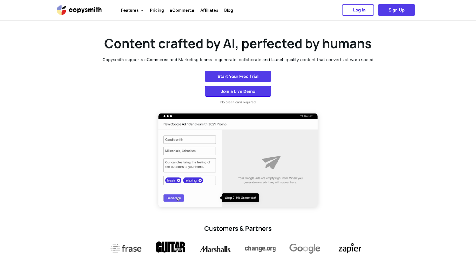
Option 3: Jasper
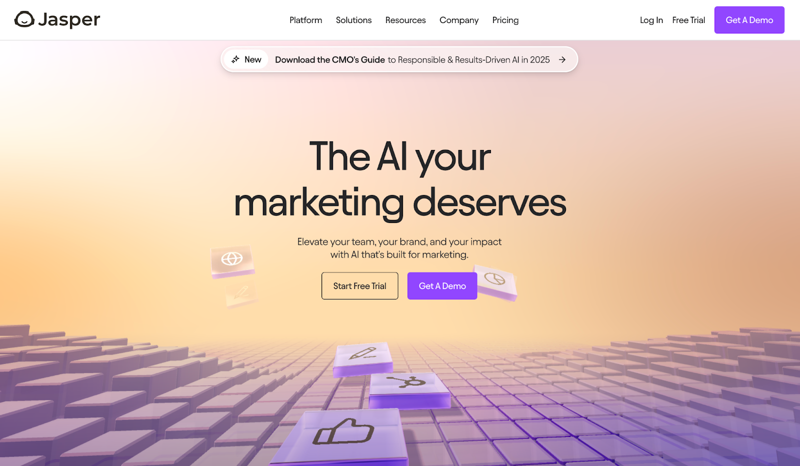
Answer: Option 3, no contest. 🏆
14. Consistency
Consistency is the backbone of a successful landing page. It means consistency across. A cohesive design not only looks professional, but also builds trust with your target audience.
- Design language: Stick to consistent design throughout the page. This includes using the same fonts, colors, and styles for headings, subheadings, and body text.
- Tone and messaging: Ensure that the tone and messaging align with your brand’s voice. Whether your brand is formal or casual, maintain that tone consistently.
- Imagery and illustrations: Use consistent designs that reflect your brand’s identity. Avoid mixing different styles of images or graphics that can confuse visitors. If you’re using custom illustrations all throughout your website, don’t start throwing stock photos out of the blue on a landing page.
- Professionalism: Consistency in design and messaging makes your landing page appear more professional and trustworthy, encouraging visitors to engage with your content.
Let’s take Mailchimp as an example. Across all of their landing pages, you’ll see
- The same font treatments for headings, subheadings, and CTAs.
- For their graphics, it’s almost always a mix of real humans and custom illustrations

15. 1:1 attention ratio
A 1:1 attention ratio refers to the ratio between the number of links on your landing page to the number of conversion goals.
In other words, if you have one conversion goal, you should only have one link (the CTA).
More links = more distraction = fewer conversions.
Which means removing unnecessary
- Navigation menus
- Footer links
- Social icons
Don't believe us?
VWO did a case study that tested out Yuppiechef's navigation bar:
Removing the navigation increased conversions by 100%.
16. Responsiveness
Is your landing page mobile responsive? If not, do you use a landing page builder that allows you to make responsive pages?
Mobile traffic makes up more than 60% of all internet traffic. If your landing pages aren't optimized for smaller screen sizes, you're losing conversions.
And mobile-optimized doesn't just mean “resized;” it might mean new graphics, less content, or different CTAs.
17. Logo
Is your logo featured in its standard header placement (upper left)? And does it open up your homepage once clicked on?
Andy Crestodina at Orbit Media Studios researched 50 top websites and found that “100% of the websites researched had a clickable logo in the upper left corner of every page on the site. That's a standard.”
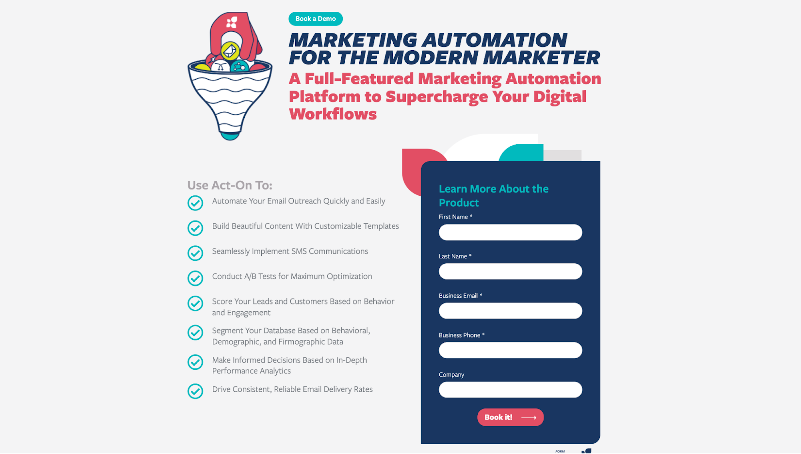
Logos build trust and establish credibility. Don't forget it, like Act-on 😑
Landing page checklist: Calls-to-action (CTAs)
People don't know what to do next; they want to be told.
Your CTA opens a door to conversion and walks your visitors right through it.
When optimizing your landing page CTAs, check the following:
- Button contrast
- Clear benefit
- Conversion intent
- CTA Placement
- Single conversion goal
18. Button contrast
Does your CTA button pop off the page?
It turns out more conversion has less to do with button color than it does with button color contrast. In other words, does your button color clearly contrast with your background color?
In a study from ContentVerve, they discovered that adding contrast to their button increased conversions by 35%.
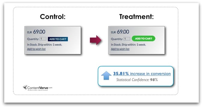
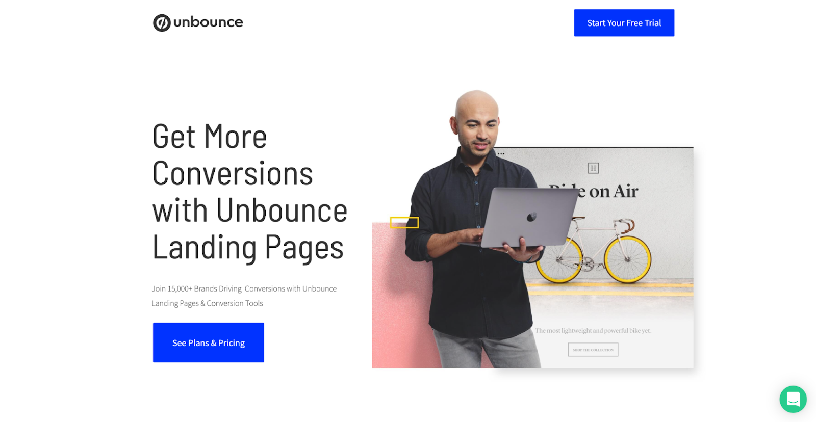
What's a good color contrast? How about only using the button color for the button and nothing else, like Unbounce does with royal blue:
If you're uncertain whether or not your button contrasts well enough with your background, use this free color contrast tool to find out.
Not to mention, by checking your color contract throughout your webpages, you’ll be optimizing pages for accessibility!
19. Clear benefit
Does your button avoid generic copy like submit, start, or click here?
A good CTA uses action-oriented copy that communicates a clear benefit.
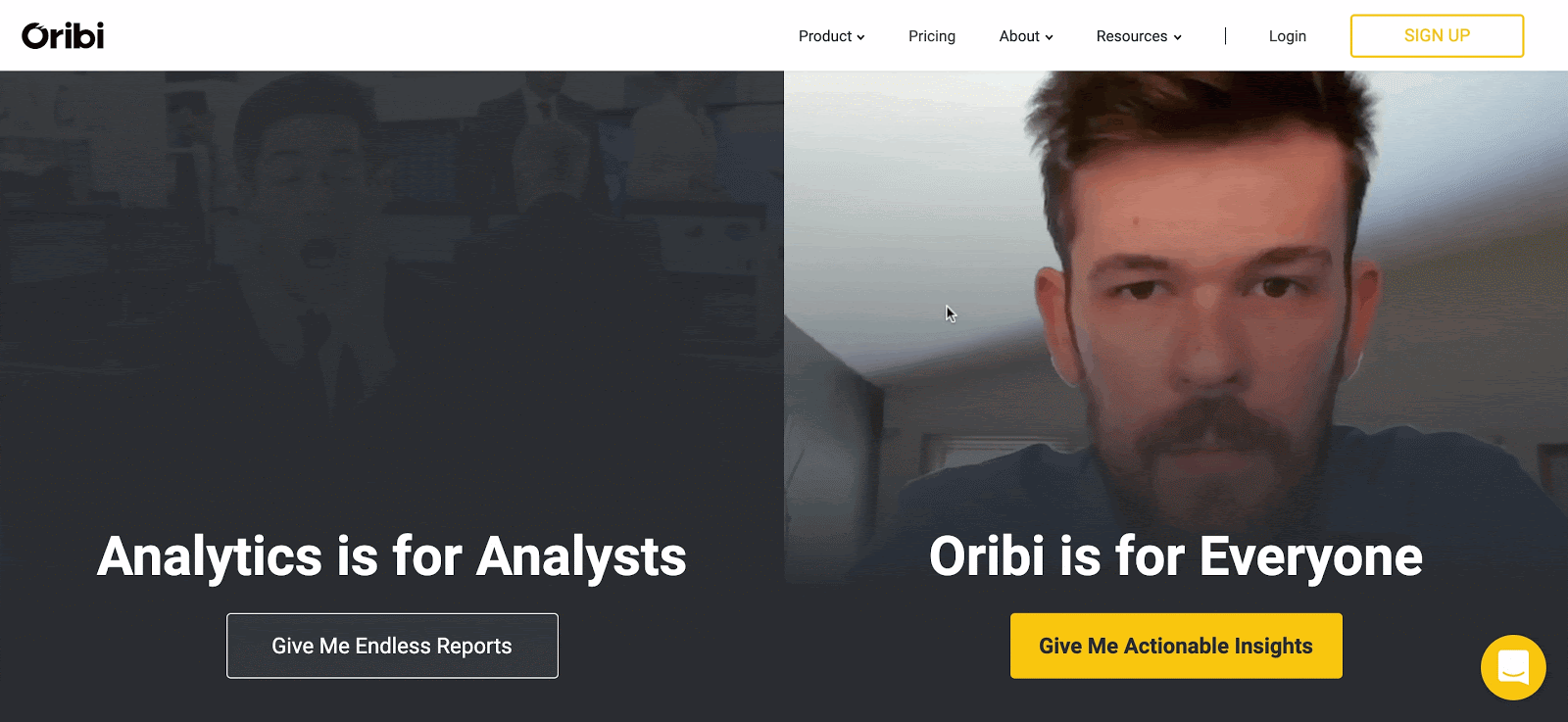
For example, Orbi crushes their CTA button copy by straying from the norm and using copy like “Give me endless reports”:
20. Conversion intent
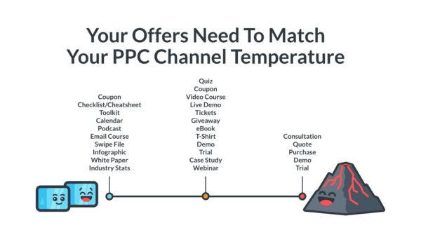
Different sources of traffic (i.e. different channels) have different temperatures.
For example, PPC traffic tends to skew hotter since you can bid on bottom of funnel, purchase-intent keywords, whereas social media traffic tends to skew colder since social media visitors aren't actively shopping.
Does your CTA and offer match the intent of your visitors? One CTA does not fit all.
21. CTA placement
Is your CTA button prominently featured above the fold (the top section visitors first see when they arrive)? And do you feature it several more times through your landing page?
Where should you feature your CTA, anyways?
- Above the fold
- Middle of page
- Bottom of the page
- Close to your benefits
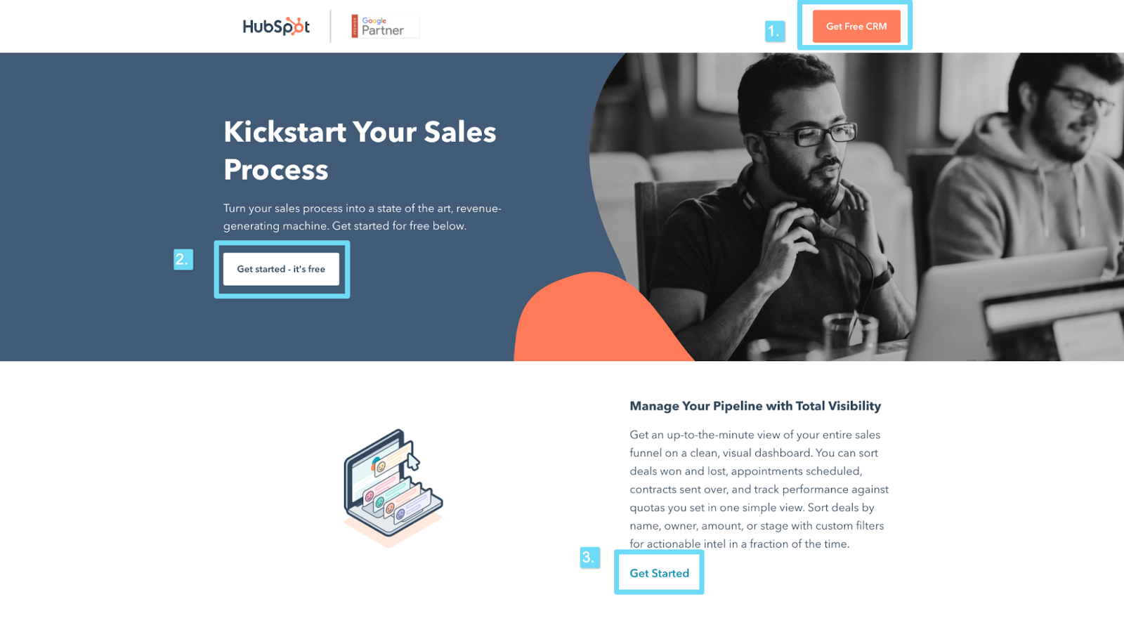
For example, Hubspot features their CTA
- In the top navigation bar
- Above the fold
- Next to their benefits (middle of page)
- Bottom of the page
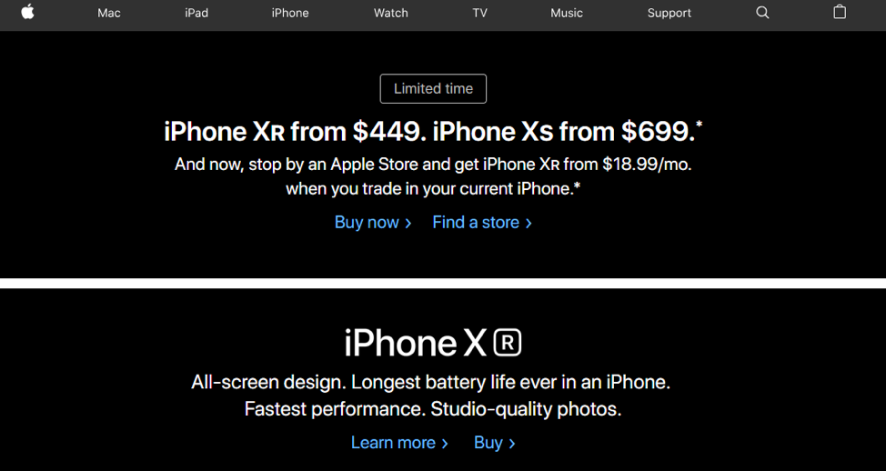
Whatever you do, don't bury your CTAs in a sea of text, like this example from Apple:
22. Single conversion goal
Does your landing page offer a single path to conversion, not many?
More offers = fewer conversions.
In fact, one study discovered that adding multiple offers (i.e. multiple conversion goals) decreased conversions by 266%.
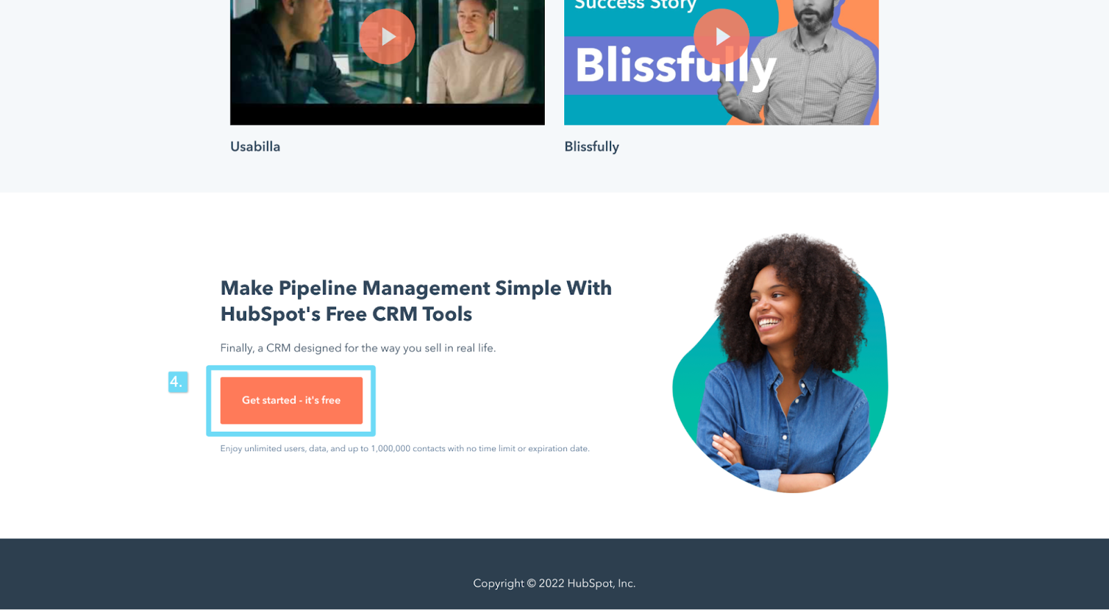
For example, Monday's landing page includes one conversion goal only: Get started with a free trial.
Landing page checklist: Forms
For lead capture pages (i.e. lead generation pages with forms), the lead form can make or break your conversion rates.
Is it too long? Too short? Too complicated? Too intimidating?
So many variables, so little margin for error.
To ensure your forms capture leads (instead of scaring them away) check the following:
- Breadcrumb technique (multi-step forms)
- Form length
- Thank you page
- Autofill (or Google One Tap)
23. Breadcrumb technique (multi-step form)
Does your landing page form use multiple steps? If so, did you save the most threatening questions for the last step?
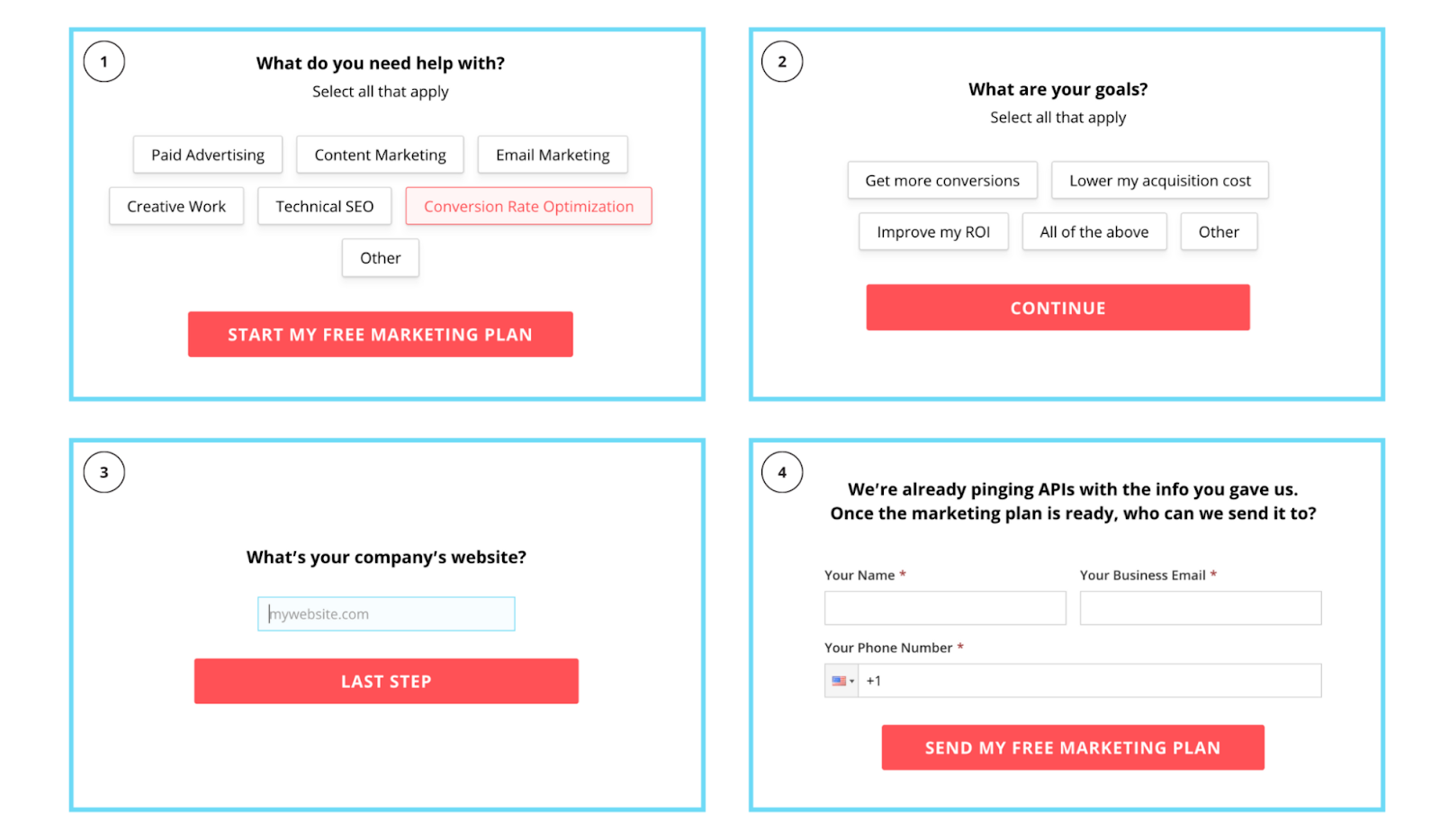
The breadcrumb technique (pioneered by our founder) is a type of form that uses multiple steps to increase conversions, one micro commitment at a time.
For example, instead of asking seven questions on one giant form, split those questions up into three stages, and ask for an email and phone number on the last stage.
Tip: Ask a non-intrusive, “softball” question first, even if the info isn't necessary. Then ask progressively more intimidating questions in stages two and three. Whatever you do, always ask for contact information last.
For example, let's look at our KlientBoost form:
Or Lytx's form:
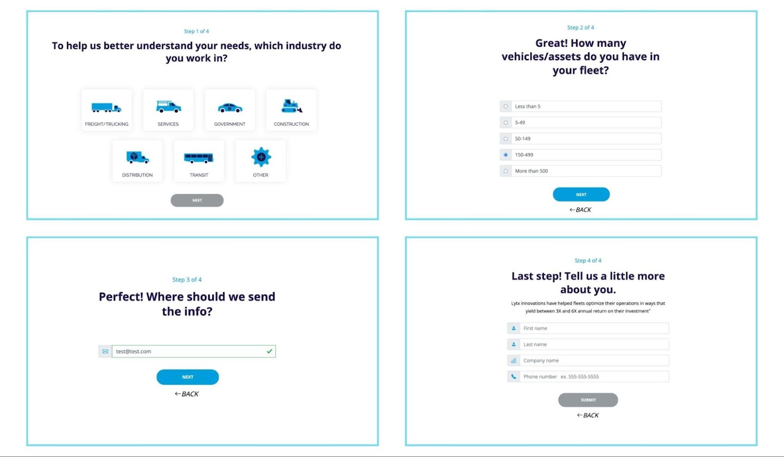
Generally speaking, people are more likely to complete something once they've started it, so getting an initial micro-conversion can be a big deal.
Stephanie Sarkis explains this Zeigarnik Effect in her Why We Hate Not Finishing What We Start post for Psychology Today:
“It turns out that the brain has a powerful need to finish what it starts. When it can't complete something, it gets stuck on it.”
24. Form length
Have you tested the length of your form (i.e. fewer form fields vs. more form fields)?
Don't assume that shorter forms perform better, because that's not always the case.
For example, in an A/B test from former Unbounce conversion designer, Michael Aagaard, he discovered that removing form fields actually decreases conversions by 14%
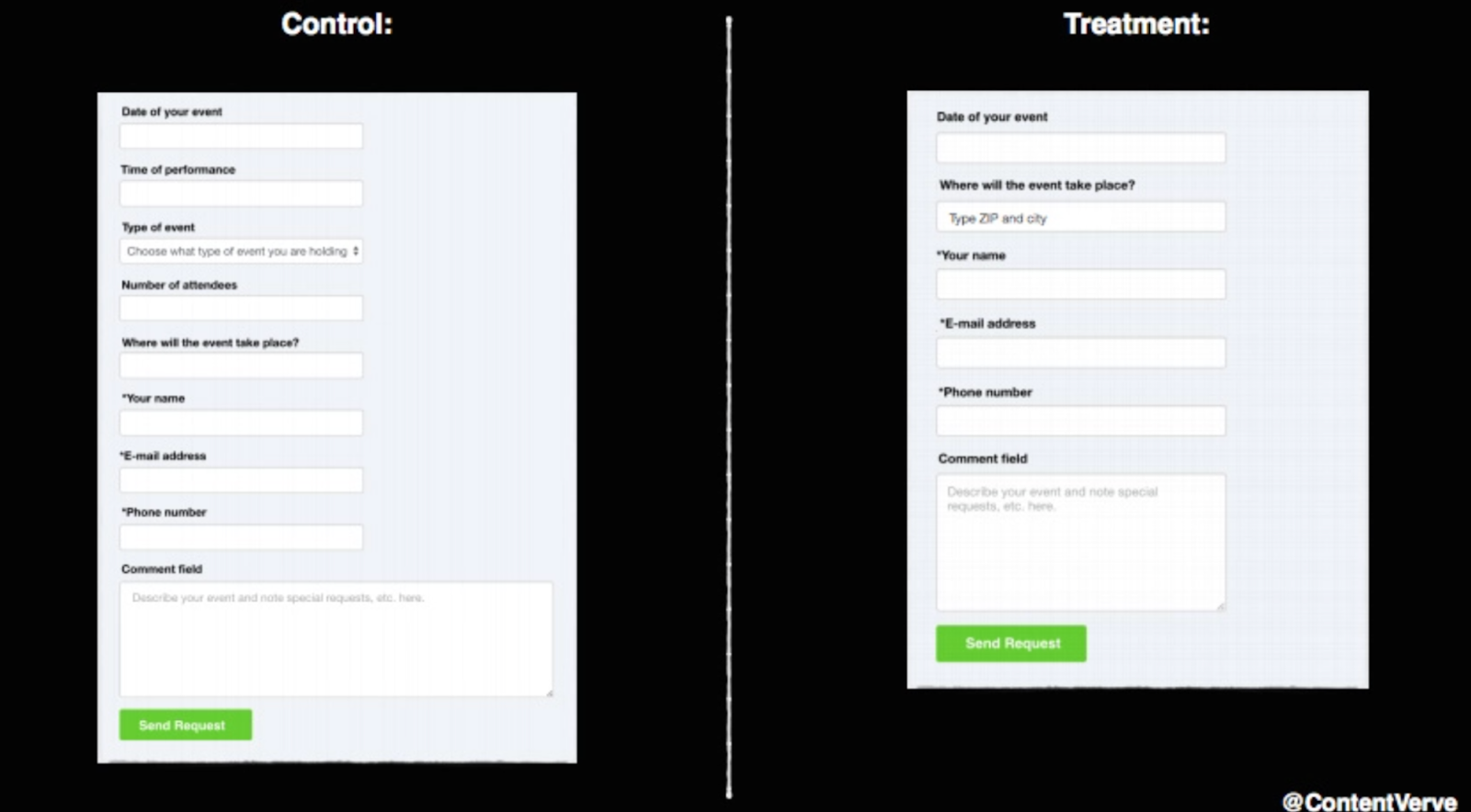
Bottom line: Shorter usually does mean better, but not always. Eliminate unnecessary form fields and A/B test everything else.
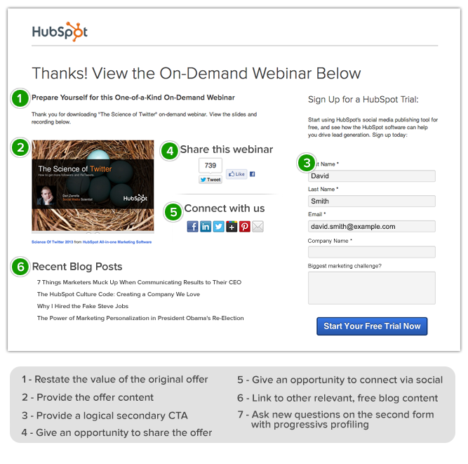
25. Thank you page
Following important advice from your parents, are you saying “Thank you”? In other words, does your form lead to a thank you page upon completion?
Though often overlooked, thank you pages give you the ability to
- Restate your value proposition
- Provide next steps
- Share social icons or newsletter opt-in
- Make an upsell or deliver a second CTA
For example, the following thank you page from Hubspot checks all the boxes and some:
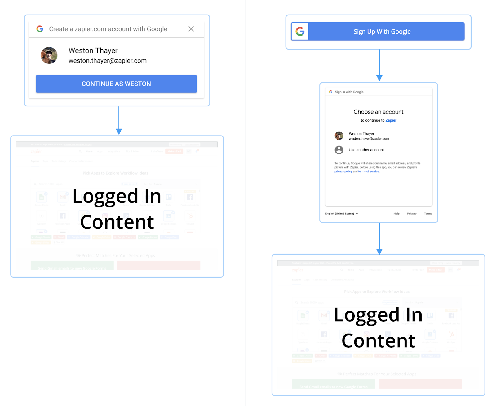
26. Autofill forms (or Google One Tap)
Let the browser do the work: Do your form fields auto-populate (AKA pre-fill) information?
In one study, Google discovered that pre-fill helped visitors checkout up to 30% faster.
Or if you're a SaaS brand that offers a free trial, do you use Google One Tap account creation so users can use their Gmail credentials instead of creating a new username and password?
According to Zapier, Pinterest, and Reddit, Google One Tap increased conversions by 20%, 47%, and 100%, respectively.
Landing page checklist: User experience
Without a proper user experience, nothing else matters.
Even the best copy, design, or offer won't convert a potential customer if your
- Page loads too slow,
- Forms don't submit right
- Images don’t render
When it comes to landing page UX, check the following:
- Page speed
- Mobile friendliness
- KISS (Simplicity)
- Quality assurance
- Accessibility
27. Page speed
When your page speed drops from 1s to 3s, the probability of a bounce increases by 32%. When it drops from 1s to 6s, the probability of a bounce increases to 106%. Yikes. 🤯
Not to mention 53% of your mobile visitors will abandon your site if it doesn't load within 3 seconds.
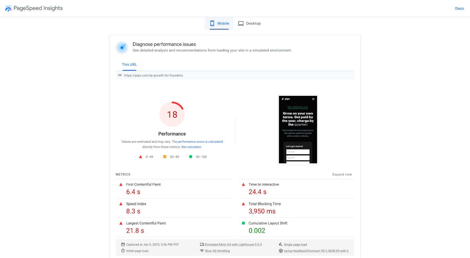
To make sure you're not hemorrhaging conversions due to high bounce rates at the hands of slow-loading landing pages, run your landing pages through Google's free PageSpeed Insights tool before pushing live.
For example, according to PageSpeed Insights, Pipe's landing page needs a bit of work:
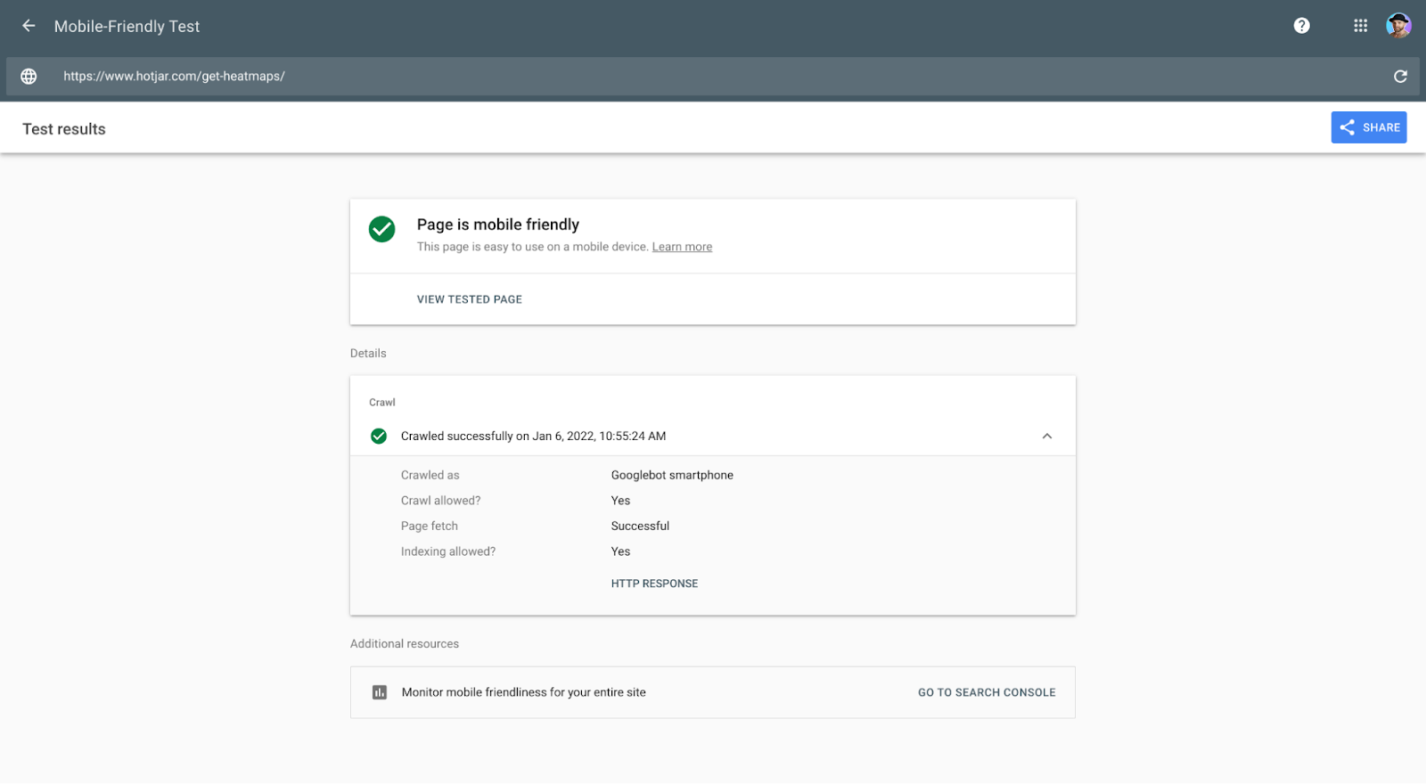
28. Mobile friendliness
We already touched on mobile responsiveness. But does your landing page pass Google's Mobile Friendly Test?
Consider the Mobile-Friendly Test the true arbiter of “responsiveness.”
I've seen plenty of “mobile responsive” websites or web apps fail the Mobile-Friendly Test.
29. KISS (Simplicity)
Keep it simple! Don't make visitors think.
That means sticking to web design best practices that your prospects instinctively know how to use, not avant-garde features and functionality they've never seen before (looking at you, fancy mouse icon and scroll effect) 👀.
30. Quality assurance (QA)
Did someone other than you QA your landing page before pushing it live?
Like a real, breathing human?
I hope so!
When QAing landing pages, check the following:
- Functionality check (links, buttons, tabs, menus, forms, etc.)
- Browser check (compatible on all browsers)
- Content check (images render, content loads, etc.)
- User experience check (compatible on all devices, page speed)
- Measurement check (analytics, pixels, conversion tracking, etc.)
Additionally, run a check in incognito mode for extra assurance.
31. Accessibility
Accessibility is a crucial aspect of landing page design. Ensuring that your landing page is accessible to all visitors, including those with disabilities, is not just a best practice but a necessity.
When checking for accessibility, ensure your landing page has the following:
- Alternative text: Provide alternative text for images. This helps visually impaired users understand the content of the images through screen readers.
- Keyboard bavigation: Ensure that the page is navigable using a keyboard. This is essential for users who cannot use a mouse.
- Accessibility tools: Use accessibility tools to test your landing page’s accessibility. Tools like WAVE can help identify and fix accessibility issues.
Landing page checklist: Social proof
Social proof fills your value proposition with trust and credibility.
And you don't get conversions without it.
When it comes to trust seals, check that your landing page includes the following:
- Testimonials
- Client logos
- User stats
- Awards
- Star ratings
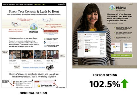
32. Testimonials
Do you have evidence to support your testimonials beyond quotes?
- Images
- Video case studies
- Badges
- Client logos
- Testimonials
- Success stats
Here's an example where featuring a testimonial with an image increased conversion rates by 102.5%:
33. Client logos
Does your landing page feature relevant client logos? If so, are you sure your top 1% of clients aren't scaring away the other 99%?
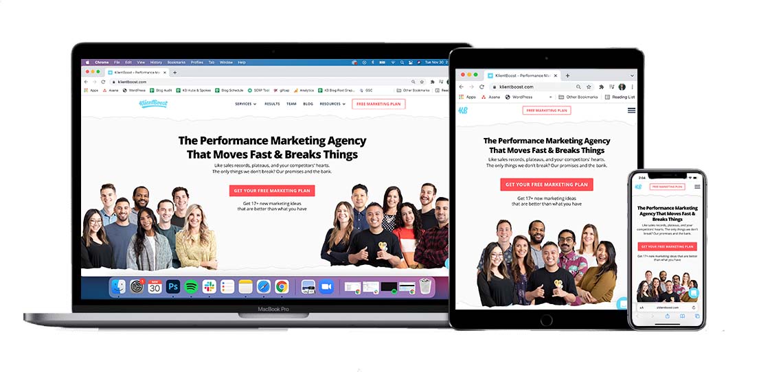
For example, on our KB landing pages, we feature some of our most recognizable clients:
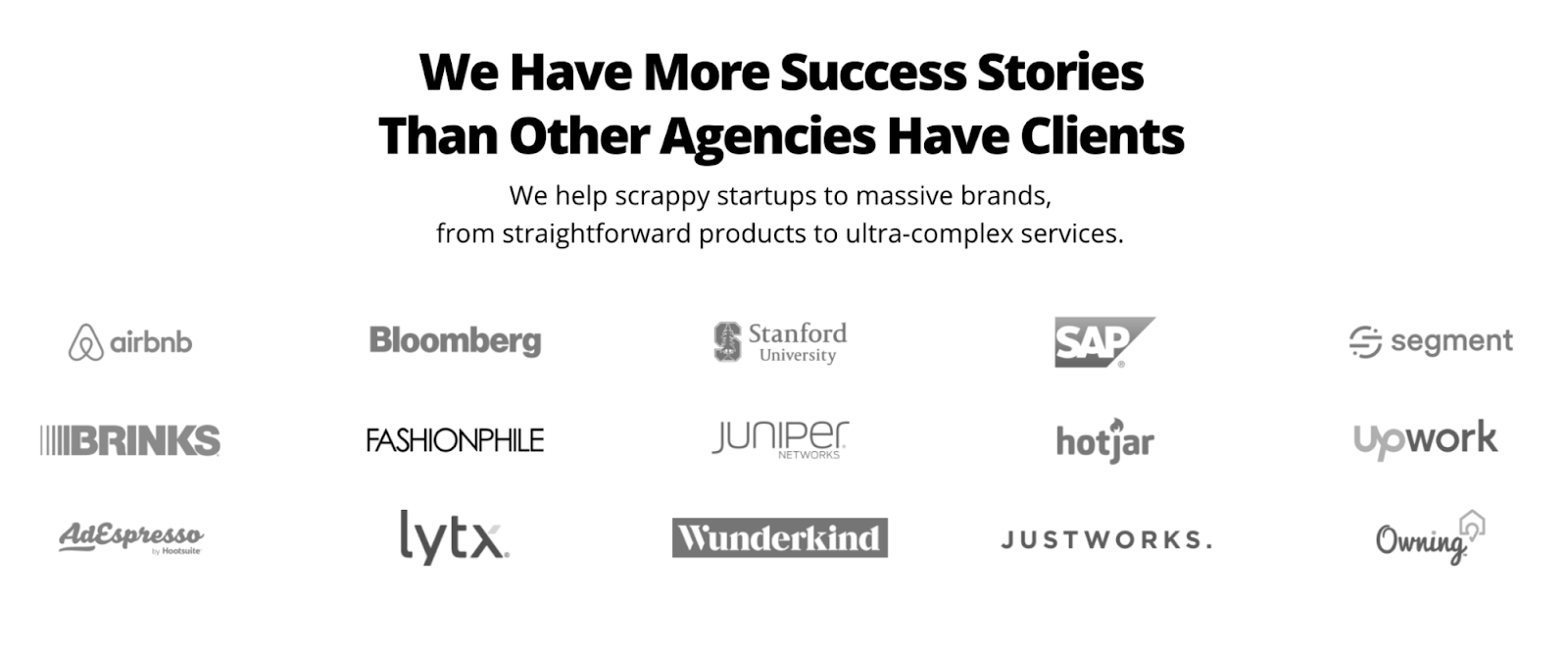
However, even though we manage some of the biggest accounts in the world, most of our clients are small to mid-sized businesses.
To ensure our prospects know we're a good fit for them (since most of them aren't in the top 1% of their industry), we also include a link to over 600 client case studies from every industry and size.
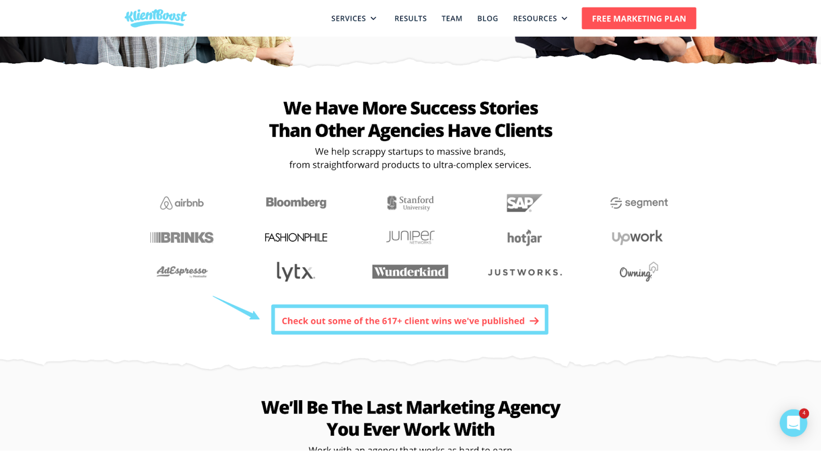
Either way, if you include client logos, don't let it backfire on you. If you only serve enterprise clients, sure, only feature enterprise clients. But, if you also serve smaller businesses, don't scare them away with big logos.
Whatever you do, always test.
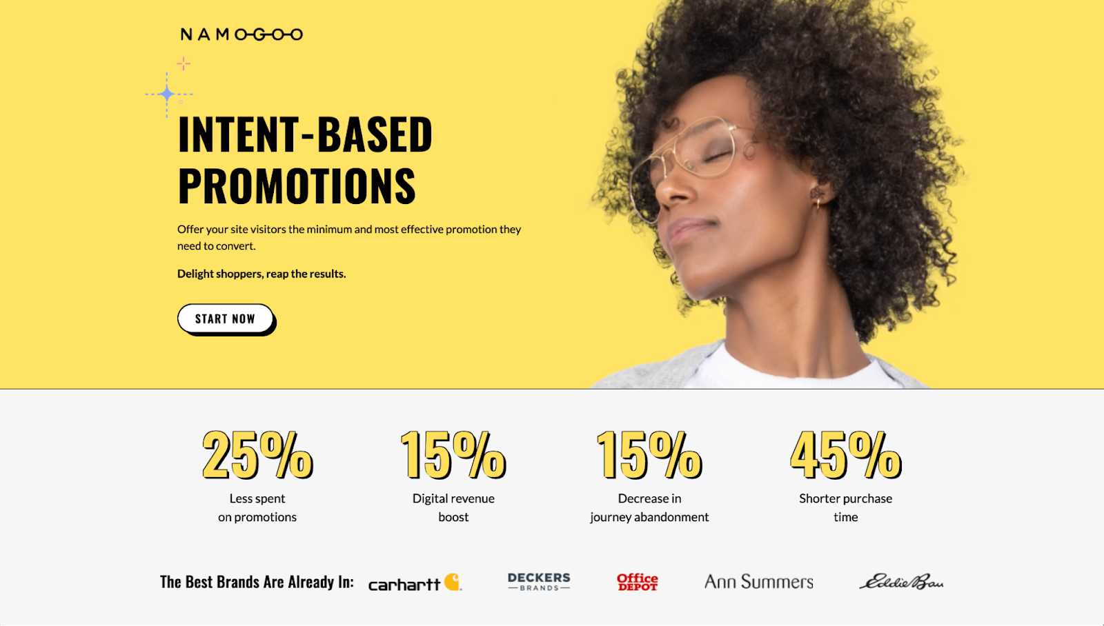
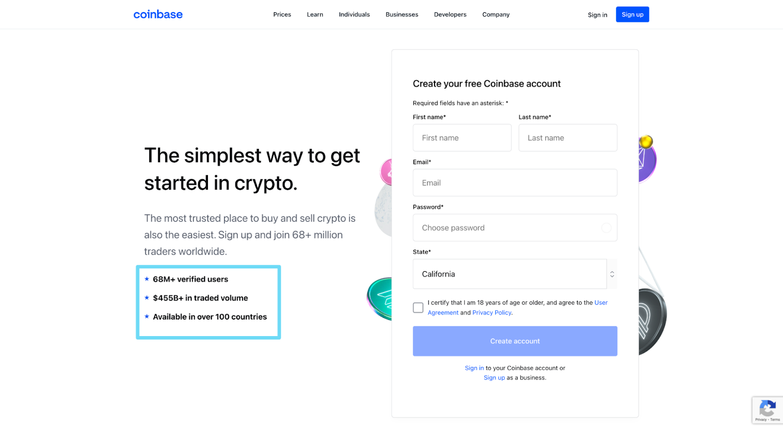
34. User stats
If possible, does your landing page feature collective wins that your customers have experienced from using your product or service? Wins like
- Money earned
- Time saved
- Clients won
- Interest accrued
- Increased productivtiy
For example, Namogoo features user stat social proof above the fold:
And Coinbase features user stat social proof below their subheading:
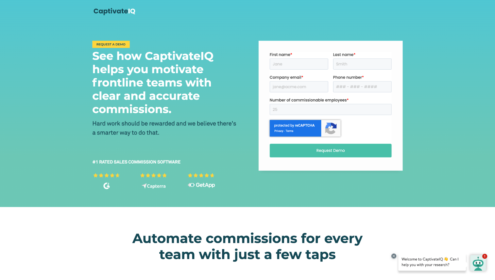
35. Star ratings
Do you share your aggregate star ratings from different review platforms unique to your industry?
For example, CaptivateIQ features their aggregate star ratings from G2, Capterra, and GetApp:
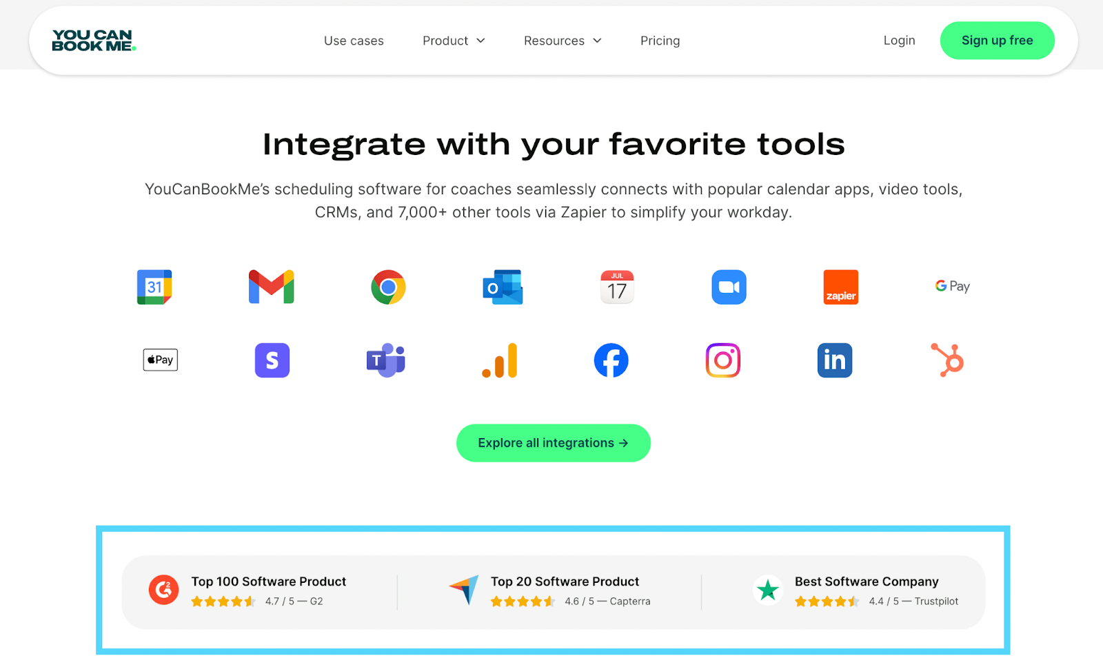
YouCanBookMe also includes their star ratings on their industry pages:
36. Badges
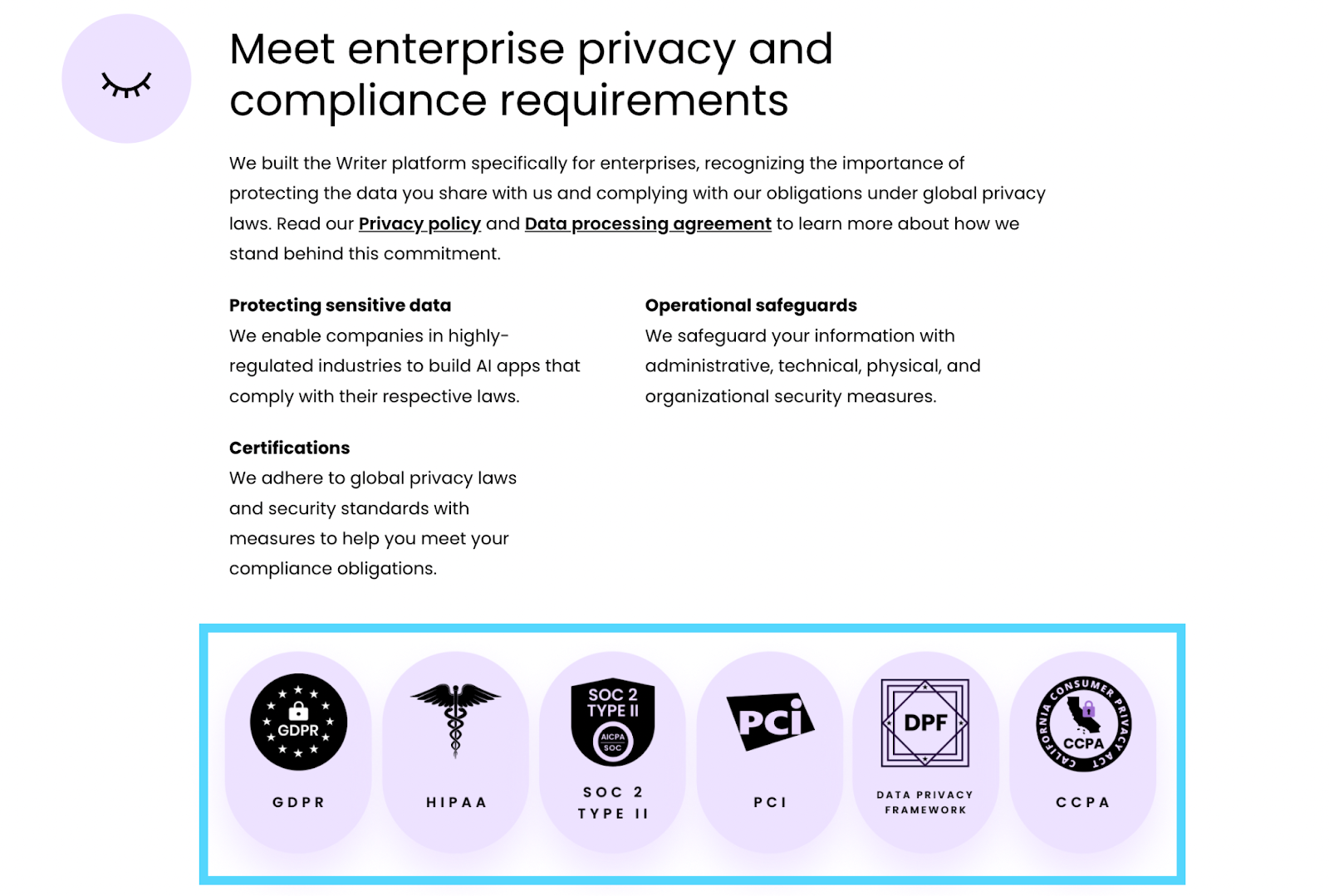
Security matters online more than ever. Do you have logos or badges that promise protection if people share their information with you?
A badge can help encourage a purchase. Some badges help more than others:
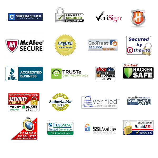
Remember when we talked about Writer.com’s focus on talking about security right away? This is the perfect opportunity to drive that message home with security badges:
Landing page checklist: Tracking and integrations checklist
Depending on your campaign goals, industry, or budget, the number of tools or apps you integrate with your landing page will vary.
Nonetheless, connecting analytics and tools so they talk to each other is how you mine data and make improvements.
When it comes to tracking and integrations, check the following:
- Google Analytics
- Pixels
- Conversion tracking
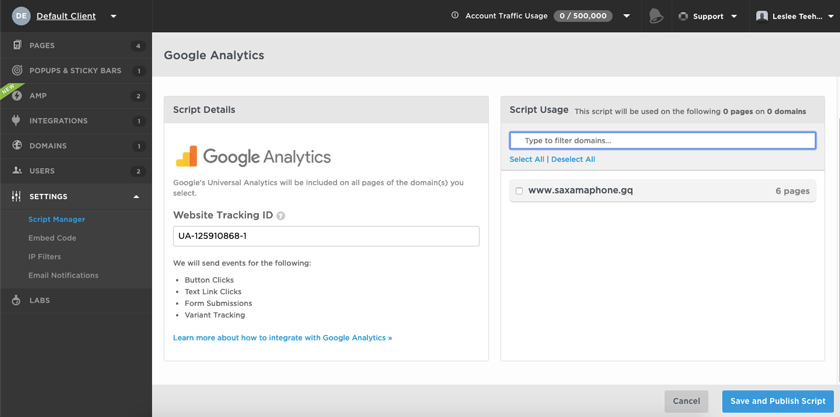
37. Google Analytics
Did you paste your Google Analytics (GA) tracking snippet into the <head> section of your landing page? Or if you're using a paid analytics platform instead, did you paste their tracking snippet into your <head>?
If you're using a landing page builder like Unbounce or Instapage, they'll have a script manager section somewhere in the dashboard. Simply paste your GA snippet in the box:
38. Pixels
Did you embed social media pixels (X, Facebook, LinkedIn, Pinterest) and remarketing pixels (Google, AdRoll, RollWorks, etc.) into your landing page code too?
Even if you're not running social PPC campaigns or remarketing campaigns, best to collect audience data anyways. If you want to run them in the future, you'll have the data you need.
39. Conversion tracking
Have you set up conversion goals in Google Analytics? And if you're running PPC campaigns, have you embedded the Google Ads conversion tracking snippet?
Any landing page builder worth its salt will track conversions within their platform, but we recommend setting up conversion goals in Google Analytics too. GA will give you a layer of data your landing page builder can't.
40. Integrations
Have you integrated your landers with the following marketing tools (all that apply):
- Email marketing (Mailchimp, CampaignMonitor, etc.)
- Marketing automation (Hubspot, Autopilot, Drip, etc.)
- Ecommerce (Shopify, Stripe, PayPal, etc.)
- CRM (Salesforce, Hatchbuck, Zoho, etc.)
- Call tracking (CallRail, CallHub, Callingly, etc.)
- Live chat (Intercom, LiveChat, etc.)
- Email verification (NeverBounce, etc.)
- Conversion tools (Hotjar, UsabilityHub, etc.)
All the landing page checklist boxes are checked
Phew! That's a lot of boxes to check. 😅
But a comprehensive landing page checklist is essential: there’s a lot of working parts to launching a new landing page.
A lot.
But as digital marketers, we have to keep our eyes on the forest, not the trees: target audience, message, and offer.
This is why a landing page checklist works: Use it to offload repetitive details so you can free up cognitive space to think about what matters most.
One last thing…
At the end, we test if we did a good job with The Blink Test.
41. The Blink Test (seeing without thinking)
Does your landing page performance pass The Blink Test (AKA the five-minute test)?
If you've never heard of a blink test or five-second test, it's as simple as it sounds (and it verifies you created a great landing page user experience).
Do this:
Ask real people (customers or friends, not colleagues) if they can tell you these things about your page:
- Purpose
- Value proposition
- Offer
- Goal
Were they able to answer correctly?
Some example questions:
- What is this page about?
- Who is this page for?
- What was the offer on the page?
- Can you find the form?
A blink test is a true test of whether or not your landing page's design, copy, page speed, user experience, and conversion goals all work together to make an indelible (and clear) first impression.
Go back and check this list thrice if they can't answer your questions.
Happy landing page optimization 🙂
P.S. If you're one of the few who want your landing pages indexed by search engines, we've got an entire hub of SEO checklists right here: The SEO Guide. Or if you’d rather offload all landing page responsibilities to a team who will do the hard work for you AND create insane results, we do that.


