You know the age-old hat magic trick where the magician makes you believe they pulled a live rabbit out of nothingness?
At first glance, you don’t understand how that’s possible.
Then, once it’s explained to you, it all makes sense. It doesn’t seem so difficult now that you’ve learned what’s going on.
Conversion rate optimization (CRO) is just like that. It’s the magic behind all the success other marketers are finding.
So let’s demystify the magic of CRO and talk about 8 tips you can implement to increase conversions and conversion rates before you can even say “abracadabra.”
- 1. Increase form completions by starting small
- 2. Use the decoy effect to get more customers through your checkout
- 3. Utilize exit-intent technology to repurpose your users
- 4. Improve user experience by learning more about your audience
- 5. Revisit your call-to-action button to tip the scales
- 6. Match your message to your target audience for better results
- 7. Optimize your page speed to keep your user on the page
- 8. Personalize content to provide better utility
- Let’s make some magic
Get brand new conversion strategies straight to your inbox every week. 23,739 people already are!
1. Increase form completions by starting small
Which of the forms below would you rather complete? A or B?
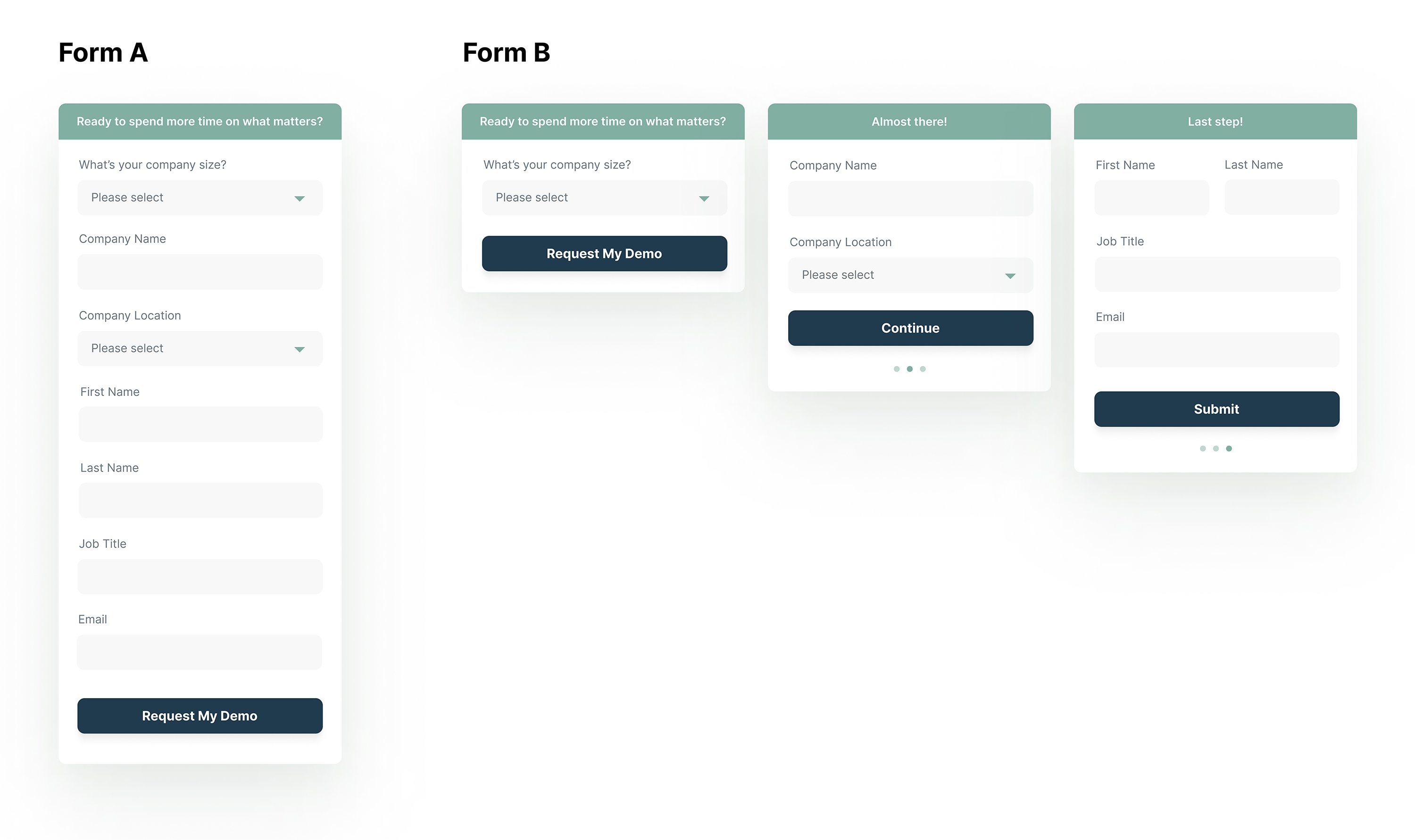
Almost all of you will say B. Why’s that?
Well, first of all, it looks shorter even though they both have the same form fields. Secondly, we don’t ask for your personal information until the very last step, and by then, you’re so far along in the form you might as well finish it, right?
Website visitors make a small commitment first, they are much more likely to make a bigger commitment in the future.
So how do you start small with your forms? There are two ways:
- Multi-step forms
- The Breadcrumb Technique
Use multi-step forms
A multi-step form is a form that separates questions into different steps.
Multi-step forms are magical because they have a better chance of getting users to convert than single-step forms.
Seeing all of the information you need to fill out and hand over to a company can be overwhelming. Additionally, most people aren’t comfortable knowing they need to give up their name and email.
With a multi-step form, you can ease people into completing the form. Additionally, if you put the most high-threat fields (usually name, email, and phone number) last, you can utilize compliance psychology. Essentially, once users comply with the first step of the form, they’ll have an easier time completing the rest of it.
Implement The Breadcrumb Technique
The goal of The Breadcrumb Technique is to eventually get what you really want by getting users to comply with smaller asks first.
But, in order to get users to complete the first step of the form, you must ask a question they feel comfortable answering.
“What’s your company size?” could be a good question since it’s not too personal. It may take some A/B testing to find the right question for you, but we promise it’s worth it.
We utilized the Breadcrumb Technique with Payanywhere and they increased their conversion rates by a whopping 355%. 👀
Interested in learning more? Read our full article on how to dominate using the Breadcrumb Technique.
2. Use the decoy effect to get more customers through your checkout
The Decoy Effect states that people tend to change their opinion about a particular product when two options are presented alongside a third option that is asymmetrical, a little bit uglier, or inconvenient.
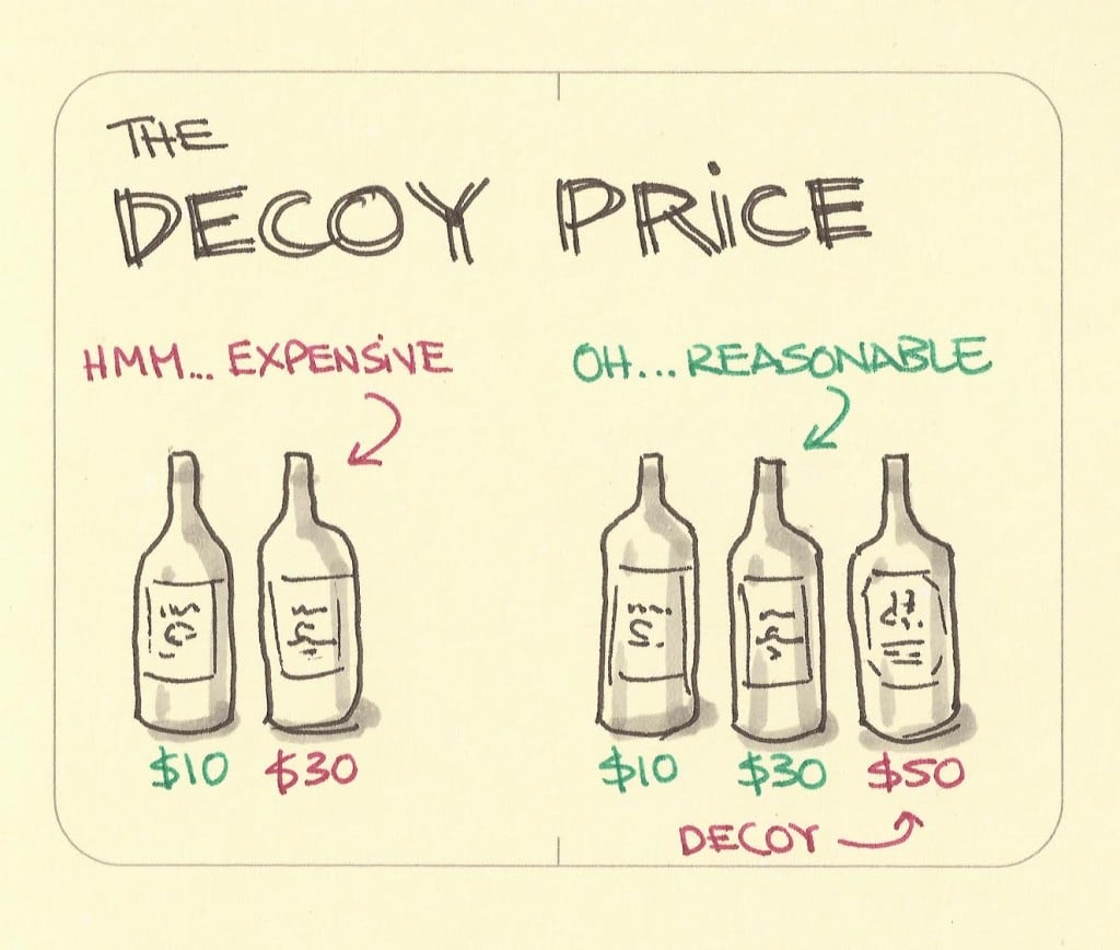
At first, the $30 bottle seems too expensive and a poor value compared to only the $10.
When the $50 bottle is introduced, the $30 bottle doesn’t seem too bad by comparison.
In case you’re wondering how to do it, let’s look at a solid process you can follow.
Create three options
As seen in the example above, you’ll need to create two variations of your product or service, usually on both extremes, that seem more inconvenient than the third.
So with the bottles, it was a cheap option and expensive option.
Remember, the two more inconvenient options are meant to make your third option look much better in comparison. You actually want people to convert to that third option, usually, the middle option presented.
Remember to include visuals
Marketing experts will tell you that good marketing draws the customer’s eye into the content with visuals while simultaneously communicating the same message.
It doesn’t matter if you’re selling. Including product images or images related to your service is vital to creating a comprehensive customer experience.
3. Utilize exit-intent technology to repurpose your users
Let’s say your users aren’t too interested in your content, and they’re looking to leave your webpage.
How are you going to boost conversions if they’re on the way out?
Exit-intent technology can help you repurpose your users so they’re not a total loss. In fact, it may be exactly what you need to increase your website conversions.
Get second chances
Second chances with exit-intent technology are mostly useful for eCommerce sites (i.e. Amazon).
When trying to save a sale, companies often employ exit-intent popups utilizing one of these three strategies:
- Scarcity: Customers may perceive your product as more valuable if there’s a limited supply or a limited-time offer, because of the principles of supply and demand.
- Incentives: Customers may be more likely to convert if they have a discount. If they’re not paying full price for something, it seems like a better deal, even if they weren’t interested to begin with.
- Product recommendation: Cross-selling is your best friend, as customers may find that they like a similar product more and buy that one instead of leaving altogether. If you’re lucky, you may upsell and send them to another product page.
By trying to redirect your customers, you can increase conversion rates without being forced to target new customers only.
Build email lists
Just because they’re not converting now, doesn't mean they won’t convert in the future.
When it comes to SaaS companies, the best-case scenario is to build your email lists and repurpose your users that way. However, this approach can also be used for eCommerce brands.
Before users exit your site, encourage them to sign up for your newsletter. You could even incentivize them with some gated content.
Now, you can re-engage them in the future about your products or services at a later time.
Further Reading: 5 Best Uses For Exit Intent Popups + 22 Hacks That Actually Work
4. Improve user experience by learning more about your audience
To be successful in marketing, you must be knowledgeable about two things: people and data.
Unfortunately, you can’t read people’s minds….so how do you get to know your people?
Ask questions
Sometimes, you won’t know why users aren’t converting.
The good news is you can find out by asking them.
Yep, we know what we said.
User surveys are a great way to garner valuable information directly from your users. But to make them truly valuable, you must ask the right question and provide several different responses for your users to choose from.
Check out the user survey we put together.
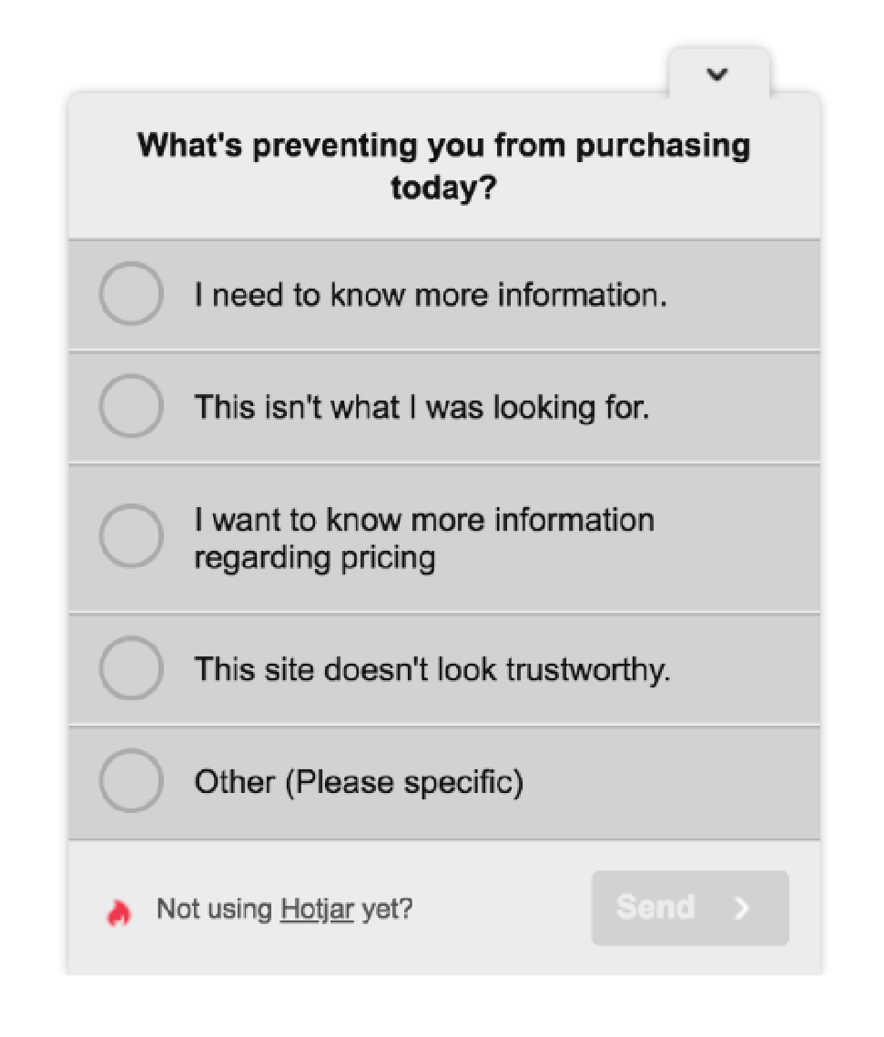
When surveys are used to their full potential, they can provide useful insights about what people like and don’t like, think and don’t think, and you can plan your next move.
See real-life user interactions
Seeing exactly what your users are up to on your website sounds impossible. However, it’s actually very possible.
Heatmaps allow you to see where your users are clicking, hovering, or scrolling on your webpage.
Pretty magical right?
You can then use this data to make informed decisions to improve your website, like where to place your content to ensure users see it.
Utilize user metrics
Google Analytics is a great tool for learning about the data that goes hand-in-hand with the information you glean from user surveys and heatmaps.
Paying attention to important SEO metrics like bounce rate can help you know where you may be falling short or doing well.
Need help getting your Google Analytics set up for success? We’ve got you covered.
5. Revisit your call-to-action button to tip the scales
If you were looking for a quick tip to move the needle, this is it.
Changing up your call-to-action (CTA) button is one of the easiest and best ways to boost conversions.
For real. Two of our best low-effort high-win testing ideas involve tweaking the CTA.
To get started, take a look at our steps below.
Use only one CTA button
The first step to optimizing your CTA buttons is to make sure you have only one CTA — ideally, the CTA that best serves your value proposition.
Take a look at the example below of what not to do:
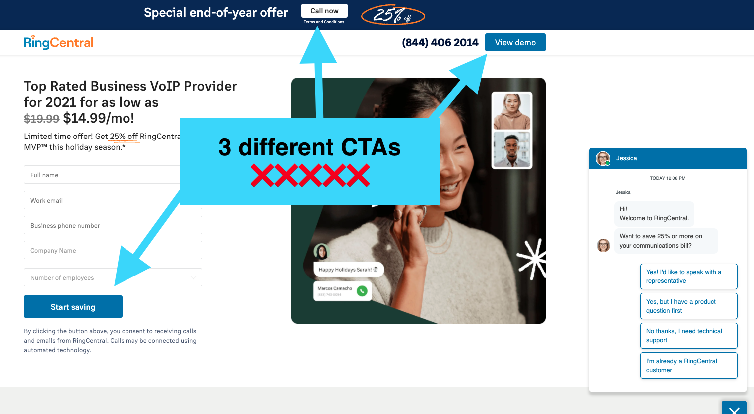
When you have multiple CTAs, it can be distracting to the user, and ultimately, they may not take the action you’re really wanting them to take.
In the example above, RingCentral wants you to click “Start saving,” but it’s hard for users to choose that when there are two other buttons and a chat they could interact with instead.
Make it easy on your users and give them only one choice.
A/B test different button variations
The second step is to make sure you’re A/B testing the copy and color.
When it comes to CTA buttons, these two features can boost conversions if you have the right combination.
For example, if you have an eCommerce brand, see if “Shop Now” performs better than “Buy Now.”
“Buy Now” implies that customers may be taken directly to the payment screen, which is a high-threat CTA, whereas “Show Now” implies that customers may get the chance to shop around first before going to the payment screen, which is a low-threat CTA.
The best CTA copy will come down to your target audience and funnel stage, but we’ll get into that in the next tip.
When it comes to color, consider the significance of color theory.
For example, if your hero image has a lot of blue in it, try using an orange CTA button, since orange contrasts with blue the most.
Use these tips for your CTA and you’ll see a huge difference.
Looking for irresistible call-to-action button ideas? We’ve got 61 you can’t help but click.
6. Match your message to your target audience for better results
Many times, conversions can be lost when your content marketing doesn’t match your target audience. On the other hand, you can multiply your conversion rate immensely by making some adjustments.
Matching your customers as they make the journey down your marketing funnel essentially comes down to two steps: developing your buyer personas and basing your offer on the funnel stage.
Develop your buyer personas
You’ve probably heard of buyer personas, but as a reminder, a buyer persona is your ideal customer.
When you’re making your personas, consider what age, spending habits, interests, location, etc. would make up your customer perfect.
For example, if you own a children’s clothing store, one of the qualities of your buyer persona will be “parent.”
Make a list, tailor your marketing accordingly, and you’re ready to go.
Base your offer on the funnel stage
Now that you’ve developed your buyer personas, you need to optimize your funnel by matching the temperature of each stage of the funnel to its respective audience, or you risk missing out on high-quality conversions.
For example, let’s say you’re targeting the top of your funnel (TOFU).
As a refresher, the TOFU is best for people who aren’t overly interested or invested in your brand or solution. Think of it as “window shopping” if you will.
Their likelihood to commit right away is low so the offer must reflect that “temperature.”
For these people, offering a “free trial” may not be as effective as a “free whitepaper.” A free trial is a high-threat offer, whereas a free whitepaper is a low-threat offer.
With a free trial, they know they’re going to be contacted by your team to secure a sale, whereas a free whitepaper allows them to take a peek at your company as you focus on generating leads.
Conversely, for customers at the bottom of the funnel (BOFU) — those who are ready to make a purchase and are already interested in your company — a “free trial” is very effective.
Furthermore, consider what marketing content you’re promoting to these potential customers as well.
For example, when it comes to social proof, social media updates would be better suited for TOFU customers, in comparison to testimonials and customer reviews that are more effective for BOFU customers.
7. Optimize your page speed to keep your user on the page
It doesn’t matter what’s on your landing page if it doesn’t load (quickly).
You have two seconds to convince your customers that your page is worth checking out before they’re gone and onto the next website. Yikes.
And as of 2019, speed is also a factor for Google Search and Ads. Double yikes.
As you can see, site speed is incredibly important. If you want to know all of our best site speed tips, read this. But for now, one bonus tip that’s not included in the article.
Implement Accelerated Mobile Pages
Accelerated Mobile Pages (AMP), a Google-driven technology, can help your web pages load faster on mobile devices.
AMP allows users to only see the most relevant information upon the initial web page load. Since the pages are stored on the search engine’s server, they load relatively quickly.
While the users look at the select content available, the full site can load in the background and users are none the wiser.
This is great news for mobile devices, as it can drastically quicken page speed to provide users with an excellent mobile experience.
To learn more about how to use AMP, reach this article by Google.
8. Personalize content to provide better utility
We’ve saved the most magical tip for last.
Did you know that 25% of PPC marketers drive all visitors to the same landing page, no matter what keywords or circumstances brought them there?
In most cases, that’s a huge mistake.
Personalized copy will persuade potential customers more than a pretty page ever will.
Marketing experts agree that personalized content is incredibly important, so when we talk about “effective copy” in this context, we really mean personalized copy.
We suggest you personalize your copy to give your users the most utility and relevance. The more relevant your page is, the more likely people are to convert, which directly results in a higher Google Ads Quality Score.
Further reading: 7 Website Personalization Tips To Reduce Acquisition Costs
Instead of trying to guess what your users are most interested in, you can do this dynamic text replacement (DTR) and dynamic keyword insertion (DKI) to get the job done.
Let’s talk about how.
Dynamic text replacement
DTR essentially means that text on your landing page can automatically (AKA dynamically) change.
For example, let’s say someone is searching for movers.
If someone is searching for “movers orange county ca,” the headline for the landing page they click on may say “Make Your Move to Orange County Easy.” The same headline for someone searching for “movers raleigh nc” may say “Make Your Move to Raleigh, NC Easy.”
In this example, DTR changed the location to add personalization and specificity to the headline.
Implementing DTR for landing pages can vary between landing page builders, but it should be relatively easy regardless of the platform you use.
Dynamic keyword insertion
DKI is essentially DTR but for Google ads.
You can use the IF Function to switch out ad text to match your PPC ad’s keyword to create a more relevant ad.
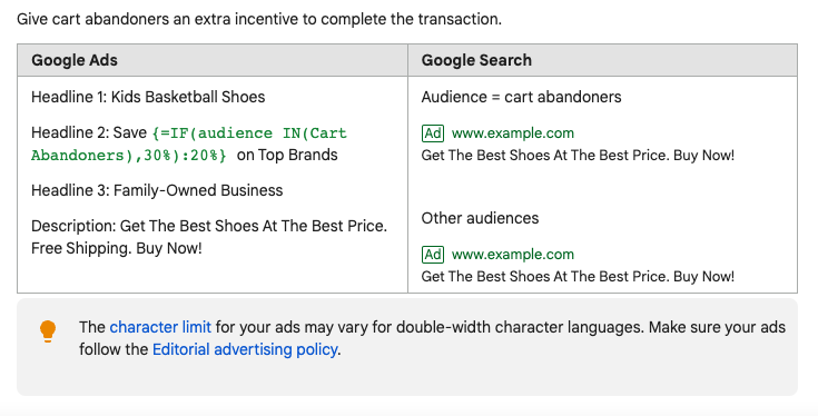
You can choose who you want to target with DKI and what the keywords will be to optimize your conversion opportunities.
Further Reading: Dynamic Keyword Insertion: A 16 Point Guide for Getting Amazing Results
Let’s make some magic
And voìla. You are now the marketing magician.
Now every move you make can be strategic and lead to more predictable results.
You’ll finally be able to stop guessing and start driving your business to a more lucrative future.
But don’t feel like you need to try everything at once. Just like our multi-step form, feel free to do these tips one step at a time.