Social proof is one of the oldest marketing tactics in the playbook, literally.
Back in 1760, Josiah Wedgewood used royal endorsements to promote his high-quality pottery and chinaware.
In the early 1900s, cigarette brands featured entertainers like Harry Bulger in ads.
And in the 1940s, Red Rock Cola signed Babe Ruth as their official drinking partner.
But social proof has come a long way since these early examples of celebrity endorsements.
One could only imagine the creative ideas ol’ Wedgewood might have mustered had he only had access to a landing page, right?
Today, PPC agencies and conversion optimization specialists have found dozens of data-backed ways to inject their landing page designs with social proof and testimonials. And conversion rates have never been higher because of it.
And in this article, we’re going to explore 18 innovative ways you can do the same thing with your landing pages.
- What is landing page social proof?
- What’s an example of landing social proof?
- Why is social proof important for landing pages?
- 18 examples of landing page social proof that convert
- Where to use social proof on your landing pages
- How to use social proof on your landing pages
- Avoid negative social proof at all cost
- Key takeaways
Get brand new landing page strategies straight to your inbox every week. 23,739 people already are!
What is landing page social proof?
First coined by Robert Cialdini in his seminal book, Influence: The Psychology of Persuasion (1984), social proof refers to the psychological and social phenomenon wherein people use the choices of their peers to influence their own choices in times of uncertainty.
According to Cialdini,
“The principle of social proof says so: The greater the number of people who find any idea correct, the more the idea will be correct…We will use the actions of others to decide on proper behavior for ourselves, especially when we view those others as similar to ourselves…”
For example, when we’re shopping for new products but don’t know which brand to choose, we’ll try to find out which brand our friends, colleagues, or people in similar situations chose first. Then make the same choice.
What’s an example of landing social proof?
When it comes to landing pages, social proof refers to any evidence that other people in similar situations have purchased or used a product/service and gotten value out of it.
The most common forms of landing page social proof include:
- Testimonials
- Customer reviews
- Product reviews
- Star ratings
- Case studies
- Publicity
We’ll dive into each of these (and much more) in just a minute.
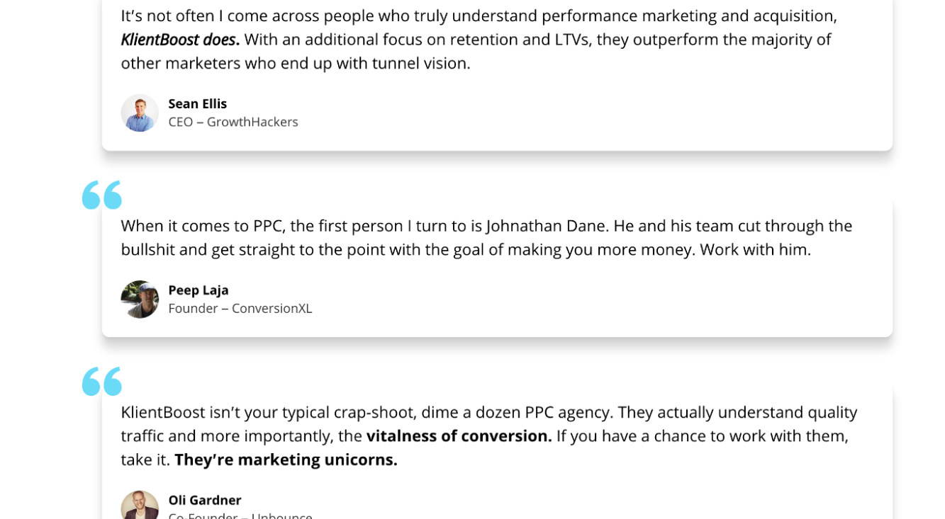
For example, we use social proof in the form of client testimonials throughout our website and landing pages:
Why is social proof important for landing pages?
Social proof is rooted in behavioral psychology, and it’s been scientifically proven to increase landing page conversion rates.
One study discovered that, when investigating products, people were more likely to incorporate the choices of their peers when their own experience with the product was ambiguous.
But that’s not all. Let’s look at a few more social proof stats:
- 91% of millennials trust reviews as much as recommendations from friends and family
- 83% of people trust reviews over advertising
- Testimonials can increase conversion rates on sales pages by 34%
- Having at least 5 reviews causes purchase likelihood to increase by a factor of nearly 4X.
- 66% of customers said the presence of social proof increased their likelihood to buy
Bottom line: Without social proof, you’re forcing your prospects to make a tough decision on their own. And people don’t like making decisions on their own; they like making decisions that people in similar situations have already made with success.
How hard do you think it is to sell AI copywriting software without third-party approval?
Very.
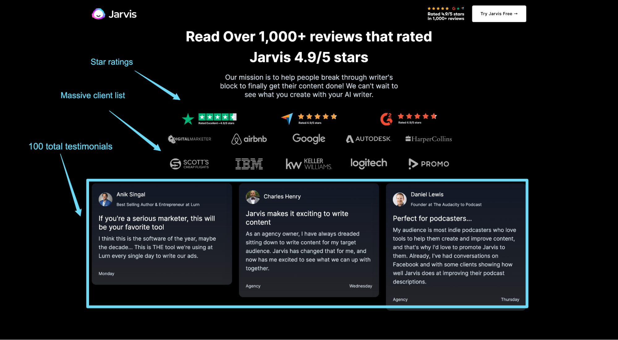
This is why Jarvis uses social proof to let their prospects know that the best and biggest businesses already use their software:
18 examples of landing page social proof that convert
Without further ado, let’s explore some real-world examples of landing page testimonials and social proof.
Below is a list of 18 different types of social proof (with examples) that you can use for your landing pages:
- Testimonials
- Reviews
- Star ratings
- Case studies
- Client logos
- Awards
- Publicity (media mentions)
- Wisdom of crowd
- Wisdom of friends
- Customer data
- Integrations
- Years in business
- Research
- Trust badges (visa, mastercard, etc.)
- Endorsements (celebrity or expert social proof)
- User-generated content (UGC)
- Recent sales notifications
- Frequently bought together
1. Testimonials
A testimonial is a customer statement praising the virtues of your product or service. It’s also the most common form of social proof in marketing.
Unlike a review (that gets left on a third-party website), businesses collect testimonials specifically for marketing or advertising purposes.
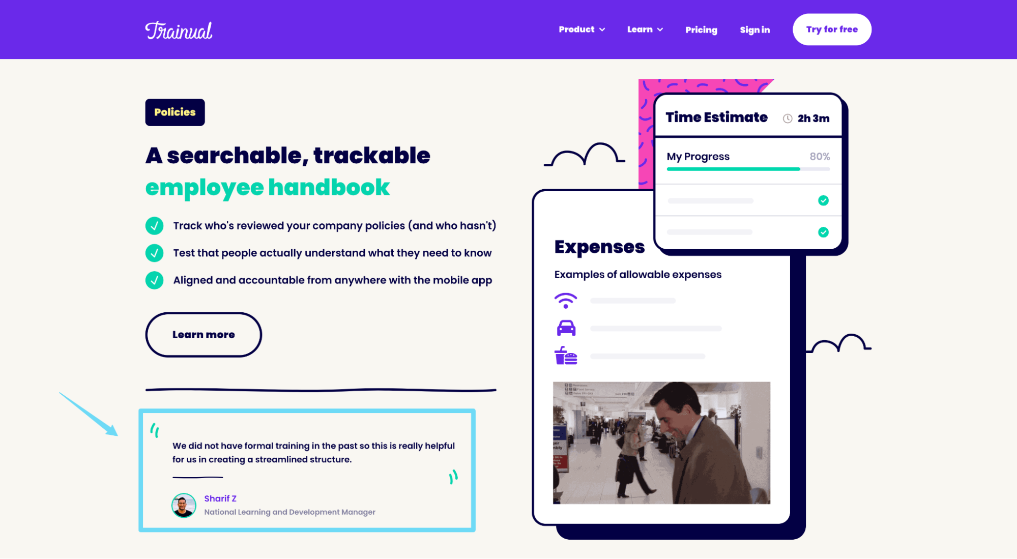
For example, Trainual uses a customer testimonial to sell the benefits of their software, directly from their landing page:
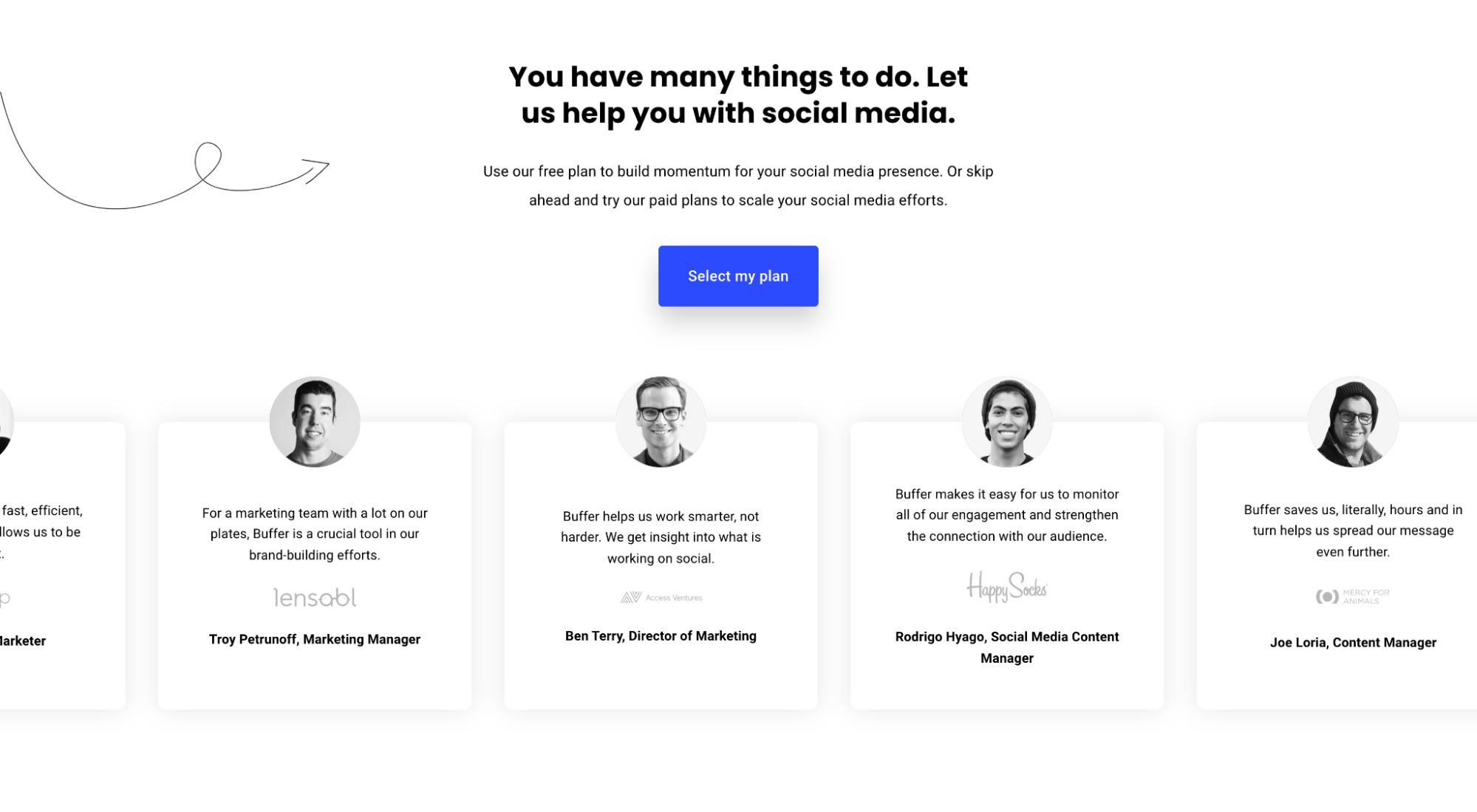
And Buffer uses a group of testimonials to spotlight their many happy customers:
When it comes to landing page testimonials, not all testimonials are created equal.
For example, CXL discovered that testimonials with photos are significantly more effective at generating recall than those without.
Makes sense, considering that photos add a layer of credibility—and credibility matters.
Little details such as including a photo can make the biggest difference. We A/B tested testimonials for one of our medical spa clients and discovered that adding the procedure name to the testimonial (i.e. making the testimonial feel more real) increased conversions by 18.7%.

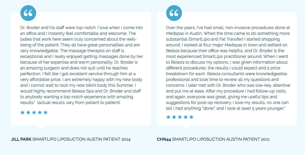
To make your testimonials feel more genuine and believable (and to get the most out of them), use the following:
- Real names: Give your testimonials an identity with first and last names
- Job titles: Add relevance with job titles or labels (like procedure type)
- Photos: Put a face to the name
- Star ratings: We’ll cover star ratings in just a minute, but testimonials with star ratings perform better than those without
- Authentic responses: More often than not you can tell when a testimonial has been engineered. Let your customers do the talking; use their own words (however imperfect)
2. Reviews
The only difference between a review and a testimonial is that customers write testimonials for your website and they write reviews on third-party review aggregators like Google, Capterra, or G2.
When it comes to your landing pages, use third-party reviews generously.
For example, we embed hundreds of third-party reviews from sources like Google, Clutch, and Hubspot directly within our landing pages:
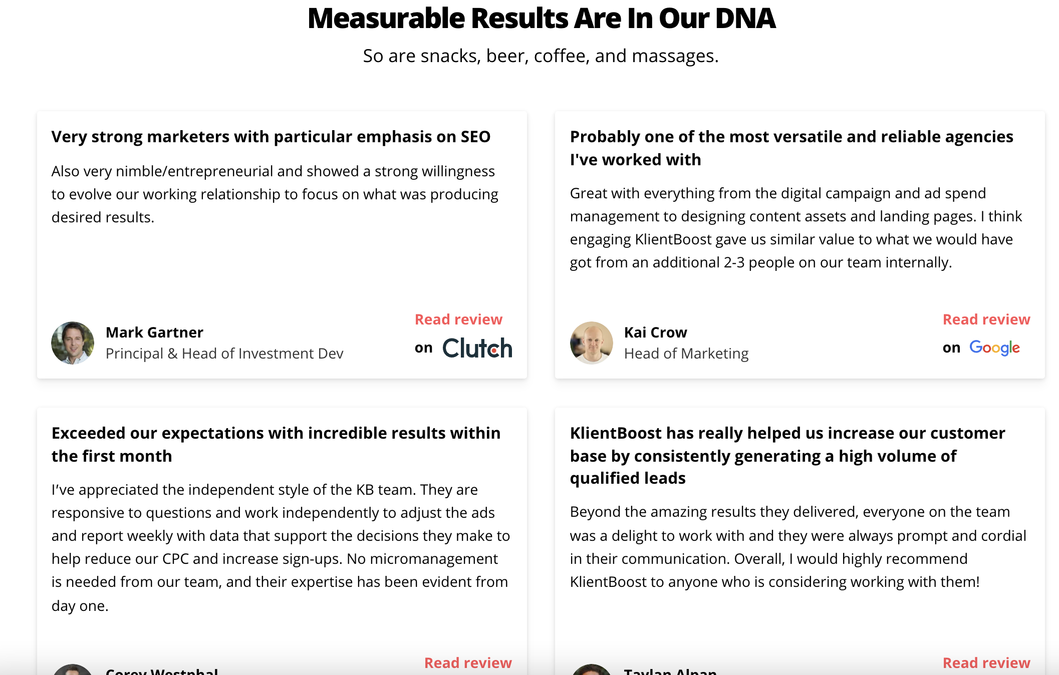
Depending on the review platform or industry, certain reviews may hold more weight than others- at least in the minds of your prospects.
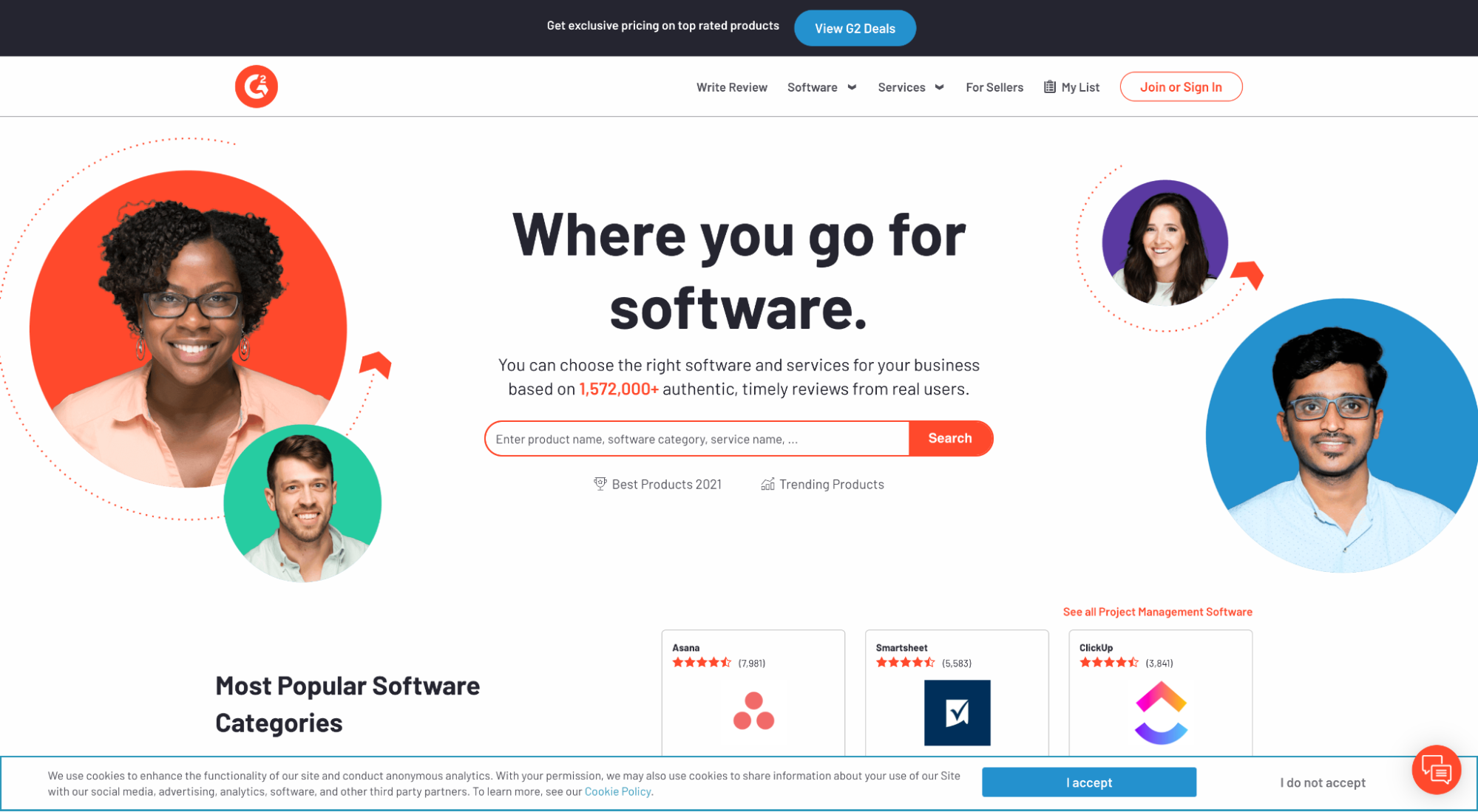
For example, a 5-star review from G2 is more relevant to a SaaS landing page than a 5-star review from Google since G2 is a credible software review aggregator.
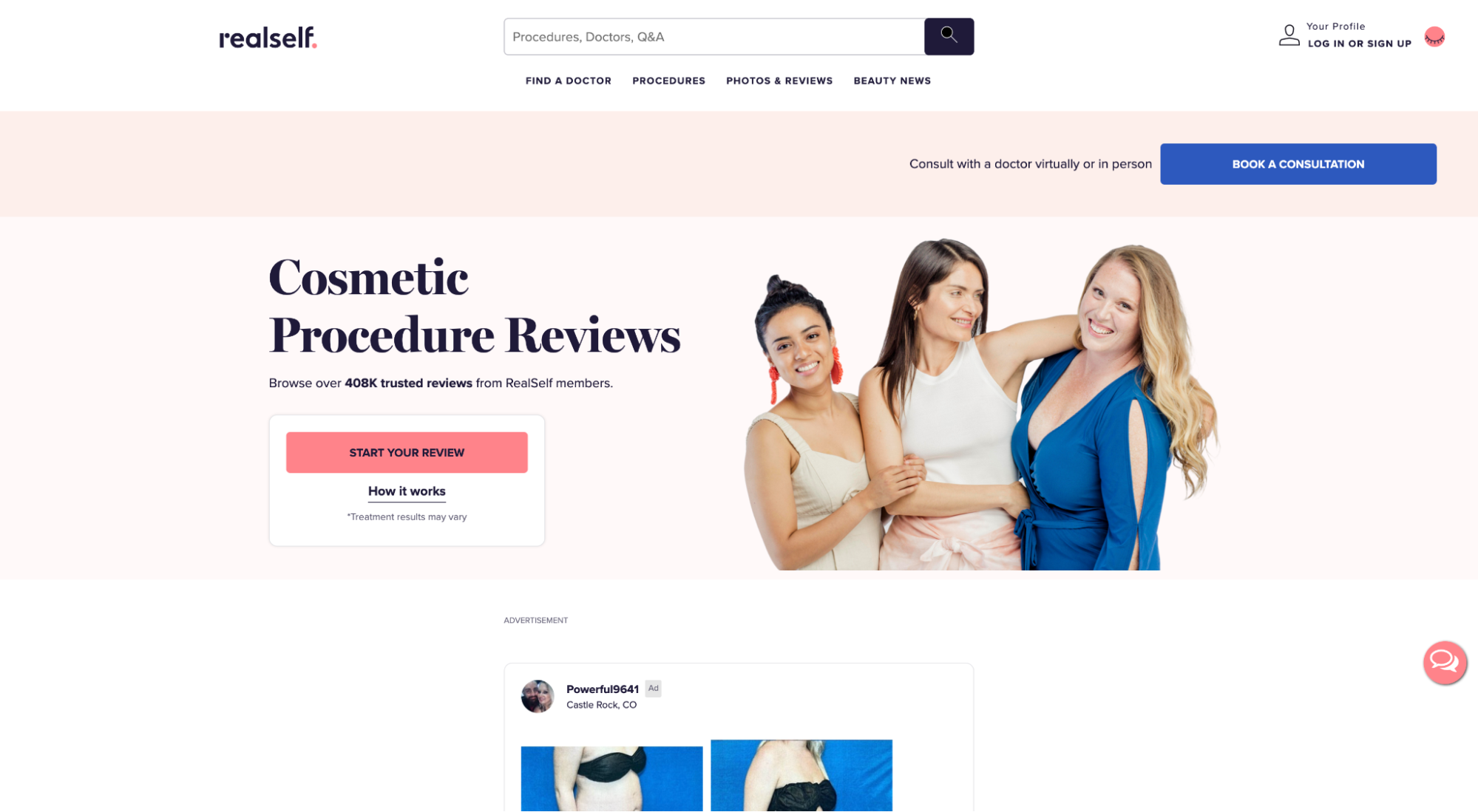
Or for plastic surgeons, a review from RealSelf is more relevant than a review from Yelp since RealSelf is a credible cosmetic surgery review aggregator.
When it comes to reviews, follow the same principles we laid out for testimonials, and don’t be afraid to include less than perfect reviews.
In fact, Revoo discovered that 68% of customers trust reviews more when they include a healthy mix of both positive and negative reviews. They also discovered that customers who seek negative reviews convert 2% higher than anyone else.
3. Star ratings
Star ratings assign a quantitative value to your reviews, and they come in two types:
- Aggregate: the average star rating of all your reviews on a single platform
- Individual: the star rating assigned to a specific review
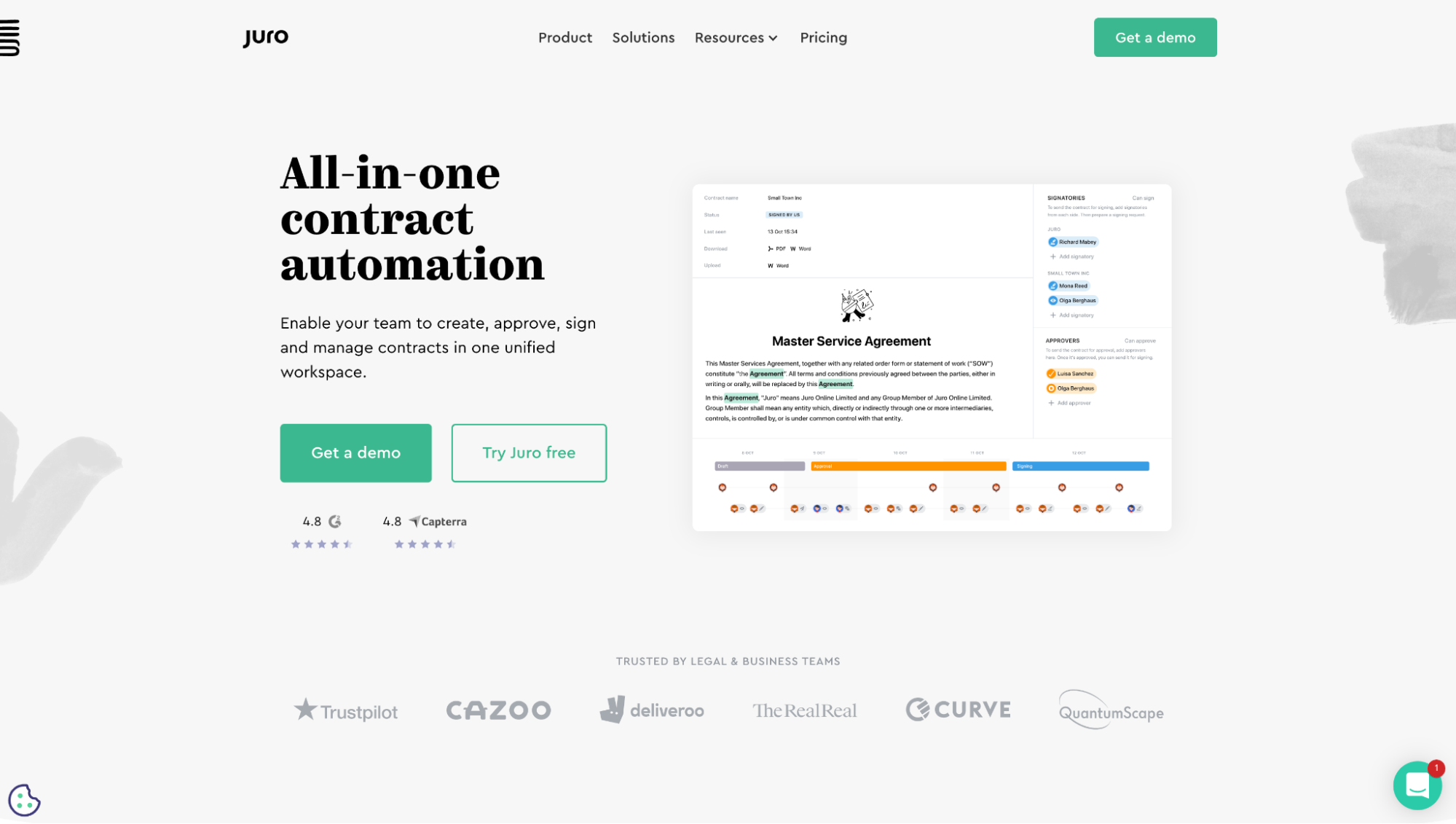
For example, Juro features aggregate star ratings for both Google and Capterra directly on their landing page:
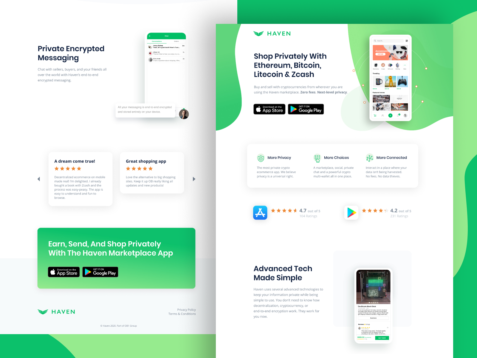
And our client Haven (a crypto app) features aggregate star ratings from Apple’s App Store and Google Play:
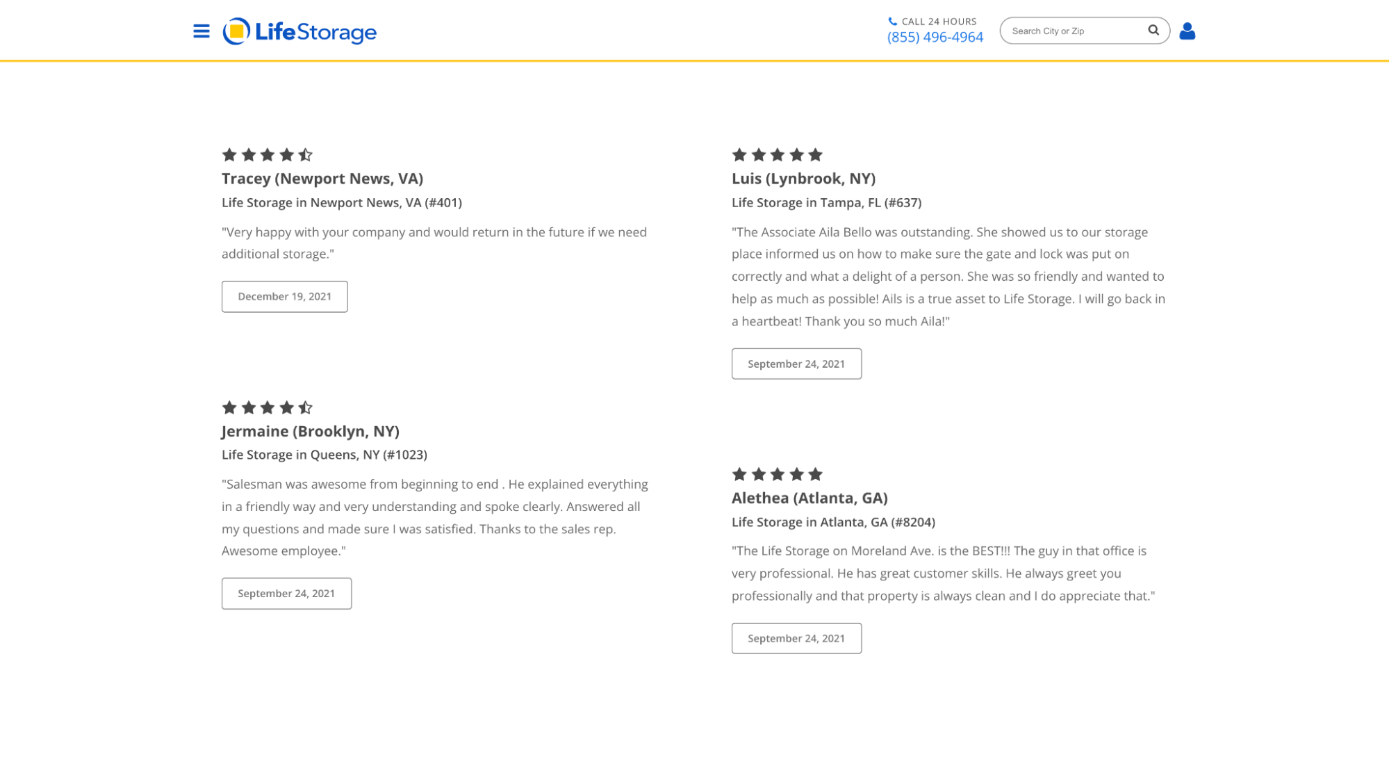
And LifeStorage features individual reviews with star ratings:
How important are star ratings to your prospects? Super important.
- 70% of consumers use rating filters when searching for a business
- 4.2-4.5 out of 5 stars had the most influence on product purchases
- 38% of customers require around a 4-star review minimum to consider a business
So which is better, aggregate star ratings or individual star ratings?
Neither. You need both.
But when it comes to individual reviews, reviews with star ratings convert higher.
For example, we ran a second A/B test for the same medical spa we mentioned earlier, this time testing whether or not star ratings contributed to conversions, and we discovered that reviews without star ratings converted 8.8% less than reviews with star ratings.


4. Case studies
A case study is a deep dive examination of a real-life customer case.
56% of enterprise-level purchasers and 23% of small business owners said case studies influenced a technology purchase in the past six months.
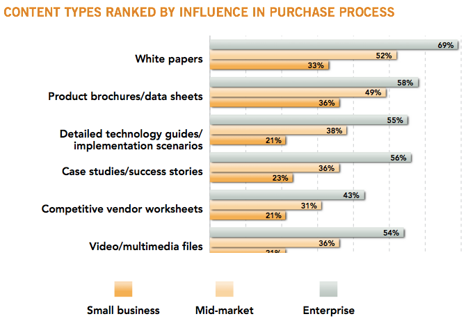
When it comes to trust, case studies deliver a gargantuan dose of credibility and validation.
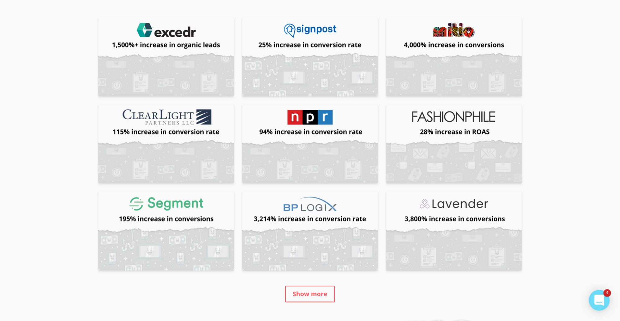
We believe in case studies so much that we’ve produced over 300 of them (yes, that’s more than any other agency, ever):
Heck, we even ran an ad campaign that drove traffic just to our case study landing page and it delivered a 73% conversion rate.
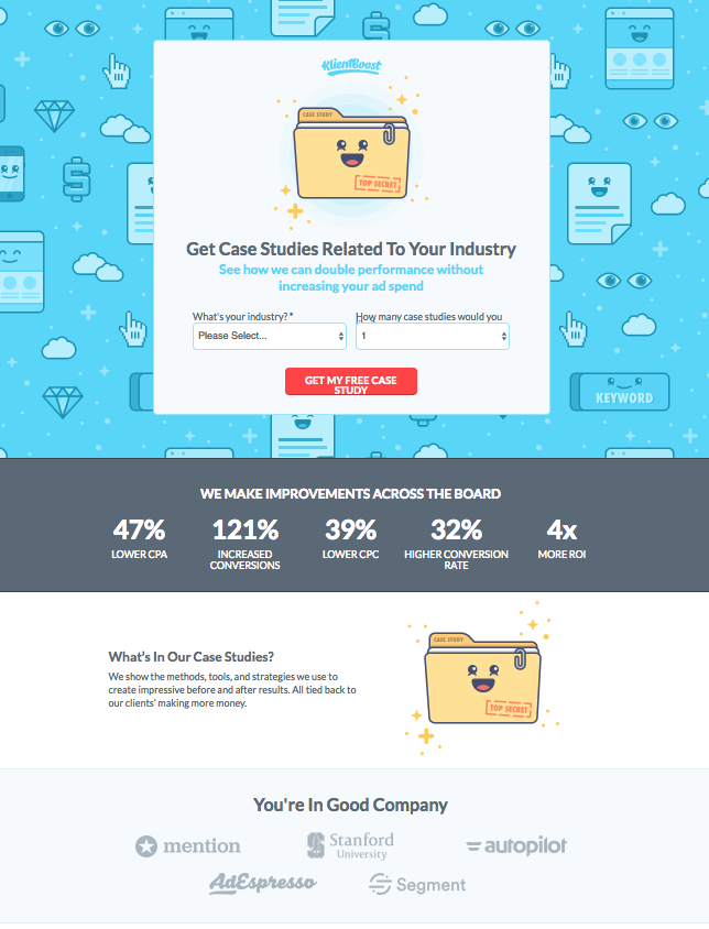
The results: 73% conversion rate.

Case studies take time to develop, but once you have them, they’re like conversion gold.
5. Client logos
Another popular type of landing page social proof comes in the form of client logos.
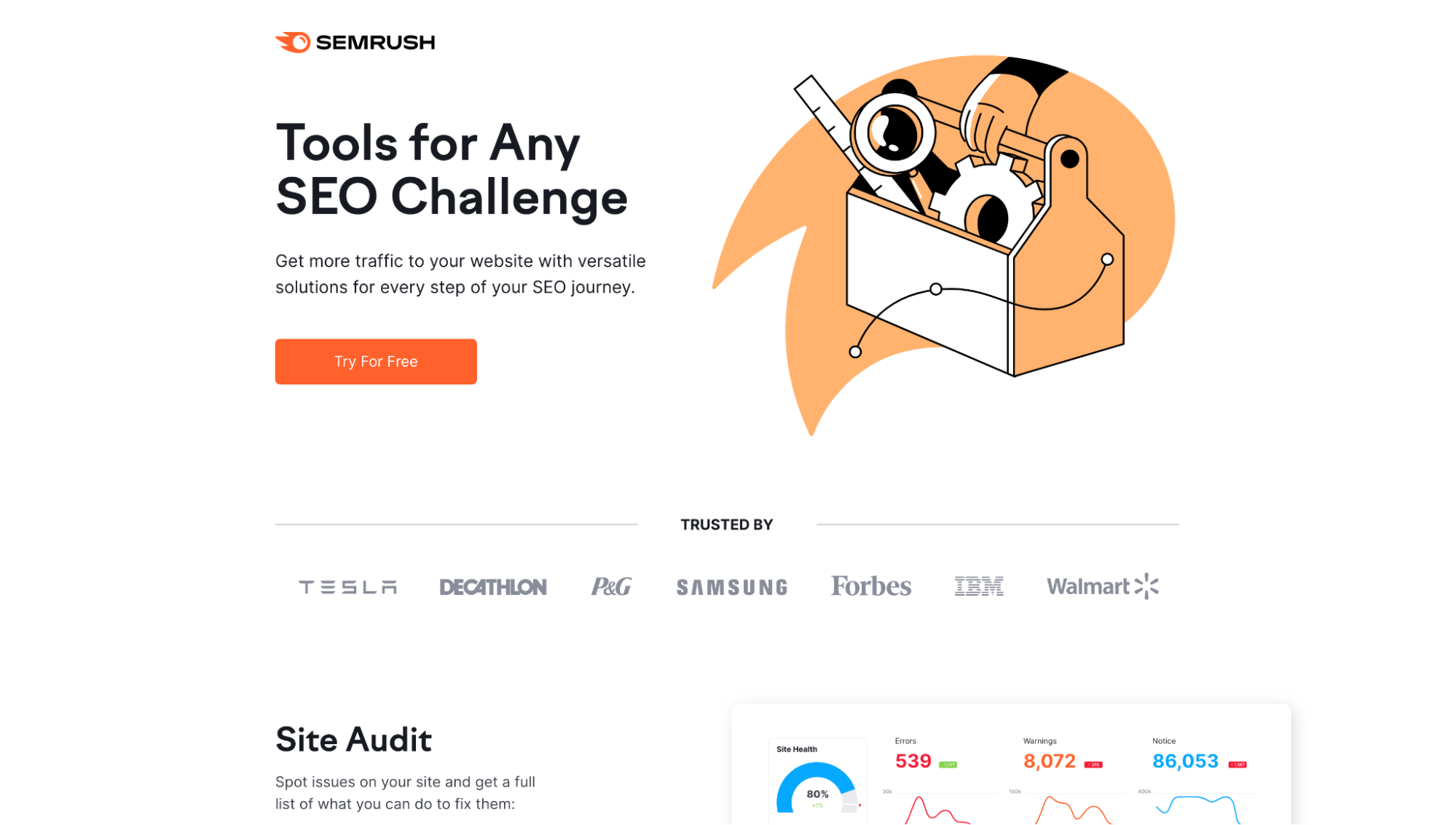
For example, SEMRush features prominent client logos above the fold on their SEO tool landing page:
And we feature prominent client logos on our PPC and CRO landing pages:
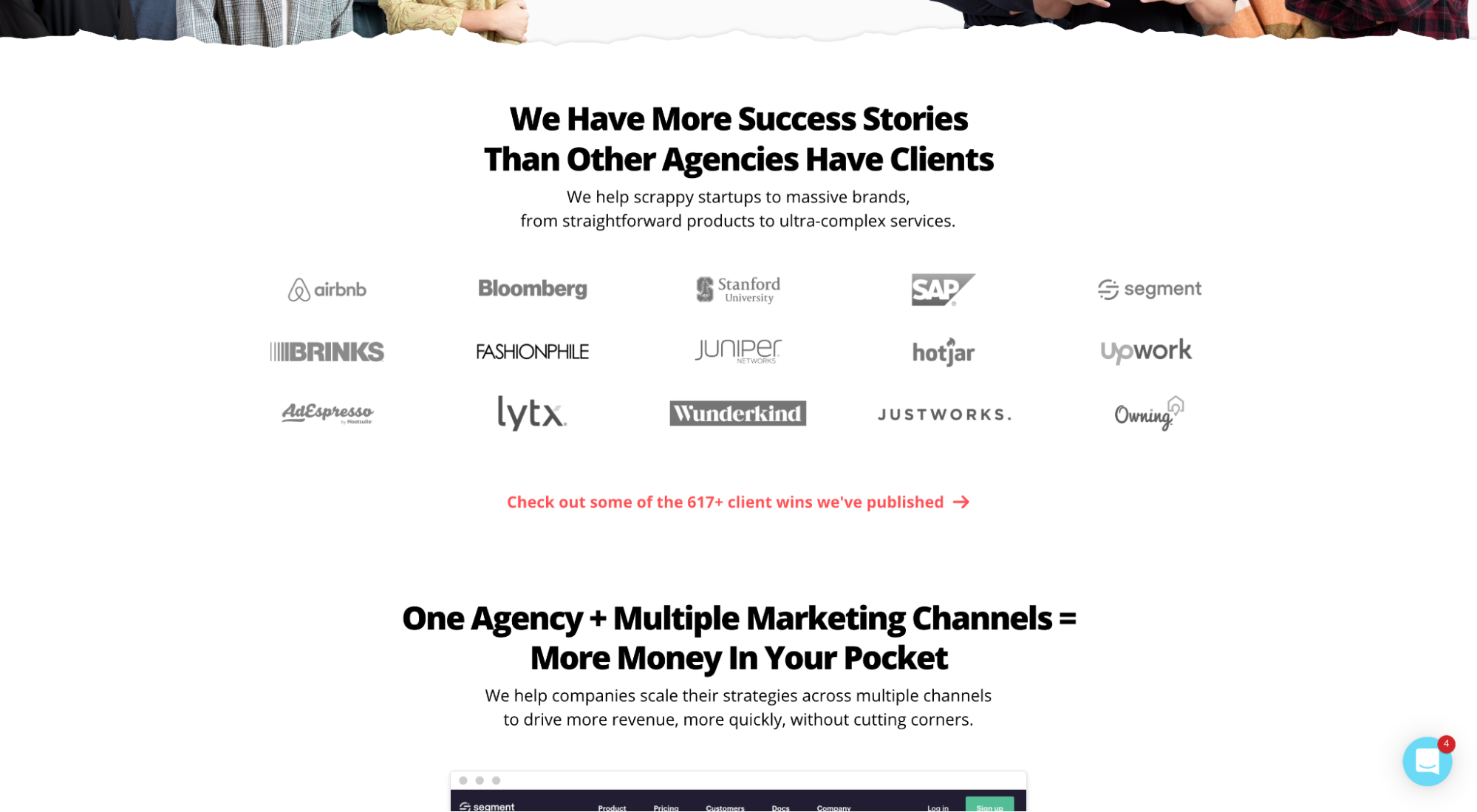
How important are client logos?
In one A/B test conducted by comScore, adding a client logo increased landing page conversions by 69%.
And according to CXL, client logos are one of the best forms of landing page social proof because they balance high recall with low cognitive load. In other words, client logos are one of the easiest ways to communicate trust and credibility.
6. Awards
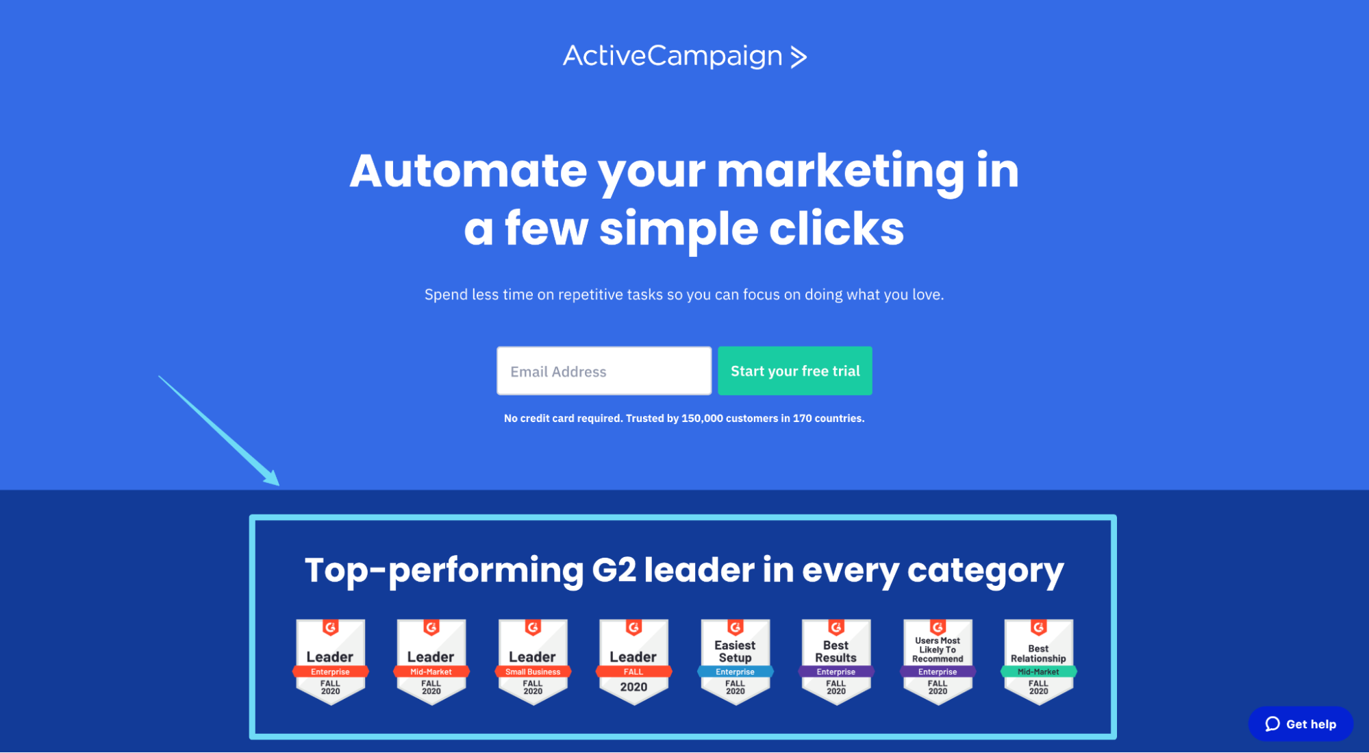
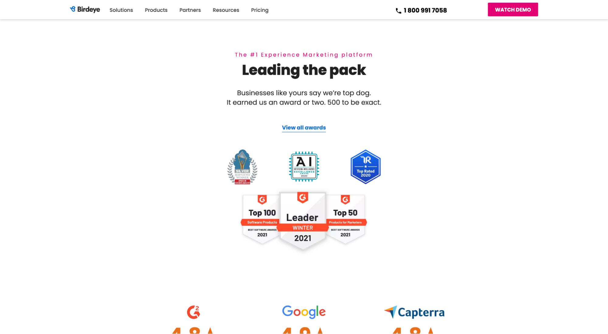
Awards tell potential customers that other credible sources (not just customers) believe you’re so good at what you do that you deserve recognition. They’re perfect social proof badges for your landing pages.
For example, ActiveCampaign features a litany of industry awards and badges on their marketing automation landing page:
And BirdEye features the same type of G2 awards, along with a link to a dedicated page for awards:
7. Publicity (media mentions)
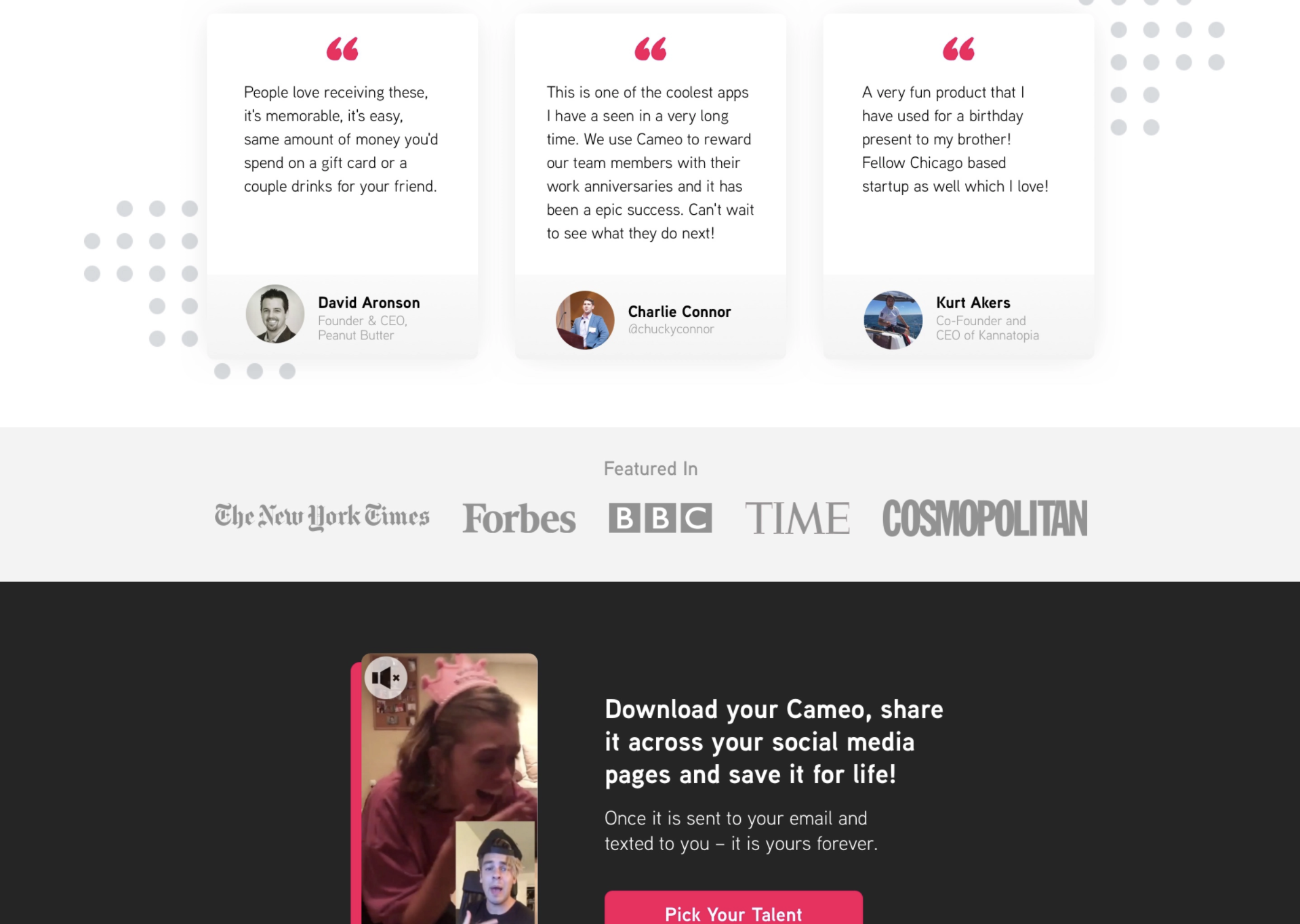
Like client logos or award badges, media mentions or press logos also provide credibility and social proof.
If reputable media companies deem you worthy of the press, then there must be something worth exploring, right? At least that’s the idea.
For example, for our client Cameo, we featured press mentions from The New York Times, Forbes, BBC, Time, and Cosmopolitan directly on their landing page:
8. Wisdom of crowd
Wisdom of crowd refers to the type of social proof where large groups of people endorse your brand. It cuts to the core of social proof and herd behavior by luring prospects to your brand using FOMO (fear of missing out).
Three common types of wisdom of crowd social proof include:
- Social media followers (if you have thousands) or share buttons with share counts
- Total or lifetime customer count
- Product badges (“Most popular” or “Almost out”)
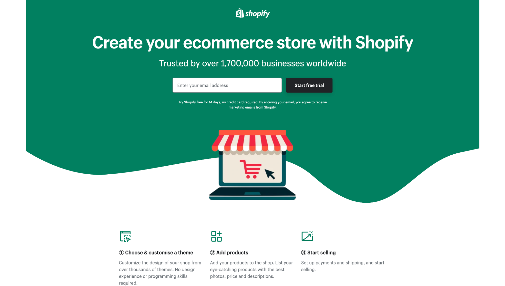
For example, Shopify has over 1.7 million customers, so they rightly display it on their landing pages:
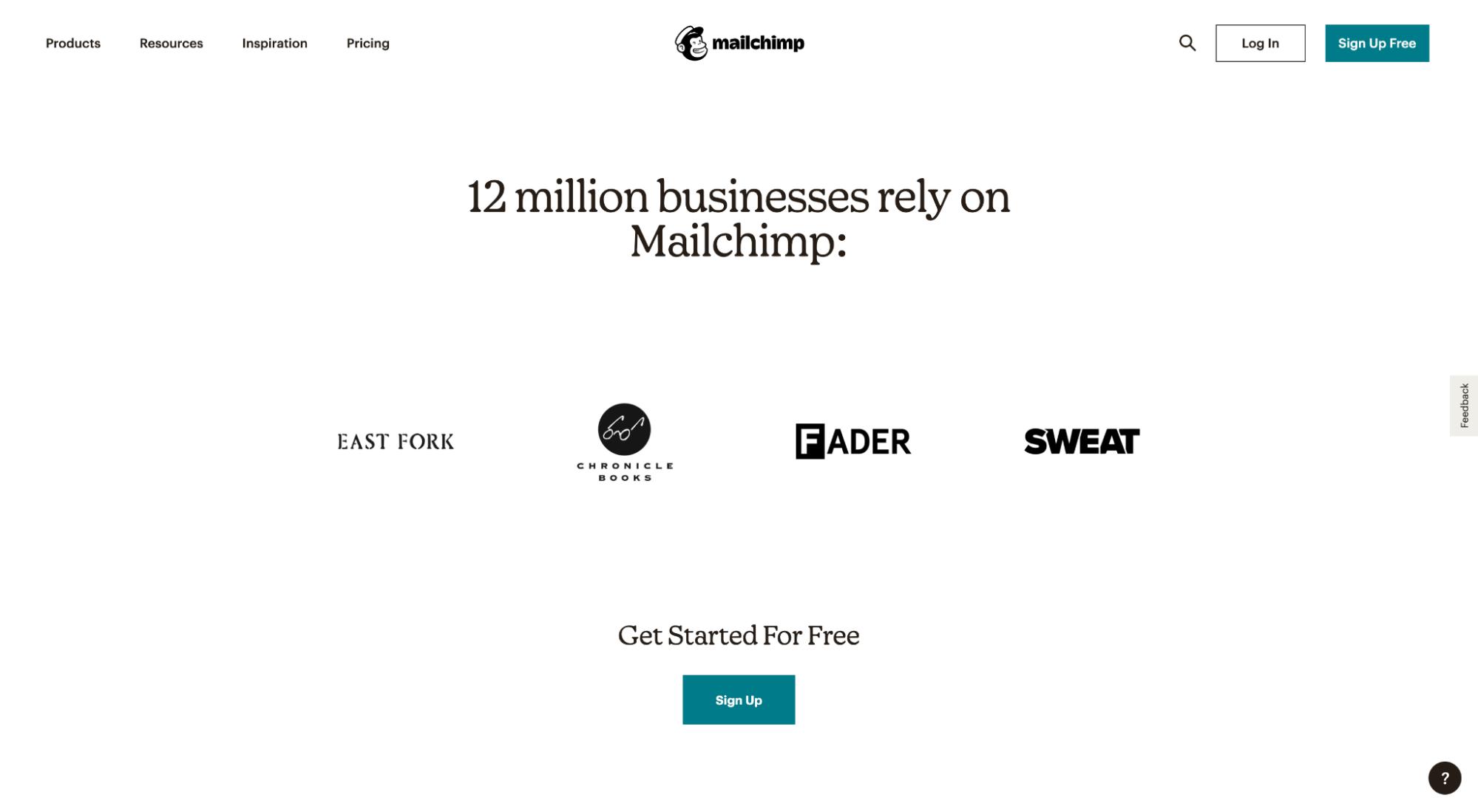
Just like MailChimp features their 12M customer count on their landing pages:
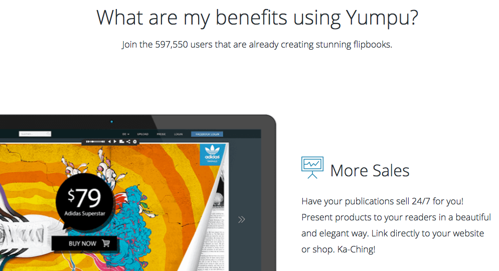
Before posting your customer count, make sure it stacks up to the competition.
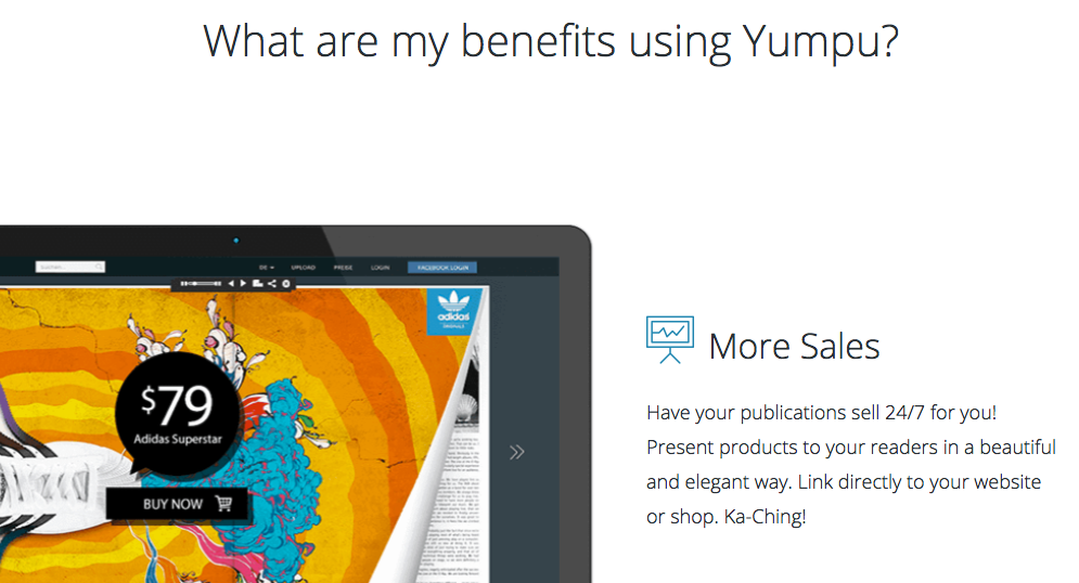
For example, we A/B tested customer count and discovered that the landing page without customer count actually increased conversions by 3% (I guess 597K customers wasn’t enough?).
And don’t forget product badges like “Most popular” or “Best seller.”
For eCommerce brands, product badges have been shown to increase conversions as much as 55%.
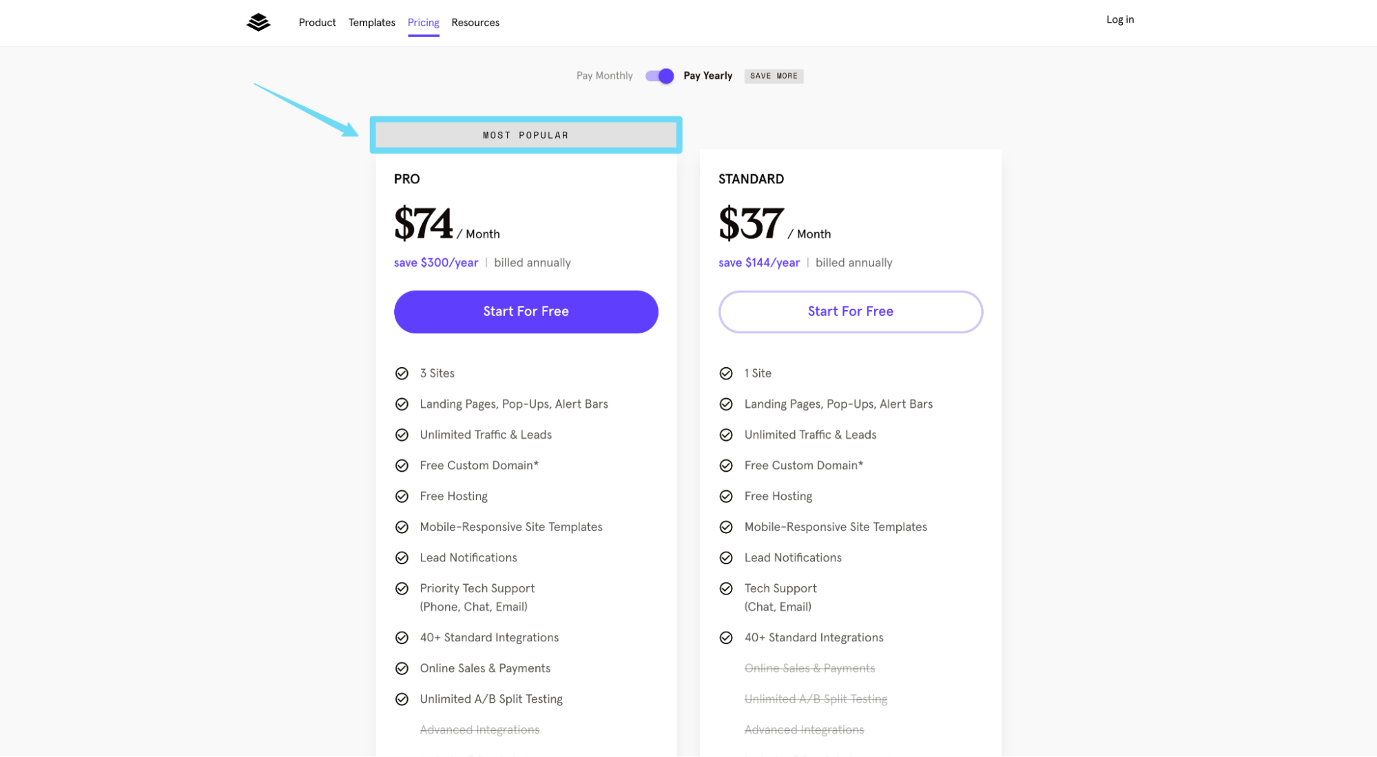
For example, Leadpages (like many other SaaS companies) features a �“Most popular” label above their Pro pricing plan:
9. Wisdom of friends
Wisdom of friends, on the other hand, is a type of social proof that uses endorsements from friends to build trust and establish credibility. And it works.
Why? Because when people don’t know and trust you, they try to find friends that know and trust you since they know and trust their friends.
According to Nielson:
- When referred by a friend, people are 4x more likely to purchase (i.e. they’re already sold)
- 85% of online buyers trust recommendations from friends
An example of wisdom of friends social proof is when landing pages feature testimonials from recognizable figures in your industry.
For example, Pipe is a tool that helps startups turn recurring revenue into upfront capital. On their landing page, they feature testimonials from some of the startup world’s most recognized figures:
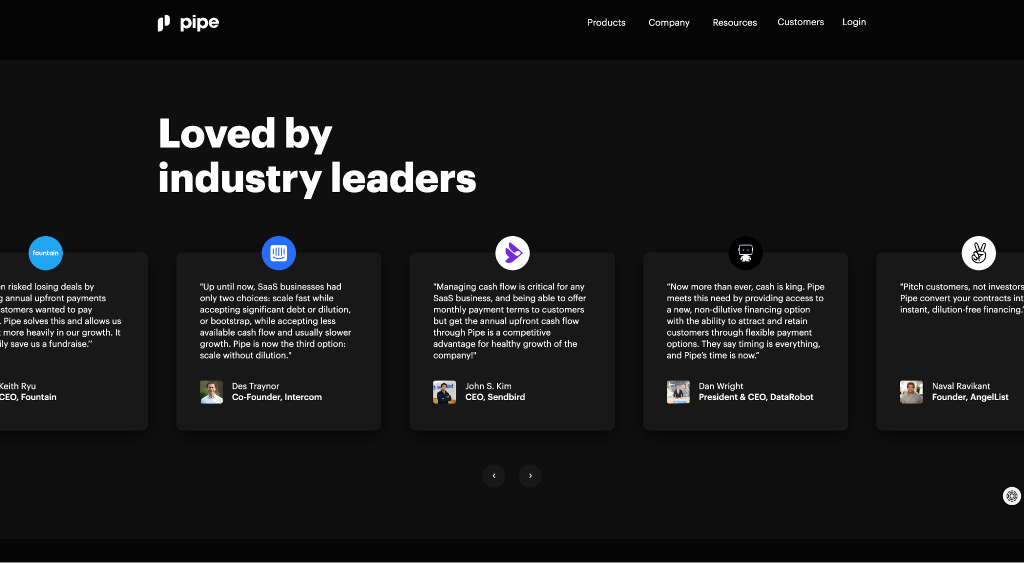
I know what you’re thinking: “But those aren’t real friends?”
You’re right. But since it’s hard to know which friends actually made a purchase, recognizable industry celebs serve as a close proxy.
Another option would be to embed a Facebook or Instagram widget within your landing page that shows which friends like or follow your social accounts. A close second, but social widgets might lure your site visitors away from your page and into the abyss of social media instead.
10. Customer data
What data can you cull from your users or customers that proves your product or service works?
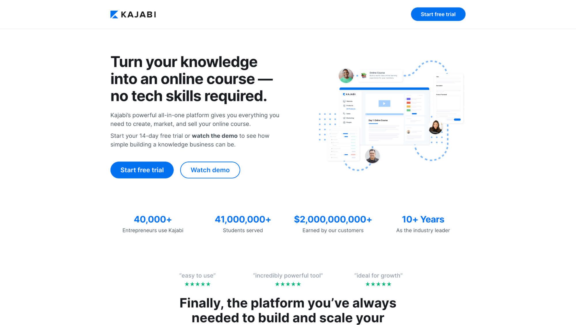
For example, Kajabi features the total number of students served (41M+) and total revenue earned by customers ($2B+):
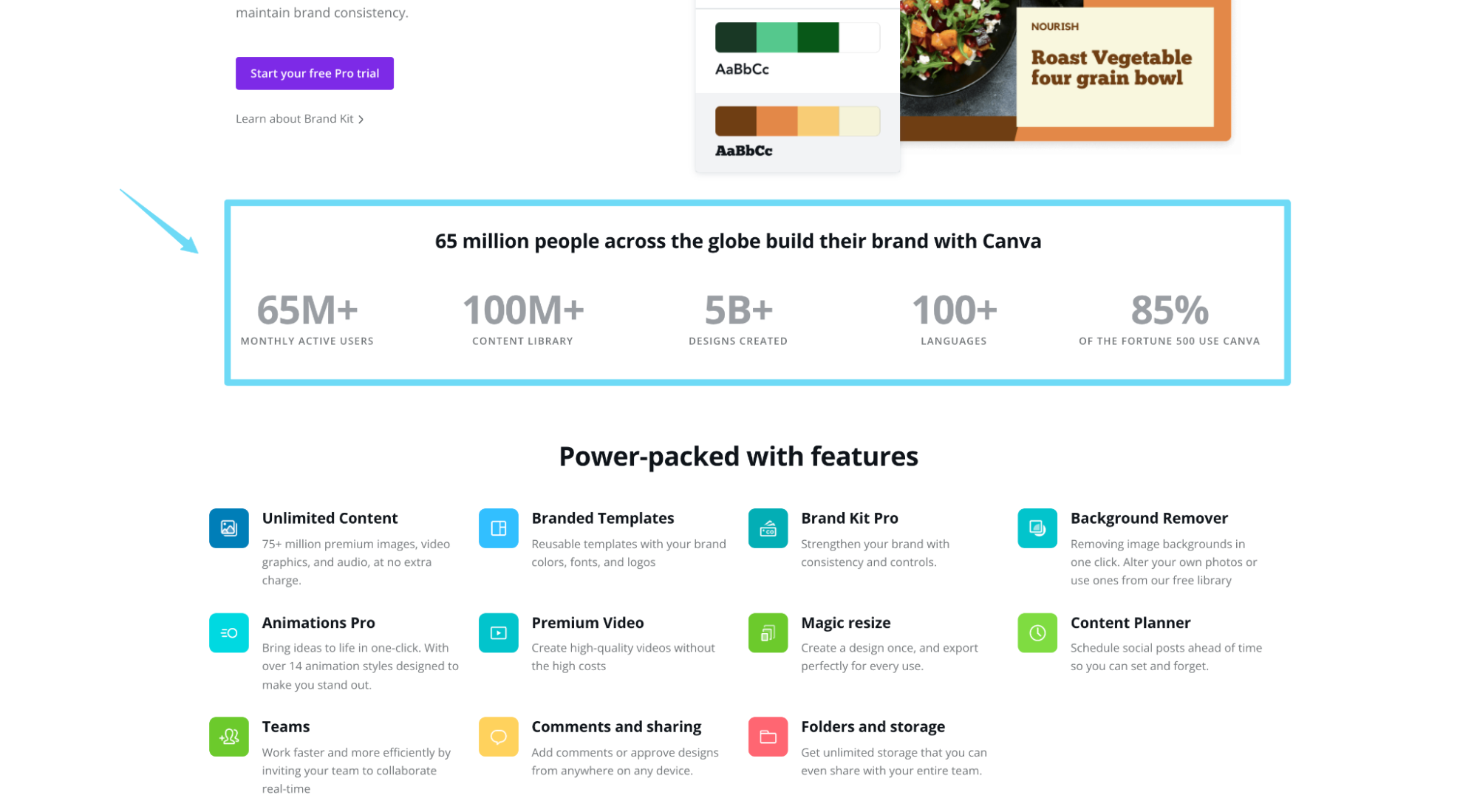
Canva does the same, only instead of total revenue earned, they feature total designs made and percent of Fortune 500 users (along with customer count and languages served):
11. Integrations
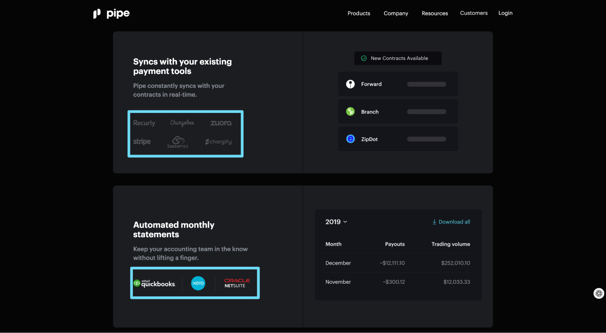
Though this type of social proof is most useful for SaaS brands, since visitors inherently know that direct software integrations require some engineering and cooperation from both parties, integration icons serve as a viable source of credibility.
Connecting your services to platforms that your visitors already use and trust can help build trust in you too.
For example, Pipe features logos of the different software companies that their platform integrates with:
12. Years in business
Years of experience (or years in business) is a type of implied social proof that suggests a large amount of satisfied customers over time.
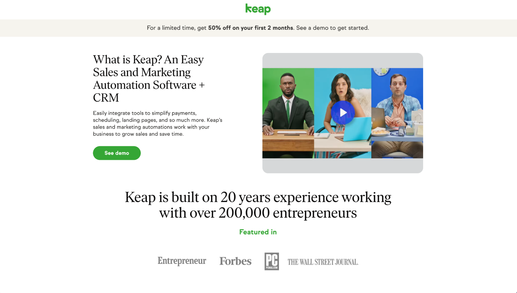
For example, Keap (formerly InfusionSoft) writes in big, bold letters on their landing page: “Keap is built on 20 years experience working with over 200,000 entrepreneurs.”
13. Research
Though often overlooked, credible research or statistics about consumers and markets can help communicate herd behavior too.
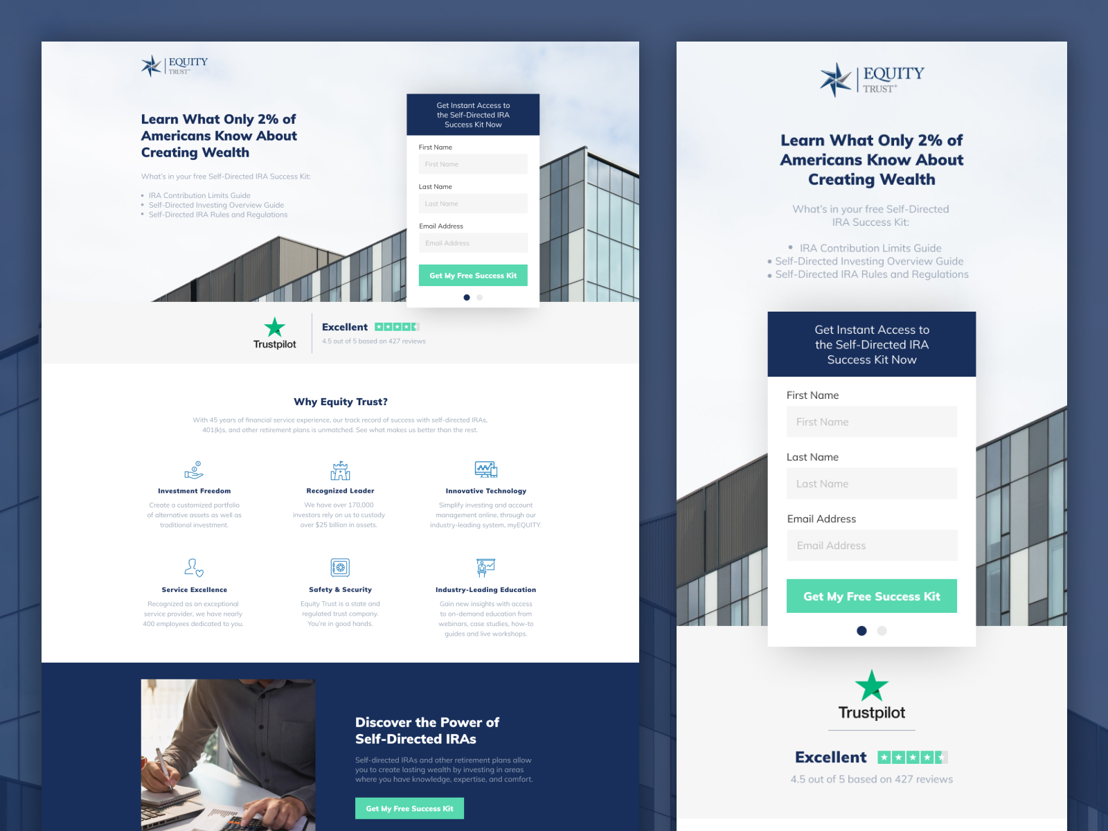
For example, to increase conversions for a financial success kit for our client Equity Trust, we featured a prominent stat directly within the landing page headline that read: “Learn what only 2% of Americans know about creating wealth.”
The 2% stat implies that 98% of Americans aren’t wealthy because they don’t have access to the information shared in the success kit.
14. Trust badges
Every type of social proof serves as a trust badge. From testimonials to star ratings and everything in between, all social proof builds trust.
But when we talk about “trust badges” in this case, we’re talking about website security seals of approval.
For example, SSL certificates, VeriSign Trusted seal, safe checkout badges, Norton, or even popular payment logos like Visa or Mastercard.
Think of trust seals like certifications. They make potential customers feel like they can trust you because other reputable website security and payment providers have deemed you a legitimate business.
Why are trust seals so important? Because online buyers are skeptical.
In a survey from ActualInsights, they discovered that 61% of respondents didn’t purchase something in the past because trust seals were missing.

In that same survey, ActualInsights discovered that 75% of respondents didn’t purchase something in the past because the trust seals featured were unrecognizable.

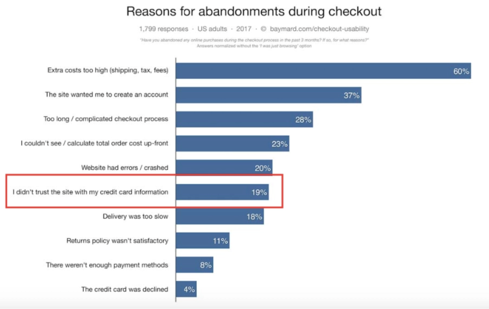
And in a survey from Baymard Institute, they discover that 19% of buyers have abandoned an eCommerce shopping cart because they didn’t trust the website with their card information.
What trust badges should you feature on your website?
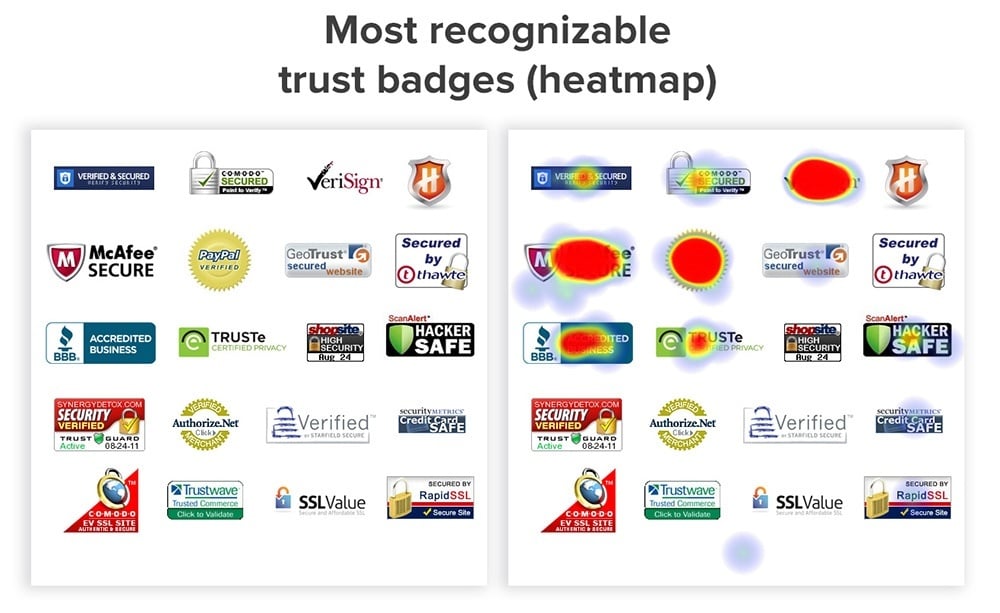
It depends on whether your an eCommerce site or a B2B site, but according to CXL, the most recognizable trust badges include:
Other trust badges include:
- Partnerships (e.g. Google Partner, Facebook Marketing Partner, etc.)
- SSL certificate (website security provided by hosting company)
- Payment providers (Visa, Mastercard, Amex, Discover)
15. Endorsements
Endorsements come in all shapes and sizes, namely celebrity endorsements, expert endorsements, and influencer endorsements.
For example, Hers features Miley Cyrus on their skincare landing page:

We feature expert endorsements from industry leaders like Sean Ellis, Peep Laja, and Oli Gardner (also testimonials):
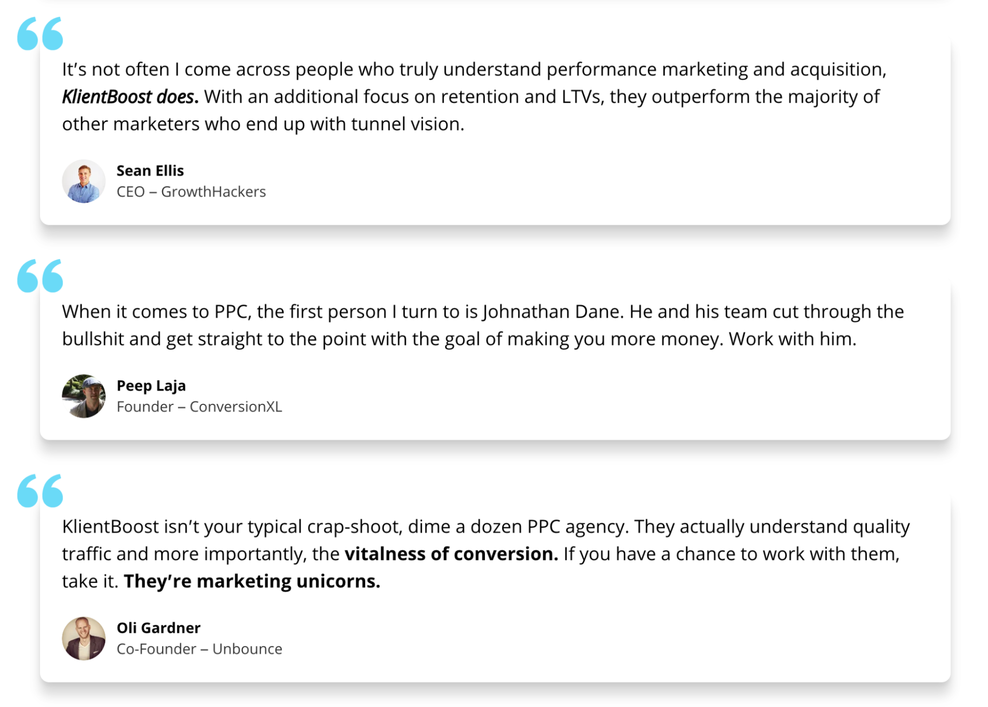
Why do endorsements work? Familiarity.
Our brains don’t do a good job differentiating between real and make-believe, so in our heads, celebrities, popular influencers and industry experts feel like trusted friends. As a result, the products or services they support feel more familiar too.
16. User-generated content (UGC)
User-generated content (UGC) refers to authentic content produced by your customers. Like, actual customers filming or photographing themselves using your products and services.
What better way to show prospective customers how many people use and love your products and services than by showing them real customers using and loving your products and services?
For example, LiveControl (live streaming software) features actual live streamed events from customers, directly on their landing page:
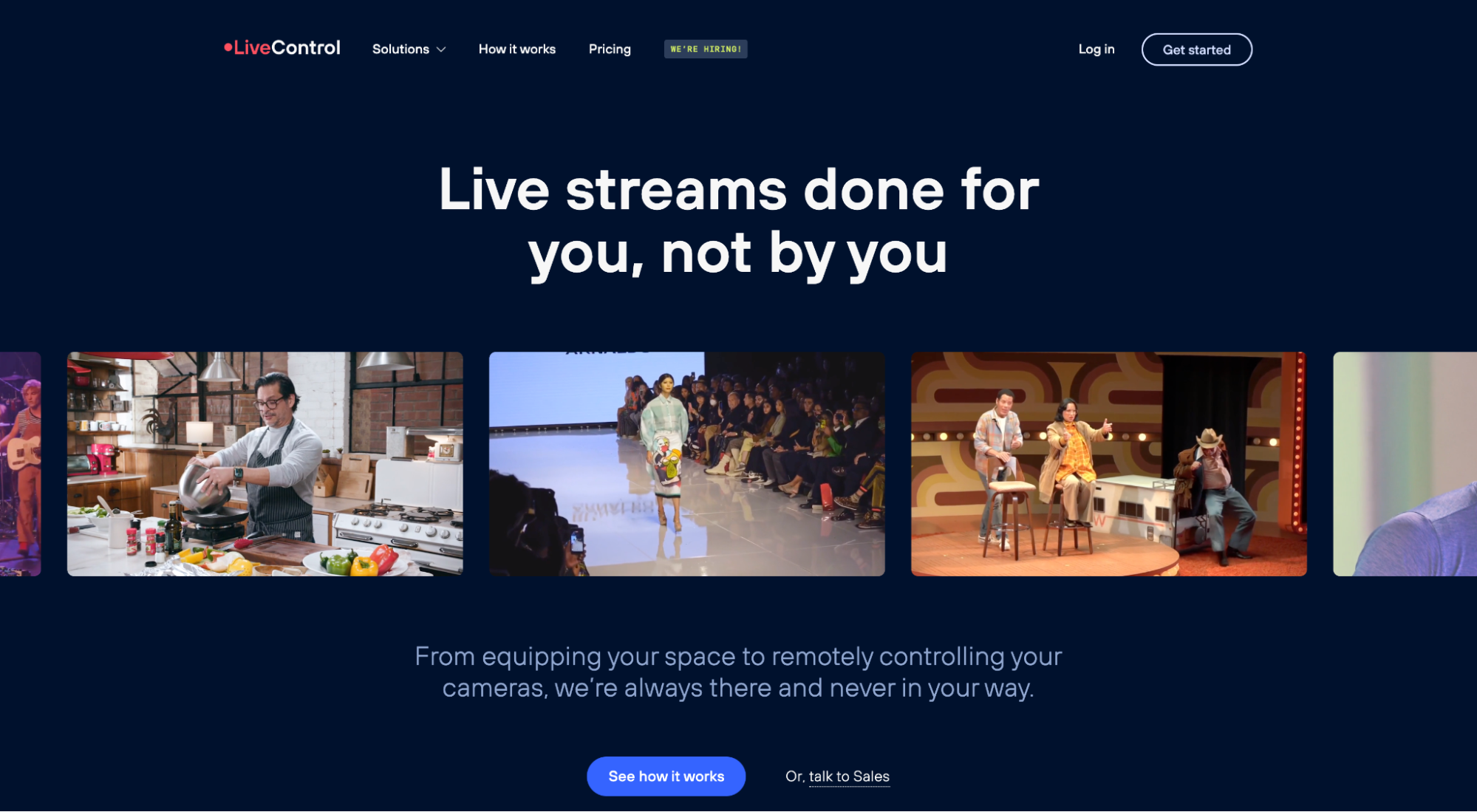
And Beauty by Earth features home videos from happy customers using their jade rollers:
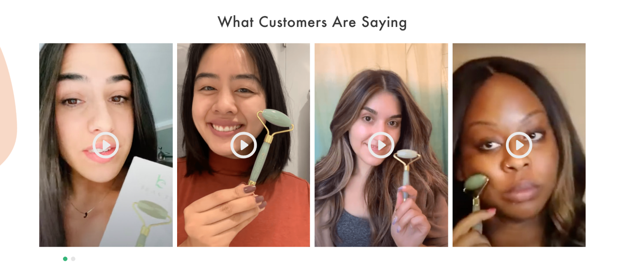
UGC serves the same purpose as a testimonial, only the added layer of authenticity delivers extra credibility and trust.
How much authenticity? 79% of consumers say user-generated content impacts their purchasing decisions.
Where can you find UGC?
- Instagram photos and videos
- Tweets
- Articles from bloggers
- Comments
- Reviews
- Forum discussions
17. Recent sales notifications
A recent sales notification is a website popup that alerts visitors when someone else buys.
For example, this is what a TrustPulse sales notification looks like:
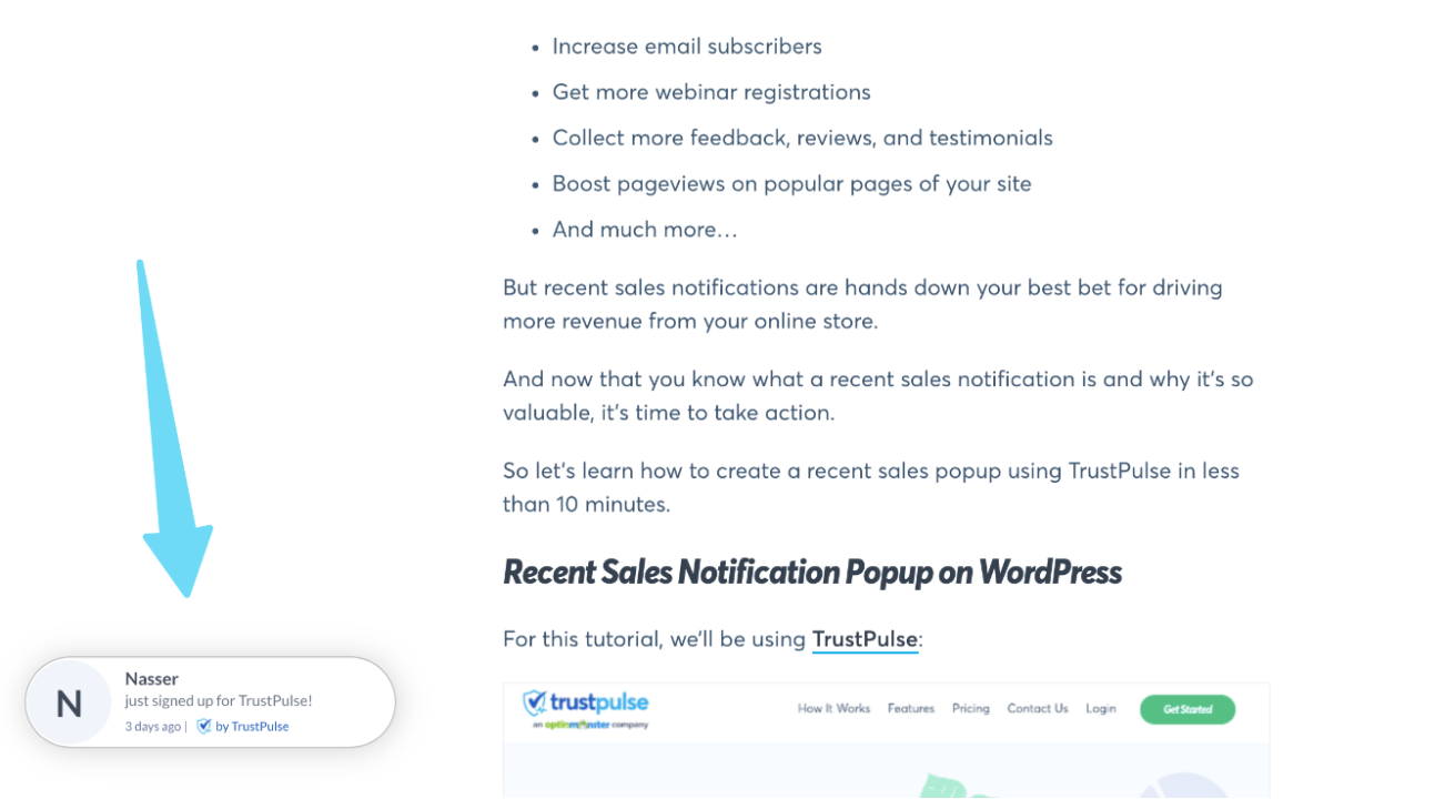
Sales notifications tap into FOMO and use social proof to build urgency and desire.
In other words, they’ll have your prospects saying, “If this many people have bought just while I’m on the website, I must be missing out on something good!”
According to TrustPulse, their recent sales popups can help increase conversions as much as 15%.

18. Frequently bought together
Perhaps no better example of “frequently bought together” exists than from the pioneer of the feature itself, Amazon:
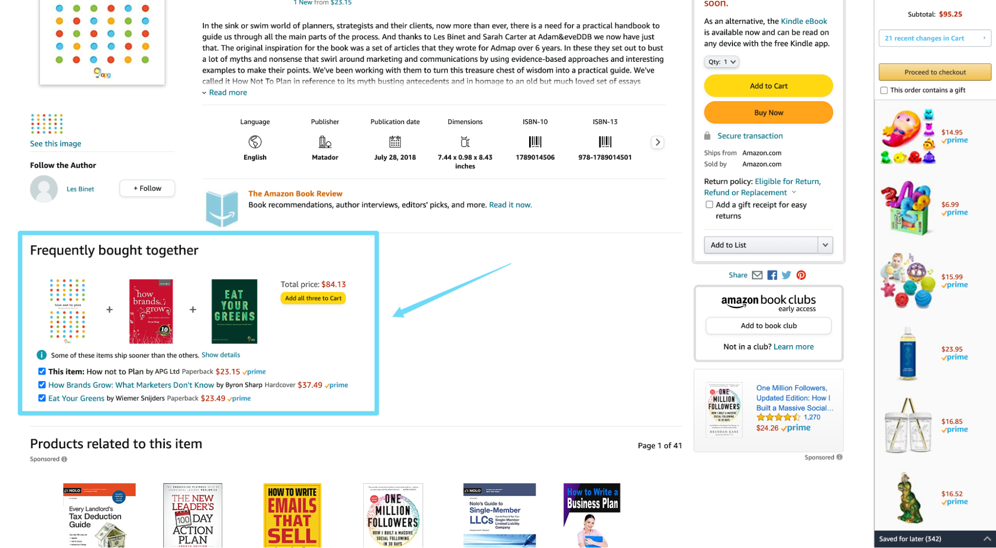
Though not technically a landing page, Amazon’s product pages demonstrate how subtle social proof can lead to massive upsells.
How much, exactly? As much as 35% of Amazon's total sales come from their recommendation engine.
When it comes to eCommerce landing pages, remind buyers what others like them bought in addition to their main purchase, and watch your sales skyrocket.
Where to use social proof on your landing pages
Is there a right place or wrong place to feature social proof on your landing page?
Short answer: No.
Sprinkle. It. Everywhere.
But here are eight creative ways to use social proof on your landing page:
- Above the fold
- Benefits
- Form
- Click triggers
- Social proof section
- Conversion page
- Checkout
- Thank you page
Above the fold
Front and center.
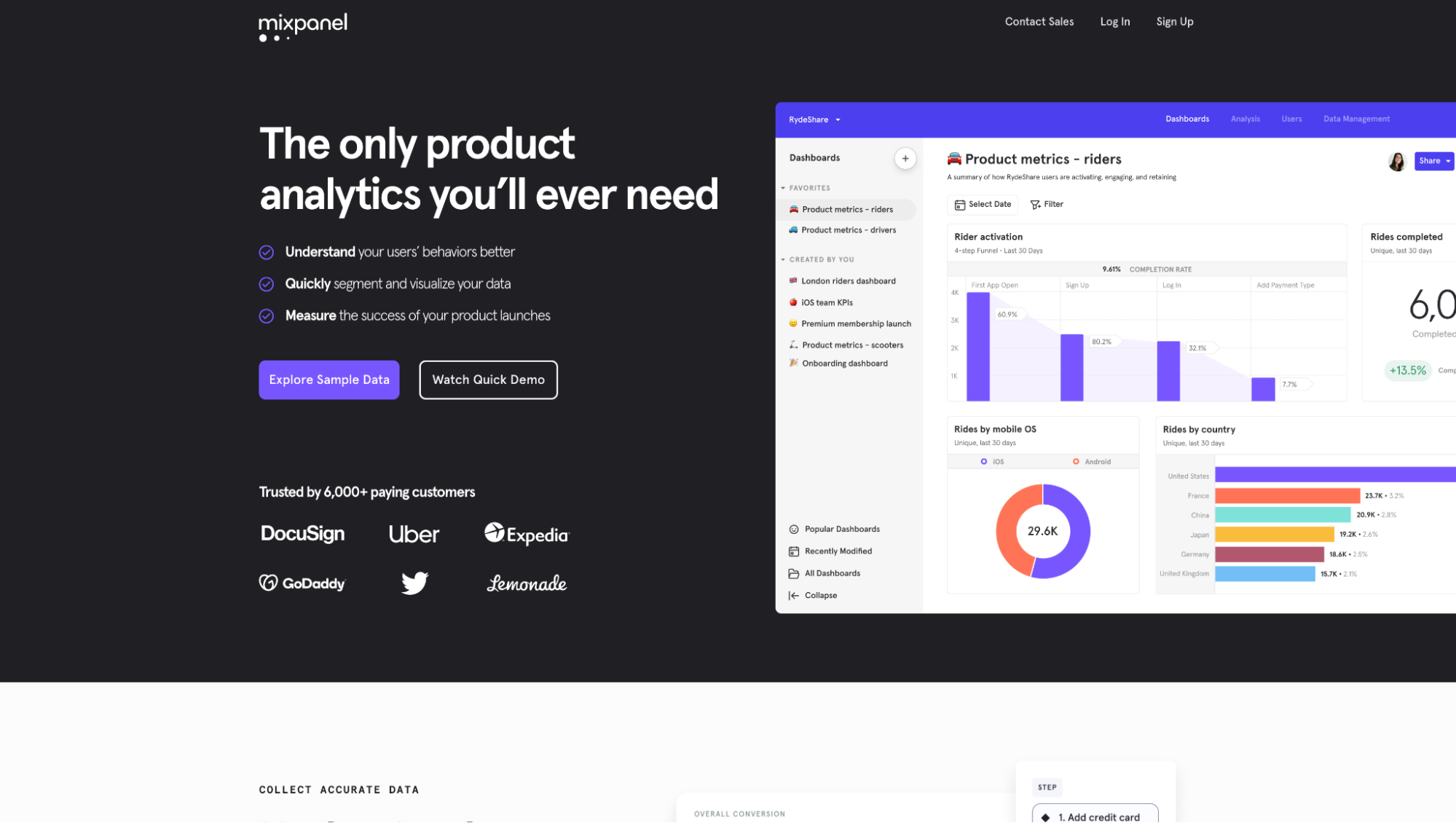
Place social proof above the fold (the first section of the website someone sees before scrolling).
Conversion page
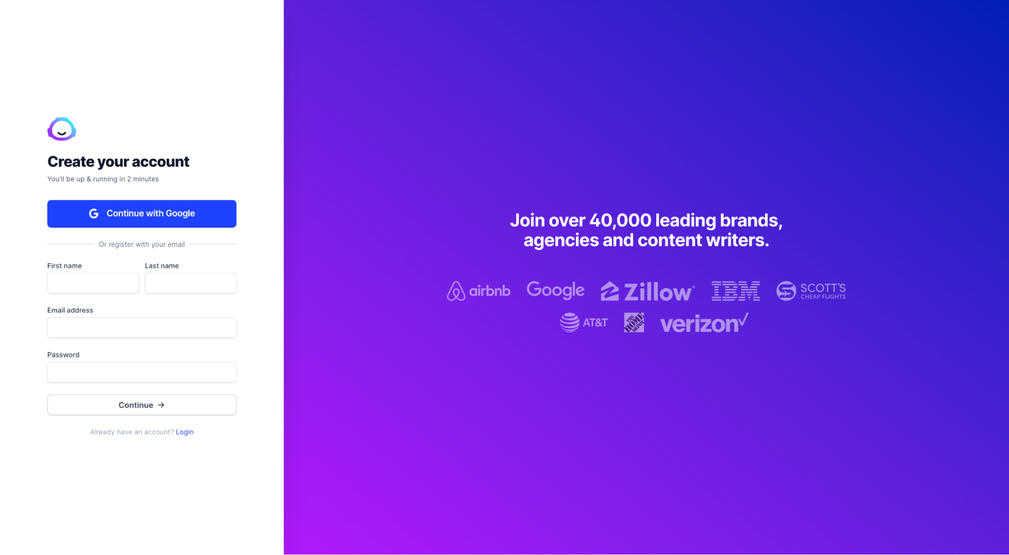
For click-through pages, when someone clicks-through on your offer, don’t forget to include social proof on the destination page.
Every page offers a new opportunity to win or lose a prospect; remind visitors to keep pushing forward (they’re almost there!).
Click triggers
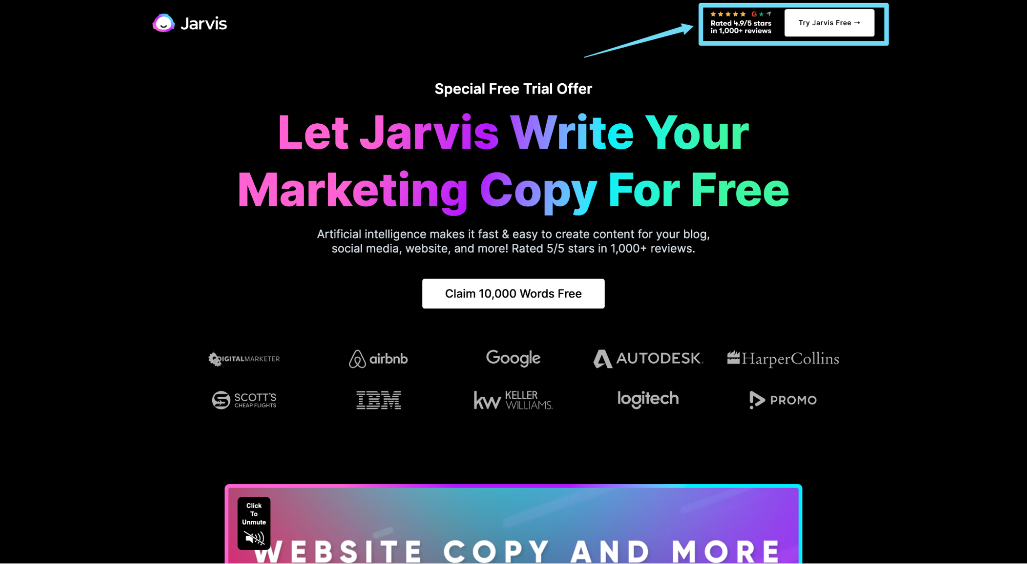
A click trigger refers to micro-copy placed near your CTA button designed to motivate action.
Common click triggers include “Money back guarantee,” or “No credit card required,” placed underneath CTA buttons in small text.
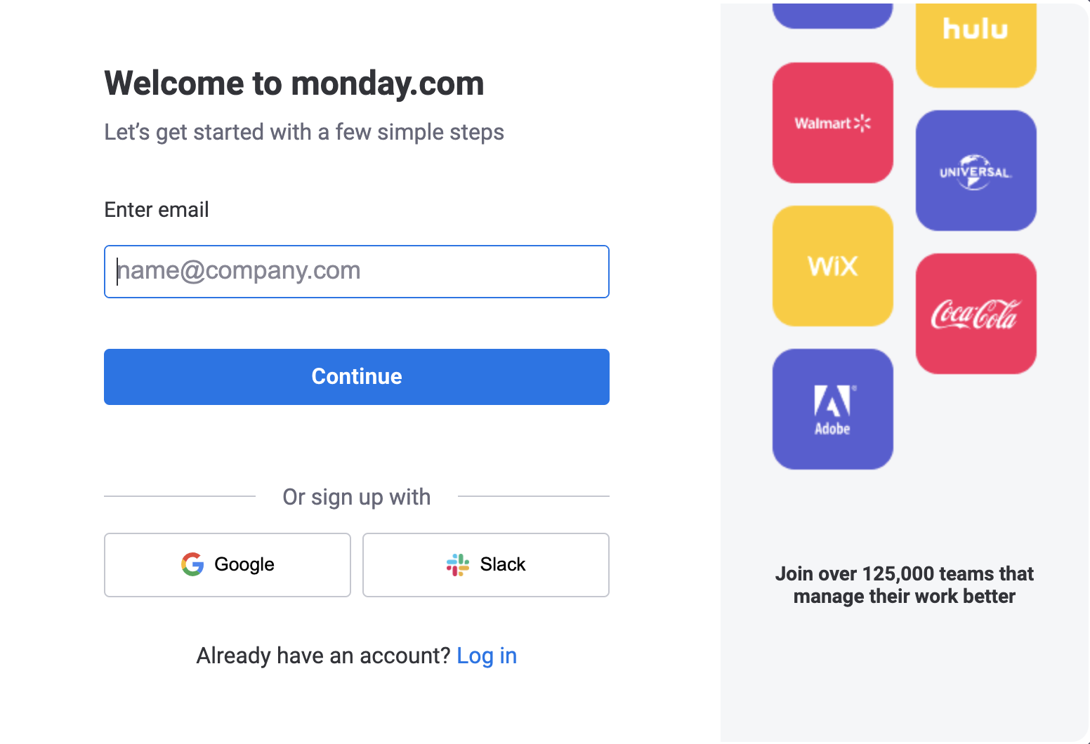
When it comes to click trigger social proof, nobody does it better than Jarvis:
Form
Like a conversion page or a checkout page, for lead-capture pages, the form is the final step before conversion. Use social proof to remind prospects how many similar businesses made it to the same step and pushed forward.
Benefits
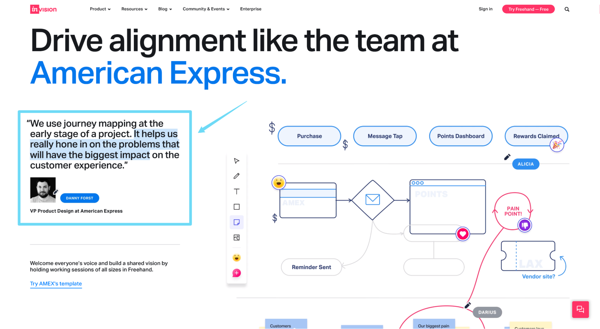
Use client testimonials (video testimonials or written testimonials) to support your core benefits.
For example, InvisionApp uses client testimonials as subheadings to their benefit headlines. Each testimonial directly supports each benefit.
Checkout page
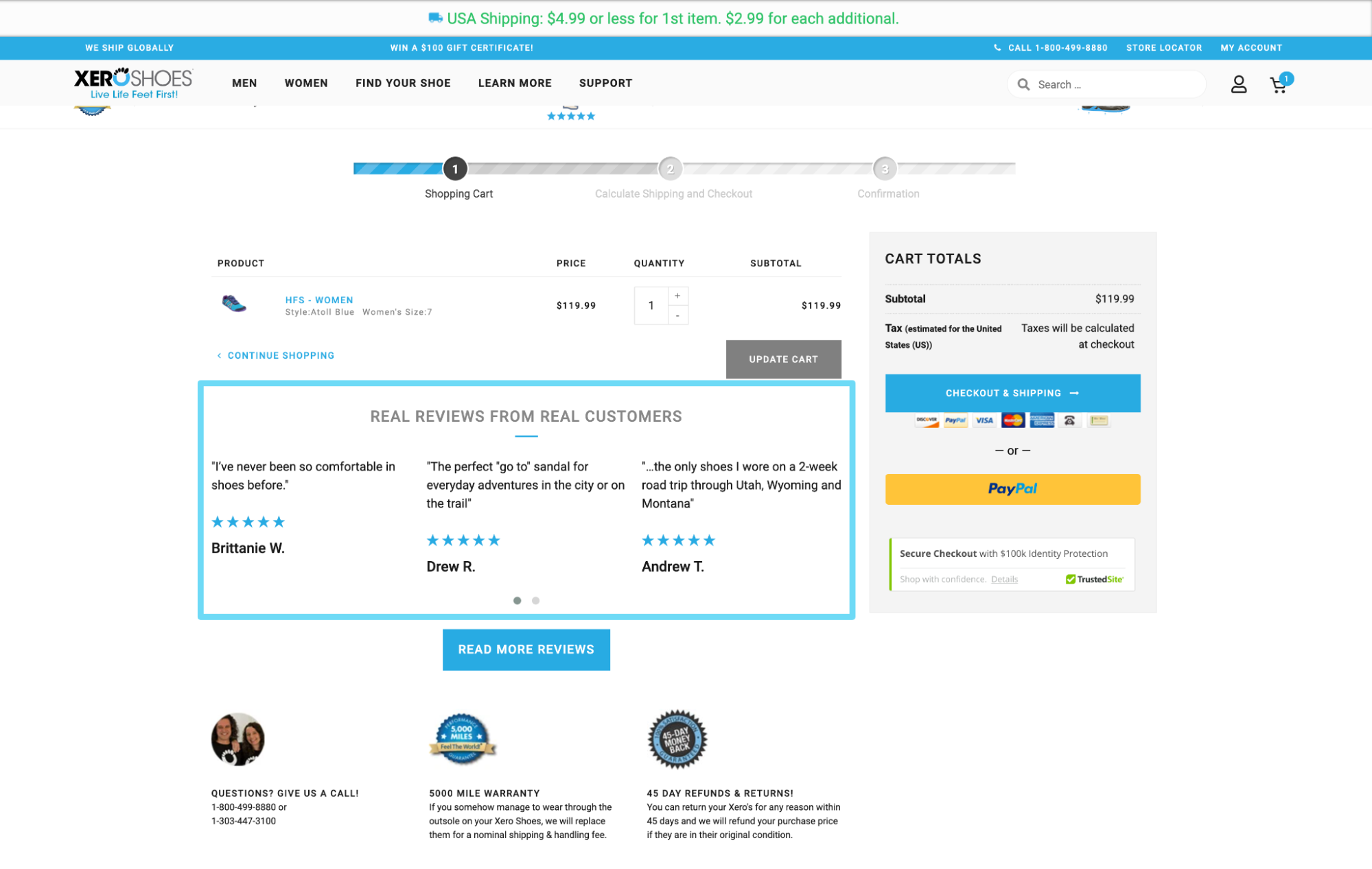
Like a conversion page, a checkout page is the last step a potential customer will take before closing the deal. Don’t forget to remind them why they made it this far in the first place.
Dedicated social proof section
Package all of your social proof into one, clean section within your landing page.
For example, Jarvis sprinkles social proof throughout their entire landing page, but they also feature a social proof section with star ratings, client logos, and 100 testimonials.

How to use social proof on your landing pages
No matter where you place it, ensure your landing page social proof checks the following boxes first:
- Relevant: Is the testimonial, case study, or award relevant to your target audience and product? For example, if your landing page targets small businesses, ensure your case studies spotlight small business, not enterprise businesses.
- Credible: The more believable you can make your social proof, the better it will perform. People are skeptical. Feature social proof from credible sources, and make it real.
- Visual: Humanize your social proof by putting a face to it (see: make it real).
- Specific: Broad generalization about your products and services won’t perform as well as specific messages that overcome objections.
- A/B test: Test. Everything. In some cases, or with some audience, social proof doesn’t always land like you expect.
Avoid negative social proof at all cost
What’s negative social proof? It’s social proof for bad behavior.
According to Robert Cialdini, negative social proof is the phenomenon wherein people feel less wrong for doing something bad because they’ve been told that a lot of other people are doing it too.
For example, when trying to reduce the amount of petrified wood stolen from the Petrified Forest National Park in Arizona, Cialdini tested a sign that embodied negative social proof and discovered that it actually increased the amount of stolen wood.
What did the sign say?
“Many past visitors have removed the petrified wood from the park, changing the natural state of the Petrified Forest.”
By acknowledging how many people stole wood, the sign made people feel less wrong for doing it. So they did it more often.
When it comes to your landing pages, don’t fall into the same negative social proof trap.
For example, Wikipedia uses negative social proof when fundraising by reminding visitors how many people don’t contribute:

Bottom line: Don’t remind potential customers how many people don’t use your product or service (i.e. low customer counts) or don’t solve their problem the way you can.
Key takeaways
Digital marketing has come a long way in the last decade. And marketing has come even further since the days of Josiah Wedgewood.
But I think if ol’ Wedgewood had lived today, he would have figured out a way to make his landing pages 98% social proof.
I mean, for a commoner like himself, to have the chutzpah to ask a king and queen to put their seal of approval on his handmade china… like, wow. Ahead of his time.
This brings up one final thought (and lesson) when it comes to social proof: sometimes you have to have the courage and belief to ask your customer base for it.
Happy converting.
