“Thanks, Bub, and here’s your whatever.”
👆That’s what too many thank you pages look like 😣
But that’s because too many thank you pages are examples of lackluster porridge that stop short of what they were made for.
What were thank you pages made for?
The Coles Notes answer: someone who just converted on something is primed and ready to take one more step, but if all you offer is a mumbling gracias, your thank you page is actually a goodbye page. And goodbyes do not make a flowing funnel.
Don’t shut things down; open a new door with your thank you page.
Expressing gratitude is a polite stronghold we should all uphold to protect the better side of humanity in this faster world (for starters).
But, more importantly, manners in this case is a conversion rate optimization (CRO) digital marketing opportunity.
Thank you pages
- are the perfect way to make your visitors feel warm and fuzzy about a fresh conversion
- cultivate conversion momentum in the form of an upsell/cross-sell opportunities
- might convert what turns out to be a lifetime customer
They’re a positive tool of the buyer journey and you should use them anywhere and everywhere you can—the right way.
And that’s what you’ll learn about here.
Get brand new conversion strategies straight to your inbox every week. 23,739 people already are!
What is a thank you page?
A thank you page is the post-conversion page that automatically shows up after your visitor opts into your offer (from a contact form or checkout page, for example).
That’s the perfect time to ask for more from that person who converted and clearly likes you.
A thank you page helps you reach bigger goals (like recurring revenue from loyal lifetime customers).
But not all thank you pages look the same; they differ based on the conversion.
Why is a thank you page important?
Your visitor said yes to your offer, filled out your form, and clicked the call-to-action (CTA) button. The least you can do is thank them for that. That thank you confirms that their action completed ✅
But then you’ll want to seize the day and delight your visitors so they’re even more attracted to your brand 😍
If your conversion is a sale on your eCommerce site, you can use a thank you page to build retention and increase the lifetime value of your customers.
Here’s an example of Amazon’s thank you page:
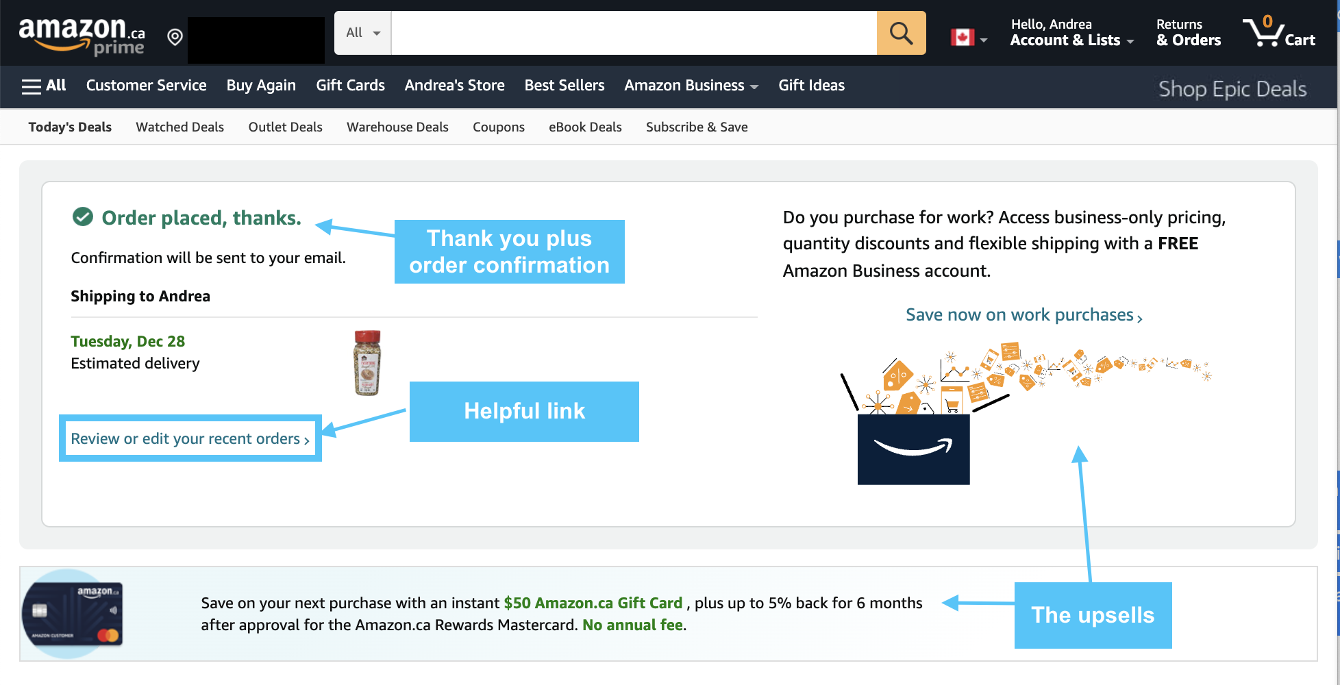
If your offer isn’t a sale, then use the thank you page to further push people through the sales cycle. Show off with fancy extras if you have them—have them 🤨—and give your visitors a taste of what it’s like to be a valued member of your audience.
How do you write a thank you page?
You write a thank you page to take full advantage of your conversion. How you do that is by engaging your visitor in some extra way.
You can
- move them to another page of your website
- offer an add-on to what they just bought
- give them an incentive to follow you on social media
- ask them to please share your product/service with someone else
There’s a lot you can do with it.
But it isn’t just about the copywriting (which should be super, short, and clear). It’s also about the page design and the direction (the next step).
We’ve got 17 thank you page ideas to nudge your visitors through to your end goal: making more money 🤑
Let’s break them down into three categories:
- Conversion confirmation
- Nurturing
- Trust building and feedback
Conversion confirmation thank you page ideas
1. Provide expectations
Make your visitors feel good about their conversion by giving them specific instructions about what to expect next on the confirmation page.
Follow this format:
- Thank you
- You’re on the right track to solving [this problem] with [your solution]
- Here’s what happens next…
- Include info about where, how, and when the offer will be delivered
Here’s an example thank you page from Omniconvert that appears after signing up for a free trial:
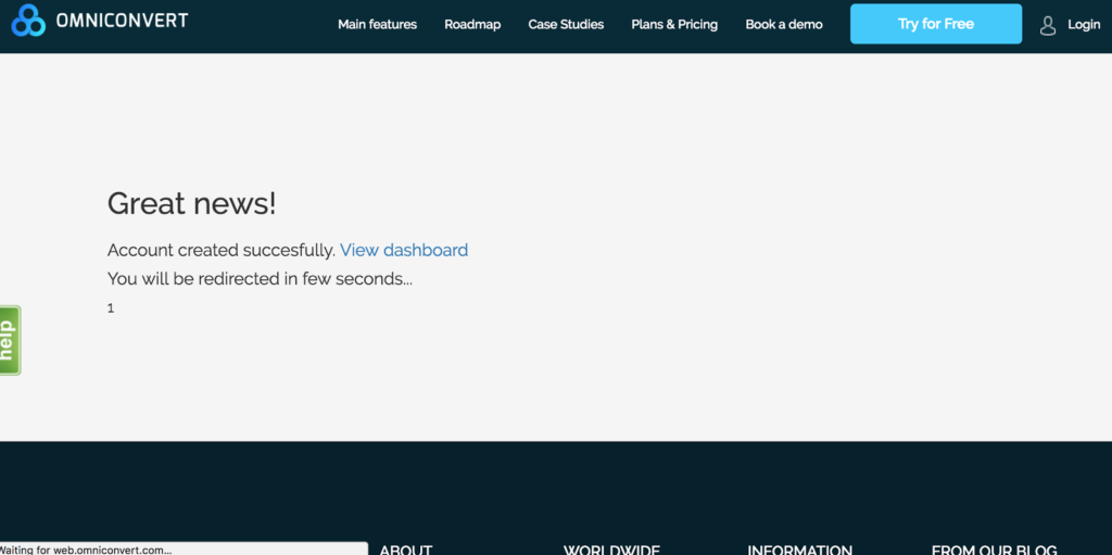
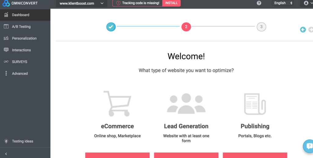
There was no confusion about what was going to happen next or to where the page would navigate.
2. Autoresponder email
Send out an immediate auto-responder email as an extension of the thank you page that outlives the URL.
Autoresponders are another way to confirm the details of your visitor’s recent opt-in and make an impression.
Right after the conversion on the Omniconvert page, this email from the CEO lands in my inbox:
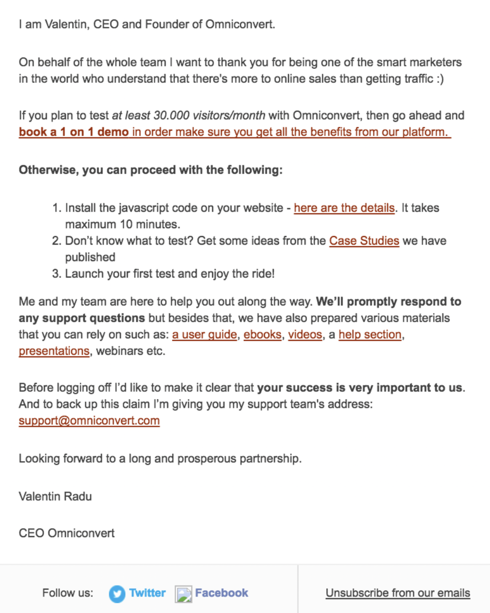
The email also includes additional elements like exploratory links, social sharing buttons, and download links (more on all that later).
Here’s another example of an auto-response email from Hubspot that explains the timing of their offer:
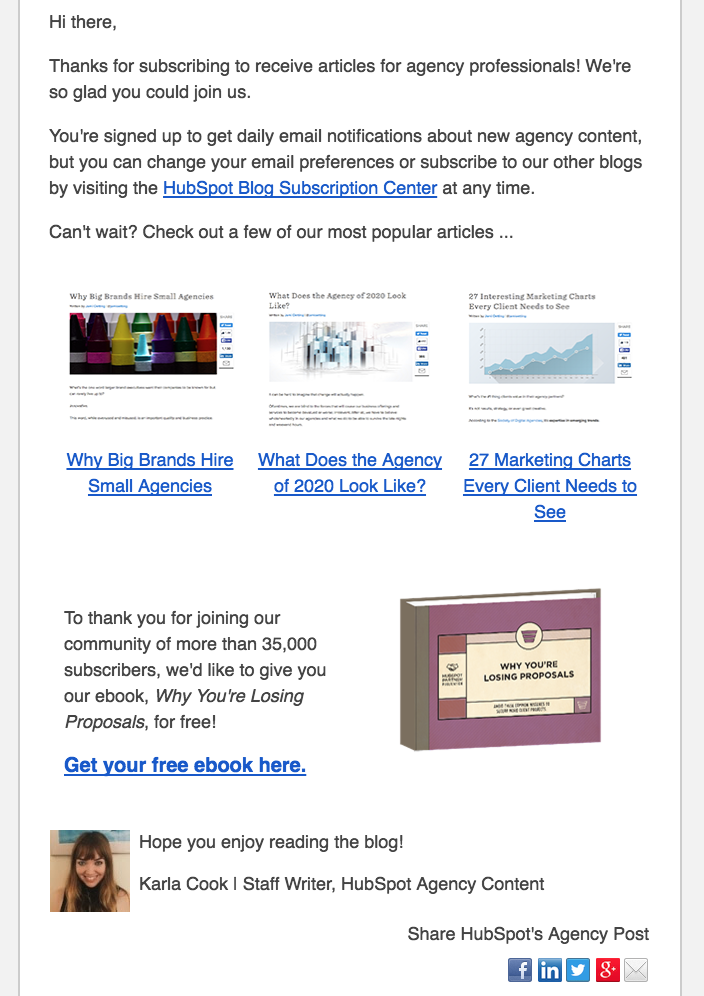
New content received daily in my email inbox—pretty clear expectation. Plus, here’s some stuff I might be interested in 👏, and here’s a freebie (a nurturing component) 👀
3. Multiple delivery options
It’s a buyer’s world and offers should be delivered in a way the customer actually wants.
For instance, if your offer is a downloadable eBook, offer access to an immediate download button or an email delivery of the link, so they can save the reading for later.

Here’s the email access:
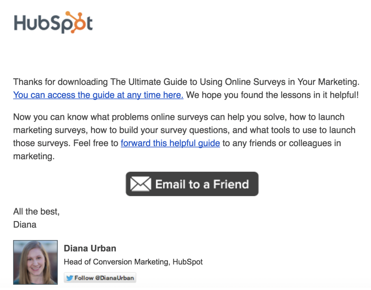
Give them a choice. It’s a way for your offer to conveniently fit into their life.
4. Exciting visuals
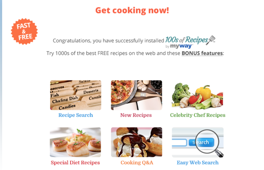
Visually appeal to your visitors’ sense of anticipation. Use imagery to show them what’s to come and to get them excited about it.
After installing the “100s of Recipes” extension, this thank you page included several image options on where to go next.
5. Tap into your visitor’s ego
The concept of reciprocity played a role in getting your visitor to click your CTA. There was just enough around that button to make them want to know what more was behind it.
Return the favor by feeding into their ego and use the reciprocity concept again. Here are two stages of reciprocity:
- Landing page reciprocity: you provide so much value to your visitors, gifting something for free with no strings attached, that they feel inclined to opt in to your offer (reciprocate)
- Thank you page reciprocity: your visitor gave up some personal contact info opting in, so you double up on the reciprocity effort and make the post-conversion experience as valuable, enjoyable, and effortless as possible—while showering your visitors with gratitude.
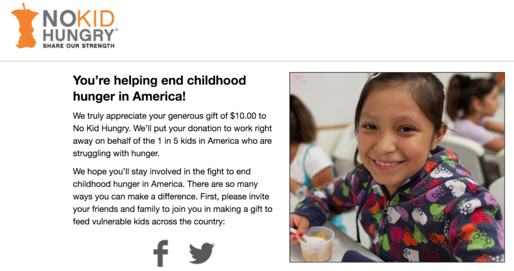
No Kid Hungry used this concept to reach its donation goals. They entice visitors further into the conversion by describing what $10 pays for:

After the donation is made, the thank you page feeds into the donor’s ego and explains specifically what that contribution did.
Tips to nurture leads with your thank you page
6. Exploratory links
While you have your visitor’s interest, give them even more value with relevant offers. Unlike landing pages, the attention ratio on a thank you page can go upward of 1:1 🎉
This is the appropriate place to add exploratory info and links to other relevant content. Include additional forms, links to your best content, and helpful supplementary resources.
Offer ideas:
- White papers
- Case studies
- Books
- eBooks
- Educational info
- Upcoming webinars
Invite your visitors to enjoy extras that are related, educational, helpful, and valuable.
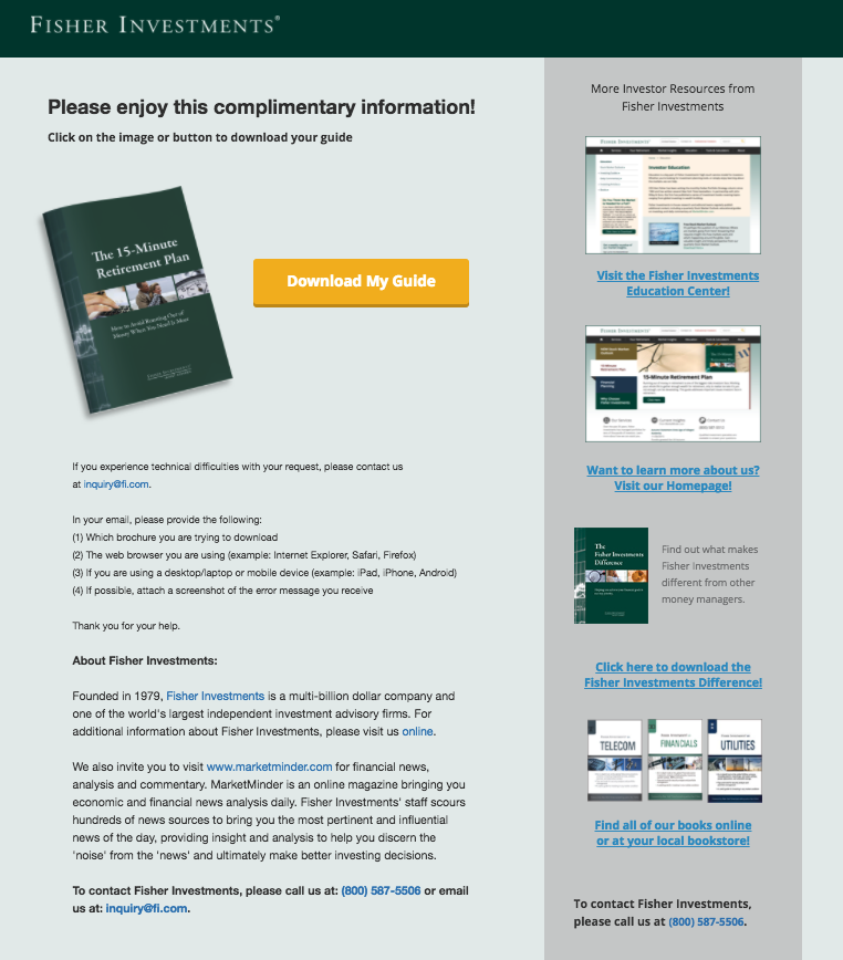
Here’s an example from Fisher where we included their most popular content on the right-hand column of their thank you page:
7. Email subscription invite
Use your thank you page to turn one conversion into two. Thank them and then invite them to subscribe to your email list 👈 but make that invitation enticing.
This is the perfect opportunity to capture their contact info so you can continue to nurture them.
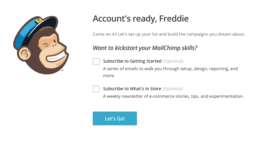
MailChimp gives you two different email subscription options after signing up for an account:
8. Referral requests
This one’s easy to shy away from because it can feel like asking your audience for a favor—kinda the opposite of the reciprocity concept, right? Nah 😉
Asking for a referral from a fresh conversion (your new lead) does two things:
- It empowers them (which minimizes second guessing)
- It makes them feel like you trust them to do something as part of your tribe—it’s inclusive
The worst thing that can happen is no referral.
But there's a potential positive impact that comes from asking your converted visitors for a referral. So long as your offer is something that successfully works and improves your visitor’s life, they should feel like sharing your offer to enhance their social standing.
Getuwired’s Ella Wilson describes referral psychology:
“It’s your job to make your clients believe referring your business will reflect positively on them if you want to get more referrals.”
Takeaway: Make your offer so bomb that people will look good by recommending you.
Tip: Make the referral process easy and seamless so your visitors participate.
After opting in to download Hubspot’s “Why You’re Losing Proposals” eBook, I landed on a URL that looked like this:
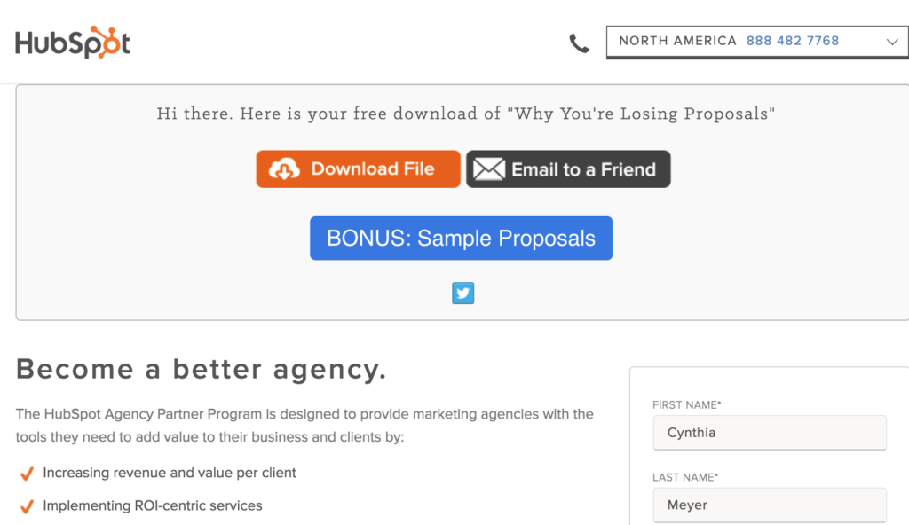
And once that CTA is clicked, the email is already written with the subject, copy, and link ready to go:
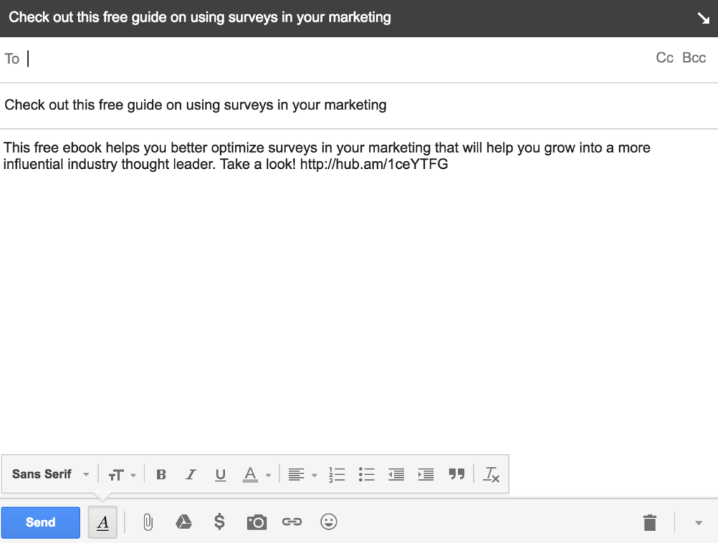
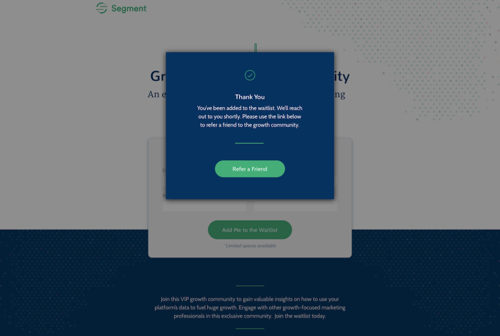
Take a look at this Refer a Friend thank you pop-up:
9. Educational videos
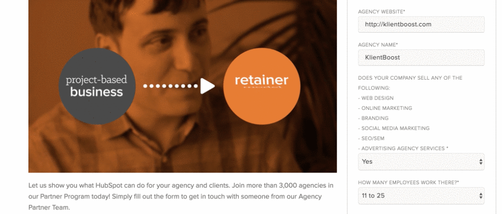
Another thank you page option is the landing page video.
On the same Hubspot eBook thank you page, there’s an Agency Partner Program video below the fold. The video provides related info to the proposals eBook and my opt-in within the agency category.
10. Completion reminders
Nudge your visitors through the decision-making cycle by encouraging them to complete their registration on your thank you page. Couple your offer delivery with a next-step offer.
For eCommerce sites, this can be post-cart completion reminders about previously viewed items.
For lead generation sites, this can be registration reminders for proposals, audits, guided tours, or demo request lead magnets.
The idea is to offer something of value that’s one step closer to your defined sales conversion.
Here’s an example of a thank you page after signing up for a Mac Select membership:
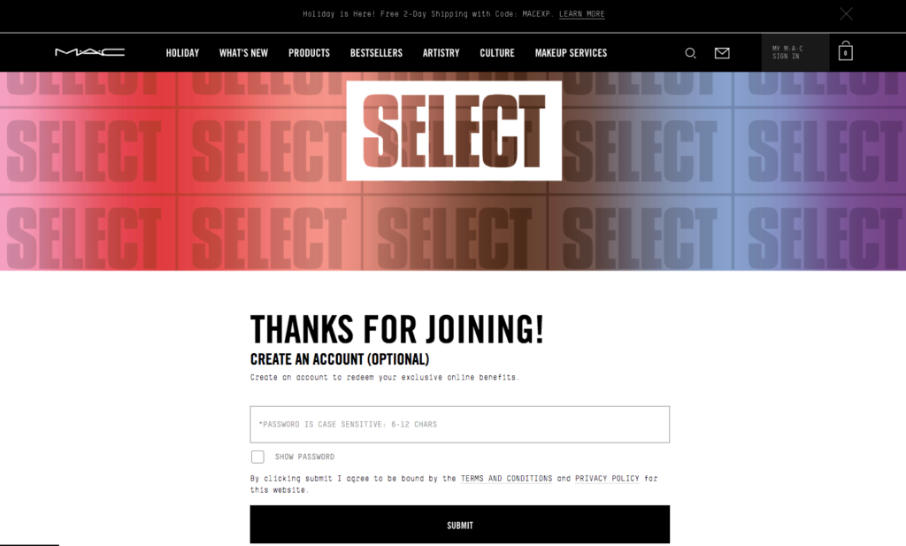
Encourage visitors to move through the conversion funnel by reminding them to create an account.
11. Coupon codes and discounts
This one’s designed to entice your converted visitor to come back for more. Promotional discounts reward visitors and make them feel like they’re a part of an exclusive club.
Personalize wherever possible to make your visitor feel special—like you’re speaking directly to them. If it’s a limited-time offer, tap into your visitor’s sense of loss aversion and urgency.
Here’s the personalized complimentary shipping offer that appears after opting into Mac Select:
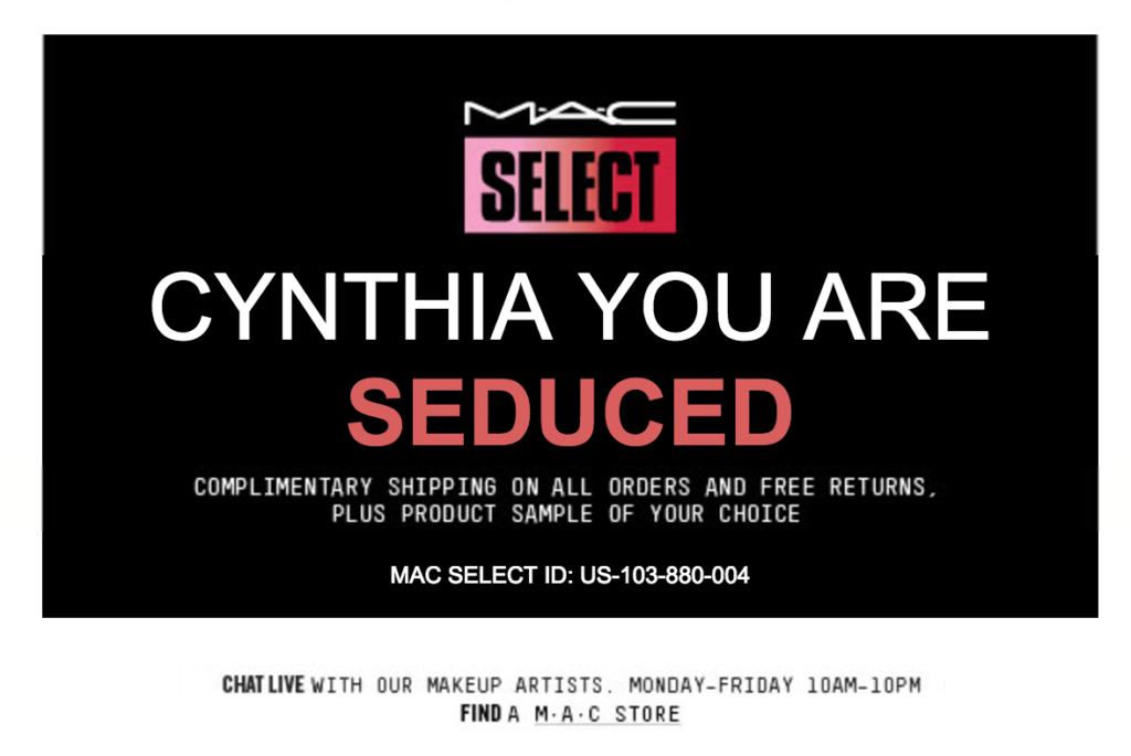
With a unique Mac Select ID assigned to each visitor, the experience is even more personalized and exclusive.
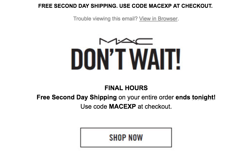
And then Mac follows up with a nurturing limited-time email offer:
12. Cross-promotions
Based on your offer, throw additional recommendations on your thank you page for your visitors.
Consider where your visitor came from and where they stand in the decision-making cycle, then speak to that need.
If you have an eCommerce site, recommend other complementary products on your thank you page.
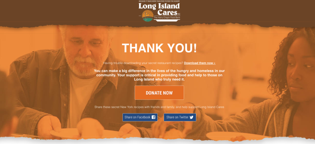
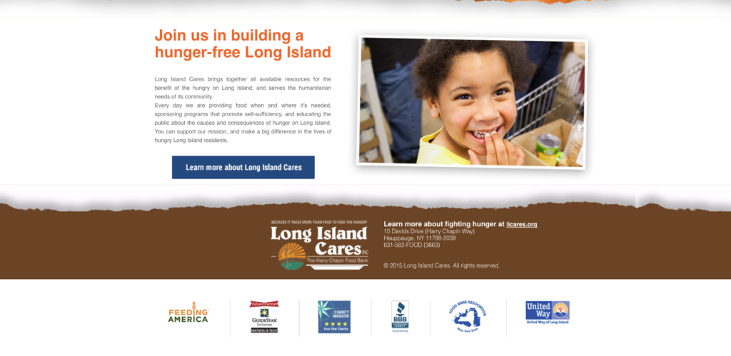
When you opt in for a Long Island cares recipes offer, the thank you page redirects to an offer to donate to the hungry:
13. Upselling opportunities
When you donate to No Kid Hungry, a pop-up urges you to go one better and make monthly donations instead of the one-time donation.
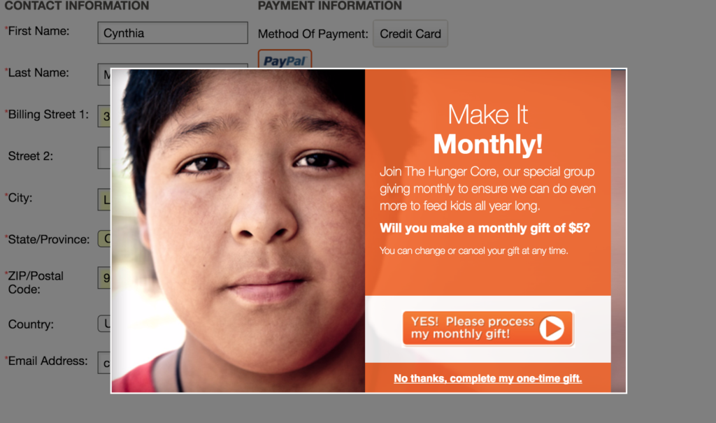
Take advantage of upsell opportunities in the conversion momentum.
Applying this concept to eCommerce sites, recommend larger bundles or purchase upgrades to your paying customers.
Tips to build trust with your thank you page
14. Social proof and social share requests
Another way to keep the conversion momentum going is to urge your visitors to keep in touch on a social level. Use social share invitations, social proof, and testimonials. (See some of the best examples here.)
After opting in to Backlinko’s newsletter, the email confirmation contains a link that leads to this page:
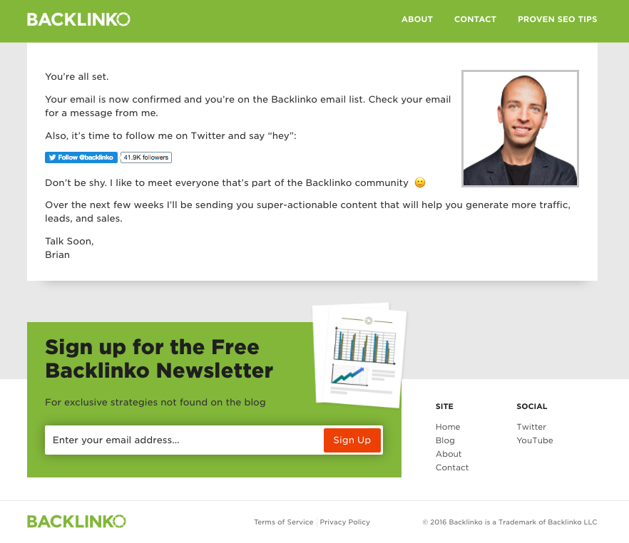
The headshot of Brian Dean personalizes the page as if he’s directly asking you to reach out to him on Twitter. He references a community of over 41k Twitter followers that he personally wants you to get to know.
15. Testimonials
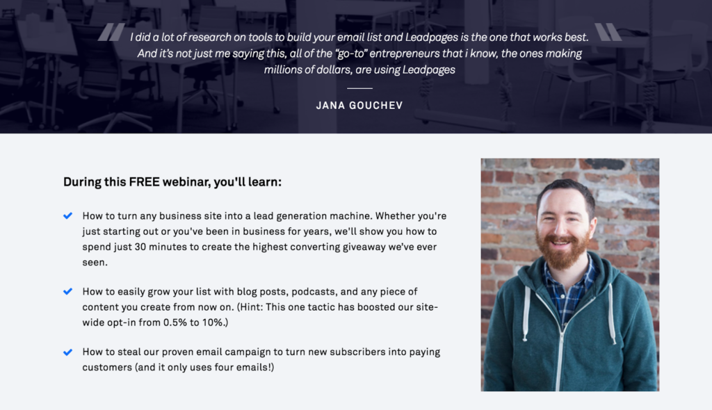
Testimonials show off how useful and beneficial your offer was to other people. After signing up for a Leadpages webinar, I was redirected to a thank you page that included a testimonial:
If you scroll down the thank you page for our own KlientBoost SEM Agency page, you’ll see our testimonial feature:
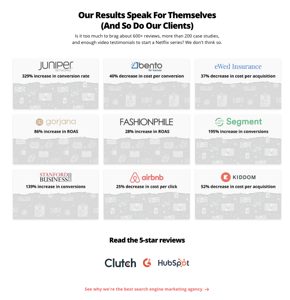
If you’ve got 600+ reviews, more than 200 case studies, and enough video testimonials to start a Netflix series, don’t sit on that stardom—flaunt it.
16. Conversational copy
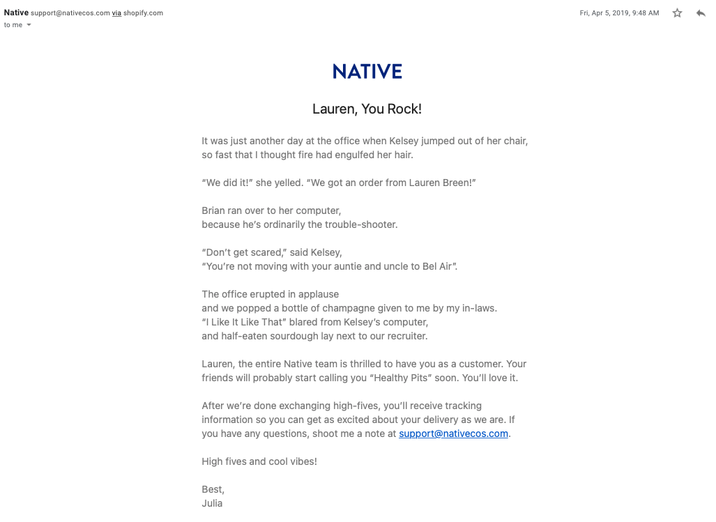
Don’t underestimate the power of good landing page copy. Be as human as possible everywhere you can. Continue the conversation all the way through from your ads to your post-conversions. Be consistent in tone and voice and let your brand shine through.
Here’s the conversational email our Head of Content, Lauren, received after a Native Deodorant purchase:
17. Feedback requests
Use a survey to request feedback from your thank you page visitors. This is a way to further engage your visitors, build their trust, gain potentially useful insights from the customer’s perspective, and increase conversions.
You can request user info and feedback on what they’d like to see next, or any related pain points your visitors typically deal with. Tap into their life using feedback tools, and use this as a chance to improve your offer and the customer experience.
Here’s how Erno Laszlo incentivized participation in their post-purchase survey:
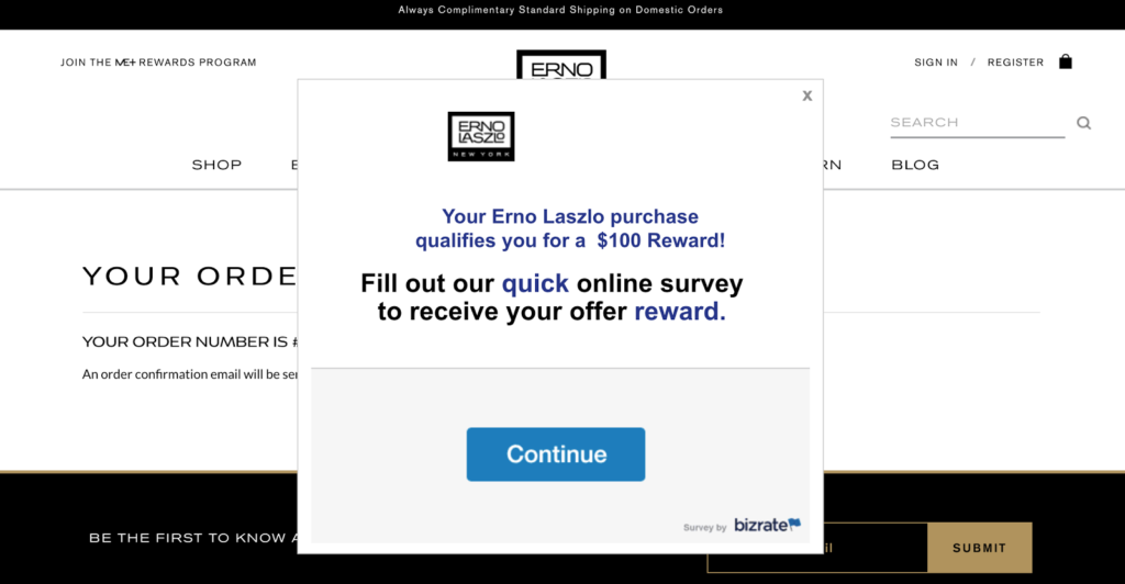
By clicking Continue, I was brought immediately to the survey, which also told me specifically how long the survey would be:
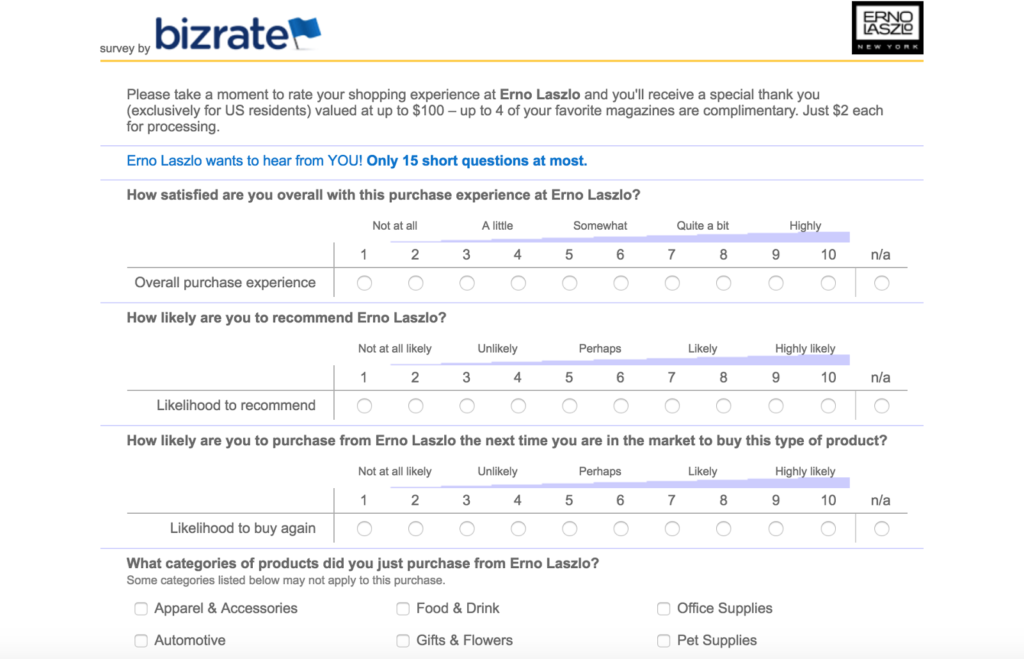
When I finished completing the survey, the thank you page let me know that the promised reward was delivered to me by email.
Closing thoughts
What makes the best thank you page?
The kind that amplifies lead nurturing, minimizes buyer’s remorse for your target audience and doubles down on your conversion game.
How do you design those? By using any of the ideas listed above.
How do you know when they’re working? You always test your thank you page ideas—that goes without saying. Some versions of these pieces will work better than others for you. Try different combinations and you’ll tap into the winning combo.
And be sure to track all those thank you page touches so you know what worked best in order to boost conversions in the future.
Level up your thank you page by thanking customers via multiple channels (like social media and email marketing).
Bonus tip: In addition to having a thank you page that cross-promotes, upsells, builds trust, asks for referrals, offers coupons, gathers feedback, and demonstrates happiness with testimonials, try sending a physical hand-written thank you note. It is a lost art, but customers appreciate the extra thought and consideration.
Final thought: Take advantage of conversion momentum; push your visitors down the sales funnel and increase your retention rate and their lifetime value.
