In the last six years, we’ve literally designed, published, and tested thousands of landing pages for ourselves and our clients.
Don’t believe us? Check out our 300+ client case studies.
After all of that work, we concluded that there are only five reasons why you should use landing pages.
Yup, only five.
But those five reasons will change your marketing forever.
And that’s exactly what we’re going to explore in this article: life-changing marketing made possible by landing pages.
First, we’ll review a landing page definition that we can all get behind (No, Google, every page is not a landing page).
Second, we’ll review the key components of a landing page.
And last, we’ll dive into the five undeniable reasons why you should use landing pages.
Get brand new landing page strategies straight to your inbox every week. 23,739 people already are!
Landing page definition
If you’ve come this far and don’t know what a landing page is yet, we suggest reading our introductory article aptly titled, What Is a Landing Page: Definitions, Examples, Best Practices.
If you do, carry on 😊.
According to Google Analytics, any page someone “lands” on after clicking a link, either from Google’s SERPs, a social media post, an email campaign, or an ad, is technically a “landing page.”
But when marketers talk about landing pages, we’re not talking about any page on your website (sorry, Google); we’re talking about dedicated pages optimized for conversions and built specifically for certain campaigns and sources of traffic.
In other words, your homepage, product or service pages, about page, or any other page that sits within your website’s navigation is not a landing page.
For example, let’s compare our client’s homepage to one of their landing pages:
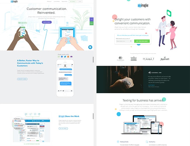
Notice the difference?
Whereas a normal web page functions as a portal to other pages, landing pages function as destinations.
Moreover, a good landing page focuses the copy, messaging, design, and offer on a single conversion goal. That’s it.
No links to further information. No links in the navigation or footer. No links to multiple conversion goals.
5 reasons why you should use landing pages
Alas, why use landing pages in the first place?
I could talk for days about the benefits of landing pages. Seriously, I’m a conversion rate optimization geek.
But after years of building and testing landing pages, I’ve distilled the five core reasons why every digital marketer should use landing pages (including you):
- Increase conversions
- Reduce cost per acquisition (CPA)
- Showcase (and optimize) your offers
- Scale your marketing (not your resources)
- Validate new business ideas
Let’s explore each.
1. Increase conversions
Let’s start with the obvious: more conversions.
Whether it’s lead generation, downloads, newsletter subscriptions, or something else, businesses who use landing pages experience much higher conversion rates than those that don’t:
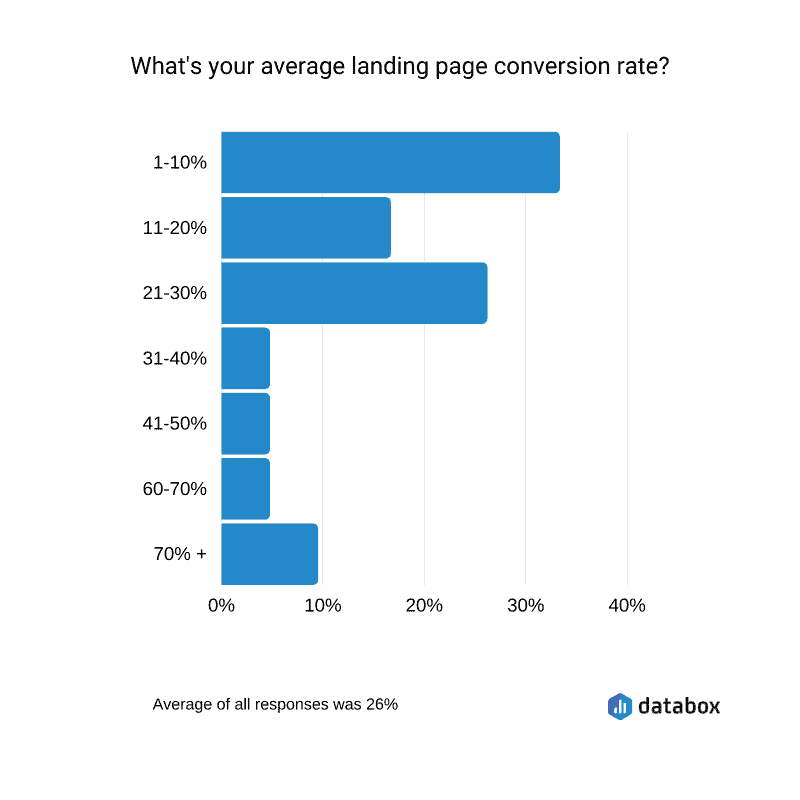
It’s not that the mere presence of a landing page guarantees a higher conversion rate; it’s that landing pages give you the tools to improve your conversion rate over time.
For example:
- Targeted messaging
- A/B split testing
- User data and feedback
- 1:1 attention ratio
Targeted messaging
People act differently on different channels.
For example, people doom-scrolling through Instagram are less likely to convert on a bottom-of-funnel offer than someone who searches for your product via Google. That’s because people use social media predominantly to spy on celebrities and friends, not to buy stuff (that’s where Google comes in).
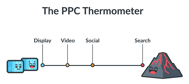
If you want to increase conversions, then you need to match your offers with the intent of users on each channel.
Cold traffic = cold offer. Hot traffic = hot offer.
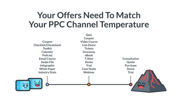
The closer the match, the higher the conversion rate.
Landing pages make it easy to send different traffic sources (e.g. email, social, PPC, offline) to different landing pages with different messages and offers. Which makes it easy to match offers with conversion intent.
For example, to build brand awareness, you can send social traffic (cold traffic further away from converting) to a dedicated landing page that promotes an ebook or free download as opposed to your homepage.
To increase short-term sales, you can send PPC traffic (hot traffic ready to buy) to a dedicated landing page (AKA sales page) promoting a demo or free trial as opposed to a service page.
Takeaway: Landing pages make targeting offers to different stages of the sales funnel or different traffic temperatures easy.
A/B testing (split testing)
Split testing is when you send a portion of traffic to landing page version A and the other portion of traffic to landing page version B, then test which converts higher.
Without a landing page builder, running a split test is hard. With a landing page builder, you can run a split test in minutes (no technical skills required). Just duplicate the landing page, make your edits, and push it live.
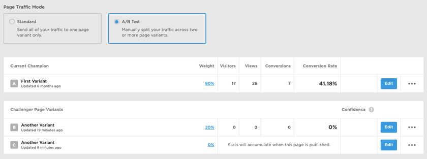
Not only do landing page builders divide the traffic between variants for you, but they also measure results and crown a winner too.
Takeaway: Landing page builders make it easier than ever to test your copy, messaging, calls-to-action (CTAs), and offers to discover which combination converts higher.
Easy peasy.
User data and actionable feedback
Because you can control which sources of traffic visit your landing page (and which don’t), measuring conversion rates at the campaign and channel level is easy. No diluting your data with search engine traffic (SEO) or direct traffic, for example.
By isolating traffic to landing pages, you can produce ever more granular data about the performance of your target buyers, channels, and marketing campaigns.
- Which campaigns convert the best? More importantly, why?
- Which marketing channels drive the most awareness? The most short-term sales?
- Which offers convert the best?
- Which messages resonate the best?
The list goes on…
Also, if your landing page includes a form (i.e. it’s a lead generation landing page), you can use it to cull demographic and firmographic data or to ask qualitative questions too.
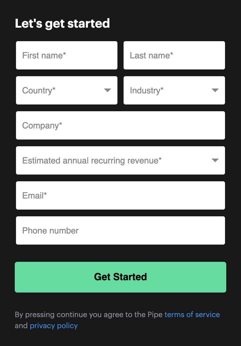
Takeaway: Landing pages make collecting actionable data about buyer behaviors and campaign and channel performance quicker and easier.
1:1 attention ratio
An attention ratio refers to the ratio of links to conversion goals.
When it comes to your homepage or service pages, they’re littered with links—navigation links, social media links, footer links, links to product features, links to blog posts, etc.
Lots of links, lots of goals. Which means conversions get distributed between all of them.
In fact, adding more than one conversion goal can decrease conversion rates by 266%.
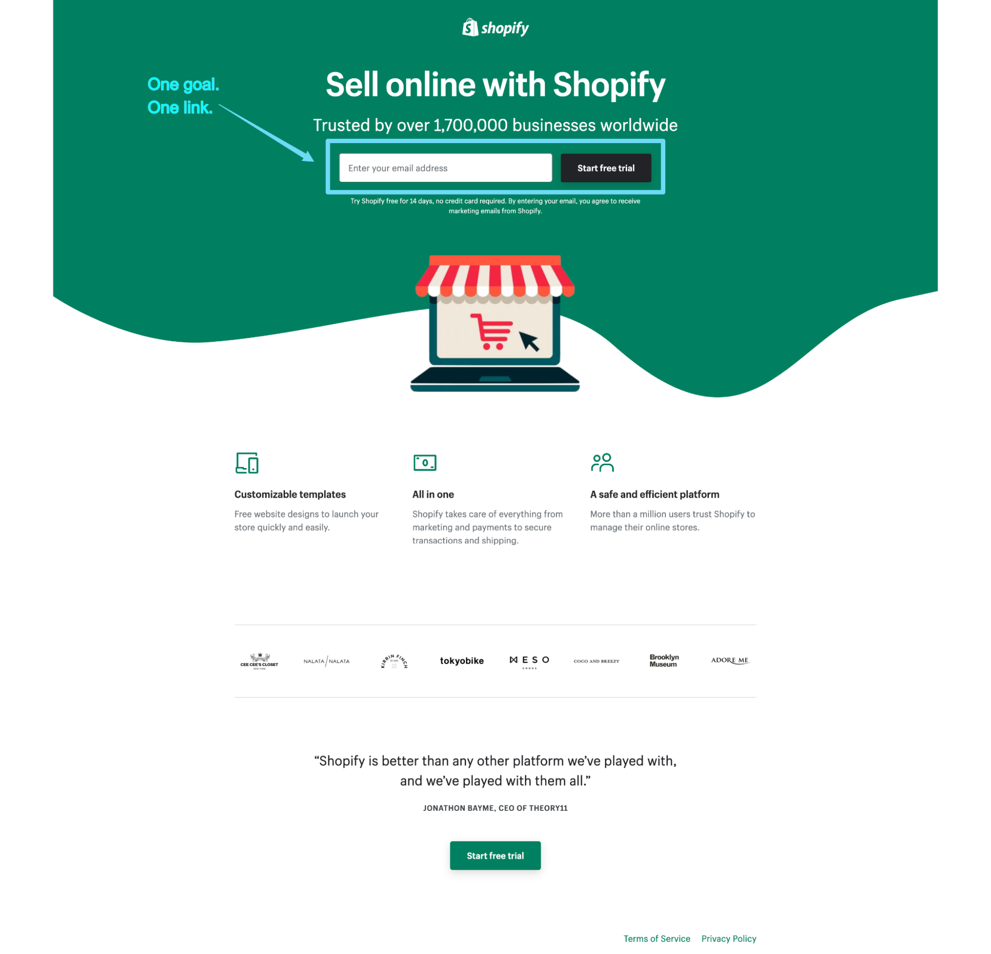
But when it comes to landing pages, you can increase conversions by eliminating unnecessary exit links and creating a 1:1 attention ratio: one conversion goal, one link (the CTA that fulfills that goal).
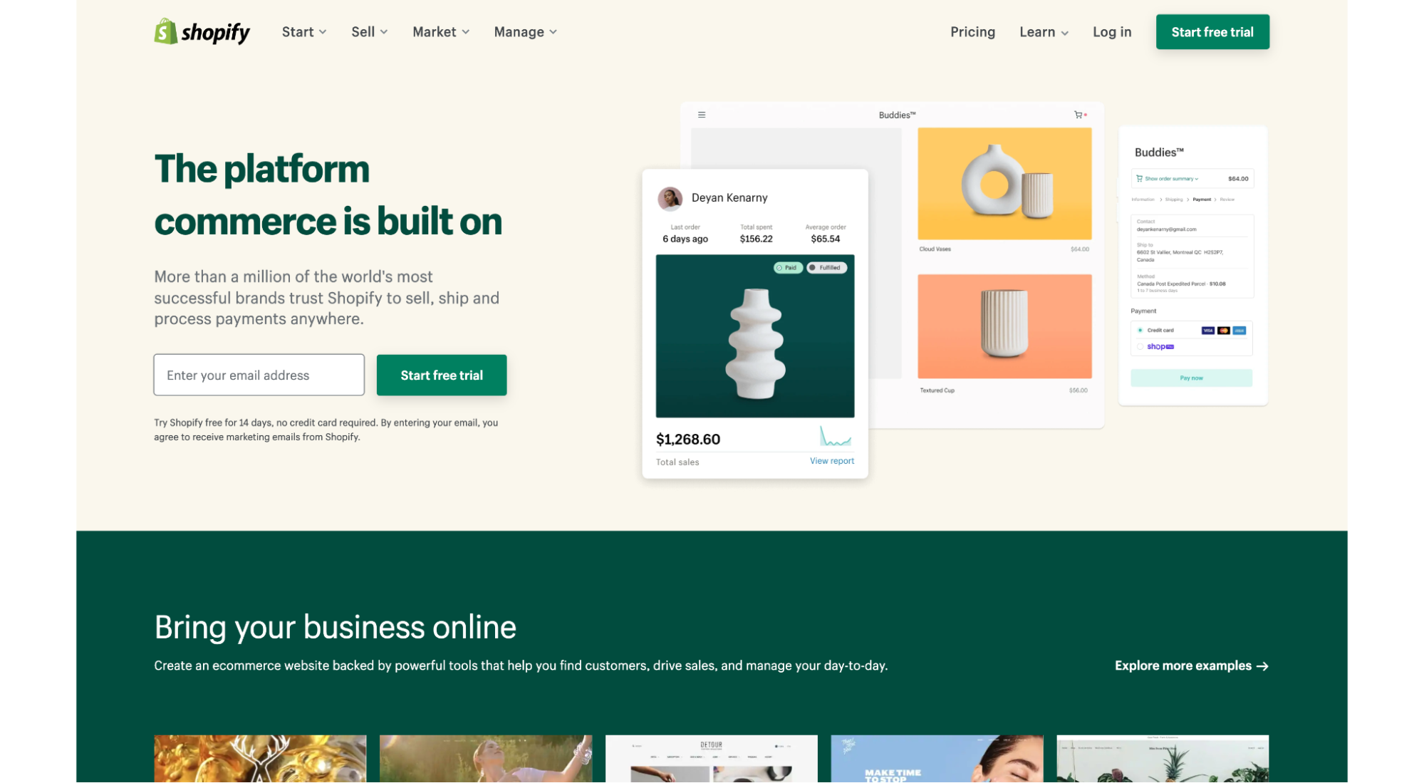
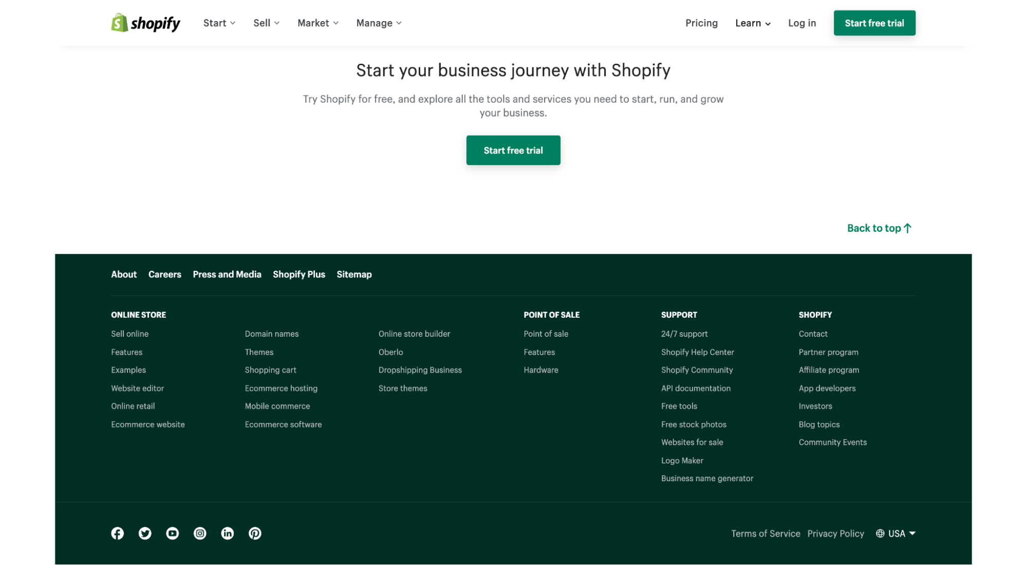
For example, let’s look at the Shopify homepage (lots of links, lots of goals):
Above the fold: Navigation links, free trial CTA, links to templates
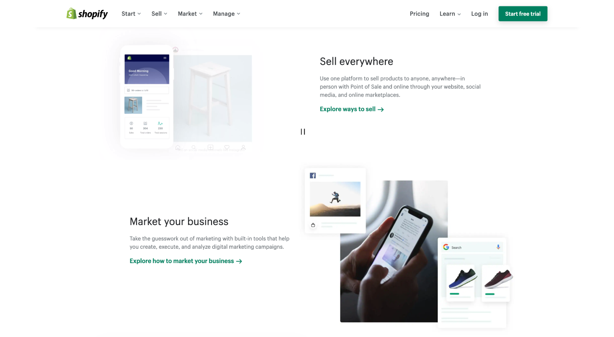
First scroll: Links to more information about selling, marketing, and managing online stores
Second scroll: Links to support, app store, and marketplace
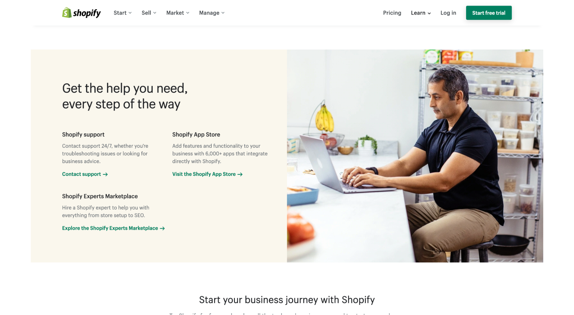
Footer: Dozens of footer links, social profiles
Now let’s look at one of their campaign landing pages (one goal, one link):
2. Reduce cost per acquisition (CPA)
CPA or customer acquisition cost (CAC) refers to the total cost to acquire a new customer (if that wasn’t obvious by the name).
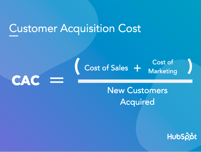
How much does it cost to acquire a customer? A lot less with landing pages.
We already explored conversions. By increasing conversions, landing pages produce a higher return on investment (same spend, same amount of traffic, more conversions).
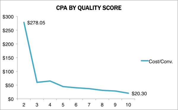
But landing pages also help increase Google PPC Quality Scores (QS), which helps reduce cost per click (CPC), which helps reduce cost per conversion (CPC), which reduces your CPA.
How?
Your quality score is a number from 1 (worst) to 10 (best) that Google gives your campaigns based on how relevant your ads, keywords and landing pages are to the query and intent of the person who sees them.
Higher Quality Scores lead to lower costs and better ad positions. This means more relevant ads and landing pages pay less to sit at the top of Google.
There are three factors Google uses when grading a landing page (in their words):
- Relevant, useful, original content: “The page that they click should be useful and applicable to what they’re looking for. If not, they’re more likely to leave your website and move to another website which will provide what they are looking for.”
- Transparency and trustworthiness: “If a landing page is poorly designed or lacks product or service explanations, this signals that the website may not be completely honest or transparent. Customers want to know what they’re buying and that it comes from a reputable source.”
- Ease of navigation: “Users shouldn’t have to click through a million links to find what they’re looking for. A landing page should be simple and straightforward – this includes on mobile devices, as well.”
You don’t check all those boxes by sending traffic to your homepage or a generic product or service page. You check those boxes by tailoring copy and messaging, reducing the number of clicks it takes to accomplish a goal and focusing the design.
In other words, you do that with real landing pages.
3. Showcase (and optimize) your offers
Offers need their own homes. And landing pages provide the perfect base.
Depending on the scale of your marketing program, you may have dozens of offers, from content upgrades (on-demand webinars, resources guides, white papers, etc.) to promotions to referral programs and beyond.
And depending on the type of offer, the information you share and collect will vary. This means you need the flexibility to edit layouts, change form fields, and optimize copy and design accordingly (a standard template won’t work).
Moreover, each offer needs its own shareable link. Without quick links, how do you expect to promote them?
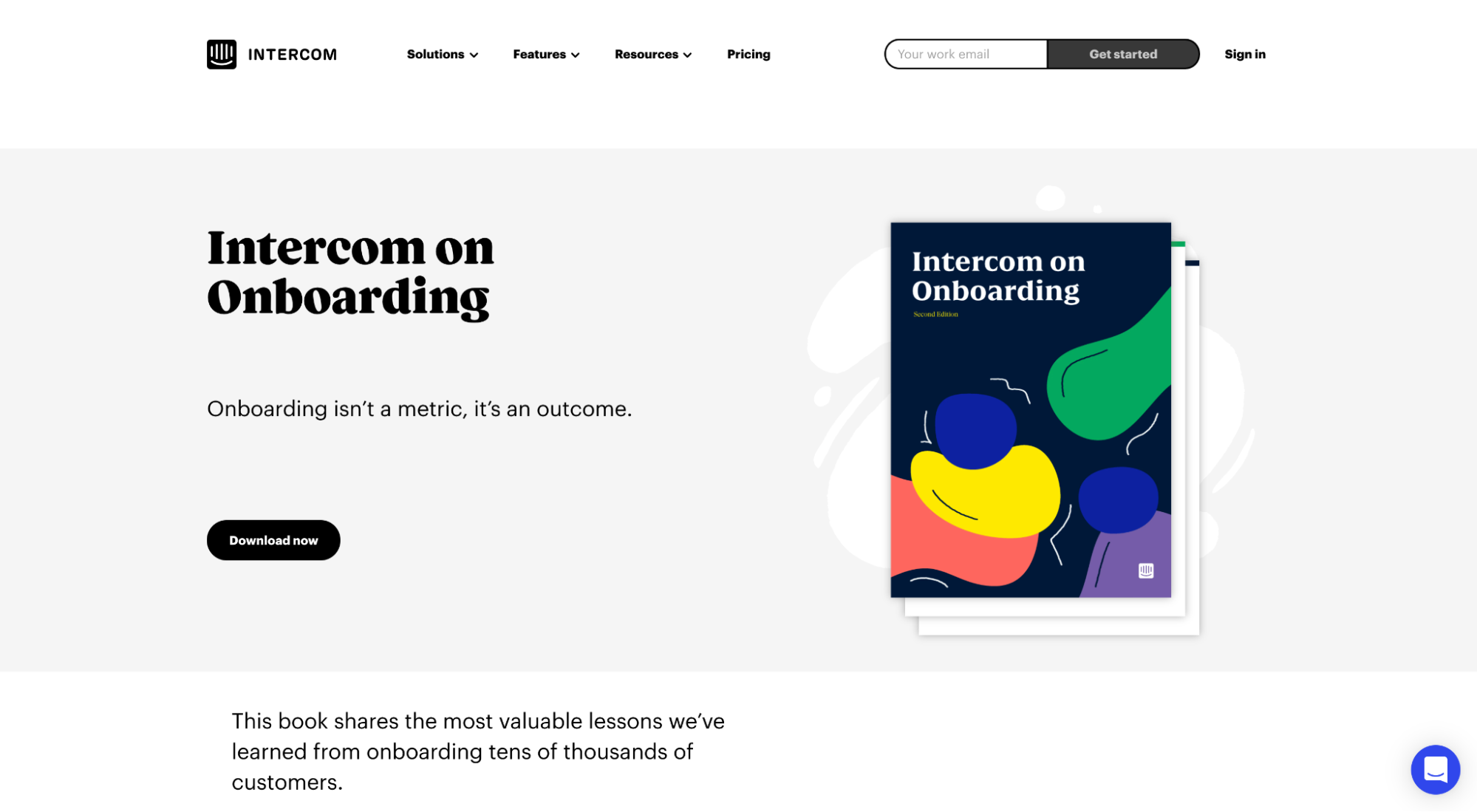
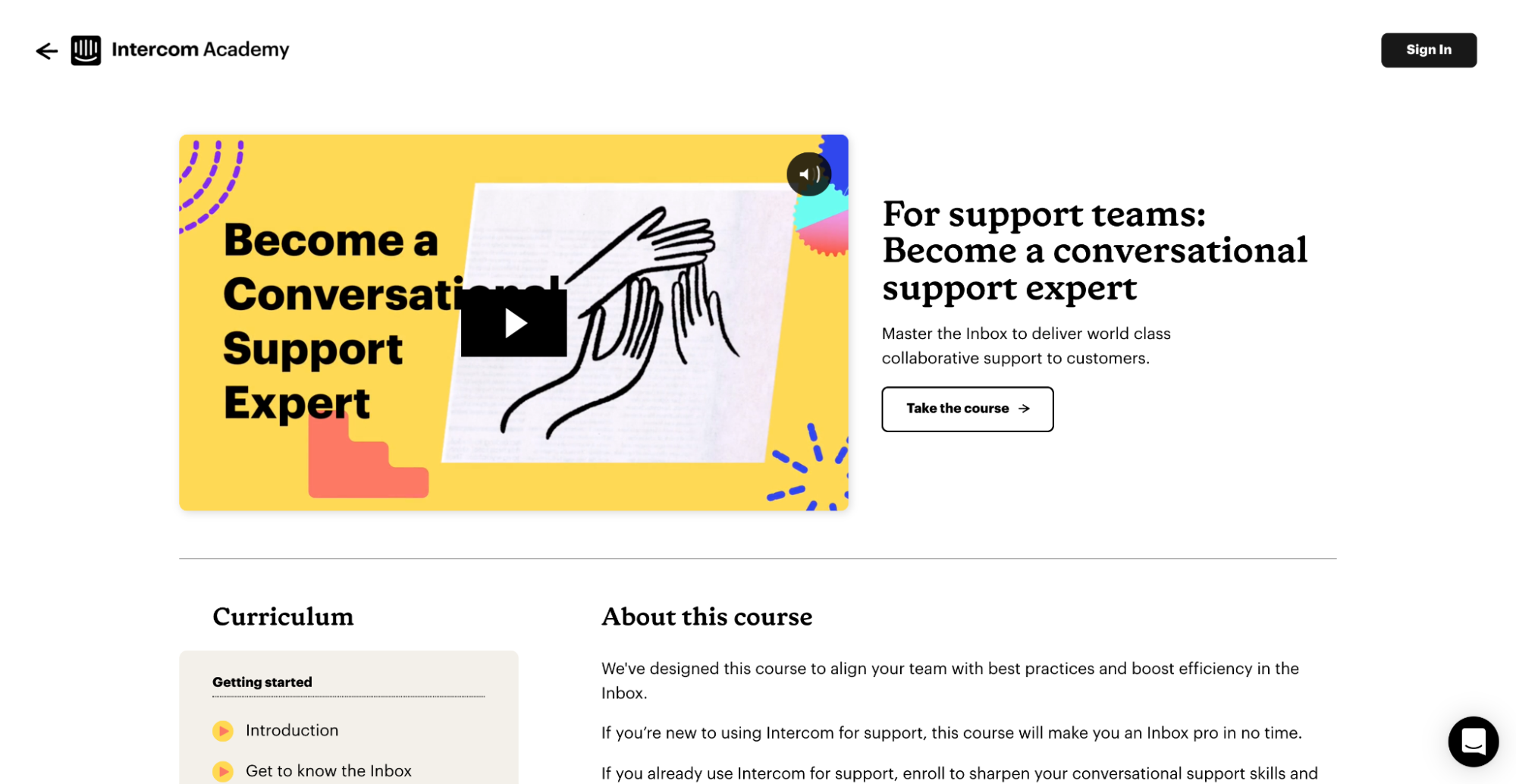
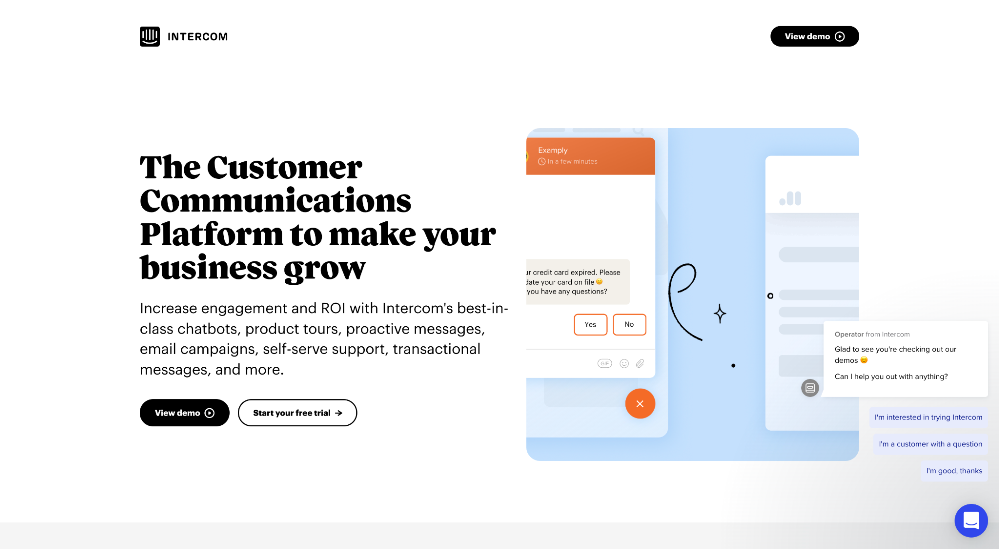
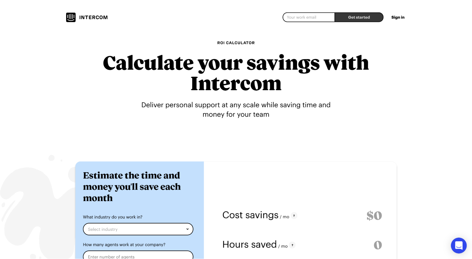
For example, Intercom uses different types of landing pages for different types of offers, each optimized for conversions:
Resource guide (ebook)
Academy courses
Free trial offer (paid ads)
Demo
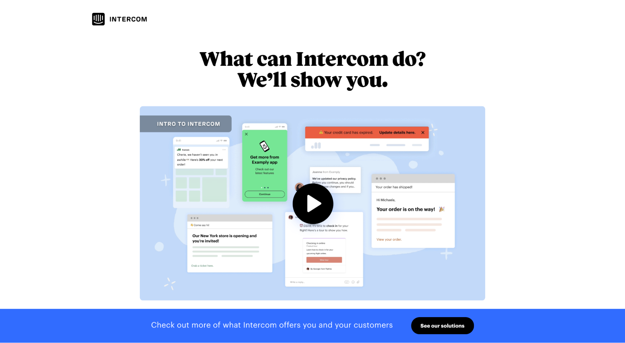
ROI calculator
4. Scale your marketing (not your resources)
Landing pages let you scale your marketing without scaling your time, money, or resources.
Think about it…
Creating landing pages used to take time, money, and resources. After all, before landing page software existed, designing, developing, and publishing a landing page required multiple teams, hours and hours of work, and plenty of coordinated action.
Today, it’s never been easier, cheaper, or faster to design, develop and publish new pages and offers on your website.
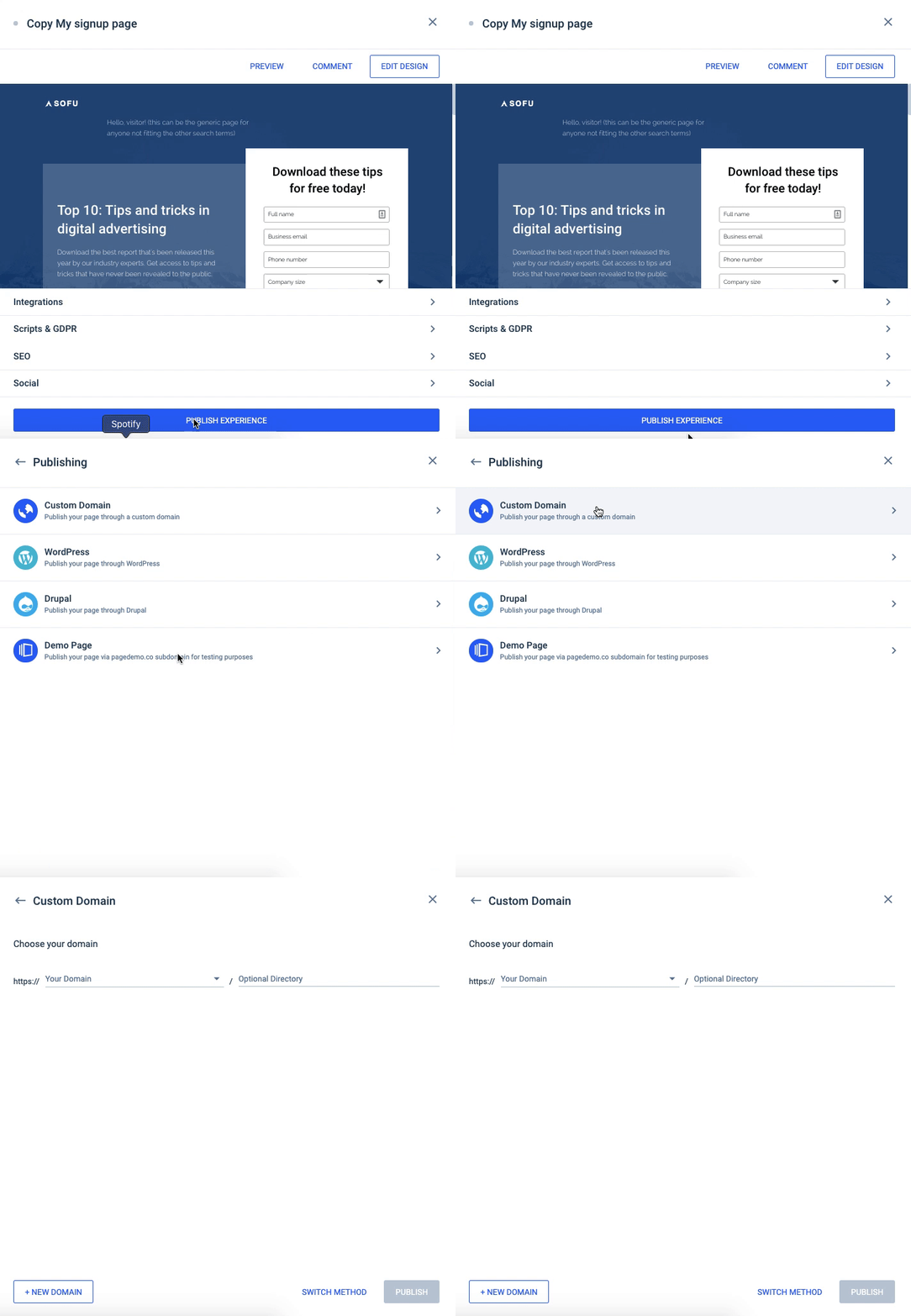
Heck, you don’t even need a developer anymore: simply connect your landing page builder to your domain, and it will publish pages directly to your URL with the click of a button.
Heck, you don’t even need a designer anymore either: simply choose a free landing page template and voìla!
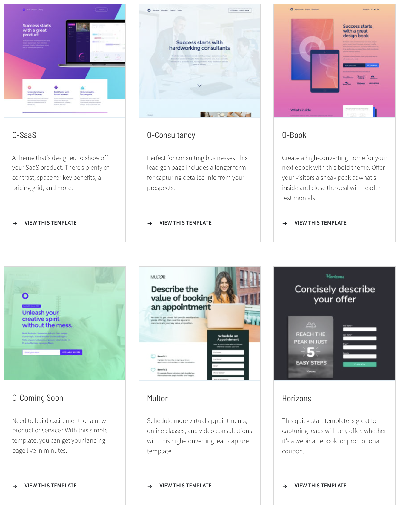
Anyone in the marketing department can strategize, design, publish and test landing pages and offers (Note: we’re not recommending you fire your designer or developer just yet).
Takeaway: With landing pages (and landing page software), you can scale your marketing like never before. More creative output, less coordinated action (and no more annoying the dev guy).
5. Validate and test new business ideas
You can spend time, money, and resources building out an entire website home for a new event, startup, product launch, feature update, or content series. Then see if people like it.
Or you can use a landing page to collect feedback and validate your audiences’ response before you spend all that time and money on an idea nobody cares about.
That’s the entire point of Kickstarter: use a dedicated landing page to promote a prototype or idea, then see if people are willing to pay for it.
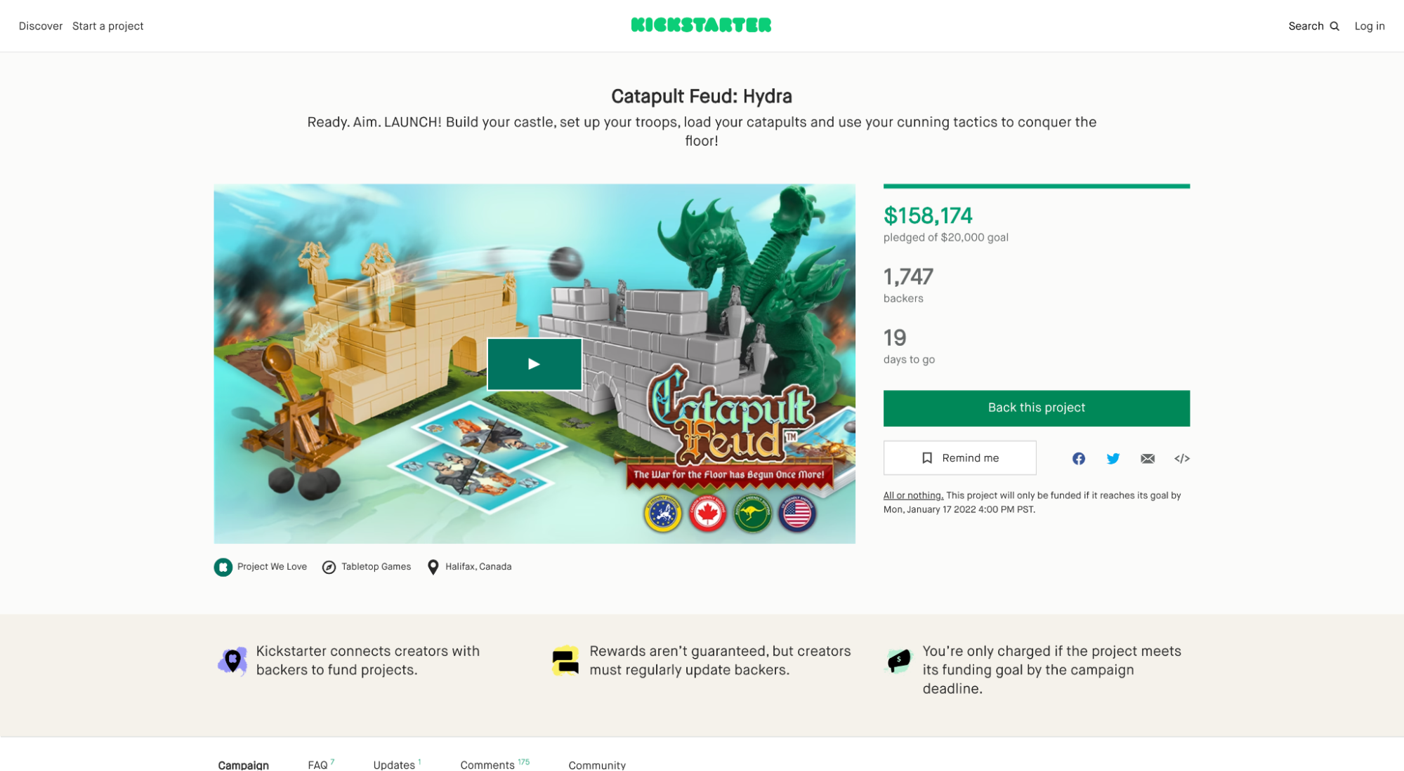
With a landing page, you can:
- Sign up beta users
- Amass a customer list for launch
- Presale products before you create them
- Test messaging, pricing, and design
- Get feedback features
- Move fast (one page, not an entire website)
For example, when Slack first launched (back in 2013), they threw up a quick landing page to introduce users to their beta release (which they called “limited preview release”).
One page. No links. Just an email form:
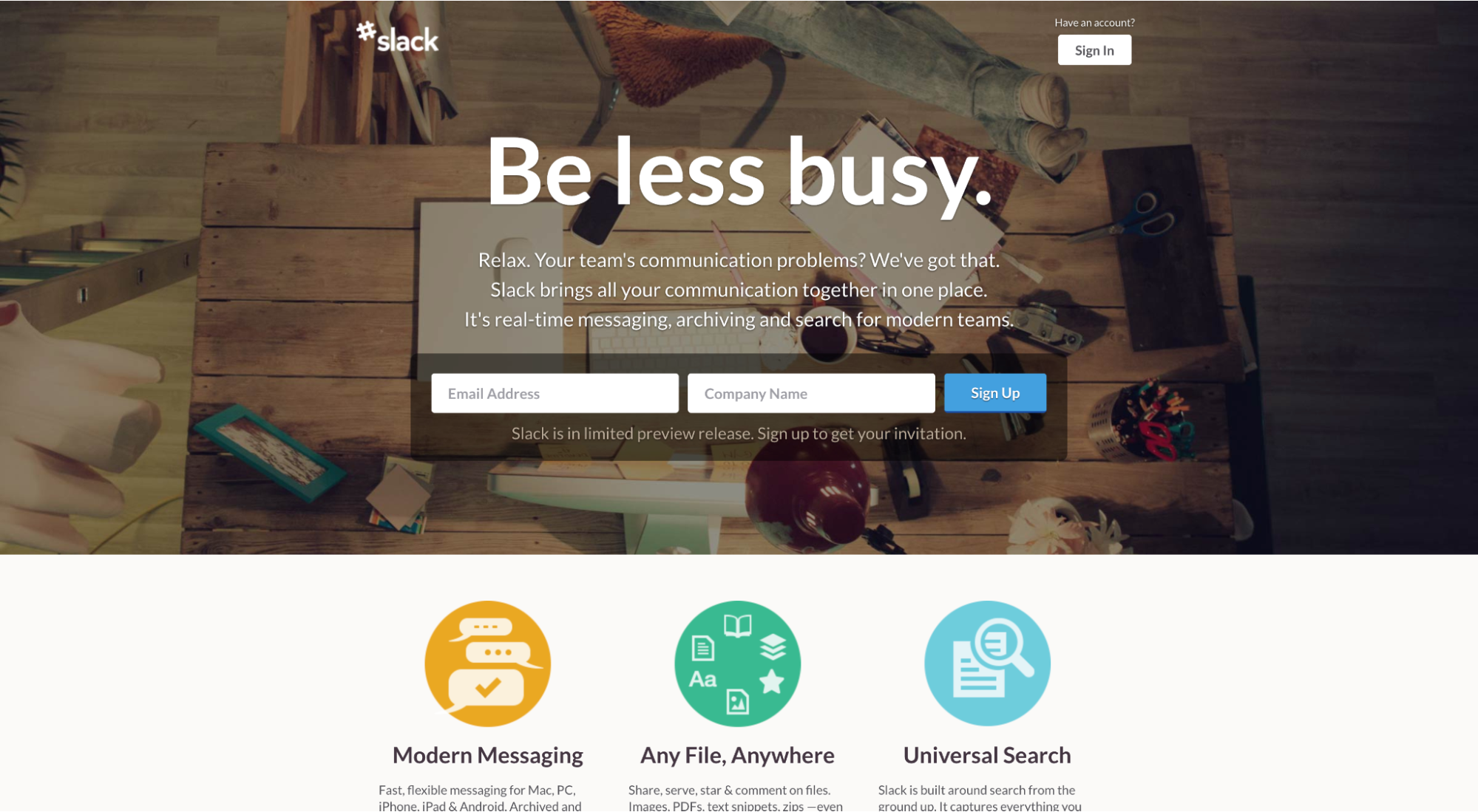
Compare that to today’s website with pricing, product feature pages, uses cases, and more:
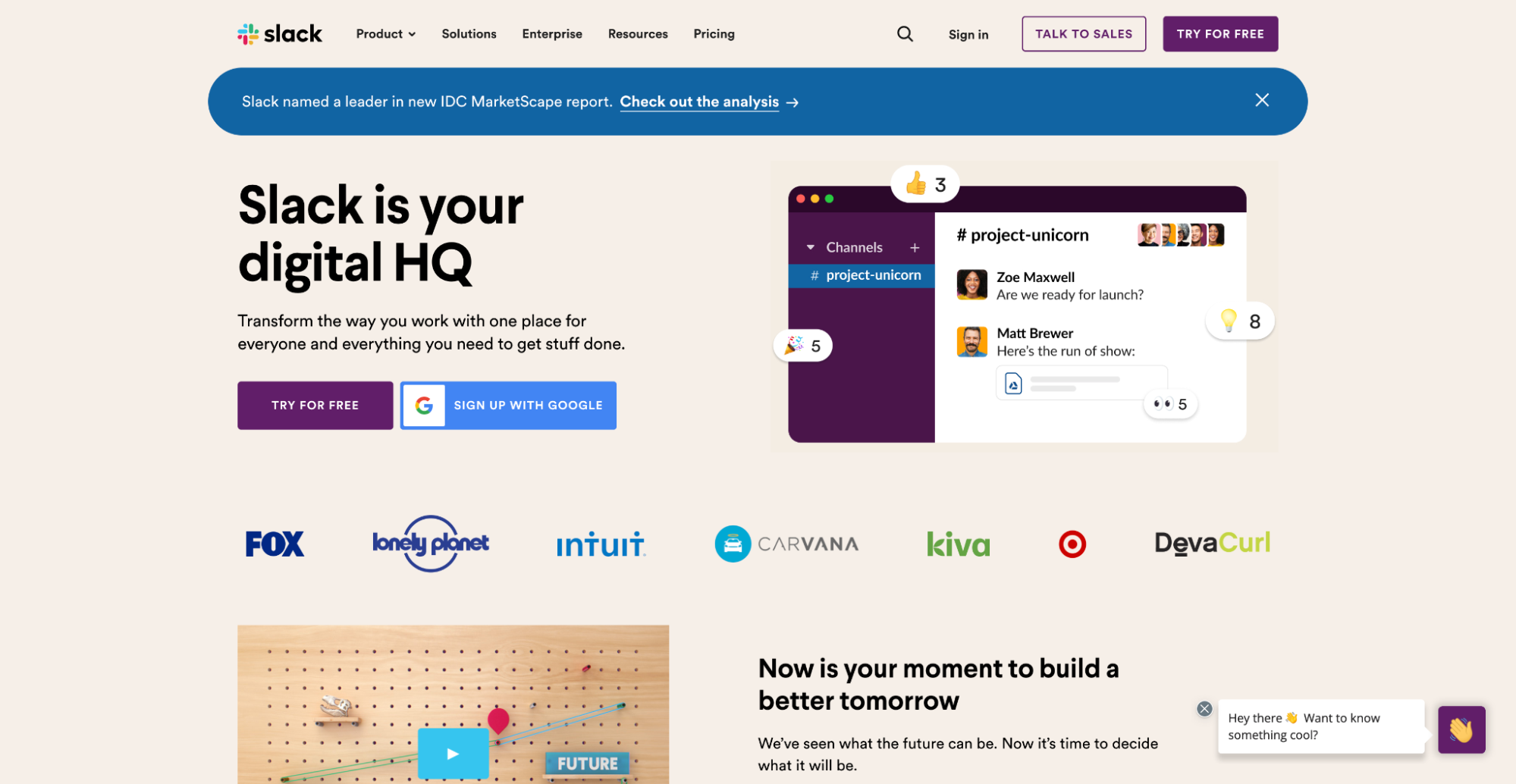
Everything worked out for Slack, but that’s because they validated their idea before building out an entire website. And thanks to their OG landing page, they were able to collect beta users and feedback with speed.
Key components of a good landing page
Ok, you’re warming up to the idea of landing page. What do you have to do?
Well, we’ve written nearly a dozen articles about the different components of a high-converting landing page, so we’re not going to dive too deep here. Instead, we’ll briefly cover the five main components of a good landing page (along with links to their respective articles).
- Conversion design: All great landing pages utilize white space, guiding lines, contextual graphics, structure, and rhythm to draw emphasis to a single conversion goal.
- Unique value propositions: Your value proposition is the clear and concrete benefit someone can expect to receive by converting on your offer. Effective landing pages queue up an irresistible offer.
- Persuasive copy: Landing pages entice visitors to complete a goal by stressing benefits over features. Moreover, landing page copy supports your value proposition by adding much needed context.
- Social Proof: Social proof is when reputable third-parties, like customers, review aggregators or media publishers vouch for your product, service or offer. Think: testimonials, reviews, star ratings, client logos, etc.
- Call-to-action (CTA button): Last, every great landing page offers a single clear and compelling CTA that motivates people to push the button and convert!
Wrapping up
Did I convince you to make landing pages a critical part of your marketing strategy yet?
Great!
Because landing pages make a marketer’s life easier:
- They increase conversions and generate leads
- They increase quality scores and decrease CPA
- They provide a shareable home for all your offers
- They save you time, money and resources
- They help validate new business ideas fast
Next steps? Start exploring the different types of landing pages (there are many). We got you covered:
