


Back in 2004, UX pioneer Peter Morville presented the digital marketing community with the User Experience (UX) Honeycomb:
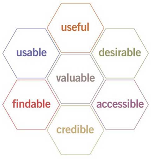
For Morville, the honeycomb served as a tool for advancing the conversation around user experience beyond mere usability. Not to mention it functioned as an invaluable tool for organizing and prioritizing UX design.
Fast forward 20 years and the UX Honeycomb is as relevant today as it was back then.
Today, we use Morville’s honeycomb to inspire our landing page UX design and experimentation—and it hasn’t let us down yet.
Though you can tackle each respective hexagon one at a time, a single hexagon is not sufficient enough to deliver a successful landing page user experience. You need all seven:
- Usefulness: Your landing page must fulfill a need
- Usability: Your landing page must be easy to use
- Desirability: Your landing page must use images, brand, and design to evoke emotion and positive feelings
- Findability: The content on your landing page must be easy to navigate and locate
- Accessibility: Your landing pages need to be accessible to people with disabilities
- Credibility: Your landing page must provide proof of claims so visitors believe you
- Value: Your landing page must deliver value to your customers and you (i.e. revenue and profit)
In this article, we’re going to show you how to create a high-quality, high-converting landing page user experience by mastering the seven principles of Morville’s UX Honeycomb, complete with tactics and examples for each.
Get brand new landing page strategies straight to your inbox every week. 23,739 people already are!
What is a landing page UX anyways?
Quick sidebar: Before we jump into Morville’s hexagons, let’s first explore a single definition of UX that we can all agree upon.
When it comes to landing pages, UX refers to how your potential customers use your landing pages and interact with them, and, ultimately, how those interactions make them feel about choosing your brand over others.
From design to messaging to functionality, your landing page UX is the sum total of every interaction a visitor has with it. More crucially, UX isn’t just the inputs that go into creating it; it’s the outcomes as well (i.e. conversions, leads, sales, revenue, profit).
What does a great UX look like to your landing page visitors?
Absolutely nothing.
A great UX goes unnoticed by the conscious mind.
It just is.
But crafting an effective landing page user experience is anything but unnoticeable.
It’s conscious, deliberate, and informed by a prescient understanding of your customers' needs.
The principles of landing page UX
Now that we got that out of the way, let’s jump into the fundamental principles of an effective landing page UX.
Below, we’ll explore each hexagon of Morville’s UX Honeycomb, along with the explicit tactics you can deploy to master each.
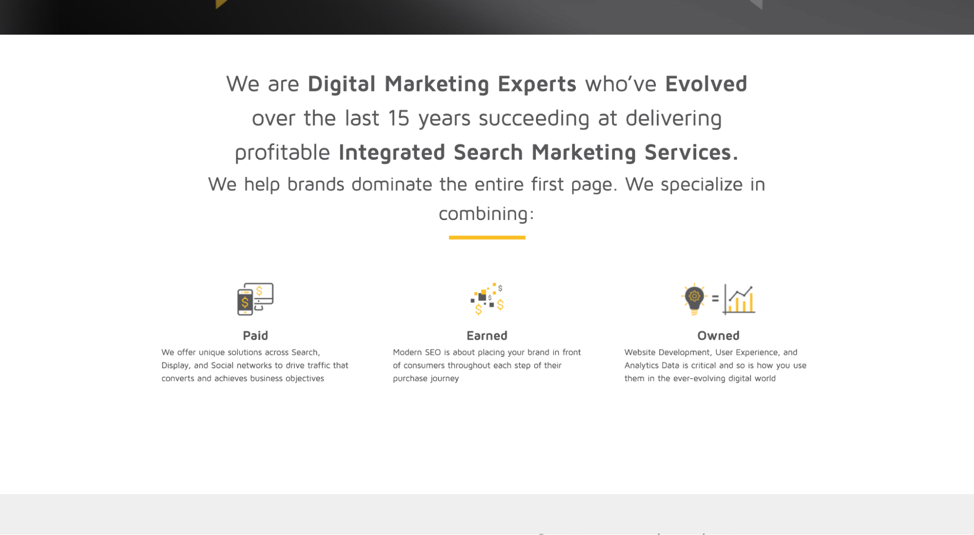
1. Landing page usefulness
First and foremost, a quality landing page UX should help visitors fulfill a specific need.
It's your job to anticipate and accommodate those needs, then satisfy them.
This is why the best landing page UX designers know their customers the best. After all, UX is born out of a deep understanding of the user.
How do you make sure your landing page has maximum utility?
Four ways:
- User behavior data
- Message match
- Conversion goal
- Call-to-action (CTA)
Identify visitors’ needs with UX tools and analytics
To better understand your visitors’ needs, directly from the landing page, you’ll need tools to help you collect user behavior data.
Quality UX isn’t informed by intuition or gut feeling; it’s informed by credible data.
We wrote an entire article on landing page tools, including the tools that can help you gather the data, complete with links to our favorite tools based on budget: 18 Best Landing Page Tools for Increasing Conversions.
But let’s cover the essentials here:
- Google Analytics: It’s free, and it provides adequate engagement data like bounce rate, time on page, page speed, and performance by channel. Also, you can set up Google Goals to track landing page conversions.
- Heatmaps: Heatmaps show you what your visitors spend most of their time looking at on your landing page. They’re a great tool for assessing the effectiveness of your design and page layout.
- Session recordings: User recordings actually screen record your visitors' reactions through their computer camera as they navigate your landing pages. Session recordings are a great (and quick) way to gather honest, unfiltered feedback about your UX.
- Form analytics: Form analytics tracks and measures users as they navigate your forms. Landing page forms (and form UX) is a beast of its own. But knowing which parts of your form visitors get stuck on the most can save you a lot of money (millions if you’re Expedia).
- Landing page builder: Landing page builders track conversions, but they also make A/B testing easy. And you can’t improve your UX without A/B testing (more on this later).
Message match campaign with landing page
Message matching is when you match your ad copy, offer, and messaging with your landing page copy, offer, and messaging.
1:1 ratio, ad to lander. Simple.
Aside from creating a seamless experience from campaign message to campaign destination, message matching ensures that your ads or campaigns drive relevant traffic to your landers (and keep irrelevant traffic away).
In other words, the only way to ensure that 100% of your landing page visitors have a need that you can fulfill is to communicate that need in the ad or campaign, then follow through on your landing page.
Think about it: If your campaign or ad copy describes a clear and compelling benefit, and your potential customers click on it, that’s like them raising their hands and shouting, “I have this problem, and I’m interested in your solution!”
How should your message match? The following elements should all look, feel, and say the same:
- Design
- Headline
- Subheading
- Copy
- Offer
- CTA
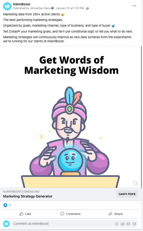
For example, check out our ads hyping up our good friend, Zoltad (yep, like Zoltar). He has the insight to tell you your best marketing fortune:
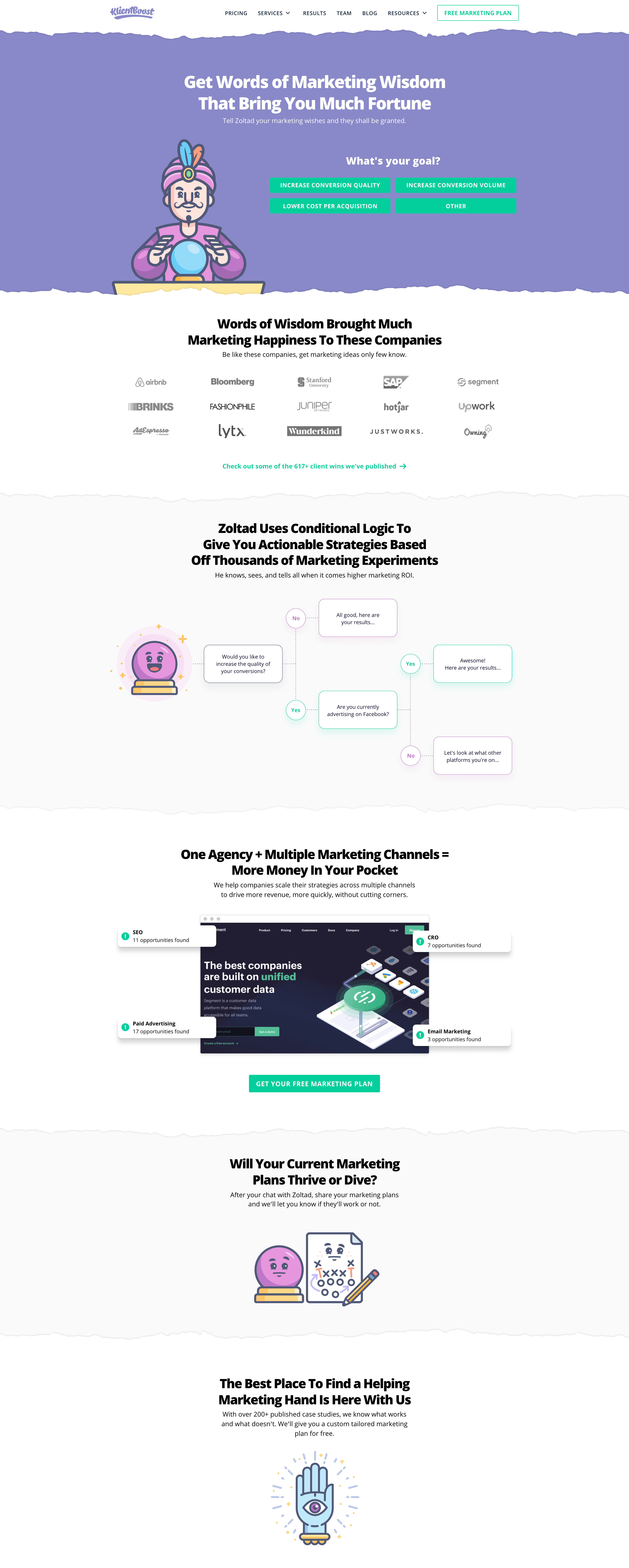
Now check out the campaign landing page:
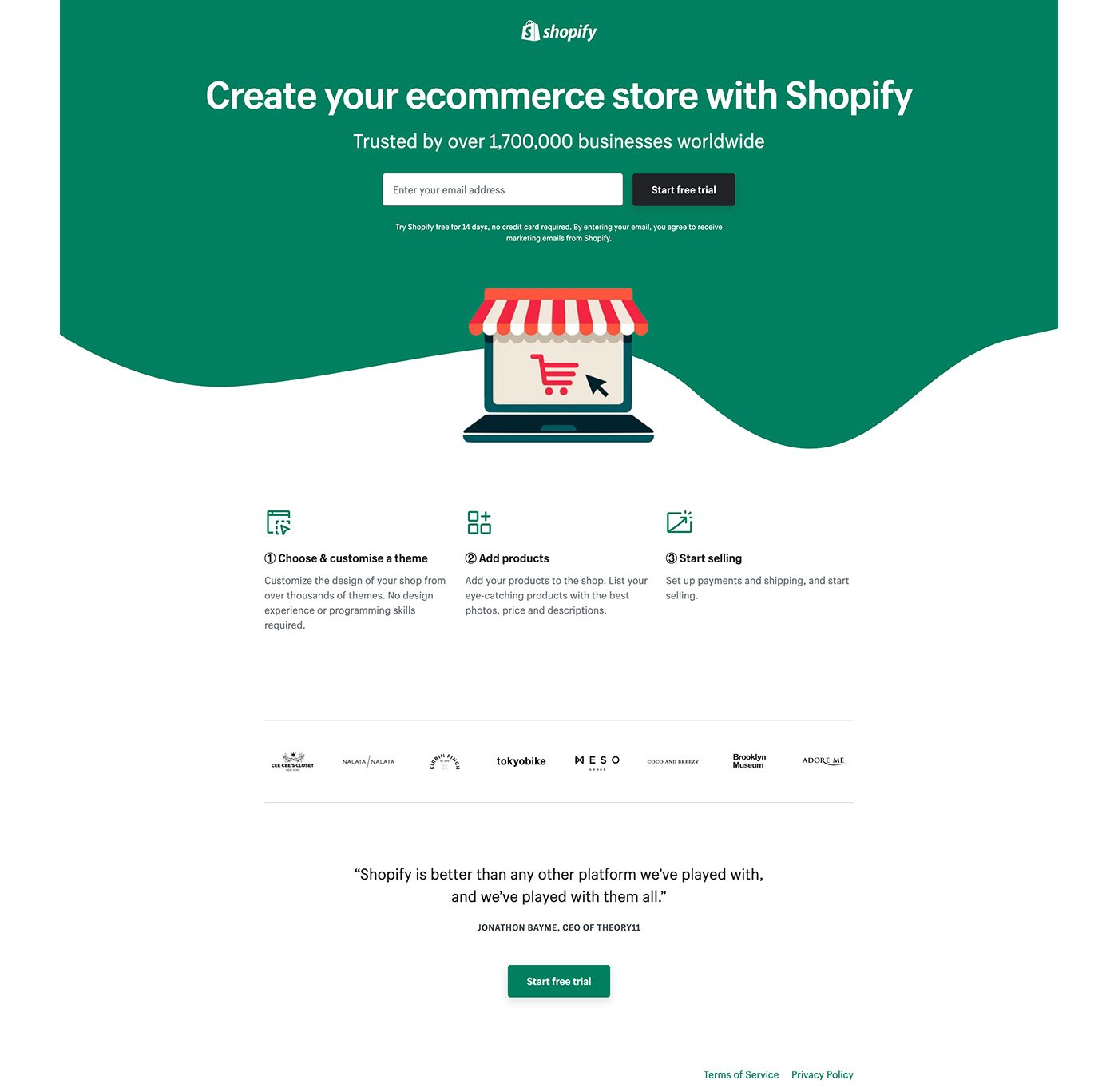
Solve a single need with a single conversion goal
A good landing page user experience delivers on the promise you made in your ad or campaign, but that’s it.
For example, if the call-to-action (CTA) in your ad or campaign creative says, “Book a demo,” then your landing page shouldn’t also provide options to start a free trial, download a buyer’s guide, and subscribe to a newsletter.
Too many conversion goals. Too many distractions.
Stay focused: Stick to one landing page conversion goal. That’s it.
Research has shown that adding a second conversion goal can decrease conversions by 266%.
For example, this Shopify landing page offers only one conversion goal: Start a free trial.
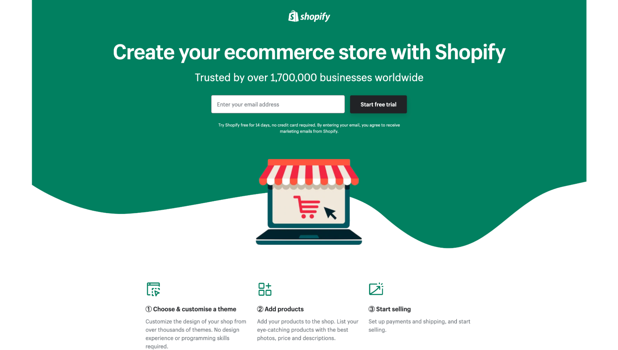
Be like Shopify.
Provide a clear, concise and compelling call-to-action (CTA)
Now that you’ve narrowed your CTA down to one, how can you make it click-worthy?
A quality CTA confidently communicates a clear benefit, uses strong value-based verbs like get, discover, start, join, or receive, and handles any last minute objections.
Most importantly, it closes the door on the journey your ad or campaign opened by reminding visitors that the need they want fulfilled sits on the other side of a click.
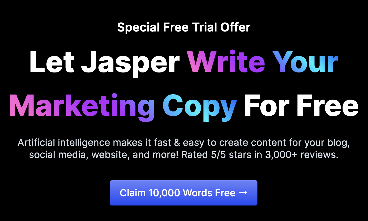
For example, no one does CTA copy better than Jasper.ai (formerly Jarvis):
2. Landing page usability
When most think about user experience, it starts and stops with usability.
That’s because, without simple functionality or ease of use, nothing else matters.
When it comes to usability, cognitive load reigns supreme.
Cognitive load refers to the amount of brain capacity we can muster at any one time. When it comes to landing page usability, your goal is to ensure your visitors cognitive load never gets overloaded by dysfunctional, disruptive, or unintuitive features.
How do you do that?
Three ways:
- Jakob’s Law
- Page load speed
- Mobile responsiveness
Remember Jakob’s Law of UX
Jakob’s Law, a founding principle of user experience design, states the following:
“Users spend most of their time on other sites. This means that users prefer your site to work the same way as all the other sites they already know.”
In other words, your landing page visitors will take their cumulative experiences and transfer those expectations onto your landing pages.
That means your landing pages should feature familiar layouts and functionality, and empower visitors to continue to use a similar version of what they already know.
- Logo in left corner
- Navigation in header (if applicable)
- Social proof/credibility
- Call-to-action in header
- Visual hierarchy (headlines, subheadings, paragraphs)
- Consistency throughout
Bottom line: Don’t get cute. Make your landing page visitors feel in control.
For example, is it any surprise that every SaaS brand known to man uses a “Free trial” CTA on their landing page? No, because the freemium offer is a mental model that people have come to expect.
Increase page load speed
A slow site is an unusable site, especially on mobile.
If your landing pages don’t load within 1-3 seconds, get to work.
According to Google, the probability of a bounce increases 32% as page load speed goes from 1 second to 3 seconds. Worse, on mobile (which makes up over 50% of internet traffic) for every second delay in page load speed, conversions can decline by 20%.
That, and slow-loading websites cost retailers over $60 billion in lost sales each year.
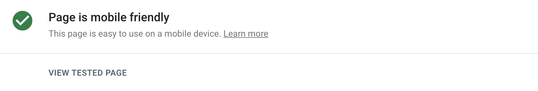
To test your landing page load speed, use Google’s free PageSpeed Insights tool and make sure it passes their Core Web Vitals test on both desktop and mobile.
Optimize for mobile friendliness
If your landing page user experience isn’t optimized for mobile users, don’t run mobile campaigns or ads to them. Period. Not unless you want a 100% bounce rate.
A quality landing page UX is quality on any device, whether a desktop, tablet, or mobile.
When it comes to mobile landing pages, heed the following:
- Fast loading
- Pinch to zoom
- Big CTA buttons
- No navigation (or sticky nav with CTA button only)
- Small blocks of text
- Fewer words (i.e. prune for mobile)
- No smaller than 16px fonts
- Less functionality (i.e. tabs, toggles, swipes)
- Non-intrusive pop ups (including forms)
- Segment mobile traffic to mobile optimized landers
- Make phone numbers clickable
- Pass Google’s Mobile Friendly Test
Don’t make people think…about your forms
Not every landing page will have a form embedded on it. For example, click-through pages don’t include forms at all, only lead capture pages do. But even still, click-through pages lead to a form at some point, whether via a checkout page or an account registration page.
Bottom line: Forms are unavoidable, and when poorly executed, they can cause a UX nightmare.
Good news: We wrote an entire article on landing page forms titled “17 Key Elements of A Landing Page Form.” So we won’t go deep here.
But let’s cover the basics.
First, a quality form UX eliminates friction by reducing cognitive load. It doesn’t make people think.
That means:
- Auto-populating fields using browser cached data
- Auto-formatting numeric values like dates and phone numbers so visitors don’t have to guess
- Using conditional logic for long-forms so visitors don’t have to engage with unnecessary fields
- Placing labels on top of form fields, not within, so visitors don’t forget what to type
- Using radio buttons and checkboxes in place of dropdowns as much as possible.
But above all, a good landing page UX makes committing to a form feel easy and less threatening.
And the best way to do that is with a multi-step form (AKA the Breadcrumb Technique).
A multi-step form breaks up longer forms into 3-4 linear steps, each step with 1-3 questions. Most importantly, a multi-step form asks a non-threatening question first, and leaves the most intimidating questions (i.e. name, phone, email) for last.
Why? The multi-step format taps into behavioral psychology and our impulse to finish something that we’ve started. By making the form easier to start, ultimately, it makes it easier (or more desirable) to finish.
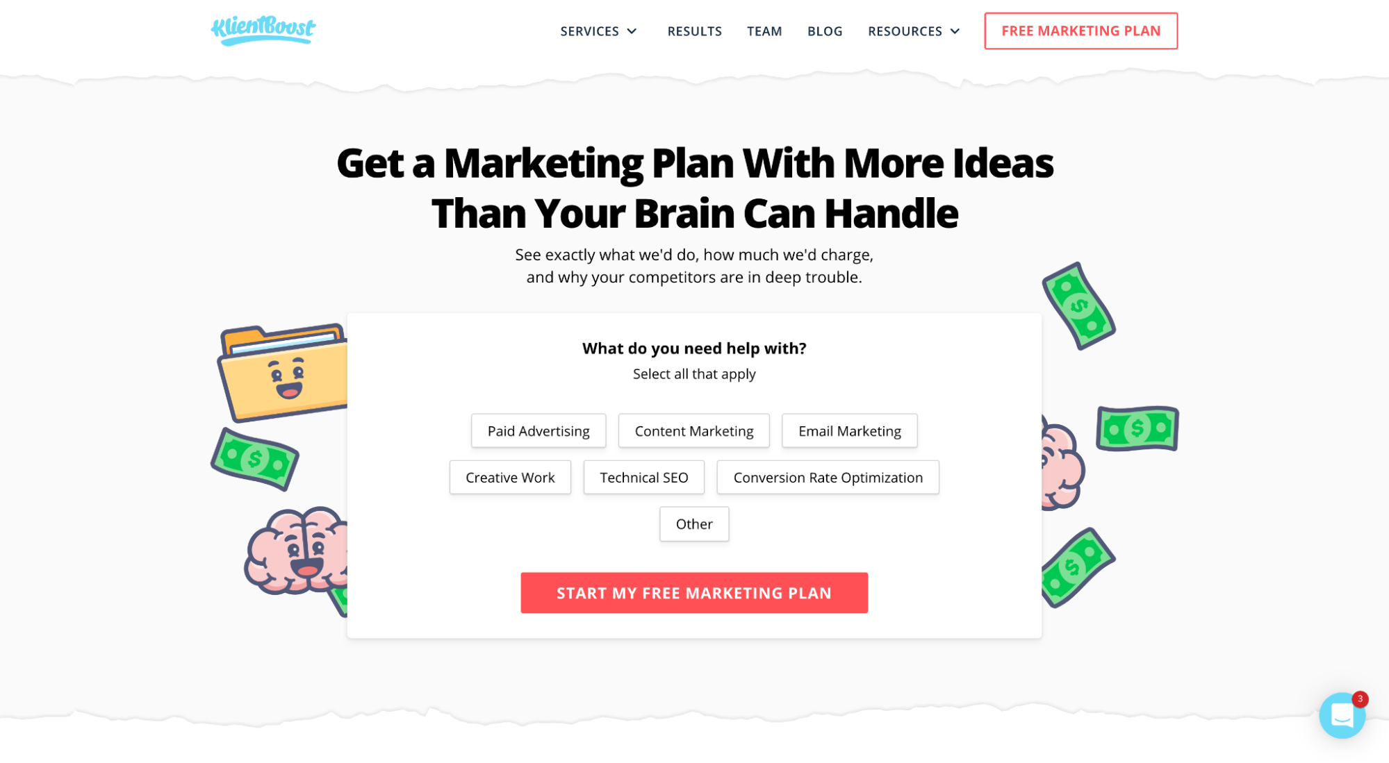
For example, check out our multi-step form on our free marketing plan page:
Here’s what each step in the form looks like broken out:
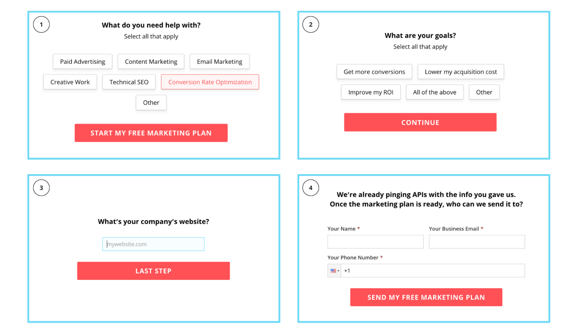
Notice how we ask a softball question first and second, then ask for an email on the third phase?
Not only do multi-step forms make for effortless UX, but they also increase conversions.
3. Landing page findability
Can visitors easily find what they’re looking for when they land on your page?
It’s not enough just to place information on a page; a good user experience uses design to make the most important information pop off the page.
How do you do that?
Three ways:
- Attention ratio
- Visual distinction
- Information hierarchy
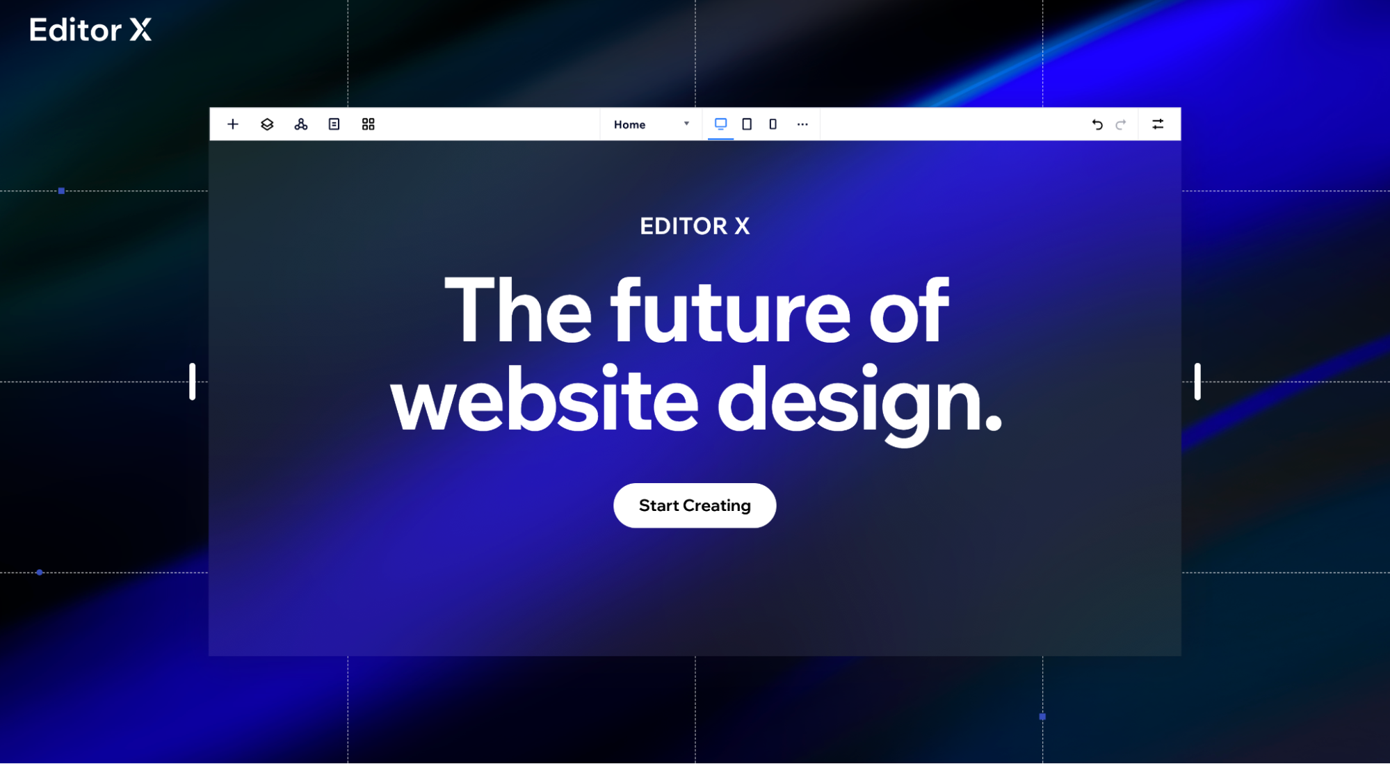
Maintain a 1:1 attention ratio
Attention ratio, first coined by Unbounce’s founder Oli Gardner, refers to the number of links on a landing page compared to the number of conversion goals.
In other words, for an optimal user experience, if you only have one conversion goal (which you should), then you should only have one link (the link to complete that conversion goal).
That means removing any unnecessary links that could distract visitors and divert them from accomplishing their goal, like navigation links, footer links (with the exception of legal links), or social media links.
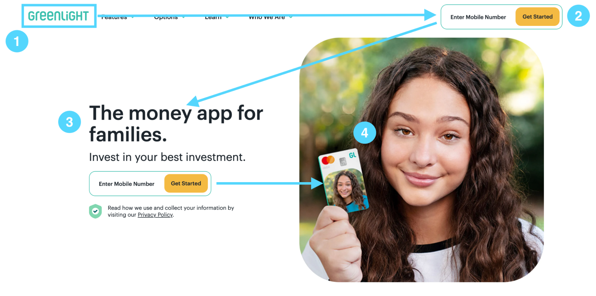
For example, notice how this Editor X (Wix) landing page includes only one link (not counting the terms and service and privacy policy footer links)?
Create visual distinction
Using design to maneuver your visitors’ gaze, draw attention to important elements, and reduce cognitive load are the three cornerstones of landing page UX.
How do you do it?
- Sections: People perceive information within the same boundary as grouped together. Use sections accordingly.
- Patterns: Not patterns as in flowery sequences, but patterns as in repeatable style and design choices, like using a red background for every CTA section, or using underlined text for anchor links but green buttons for CTAs. Make your landing pages learnable.
- White space: White space is an implicit directional cue. The lack of content surrounding your content draws attention to it. Like a flowing river, white space guides your visitors’s gaze throughout your landing page.
- Inverted triangle: The inverted triangle of design places the most important information on top (like a headline), then follows with more granular details in the shape of a triangle (like a subheading followed by a CTA).
- Button contrast: The color of your buttons matters much less as the color contrast of your CTA button. For example, red might convert best on a white background, but it won’t convert best on a red background.
- Formatting: Small blocks of text, bullet points, highlighted text, and colors, when used consistently, makes landing page content more digestible and skimmable.
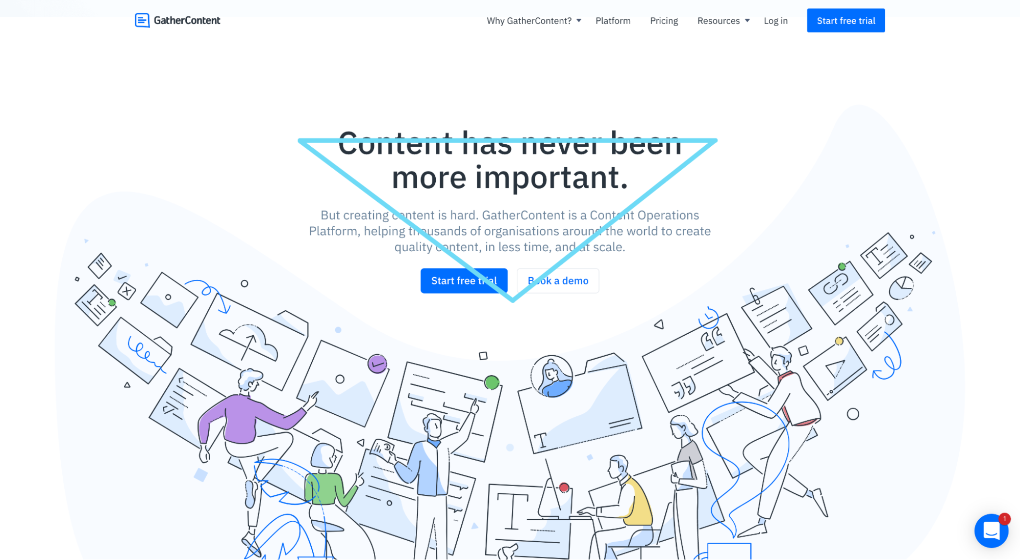
For example, this GatherContent landing page makes use of the inverted triangle, button contrast, and white space to draw your attention to their call to action:
Use an F-shaped or Z-shaped information hierarchy
Information hierarchy refers to the structure of your content, from top to bottom.
More specifically, the F and Z refer to the reading (or skimming) patterns of website users.
According to eye-tracking software, an F-shaped reading pattern is the most common way people skim web pages.
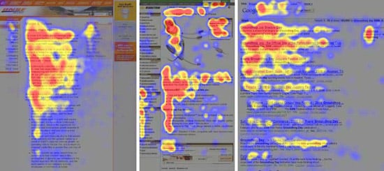
In a close second, the Z-shaped reading pattern:
To make your landing page content eminently more digestible, structure your layout the way people are going to read it and place your most important content at the points of the letters.
Use an F-shaped structure for text-heavy landers.
User a Z-shaped structure for image-heavy landers.
4. Landing page desirability
Can your landing page’s user experience actually make people feel emotionally closer to you? And, as a result, positively influence their purchase decision?
Absolutely.
Design, brand, imagery, colors, and offer all coalesce to evoke certain emotions in your visitors.
It’s up to you to ensure those emotions remain positive (or negative if that’s what you need).
How do you do that?
Three ways:
- Conversational copy
- Emotional web design
- Irresistible offer
Use conversational copy that visitors can relate to
Nothing makes people feel more uncomfortable than a pretentious writing style.
To engage your visitors on a human level, use a conversational writing tone. It disarms your visitors, builds trust, makes them feel like you’re talking to them (not at them), and creates a sense of intimacy.
How do you do it?
- Use 2nd person point of view
- Write like you talk
- Incorporate customers’ words
- Be specific
- Use contractions
- Write short, choppy sentences
- Eliminate industry jargon
- Eliminate flowery language
- Break grammar rules
- Eliminate the verb “to be” in all its forms
- Use strong verbs (discover, explore, etc.)
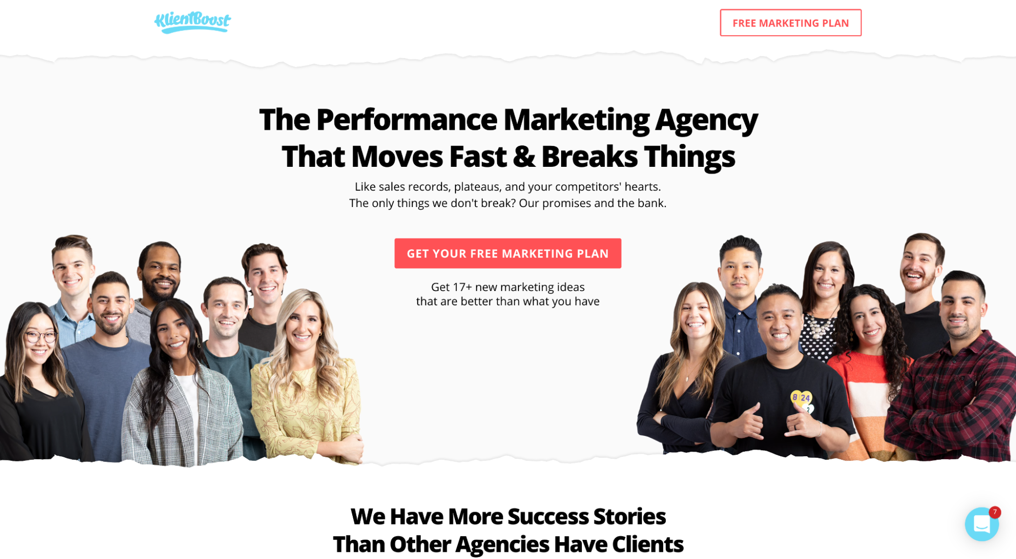
For example, notice the conversational tone we use on our PPC landing page:
Now juxtapose that with the vague, robotic, and passive style of this PPC agency:
Talk like a human. Period.
Learn more about how to write your landing page copy here.
Evoke emotion with design
The truth: Though we marketers like to think people buy based on rational, logical decisions, and that persuasive copywriting can convince people to buy from us, most of the time, emotion—even subconscious emotion—is what influences our decisions.
To be clear, when we say emotion, we’re not talking about moving people to tears; we’re talking about making people feel something positive about your brand, directly from the landing page.
What does emotional design look like?
Emotional design engages visitors on three different levels: Visceral, behavioral, and reflective.
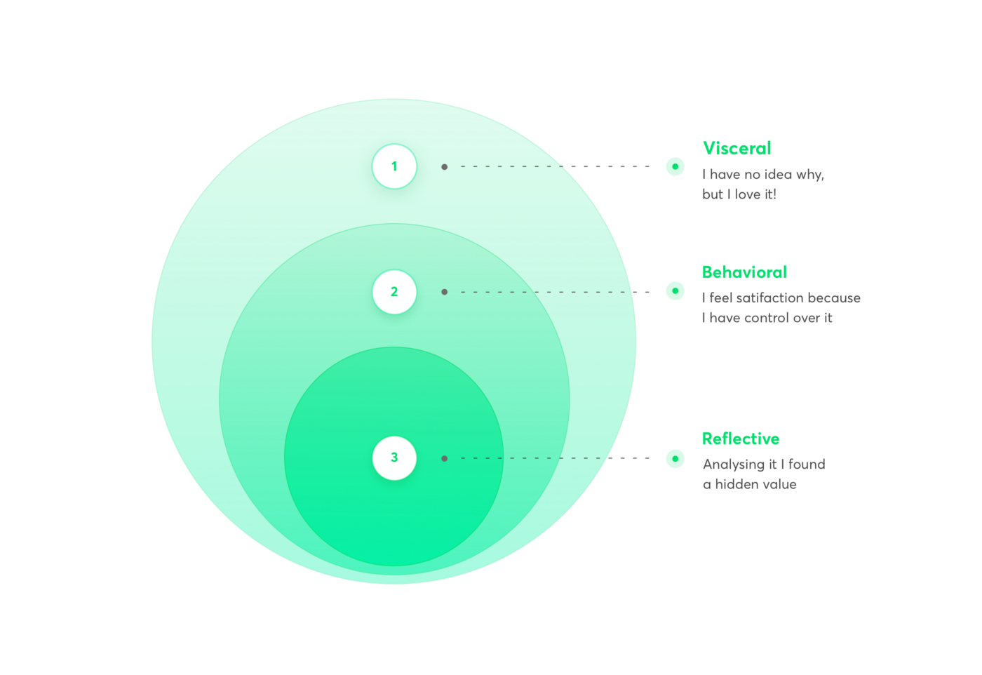
How do you do that? Here are a few ways:
- Minimalism: An uncluttered design creates an effortless visceral first impression. Keep it simple. Let it breathe.
- Familiarity: Using the same brand codes as the rest of your communications can help build a sense of familiarity and comfort.
- Color: Color psychology may sound like pseudo-science, but over time, humans have learned to assign different meanings to different colors. For example, yellow represents optimism and happiness, whereas red might represent danger, anger and violence (or love and romance). Use color to make people feel.
- Control: See Jakob’s Law. Don’t get cute. Make users feel in control of their experience.
- Images: A picture says 1,000 words. Use images that reflect the emotions you want to convey.
- Delight: Instant gratification. Can your visitors convert on your CTA immediately? Or do they have to travel through unnecessary hoops? If not immediately, do you send them to a thank you page with instructions on what to epic next? Don’t make them wait.
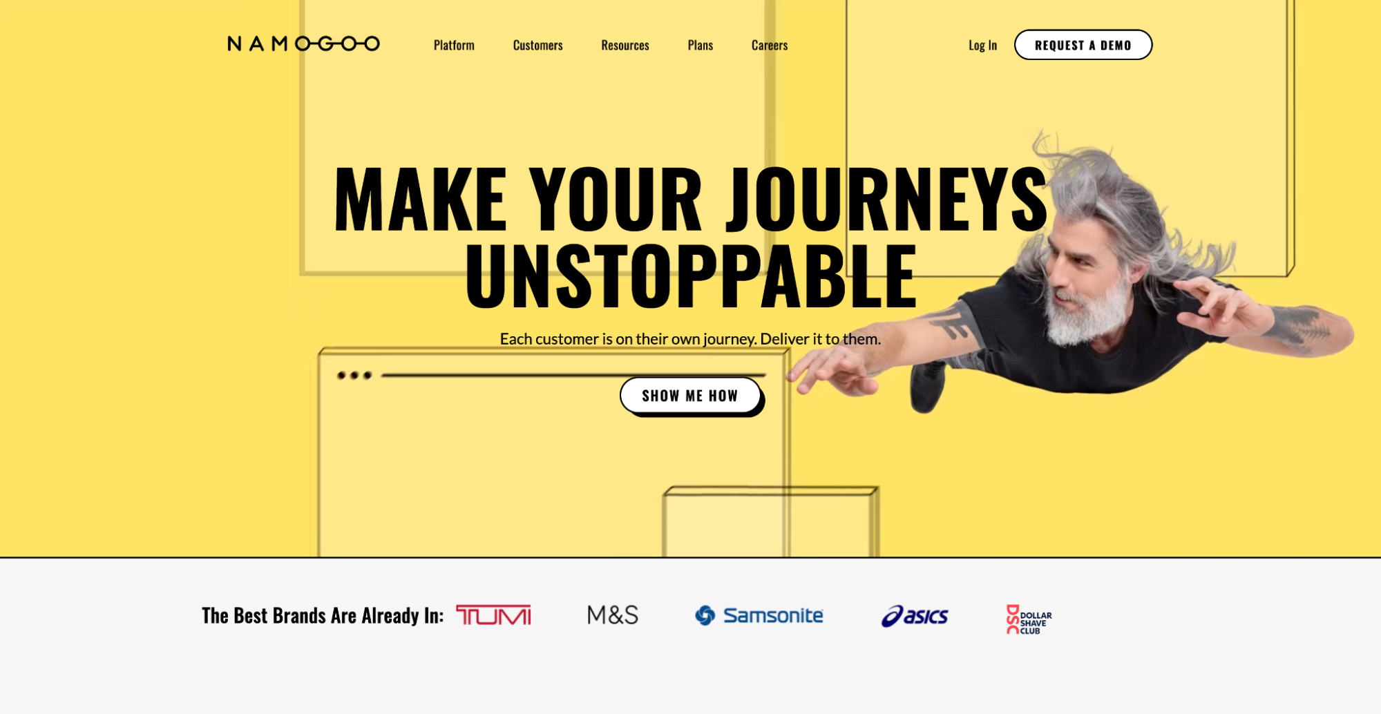
Let’s look at an example of two very different emotions evoked by two different landing pages.
Notice the difference in mood and emotion between Nasa’s climate change website and Namogoo’s landing page?
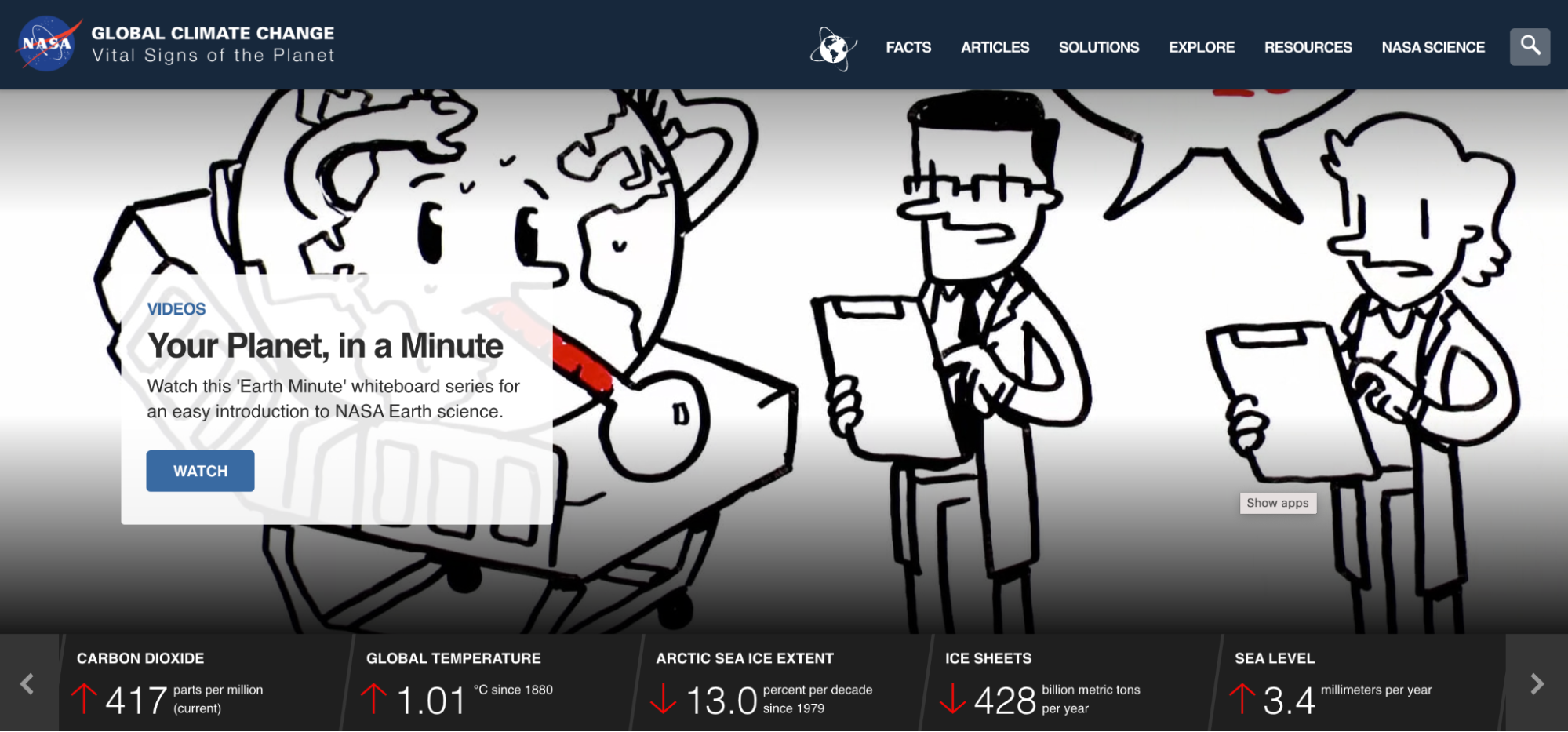
For Nasa, color, imagery, and minimalism coalesce to create a feeling of anger and disgust.
For Namogoo, color, imagery, and minimalism coalesce to create a feeling of happiness and optimism.
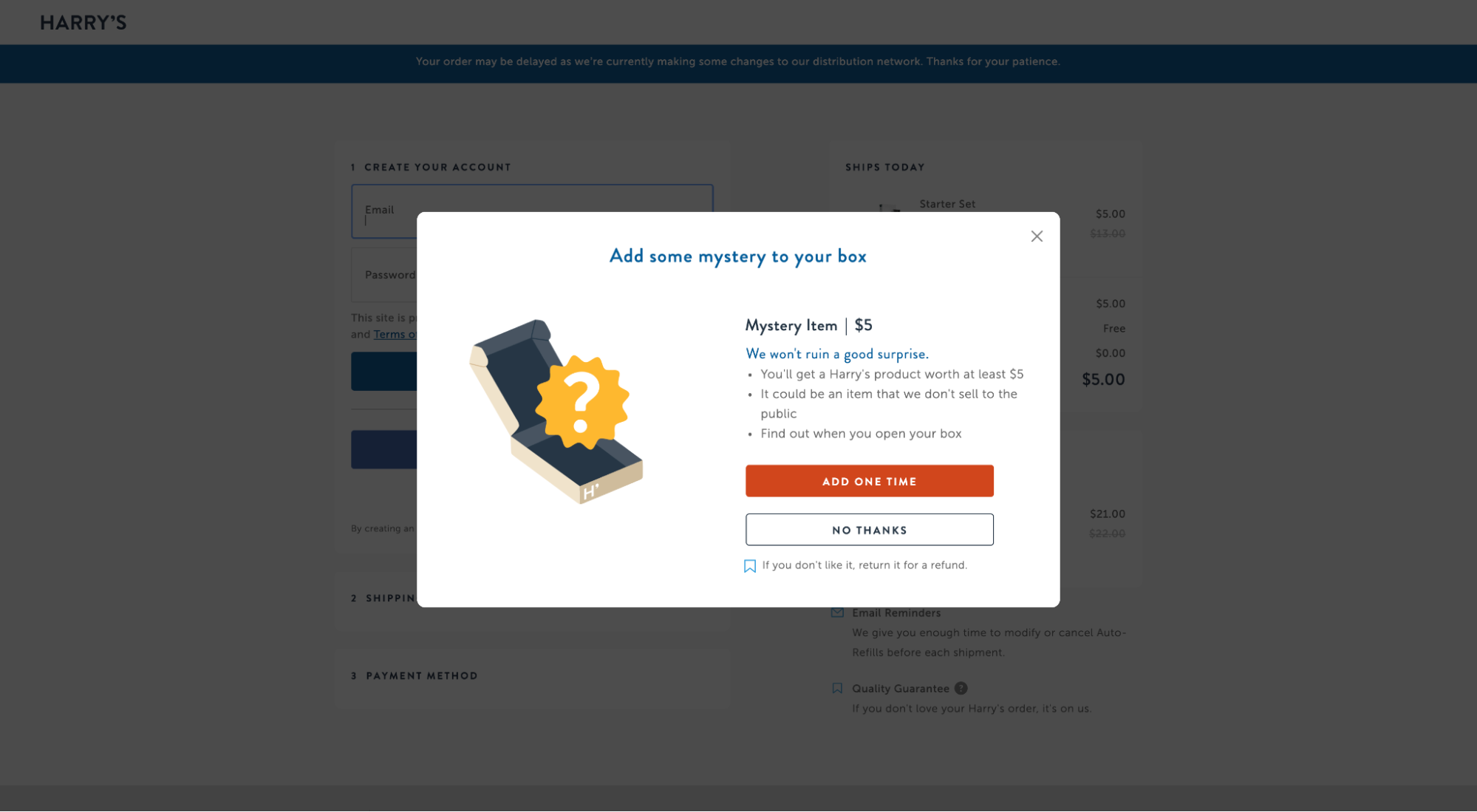
One more example, this time from Harry’s Razors, who knows how to increase brand affinity from the landing page UX by delighting their customers with a surprise gift:
Make an irresistible offer
This should go without saying, but if you want to increase the desirability of your brand and products directly from your landing page, add a little oomph to your offer with an incentive.
Incentives are scientifically proven to affect human decision-making.
How can you sweeten the deal, so to speak?
Some of the most desirable offers include one or a few of the following incentives:
- Price-based: Buy one get one (BOGO), free shipping, bundle discounts, freebies, free trials
- Scarcity: Limited supply, inventory counters, out of stock labels, exclusivity
- Urgency: Offer deadlines, discount hours, countdown timer
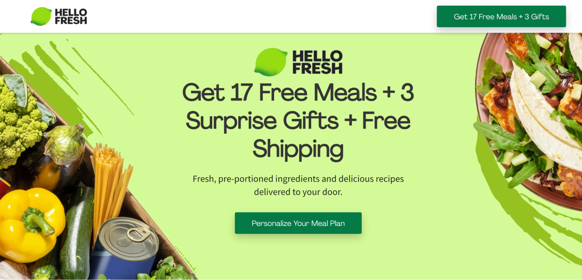
For example, Hello Fresh ups the ante by including 17 free meals, 3 surprise gifts, AND free shipping.
5. Landing page credibility
If your landing page visitors can’t trust and believe you, then how can they possibly have a quality user experience?
They can’t.
This is why credibility is a fundamental pillar of landing page UX.
How do you add credibility to your offer?
Social. Proof.
Sprinkle social proof everywhere
Social proof refers to the psychological phenomenon wherein people assume the decisions of others who came before them.
For example, when we’re unsure which brand to choose, we look to see what brand other people in our same situation chose, then follow suit.
Good news: We wrote an entire article on landing page social proof, complete with definition, best practices, and examples. But let’s explore the basics here.
First, why is social proof so important?
- 91% of millennials trust reviews as much as recommendations from friends and family
- 83% of people trust reviews over advertising
- Testimonials can increase conversion rates on sales pages by 34%
- 66% of customers said the presence of social proof increased their likelihood to buy!
To add credibility to your offer, and to make for a more pleasant user experience, use social proof generously.
How?
Landing page social proof comes in all shapes and varieties:
- Reviews
- Testimonials
- Star ratings
- Case studies
- Client logos
- Trust badges
- Customer stats
- Years in business
- Number of clients
- And so on…
And you can place social proof virtually anywhere on your landing page. Though we recommend starting with the following:
- Above the fold
- Click trigger (near button)
- In its own section
- Close proximity to benefits/claims
- On forms
- On registration pages
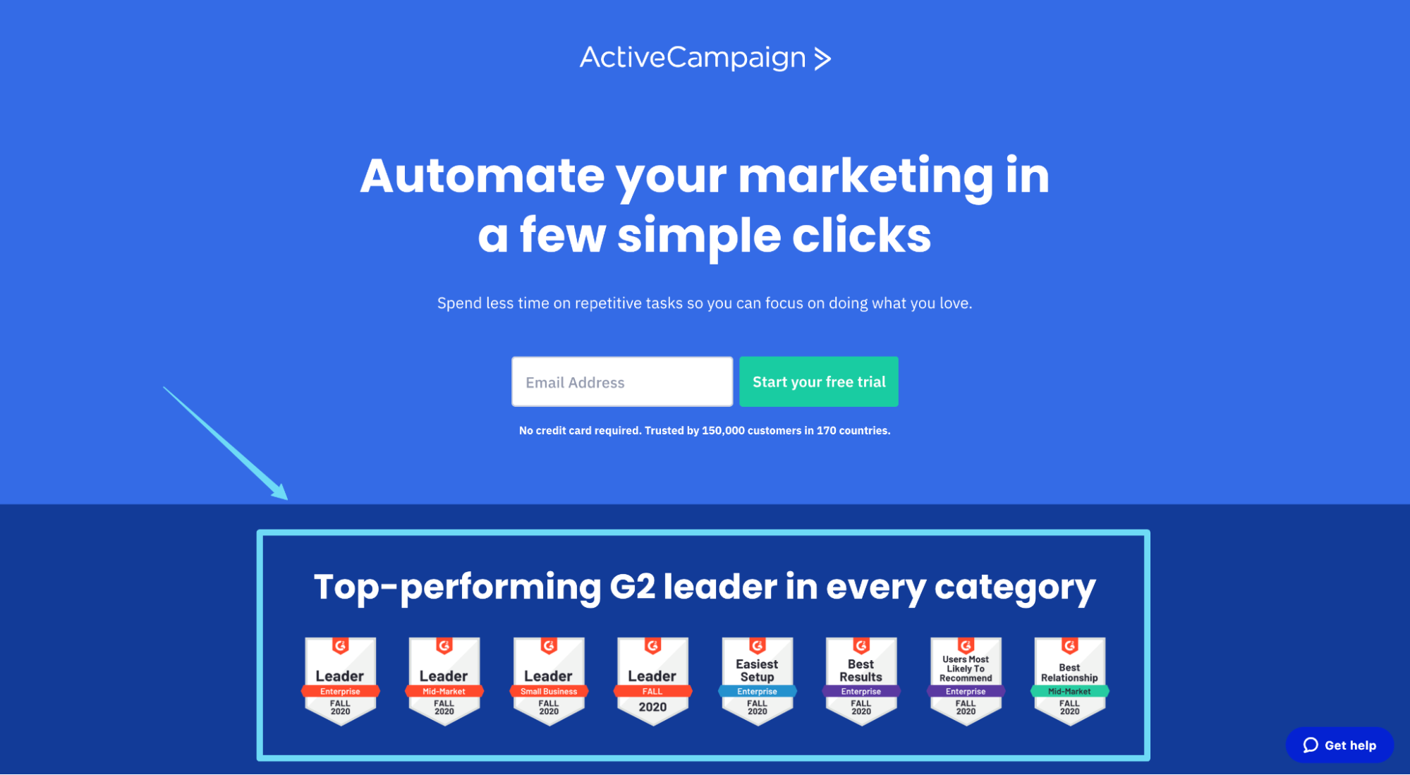
For example, ActiveCampaign features social proof in the form of third-party award badges:
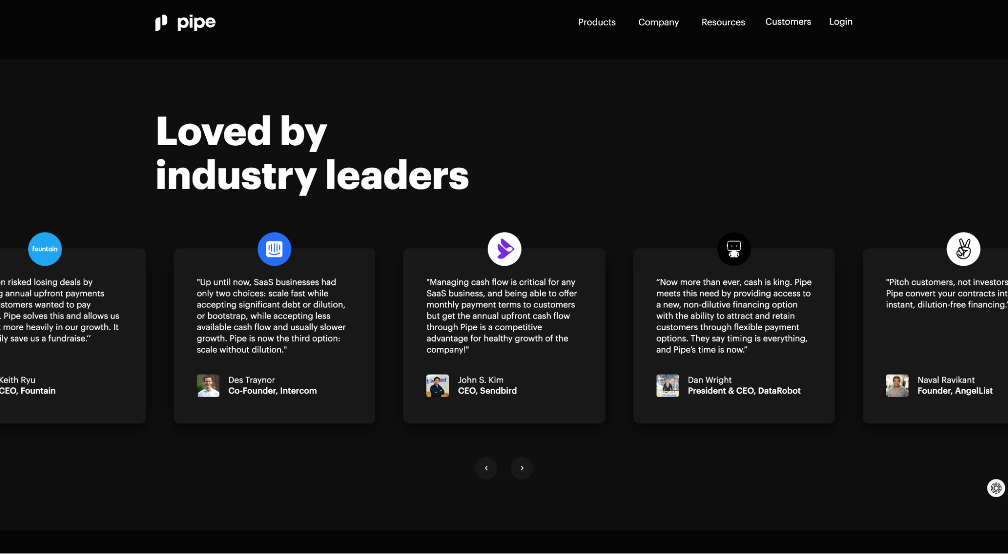
Pipe features social proof in the form of testimonials from some of the biggest names in the startup world:
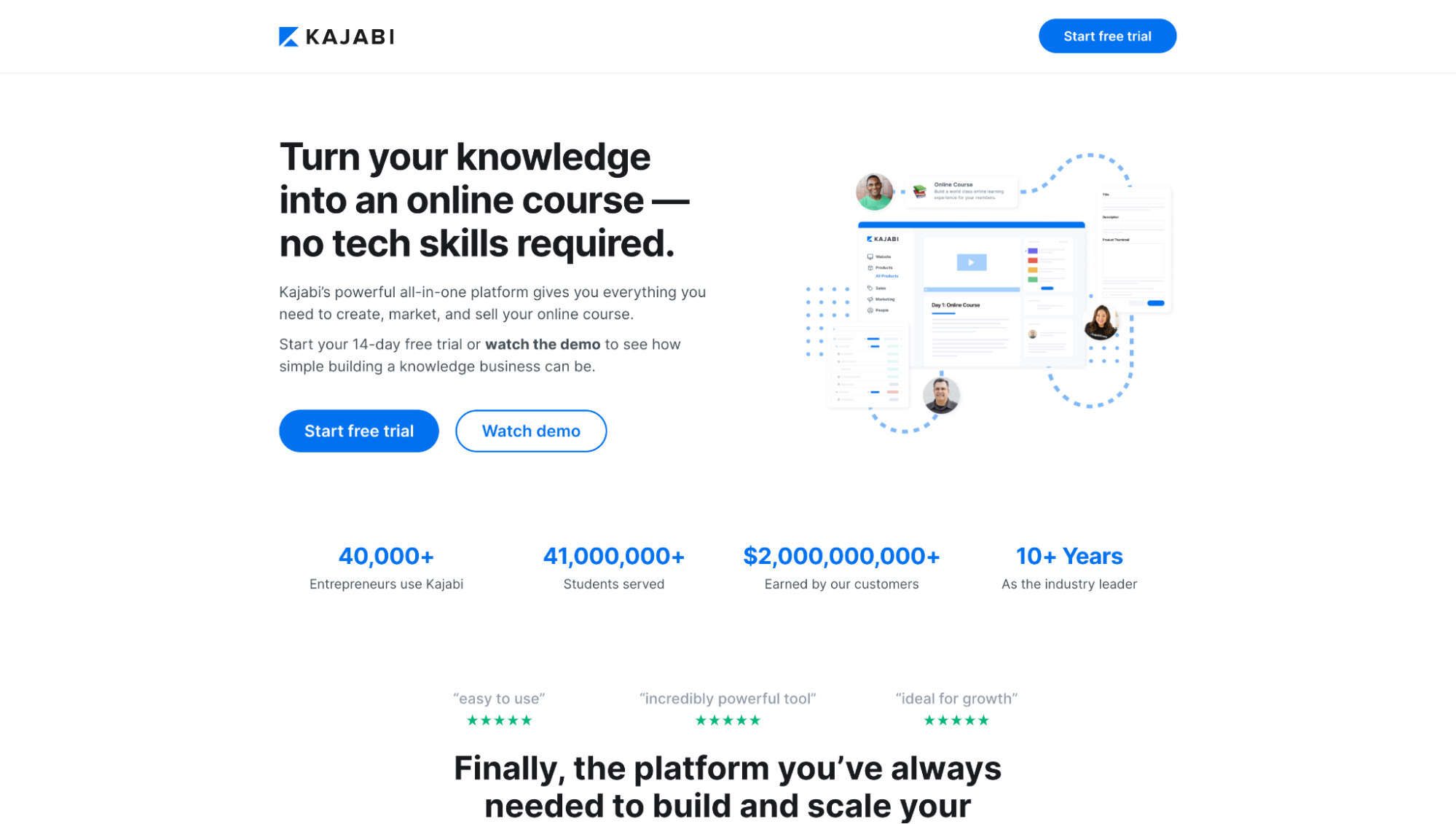
And Kajabi features social proof in the form of customer data and stats:
6. Landing page accessibility
“Just as our buildings have elevators and ramps, our websites should be accessible to people with disabilities (more than 10% of the population)”
- Peter Morville
Bottom line: No user experience is complete without ensuring it’s pleasant and accessible to everyone.
This is a giant topic, and there’s no way we can cover it all within this article.
But if you want to take a deep dive into web accessibility, the W3C (World Wide Web Consortium) wrote an entire guide about implementing web accessibility standards.
For now, we’ll dive into three of the most common standards you can implement to ensure your landing pages accommodate visitors with disabilities.
- Affordance
- Contrast ratio
- Alt tags
*Note: Also, many landing page builders have ADA compliance built into them, and others like Instapage go a step further and provide editable accessibility features within their editor.
Design with high affordance
Affordance refers to the quality or property of an object that clearly defines its use.
In other words, when you add subtle hints to your landing page design, like giving a CTA button a drop shadow to make it look more like a clickable button, that’s an affordance.
High affordance makes it easier for those with impairments or disabilities to use your landing pages, thus creating a more accessible user experience.
When it comes to affordance, the most important affordances you can bake into your design are those that distinguish interactive design elements from non-interactive design elements.
For example, links or buttons. To clearly communicate their use with design alone, heed the following:
- Underline links
- Make buttons look like buttons (drop shadows, button shape, etc.)
- Change link and button colors once hovered over
- Change link and button colors once clicked on
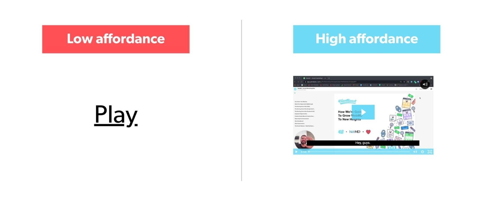
For example, of the two video play buttons below, which provides a better hint that the button will play a video when you click on it?
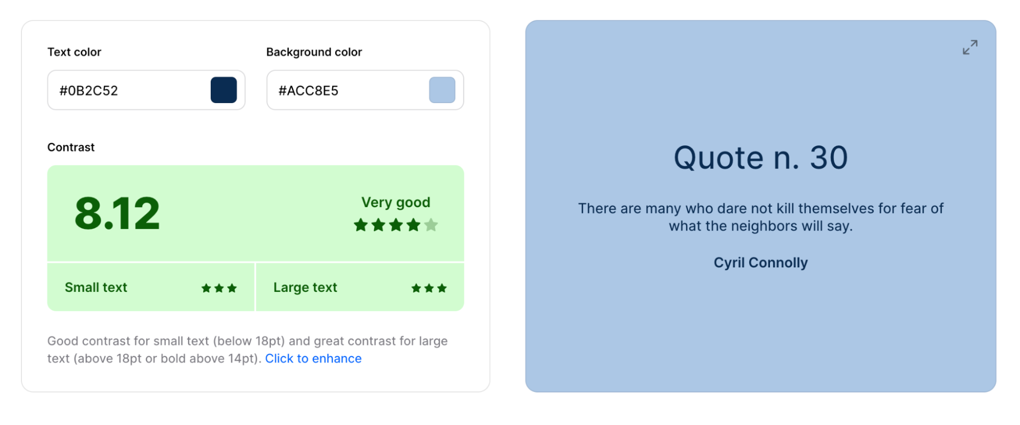
Maintain a 4.5:1 contrast ratio
Contrast ratio refers to the color of your text and the color of the background it appears on.
For those with loss in contrast sensitivity (20/40 vision), a 4.5:1 ratio is the minimum contrast ratio they can read. For those with a severe loss in contrast sensitivity (20/80 vision), a 7:1 contrast ratio is the minimum they can read.
What does that look like? Let’s take a look:
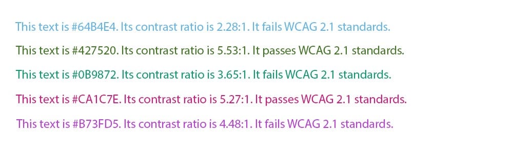
Note: For large text (over 18pt font), a 3:1 contrast ratio will suffice.
To ensure your landing page text is accessible to those with vision impairment, use a tool like Coolors Color Contrast Checker (free) to see whether or not you meet the standard requirements.
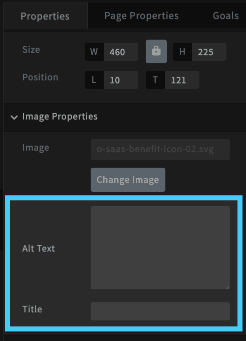
Add image alt tags
Image alt tags (short for alternative tag) are text descriptions of the images on your landing page, added using the alt attribute (HTML).
Google uses alt tags to better understand the content on your page since they can’t read images, which is why alt tags usually come up in SEO conversations, not landing page ones.
But screen readers read image alt tags aloud for people who may not be able to see them clearly.
How do you add image alt tags? Any landing page builder worth its salt will include an image alt tag box for each image, like Unbounce here (just don’t forget to fill them in):
7. Landing page value
Last, but certainly not least, Value with a capital V.
I put value last because value isn’t something you do separately; it’s the sum total of everything we mentioned previously.
If you provide a desirable, usable, credible, accessible, findable, and useful landing page user experience, then you will have also provided something valuable to your target audience.
But value doesn’t stop with your customers; an effective UX also provides value to you, the business, in the form of revenue and profit.
Therefore, the true measure of value (for both you and your customers) is whether or not your landing pages convert.
And if your landing pages don’t convert (i.e. don’t provide enough value to either party), there’s only one way to find out why: Split testing.
A/B test your UX consistently
We wrote an entire article on A/B split testing your landing pages: 11 Low Effort, High Impact Landing Page Split Test Ideas.
But let’s cover the basics here.
What’s a split test?
A split test (or A/B test) is a controlled experiment that sends 50% of traffic to one version of your landing page (A) and the other 50% to another version of your landing page (B) to discover which converts higher.
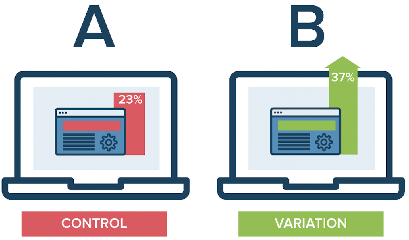
Unlike a multivariate test, an A/B split test only measures one UX variable at a time, like a CTA, a headline, an image, or an offer.
When it comes to A/B testing landing pages, you can test any UX element:
- CTA
- Headline
- Copy
- Message match
- Offer
- Color contrast
- Forms
- Graphics
- Affordance
- Social proof
- Etc.
Bottom line: Make split testing a fundamental (and continuous) step in your landing page UX process. It’s not one and done.
Split testing is how you gather behavioral insights so you can make data-driven UX decisions that increase value for your and your customers.
Final takeaways
In the end, landing page UX boils down to seven core principles:
- Usefulness
- Usability
- Findability
- Desirability
- Accessibility
- Credibility
- Value
When done right, you’ll never hear your customers mention it, because great UX goes unnoticed.
It’s useful, usable, findable, desirable, accessible, credible, and valuable without conscious thought.
The only time you notice UX is in the absence of a good one.
As long as you stick to Morville’s seven principles of UX design, you’ll never have to worry about that again, ever.
Happy converting.


