


Some SaaS landing pages convert at 15%. Others barely hit 2%.
Why is that?We analyzed 51 examples from the world's top SaaS brands to figure out what drives real results. We put that analysis right here and paired the real-world examples with SaaS landing page best practices and great landing page design.
TL;DR
- What is a SaaS landing page?
- Elements of a high-converting SaaS landing page
- 51 of the best SaaS landing page examples
- 1. Asana
- 2. Mixpanel
- 3. Trinet
- 4. OpenPhone
- 5. SurveyMonkey
- 6. Jira
- 7. Squarespace
- 8. SEMRush
- 9. 6Sense
- 10. Twilio Segment
- 11. Kajabi
- 12. Riverside
- 13. Higher Logic
- 14. Honeybook
- 15. Poppulo
- 16. Freshdesk
- 17. Smartsheet
- 18. Quantilope
- 19. Formstack/Xverify
- 20. Recurly
- 21. All in the Loop
- 22. Design Pickle
- 23. Birdeye
- 24. Progress/Sitefinity
- 25. Frogslayer
- 26. Templafy
- Bonus: Single CTA, unique site scroll UX 27. Connecteam
- 28. Later
- 29. Sana
- 30. Dropbox/DocSend
- 31. NoahFace
- 32. Absorb
- 33. ConstantContact
- 34. Remote
- 35. Bitly
- 36. Intercom
- 37. Acuity: Scheduling
- 38. UScreen
- 39. Ro.am
- 40. Intercom
- 41. Loom
- 42. Zendesk
- 43. Jotform
- 44. Ramp
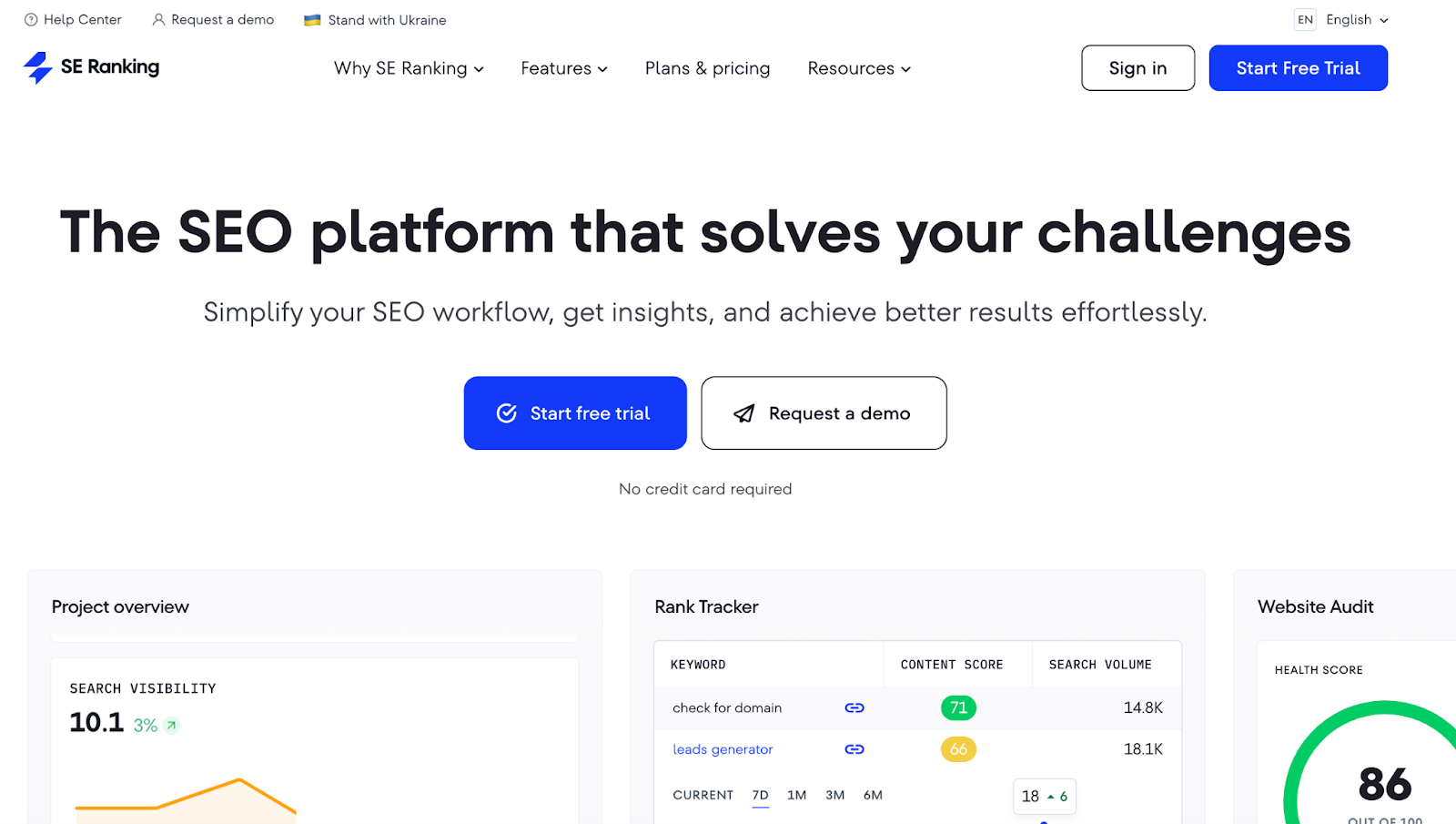
- 45. SERanking
- 46. Textline
- 47. Vroozi
- 48. Augmentir
- 49. InEight
- 50. Performio
- 51. Beamer
- The good and bad: Analysis of the 51 SaaS landing pages
- How to create your own SaaS landing page
- Final thoughts
- Frequently asked questions
Get brand new landing page strategies straight to your inbox every week. 23,739 people already are!
What is a SaaS landing page?
If you’ve never heard of a landing page before, or if you’re unfamiliar with landing page features and best practices, we encourage you to read our landing page 101 article first: What is a Landing Page? Definition, Examples, And Best Practices.
For everyone else, tally ho.
Like any other landing page, a SaaS landing page is a dedicated page built for a specific campaign and traffic source. The goal of every great or best SaaS landing page is to increase the number of visitors who convert on your offer by providing a hyper-relevant experience.
Say you work for a SaaS company like Asana.
You want to increase the number of free trials from people who are interested in goal management software. Instead of sending Google ad traffic to your homepage, where you talk about dozens of use cases, you could build a custom landing page specific to goal management features and benefits.
The best SaaS landing pages highlight the benefits of features rather than the features themselves. Benefits engage users, and UX is extremely important.
Tailor your message and offer to a specific source of traffic or target audience; and easily test everything from page copy and calls-to-action (CTAs) to design inspiration, layouts, and pricing—ultimately using the combination of features that converts the most.
Bonus: landing page builders like Unbounce, LeadPages, and WebFlow make landing page creation and split testing easier and quicker than ever.
Elements of a high-converting SaaS landing page
A SaaS website landing page should incorporate a handful of core elements to ensure it converts optimally.
Let’s explore the key characteristics of a high-converting SaaS landing page here.
- Hero section: The “above the fold” section (i.e. visible viewport before you scroll) contains all the pertinent information needed to take action immediately—from an enticing headline and subheading, to a compelling call-to-action.
- Social proof: This area covers SaaS product reviews, testimonials, success stories, client logos, publicity, awards, user stats, etc.
- Features/benefits: Here, you’ll list the undeniable pain point that each feature was created to eliminate.
- Contact form: This is the way you collect the information needed (ideally in a non-threatening way).
- Call-to-action (CTA buttons): Here, you’ll be clear on what action you want them to take next—whether that’s trying your SaaS tool or exploring another area of the website.
- No distractions: Limit distractions by limiting exit opportunities (i.e. links in header and footer).
- Product video: Show visitors what it looks like under the hood of your product (sell the invisible) using product videos or screenshots.
- LiveChat: Provide a way to offer immediate feedback on the SaaS tool, either as a chatbot or in a Contact area.
- User experience: Incorporate elements such as screenshots of features, a fact page , and a user-first layout…and make it mobile responsive wherever possible.
- Tracking: Don’t forget call tracking and goal tracking in analytics.
Oh—a few notes about the SaaS landing page examples:
- They’re only from PPC ads. Maybe one day we’ll put together an article that features landers for email subscriptions, lead magnets, webinars, or other top-of-funnel offers, but for this article, all SaaS landing page examples came from PPC campaigns (sorry for the clicks, friends).
- They’re for bottom of funnel prospects. We typed in bottom-of-funnel/purchase-intent keywords in Google to find these landing pages. No top of funnel keywords. Also, we included the keyword next to each example below.
- They’re diverse. Not every example is a winner. But overall, most of the landing page examples have commendable highlights with a solid takeaway. Either way, you’ll have a ton of inspiration to draw from.
The more elements you can feature from above, the lower your bounce rates and the higher your SaaS page conversions.
51 of the best SaaS landing page examples
Courtesy of the biggest SaaS brands in the world, here is everything you need to build a high-converting SaaS landing page. We’ve got valuable takeaways, a winner and loser, and landing page tips for the road.
1. Asana
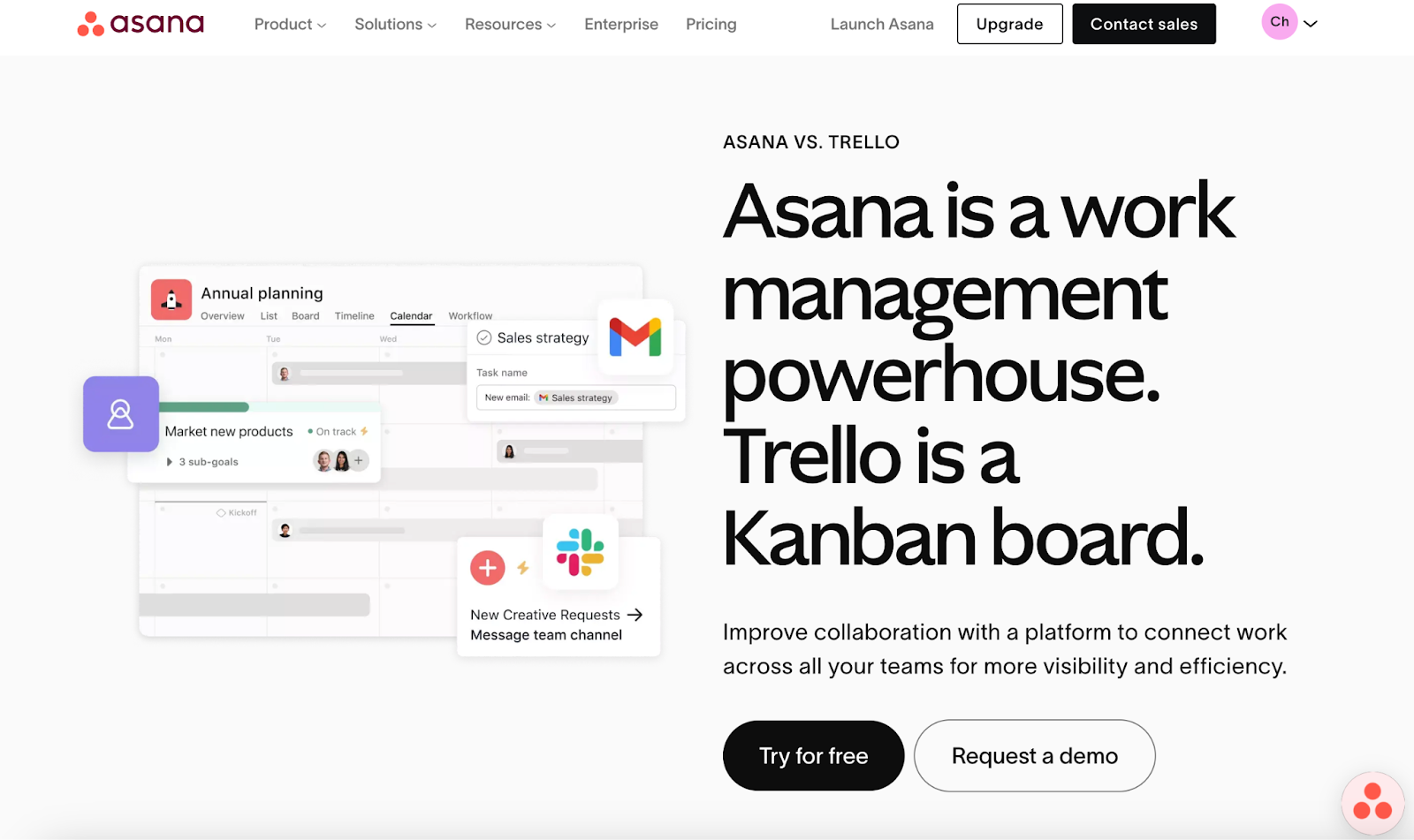
View full page: Asana lander
Keyword used: “Trello competitor”
What we love: Image-first user experience, powerful header, no-scroll opportunity for conversion in the hero header
Bonus: Live chat, demo offer, comparison table, FAQs
2. Mixpanel
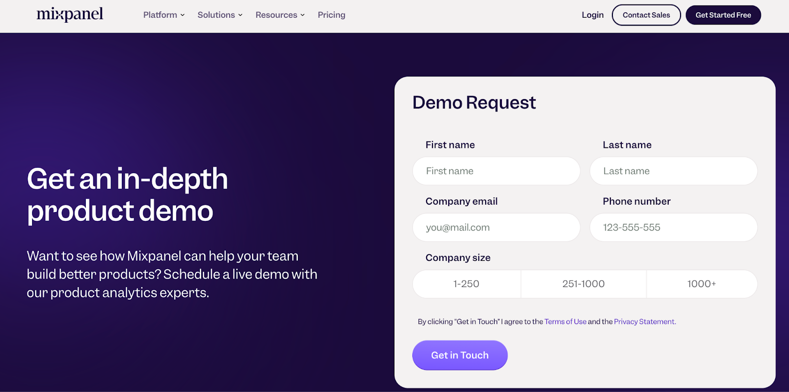
View full page: Mixpanel lander
Keyword used: “Product analytics tools”
What we love: Aligned offer for searcher intent, approachable form, social proof bar
Bonus: Full user experience and mobile optimization, strategic copy, single CTA
3. Trinet
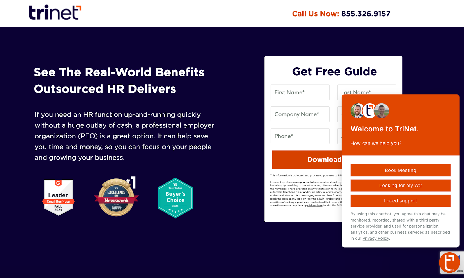
View full page: Trinet lander
Keyword used: “Payroll software”
What we love: Free lead magnet access, hero-header level social proof, simplified form
Bonus: Single CTA, chatbot support, “by the numbers” value bar, customer testimonials down the page
4. OpenPhone
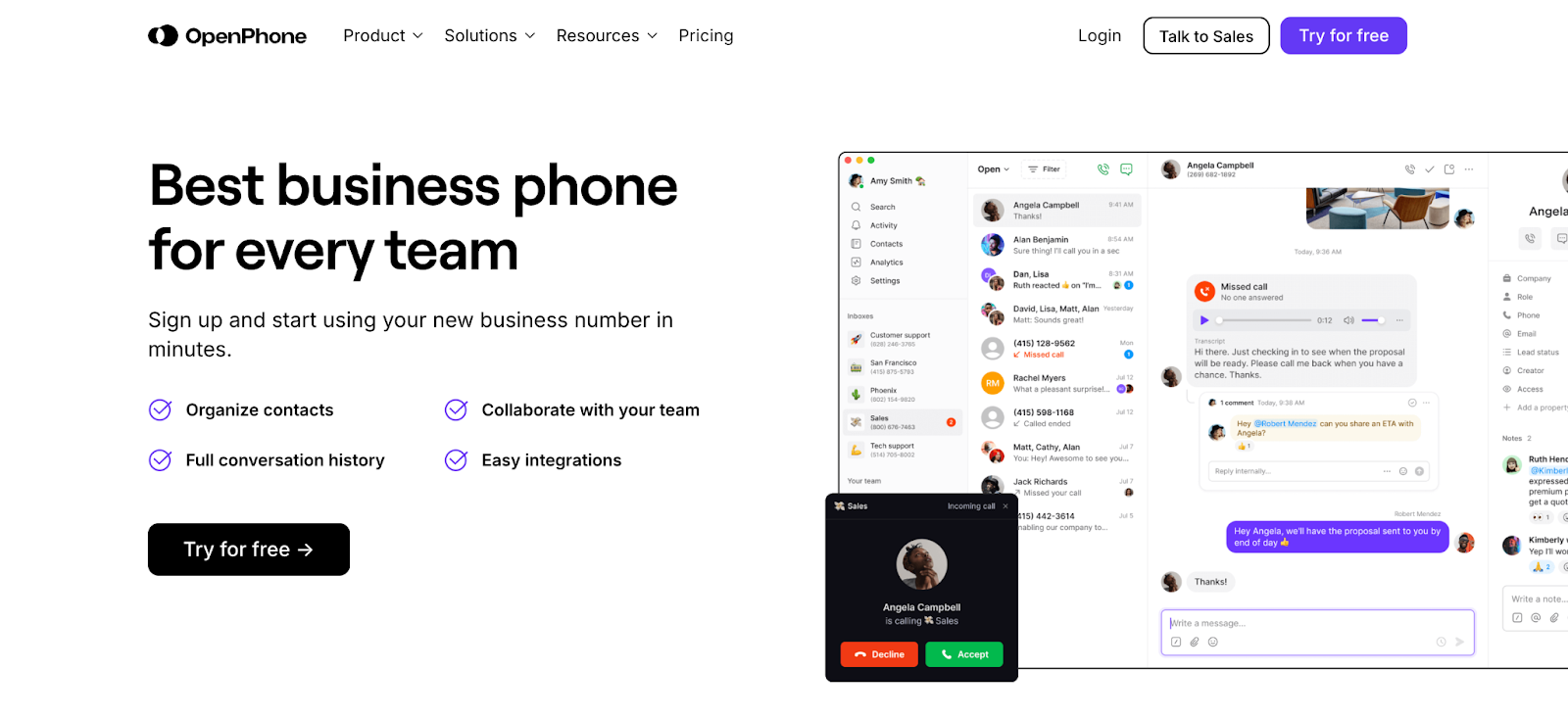
View full page: OpenPhone lander
Keyword used: “VOIP”
What we love: Social proof bar, single hero header CTA button, bulleted value list, targeted copy, hero header image of real-life user experience
Bonus: Social proof, strong features area, real-life customer experiences
5. SurveyMonkey
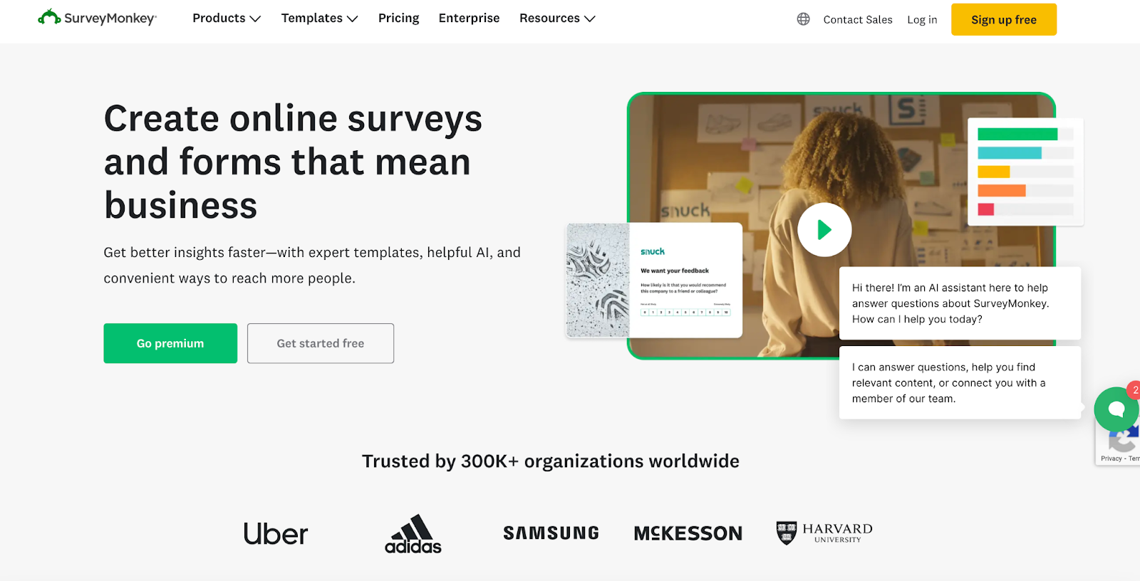
View full page: SurveyMonkey lander
Keyword used: “Survey software tool”
What we love: Hero header social proof, condensed copy
Bonus: Free plan offer, white space, upfront pricing further down the page
6. Jira
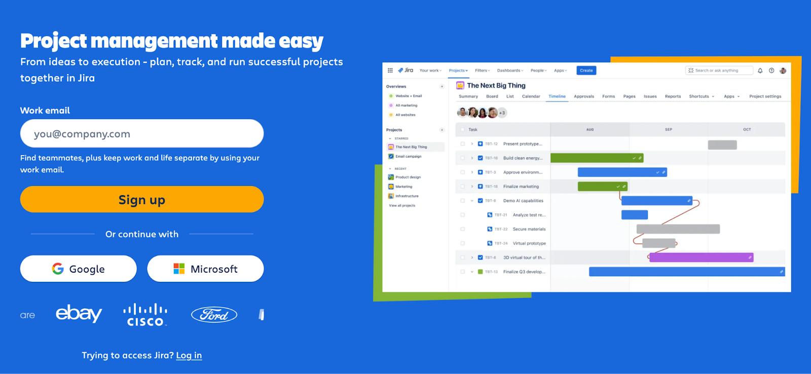
View full page: Jira lander
Keyword used: “Project management software”
What we love: Condensed copy, image-first design, simple CTA and conversion process
Bonus: Social proof, use cases bar, white space and strategic features section
7. Squarespace
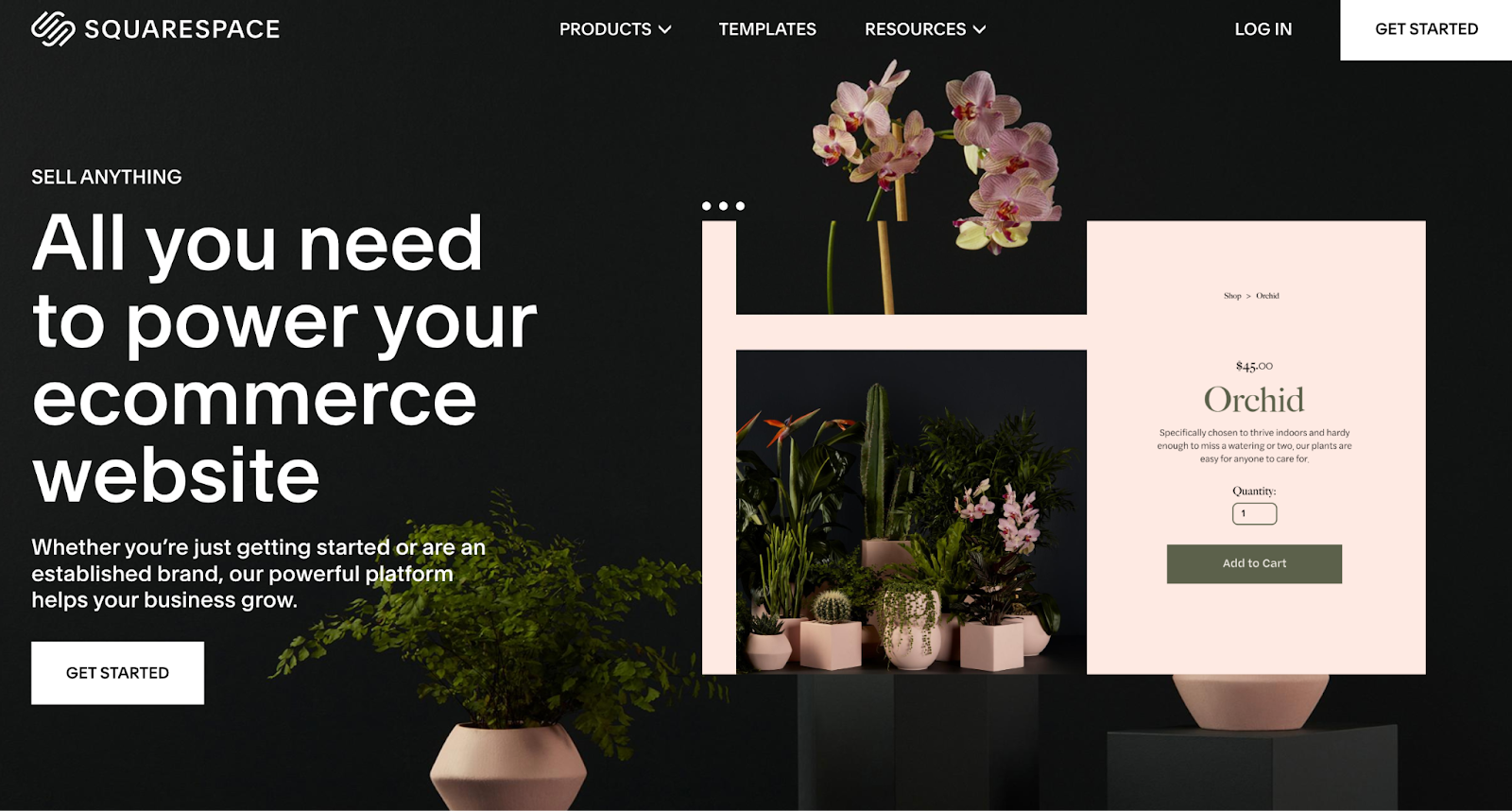
View full page: Squarespace lander
Keyword used: “start an ecommerce store”
What we love: Single CTA, extensive features area, moving images incorporated into hero header
Bonus: Powerful copy, template previews, FAQs
8. SEMRush
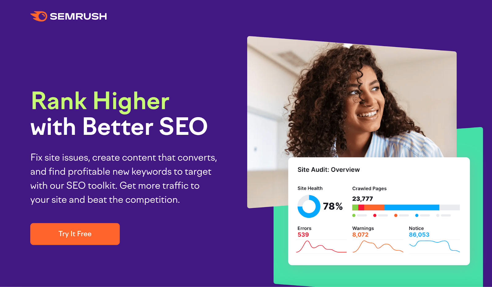
View fullpage: SEMRush lander
Keyword used: “SEO software”
What we love: Free offering, transformation-oriented copy, simplified user-first design
Bonus: Social proof, feature focused, minimal footer links
9. 6Sense
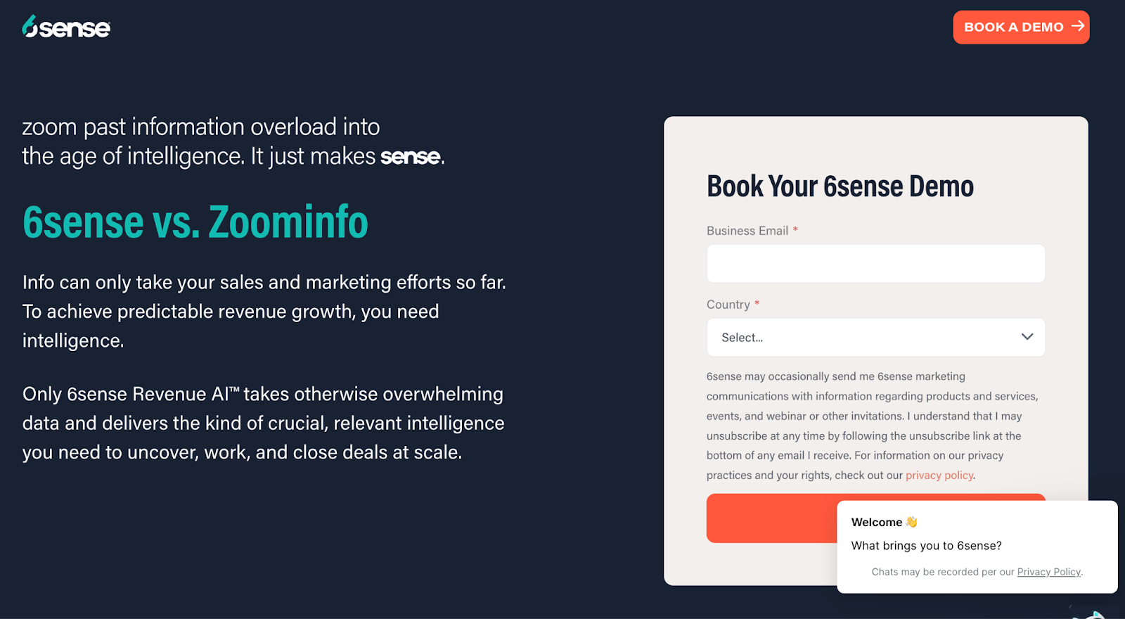
View full page: 6Sense lander
Keyword used: “Zoom info”
What we love: Direct comparison, strategic copy, simple form
Bonus: Condensed page, feature-focused copy further down the page, chatbot
10. Twilio Segment
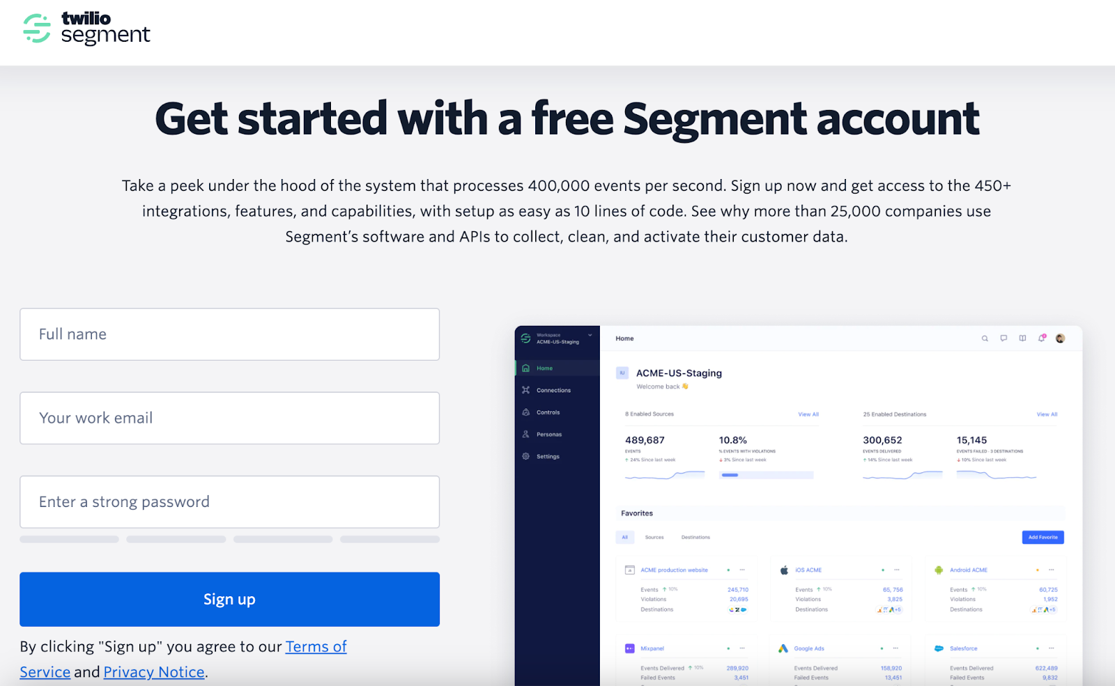
View full page: Twilio Segment lander
Keyword used: “Marketing automation software”
What we love: Approachable form, simple sign-up process, transparent feature listing, social proof
11. Kajabi
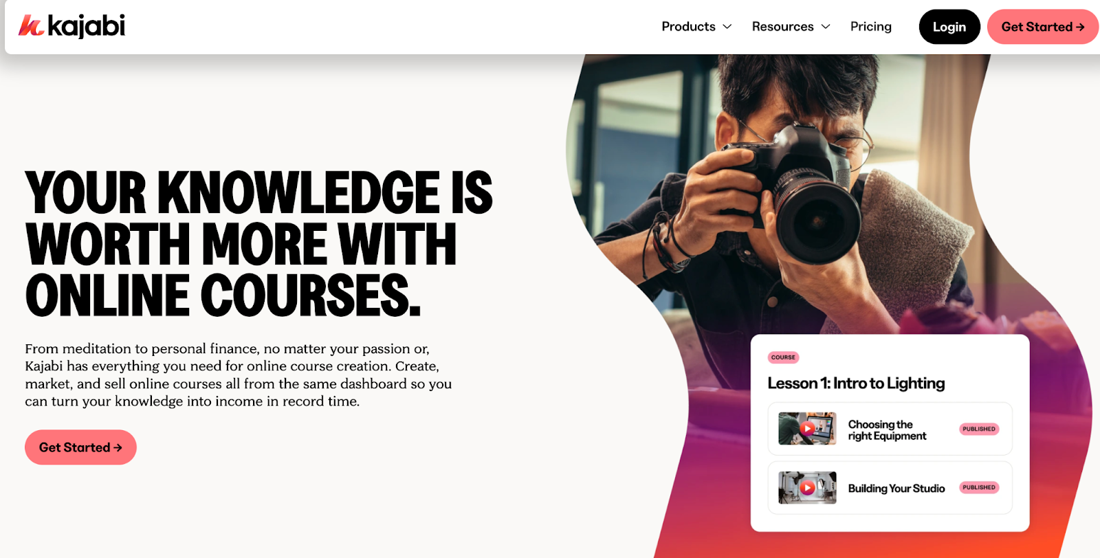
View full page: Kajabi lander
Keyword used: “Online course creator”
What we love: Social proof (testimonials, star-ratings, number of users, $$$ earned), compelling copy
Bonus: CTAs down the features section, direct user experiences and testimonials with quantitative gains
12. Riverside
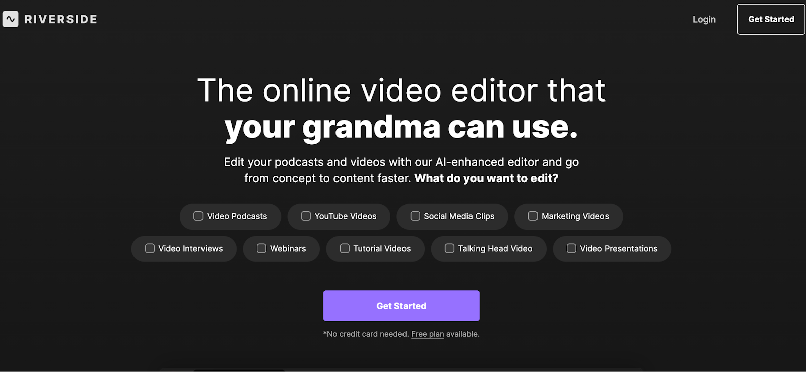
View full page: Riverside lander
Keyword used: “Podcast editing software”
What we love: Accessible copy, interactive components in hero header to determine use cases, free plan and no credit card requirements
Bonus: Single CTA, social proof bar, multiple CTAs used as page breaks to capture conversions all the way down
13. Higher Logic
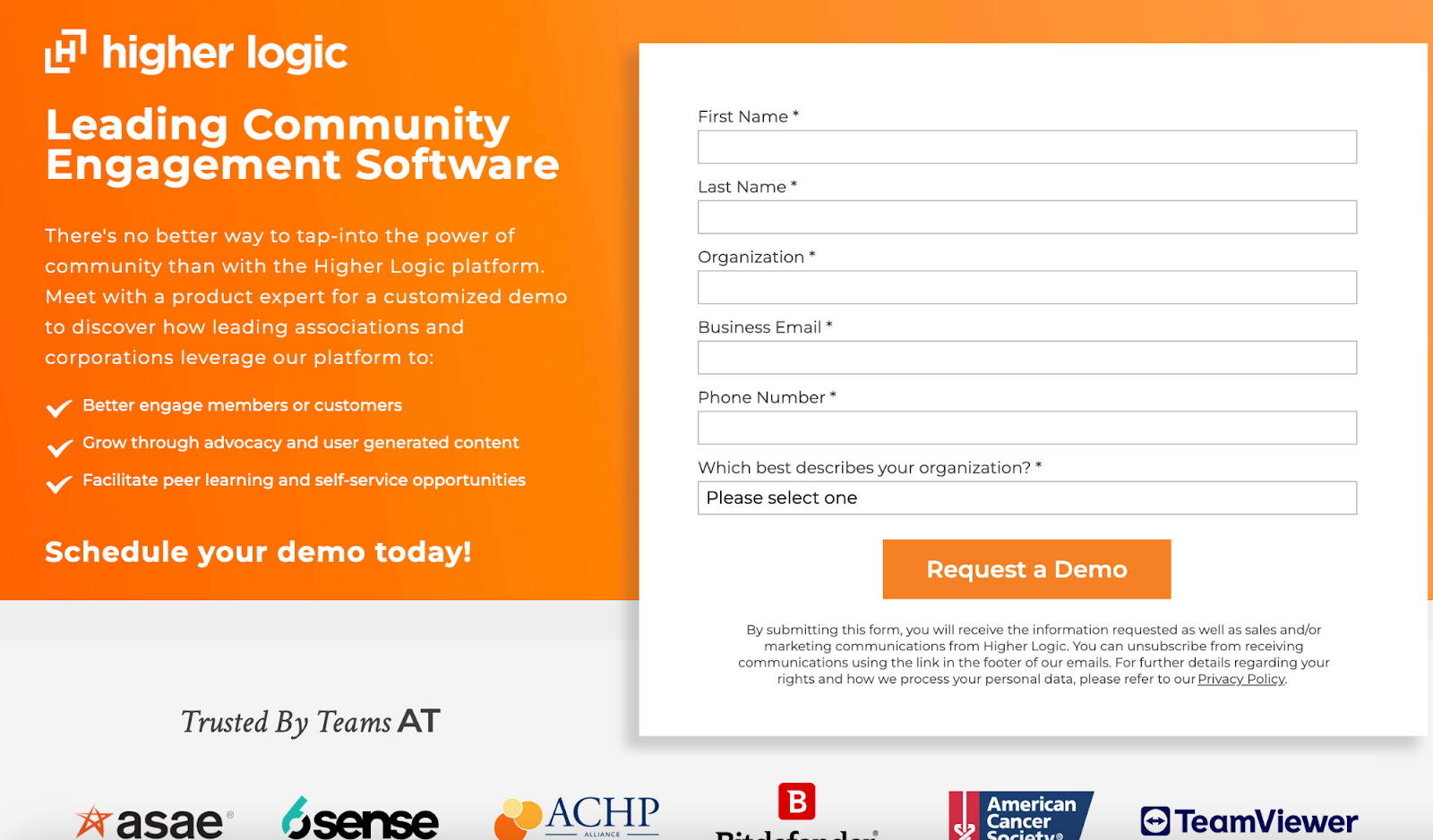
View full page: Higher Logic lander
Keyword used: “Social media analytics”
What we love: Social proof, user-friendly list format for content in header, demo
Bonus: Multiple types of social proof, few footer links
14. Honeybook
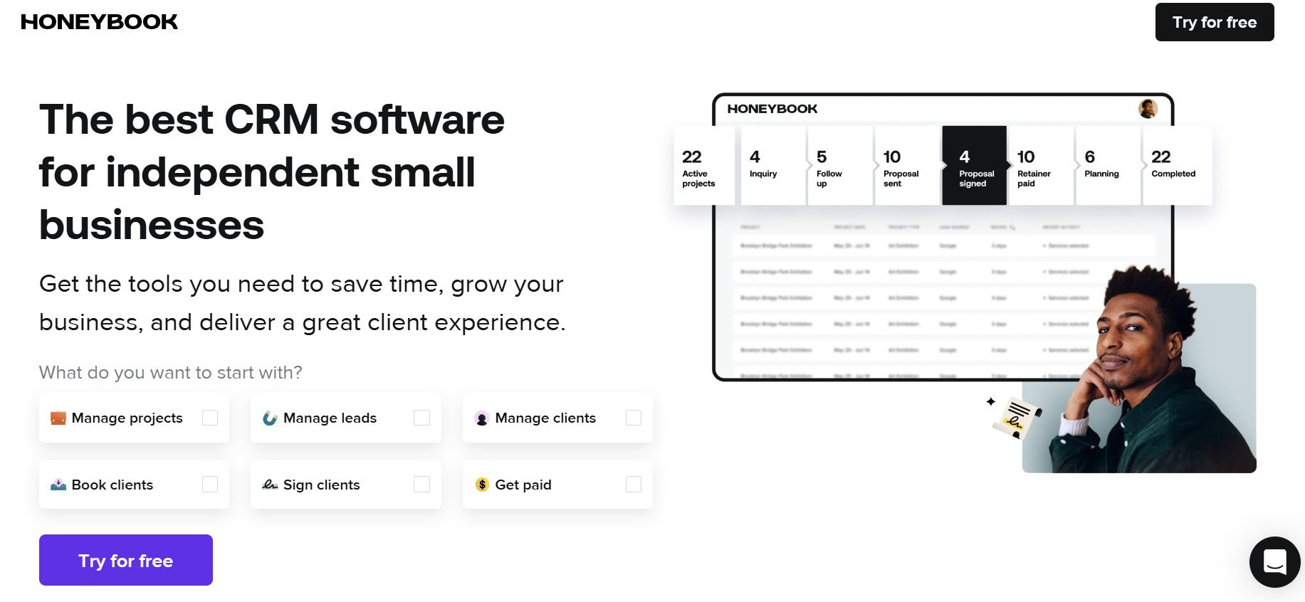
View full page: Honeybook lander
Keyword used: “CRM software”
What we love: “By the Numbers” bar above the fold, free trial offer, interactive hero header components and no credit card requirements
Bonus: White space, simplified outlook of features
15. Poppulo
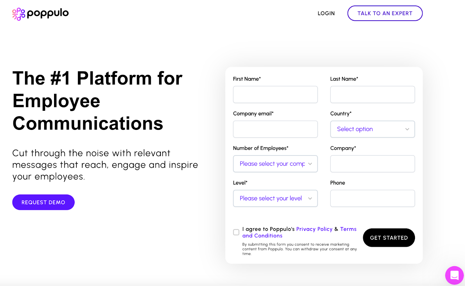
View full page: Poppulo lander
Keyword used: “Internal communication tool”
What we love: Design, white space, chatbot, simplified engagement form
Bonus: “By the Numbers” bar, social proof bar, design
16. Freshdesk
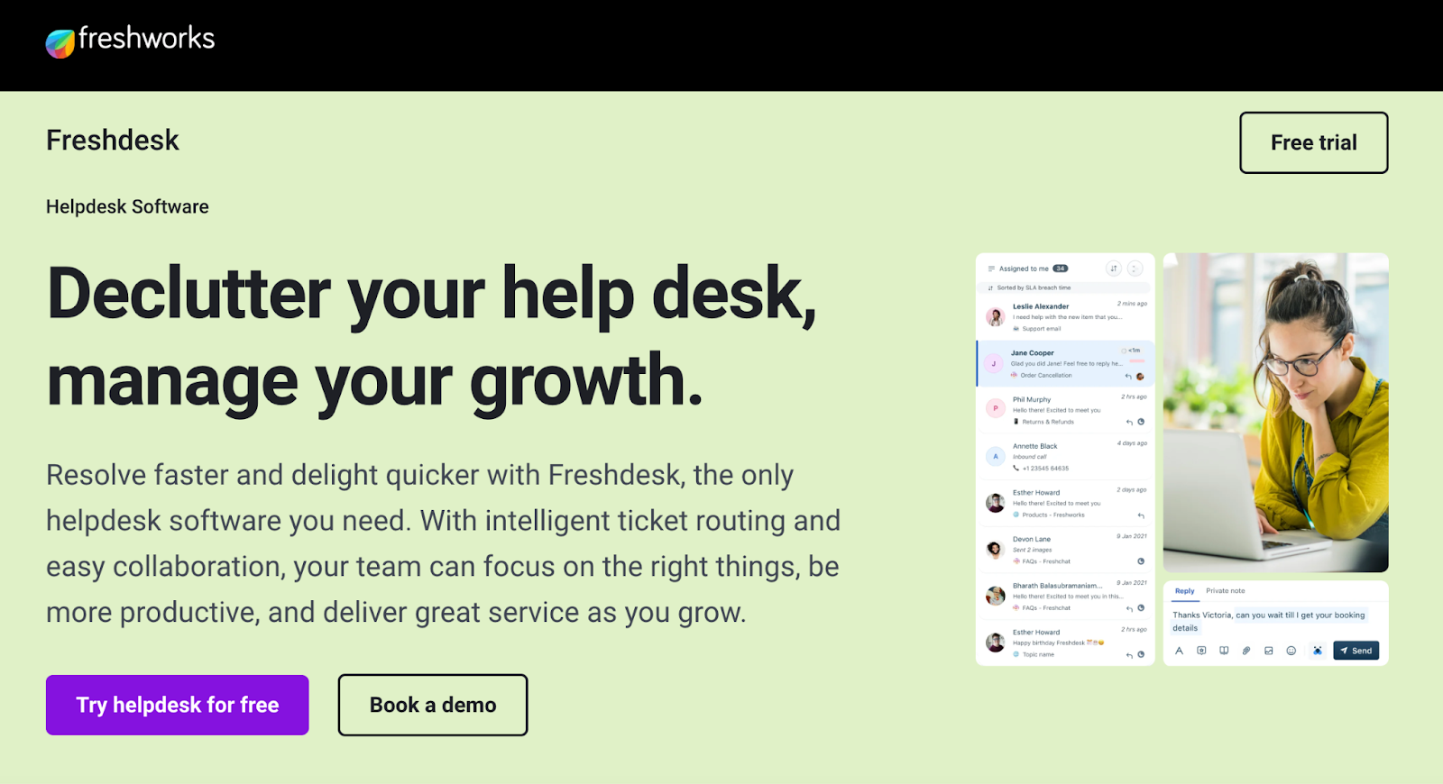
View full page: Freshdesk lander
Keyword used: “Help desk software”
What we love: Free trial and demo options
Bonus: Not much else, the design is not as competitive as others on this list.
17. Smartsheet
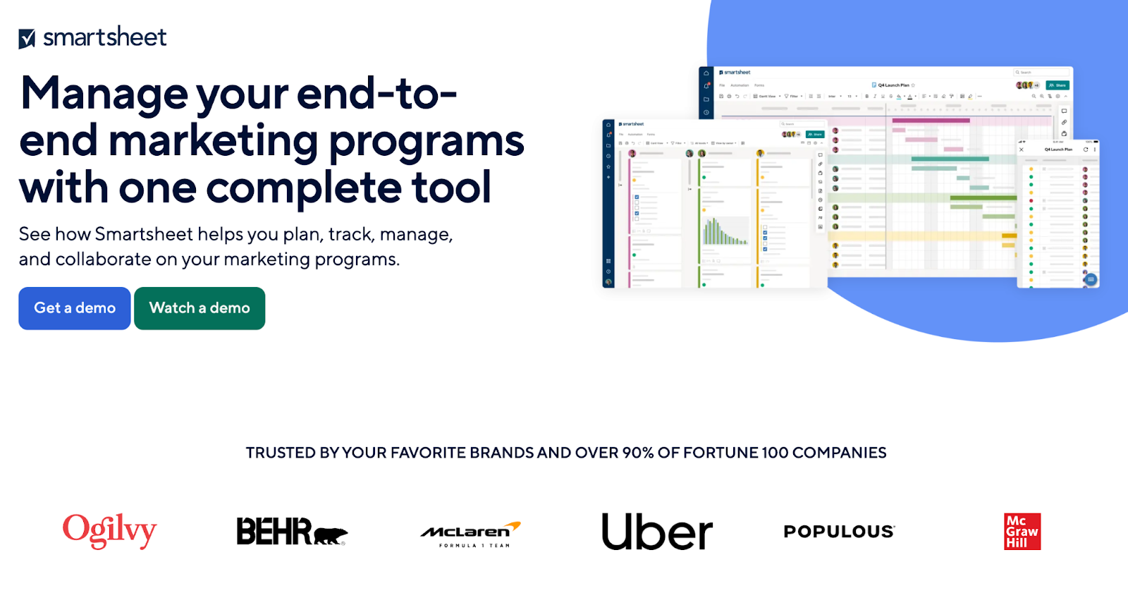
View full page: Smartsheet lander
Keyword used: “Product marketing software”
What we love: Simplified copy, hero header social proof
Bonus: Quantitative data behind benefits, in-depth feature section
18. Quantilope
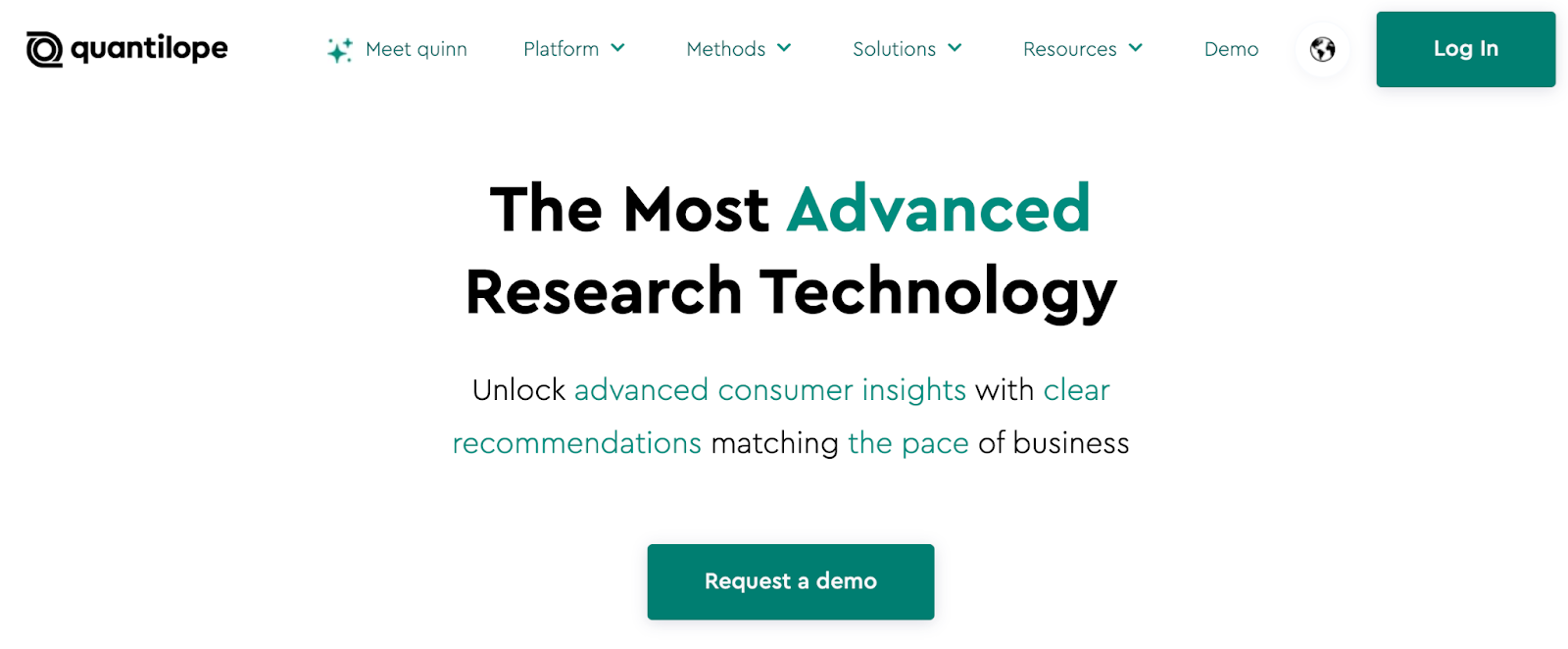
View full page: Quantilope lander
Keyword used: “Market research tools”
What we love: Design
Bonus: Quantitative by the numbers section, rich social proof section
19. Formstack/Xverify
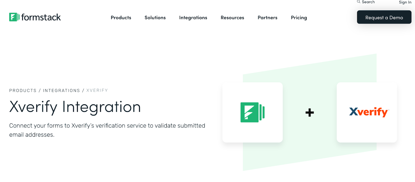
View full landing page: Formstack/Xverify
Keyword used: “Email verification tool”
What we love: Simplified formatting and basic copy
Bonus: Minimal navigation
20. Recurly
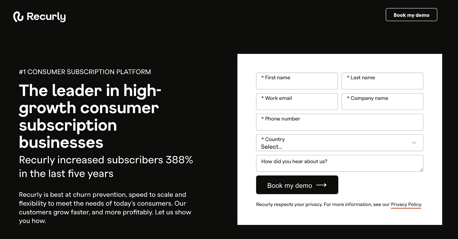
View full page: Recurly lander
Keyword used: “Chargebee”
What we love: Quantitative benefit-first writing, accessible form
Bonus: Feature-focused section beneath hero header, use case section, multiple types of testimonials and user experiences.
21. All in the Loop
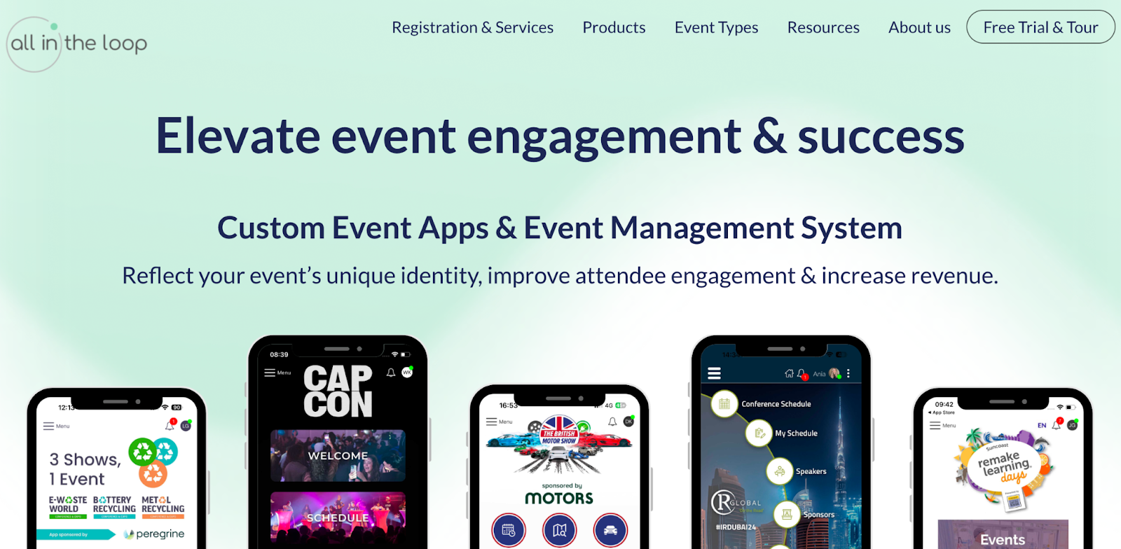
View full page: All in the Looplander
Keyword used: “Event software”
What we love: Visual aids
Bonus: Engaging site template and user optimization down the page
22. Design Pickle
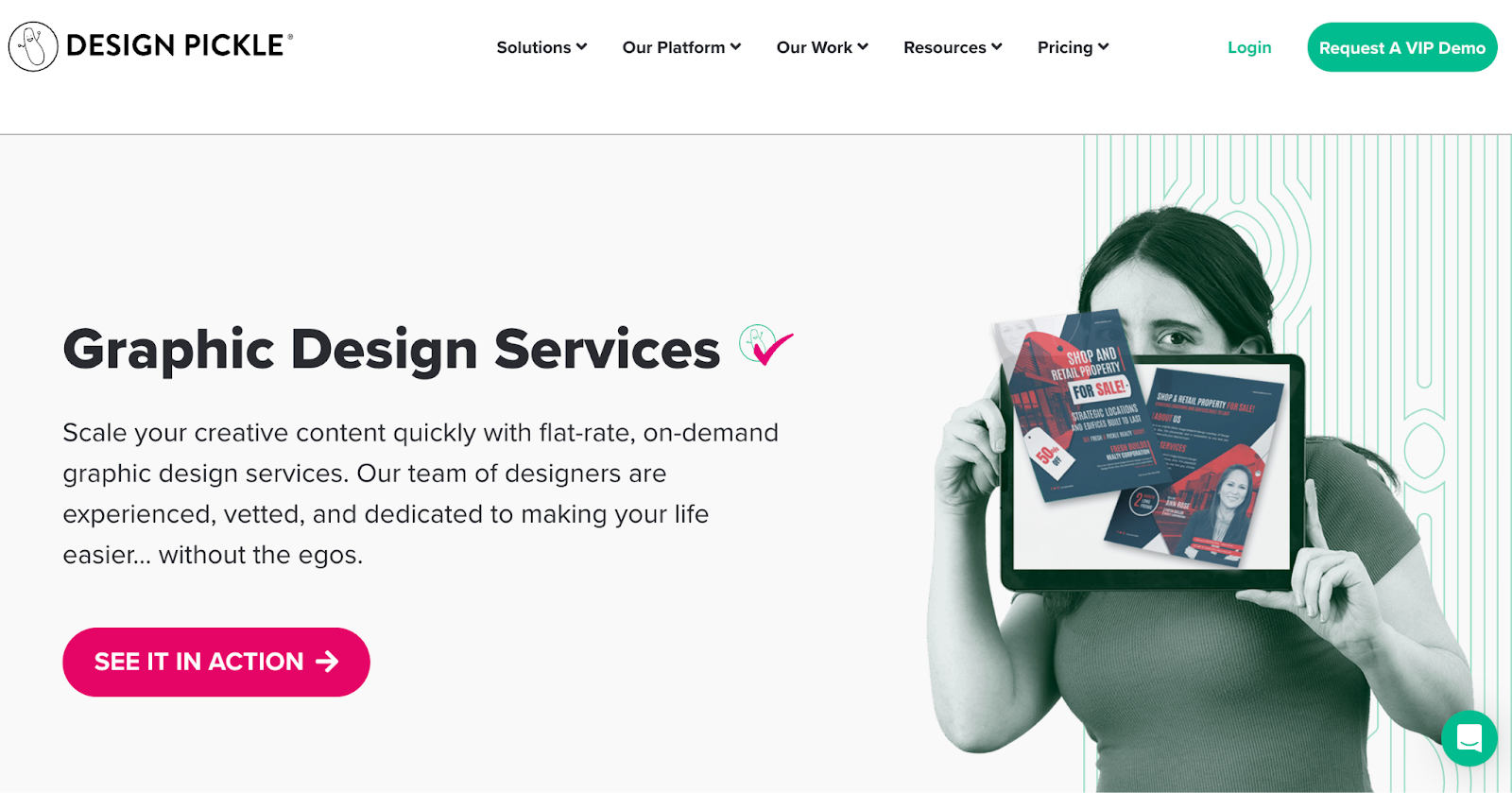
View full page: Design Pickle lander
Keyword used: “Design software”
What we love: Eye-popping contrasted graphics, single hero heading CTA, and strategic/simple copy
Bonus: Simple and powerful features section, FAQs, chatbot
23. Birdeye
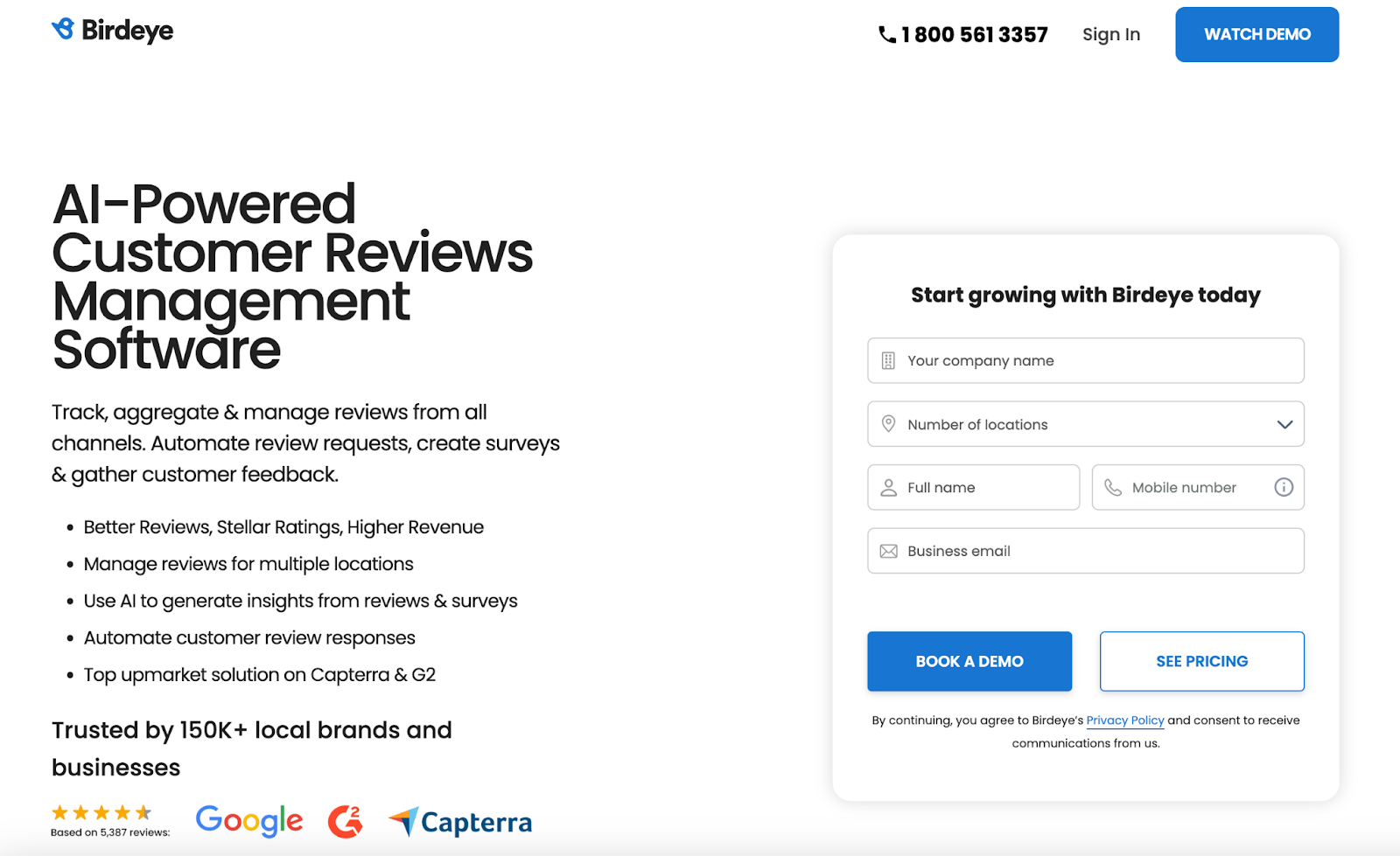
View full page: Birdeye lander
Keyword used: “Review management software”
What we love: Bulleted feature copy in hero header, included social proof bar, and simple form with two CTAs (appealing to two types of ICPs)
Bonus: Social bar, white space, minimal footer links, testimonials
24. Progress/Sitefinity
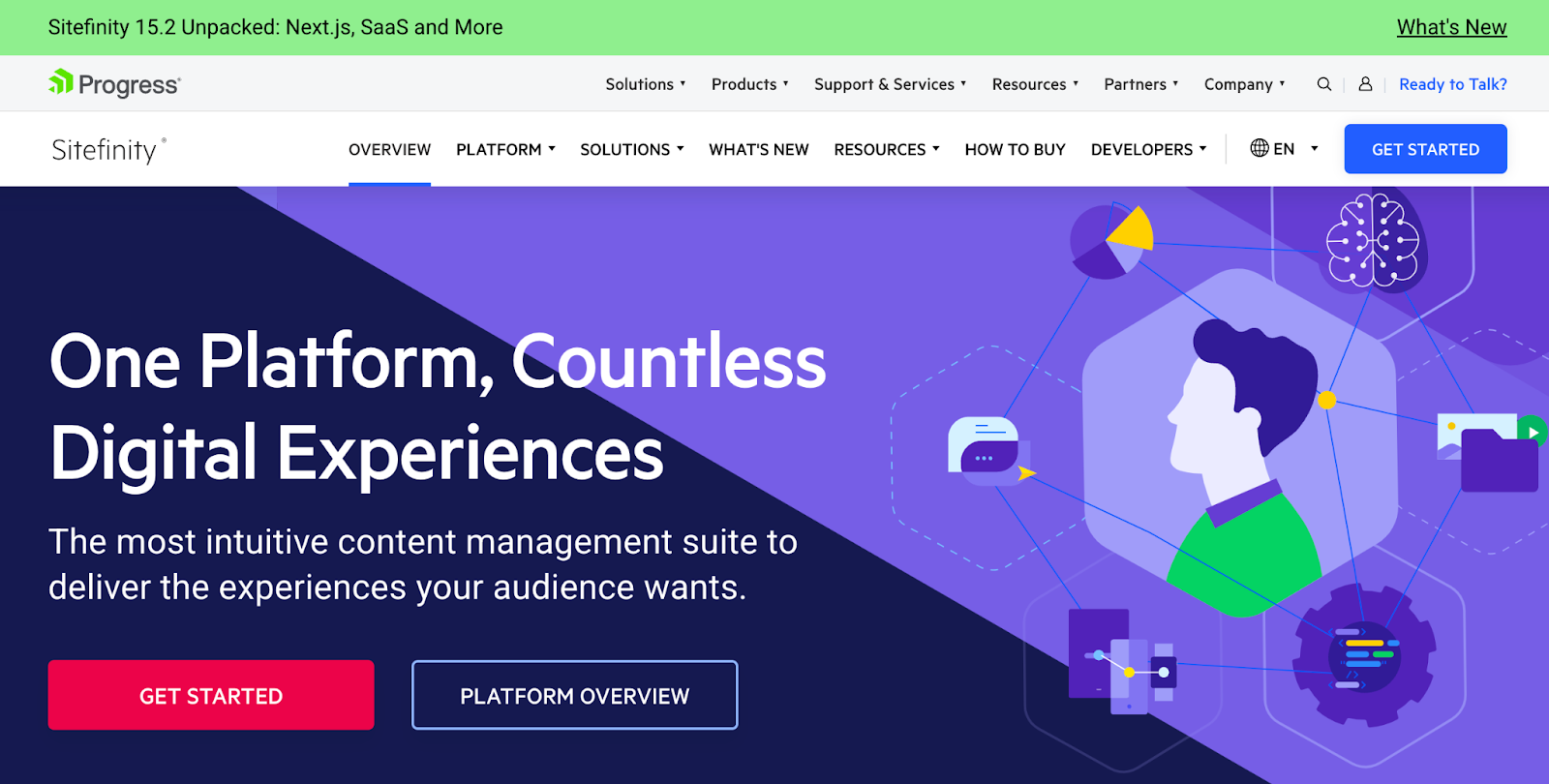
View full page: Progress/Sitefinity lander
Keyword used: “Website builder”
What we love: Minimal (in and out with the value proposition)
Bonus: By the Numbers quantitative benefit section, feature-rich copy
25. Frogslayer
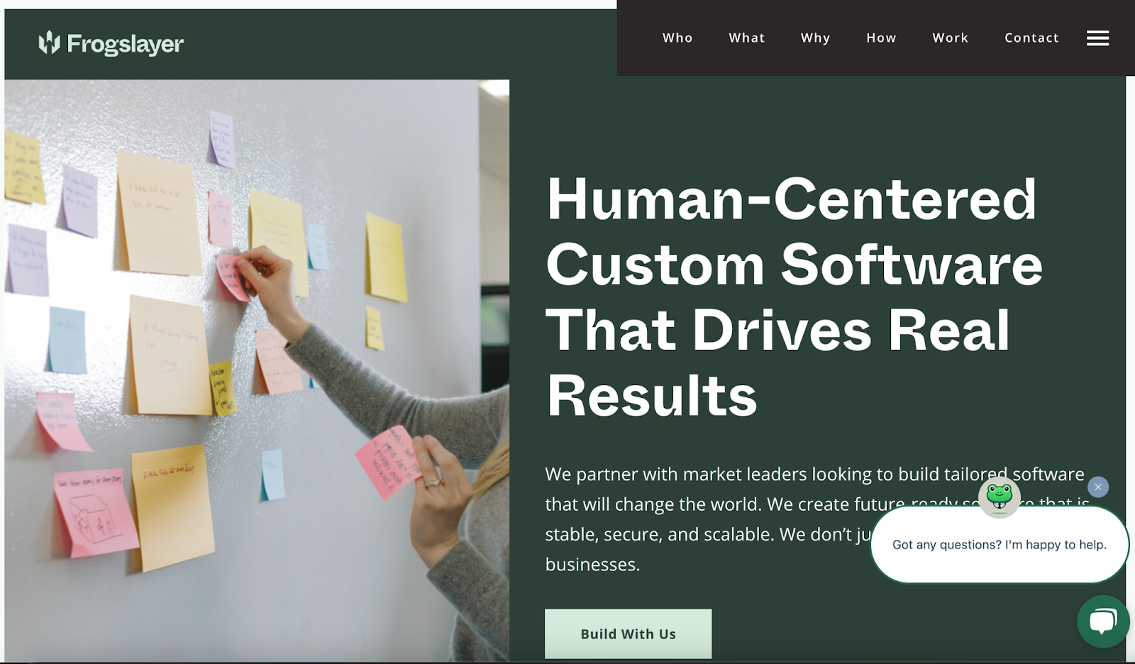
View full page: Frogslayer lander
Keyword used: “Website pop-up software”
What we love: Single CTA
Bonus: Chatbot
26. Templafy
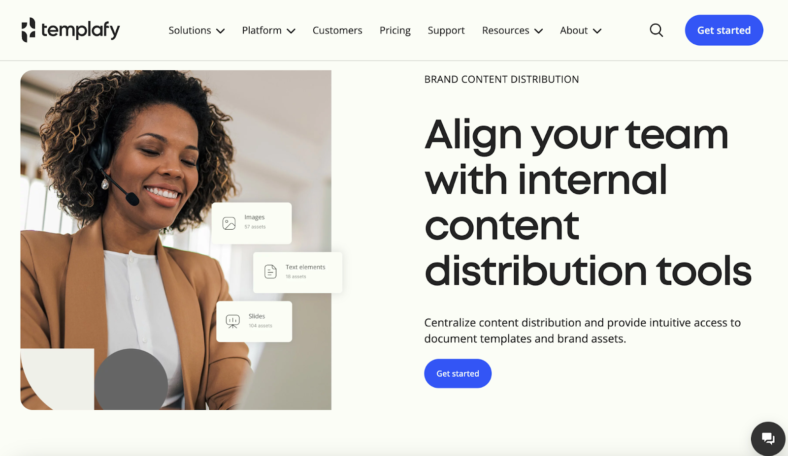
View full page: Templafy lander
Keyword used: “Landing page software”
What we love: Transformation-oriented hero header copy, chatbot
Bonus: Single CTA, unique site scroll UX 27. Connecteam
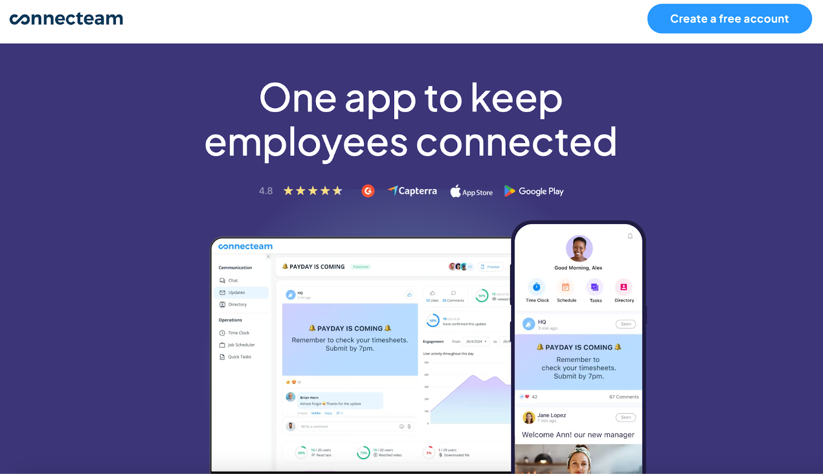
View full landing page: Connecteam lander
Keyword used: “team collaboration tool”
What we love: Simplified design, social proof with heavy-hitters (hello, Subway!)
Bonus: FAQs, free account option, simple navigation
28. Later
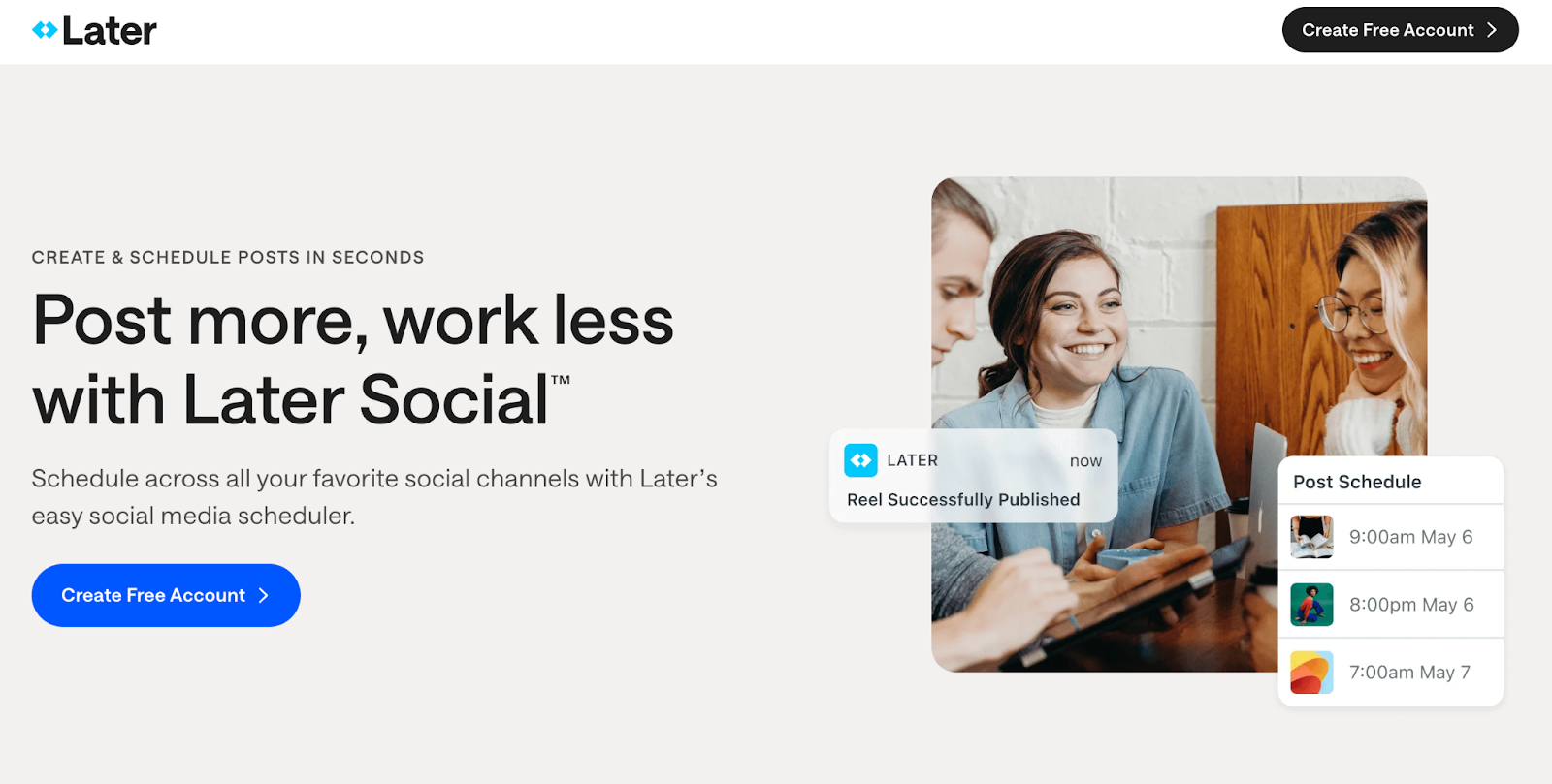
View full page: Later lander
Keyword used: “Social media scheduling tools”
What we love: Free account offer, heavyweight social proof (i.e., Adobe and Food Network)
Bonus: Transparent pricing, testimonials, partnership authority bar and minimal footer links
29. Sana
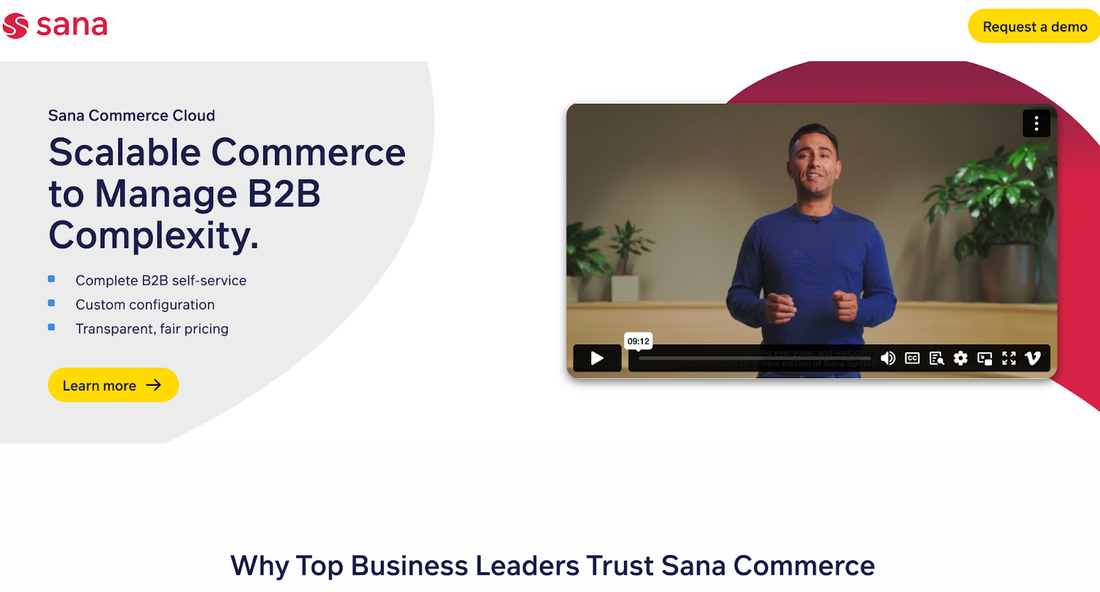
View full page: Sana lander
Keyword used: “BigCommerce”
What we love: Video introduction, bulleted list copy, single CTA
Bonus: White space, no footer links
30. Dropbox/DocSend
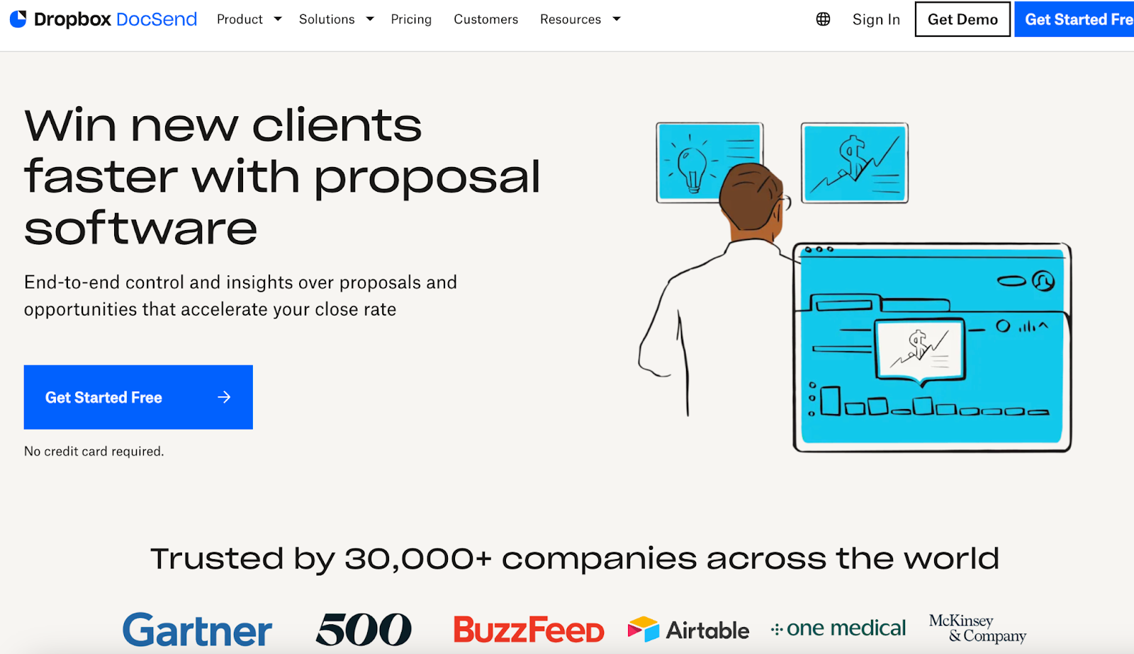
View full page: Dropbox/Docsend lander
Keyword used: “Proposal software”
What we love: Free start option, concise copy, simple landing page design…surprised? Sometimes the best SaaS landing page is a simple landing page).
Bonus: Live chat, social proof, single CTA (“Try it free”), value proposition, visual aides
31. NoahFace
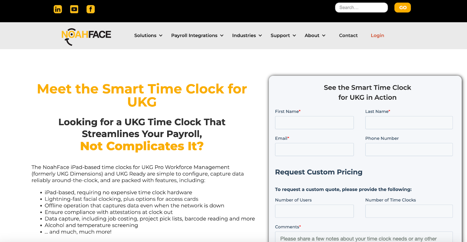
View full page: NoahFace lander
Keyword used: “Time tracking software”
What we love: Simple form, funnel landing page design, single CTA
Bonus: Introductory video, features, and limited footer links
32. Absorb
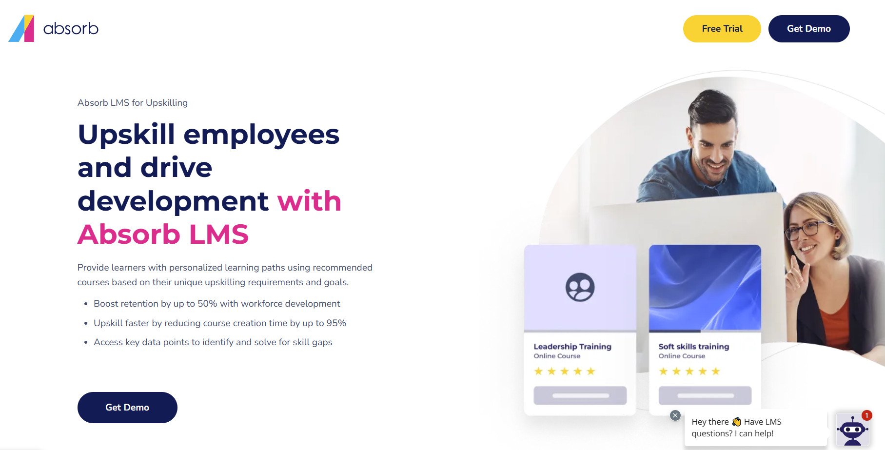
View full page: Absorb lander
Keyword used: “employee training software”
What we love: Bulleted qualitative proof of value, heavy-hitting social proof (i.e., Johnson & Johnson, Toyota, etc), and single CTA (get demo)
Bonus: Streamlined landing page design, white space, succinct yet comprehensive feature explanation
33. ConstantContact
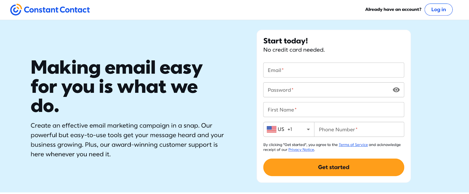
View full page: ConstantContact lander
Keyword used: “Content marketing software”
What we love: Mobile optimization, no credit card required, simplistic messaging
Bonus: Minimalist design inspiration, chatbot, condensed page format
34. Remote
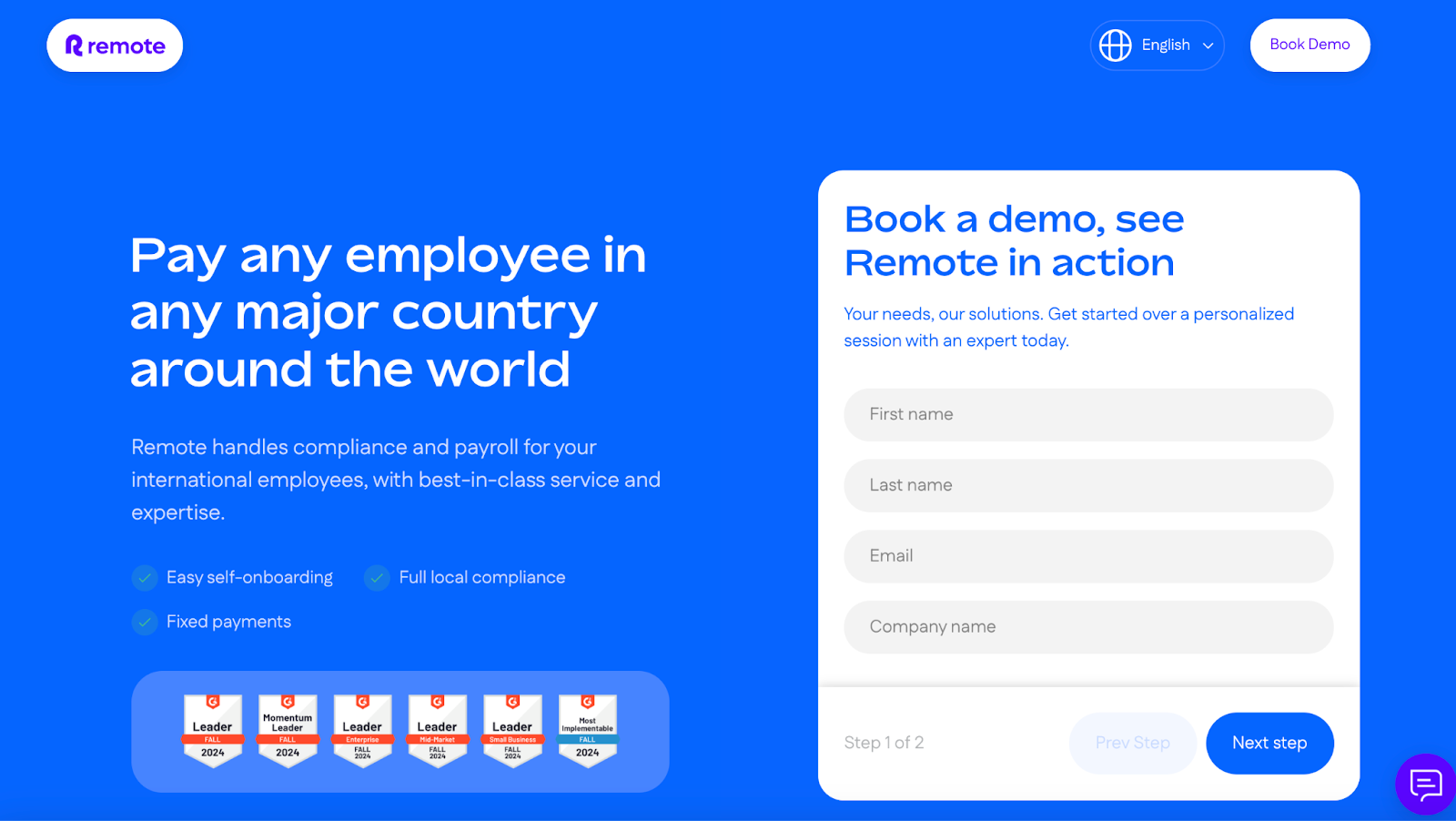
View full page: Remote lander
Keyword used: “Remote payroll software”
What we love: Features/benefits
Bonus: Live chat, social proof, included pricing, like a traditional SaaS website would have
35. Bitly
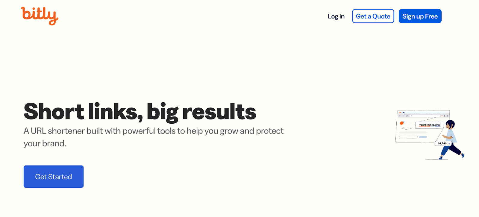
View full page: Bitly lander
Keyword used: “Link shortener for business”
What we love: SaaS animations showcasing the product, simple hero header
Bonus: Social proof, single CTA (“Get started”), minimal, features/benefits
36. Intercom
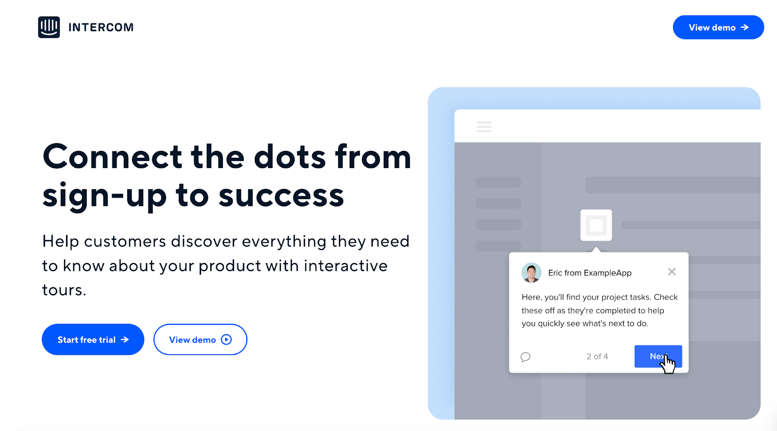
View full page: Intercom lander
Keyword used: “Onboarding software”
What we love: Screenshots, statistics, and smart SaaS website copywriting
Bonus: Chatbot, free demo, and trial options
37. Acuity: Scheduling
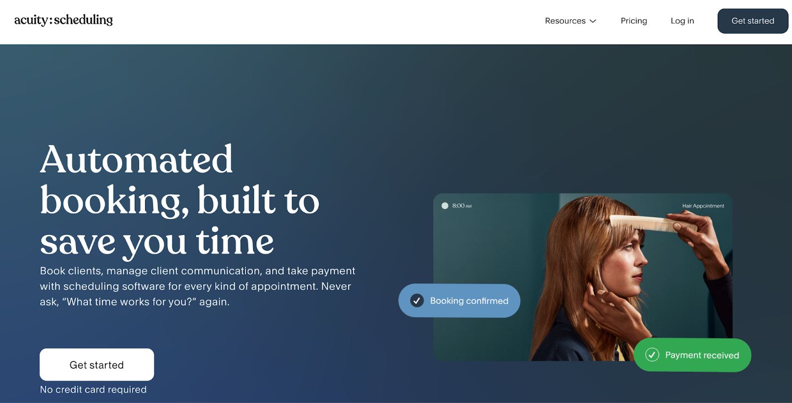
View full landing page: Acuity Scheduling lander
Keyword used: “Appointment scheduling”
What we love: No credit card required, copy speaks directly to pain points
Bonus: Chic landing page design, integration focus
38. UScreen
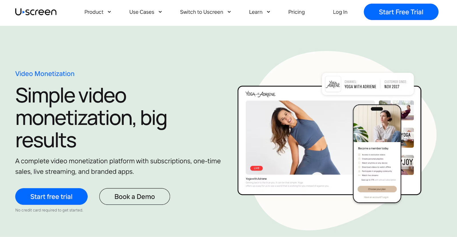
View full landing page: UScreen lander
Keyword used: “Video hosting”
What we love: Screenshots available for a real “first look” of the tool
Bonus: Clean, minimal site design inspiration throughout, FAQs
39. Ro.am
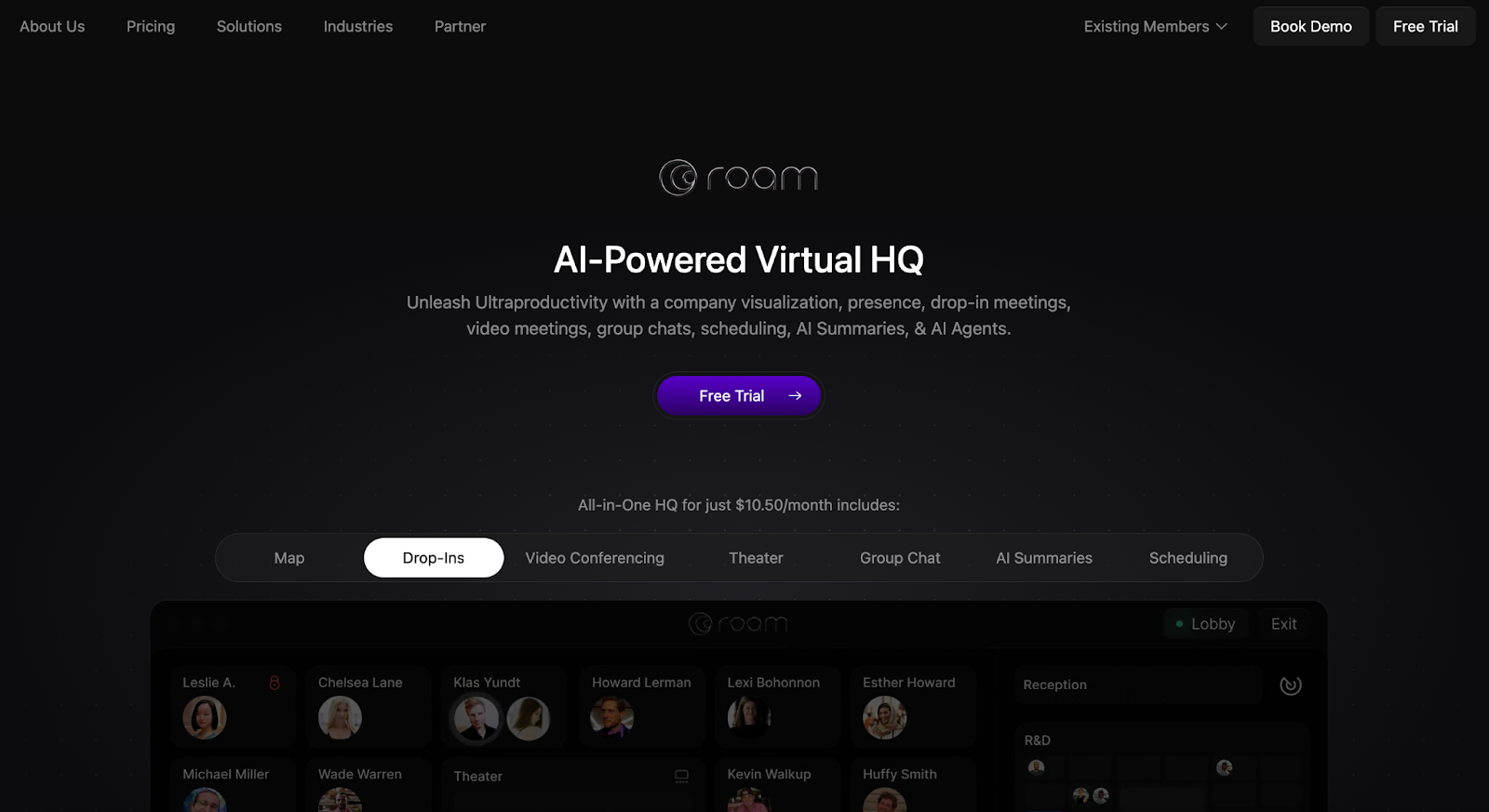
View full page: Ro.am lander
Keyword used: “Video conferencing software”
What we love: Plenty of testimonials, and live video examples of the work
Bonus: It’s too short and sweet to comment here—it’s barely the length of a real SaaS landing page!
40. Intercom
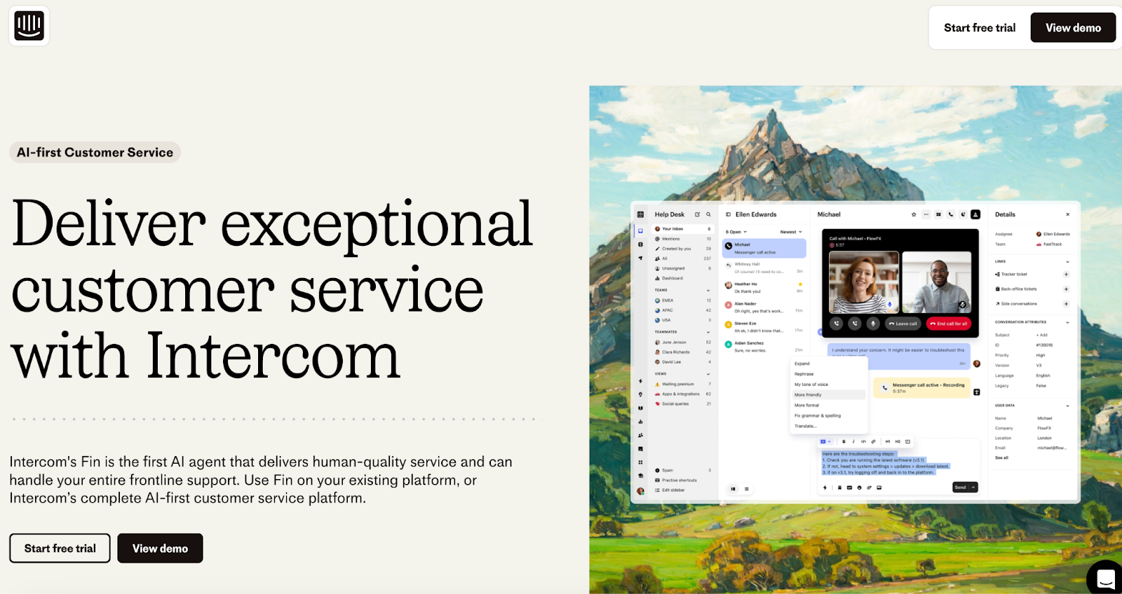
View full page: Intercom lander
Keyword used: “Intercom”
What we love: No exit links (visitors already know the brand based on their keyword, so Intercom eliminates all distractions and creates a clear path to conversion)
Bonus: Live chat, demo video, social proof, features/benefits, design, copywriting
41. Loom
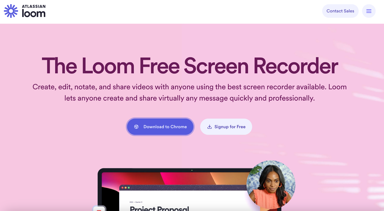
View full page: Loom lander
Keyword used: “Screen recording software”
What we love: Bulleted feature list, animated components
Bonus: Enterprise and individual testimonials
42. Zendesk
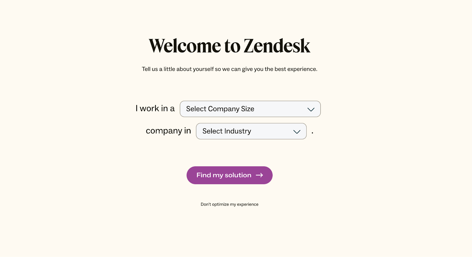
View full page: Zendesk lander
Keyword used: “NPS software”
What we love: None. It’s way too simple and assumes where a prospect is on the funnel.
Bonus: N/A
43. Jotform
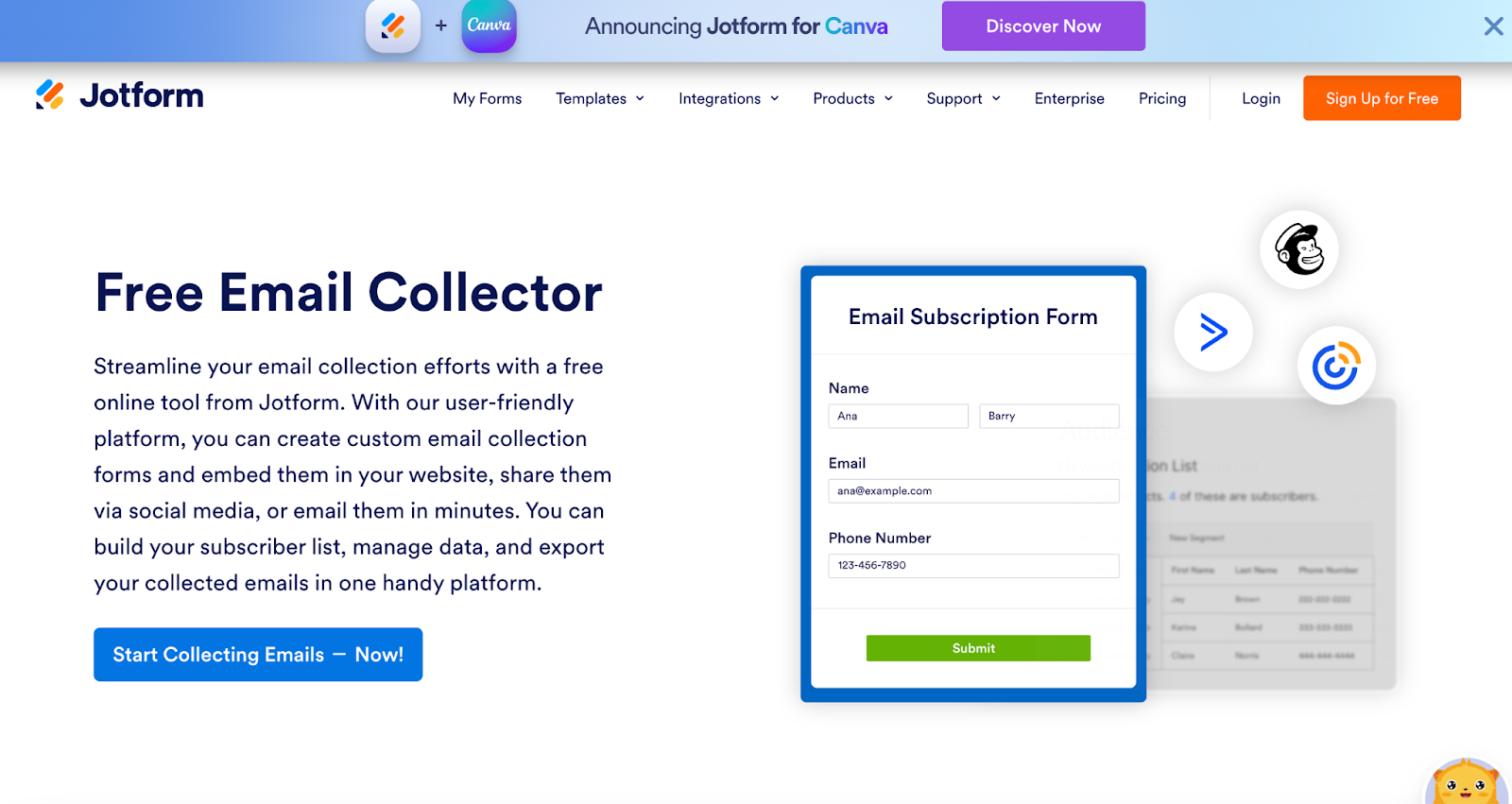
View full landing page: Jotform lander
Keyword used: “Email capture tool”
What we love: Copywriting
Bonus: Transparent examples of templates
44. Ramp
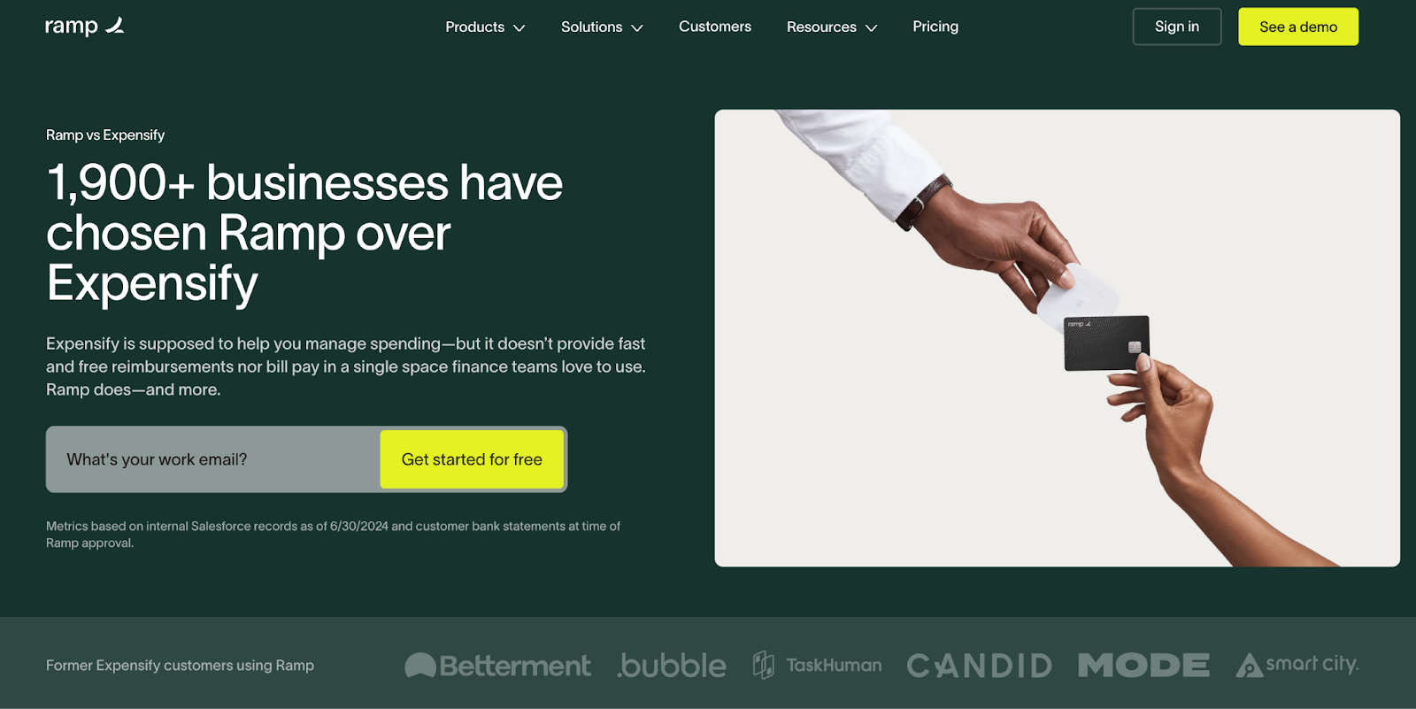
View full page: Ramp lander
Keyword used: “Expensify”
What we love: Email capture, social proof in header, strategic copywriting
Bonus: Chatbot, visuals, and branding
45. SERanking
View full page: SERanking lander
Keyword used: “SEO tools”
What we love: Visual elements and overall landing page design
Bonus: This is a great example of a “real” SaaS landing page, fantastic use of statistics and plenty of visuals to highlight the SaaS website offer
46. Textline
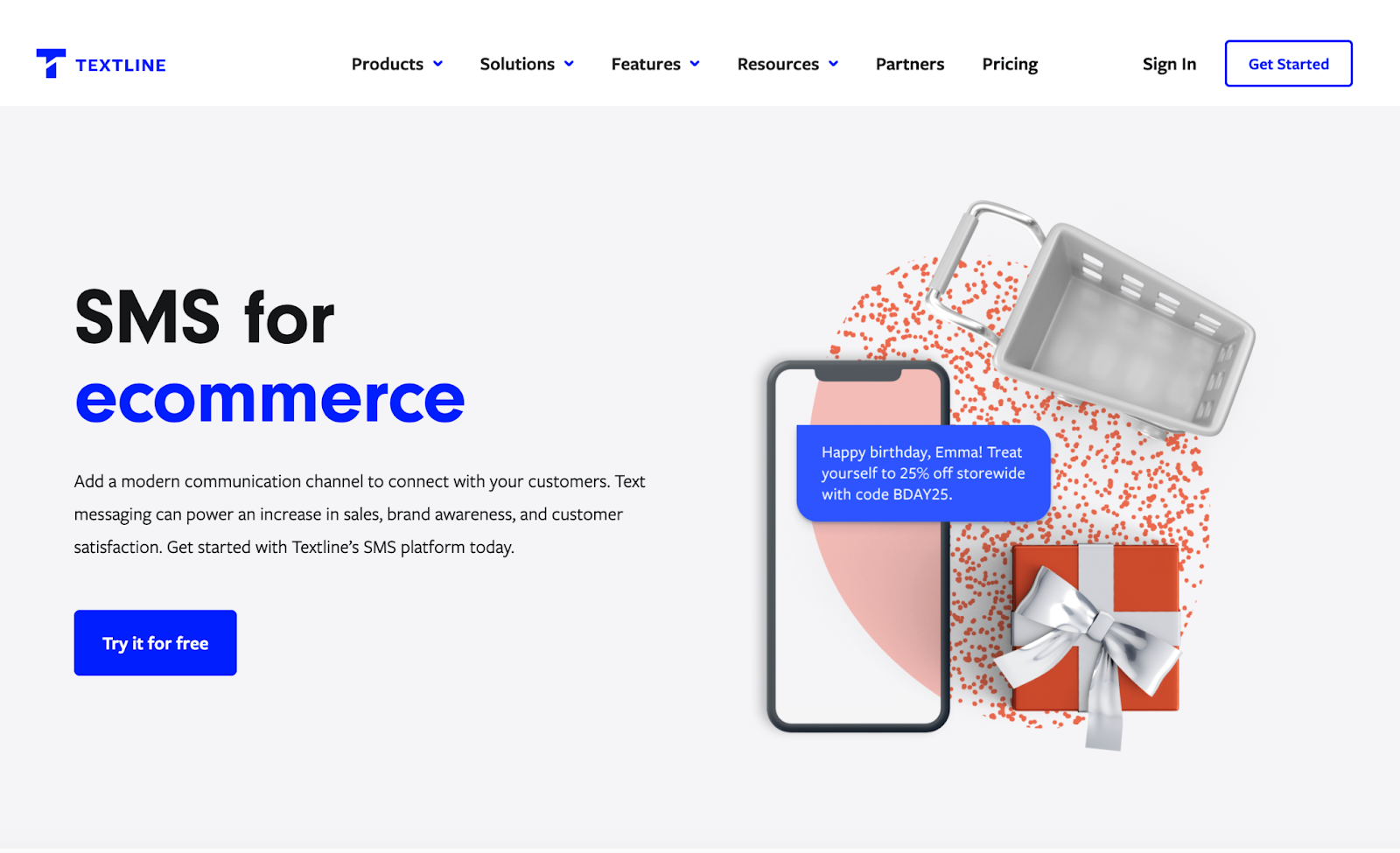
View full page: Textline lander
Keyword used: “Email and SMS for eCommerce”
What we love: Messaging (perfectly targeted to search term)
Bonus: Site takes inspiration from text-dense (yet clean) competitors, like Klaviyo
47. Vroozi
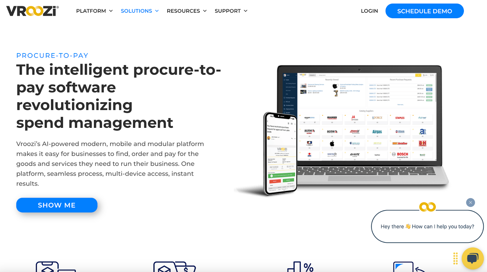
View full landing page: Vroozi lander
Keyword used: “Prisync” (Skuuudle competitor)
What we love: Extensive feature list
Bonus: Exploratory video in-built on SaaS website, taking inspiration from other similar platforms.
48. Augmentir
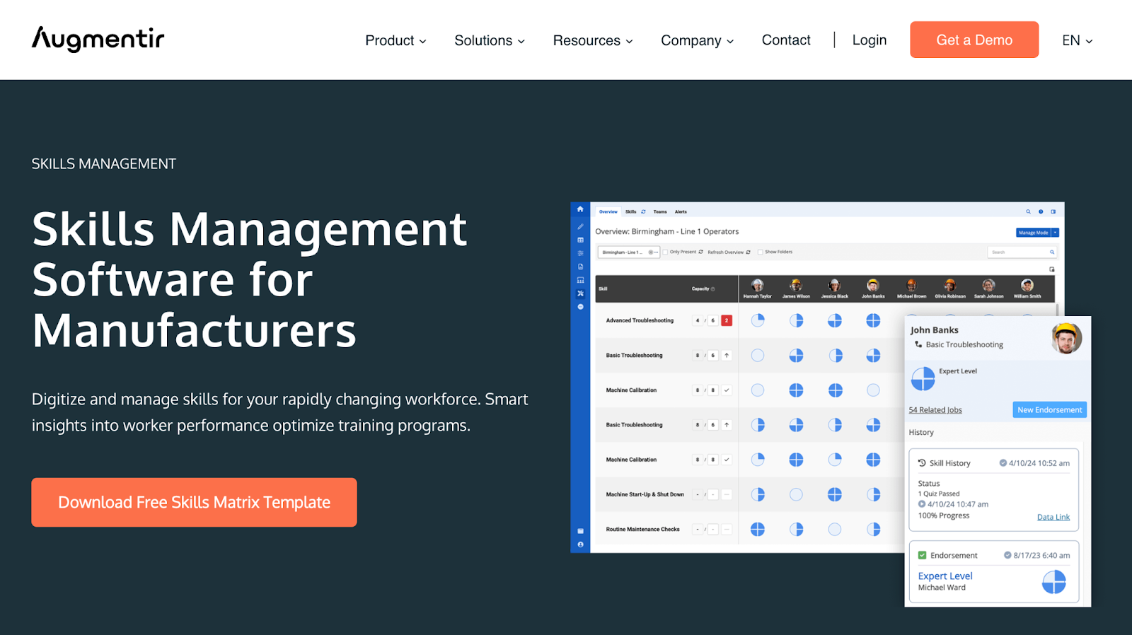
View full page: Augmentir lander
Keyword used: “Project management software”
What we love: Design
Bonus: Ungated resources, demo opportunities
49. InEight
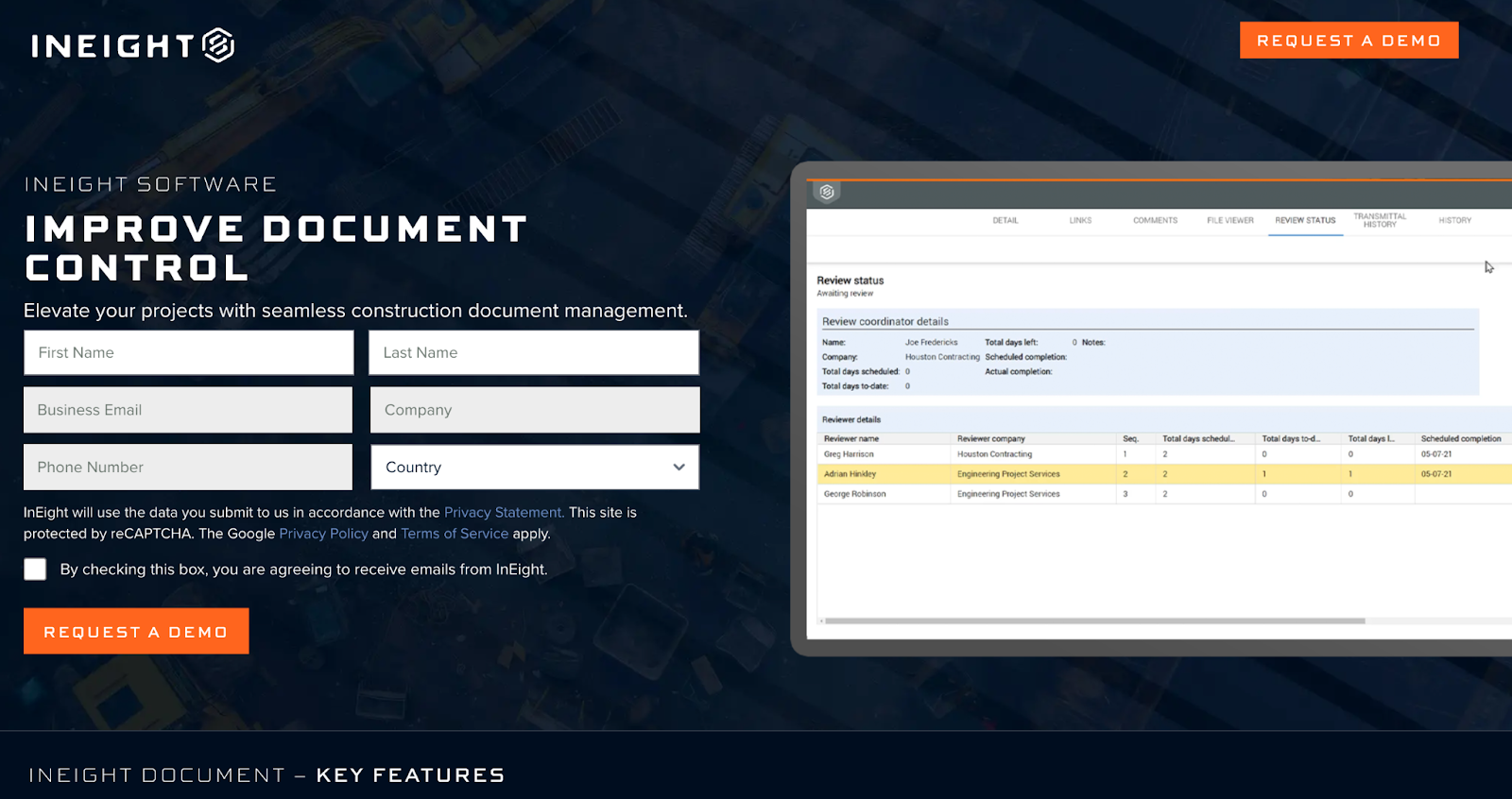
View full page: InEight lander
Keyword used: “Panda doc proposals”
What we love: Condensed website design style, visual appeal
Bonus: Copy is strategic and optimized for web
50. Performio
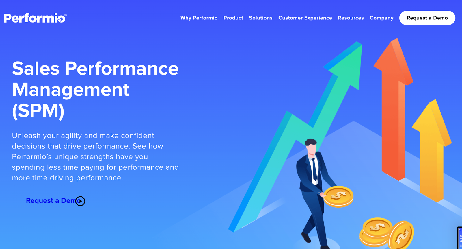
View full page: Performio lander
Keyword used: “Commission software”
What we love: CTA (“Request demo”)
Bonus: Video adds substance, makes it feel like a real SaaS landing page instead of a text-dense website
51. Beamer
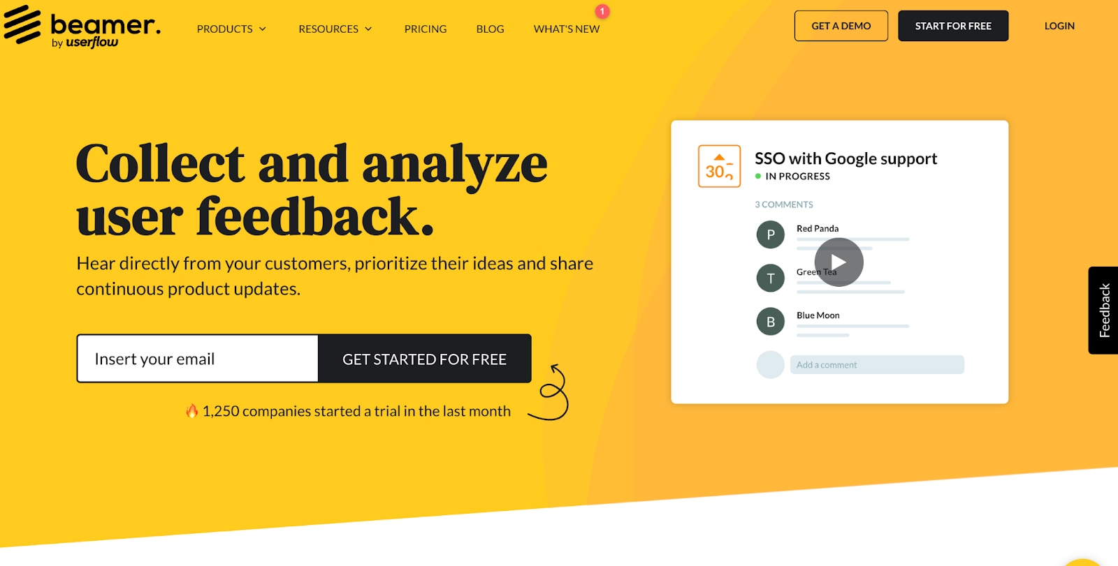
View full landing page: Beamer lander
Keyword used: “Feature request software”
What we love: Email capture, leads off with a summary video of features
Bonus: Strong social proof profile at top of the site
The good and bad: Analysis of the 51 SaaS landing pages
So what did we learn after reviewing 51 page examples from 51 of the biggest SaaS brands in the world?
The best SaaS landing page options we reviewed consistently demonstrated strong social proof, clear CTAs, engaging landing page design elements and positive user experiences. However, though many of these SaaS landing page examples demonstrated glimpses of conversion gold, in general, most of them needed improvement—as we all do.
Social proof: From client logos to testimonials to user stats and awards, almost all landers included a healthy dose of social proof from third-party sources. Crucial, considering testimonials can increase conversions by 34%
Single CTA: Landing pages should optimize for a single goal, not many goals. When you add more CTAs, conversions decline. Many contain more than one offer, but including more than one offer can decrease conversion rates by 266%. Most landers stayed focused on one CTA and so should you.
Experience: I had zero issues with page speed, mobile-friendliness, or intrusive pop-ups.
Features/benefits: It appears that after decades of beating “features/benefits” into marketing copywriters across the globe, it’s starting to pay off. Most landing pages had copy that clearly illustrated the pain points the software solves as well as the benefits it brings.
Now for the improvements:
Design: Eye-catching design communicates trust and credibility.Most of these landing page examples could benefit from a little conversion design expertise. From layouts to visual aides to white space, the design fell flat for many landers.
Forms: Fewer form fields don’t always mean more conversions—too many landers included embedded forms with lots of form fields. Instead of embedding forms, we encourage digital marketers to test the breadcrumb technique (i.e. putting a form behind a button, then asking the least threatening questions first).
Offer: Demo, proposal, start free trial… pretty much every SaaS business makes the same CTA. It’s worth noting that most of these landers were for purchase-intent keywords (bottom of funnel). But very few examples actually made a truly compelling offer. At the very least, if you’re going to offer a free trial, do a better job describing what I’ll gain from that free trial.
Messaging: Features and benefits work great, but very few landers brought an original POV that made you stop and think “a-ha!” With hyper-competition and feature parity abound, features and benefits alone won’t position one product as superior to another, but a compelling strategic narrative will..
Which website had the best SaaS landing page in our opinion?
All around, the best lander came from Intercom
✅ No exit links
We should be able to keep the traffic we get on-page as marketers—which is why we shouldn’t give customers opportunities to leave.
✅ Live chat
Accessibility leads to customer trust. Customer trust leads to stellar sales.
✅ Demo videos
Demo videos offer direct connection to the consumer, and result in an average 49% faster revenue growth.
✅ Copywriting and designA good product writes itself, but Intercom executes on the most critical features and benefits.
✅ Experience
Fast load, interactive, and mobile responsive.
Which SaaS product had the worst landing page?
Formstack/XVerify, not even close (give us a call).
❌ Way too basic
There’s barely any site elements to comment on…
❌ Poor design
It looks like someone copied and pasted images from the homepage or service pages and paid little attention to how they would look on the lander. And then they put that on a blank wall. There’s not enough to keep me here—or anyone else.
❌ Uncompelling CTA
“Request a Demo”...while it’s tried and true, it’s not super original. And the rest of your site isn’t compelling, so this definitely has to be.
❌ Mediocre copy
The copy reads well, but it’s all to be expected…and it reads incredibly generic.
❌ Hidden social proof
This is probably the biggest website “sin” on the list. There’s no social proof. Why should anyone trust the tool?
How to create your own SaaS landing page
You have three options:
- Hire a professional to do it for you. Hint: we provide landing page services. Hit us up ;)
- Hardcode one yourself or with freelancer: Hire a designer and a developer on Upwork or Fiverr or through another design marketplace, and have them design and hardcode a custom SaaS landing page on your site.
- Use a SaaS landing page builder (our favorite): Landing page builders like Unbounce or Instapage make it easy for non-designers and non-developers to design, launch, and test landing pages. They even have huge libraries of SaaS landing page templates. While we design custom landing pages for clients, we use Unbounce to easily publish and test them.
Final thoughts
Overall, the bar is pretty low.
But as we like to say, check out what your competitors are doing and then do it better. A low bar is good news for us.
As more and more SaaS brands adopt landing pages as part of their performance marketing strategy, we're still a long way from the type of conversion gold you'd expect from some of the world's most recognized marketing departments.
Bottom line: We hope this long list of SaaS landing page examples, along with our analysis, helped inform your next landing page design. Don't forget to run your own A/B tests to see what works best for you.
Frequently asked questions
The Science Behind Landing Page Hero Sections
The data shows that top-performing SaaS companies like Asana and Monday.com optimize their above-the-fold content with three critical components: a compelling value proposition, social proof, and a clear call-to-action that speaks to their audience.
Making Social Proof Work for Your Landing Page
The most effective SaaS landing pages, like Zoominfo and RingCentral, strategically leverage different forms of social proof - from customer logos and success stories to specific user statistics and awards - to build credibility and trust with visitors.
Converting Visitors Through Strategic Feature Presentation
The most successful SaaS landing pages, including examples from Mixpanel and SEMRush, don't just list features - they create a narrative that connects each feature to specific pain points their target audience experiences.


