You've read before: humans have attention spans shorter than—SQUIRREL 🐿
So get to the point.
Your landing page has to have ✨something✨ on it right away that convinces a visitor to stay. Or, even better, to click through to somewhere else.
Boring has never sold well. The best headlines win mindshare almost instantly.
They have to be spectacular—that's your benchmark.
TL;DR
If you take two things away from this page, it's these: 1. Make the ultimate benefit (your unique selling proposition) your landing page headline, and put the "what is" part underneath to qualify that benefit.
2. Use a tool like Monster Headline Analyzer to score your headline based on power, emotion, and uncommonality—we do.
By the end, you'll know the 3 things every compelling headline has, the landing page headline formula we use, 10 tips for high-converting headlines, and how to test headline variations. You'll also get plenty of killer headline examples to transform boring headlines into catchy headlines that put other landing pages (and maybe your existing headlines) to shame.
Okay 👇- What is a landing page headline?
- Why work on landing page headlines?
- How to write an effective landing page headline
- 1. Clearly communicate your offer
- 2. Promise a clear benefit to a specific audience
- 3. Landing page headline formula (that special headline bling)
- 10 tips for high-converting headlines
- You've got one glimpse to gloat
- FAQs
Get brand new landing page strategies straight to your inbox every week. 23,739 people already are!
What is a landing page headline?
That big bold title at the very top of your landing page is the landing page headline. Also called a header, H1, hed, and sometimes a title, this catchy headline lives in the hero section "above the fold."
It's the first thing anyone sees, along with the landing page hero shot.
Here's an amazing landing page headline paired next to one of the best landing page hero shots I've ever seen:
Juneshine kombucha puts the ultimate benefit as the headline—huzzah!
In a super small amount of space, here's what else makes this hero section pop:
- what it is (the product offer) as a qualifier under the headline
- a CTA to learn more
- a video hero shot
Engaging headlines capture attention like that ☝️
What will you get from drinking Juneshine kombucha? A life that's brighter.
The video hero shot loops through a solid minute of animated moments that capture what it means to love a bright life, from being with friends, to surfingr huge waves, to snowboarding and skateboarding.
It creates a ton of feel-good emotions (even if you don't surf or snowboard or skateboard). Those clips appeal to Juneshine's target audience, but the feeling is unmistakable: happy energy. Drink Juneshine and live brighter.
Where do I get mine? 🤩
If you fail to do this, it's the last thing that customer (you don't convert) will see before they click away is the headline you need to go back and optimize.
The best landing page headlines sell an intended action. That's a landing page's purpose—it has a single focus: to convert a potential customer on some desired action (like filling out a form or making a purchase or requesting a demo or learning more).
Since stories are still one of the best sales tools, a good landing page headline will resonate with someone on an emotional level, a logical level, or a level of interest. Resonance affects that user's behavior.
There's skill to writing headlines that causes an mmhmm nod 🤩 over an nuh-uh nod 🤨
Why work on landing page headlines?
Headlines aren't your only conversion rate optimization (CRO) tool. They work with images, videos, or interactive elements. But the headline is the most important element because it clearly communicate an idea in a few seconds, and because
- Images aren't specific enough without text clarification (they ask too much of the reader off the start)
- Videos might take too long (to load and to convey your message)
- Interactive elements rely heavily on either text clarification or user intuition
In short, your headline is the ONLY tool that can grab attention effectively in such a tiny amount of viewer real estate
So how do you write a good one?
How to write an effective landing page headline
What should your headline include?
These three things (and nothing more):
- Be clear about the offer
- Promise a specific benefit
- Add something interesting
Number one and number two are essential, but if you don't have an engaging hook (#3), your clear offer and specific benefit might not get that coveted conversion.
And if you add anything more than those three things, your headline will be too long, and that's bad for two reasons:
- Human attention spans suck, remember?
- Google will cut off your snippet headline in the search result pages (you get 580px of length and that's it).
1. Clearly communicate your offer
Virtually no one ends up on your landing page by accident.
Your landing page design is a cog in your carefully-designed conversion machine, and every person who visits has been specifically targeted and reeled in to your page
They land there for a reason.
Maybe they jumped to your landing page by clicking an organic SEO link on the Google search engine results pages (SERP). Or maybe they clicked a paid ad that appeared thanks to your PPC targeting. Maybe they came to you via a social media referral
Each of those channels funnel a specific type of visitor to your landing page. When they arrive, they're looking for more details about how your valuable offer can solve their pressing pain point.
So tell them right away in one big, bold, attention-grabbing headline.
Answer what you do and how that will help them (better than any other solution). That's called your unique value proposition (UVP), and describing it is the number one function of your headline.
Landing page headlines should
- answer their question
- instill confidence
- show expertise
- make it easy to continue
It should get to the point quickly because... who wants to wait for answers?
Design a clear path to conversion, starting with your landing page headline.
What kind of difference can a headline make?
When we updated Shulman Law's landing page, the first thing we looked at was their headline.
This was the original page:
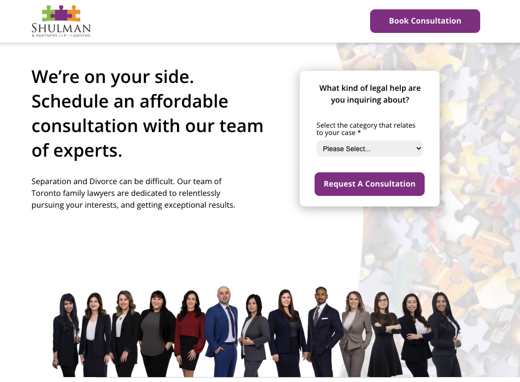
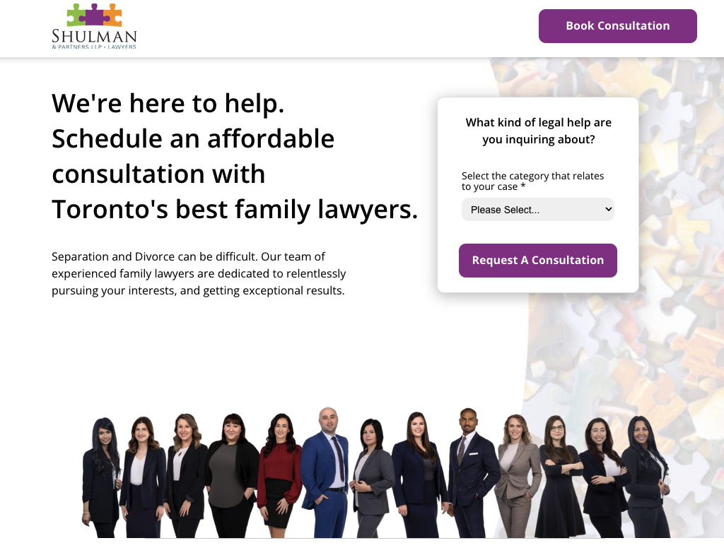

Communicating your offer by speaking directly to the audience around you can really up your conversion rates, especially when the service you offer caters to a walk-in crowd.
In this case, the page’s conversion rate increased by 95%.
Sweet.
2. Promise a clear benefit to a specific audience
The second key element of a great headline is the benefit to anyone interested.
Your audience isn’t looking for your product. They’re looking for the best solution to their problem.
If that happens to be your product, you win.
By promising a benefit that aligns with their ultimate solution, you differentiate yourself from your competitors who make the mistake of describing the what (features) instead of the how and the why (benefits).
The benefit is especially useful when you have a lot of competitors with similar product or service offerings.
For example, there are thousands of web designers out there, many of whom offer a similar level of quality at a similar price.
If you were looking for a web designer, which of these two headlines would you click?
- Beautiful Business Websites At A Budget Price
- Websites Optimized To Convert: Make Money From Day One
The first headline answers the what: cheap websites.
The second headline outlines the what (web design), the how (conversion rate optimization), and the why (because you want to make money using it, not save money making it).
Headline #2 grabs the attention of someone looking to build a website for the specific purpose of generating online revenue.
If you understand your target audience, promise a specific benefit that will resonate with why they’re searching for web designers in the first place.
Here’s a real-world example:
When ePIPE wanted to improve their conversion rate, we evaluated their hero headline.
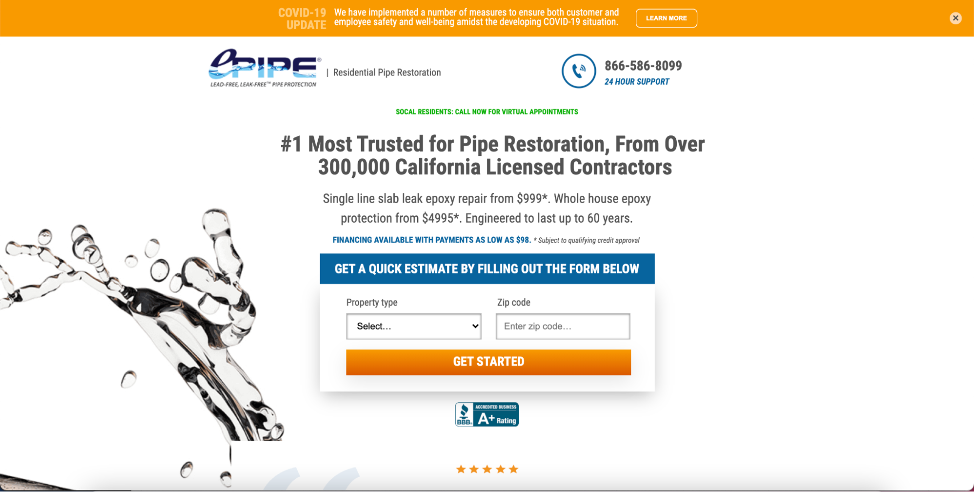
This headline doesn’t feel very sparkly. So how did we bring the bling? Simple. We spoke directly to the customer by recognizing their pain and assuring them we could help them.
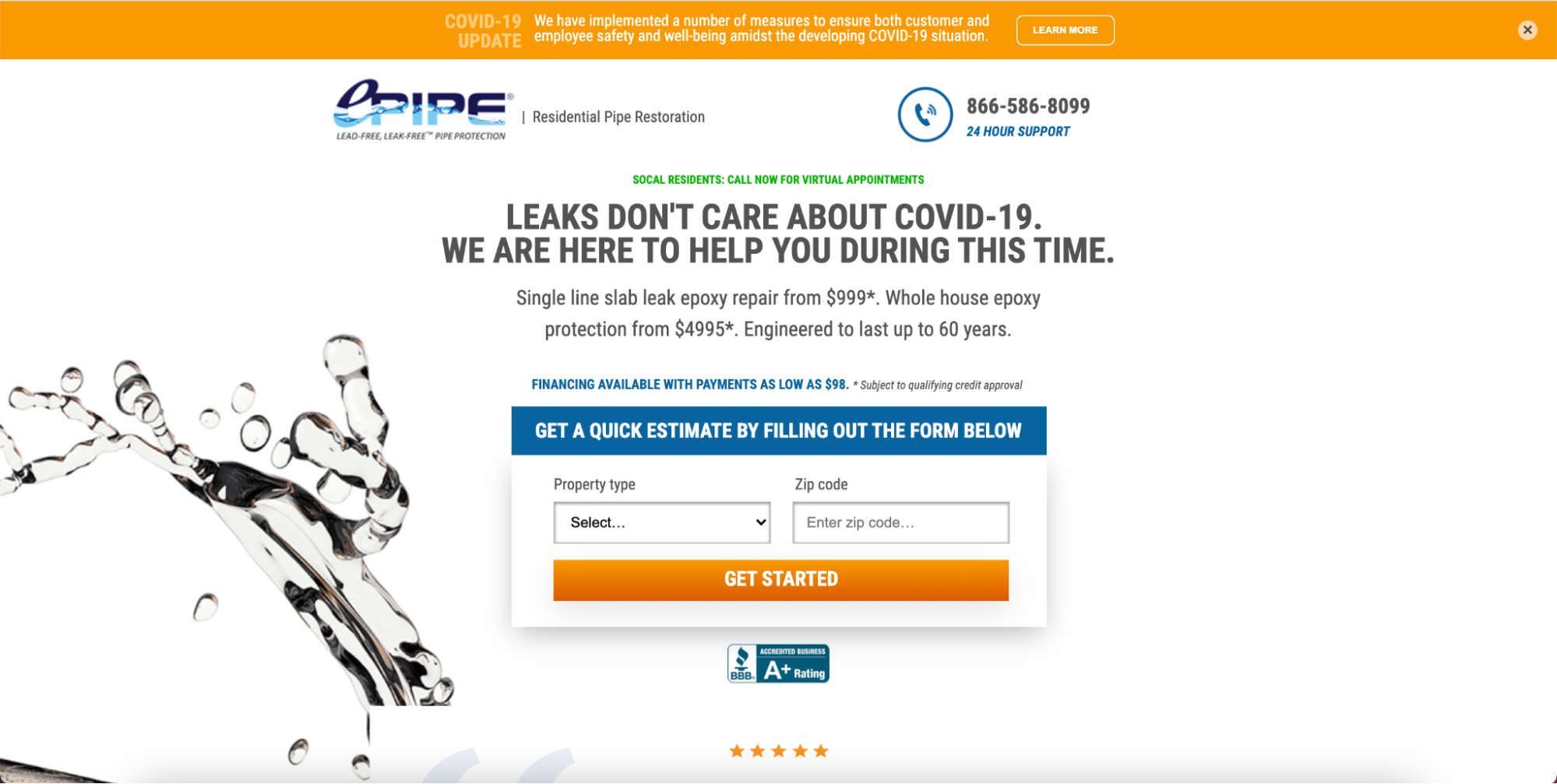
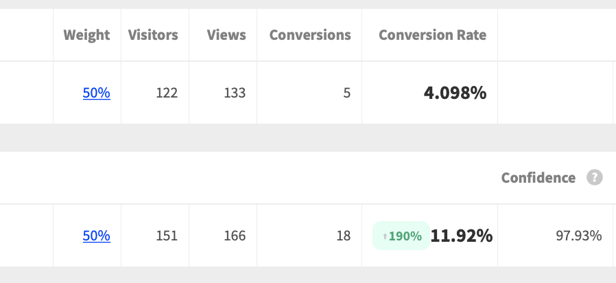
The feature is that ePIPE will fix your pipes. But the benefit is that they’ll do it in a COVID-friendly way that respects your family and takes care of the problem in short order. So what happened? This headline change increased conversions a whopping 190%.
Positive vs negative tone
How you say something matters.
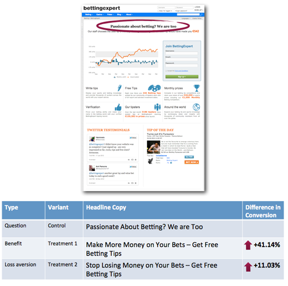
Unbounce performed a three-site headline test and found that benefits phrased in a positive tone outperformed simple question headlines and headlines written in a negative tone.
The positive benefit headline increased conversions by over 40%
- Don’t
- Won’t
- Can’t
- Isn’t
- Tired of...
- Worried about...
Do you have headlines like this? Flip them around and make them positive.
Headlines that promise a positive benefit tend to do very well. But you may have noticed a downside: Benefit-focused headlines narrow your audience.
✨ Surprise ✨👆That isn’t a downside 😲
Narrowing your audience means excluding people who aren’t after the benefits you mention. That leaves a smaller group of specific people who are after those benefits.
And that’s a really GOOD thing.
Writing landing page headlines for a specific customer segment (persona) increases the rate of conversion, which has a lovely side effect of increasing your revenue.
Buuuuuut, you can overdo it.
If your landing page targets an audience that’s too broad, your headline won’t be specific enough to be compelling. But if your landing page target is too narrow, you won’t get enough traffic to convert.
So here’s a helpful piece of advice: create additional landing pages.
Focus each landing page on highly-targeted traffic, and add all of those conversions together.
There isn’t much point in paying for PPC campaigns that target slightly different traffic (small business web design and law firm web design, for example) if you send both to the same landing page.
Landing page headlines that convert will depend on three things:
- Give each segment their own landing page
- Positively brag about your unique benefit
- Be crystal clear
That’s how you’ll convert the sh*t out of each segment.
Clarity for conversions
Clarity wins over creativity or cleverness 9 times out of 10.
When MOXĒ wanted to improve their transaction rate, we tested updating their headline from a general headline to more of an experience-focused headline.
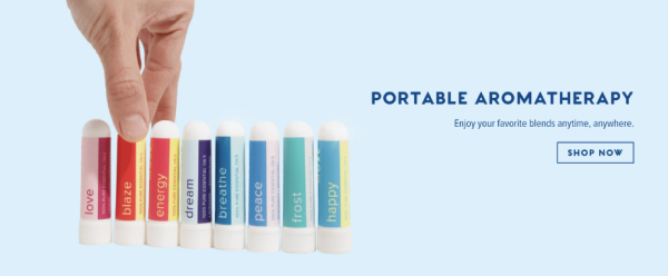
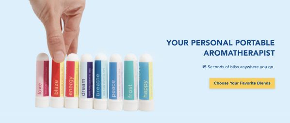
Some of the blanks need to be filled in to make things clear. Headline two filled in those blanks.
Remember, this isn’t a storyline in a book. Leave nothing to the imagination—don’t make your audience guess.
Headline #2 beat the original by 30%!
3. Landing page headline formula (that special headline bling)
You're 95% of the way there.
- You know your audience segments
- You've created several landing pages and written slightly different headlines
- Your headlines are brief and positive
- They clearly outline the benefit (more than the feature)
Now, level up and nail your headline with a formula.
Remember that your goal is to write a landing page headline that's crystal clear about the offer, promises a specific benefit, and has some bling without being too wordy.
You did that with this landing page headline formula:
Landing page headline formula
[OFFER] + [BIG PROMISE] + [✨SPARKLE✨]
That splashy bit (the sparkle) is what makes your offer better than your competitors' offers.
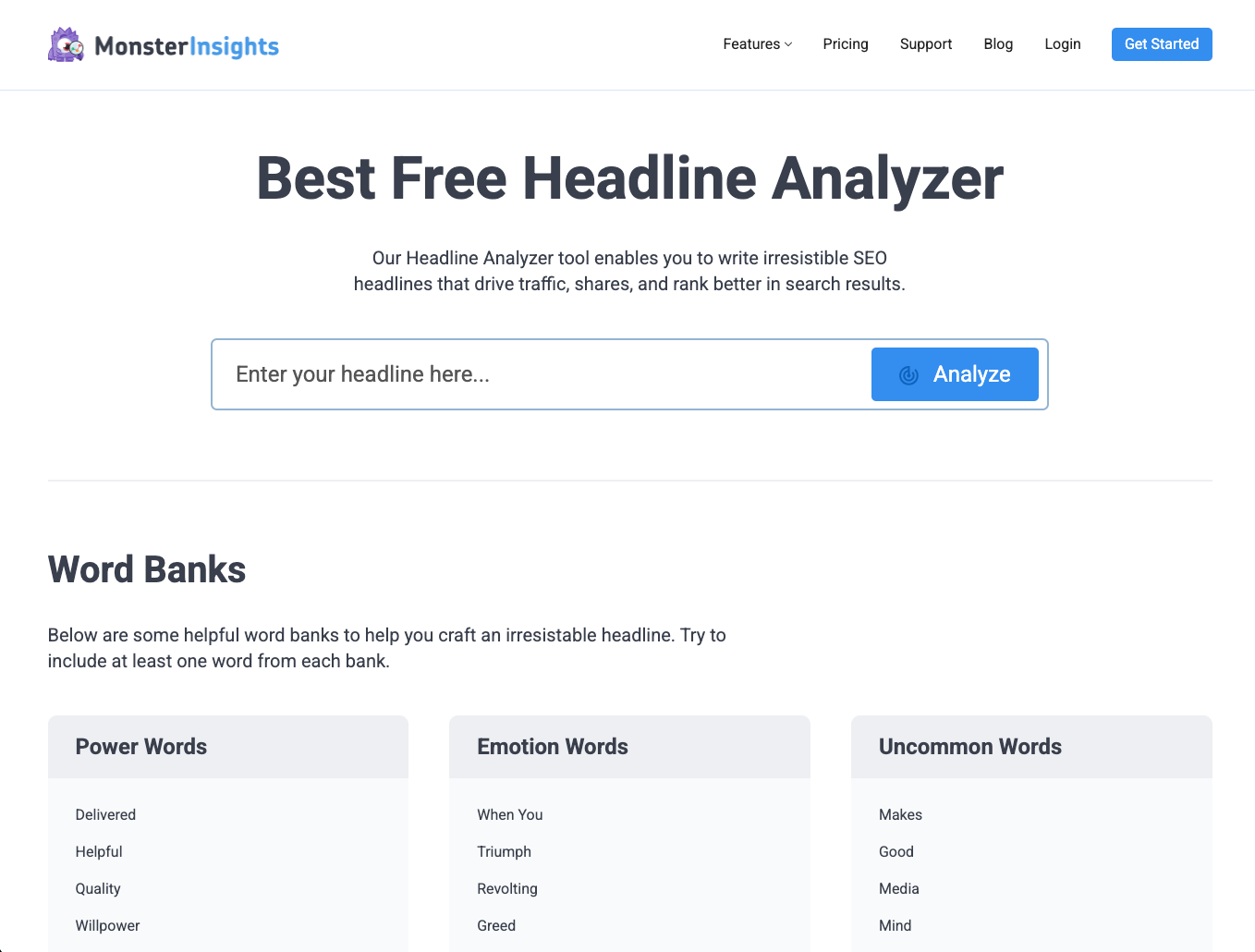
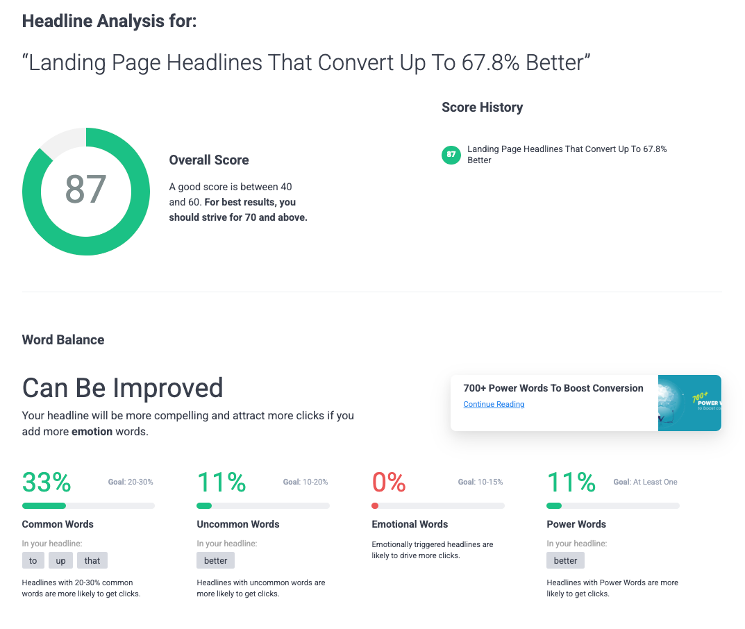
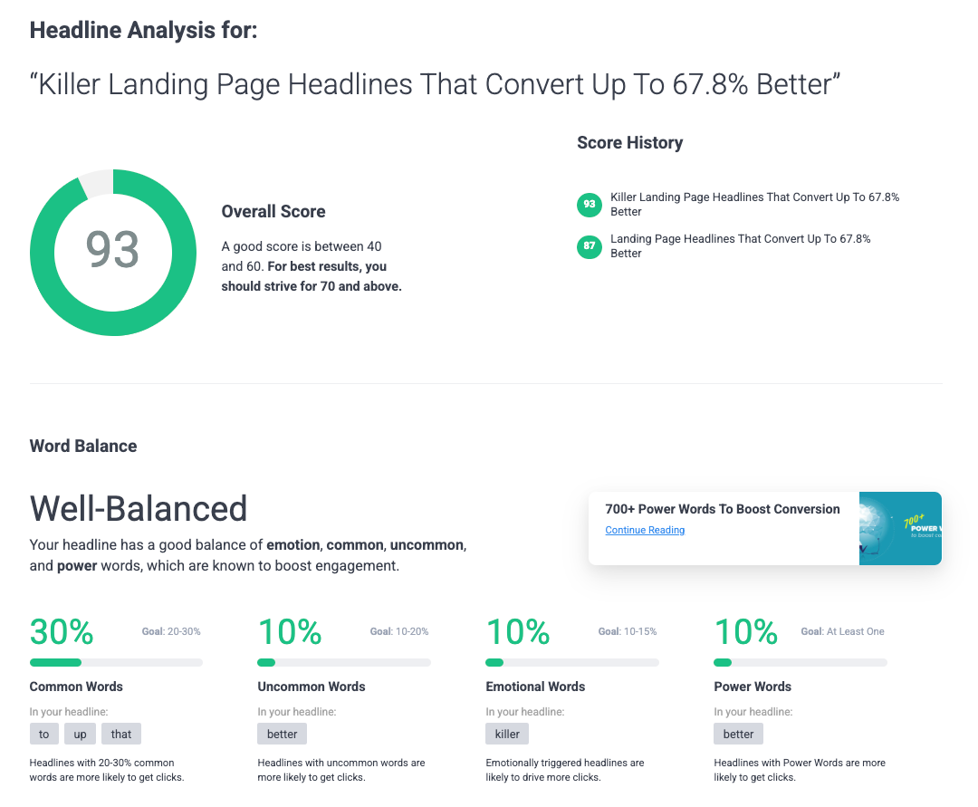
Next, you test your landing page headline with Monster Insights Headline Analyzer (it's free)
Let's walk through the formula first with a few landing page examples.
There's a sales adage that says, “sell the sizzle, not the steak.” That's exactly what we're doing here.
What twist can you add to intrigue? What words can you use to erase doubt? How can you make that first line dope AF?
Let's look at three examples:
KientBoost
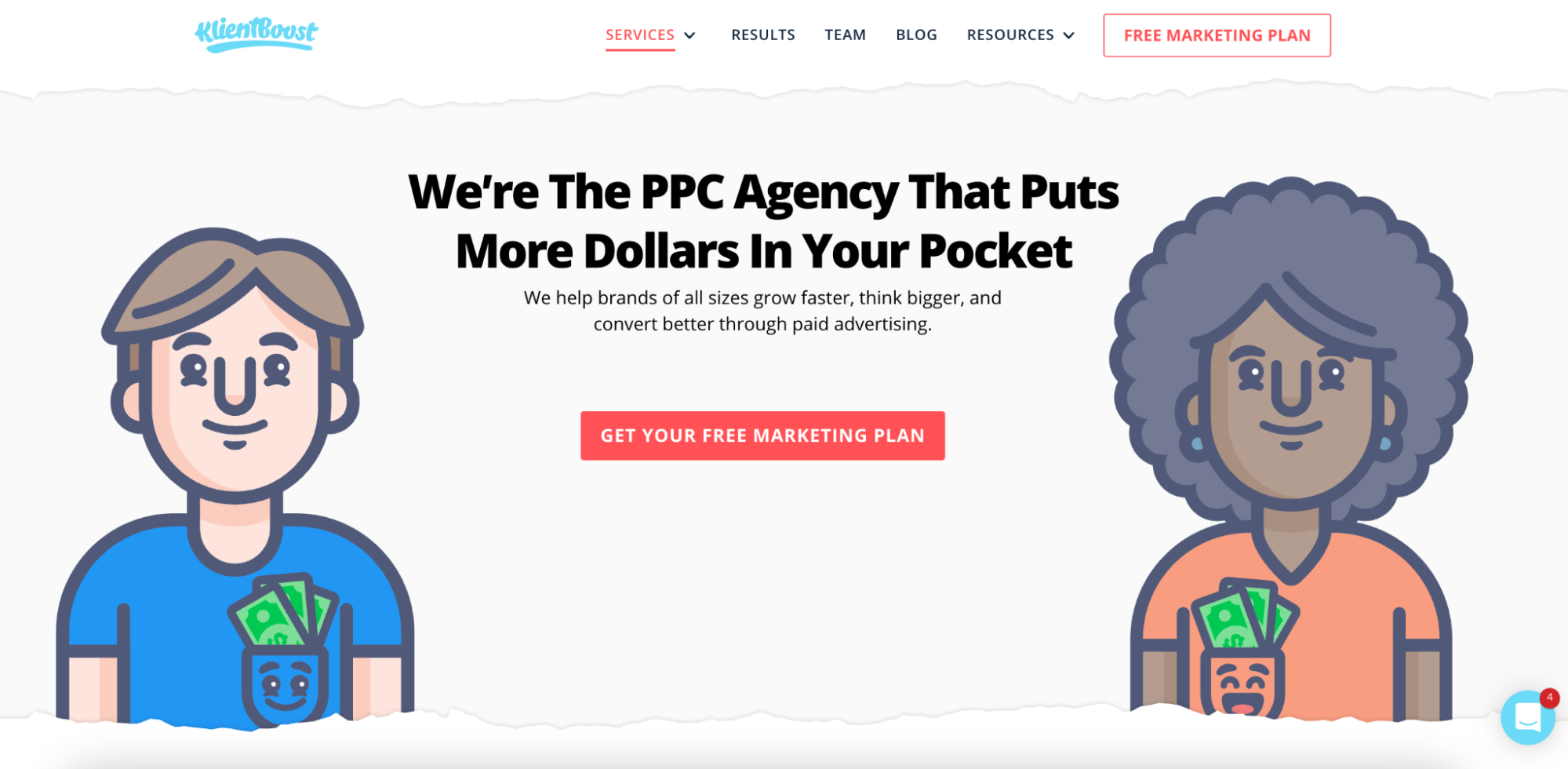
What’s the offer? A PPC Agency that makes you money
What’s the promise? Helping brands grow via paid advertising
What’s the bling? We don’t machine it; we show you how to think bigger (plus look at those graphics ☺️)
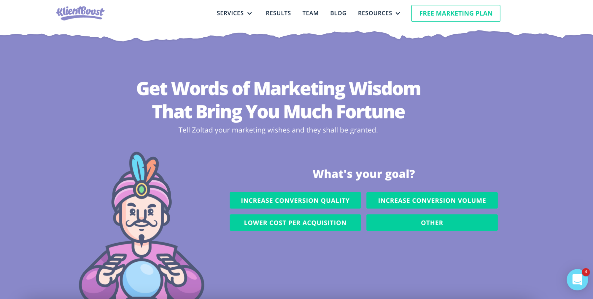
What’s the offer? Marketing advice that makes you money
What’s the promise? More conversions, better quality conversions, lower CPA, or something magically else.
What’s the bling? Gamifying your goals and giving you choice (plus look at those graphics ☺️)
The bling doesn’t have to be outrageous. It simply has to convince a click. Original research and brand new strategies are pretty convincing.
Now take a look at this landing page headline for Ecwid, an online storefront.
Ecwid
What’s the offer? An affordable digital storefront that lets you sell anywhere
What’s the promise? Free forever and no transaction fees
What’s the bling? Two things:
- A slick animation that shows you the benefit (all the new orders you'll get)
- Aggressive copywriting: sell online, don't pay a lot to do that, get started for free, keep it free forever, no transaction fees, and no credit card required—they said a lot in a small space.
Sendinblue
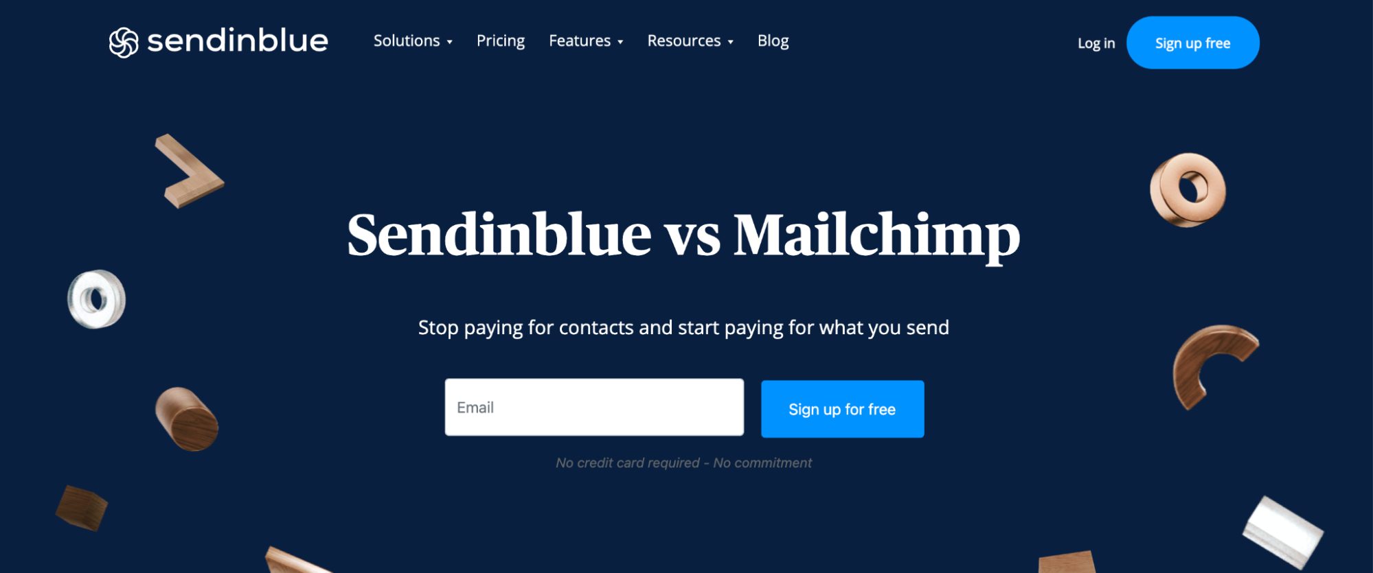
What’s the offer? Email marketing software
What’s the promise? It’s better than Mailchimp
What’s the bling? The brashness. My biggest question is answered in 1 second: Does it compare to Mailchimp? Yes. How? It costs less because Sendinblue flips the pay structure from what you input to what you output
Take the time to inject a ✨ta-da✨ element.
One great way to do that is to incorporate a power word.
Power words
One word can make the difference between a conversion and a bounce. Also known as “triggers,” they influence the next action because the reader is compelled to.
They trigger excitement, they inspire, and sometimes they create FOMO (fear of missing out).
They evoke a feeling and, most importantly, stick out.
Power word examples:
- Master (better than “learn” or “develop”)
- Ultimate
- Essential
- Proven
- Tested
- Unforgettable
- Unexpected
- Untapped
- Profitable
- Painless
- Brilliant
- Expert
- Sneak peek
Don’t settle for boring.
That’s how you’ll differentiate yourself from the crowd and surface with a landing page headline that happily converts.
10 tips for high-converting headlines
Some things are universal truths and time-tested.
Unfortunately, your headline is subject to the vagaries of your audience, the ebb and flow of your market, and your end goal to match their wants and needs to your offer.
So it’s always important to split-test a variety of headlines before choosing the best option.
Let's finish things with a list of 10 landing page headline tips that tend to result in higher conversion rates
- Use numbers in your headlines (stats)—like we did on this page
- Use superlative headlines (adverbs and adjectives like best, most, highest, biggest, zestiest)
- Use positive benefits over negative benefits (“do this” works better than “don't do this”)
- Use a subheadline to qualify the headline
- Use active voice over passive voice
- Limit adjectives and adverbs
- Focus on one main benefit
- Don't use jargon or buzzwords (use short, simple, clear words)
- Keep it short (cut it down until there's nothing left to chop)
- 100% tell the truth (don't sensationalize or exaggerate)
You've got one glimpse to gloat
There's an art to simplicity, so don't overcomplicate things.
Put yourself in your potential customers' shoes and ask the questions they would ask (what, who, why, etc.).
Answer those questions in as few words as possible. Then add some jazz.
You might spend hours writing a great landing page headline because, as simple as the best headlines can look, it's not easy to be brief, clear, beneficial, and sparkly enough to connect with your audience in a few seconds.
But if you write your landing page headline masterfully well, you'll create that positive first impression that gets your foot in the door.
Use the headline formula and take the landing page headline examples on this page to write effective landing pages that convert. Get visitors glancing, scrolling through your social proof (testimonials), and clicking on your call-to-action (CTA) buttons.
Convert them and get them moving through your sales funnel. If the metrics show you could do better, test a different headline until you find the sweet spot.
Next, we'll dive into the conversion rate optimization tool that goes beside your headline: your lead generation form
FAQs
Are “How to” headlines effective for landing pages?
“How to” headlines are great when you're targeting users in the awareness or consideration stages of the marketing funnel. These action-oriented headlines provide a clear solution to a common pain point, which can increase engagement and conversions at the top of the funnel (and your domain's authority).
"How to" headlines have less impact at the decision stage wheremore direct headlines with benefit-driven messaging that emphasizes features, pricing, or customer success stories work best.
The same headline formula applies to top of funnel and bottom of funnel pages.
Does writing effective headlines boost conversions and sales?
A well-crafted landing page headline is a game-changer for your conversions and sales. Think of it as your first impression—make it count!
A good headline should be clear, concise, and packed with value. It’s your chance to grab attention and make visitors think, “Yes, this is exactly what I need.”
Here’s how to create a headline that boosts conversions and sales:
- Clearly Communicate the Offer: Don’t beat around the bush. Tell your visitors exactly what you’re offering and why it’s valuable to them.
- Use Power Words, Action Verbs, and superlatives: Words like "best," “exclusive,” “proven,” and “instant” create a feeling of excitement. Action verbs like “discover,” “unlock,” and “boost” can drive action.
- Be Specific and Targeted: Know your target audience and speak directly to them. A headline that resonates with your audience will always perform better.
- Align with Your Marketing Strategy: Your headline should fit seamlessly with your overall messaging and strategy. Consistency is key.
- Test and Optimize: Don’t settle for the first headline you write. Test different versions to see which one performs best. Landing page A/B testing is your best friend here.
Your headline is the gateway to your offer—make it irresistible.
